Retro Logo Design: Take a Trip Down Memory Lane
Logo design has come a long way since its inception in the early 1900s. Back then, logos were considered an afterthought, a mere insignia to accompany a brand name. However, as the advertising industry developed and technology advanced, logos became increasingly important; they eventually morphed into essential visual representations of brands.
Modern logo designs are now sleek and minimalistic masterpieces that encapsulate the essence of their associated companies with just one image. At the same time, however, classic retro logo designs have held up over time due to their charm and nostalgia-inducing qualities. These vintage symbols utilise bold colours and typography alongside playful imagery, often seen today on products from established businesses such as Pepsi or McDonald's.
In addition, though, more recently, startups have begun taking advantage of retro logo design by incorporating elements from previous eras into their branding efforts to create an emotional connection with customers that stands out amongst competitors.
A survey conducted by Venngage revealed that 36% more brands use retro design elements within their logo compared to 2019 when only 20% opted for it – particularly predominant within food & beverage industries where consumers can instantly identify them due to recognisable solid visuals coupled with nostalgic sentimentality attached.
Modern technology may have revolutionised how we view graphic design. However, traditional methods still have great merit – if used correctly, they still prove very effective even amidst all the current competition across digital marketing platforms.
Table of Contents
Evolution of Logo Design

The art of logo design has been around for over a century, from simple monograms and block lettering to intricate designs featuring bold lines, geometric shapes, and colourful typography.
This evolution began with the invention of the printing press in the 1900s, which enabled new forms of mass communication, such as advertising – prompting businesses to create logos that reinforced brand recognition. Between the 1900-1920s, companies like Coca-Cola, IBM and Ford used straightforward nameplates that spelt out their company's name.
As rapid growth ensued from the 1920s to 1940s, it was time for logos to be transformed again, incorporating colour into their designs and being influenced by the Art Deco movement creating stylised typefaces and dynamic illustrations seen on Shell and Mobil gas insignias. At this point, the aim shifted towards evoking emotion through signage while marketing products toward a wider audience.
Consumer culture, mass production and the automobile industry surged in prominence during the 1940s and 1950s. This time, some iconic logos were created with bold typography and simple illustrations like those of Mercedes-Benz or Ford.
Advertising agencies pushed these boundaries further into psychedelic artworks in the '60s, expressing countercultural beliefs through Coca-Cola's and Pepsi's more curvilinear logo designs.
Graphic design technology evolved throughout the 1970s to 1990s, with computers allowing designers freedom for experimentation with typefaces, colours and graphics – leading to abstract pieces such as the Nike swoosh or Apple's logo. The emergence of eCommerce towards the end of this era meant more straightforward symbols were needed that could be easily scaled down for digital use – think Google & Yahoo!
At the turn of the millennium, graphic designers began to embrace minimalistic designs. Companies such as Airbnb, Uber and Instagram embraced this trend by creating easily recognisable logos that could be scaled for various mediums. As technology advanced, logo design has become increasingly dynamic and interactive – from Nike's Flyease logo to Intel's ever-changing emblem.
Today, logos are no longer confined to print or digital media; they have expanded into video animation and social media platforms. Graphic designers continue to explore new ways of making a lasting impression with their visual creations – pushing boundaries to make them more memorable than before.
Every era brings unique values, cultures and aesthetics, which further shape how we view our world today through graphic design – offering us infinite possibilities for future innovations in logo design.
What is Retro Logo Design?

Retro logo design is an art form that evokes a feeling of nostalgia, tradition and reliability. It combines visual cues from past eras with typography, colour palettes and imagery to create distinctive brand identities. This logo design style transports customers back in time and gives them trustworthiness and authenticity.
The components used for retro logos can vary depending on the referenced era; however, some common elements are present within this type of design, such as typography, colours and imagery.
Typography styles popular during specific periods may be incorporated into the logo – Art Deco, Victorian or Mid-century modern fonts might be included to add nostalgic vibes. Additionally, bold, vibrant shades often associated with specific decades evoke emotions – 1950s-inspired designs could feature bright pastels or turquoise, whereas 1970s-based techniques may include intense contrasting hues instead.
The artwork typically follows particular genres, e.g. Pop Art or Art Nouveau, which allows designers more freedom when creating unique visuals. At the same time, textures like grainy paper effects give off a vintage print feel from time.
Famous examples of Retro Logo Designs include long-standing companies Coca-Cola and Budweiser, who have kept their original logos throughout generations. Other brands such as Pepsi & Walmart have adapted theirs recently, incorporating traditional motifs for extra appeal. Retro Logos offer something unique that connects emotionally with customers making it one timeless way for businesses to leave a lasting impression on people's minds.
Nostalgia and Branding
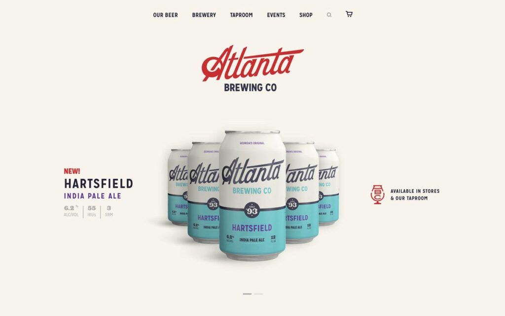
In this era of fast-paced, ever-evolving branding, companies seek creative approaches to captivate their target market. One successful technique has been the utilisation of nostalgia; by evoking emotions from the past, organisations can develop a strong connection with clients and increase brand loyalty. A popular method used to achieve this is vintage logo design.
But why does retro logo design prove so effective in promoting nostalgic sentiments? How do these elements amplify today's marketing strategies? By reflecting on memories that bring comfort and joy – such as childhood memories or favourite songs – businesses can establish trust between them and their customers while creating an atmosphere of familiarity.
Moreover, by tapping into past emotional triggers, they spark positive associations about their brand's identity, significantly increasing customer engagement. Finally, combined with contemporary designs, it allows them to stand out amongst competitors in a unique yet powerful way that resonates deeply within audiences' hearts and minds.
Nostalgia is an emotion that binds us to the past, bringing a sense of comfort and security. It's something we all experience – no matter where in the world or when in life – as it evokes positive memories that can lift our spirits and increase our overall well-being. Through nostalgia, we can make meaningful connections between our current selves and who we were before, establishing a continuous link between times gone by and now.
By reflecting on experiences from days long since passed, nostalgia allows us to relive them with fondness, providing an escape from reality — even if only for a moment — through its power of remembrance. Every time these feelings come over us, they bring waves of joy that delight our hearts. In this way, nostalgia serves as a reminder of what once was and hope for what could be again soon!
Given nostalgia's undeniable emotional strength, it's no wonder businesses are using this powerful tool in their branding campaigns. By connecting with customers' cherished memories, companies can evoke a strong emotional response and foster greater understanding and loyalty.
Retro branding is a good tactic for leveraging nostalgia to generate familiarity and trust. Utilising retro logos, typography, and visuals – all intended to remind people of past positive experiences – allows brands to build recognition in consumers' hearts and minds.
Moreover, tapping into shared memories between the business and customer base creates an interconnected bond between both parties, generating even more profound levels of fidelity over time. Companies have learned how creating these communal experiences gives them a significant advantage when forming long-term client relationships.
Using Nostalgia in Branding Effectively
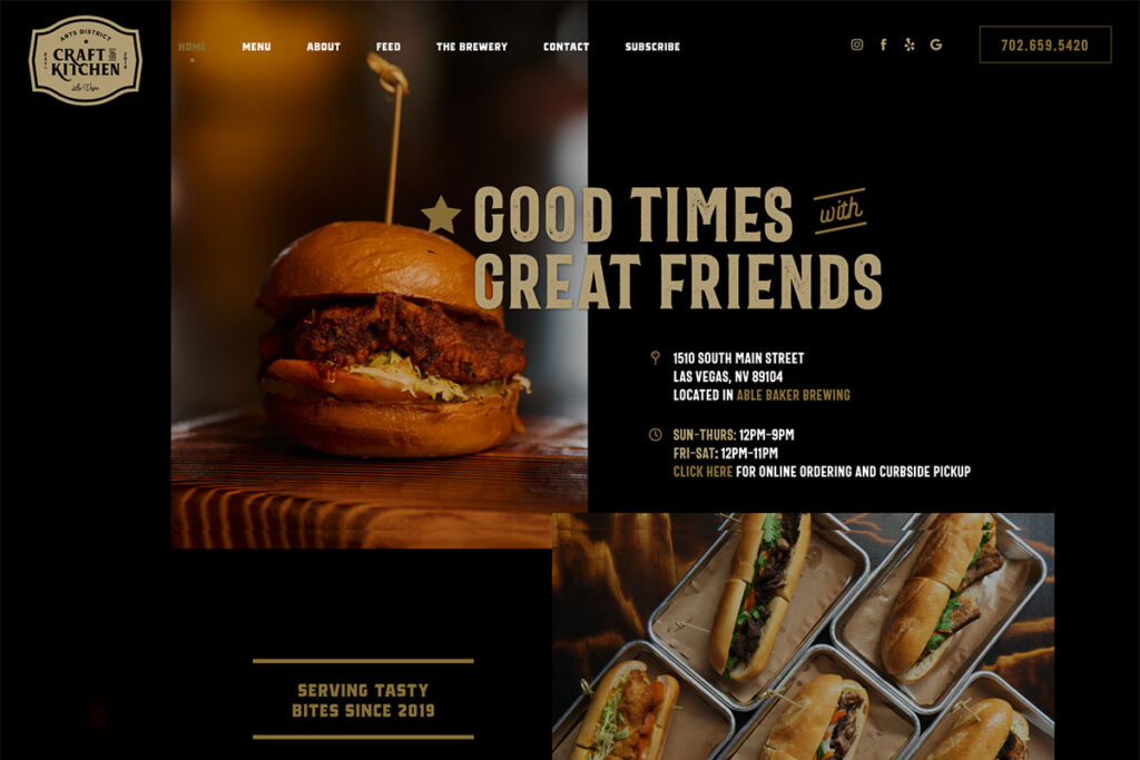
When leveraging nostalgia in branding, it's essential to strike the perfect balance between celebrating the past and staying current. Businesses must find an effective way to evoke emotion from their customers while still being timely and modern.
One successful approach is to update classic designs with contemporary elements. For instance, a business can take a beloved logo design from years gone by and refresh it with vibrant colours or fresh typography – creating a revitalised yet familiar look that captures both old-world charm and modern appeal.
Including nostalgic touches within one's branding strategy is vital for building customer trust and fostering brand loyalty over time. Retro designs are beneficial when harnessing nostalgia because they trigger fond memories of days gone by while simultaneously providing relevance in today's world. As businesses seek out innovative ways to stand apart from competitors and form meaningful relationships with their audiences, there's no doubt that nostalgic tactics will remain at the forefront of marketing initiatives moving forward.
Examples of Retro Logo Design
The concept of retro logos has become incredibly popular among businesses looking to make a statement with their branding. Retro logos offer a sense of nostalgia and familiarity, making them attractive to customers who connect with the past. But what makes these logos work, and how can businesses learn from them?
Let's look at some examples of retro logos and analyse what makes them successful.
1 – Pepsi
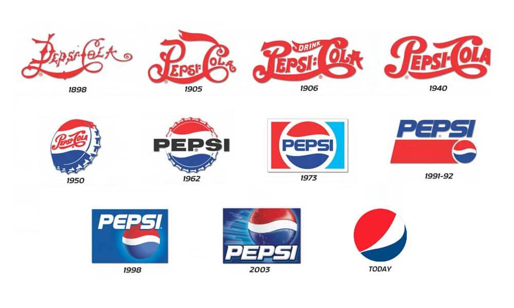
One of the most well-known retro logo redesigns is that of Pepsi. The brand updated its logo in 2008, using a simplified version of its classic blue and red circle design. The new logo retains recognisable wave imagery with a modern update to the font. The result is a logo that feels fresh and contemporary while having nostalgia.
Businesses can learn from Pepsi's success by considering how they can simplify and modernise their classic designs. Updating fonts, simplifying graphics, and incorporating modern colour palettes can help to modernise retro designs while retaining the familiarity and emotions of the original.
2 – Volkswagen
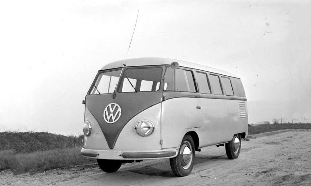
Volkswagen's classic “VW” logo has remained virtually unchanged since its creation in 1937. The logo features a simple, bold font and a circle enclosing the V and W. This iconic logo has become synonymous with VW's brand identity.
Businesses can learn from Volkswagen's success by focusing on creating a simple, easily recognisable design. A company can quickly develop a solid and memorable brand identity by keeping things clear and straightforward.
3 – Kodak

Kodak, a household name in photography, has a retro logo that conveys nostalgia in every detail. The typography is classic yet bold, and the colour scheme features deep primary colours expected in the 1950s and 60s.
Businesses can learn from Kodak by studying the styles and design elements of the eras they want to reference. By emulating classic styles from a particular period, a business can create a retro logo design that truly resonates with its target audience.
4 – Hershey's

Hershey's logo has remained practically unchanged since it was created in 1905. The logo features a swooping text ribbon with a classic serif font that has become synonymous with the brand. The logo's simplicity and classic styling make it incredibly memorable.
Businesses can learn from Hershey's by studying how the brand has maintained its iconic logo. By keeping a recognisable design element present through different eras, Hershey's has created a brand identity that has been consistent and reliable for over a century.
5 – Levi's
Levi's, the iconic American denim brand, has used its classic batwing logo since the 1950s. The logo features two horses on either side of Levi's name, giving the logo a classic western, Americana feel. The font is bold and expressive, further emphasising the strength and durability of the brand.
Businesses can learn from Levi's success by studying how the brand has connected with a sense of nostalgia and authenticity associated with American culture. Using classic imagery and bold typography, Levi's has conveyed a sense of trustworthiness and reliability that is essential in the fashion industry.
Retro logos are a powerful branding tool that can evoke nostalgia and familiarity with a company's target audience. Businesses can learn how to create modern yet nostalgic retro logos by studying the design elements of successful retro logos. Whether through simplification or classic design and typography, incorporating aspects of the past into current branding can build a solid emotional connection with customers that can last a lifetime.
Tips for Designing a Retro Logo
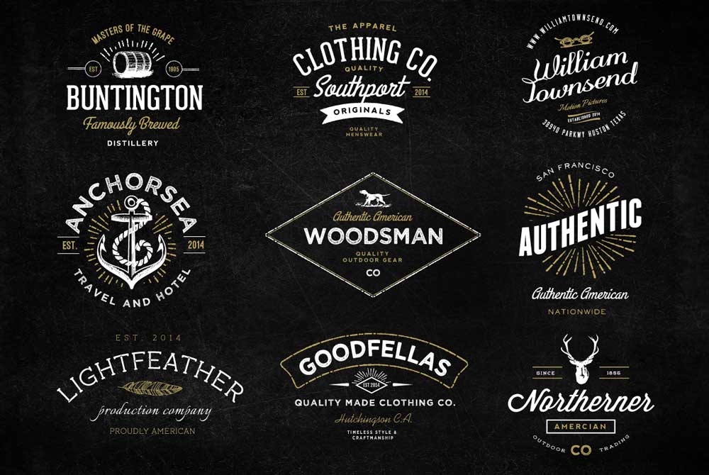
Designing a retro logo can seem challenging, requiring a balance of nostalgia and modern appeal. However, following a few fundamental design principles makes it possible to create a retro-inspired logo that feels both modern and classic. Here are some tips for designing a retro logo that will stand the test of time.
1 – Choose a Bold Colour Palette
Retro design is known for bold colour choices that reflect the style of various eras. Bright reds, blues, yellows, and greens are typical choices for retro logos. However, incorporating a balance of light and dark shades can add depth and contrast to a design.
2 – Select an Appropriate Font
The right font can make or break a retro logo. Bold, sans-serif fonts are commonly used in retro designs, as well as hand-drawn script fonts. Study classic typography from the era you want to reference and select a font that reflects the overall style.
3 – Incorporate Imagery Reflective of the Era
Imagery is a great way to evoke nostalgia within your retro logo design. For example, classic cars or music icons can be used to draw from a particular era's aesthetic. Imagery not directly associated with the past can also be used, but it should still reflect the overall retro style.
4 – Avoid Over-Designing
When designing a retro logo, it's essential to keep it balanced and straightforward. Over-designing can confuse customers and make the logo appear cluttered. Focus on creating key design elements that effectively communicate the desired style.
5 – Strive for Simplicity
A common thread among successful retro logos is simplicity. Simple designs are easy to recognise and remember, essential for creating a memorable branding identity. Remember that a good design works at any size, from digital to printed advertisement.
6 – Keep Functionality in Mind
As with any logo, functionality is vital. Ensure the design is legible on different backgrounds, resolutions, and sizes. A well-designed retro logo should be versatile, work in one colour, and be easily scalable.
Designing a retro logo requires a delicate balance of nostalgia and modernity. A retro logo can stand the test of time by selecting the right colour palette, font, and imagery that reflects the era and keeping the design simple yet effective. Retro design can be incredibly effective for businesses to evoke positive emotions and create a sense of familiarity with their target audience. A retro logo can continue representing and reinforcing a brand's identity for years by keeping the design functional and versatile.
Conclusion
A retro logo design can be a powerful tool for businesses, effectively connecting them to their audience through nostalgia. Crafting a compelling look requires taking past cues and creating something unique and memorable. For optimal results, keep your logo simple while staying true to the style of the era you're inspired by. Pay attention to colour palettes as they play a critical role in evoking that familiar nostalgia among viewers – even minor adjustments can have a significant effect! Ultimately, with careful consideration and creative flair, you'll create a timeless classic that will draw customers in time after time.
