Top 10 Best Logos with 3 Letters: ABC to XYZ
In the modern era of minimalism and brevity, logos with just three letters have become a powerful way for brands to establish instant recognition. With attention spans shorter than ever, these tightly designed icons cut through the noise and visual clutter to imprint themselves onto consumers' minds. Though comprised of only three letters, the best examples encapsulate everything necessary about the company into an unforgettable visual mark.
Today, we will explore the ten most iconic and impactful logos with 3 letters. By examining these logos' creative process, visual representation, and business effects, we can uncover why they have endured while countless others have been forgotten. We'll see how brands like IBM, UPS, and MTV have distilled their essences into three deceptively simple letters. These logos' bold colours, sharp typography, and hidden meanings will illustrate that brevity does not preclude depth.
A logo is often a company's first and most lasting impression in business. As masterpieces of minimalist design, these ten famous logos with 3 letters have shaped their brands' identities and carved out recognisable positions in the public consciousness. By studying their artistic decisions and real-world impacts, we can understand why everyone, from designers to customers, has embraced these pinnacles of visual communication. These logos convey ambition, quality, and unforgettable style, even in simplicity.
Table of Contents
The Criteria for Selection: What Makes a Three-Letter Logo Great
A successful logo with 3 letters achieves visual impact and brand recognition through simplicity, relevance, memorability, versatility, and timelessness. The best three-letter logos are icons that encapsulate the essence of a brand into three succinct letters.
- Simplicity is key. A logo should be visually clean and uncomplicated. Complexity dilutes the impact. The most effective three-letter logos use basic shapes and universal fonts to allow instant recognition.
- Relevance connects the logo to the brand identity. The three letters should ideally communicate something intrinsic about the brand, its values, or its industry. For example, UPS derives from the company's focus on parcel deliveries. The CBS eye shape captures the broadcast network.
- Memorability means the logo sticks in the audience's mind. Distinctiveness helps, but memorability also requires visual crispness and pleasing design. A clever three-letter logo plays on consumer psychology to gain instinctive retention.
- Versatility means the logo can work across mediums. From business cards to billboards, a versatile logo retains integrity when scaled up or down. It also holds up in black-and-white or grayscale applications.
- Finally, timelessness. A great logo remains meaningful even as aesthetics change. The most iconic three-letter symbols have survived cycles of evolving design trends. Their stripped-down elegance carries forward throughout the decades.
When a logo nails simplicity, relevance, memorability, versatility and timelessness, it becomes an impactful brand ambassador – condensed down to just three letters.
The Top 10 Logos with 3 Letters
1 – IBM: A Beacon of Trust and Innovation
The iconic IBM logo has stood the test of time as one of the world's most recognisable and enduring corporate symbols. With its bold, solid letters in distinctive IBM Blue, this deceptively simple logo encapsulates the spirit of innovation, reliability and visionary thinking that has defined International Business Machines Corporation since its founding in 1911.
Created by the legendary American designer Paul Rand in 1972, the current logo with 3 letters distilled the company name to its essential elements. The stacked letters of previous decades were replaced with three bold horizontal letters separated by equal spacing. This gave the mark a modern, minimalist look while retaining a sense of balance and authority. The solid letters project stability and trust, reflecting IBM's reputation as a dependable partner in technological progress.
Over the decades, the logo has undergone minor updates in font and shape, but the essential horizontal three-letter design remains unchanged. Rand's masterful use of negative space makes the logo stand out with simple clarity. The letters are boldly confident without being aggressive or overbearing. This projects an air of approachability balanced with professionalism – an ideal representation of the IBM brand.
In the 50 years since its introduction, Rand's brilliantly enduring logo design has helped IBM maintain brand consistency across its numerous products and services. The IBM logo has built up powerful brand equity from mainframe computers to artificial intelligence to symbolise innovation. Its recognition factor of 94% globally makes it one of the most identifiable logos globally, on par with iconic brands like Coca-Cola and Nike. After half a century, the three letters of the IBM logo remain a master class in memorable and strategically sound brand mark design.
2 – CNN: Breaking News, Breaking Design Norms

The Cable News Network (CNN) logo has become an iconic symbol of 24-hour television news since the network's launch in 1980. The bold, red letters “CNN” set against a white or black background immediately convey a sense of urgency and importance. The logo communicates the core function of the CNN brand – delivering breaking news and information around the clock.
CNN founder Ted Turner and a team at Turner Broadcasting designed the logo. They opted for a simple, bold design that would stand out on television screens and be easily recognised across languages and cultures. The three letters mirror the immediacy and conciseness of headline news. The vibrant red colour was chosen to grab viewers' attention.
Over the past four decades, the CNN logo has become synonymous with live reporting worldwide. It is regularly displayed on screen during major events like elections, natural disasters, and conflicts. The logo is featured prominently on CNN's website, mobile apps, and social media profiles. It provides a visual shorthand for the network's authority and reach. The minimalist yet impactful CNN logo has served the brand well since its inception. It immediately tells audiences that they can turn to CNN for breaking news whenever it happens. The logo succinctly encapsulates the network's mission while allowing flexibility across platforms and formats. It is a true classic of television branding that will likely continue to represent CNN for years to come.
3 – HBO: Entertainment Elevated

The iconic HBO logo has become synonymous with prestige entertainment since the network's launch in 1975. The stacked letters H-B-O are rendered in a clean, bold font, evoking a sense of sophistication. The negative space between the letters forms an abstract box shape, representing the “Home Box Office” – a place for premium entertainment delivered straight to your home.
Though the logo has remained unchanged over the decades, its simplicity and adaptability have allowed it to stay relevant through changing trends. The blank canvas of the logo provides endless possibilities for creative interpretations. It has been reshaped and reimagined to reflect everything from the network's hit shows to cultural phenomena. Fans have crafted HBO logos out of Legos, sand, and even pancakes as a tribute to their favourite programs.
Even as streaming introduces new competition, HBO's logo remains a beacon for the highest quality content. The minimalist design matches the network's focus on selectivity over quantity. While the streaming landscape grows more crowded, HBO's mark of distinction keeps viewers returning. The logo has become a stamp of approval that signals excellence in storytelling and production value. After nearly 50 years, those three bold letters still capture the essence of the network's brand – the gold standard for entertainment in the home.
4 – ABC: A Playful Approach to Broadcasting
The iconic ABC logo has represented the American Broadcasting Company since 1943 and is one of the most recognisable logos in television history. The logo features the letters ABC in a bold, block font stacked together in a circle against a black background.
The logo was initially designed in 1962 by graphic designer Paul Rand, shortly after the American Broadcasting Company was formed. Rand chose simple, geometric letterforms to create a straightforward, memorable design. The stacked letters evoked a sense of stability and strength appropriate for a major broadcast network.
The circular shape enclosing the letters created a unified, cohesive look and symbolised broadcasting signals emanating from a transmitter. The bold red, blue, and green letters represented authority and leadership in the industry and created an eye-catching splash of colour.
Over the decades, the ABC logo has evolved through minor refinements in shape, lettering, and colour shades but has retained its iconic, timeless look. Slight changes over the years included adjusting the spacing between letters, smoothing the edges, and modifying the hues. However, the basic design has remained unchanged and represents the ABC brand more than 60 years after its creation.
The longevity of the ABC logo is a testament to the brilliance of its simple, bold design. The logo's staying power through changing trends and technologies shows its ability to remain relevant while maintaining brand consistency. The ABC logo has become an enduring symbol of American broadcast heritage.
5 – KFC: Finger-Lickin' Good Design
The iconic KFC logo artfully combines nostalgia and contemporary design. The simple red and white colour scheme evokes a classic, old-fashioned feel that nods to the brand's roots dating back to the 1930s. Yet the playful, serif font gives the logo a casual, approachable vibe suited to modern sensibilities.
The asymmetrical, imperfect letters suggest the logo was hand-painted, reminiscent of the signage that would have adorned the first Kentucky Fried Chicken restaurants. This adds warmth and humanity to the branding, implying homestyle cooking and hospitality. However, the logo avoids appearing dated or stale. The uneven spacing between letters and the dynamic angling of the icon add energy and movement. This balances retro styling with a contemporary aesthetic.
Colonel Sanders's iconic visage at the logo's centre anchors the design in KFC's origins while giving it an approachable, illustrated personality. His string and bow tie integrates seamlessly with the letter “K,” showcasing creativity and cleverness. The result is an image that feels fresh and new while honouring the brand's heritage.
Overall, the KFC logo strikes a skilful balance between past and present. It taps into customers' nostalgic memories of the chain's early days while feeling current and lively. This innovative blending of vintage and modern makes the logo timeless, flexible, and uniquely KFC.
6 – NBC: Vibrancy in Motion
The iconic peacock logo of NBC is one of the most recognisable symbols in television history. First introduced in 1956, this vibrant logo represents the diversity and quality of NBC's programming. The 11 rainbow-coloured feathers extending from the letters “NBC” signify the network's breadth of content, from hard-hitting news to side-splitting comedies to heart-pounding dramas.
Over the decades, this classic logo has undergone stylistic updates to keep pace with the times. In 1979, the peacock received a sleeker, more modern look with fewer feathers. In 1986, it transformed into a CGI graphic to usher in the computer animation era. Most recently, in 2011, the peacock emerged with a fresh glow and metallic sheen to fit NBC's “More Colorful” slogan.
Yet through all the iterations, this logo's essence of diversity and imagination persists. The spreading plume of feathers is a testament to NBC's aim to provide programming that appeals to all tastes and interests. Whether critical journalism, irreverent sketch comedy, compelling mysteries, or hopeful tales, NBC strives to paint television's landscape vividly. The peacock logo promises viewers they can find their niche in NBC's diverse programming lineup.
After over 60 years, this legendary logo remains an iconic symbol of NBC's commitment to quality, variety and entertainment. As television continues to evolve in the digital age, the peacock endures as a dynamic emblem of the network's values and vision.
7 – BBC: Broadcasting Legacy

The iconic logo with 3 letters of the British Broadcasting Corporation (BBC) is a bold graphic statement that immediately conveys the essence of this prestigious media organisation. The bold, blocky, uppercase letters B-B-C are rendered in a classic serif font, communicating an authoritative, established voice.
This pared-down logo places the emphasis squarely on the three letters themselves. The visual simplicity directs focus towards the excellence of the BBC's programming and broadcasts. Since its founding in 1922, the BBC has been committed to informing, educating, and entertaining audiences with consistently high-quality radio and television. The unfussy, straightforward logo neatly encapsulates this dedication to substance over style.
While sleeker visual identities have come and gone, the BBC logo remains unchanged as a testament to the broadcaster's tradition and integrity. The sharp, upright letters signal a trusted source of news and entertainment, whether broadcast over the airwaves, streamed online, or accessed through social media.
This instant recognition factor is precisely why the BBC has kept its logo intact over the decades. The three bold letters convey heritage, reliability and excellence in broadcasting with minimal visual distraction. Much like the esteemed institution it represents, the BBC logo makes a bold, concise statement that its content will speak for itself.
8 – MTV: A Pop of Creativity
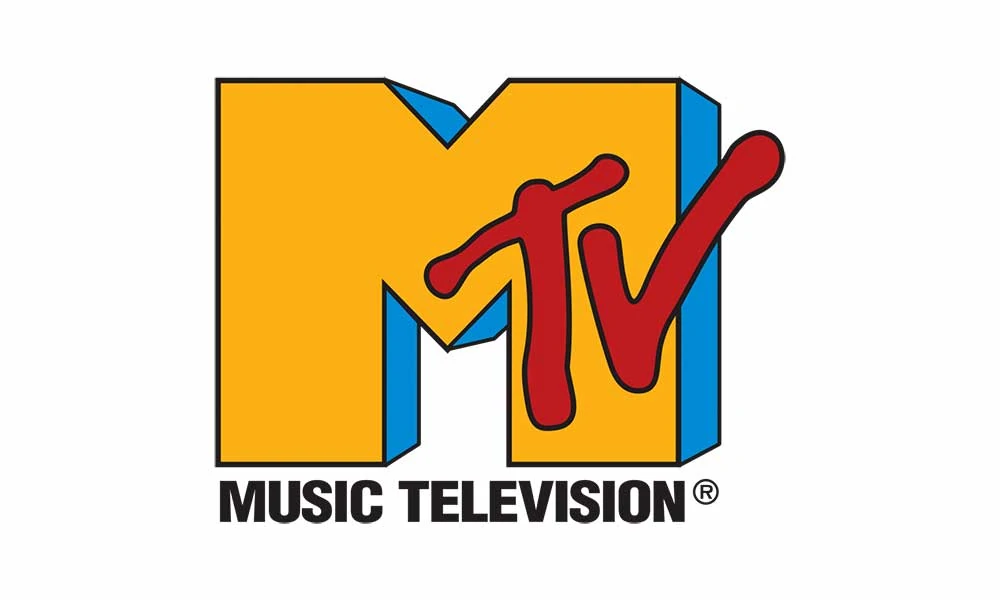
The iconic MTV logo is one of pop culture's most recognisable symbols. Since the network's launch in 1981, the MTV logo has undergone various evolutions, but its core DNA remains rooted in youthful irreverence.
The original MTV logo featured the bold, chunky letters “MTV” against a moon-like backdrop. The rough letters looked almost spray-painted, evoking an edgy and underground graffiti aesthetic for the time. This logo captured the rebellious attitude of a network that was unlike anything else on television.
In the 1990s, the logo was updated with a more futuristic and sleek 3D metallic design. The shiny chrome letters were given depth and movement, swirling and morphing into different shapes. This dynamic logo change reflected MTV's expanding programming and role in driving popular culture into new territories.
Today's MTV logo has a vibrant, gradated moon backdrop that returns to the original 1981 design. The letters are boldly stripped down with sharp edges, crafted to pop against the colourful lunar surface. The modern emblem retains the irreverent MTV spirit while evolving with the times.
Throughout the years, bold typography and visual expression have remained at the core of MTV's logos. The ever-changing designs reflect the network's youthful energy and limitless creativity. As MTV moves into the future, its logo endures as a symbol of music, pop culture, and the voice of each new generation.
9 – DHL: Delivering Excellence in Design

The iconic DHL logo encapsulates the essence of the company's core values and services. The bold red and yellow colours signify the brand's energy, speed, and reliability in delivering packages worldwide.
The three letters – DHL – represent the company's founders and original business offerings. ‘D' represents Adrian Dalsey, who pioneered the door-to-door courier route. ‘H' is for Larry Hillblom, who instigated the concept of shipping bills of lading internationally. ‘L' symbolises Robert Lynn, who spearheaded the integration of sophisticated IT systems for logistics.
Together, their initials formed the moniker DHL – a trusted name synonymous with express shipping and logistics excellence. For over 50 years, DHL has lived up to its reputation and logo, transporting documents and parcels swiftly and accurately across more than 220 countries and territories.
The distinctive DHL packaging symbolises the firm's commitment to speedy, reliable worldwide delivery. The bright red and yellow logo against a white background suggests urgency, attention, and energy in motion. As items travel rapidly through the company's seamless supply chain, the DHL brand image remains a consistent emblem of quality service and satisfaction for millions of loyal customers across the globe.
10 – CBS: Eye on Entertainment

The Columbia Broadcasting System, commonly known as CBS, has been a pillar of American broadcasting for over 90 years. Since its founding in 1927, CBS has reached iconic status in radio and television, shaping both industries through its innovative programming and expansion of network broadcasting.
CBS's visual identity is synonymous with its legendary eye logo. Designed by innovative graphic designer William Golden in 1951, the logo features bold stylised letters “CBS” in a clean sans-serif font. Perched above the letters is a stylised eye symbol, representing the network's constant vigilance in observing the world through journalism and entertainment.
While television networks did not yet feature identifying corporate logos in the medium's early years, Golden's CBS Eye stood out for its minimalist aesthetic when it debuted. The eye's oval shape encompassed the iris and pupil without additional detailing, creating an abstract, symbolic rendering of the human eye. Golden originally designed the eye to face left, imparting a sense of forward direction. Later versions alternated the direction the eye faced.
Over the ensuing decades, CBS updated its iconic eye logo through subtle design modifications while retaining its essential form. The surrounding letters adopted new fonts, spacing, and colours to denote different eras in the network's evolution. But the defining eye symbol itself persists as a core identifier for CBS, synonymous with its legacy as a broadcasting pioneer. Even in the digital age, the CBS eye stands as one of the most recognisable logos in media, representing a tradition of innovative programming that spans news, sports, comedy, drama, and beyond.
Lessons from Three-Letter Logos
The enduring popularity and success of brand logos composed of just three letters offer valuable lessons for designers seeking to craft impactful and memorable visual identities.
Minimalist logos with 3 letters demonstrate the power of simplicity in design. Designers can create clean, straightforward, and highly versatile logos by distilling a brand down to its essence using a compact three-letter monogram. The simplicity of forms like IBM's rectangles or ABC's concentric circles allows symbols to make a statement without complicated decorative elements. This simplicity also gives them conceptual flexibility to work across contexts.
Strong three-letter logos also showcase the importance of adaptability in logo design. To be effective, brand identities must look great and convey visual consistency, whether printed small on a pen or blown up on a billboard. The stripped-down, geometric nature of logos like CBS, CNN, and HBO allows them to scale up or down in size while remaining recognisable and legible.
Great three-letter logos further exemplify the value of consistency when developing an impactful brand identity. By retaining the same visual identity decade after decade, brands like UPS, GAP, and FBG reinforce recognition and trust through repetition and familiarity. Unwavering consistency strengthens the link between the logo and brand name in audiences' minds.
Finally, effective three-letter logo design requires finding the right balance between creativity and tradition. Designers must develop an original, stylistically relevant design approach while aligning with a brand's legacy, industry, values and persona. Logos like FX, NBA, and MLB artfully blend creative visual elements with a nod to tradition in their fields.
Combining simplicity, adaptability, consistency, and creative flair, designers of three-letter logos distil all that's essential about a compelling brand identity into three characters. The longevity and versatility of these logos inspire logo designers across all industries.
Conclusion: Crafting Lasting Impressions with Three Letters
In the world of design, the power of three letters is undeniable. These logos stand as testaments to the art of distillation—taking complex ideas and encapsulating them into elegant, unforgettable forms. From IBM's technological leadership to ABC's entertainment charm, each of the logos with 3 letters tells a unique story while embodying universal design principles. As you embark on your logo design journey, remember that the essence of a brand can often be found in its most straightforward representation.
