The Evolution of the Iconic IBM Logo Design
The iconic IBM logo is one of the most recognisable corporate symbols in the world. The minimalist design featuring the bold IBM letters has graced computers, billboards, and office buildings for decades.
But this iconic design didn't spring fully formed from the mind of a graphic designer. The IBM logo has undergone an exciting evolution since the company's founding in 1911. With each iteration, the logo design shifted to reflect IBM's vision of itself and its place in the developing world of modern computing.
In this post, we'll trace the origins of the IBM logo design and its transformation over time. We'll see how the logo mirrored IBM's identity, from its early days as a supplier of punch card tabulation equipment through its current status as a global technology powerhouse.
The IBM logo exemplifies effective brand building over the long term. Its changes reflect the company's technological innovations and ability to adapt its identity to new realities. For designers, the evolving IBM logo offers lessons on creating a dynamic brand identity that remains recognisable yet fresh across decades.
Table of Contents
The Early Days of IBM Logos

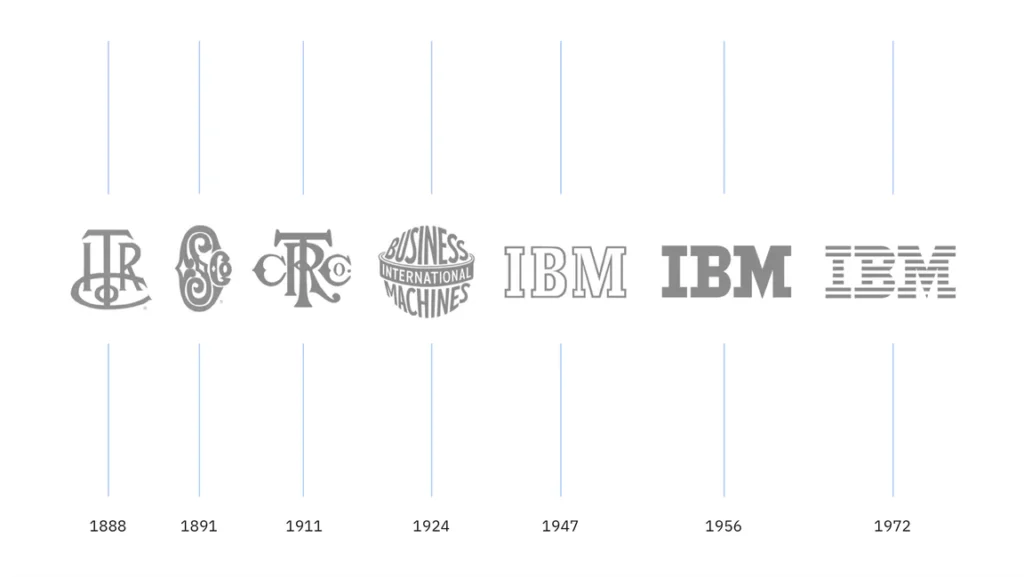
In 1888, when IBM was launched as the Computing-Tabulating-Recording Company (C-T-R), its original logo was far from the minimalist, all-caps IBM logo of today. The first C-T-R logo featured the company name spelt out in cursive script. Above the cursive lettering sat a globe with the motto “Progress & Harmony” wrapped around it.

This design reflected the era well, with ornate fonts and design elements that were popular in the early 20th century. As C-T-R developed into a global enterprise, the logo evolved too. By the 1920s and 30s, it featured a more geometric logo with strong horizontal lines running through the middle.


By 1947, when the company changed its name to International Business Machines Corporation (IBM), the logo shifted toward the IBM style we know today. “International Business Machines” was written in a serif font, all caps, against a black rectangle. This change signalled the modern, straightforward ethos IBM would become known for.

Refining the Logo in the 1960s
By the early 1960s, design trends were shifting toward simplicity and minimalism. IBM's logo reflected this shift, becoming progressively stripped down and abstracted over the decade. In 1962, the logo was reduced to just the three bold letters “IBM” in a sans-serif font centred on an unbounded black background. This reflected the pared-down, modernist aesthetic that was popular at the time.
The 1962 logo design established the concept that IBM logos have followed in the decades since. The essential elements have remained the same: the centred initials rendered in a bold sans-serif font on an unbounded background. While colour, typography, and minor stylistic flourishes have evolved, the core identity is unchanged.

This minimalist logo design was well suited for the computer technology industry as it emerged and grew through the 1960s and 70s. As IBM transitioned from mechanical tabulating equipment to a leader in the new digital computer realm, its branding kept pace with cutting-edge design. The clean, bold IBM logo became an iconic emblem of technological innovation.
Some critics have argued that the 1962 logo went too far in simplifying the brand image. Removing the complete company name reduced meaning and recognition for new audiences. However, most design scholars believe the rebranding was crucial in repositioning IBM for the computer age. The minimalist logo complemented the company’s transition into producing advanced digital technologies.
- Hardcover Book
- Cortada, James W. (Author)
- English (Publication Language)
- 752 Pages – 03/05/2019 (Publication Date) – The MIT Press (Publisher)
Adding the Iconic IBM Blue

It was in the 1970s that the IBM logo took on the blue colour it is synonymous with today. In 1972, legendary graphic designer Paul Rand gave the logo its famous eight-stripe design. The sans-serif letters were rendered in alternating lighter and darker blues. This added depth and visual interest while keeping the minimalist aesthetic.
The striped lettering stayed until the early 1980s when Rand simplified the logo again. This time, he went with an evenly-colored, solid blue logo. The IBM acronym appeared in a customised, proprietary font called IBM Plex—which the company still uses today across its brand assets. The proprietary font and custom shade of blue created a unique and owned visual identity for the brand.
Tweaks and Variations Over Recent Decades

Since the 1980s introduction of the solid blue IBM logo, there have been minor variations, but the basic concept remains the same. In the 1990s and early 2000s, a “slab serif” style font became popular for the logo lettering. This had slightly blockier serifs than the original IBM Plex font.
Sometimes, additional visual elements like lines or shapes would be incorporated, like the 2003 logo redesign that added three parallel lines running through the interior space of the letters. But decorations tended to be minimal and temporary. The company would inevitably return to the straightforward, centred IBM lettering in blue.
In 2017, IBM reverted to the original Paul Rand design—the solid blue letters in the classic IBM Plex font. They've also begun using a truncated “IBM.” logo for some product branding. This evolution shows how a logo can maintain core visual equity while adapting to the times.
What IBM's Logo Says About the Brand

After looking at the transformation of the IBM logo over 100+ years, some consistent themes emerge that align with the company's overall evolution and ethos:
Simplicity and minimalism – Even from the early days, IBM logos trended toward simple, pared-down design. This reflects the straightforward, no-nonsense attitude of the brand.
Custom typography – Proprietary fonts underscore IBM's technical expertise and desire to control all aspects of its brand image.
Uniformity and accessibility – Consistent styling makes the IBM brand universally recognisable.
Technical expertise – The bold, angular font and graphics communicate professionalism and authority.
Innovation – While remaining simple at its core, IBM's logo evolves across eras to stay contemporary.
Heritage – The logo pays homage to its history and evolution, maintaining links to the original Paul Rand design.
For any company, a logo encapsulates brand values, history, and positioning. IBM's thoughtful logo evolution resulted in one of the most iconic visual brands in the world. Their logo exemplifies how companies can maintain brand equity over time while evolving for the future.
- Hardcover Book
- English (Publication Language)
- 256 Pages – 11/15/2016 (Publication Date) – Princeton Architectural Press (Publisher)
5 Key Lessons from the IBM Logo Story
The journey of the IBM logo over the past century offers some engaging lessons for other companies looking to develop memorable and long-lasting visual identities:
- Start with your brand ethos in mind – Even IBM's early logos reflected core values like global reach and progress. Know your brand identity and purpose from the outset.
- Adapt thoughtfully, not radically – IBM largely retained or gradually simplified its logo design versus opting for radical redesigns. Thoughtful, incremental change is often best.
- Make the logo uniquely yours – Custom typography, colour, and other proprietary elements help make a brand distinctive. Own your visual identity.
- Design for longevity – Opt for simple, versatile design elements that can stand the test of time and translate across mediums.
- Balance continuity and evolution – Small changes keep a logo contemporary while maintaining links to heritage. This inspires trust and loyalty.
Conclusion
IBM's century-long journey proves that effective logo design requires creativity, restraint, and respect for brand history. Their logo is now shorthand for technological innovation, reliability, and intelligent design. While many factors go into branding, IBM's mark shows the value of evolving a visual identity without losing sight of its essence. Their iconic logo didn't happen accidentally—it took deliberation and commitment over many years.
This spirit of design evolution while strengthening brand recognition is an inspiration. It takes vision to build an enduring logo and a willingness to refine rather than reinvent it. Aspiring companies should remember that the most potent symbols hold onto their creative roots while adapting seamlessly for the future. Simplicity, accessibility and proprietorship never go out of style.
Frequently Asked Questions about the IBM Logo Design
Here are some common FAQs about the history and design strategy behind IBM's iconic logo:
Who originally designed the IBM logo?
The original 8-bar IBM logo was designed in 1972 by legendary graphic designer Paul Rand. His designs defined the modern IBM logo and visual identity.
What is the font used in the current IBM logo?
The custom font is called IBM Plex. It was designed in 2017 to reinterpret Rand's original IBM typeface. The font is proprietary to IBM.
What does the IBM logo colour blue represent?
IBM Blue evokes concepts like stability, confidence, and intelligence that align with the IBM brand. Blue also printed well on white paper, influential in the early computing era.
Has the IBM logo ever changed radically?
No, while iterated, the IBM logo has primarily retained the simple all-caps styling in some variation of the IBM Plex font. This consistency is critical to brand recognition.
Does IBM still use Paul Rand's logo concepts today?
Yes, Rand's designs from the 1960s and 70s established the core visual identity of the IBM brand, and his minimalist concepts remain influential today. IBM pays homage to this history.
Last update on 2024-05-02 / Affiliate links / Images from Amazon Product Advertising API


