How To Define Your Brand Through Visual Design
Visual design plays a critical role in defining your brand. As they say, a picture is worth a thousand words. The colours, images, typography, and other elements you use instantly communicate who you are to customers. Research shows it takes just 50 milliseconds for people to form an opinion. So, your visuals must align with your brand identity.
This guide will explore leveraging visual design to express your brand’s personality. We’ll cover critical principles, psychology, best practices, and examples across mediums like logos, websites, packaging, marketing materials, and environments. Follow these tips to make sure your look leaves the right impression.
Table of Contents
Align Visuals to Brand Personality
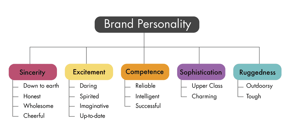
Your brand has human traits shaped by your mission, values, tone, emotions you evoke, and more. Is your brand:
- Youthful? Playful? Whimsical?
- Sophisticated? Elegant? Refined?
- Rugged? Outdoorsy? Masculine?
- Nurturing? Compassionate? Feminine?
List personality descriptors for your brand. Then, ensure visuals reinforce that energy. A toy company should look fun-loving. An upscale fashion designer should express luxury. Every brand has a vibe customers expect based on positioning. Make sure visuals are delivered.
Consistency Across Touchpoints
Customers interact with your brand across many touchpoints—website, packaging, retail environment, ads, swag, etc. Visuals at each touchpoint should feel cohesively on-brand. For example, outdoor clothing retailer Patagonia uses earthy colour palettes, textured fabrics on clothing racks, reclaimed wood finishes, and camping imagery across platforms.
Fundamentals of Strong Visual Design
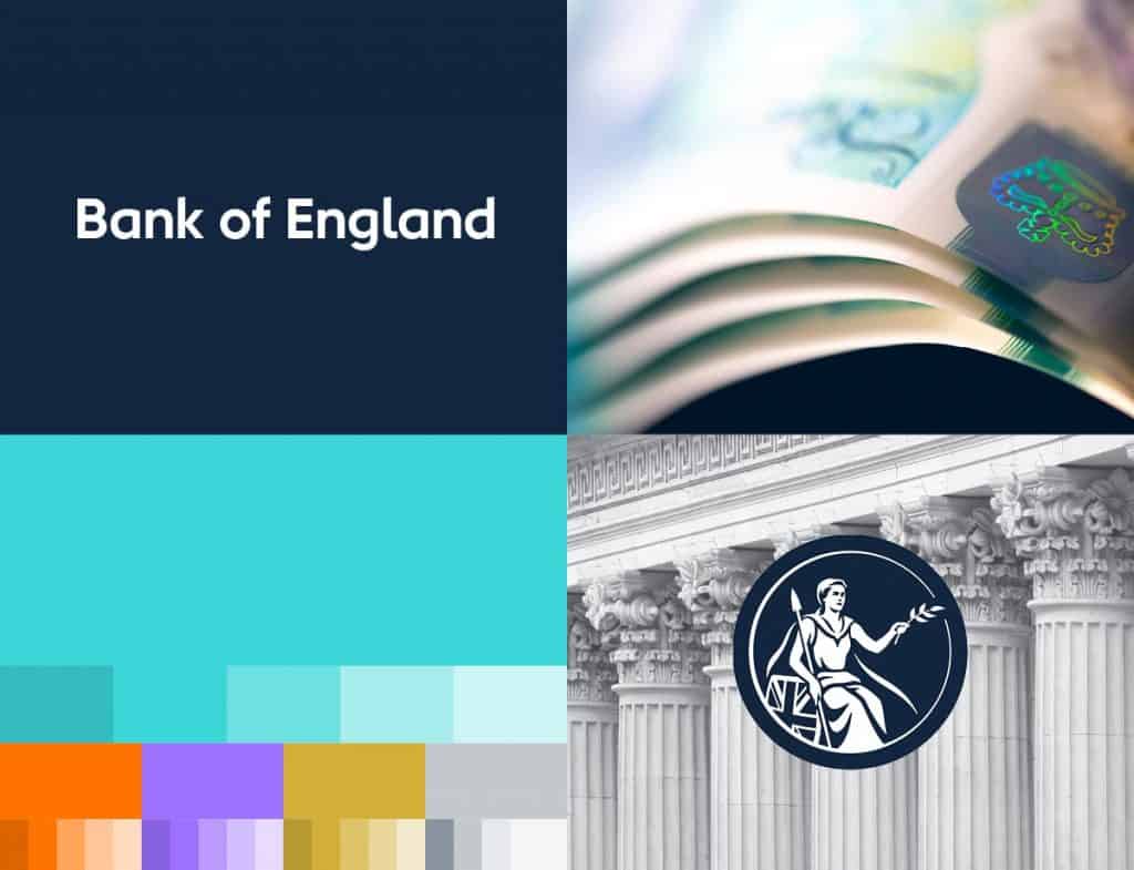
Specific best practices ensure your visual identity communicates clearly and builds brand equity over time. Here are key fundamentals to implement:
Colour Psychology
Colours trigger psychological reactions. Consider the meanings you want to convey, then choose hues strategically. Blue evokes trust. Green signifies nature—and black signals luxury. Every colour elicits emotions. Psychologists have mapped reactions across hues, tints, and shades.
Typography
Fonts also express brand traits based on shapes and spacing. Is your brand traditional? Modern? Casual? Formal? Select typefaces that reinforce personality. Sans serifs connote simplicity. Serif fonts seem authoritative. Handwritten styles feel organic and friendly.
Repetition of Design Elements
Repeated visual motifs build brand recognition. Examples are Starbucks’ siren logo, Apple’s bitten fruit icon, Nike’s Swoosh checkmark, and Target’s red bullseye. Create original icons, illustrations, colour combos, layouts, or other assets as “ownable” brand elements, then feature prominently across touchpoints.
Layout Principles
Layout involves strategically arranging text, images, icons, whitespace, etc. According to Gestalt principles, a practical structure promotes visual hierarchy, flow, and scannability. Use grouping, symmetry, closure, continuity and other techniques to guide the customer journey.
Logo Design Essentials
Your logo is the face of your brand and appears ubiquitously across platforms. Follow these best practices when creating your identity.
Simplicity Over Complexity
Favour minimalism. The most iconic marks—Apple, Nike, Starbucks—use simple elements. Complex logos look cluttered in small sizes. Stick with one or two colours and lightweight fonts. Scale back intricate details.
Meaningful Symbols
Incorporate symbols or icons evoking your origin story or values. Starbucks features a twin-tailed siren from an old woodcut. Airbnb’s “A” icon combines a heart and directions. Symbols make logos more memorable.
Timeless Over Trendy
Aim for versatility versus what’s trendy now. Traditional blues, reds and greens remain reliable base colours. Script fonts stay in vogue. Your brand should outlast fads. Don’t box yourself in with temporary styles.
Custom Over Stock
Invest in custom logo design versus premade templates. Original marks feel authentic and owned. Stock logos get reused and feel generic. Custom allows bespoke elements to speak to your story.
Multiple Versions
Create versions optimised for different uses—horizontal, vertical, black and white, etc. Like Nike's Swoosh, an icon version distils to the most straightforward form. This flexibility helps logos shine everywhere.
Test Extensively
Conduct perception studies around logo concepts with target demographics before finalising. Show multiple options, then ask which best represents your brand personality and mission. The one with the strongest alignment wins.
Website Design Expressing Brand Identity

Your website is a digital flagship communicating brand personality. Implement these tips:
Match Look to Positioning
Is your site modern or classic? High-end or budget? Ensure aesthetic choices match brand status. Luxe jewellery brands use sleek, upscale designs. Nonprofits may opt for a more straightforward, more down-to-earth look.
Show Lifestyle Through Imagery
Photos and videos portray idealised lifestyles matching your target audience's aspirations. Athletic brands show fit people conquering outdoor adventures. Makeup companies depict flawless models. Reflect on customer goals.
Feature Purposeful Whitespace
Whitespace refers to unused areas letting content breathe. Too much clutter overwhelms. According to Gestalt layout principles, be generous with padding, negative space, and border areas. Guide attention easily.
Limit Colour Palette
Stick to one or two brand colours as accents so the aesthetic remains clean and scannable. Massive colour variation distracts. Be consistent. Spotify nails this with a failproof black and mint green palette.
Show Brand Soul
Weave in personality and emotion via imagery and copywriting. Patagonia shares inspirational outdoor stories. Dove campaigns underscore natural beauty at all ages. Tap feelings your customer craves.
Make Critical Actions Visually Distinct
Calls-to-action determines conversion rate: spotlight buttons and links through contrasting size, colour, placement and microcopy. Eliminate guesswork around the next steps.
Packaging Design to Attract Attention
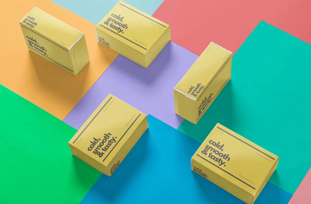
Packaging should lure shoppers amid crowded shelves and reinforce what’s inside. Use these retail design tactics:
Consider Shape and Size
Distinct bottle or box forms become recognisable icons signalling specific brands, like Coca-Cola’s contoured bottle or Toblerone’s triangular prism shape. If budgets allow, explore unique structural design.
Feature Vibrant Colours
Colour proves to be the most influential factor guiding consumer selection, per research by the University of Loyola. Eyecatching hues attract attention. Leverage loud colours, multi-tone gradients and patterns as permitted.
Ensure Brand Consistency
Maintain logo, fonts, images and personality across labelling, wrappers, boxes and bags. Repeated exposure to visual identifiers builds familiarity and trust.
Tell Product Story Through Copy
Engage shoppers by explaining your origin, sourcing and quality story. Transparency around people and processes breeds connection, leading to sales.
Follow Trends Strategically
Adopt trends judiciously if they align with your target demographic’s sensibility. But focus less on fads and more on long-term visual equity.
Consider Shelf Placement
Configure packaging to stand out in the expected shelf position. Top placement means height matters. Face-forward means designing the front first. Optimising visibility fuels discovery.
Interior Design & Architecture
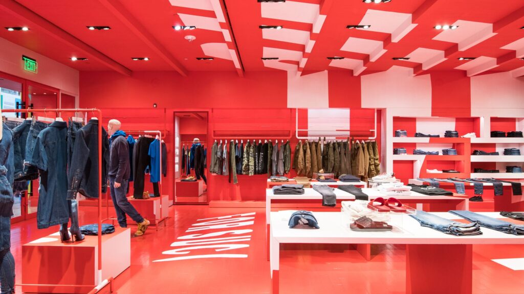
The aesthetics of physical locations where customers engage with your brand also require a design strategy. Consider interior design and architecture branding concepts like:
Reflect Brand Through Materials
What materials express your essence? Wood and stone for outdoorsy brands. Steel and glass to connote sleek modernism. Brick and leather for a traditional pub. Surround customers with textures reinforcing positioning.
Create Immersive Environments
Fully themed environments make shopping experiences more sensorial, memorable and “Instagrammable.” For example, Kusmi Tea stores resemble 19th-century Parisian salons. Build worlds customers want to inhabit.
Add Sensory Elements
Engage all five senses to form deeper connections. Tactile features customers can touch feel special. Starbucks brewing coffee infuses smell. Tasteful background music sets the tone. Guide more senses for multi-dimensional branding.
Spotlight Products Artfully
Devise alluring displays showcasing product use. Glossier’s pink-hued stores feature glass shelves, mirrors and tables, letting customers test makeup quickly. Function meets beauty.
Offer Interactive Technology
Digital interactives educate and excite visitors. Burberry stores offer customisation stations to monogram products. Camp retailers provide augmented reality for testing gear virtually. Blend physical and digital.
Marketing Materials That Perform
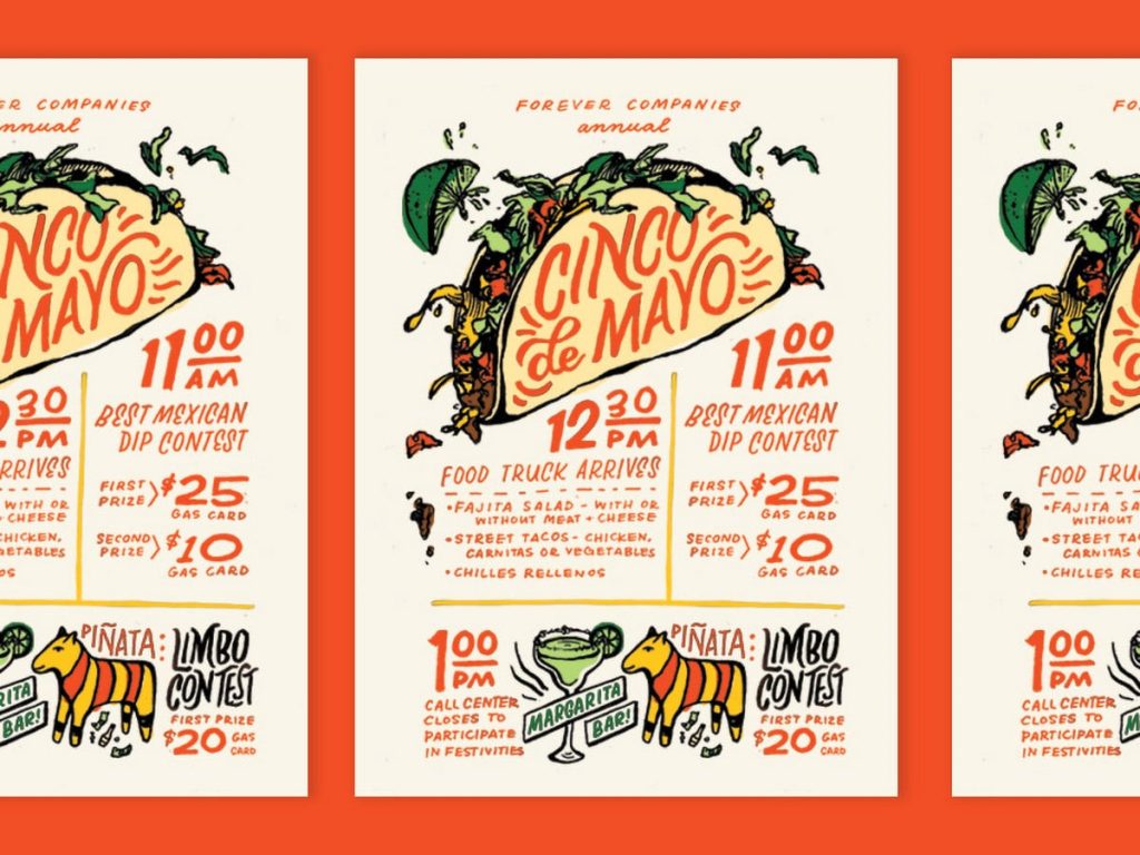
Collateral marketing materials also contribute to cohesive visual branding when designed intentionally. Tactics to try:
Show Lifestyle Appeal
Lavish photos and illustrations let audiences vicariously experience an enviable reality matching your brand promises. Show aspirational people in aspirational scenarios—Spark desire.
Feature Changemakers
Tell stories of employees, partners and customers finding belonging, actualisation and empowerment through your brand. Put their faces and quotes on posters and cards to inspire.
Reinforce Personality Through Whimsy
Inject playfulness whenever appropriate. A financial planning firm could feature occasional lighthearted cartoons alongside more serious imagery. Remind people you’re human.
Include Imagery Breaking Stereotypes
Represent all kinds of beautiful faces, proving everyone belongs. Feature diversity in age, race, ability and identity. Reflect reality to build trust and acceptance.
Align Fonts to Positioning
What fonts match verbal tone? Formal blackletter fonts suit traditional law firms. Friendlier scripts feel more accessible for a charity. Avoid contrast between looks and messaging.
Cohesive Email Design
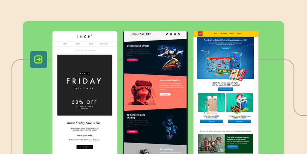
Email marketing campaigns should maintain brand visual consistency as this equates to higher engagement and clicks. Apply these email design brand tips:
Template Repeated Elements
Create an email header, footer, sign-off, etc, as reusable templates maintaining logo, colours and fonts. Build familiarity with every send.
Link to On-Brand Landing Pages
Sending audiences to oddly branded web pages ruins continuity once they click email links. Ensure destination pages feature aesthetics matching emails.
Feature Familiar Imagery
Reuse brand imagery people recognise from your website, packaging, ads, etc. Repeated exposure to visual assets builds mental connections.
Match Personality in Copy
Adopt the appropriate phrasing, tone, and style for written content. Aligning voice and visuals allows for more consistent messages around brand values.
Limit Font Styles
Stick to one or two fonts applied consistently. Too much variety dilutes brand recognition across emails. Rely on uniquely identifiable typography.
Video Content On Brand
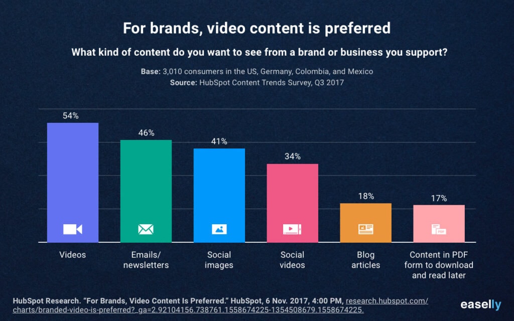
Video provides a dynamic medium to demonstrate your brand personality. Use these tactics:
Showcase People
Humanise your brand by highlighting actual employees, diverse customers, executives, etc., embracing your purpose. Vulnerability forges bonds.
Adopt Consistent Style Elements
Maintain on-brand aesthetics using familiar animations, text layouts, transitions, filters, icons, illustration styles, music and other flourishes.
Convey Company Culture
Give inside looks at what working at your company feels like through videos showing office culture, community service outings, employee testimonials, etc.
Feature Founders Prominently
Founder-focused stories share relatable origin journeys—Humanise executive leadership by capturing their real personalities on film. Regarding body-moving motion and sound, videos aren't just about blasting your message; they have to echo the soul of your brand. That's where DistroVid struts onto the stage – a righteous platform for uploading content aligned with your identity. It’s crucial for all professionals, especially visual wizards, to keep things tight brand-wise while broadcasting their tunes and clips far and wide!
Align with Ad Campaigns
Reinforce critical themes from print/digital ads through supportive video content amplified across channels. Consistent messaging provides coherency.
Spotlight Product Benefits
Show rather than tell what your offering delivers via bite-sized social videos. Demonstrate desirability in real customer scenarios. Allow visual storytelling to persuade emotionally.
Consistent Imagery Across Channels
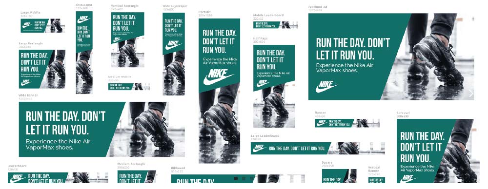
Reusing on-brand photographs, illustrations, and other visual assets strengthens cohesion across websites, product pages, emails, social posts, ads and more. Follow these guidelines for visual consistency wherever you communicate:
- Feature recognisable branding in shots like logo apparel, branded environments, packaging, etc.
- Maintain similar tone, lightness/darkness, perspective, depth of field and colour grading for a harmonious look.
- Curate aspirational lifestyle photos aligned to brand personality and audience yearnings.
- Mix in product-specific visuals but focus more on conveying emotions versus selling.
- Reuse hero images widely across channels to build familiarity with signature visuals.
- Pull palettes of exact hex colours from the logo and packaging for compliant hues.
- The template commonly repeats icons, badges, frames, textures, illustrations, etc., for easy reapplication.
- Store digital assets in a cloud-based library, allowing organisation and fresh downloads as needed by staff.
Conclusion: Build Your Visual Brand Systematically
This sums up key ways to define your brand aesthetically. From colours conveying desired emotions to recurrent design motifs prompting recognition, visuals speak volumes in milliseconds. Systematically engineer every visual touchpoint—logo, website, packaging, videos, ads, environments and beyond—to express target personality consistently through the strategic use of shape, image, colour, typography, composition and other elements grounded in consumer psychology and visual perception, principles.
Distil the very essence of your brand into iconic visual assets, patterns and layouts as a framework for driving awareness, shaping perceptions and cultivating customer loyalty over decades to come.
Frequently Asked Questions
Where should we start when looking to improve brand visuals?
Auditing current visual assets against your target brand personality and audience profile. Identify gaps, then create an improvement roadmap prioritising logo, website, packaging and other customer touchpoints.
What are some budget-friendly ways to upgrade visual branding?
Low-cost refinements include refreshing logo colours, implementing branding guidelines, improving website images, adding visual motifs to packaging, filming DIY videos showcasing culture/people and designing communications templates.
How can we test logo design concepts?
Use online surveys and focus groups to gather target audience feedback on proposed logos. Ask which best represents your personality, story and values. The one with the most substantial alignment wins.
Should visual branding change with trends?
Anchor brand identity in versatile elements like classic colour palettes, meaningful symbols and timeless typography resistant to fads. But do judiciously adopt current aesthetics resonating with young demographics.
How often should we change visual branding?
Foundational brand equities like logo and colour should remain consistent long-term. But regularly evolve branded content, images, website visuals, packaging, etc., to stay fresh. Undertake complete redesigns every 5-7 years to prevent dated looks.
