Avo Consulting by Bleed
Opinion by Richard Baird Posted 14 May 2020

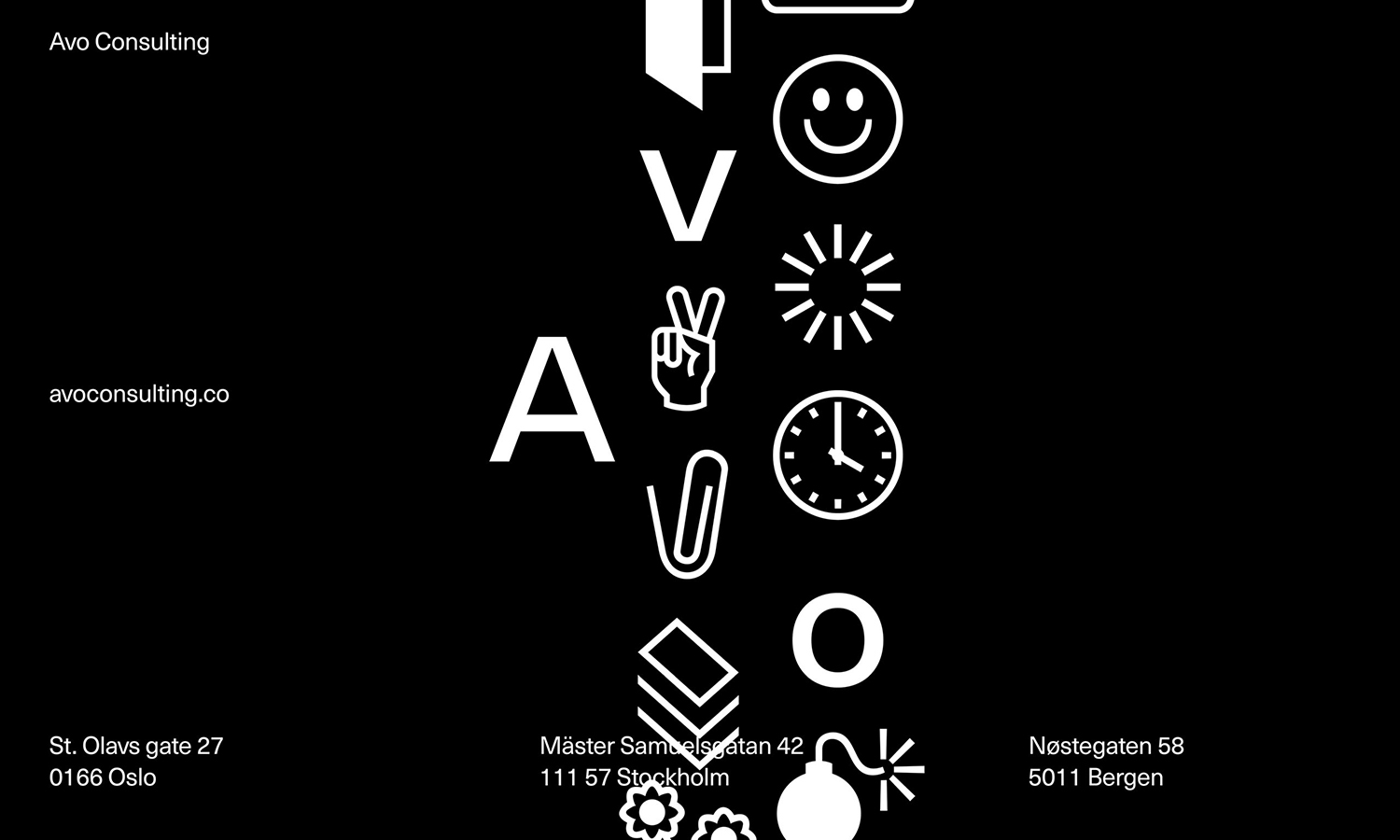
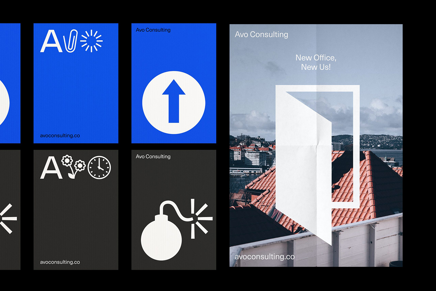
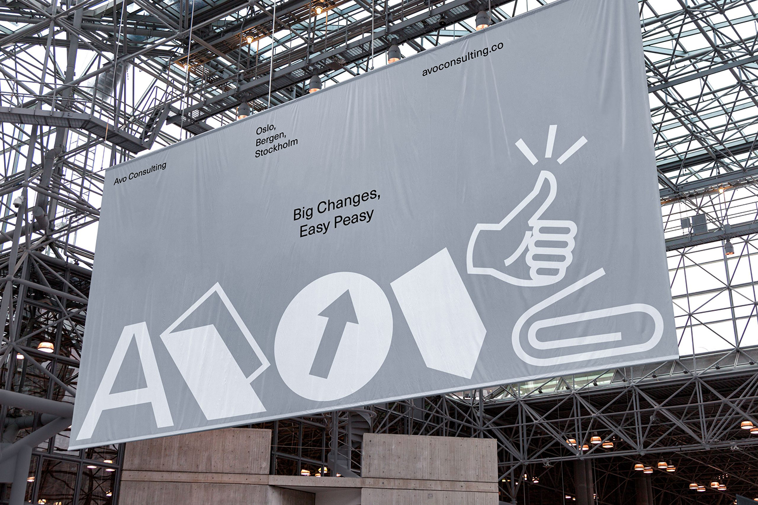
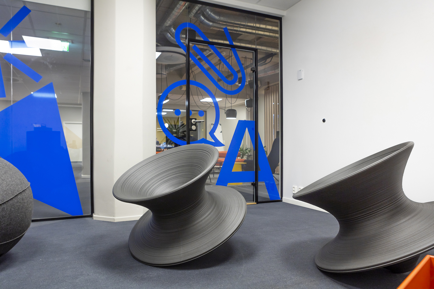
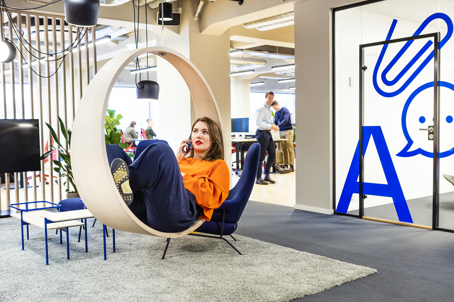
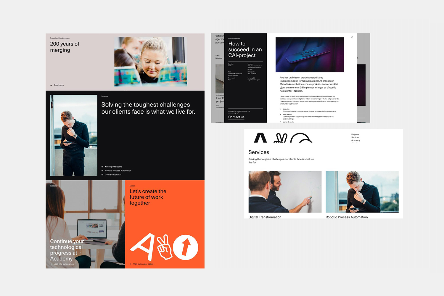
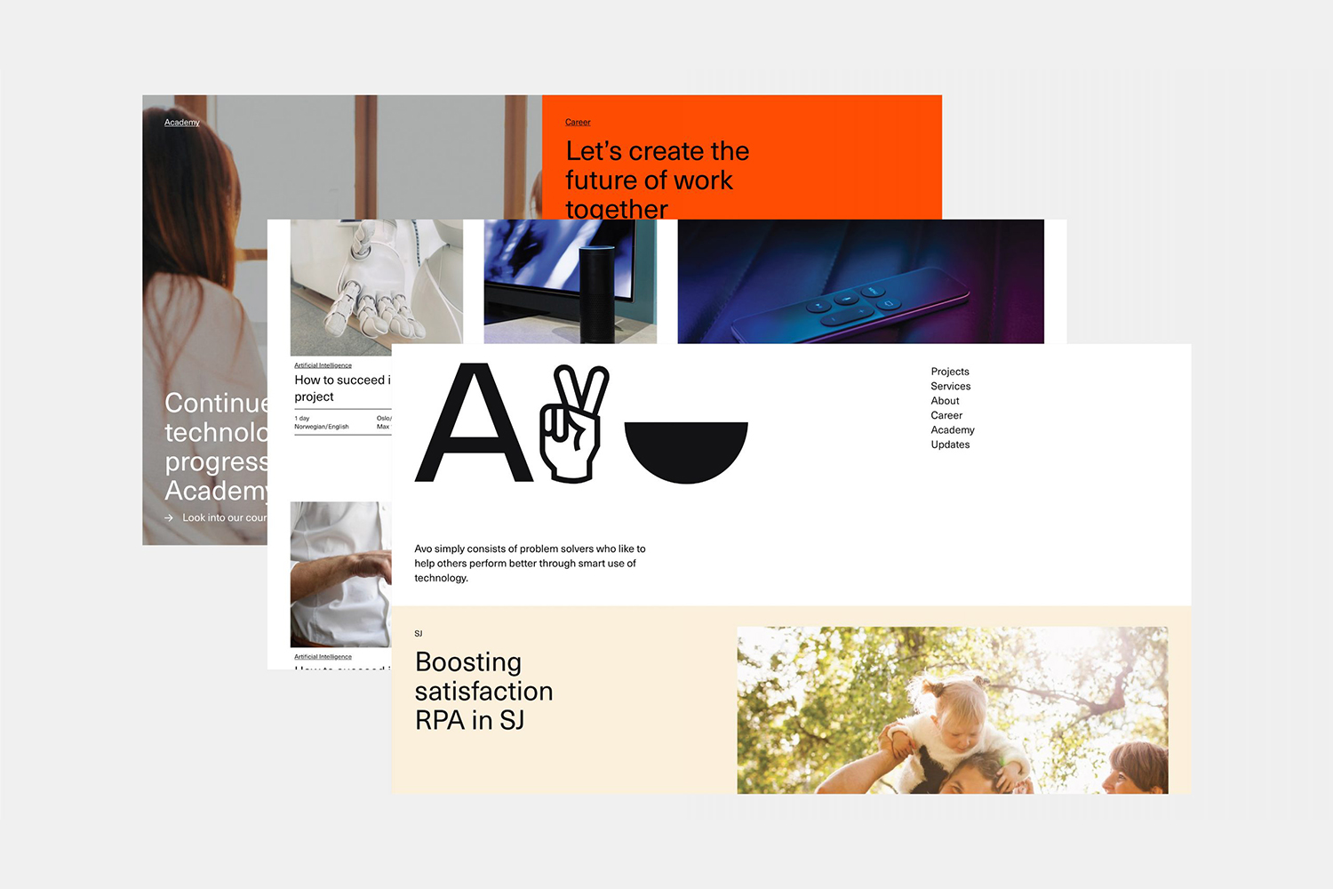
Avo is a Nordic technology and management consultancy with offices in Norway and Sweden. Since its founding in 2016 it has seen rapid growth, expanding from 5 to 85 employees in three years. It has done this through a strategic rethinking of the way in which consultancy services are delivered, removing the buzz words associated with the industry, solving business problems and then helping to make the necessary changes easy. The Avo Consultancy culture is described as having a unique and playful philosophy. It is this, and the ambiguity of the AVO name (often assumed to be an acronym, or initials with an embedded meaning) that was the foundation of a new visual identity design created by Bleed. This playful philosophy and ambiguity is expressed predominantly as an A, followed by two characters from “Avodings”, a custom typeface of unique dingbats. This links the Avo Consultancy website, alongside colour and Neue Haas Unica, with interior supergraphics, tote bags, banners, posters employee generated e-mail signatures and other communications.
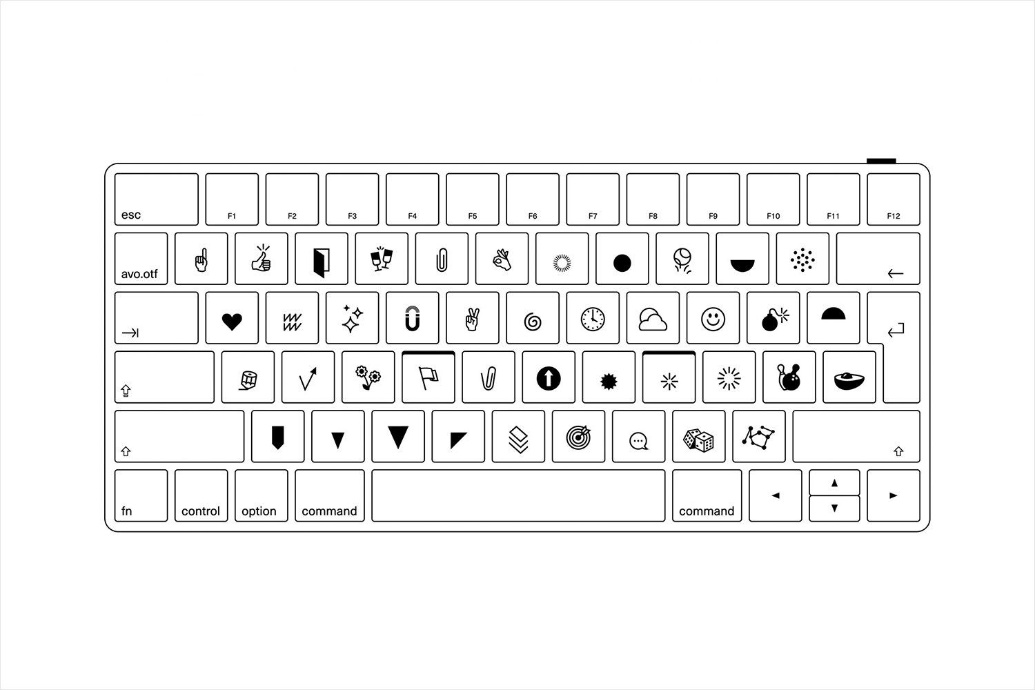
“To many, Avo (previously AVO) seemed like an acronym, an abbreviation with some embedded meaning. While this was not the case, we decided to use this misinterpretation of the company name to build a universe of suggestions of what Avo could mean.” – Bleed.
Avo Consulting are tech problem solvers, and the graphic language has something of an equation-like quality to it. The dingbats add up to something greater. And that these are nod back to the origins of digital technology where, due to limited bandwidth, dingbats made up the visual language of the time, rather than images we have today, is a nice call back.
BP&O is a great believer in the power of ambiguity, that bit of space left for the viewer to project their own meaning on to something such as a logo or visual identity. In this way, the graphic language becomes invitational rather than dogmatic and preprescribed. The connection runs deeper if the interpretation and meaning-making comes from a place that is deeply personal and drawn from a lived life. This is where this is so fascinating as an approach, particularly when a lot of things have become over-simplified or literal to the point of meaningless.
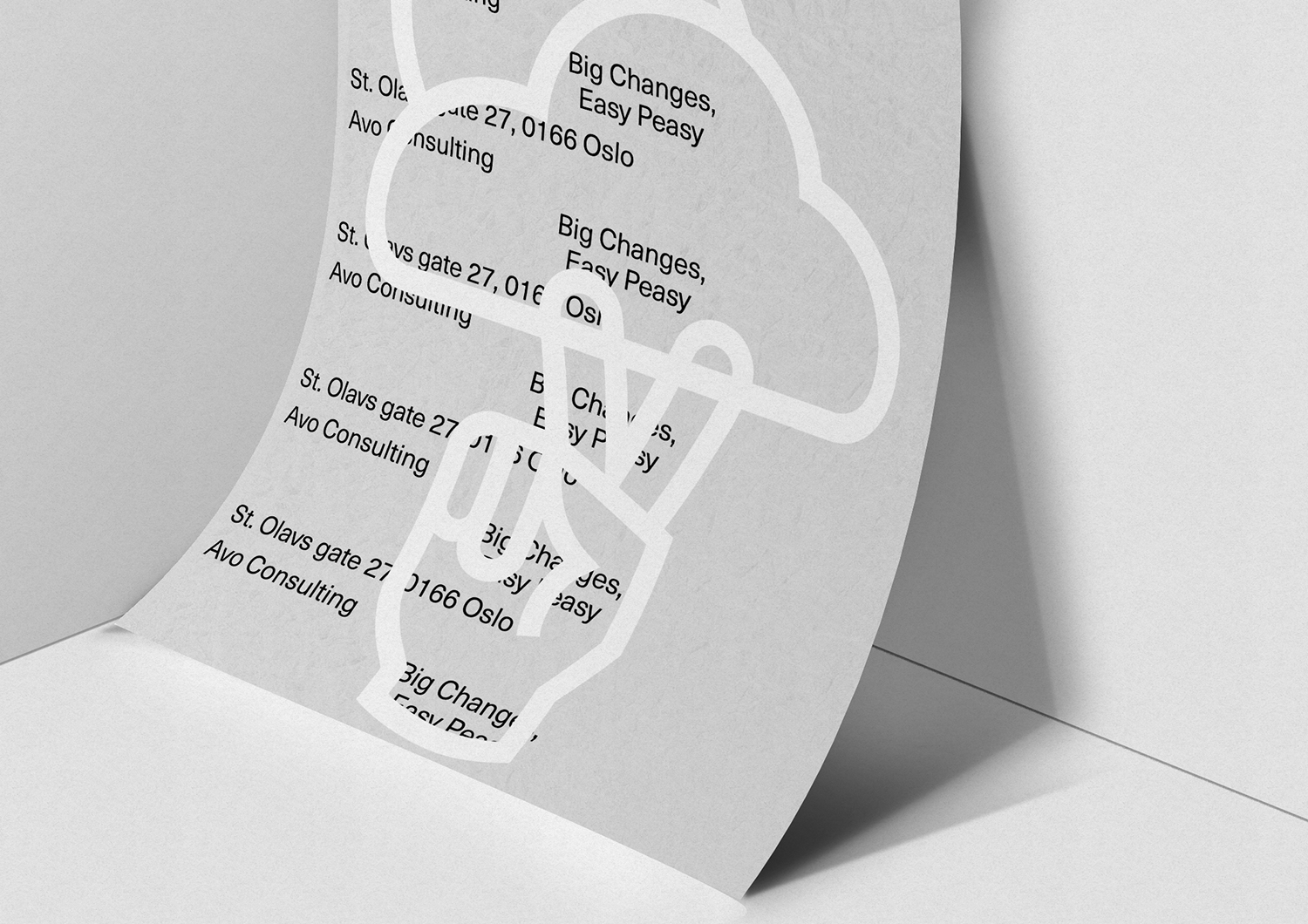
The execution of the “Avoidings” is really well done. Although, as an idea, these are rooted in the past they appear thoroughly modern and bring a lot of character and life to an industry that often uses trite visual language, or leans too far into the tech zeitgeist. There is also a visual range to the approach that keeps it interesting. Some of the “Avoidings” appear friendly and office-centric, others, odd and left-field, the rest, playful and cheerful. Stylistically they effectively move between fills and outlines, working in contrast, subtly and immediacy. This is also helped by differing proportions in application. These look great large across the website or as small Story Highlights on Instagram.
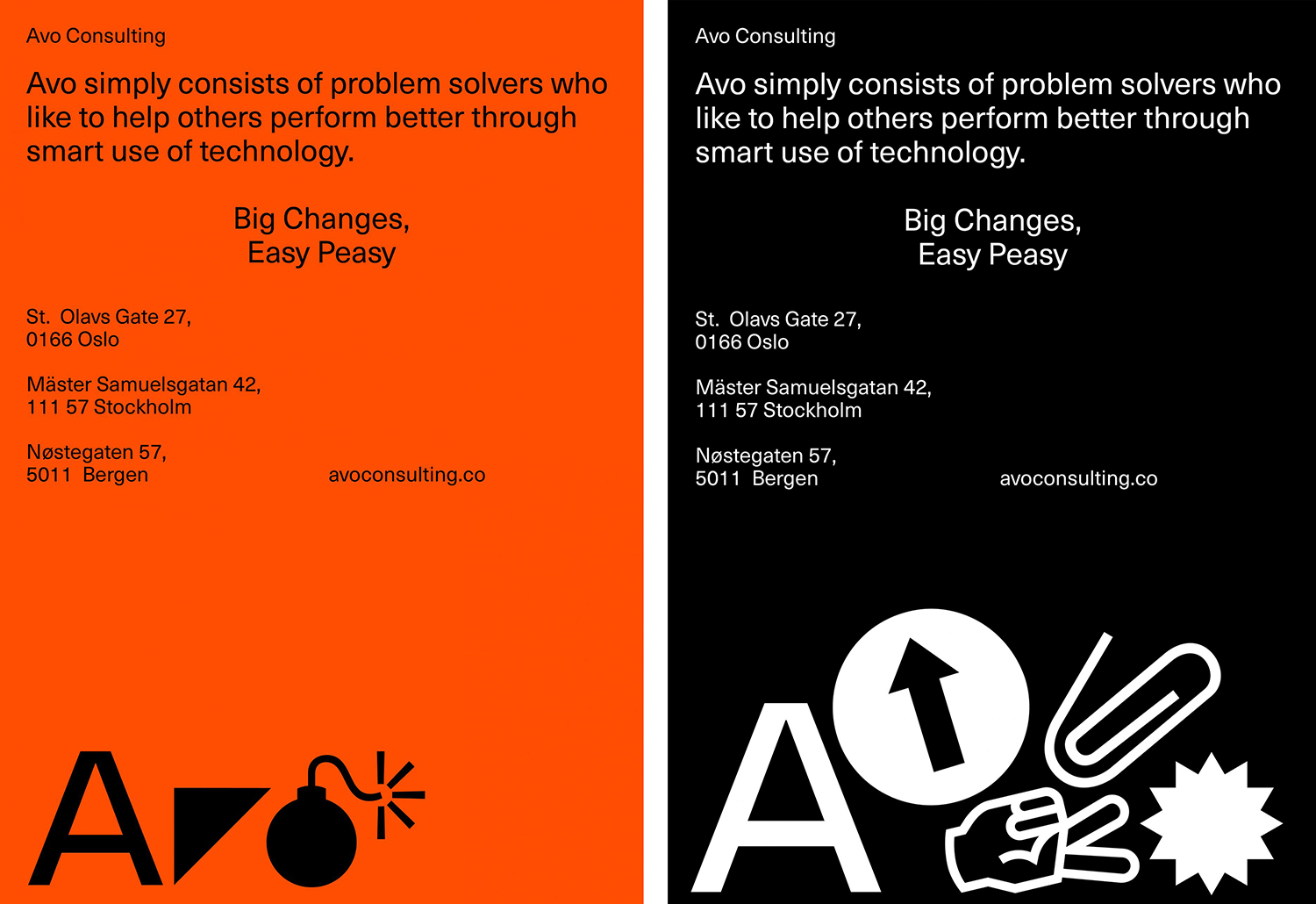
Typography and approach to layouts create a visual framework that is contemporary and useful. It holds everything together somewhere with something of a the Swiss International style in the use of space, a hierarchy set by arrangement rather than type size (giving prominence to the dingbats) but with a loose playful irregularity.
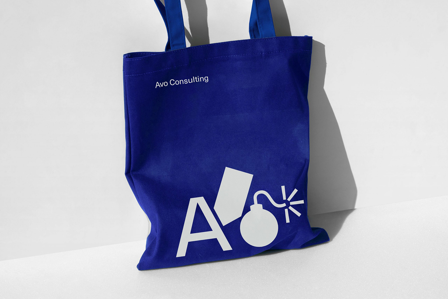
The A forms a useful constant, an anchor for play and visual ambiguity, there is space for imagination, both on the client side without getting too odd, and employee side through participation. The system created by Bleed gives the Avo staff a chance to make their own versions of the Avo logo, and to share what Avo means to them. These can be deployed as mail signatures, across keynotes and business cards. As Bleed rightly states, “while dynamic identities seldom are dynamic in the long run, the “Avodings” typeface allows Avo to be dramatised uniquely in different contexts, by different people”. More work by Bleed on BP&O.
