The Art and Science of Geometric Logo Design
Logos are the face of a brand. A great logo conveys the essence of a company at a glance. However, creating an impactful and memorable logo is both an art and a science. A simple geometric logo can communicate sophistication, reliability, and timelessness when designed well.
In this article, we'll explore the fundamentals of geometric logo design. You'll discover what makes geometric logos work, why brands are turning to geometric simplicity, and how to craft geometric logos that pop. Read on to learn the geometry behind powerful brand identities.
Table of Contents
The Rise of Minimalist Geometric Logos
Clean lines. Simple shapes. Solid colors. These are the hallmarks of the increasingly popular geometric logo trend.
Geometric minimalism has been on the rise since the 2010s. Significant brands like Mastercard, Spotify, Uber, and YouTube have all adopted bold, basic geometric designs. The look is modern, versatile, and scalable.
There are several reasons for the shift to minimalist geometric logos:
- Visual clarity. Simple logos are more accessible to reproduce and recognise across platforms and sizes. Spotify's green circles look crisp on a billboard or an app icon.
- Brand sophistication. Basic geometric shapes connote stability, professionalism, and timelessness. Mastercard's overlapping circles evoke ideas like connectivity and global transactions.
- Cultural trends. Minimalism is resonating with modern aesthetics. Lines and circles reflect a clean, uncluttered design.
- Cost efficiency. Geometric logos are cheaper to reproduce with fewer colours and details. Uber's bitten square saves money compared to detailed graphics.
When designed strategically, geometric logos check all the branding boxes: distinctive, memorable, versatile, and cost-effective. For new and established companies, elemental geometry offers a compelling visual identity.
Fundamentals of Impactful Geometric Logo Design
Geometric logos may look deceptively simple. But thoughtful care goes into crafting shapes and configurations that encapsulate a brand. There are key fundamentals to keep in mind when designing a geometric logo.
Simplicity is Key
Resist the urge to clutter. The most effective logos use only essential elements. YouTube's play button, Nike's swoosh, Apple's apple—these logos derive power from paring down to the absolute core icons.
Prioritise 1-3 geometric shapes at most. Avoid detailed illustrations or gradients. Stick to solid colours and clean lines. Space is good—it creates visual relief, allowing the key shapes to shine.
Strategic Use of Shape Psychology
Basic shapes carry cultural associations. Circles suggest community. Squares represent stability. Triangles evoke energy. Use shape symbolism deliberately to reinforce branding.
For example, Mastercard's overlapping circles reflect connectivity, inclusion and transactions. Different shapes in the logo capture the essence of the brand.
Align Shapes Thoughtfully
How geometric shapes are positioned also impacts perception. Overlapping or touching shapes show a connection. Separated shapes can imply innovation or breadth. Vertical shapes feel professional and robust. Diagonal shapes add dynamism.
Pay attention to shape alignment based on brand personality. For instance, YouTube's angled play button symbolises dynamic motion, which is perfect for video.
Color Choice Matters
Colour has a powerful influence on logo recognition and associations. Brighter colours feel energetic, darker, and more sophisticated. Primary colours are bold, and pastels are more delicate. Choose palettes strategically based on brand positioning.
YouTube's red evokes its vibrant, youthful community. Mastercard's overlapping red and yellow circles create visual dynamism. Even simple geometric logos require thoughtful use of colour psychology.
Own Unique Shapes
The most iconic logos employ unique, ownable silhouettes. Apple's apple. McDonald's arches. The Nike swoosh. Distinctive shapes make a logo instantly identifiable.
When crafting a geometric logo, prioritise creating shapes only associated with your brand. Uber's bitten square is recognisable without the company name. Strive for this level of shape memorability.
You can craft geometric logos with outsized impact by focusing on simplicity, shape symbolism, alignment, colour, and uniqueness. Keep these core principles in mind as we explore popular geometric logo applications.
The Meaning Behind Basic Shapes
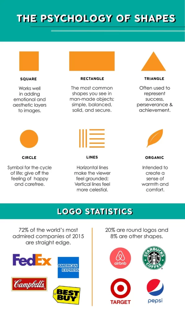
Before diving into complex geometric logo designs, it's helpful to understand what basic shapes symbolise. Different forms evoke different gut reactions and associations in viewers. Skilled logo designers carefully select shapes that communicate their brand's desired attributes. Let's break down the meanings behind five foundational geometric shapes.
Circles
Circles have the most uniform and balanced appearance of all the basic shapes. This gives them an inclusive, harmonious feel. Circles and curved lines also symbolise continuous movement and cycles. That's why we intuitively link circles with ideas like community, relationships, wholeness, and infinity. Circle-based logos evoke attributes like trust, unity, friendship, and permanence.
Squares
Squares and rectangles visually convey stability, order, and strength. Their right angles and equal sides give them a grounded, balanced appearance. Consequently, square logos include transparency, directness, professionalism, and durability. Squares also communicate a sense of rationality and practicality.
Triangles
Triangles can take many forms but share a fundamental visual power. The solid lines and prominent points psychologically link them with action, energy, and forward movement. Brands use triangle logos to project motivating qualities like innovation, aggressiveness, and competitiveness. But inverted triangles also have spiritual overtones, visually evoking stability and feminine energy.
Hexagons
Made up of six equal sides, hexagons have underlying meanings of balance, symmetry, and unity. Their six points radiate outward, giving them a dynamic energy. Hexagonal logos are great for evoking teamwork, resilience, and natural themes. But they can also symbolise complex ideas or networks, thanks to their intricate honeycomb associations.
Octagons
Octagons contain eight straight sides of equal length. This striking shape grabs attention while also projecting balance and precision. The eight sides imply multidirectional reach or perspectives. That's why octagonal logos often symbolise control, cutting-edge technology, digital interconnectivity, and global thinking.
This quick introduction shows how even primary geometric forms carry symbolic weight. Skilled logo designers consider underlying shape meanings when crafting geometric visual identities. But, combining and customising geometric forms allows creators to design unique brand symbols. Let's look at some key strategies.
Blending Shapes to Form Original Icons
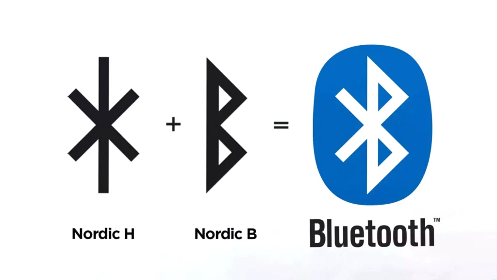
One hallmark of expert geometric logo design is blending multiple shapes into a new symbolic icon. By overlapping, fusing, and transforming basic geometry, designers craft custom icons that become powerful visual shorthand for brands.
Consider the examples below:
- The Bluetooth logo fuses a runic symbol and initials into a hexagonal shape.
- The WWF panda uses negative space in a bold yin-yang-style character.
- The Formula 1 logo transforms a bold numeral into a dynamic speeding icon.
This kind of shape play requires creativity and spatial awareness. However, the iconic results become a core part of the brand identity. Customers instantly recognise these logos across contexts. The fusion process also imparts deeper meaning. Creative shape blending allows designers to mix desired symbolic qualities into a bespoke visual identity.
When brainstorming your geometric logo, explore ways to overlap and integrate multiple shapes. This adds visual interest while producing a symbol tailor-made for your brand.
Using Shapes Creatively
In addition to blending geometric forms, designers also transform and customise individual shapes in clever ways. Some techniques to spark logo ideas include:
- Overlapping identical shapes: Try offsetting duplicate shapes to create unusual negative space.
- Cropping or masking: Frame shapes selectively to add dynamism or hide/reveal critical details.
- Rotating and angling: Change a shape's orientation to imply movement or different perspectives.
- Inverting and flipping: Manipulate symmetry and balance for optical illusions.
- Distorting: Bend, taper, or morph shapes into fresh iterations while retaining associations.
- Applying perspective: Use diminishing sizes, angles and dimensions to add depth.
- Fragmenting: Break apart or segment shapes into inventive new formations.
With a dash of graphic wit and spatial awareness, these techniques offer unlimited potential for breathing new life into geometric forms.
Of course, restraint is essential. Logos should still retain a simple, cohesive appearance. But creatively transforming even one or two shapes can produce a symbol full of character and visual impact.
Choosing Complementary Colours

Shape manipulation provides the foundation for imaginative geometric logos. But colour choices also significantly impact a logo's look, feel, and meaning. Bright, bold palettes attract attention and imply vibrancy for youthful brands. More profound hues project professionalism and luxury—symbolic colours like red and green tap into cultural associations.
With geometric shapes, you gain even more opportunities to apply colour strategically. Some tips include:
- Use contrasting colours to make different forms distinct or create optical vibrancy.
- Apply gradients and shading to add dimension and visual interest.
- Use muted or neutral palettes to place focus directly on the shape impact.
- Associate certain hues with crucial brand values or emotions.
- Consider cultural colour meanings in your target market.
Don't forget white space. Clever use of negative space not only shapes the logo's composition. It also lets colours and geometric forms stand out boldly from the background—Prioritise simple palettes with one or two core hues for the most incredible cohesion and versatility.
Typography That Complements Shapes
Even the most beautifully crafted symbol still needs the right typography pairing to complete an iconic logo. When designing a geometric logo, you want fonts that complement the shapes visually rather than compete with them. Some typography considerations include:
- Simplicity: Avoid overly elaborate scripts and display fonts. Opt for simple, readable letterforms.
- Weight: Choose lighter or thinner fonts. Heavy text tends to clash with geometry.
- Spacing: Use tracking to match the layout of your shapes. Wider letterspacing works well with airy compositions.
- Style: Pair soft, rounded geometry with flowing script fonts. Sharper contours call for straight-edged type.
- Hierarchy: Make shapes and typography co-stars. Don't let one element overpower the other.
When paired elegantly, geometric shapes and typography unite into a cohesive visual story. The iconic Coca-Cola logo demonstrates this harmonious balance beautifully.
Take time to explore fonts that align with your symbol concept. The correct text completes the logo.
Achieving Scalability and Adaptability
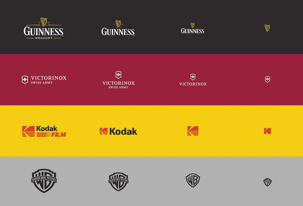
A logo should display clearly and maintain its visual impact at any size for maximum effectiveness. That means clean, simple designs without intricate details work best. Regarding shapes, this means sticking with fundamental building blocks rather than complex constructions.
Compared to gradients and shading, solid, flat colour fills reproduce cleanly across contexts. Plus, leave ample white space around the logo. Crowding elements together makes scaling challenging.
Beyond scalability, today's digital media landscape also demands flexibility. Can your logo be adapted for square social profile layouts? Does it retain its recognisability in black and white? Simpler is almost always better for geometric logo longevity.
Making Custom Geometry Your Own
When designing an original geometric logo, you want to ensure it feels owned and not borrowed from other brands. A few strategies to make customised shapes distinctive include:
- Tweak standard forms with your unique flourishes, angles, overlaps or details.
- Incorporate hidden references only your business relates to.
- Develop an original name for your bespoke shape, like Google's “coloured squares.”
- Create a compelling brand story around your shape's origins and meanings.
- Use the shape consistently across branding touchpoints to cement the association over time.
Owning your geometric identity establishes legal rights and cements meaningful emotional ties with your audience. That drives brand loyalty and recognition in the long run.
Key Questions to Assess Geometric Logo Designs
If you're weighing up potential logo options during the design process, asking the right questions helps filter out less effective concepts. Some of the critical considerations for geometric logo designs include:
- Memorability: Does the shape configuration create an impactful visual impression? Is it inherently distinctive?
- Meaning: Do the shapes selectively convey relevant symbolic meanings or values?
- Distinctiveness: Does the geometry blend avoid feeling generic or derivative?
- Harmony: Do the shapes, colours, and types complement each other elegantly?
- Adaptability: Does the logo retain its impact and recognition at different scales?
- Longevity: Will the logo remain practical and relevant in 5, 10, 20+ years?
Keep critiquing logo concepts until you find the one that combines maximum geometric creativity with practical brand-building effectiveness. This sweet spot takes insight and persistence to achieve.
Turning Geometric Logos Into Optical Illusions
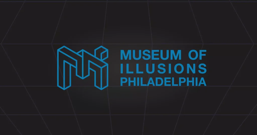
Once you have a strong logo concept, exploring optical illusion effects offers another way to infuse extra intrigue. Our minds can't resist deciphering visuals with multiple interpretations. Illusion logos also feel more interactive since viewers must actively figure them out.
Some techniques designers employ include:
- Ambiguous shapes: Use negative space or missing details to suggest two or more possible forms.
- Perspective: Apply advanced perspective to shapes that shift as viewers move.
- Rotation: Spin nested shapes or patterns to imply movement.
- Symmetry: Reflect shapes to tap into our pattern-seeking wiring.
- Fragmentation: Dissect and scatter shapes to make viewers mentally reassemble them.
When handled with care, optical tricks build engagement while strengthening brand associations in memory. However, restraint is still essential to maintain versatility. Take inspiration from clever illusion logos like Toblerone's bear or the FedEx arrow.
Optimising Geometric Logos for Digital Reproduction
Today's brands need logos that reproduce crisply across digital mediums. Consider factors like resolution, gradient banding, and colour reproduction when designing geometric shapes. Some tips include:
- Favour solid, flat colours over gradients or transparencies. These can degrade or blur digitally.
- Avoid thin line weights or tiny details that may pixelate at smaller sizes.
- Pick colours from digital colour systems like RBG or CMYK rather than Pantone for consistency.
- Ask to see your logo at different digital specifications before finalising the design.
- Request vector files to allow lossless scaling and digital reproduction of your logos.
With digital dominance only growing, these technical considerations help futureproof your logo.
Key Categories of Geometric Logos
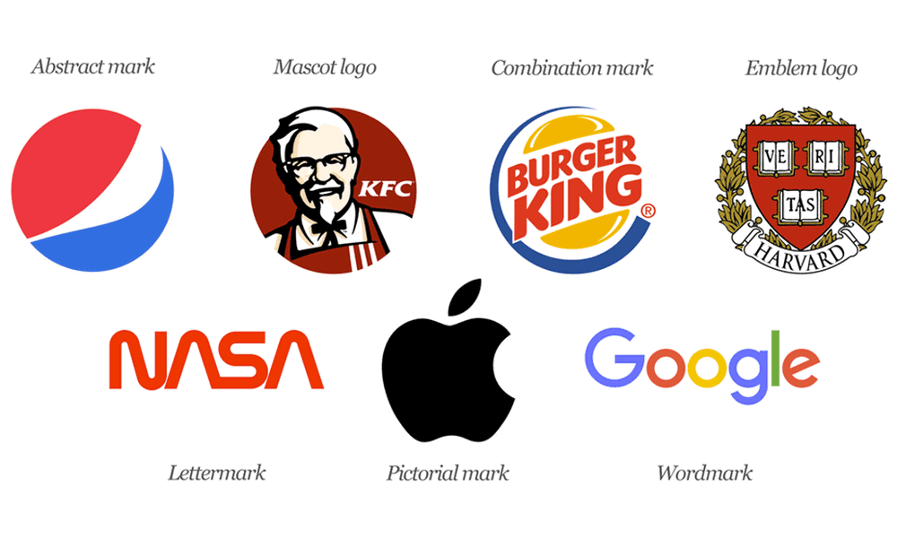
While simplicity is vital, geometric logos take many forms. Different configurations of basic shapes create diverse looks with unique brand associations.
Common geometric logo varieties include:
Abstract Icon Logos
These logos use custom abstract shapes as icons representing the brand. Examples include the Nike swoosh, Starbucks mermaid, and Apple apple silhouette. The icons become visual shorthand for brand recognition.
Letterform Logos
Letterform logos incorporate geometric styling into the shaping of the company name initials. Letters may be stripped down to elemental lines and curves or fused. Examples include the IBM initials, FedEx arrow, and HP slanted squares.
Emblem Logos
Emblem logos frame the brand name in a geometric shape like a circle, square or triangle. Examples include Mastercard's overlapping circles, YouTube's angled play button, and PayPal's double-blue P's.
Grid Logos
Grid logos use geometric patterns like lines, dots and shapes repeated in a grid. Grids suggest connectivity and networks. Examples include NBC's peacock grid and Baskin Robbins' “BR” grid.
Shape Overlay Logos
These logos overlay geometric shapes like circles, squares, triangles or lines over other design elements. Shape overlays may suggest framing, connectivity or movement. Examples include Adidas's three stripes and Doritos' triangles.
This list covers typical applications, but there are infinite ways to configure geometric shapes into minimalist logo designs. Simplicity and memorability remain the goals across all varieties.
Next, look at some design tips and tricks for crafting compelling logos using basic geometry.
Design Tips for Immaculate Geometric Logos
Once you've selected your geometric approach, some best practices can elevate a logo from good to truly iconic. Here are some pro design tips:
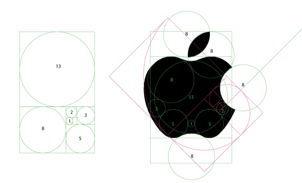
Use the Golden Ratio
The golden ratio, or divine proportion, is a mathematically pleasing ratio found throughout nature and architecture. Incorporating the golden ratio into logo dimensions subconsciously pleases the eye. For example, Apple's logo width to height roughly aligns with the golden ratio.
Overlap Shapes Strategically
Overlapping shapes create visual interest and energy. Mastercard's overlapping circle's emblem would feel static as side-by-side circles. Overlap shapes thoughtfully based on desired associations.
Rotate for Dynamism
Angling basic shapes adds visual intrigue. YouTube's play button pops more dynamically turned versus straight horizontally. But don't over-rotate – shapes still need to feel grounded.
Pair Curved with Linear
Balancing curves and lines pleases the eye in logo design. Softening linear shapes with curves makes logos more approachable. See how IBM fuses rigid lines with rounded curves in their lettering.
Use Negative Space Creatively
Negative space defines the boundaries of shapes. Leverage negative space purposefully to reinforce symbolism. The arrow in the FedEx logo only emerges through negative space.
Design in Black and White First
Start logo concepts in black and white to ensure shapes and spatial relationships work in the simplest form. Adding colour after nailing basics allows for more polish.
Thoughtful placement of geometric shapes takes practice. You can evolve essential ingredients into an engaging and memorable visual identity by leveraging design principles around shape, space, colour and angle.
Now that we've explored the strategic use of shapes, angles, lines and colours, let's move on to some tips for creating your geometric brand logo.
How to Craft Your Geometric Logo: 7 Key Steps
Here is an actionable 7-step process for developing geometric logo concepts:
1 – Clarify Brand Essence
Start by distilling what makes your brand distinctive. Define the values, emotions and associations you want your logo to convey visually through geometry.
2 – Research Competitors
Examine other brand logos within your sector. Identify gaps where your geometric logo can stand apart.
3 – Sketch Initial Concepts
Brainstorm geometric logo approaches. Sketch abstract icons, letterforms, and emblems using circles, squares, triangles and lines.
4 – Refine the Most Promising Idea
Determine which 1-2 logo concepts have the most potential based on memorability, uniqueness, and alignment with your brand essence. Develop these further by iterating on shape, colour and positioning.
5 – Digitise and Finalise
Take your final manual logo to digital software like Illustrator. Finalise geometric proportions, colours, and thicknesses so the logo files are reproducible anywhere at any size.
6 – Apply and Evaluate
Test your completed geometric logo across mediums like websites, business cards, and signage. Collect feedback on strengths and areas for improvement.
7 – Evolve the Identity
Your brand should grow beyond just a logo. Develop a geometric visual language that applies across websites, packaging, branded content and beyond.
Following this strategic creative process, you can develop geometric logo concepts with the memorable visual power to become brand icons.
FAQs About Crafting Great Geometric Logos
Questions commonly arise when creating a new logo. Here are answers to some frequently asked questions:
What makes a good logo?
A strong logo is distinctive, evocative of the brand, versatile, memorable, and timeless. Geometric symbols achieve this by strategically using shapes, angles, colours and positioning.
How much does a geometric logo cost?
Simple geometric logos can cost between $200-$1500 from a designer. Complex multi-shape branding systems cost $2000-$15,000+. The investment pays dividends through years of cohesive brand recognition.
Who owns the rights to my logo design?
You'll sign a contract with the designer assigning rights for your custom logo exclusively to your business. You own the logo and can trademark it.
Can I create and trademark my logo?
Yes, you can DIY geometric logo creation and file a trademark. However, hiring an experienced graphic designer still offers more strategic expertise.
How long does logo design take?
Professional logo development takes 2-6 weeks, from researching to finalising design files. Quick logo maker websites produce faster but less original results.
How do I make a logo stand out?
Distinctiveness stems from the strategic use of shape, colour, angle, and simplicity. Analyse competitors to ensure your logo design feels fresh and ownable.
A solid geometric logo acts as the cornerstone of your visual branding. By following the tips and strategies outlined above, you can craft a logo that makes your brand unmistakable at a glance. The minimalist power of basic geometry applied creatively can yield maximum impact.
Conclusion: Master the Art and Science of Geometric Branding
When leveraged creatively, geometric logo shapes provide a toolbox of visual storytelling power. Companies worldwide use geometry's symbolic forms to convey key brand attributes and values. Designers craft potent logos that resonate across cultures by blending, transforming, and stylising geometric building blocks. But strategic thinking also underpins effective geometric design. The iconic symbols fuse aesthetic appeal with functional symbolism tailored to the brand identity.
Next time you encounter a striking geometric logo, reverse engineer its strategic underpinnings. Let its artistry and smarts inspire your branding ideas. With practice experimenting, you'll master the blend of science and creative magic that generates memorable visual identities. Just remember that geometry offers ingredients, not cookie-cutter solutions. Meaningful brands come from customising shapes, not merely copying them. So embrace geometry as a launch point for creativity, not limitation. Armed with this adaptable design toolkit and strategic perspective, you're ready to build legendary logos set to inspire generations.
