
This post contains affiliate links. We may earn a commission if you click on them and make a purchase. It’s at no extra cost to you and helps us run this site. Thanks for your support!
In the bustling cosmos of typography, where fonts jostle for attention like stars in a galactic showdown, emerges a font that doesn’t just shine—it gravitates. Yes, folks, buckle up as we delve into the cosmic marvel that is the Gravita font family by TipoType.
Gravita isn’t just your run-of-the-mill font. Oh no, it’s a symphony of solidity and finesse, a harmonious blend of classic proportions and the razor-sharp precision of modern design. Picture this: the sturdiness of a fortress melded seamlessly with the sleek lines of a cutting-edge skyscraper. That’s Gravita for you—a font that exudes trust, respect, and a whisper of futuristic allure.
Designed for the titans of modern corporate communication, Gravita is the secret weapon for those who seek to weave threads of confidence and transparency into their brand’s fabric. Think of it as the beacon of trust in a sea of typographic uncertainty.
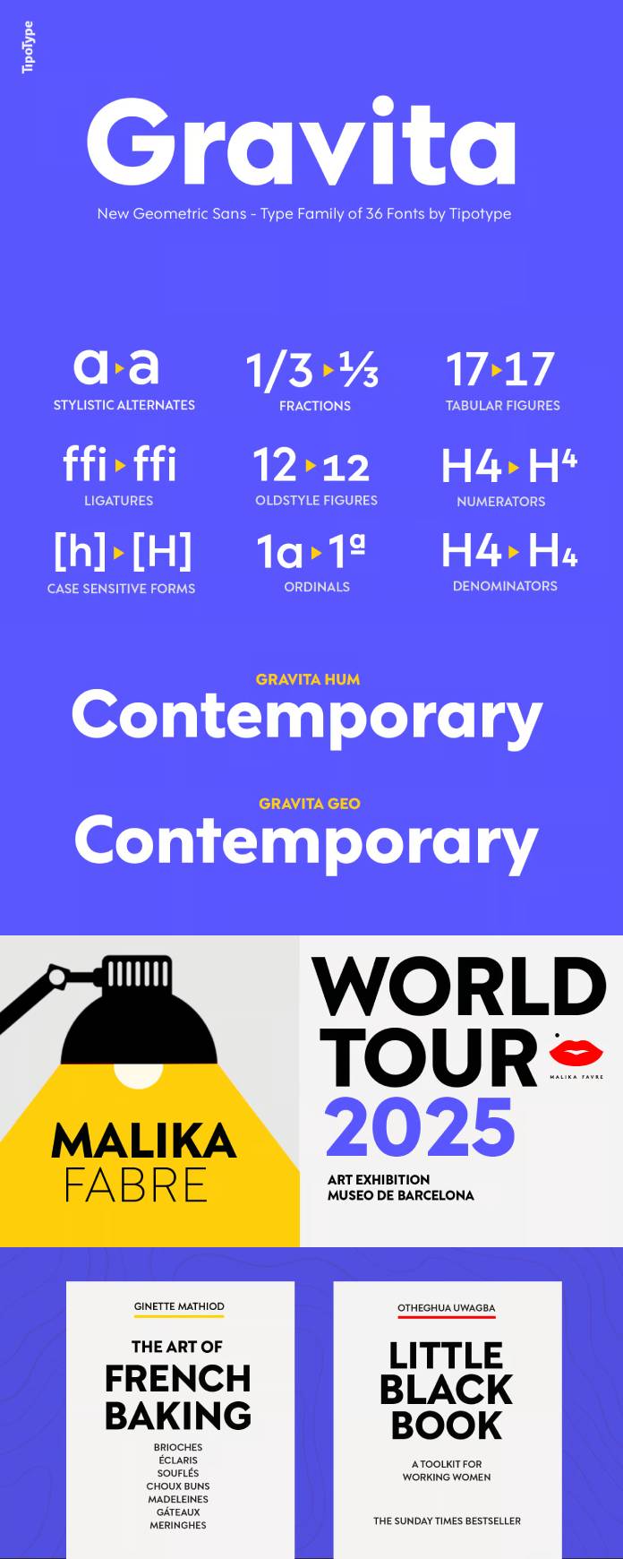
But wait, there’s more! Gravita doesn’t just stop at being a one-trick pony. With not one, not two, but nine weight variations, this font family’s versatility knows no bounds. From feather-light elegance to a bold, commanding presence, it’s got every weight to match your design mood board’s every whim.
Ah, and let’s talk about its alter egos—GEO and HUM. These predefined sets aren’t just names; they’re personalities, each with its own italicized charm. GEO is the embodiment of geometric precision that would make even Euclid nod in approval, and HUM, is the touch of humanity that softens the edges, reminding us that behind every font lies an artist’s touch.
The design? Inspired by the architectural finesse of modernist embossed fonts, infused with the finesse of the 21st century’s digital age. Gravita isn’t just a font; it’s an amalgamation of past grandeur and future aspirations, a bridge between tradition and innovation.
Graphic designers, this isn’t just a font; it’s a journey. A journey through the cosmic waves of typography where trust meets innovation, where precision embraces artistry. So, strap on your creative spacesuits and get ready to elevate your designs to celestial heights with Gravita.
TipoType’s Gravita font family isn’t just a choice—it’s a statement. It’s the language of trust, the symphony of modernity, and the bridge to a design utopia where form meets function in perfect harmony.
Feel free to find more trending typefaces on WE AND THE COLOR.
Subscribe to our newsletter!


