


Vision is perhaps the most acute sense with which humans discern information about the world – in the context of interiors, space – so much so that it can elicit a visceral reaction. If utilized properly, wallpapers can dramatically support the aesthetic and energetic goals of a fully realized design. When introducing color, pattern, and texture at any scale, it’s important to consider how those elements might hold a deeper meaning and with whom there may be resonance.
“I always bring it back to a feeling place with my clients. Prioritizing what they are navigating in their lives, and the effect that has on the intention and use of the space, is paramount to me,” says Sarah Rigano, vibrational designer and founder of FORM + LIGHT. “From there I gently guide them toward what would be of greatest benefit as our spaces are vital containers that can nurture, heal, and inspire us if we treat them so,” she adds. “For example, someone in need of grounding, respite, or anxiety reduction? Organic shapes, reflections of the natural world, muted colors. Working through loss, grief, unease, or trouble sleeping? Soft colors, curved lines, blurred forms. Seeking inspiration, focus, boundaries? Bold patterns, strong lines, statement colors.”
With a market supersaturated in surface pattern designs and a myriad of options, it can be difficult to parse prints to find one accommodating of taste, budget, installation limitations, as well as material, like printed, plaster, or textile. Laura Guido-Clark, the former Creative Director of Materials Innovation at Herman Miller and founder of Love Good Color, offers a roadmap for those looking for nuanced decision making – and a bit of anthropological commentary on contemporary visual language. Guido-Clark breaks it down into four shared throughlines:
Vertical to Horizontal Symbology
Studies cite that horizontal lines are more calming than their vertical counterparts. Experts argue that horizontal lines represent wide open spaces and vastness, or primordially speaking where a threat can’t hide or be threatening as they are visible from far away. In contrast, vertical lines can imply grandeur or spirituality, broad gestures from the earth below to the heavens above. They can also imply strength depending on the weight of the line where boldness, thickness, and opacity are in direct correlation to it.
Emotional Representation
A great deal of emotional response to wallpaper is derived from isomorphic correspondence – how the viewer interprets information, finds meaning, and formulates a response based on past experiences. Many colors, shapes, and patterns pull from nature and speak to an innate fondness to flora and fauna while others imbue prints with an otherwise intangible energy. Dynamic and kinetic energy is generated in the proximity and scale of print demanding attention. Visual vibrations generated restlessness.
Organic vs. Geometric
Compositions can comprise themselves with any combination of organic and geometric forms. Organic forms are found in the natural world and often trade a sense of uniformity or perfection for spirit, whereas geometric forms exist in stark contrast appearing man or machine made. It is often the difference between flow and ease, or rigidness and order.
Color Story
Unlike an even coat of paint only activated by its finish in the light, wallpapers are multifaceted in color, often dominated by undertones. Monochromatic or analogous schemes imply a sense of calm or harmony while contrasting color articulated through pattern can create vibrancy. Perception of color is also impacted by shape, shade, and proximity of other colored elements.
The selection below represents a small swath of emotive and contemporary wallcoverings from powerhouse brands, intimate design studios, and solo illustrators. Of the roundup Guido-Clark adds: “I am so excited about these, first because I love wallpapers and second because I believe they signify an undercurrent of our innate desire for connection with nature. I do feel that they imply a sense of softer landings, or perhaps our need for that emotion in this current time.”
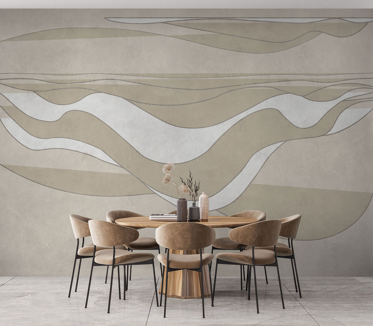
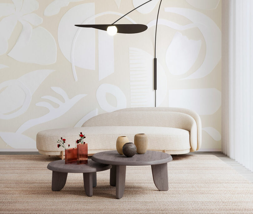
Studio Milo for Affreschi & Affreschi \\\ Tailor in style SM02B
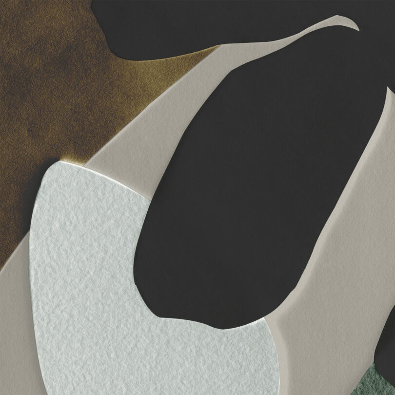
Affreschi Affreschi style SM02B
Affreschi Affreschi style SM02B plaster detail
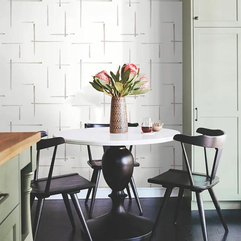
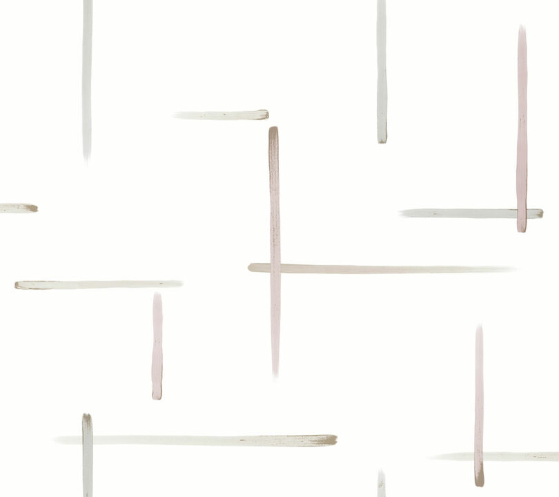
Calico Wallpaper \\\ Ephemera in Pastiche + Avant
Calico style Ephemera in Pastiche
Calico style Ephemera in Avant
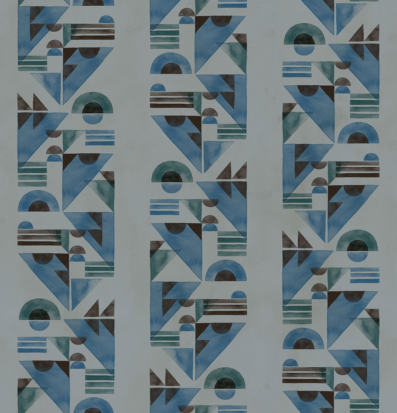
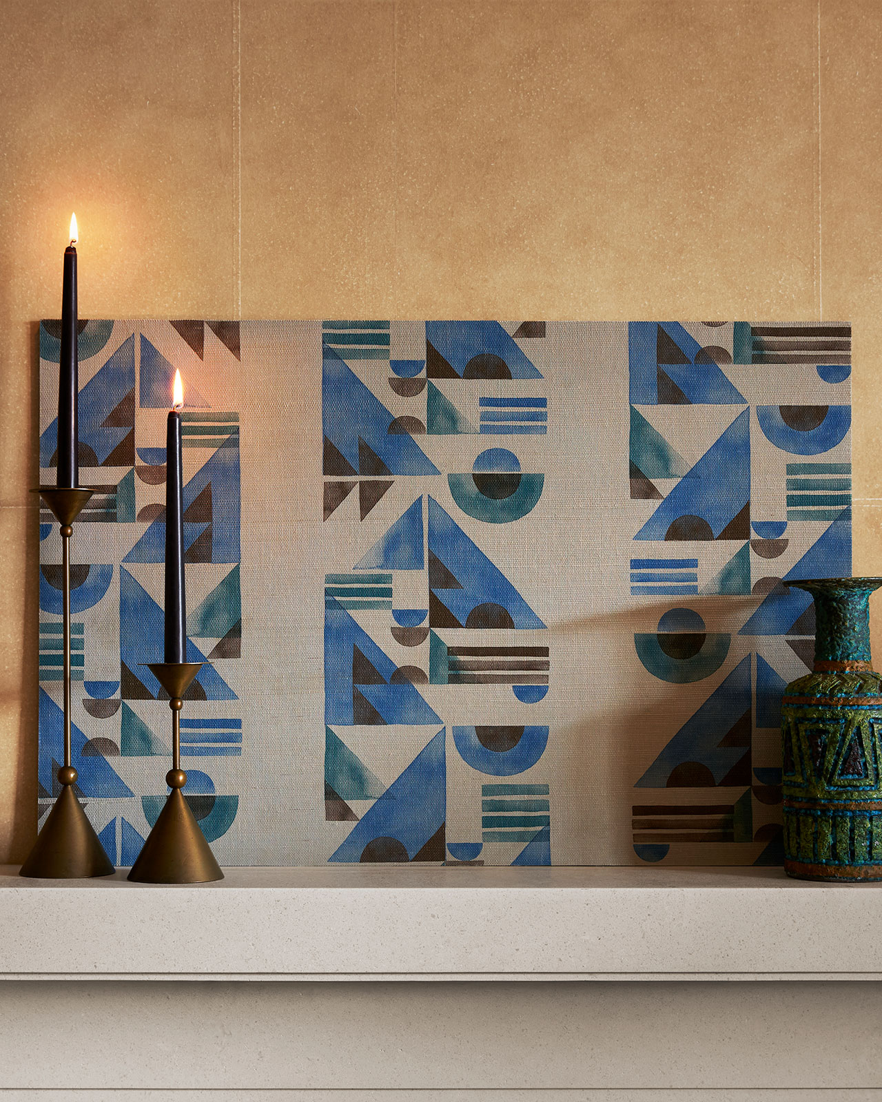
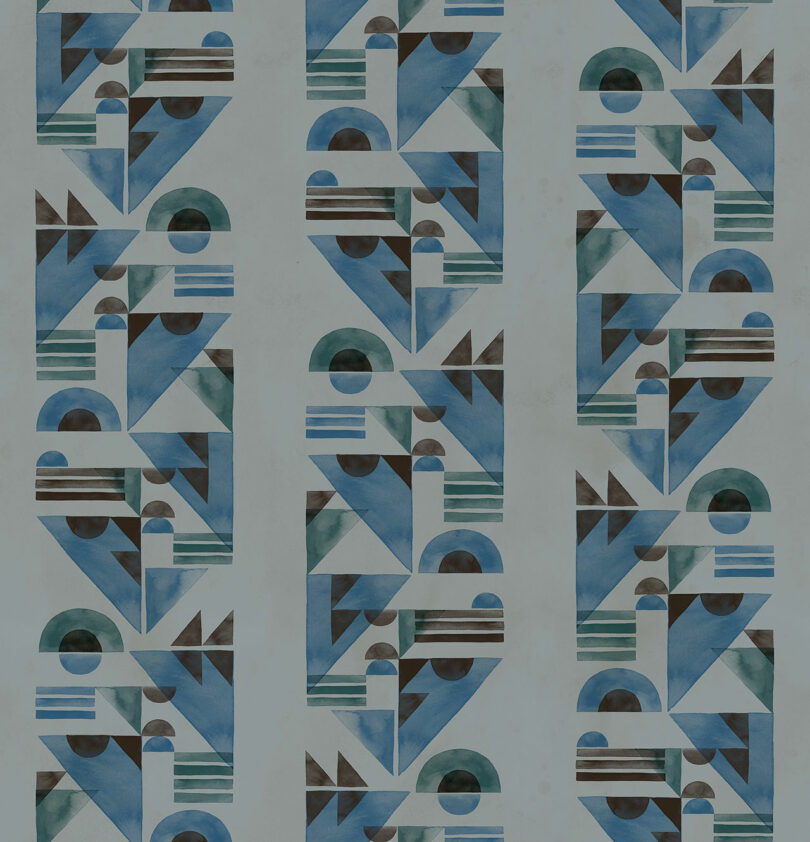
Josh Greene Design \\\ Banda in Denim
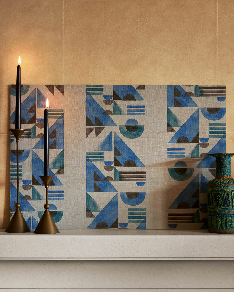
Josh Greene style Banda in Denim photographed by Ethan-Herrington
The Portaluppi Pattern Project for Pictalab \\\ Attelano in Chrome 01
Pictalab style Atellano in Variation 3 photographed by M. Pescio.
York Wallcoverings \\\ Artistic Abstracts Gilded Sumi-E in Orchid/Glint
York Wallcoverings Gilded SumiE print in OrchidGlint
Tara Hogan \\\ Milk Bath Series in Style 2
Tara-Hogan Milkbath Series in Style 2
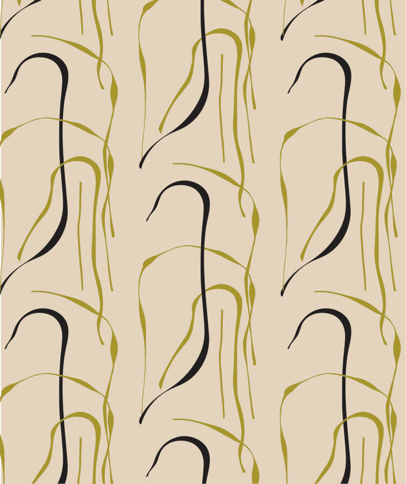
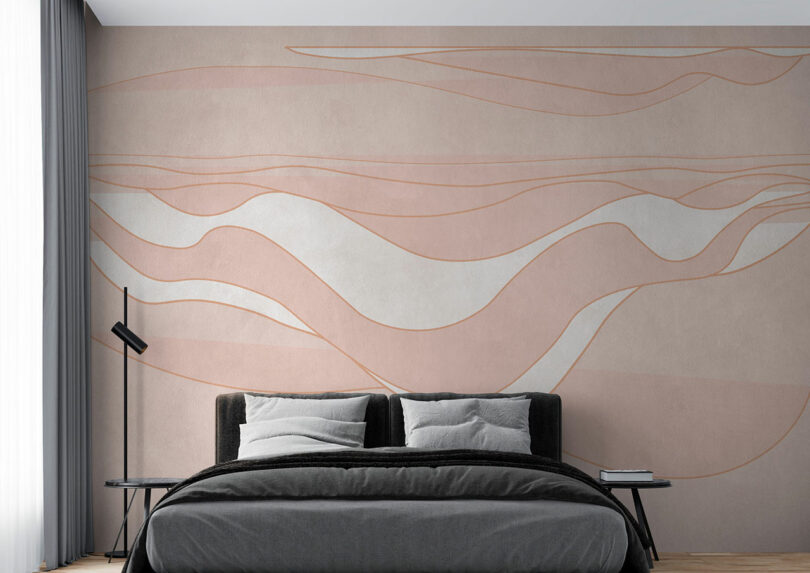
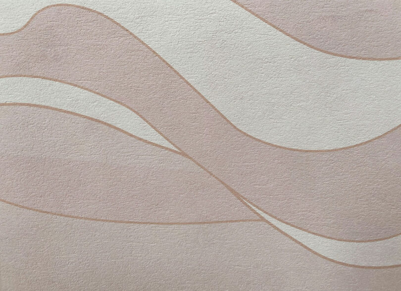
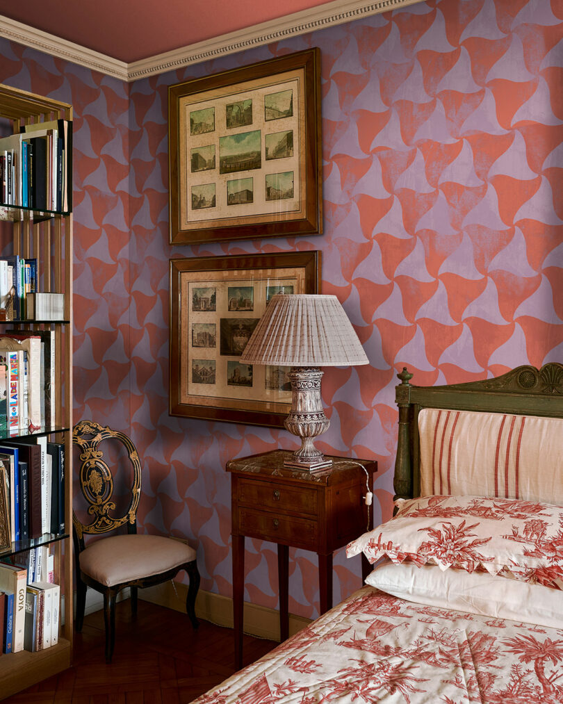
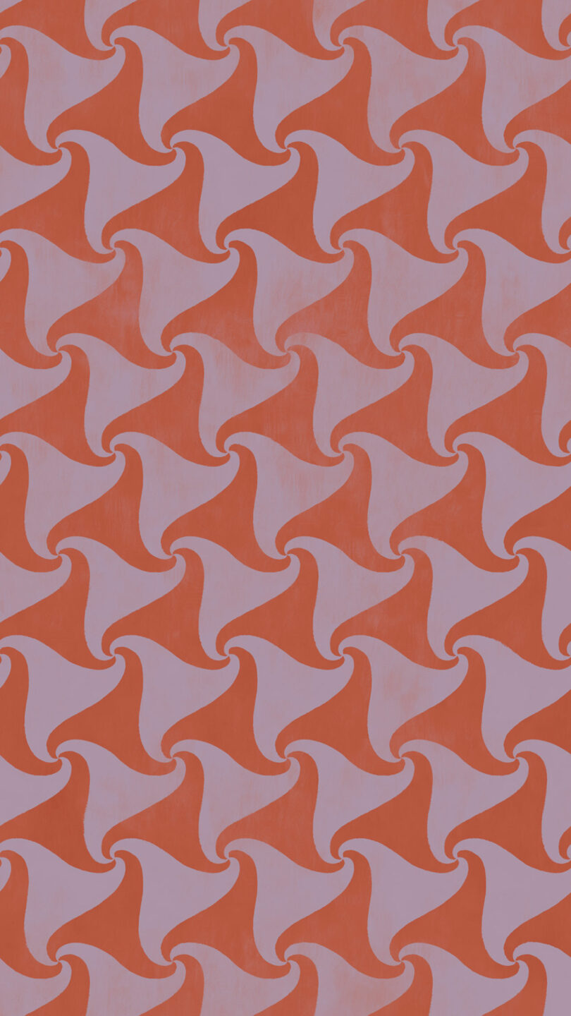
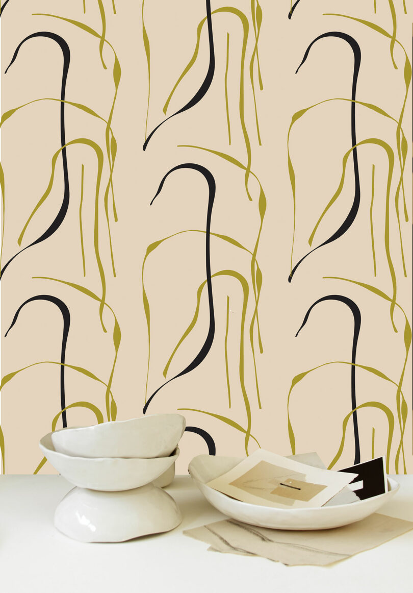
Kelly Wearstler x Lee Jofa \\\ Intargia in Buff
Kelly Wearstler x Lee Jofa style Intargia in Buff