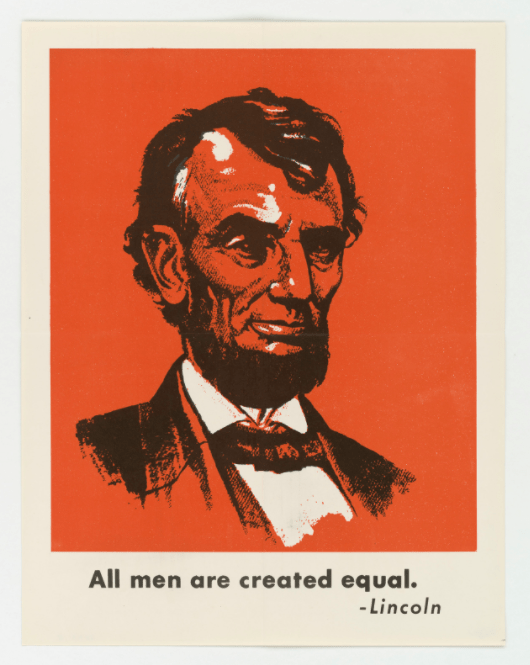
If you are a graphic designer, or just a design lover that creates print work, you surely know how hard it can be to achieve satisfying work when designing a custom poster. One of the main issues is that poster design can be quite constraining, mostly due to the importance of perfectly combining form and function in order to be efficient. In this article, we will give you a few tips in order to stay focused on what matters in terms of poster design.
1. Include Only Essential Content
People will only look at your posters for half a second if they don’t care, or 10 seconds if they are really interested in what your poster is promoting. For that specific reason, you cannot afford to include unnecessary content and must ensure that even a glimpse at the poster gives them some information. For example, for a jazz concert, a well designed poster with a “jazzy” athmosphere will give some information even if the passer-by only reads the word concert. Later that day, while discussing with friends, this person may remember it and tell their friends: “Hey, I saw there will be a jazz concert soon” and end up googling it to find you. Obviously, you should also print the dates and venue on the poster, in case someone is interested right away, but you shouldn’t include a bio of the band or information that is not relevant right away.
2. Color Selection Matters
Again, this seems a bit obvious, but you shouldn’t use the same colors for a poster about events based in the forest or for one about corporate services or products. If you are not familiar with color theory, take some time and educate yourself about the topic. There is also a lot to learn about color psychology, and what colors are associated to which feeling or emotion. You can try to be creative with your use of color and be more subtle, but it will be hard to let people associate purple with nature or orange with a funeral company. Never forget that you will not have time to educate the viewers of your posters about your specific use of color.

3. Make It Readable
Back to the same point: no time for deciphering posters, the person that passes by should be able to read your poster while walking by, or even better, by driving by. Graphic designers love small fonts and subtlety, but bigger texts read better. One second should be enough to read what’s in the poster. Keep in mind that contrast matters when it comes to reading faster, and use the right font for optimal readability. If you are not sure about the font size or style to use, make a mockup and test it on people. Don’t just test it on your young friends that have perfect eyesight, also include older people and kids to get a more representative impression of the readability of your poster.
4. Design For Location
Not all posters were made equal. A poster in front of a store doesn’t serve the same purpose as an advertising poster in a train station. In both cases, you need to catch the attention of the passer-by, but you need to address him or her differently based on the context. Obviously, context will affect the message, but it will also affect the design for more practical reasons. For example, a poster displayed outside with only natural light will have a different impact and will need different graphic treatment from a poster designed to be displayed in an airport with permanent bright lights on it.
5. Know The Audience
This is a classic in graphic design, but you should always know who you are designing for. When writing “designing for”, we are obviously not referring to your client, but to the person that will be looking at the poster, and hopefully influenced by it. Knowing the audience means knowing their taste and cultural references, so you can design accordingly and choose the right fonts, colors, visuals, and layout styles. The best audience may well be yourself, when you want to decorate your home and create personal posters.
Conclusion
As you can see from the article, the rules for designing efficient posters are not so different from general graphic design rules. Form and function should always both be considered and one should not be privileged over the other. The tips in this article should obviously not be considered as set in stone, but can serve as a useful reference when in doubt.

