A mobile application’s CTR (click-through rate) is greatly influenced by its app icons. On the app stores, first impressions count for a lot, comparable to in real life. With 5+ million apps available on Android’s Google Play and Apple’s App Store combined, it’s critical for apps to differentiate themselves from rivals with an optimized icon.
An app icon should instantly catch the users’ eye and entice them to download the app. It’s crucial to illustrate the primary features of the app in addition to creating a distinctive icon. Examine these 10 professional suggestions and best practices for creating an app icon that’s optimized.
First Tip: Have Your App’s Icon Simple
Everyone looks for the simplest path to their goals. Your app’s icons should therefore be easy to read and comprehend. An app icon that displays a lot of information or several functionalities may look overly busy. Therefore, an overly complex app symbol may mislead consumers and fail to convey its purpose.
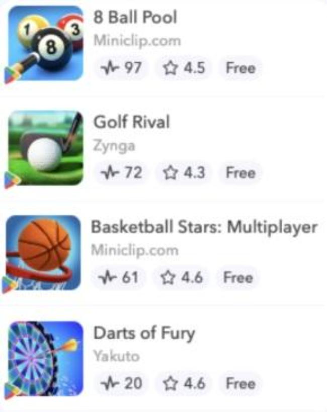
The best free sports games on Google Play that stick out with straightforward designs and single-object emphasis are displayed in the example above.
Second Tip: The Goal of Your App Should Be Conveyed Through Its Icon
While it’s true that you shouldn’t overcrowd your icon with information, you still want to make sure it’s clear what your app’s primary features are. You don’t want to design an ethereal app icon that makes it difficult for customers to understand the purpose of your app. Thus, consider your app’s use and primary advantages, your brand and services, and your unique value proposition. Consider what you’re providing to your final consumers while creating the icon for your app.
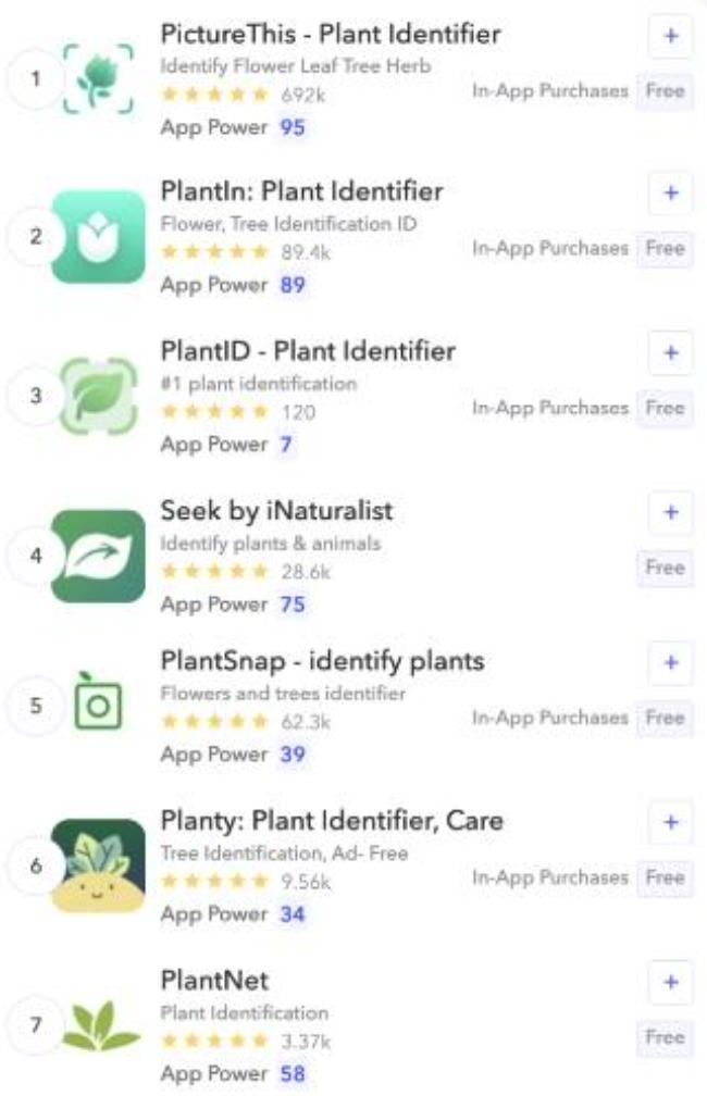
This graphic displays the results of a search for “plant identifier”. Applications with basic designs, such as PlantID and PictureThis, demonstrate to the user the app’s functionality by including a plant within a visual outline in their icons. Although PlantSnap and Seek have included artistic elements in their icons to convey a tech-related purpose, the icons lack sufficient clarity to convey the intended message. Lastly, while Planty, PlantNet, and even PlantIn, concentrate on plant pictures, their app icons lack an easy-to-identify feature.
Third Tip: Select the Appropriate Shades for Your App’s Icon
Make sure the colors complement your brand when creating an app icon. Spend some time considering the following strategies to help your icon stick out in the search results:
Vibrant colors can aid in drawing a user’s attention to an app. Additionally, limit the number of colors you utilize to one or two primary hues. Compared to sophisticated app icons, simple ones drive a lot greater conversion.

This example shows how numerous apps have made use of vivid colors to differentiate themselves from rivals. The icons for Piscart Photo & Video Editor, Photo Editor Pro, Fender, Guitar Tuner, and GuitarTuna are the most striking.
Consider your brand’s colors while selecting the colors for your app’s icon. Headspace, for instance, has a rather straightforward app symbol that just features its logo against a white backdrop. The unadorned symbol informs customers of what to anticipate after downloading the program and illustrates how straightforward the UX (user experience) is.
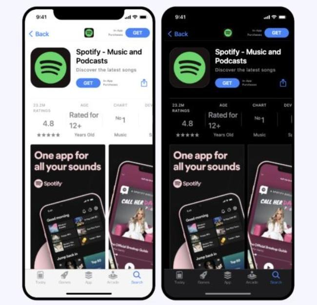
Remember that your app’s icon should appear just as nice in dark mode as it does in light mode. We suggest that in both modes, you ought to employ contrasting colors. Your app symbol should generally appear professional against both backgrounds. Using a backdrop that’s transparent in the app symbol (like Spotify does below) is another excellent advice for Android users to enable their app to adjust to their favorite mode.
You can submit multiple icons to Store Listing Preview (Google Play) or AppTweak’s App Page Preview (App Store) – these are just two preview pieces of software out there – and see which version looks best in each mode.
Fourth Tip: Don’t Overdo the Wording in Your App Icon
An app icon must be able to be understood on its own. When designing an icon for your app, the adage “a picture is worth a thousand words” is highly relevant. Icons without any words are typically easier to understand. They are less confusing and likely to get more clicks.
Remember that on mobile devices, apps are presented significantly smaller. When an app has a lot of text, it becomes cluttered and the user might not know what the purpose of the app is. In the event that you want to release your program in a foreign nation, adding text may also result in localization issues.
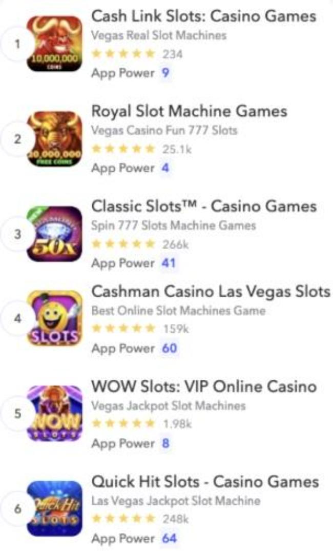
Casino games and bookmakers, for instance, frequently include text in their icons and employ a wide variety of color schemes. Especially casinos aim to please every sensation, but this gaudy style appears a bit busy in the app store and doesn’t help an app stand out from the competition when it comes up in the search results.
Bookmakers that are rated high on Bookmaker Expert, a specialized platform reviewing them, in 2024, e.g. best MuchBetter bookmakers and many others, have somehow figured out that focusing on an immersive playing experience over a colorful app icon design is the better long-term strategy.
Make sure the typeface is readable and doesn’t overcrowd the app icon if you’re inserting text. Additionally, take care to avoid using promotional content in your app icon that promotes sales or implies shop performance.
Fifth Tip: Only Use Logos with Strong Branding for Your App’s Icon
Developers occasionally ponder if it would be wise to use their company logo as the app icon. Remember this: deeper brand loyalty and a better reputation may result from this. This works well with a company that’s already fairly well-known and has a distinct visual identity. Snapchat, Nike, TikTok, Tinder, or Spotify can serve as examples.
If your app’s logo is not well-known, it isn’t advised to add it to the icon. You want your audience to understand your app easily. Users won’t understand the goal of your app fast if they can’t recognize your brand.
For instance, the apps that are included in the App Store’s top rankings within the Food and Drink category are from well-known firms that have well-known names or logos. Users can identify apps in search results more quickly because of the incorporation of branding into their icons. Utility apps, on the other hand, are less well-known in the app stores. Therefore, a straightforward icon that conveys the purpose of the app would be more impactful than the name or logo of the company.
Once more, it’s critical to keep in mind that app stores won’t accept apps that contain misleading images in their logo or promotional content.
Sixth Tip: Update the Seasonality of Your App’s Icon
It’s essential to periodically update your app’s icon. Users may find this even more appealing if you change the app icon for holidays like New Year, Christmas, and Halloween. You want users to be aware that you’re always adding new features and interacting with your audience. When businesses take the time and make the effort to post pertinent updates, customers appreciate it.
It’s not always necessary to completely rethink icon changes. Let’s examine the Trivia Crack 2 video game as an illustration. We saw that while the emblem is still recognizable and similar, it has a seasonal flair.

Seventh Tip: Localize the App Icon for Different Markets
It’s advisable to optimize your app icon for every market where it’s offered in order to make it stand out from the competition. Users may feel more akin to your app when they see it in the stores and notice that the app icon matches their preferred style of cultural design.
Additionally, localizing your app’s symbol across markets will set it out from the competition even more.
Eighth Tip: Set Your App Icon Apart from Rivals’
Take a look at what your rivals are doing before designing your app’s symbol. Consider why a customer would choose your app over that of a competition. You can get ideas on how to stand out from or enhance your app icon by keeping an eye on your rivals. Your objective is to differentiate your icon from the competition by emphasizing a certain quality that makes it stand out.
The example below shows how apps with comparable goals but less well-known brands can nevertheless convey their message and set themselves apart from rivals. By looking for “crossword puzzles”, we may observe how applications manage to differentiate themselves while maintaining a clear understanding of their intended use.

Ninth Tip: Take Note of Your Rivals’ Strategies and Employ A/B Testing
You can use some ASO (App Store Optimization) tools such as AppFollow or App Radar to observe your rivals’ A/B testing and discover what strategies they employ. Subscribing for their features, you can tell automatically whether an app is doing an A/B test or not. After that, you can learn more and discover which earlier versions they are comparing to.
A/B and A/B/B testing can be quite helpful when optimizing your own app icon to determine which version is most likely to succeed. You can create tests for both your current icon and a different one in order to conduct an A/B/B test.
Tenth Tip: Observe the App Stores’ Requirements on App Icons
Follow the standards listed below, which are exclusive to Google Play and the App Store, when creating an icon for your app.
Google Play:
- Google has modified its icon system to incorporate drop shadows and adopt iOS’s rounded-corner square design. This means that your original artwork should be published as a full-bleed icon and should not contain drop shadows or rounded corners.
- Google forbids using terms in the app icon that imply store performance.
- It’s highly advised to avoid using any graphical components in your app symbol that could mislead users about it.
- Google advises against utilizing this area to advertise your involvement in a Google Play program or placing deal adverts (such as discounts) in the app icon.
App Store:
- When possible, build an app icon that’s compatible with several platforms so that it may be easily used on each; for watchOS and macOS apps, for instance.
- Give graphical pictures more weight than photos, stay away from screenshots, and don’t replicate UI (user interface) elements in your icon. Making images, especially for your app’s icon is preferable.
- Create a square, full-bleed image for your icon.
- If you want to offer different app icons, think about it, but make sure the changes stay true to your brand. As an illustration, consider a sports app that offers distinct app icons for various clubs or a game that offers different icons to show different characters.
Conclusion
It can be challenging to design an app icon, but hopefully, these pointers will give you confidence as you proceed. Don’t be scared to take risks and use your imagination to create an app symbol that accurately represents your company – in other words, think and act outside the box!