As a graphic designer, it’s essential to stay up-to-date on the latest color trends. As you choose the color schemes for projects you’re working on, you’ll want to consider how to make your projects resonate as current and relevant.
So, what will be the hot colors for graphic design in 2022?
In this guide, we’ll share our predicted color trends for 2022. Keep these colors in mind when designing your next project.
Pantone Color of the Year
Each year, the Pantone Color Institute announces a Color of the Year. Pantone’s color experts use in-depth trend analysis and consider a wide range of factors like the entertainment industry, art, fashion, design, and other aspects of society. Designers can benefit from the countless hours that Pantone’s experts dedicate to analyzing trends.
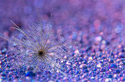
For 2022, Pantone has selected Very Peri as Color of the Year. Very Peri is a shade of blue with violet undertones that Pantone describes as “displaying a carefree confidence and a daring curiosity that animates our creative spirit”.

Pantone’s Color of the Year (source)
“As we move into a world of unprecedented change, the selection of PANTONE 17-3938 Very Peri brings a novel perspective and vision of the trusted and beloved blue color family, encompassing the qualities of the blues, yet at the same time with its violet red undertone, PANTONE 17-3839 Very Peri displays a spritely, joyous attitude and dynamic presence that encourages courageous creativity and imaginative expressions.”
– Leatrice Eiseman, Executive Director of The Pantone Color Institute
Get millions of stock images and videos at the best price
Unlimited access. No attribution required. Starts at just $9/month.
Learn about more current trends:
Incorporating Very Peri Into Your Work
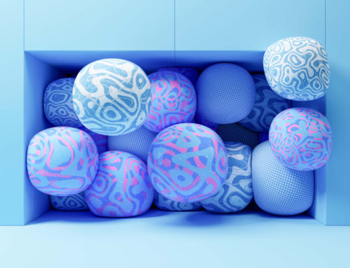
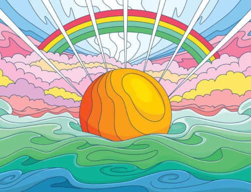
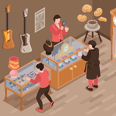
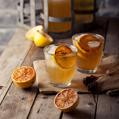
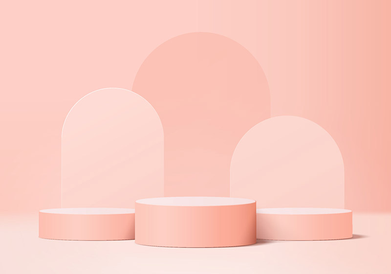
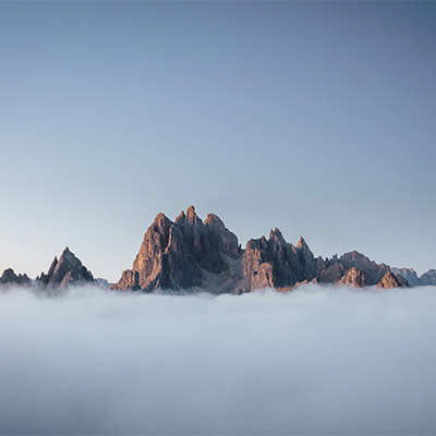
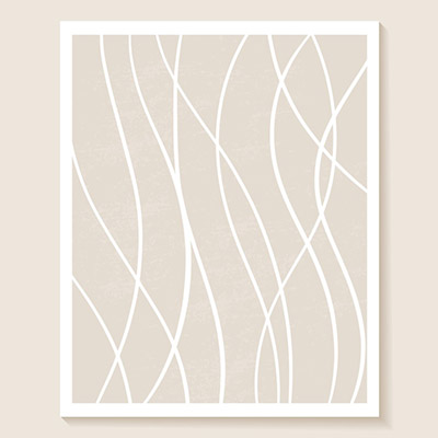
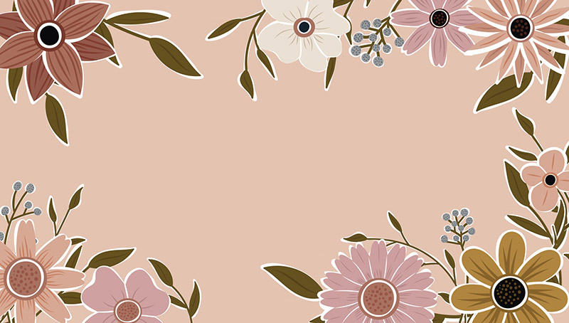
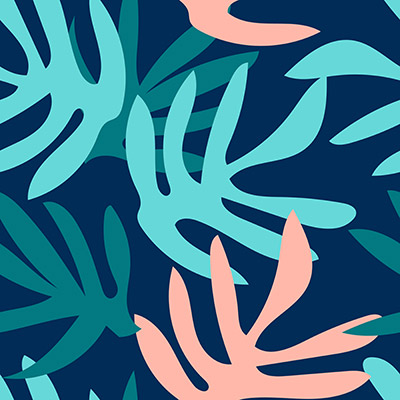
If Very Peri would be a good fit for a project you’re working on, one of the best and easiest ways to incorporate it into your work is to use pre-made elements like vectors and stock photos that already feature Very Peri, or a similar shade. Here at Vecteezy, we make it easy to search for vectors and photos by color. When you search our site, you can filter the search results by color. Simply use the color wheel to select the color you want and you’ll see only resources that include or feature that color.
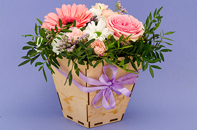
Here are some examples of the resources you might find if you filter the search results for Very Peri.


More Color Trends for 2022
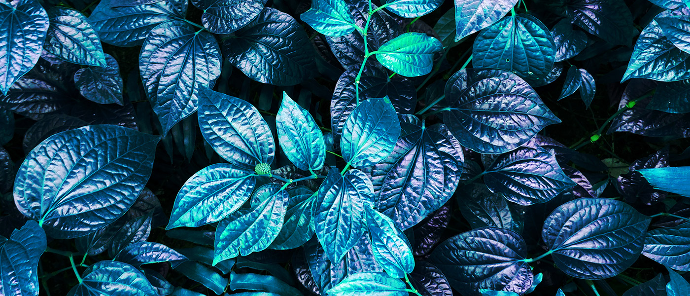
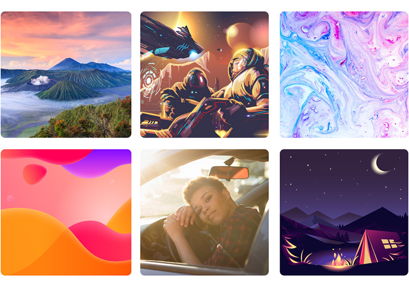
While Pantone has named Very Peri its Color of the Year, there are some other trending colors worth pointing out as well. Here are some of the currently trending colors that we expect will continue to gain popularity in 2022. You’ll also see some sample resources available from Vecteezy that feature each of these colors. If you want to use any of these colors in your own designs, download the resources that meet your needs.
Guacamole
Guacamole (named by Glidden as Color of the Year for 2022) is a rich green with yellow undertones. It’s going to be a color to watch in 2022 as it can make a bold statement and create energy. Use this striking color for designs that you want to stand out. Or, use it sparingly as an accent or highlight color.


Earthy Brown
Earthy brown is a great color for projects that are earthy, natural, or organic. As a neutral color, it can be used in almost any design without clashing with other elements or colors. It works well as a background or complement to many other colors, including guacamole.


Citron
Citron is a shade of yellow. While it’s not an extremely bright shade like lemon yellow, citron still brings plenty of energy and excitement to a design with a nature-inspired look. It works well with a variety of other colors, both subtle and bold.


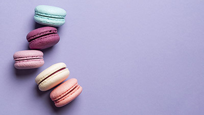
Soft Melon
Soft melon is similar to pink but with orange undertones, and it can bring some warmth to your design. It can be used as a neutral color and works well as either a primary or accent color. While soft melon is tranquil and soothing, it also brings more life and energy than a typical neutral color.


Gray-Blue
Gray-blue is a pale shade that’s tranquil and promotes rest and relaxation. It can be used with other colors in the blue spectrum for designs that are calming. Or, pair it with warmer colors like soft melon for a unique color scheme.


Alabaster
Alabaster is another pale shade, but this one’s more neutral than gray-blue. It’s often described as soft and serene with a calming effect. Alabaster pairs well with just about any other color and it is excellent as a light background.


Sage Green
Sage green is another color for projects that are organic, natural, or earthy. It’s a subtle color but can have a more powerful impact in your designs than a neutral color.


Tame Teal
Tame teal is a light shade of blue that’s frequently used as an accent color. It’s soft and soothing but also brings energy. If you’re looking for an understated color that is not dull or boring, tame teal could be an excellent choice.


Pale Brick
Pale brick is a muted color that’s often described as soft and transitional. Like soft melon and citron, pale brick can be used as a neutral color that plays a complementary role in your color scheme. It’s relaxing but not boring, and subtle but still able to make a powerful statement.
Navy Blue
Navy blue is a rich and bold color, but it can still be used as an accent or highlight to complement other colors in your design. It makes a statement when paired with the right complementary colors.

Final Thoughts on the Color Trends of 2022
Many of the trending colors for 2022 are subtle and understated. When you’re creating a color scheme, be sure to consider these trends. And as you’re searching for creative resources like vectors and photos to use in your designs, you’ll love the color filter that narrows down the Vecteezy search results. Creating on-trend designs will be easier than ever before with the help of this guide.
Lead photo by Wasan Prunglampoo.