Color is an integral part of design, marketing, and branding. You can use specific colors to communicate a message or evoke emotions in viewers.
Choosing the right colors can be a difficult process. That’s why we’ve compiled this blog post to help you learn about the psychology of color and how it impacts your marketing, branding, and design projects. We’ll discuss what different colors mean and provide tips for designers who need to pick the perfect colors for their projects.
What Is Color Psychology?
The psychology of color considers the ways that different colors impact perceptions and emotions. Each color tends to affect viewers in a specific way, so it’s essential to understand these impacts when choosing a color scheme for your design project or a brand’s image.
Color is a visual element that can communicate a message or evoke emotions. When choosing colors for your projects, you need to consider how people might respond to specific colors to choose the right ones.
By considering the psychology of color and choosing wisely, your designs will be more effective at evoking the feelings and emotions you’re after.
The psychology of color is a somewhat complicated topic because personal perceptions and feelings can vary from one person to the next, but there are some generalizations we can use.
The Meaning of Colors
Let’s look at some specific colors and the psychological impact they tend to have on viewers.
Get millions of stock images and videos at the best price
Unlimited access. No attribution required. Starts at just $9/month.
Red

Associated with passion, desire, excitement, power, aggression, danger, anger
Red is the color of both love and anger. It’s associated with feelings like passion, desire, blood, war, and sometimes death.
Red can be used to attract attention or convey danger in a warning sign because it’s eye-catching. However, too much red may feel overwhelming.
The attention-grabbing nature of red also makes it an excellent choice for calls to action (like buttons on landing pages).
Orange
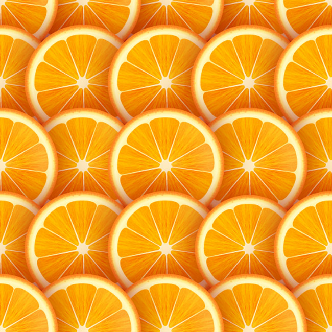
Associated with happiness, optimism, friendliness, confidence, enthusiasm, rejuvenation, caution
Orange is cheerful and optimistic. It’s associated with feelings like warmth, happiness, and energy.
It’s similar to red but gentler and less extreme. Orange can be used to evoke creativity or comfort in an audience because it feels cozy.
Yellow
Associated with warmth, clarity, brightness, energy, frustration, anger
Yellow is an intense color that may generate strong feelings. It brings to mind both sunshine (which makes us happy) and caution signs (with the warning that something dangerous lies ahead).
Yellow is generally uplifting and cheery, but too much yellow may cause anxiety or apprehension. It’s a color you want to use in moderation, as it can cause visual fatigue.
Green

Associated with nature, growth, peace, organic, health, fitness, outdoors, money, safety, security, luck, envy
Green is the color of nature, growth, and renewal. It’s also associated with safety.
People may be drawn to green because it represents something that’s natural and sustainable. Therefore, the color can give off a calming effect, especially in natural shades, which makes it ideal for many corporate brands.
Aside from nature, green can also represent money or financial success.
Blue

Associated with trust, security, loyalty, dependability, reliability, strength, maturity, calmness, sadness
People often associate the color blue with trustworthiness and dependability. Therefore, blue is an excellent choice for corporate brands, especially those related to healthcare or technology, because blue is calming yet trustworthy at the same time.
Overall, blue is a safe and non-threatening color that has a traditional feel. However, blue can also create feelings of sadness.
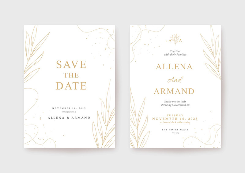
Purple
Associated with royalty, luxury, creativity, wisdom, imagination, power, bravery, spirituality
Purple is often associated with creativity, royalty, luxury, or spirituality. It’s a color that has rich history and meaning across cultures. Purple dye was at one time very rare and expensive, which is why it was limited to use by royalty and the wealthy. To this day, purple still envokes feelings of royalty or wealth.
The use of purple may also convey wisdom or bravery. In many cultures, purple represents courage or power.
Pink
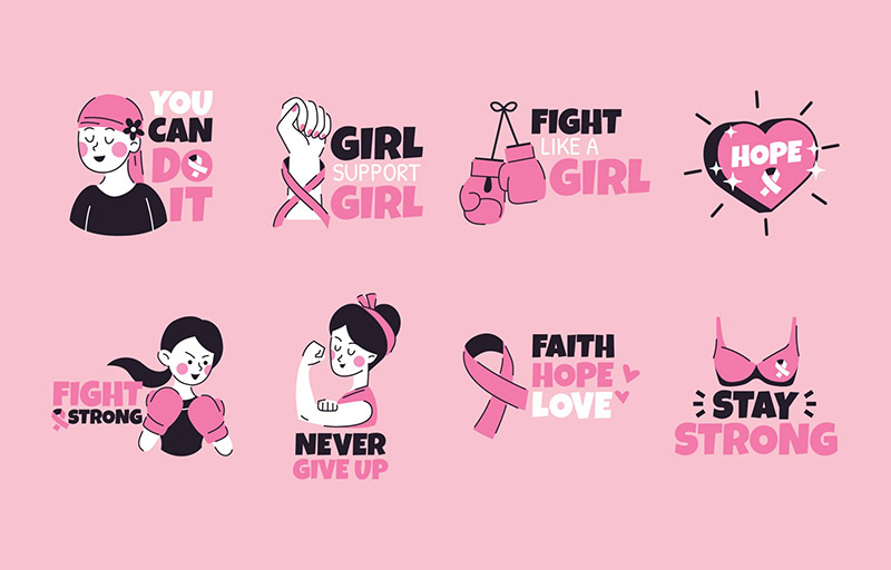
Associated with love, romance, femininity, kindness, compassion, sincerity, calmness, joy, youth
Pink often creates feelings of love and romance. Pink also has feminine associations, making it the perfect choice if you’re looking to create something that targets a female audience. However, pink is often seen as too juvenile for some brands.
Brown

Associated with nature, ruggedness, security, strength, comfort, dependability, reliability, security, loneliness, isolation
Brown conveys reliability and stability because of its connection with nature and the earth itself. People may also associate brown with warmth. It’s practical and stable, but not overly exciting.
Black
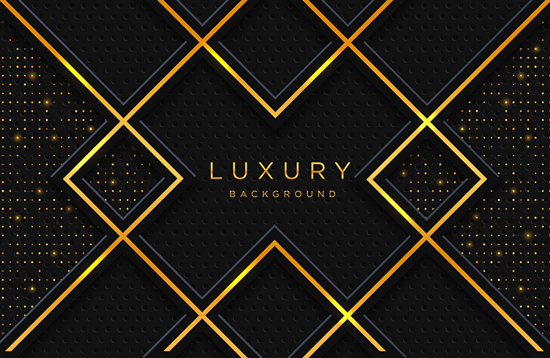
Associated with elegance, luxury, mystery, boldness, power, unhappiness, evil, anger, death
Black creates feelings of elegance and sophistication. It’s often used in the fashion industry, but it can also be found in the branding of many luxury or upscale products. Brands that want to convey a sense of high-end quality may use black as one of their primary colors because of its elegance and boldness.
However, black can also have negative connotations related to evil or death. For this reason, it’s essential to carefully consider your brand message before using black as one of your key colors.
White
Associated with purity, innocence, cleanliness, safety, peacefulness, honesty, emptiness, coldness
The color white is associated with purity, cleanliness, and innocence. Therefore, it’s suitable for medical brands such as hospitals or healthcare companies and religious organizations like churches.
However, on the negative side, white can be seen as cold or bland and lacking personality.
The Impact of Cultural Differences
Before choosing a color, it’s important to consider your target audience because colors have different meanings in different cultures. The descriptions above are generalized for most western audiences, but cultural differences can significantly impact the perception of a particular color.
For example, white is associated with innocence or purity in most western cultures, but in China, white represents death. So if you’re designing for a different culture, be sure to research the meanings of colors based on your target audience.
Final Thoughts
Color is a critical aspect of any design project since colors are so powerful for creating and influencing emotions. Therefore, be sure that you’re considering the psychology of color whenever you’re creating a color scheme. By using the psychology of colors to your advantage, you’ll be able to position your design or your brand appropriately and as desired.