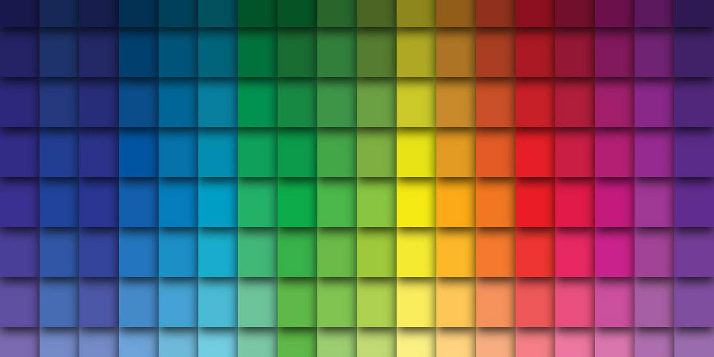
Color is an essential tool for graphic designers. There are many ways that color impacts your work and the people who view it. Colors are important to make a design visually appealing and invoke feelings and convey messages, even if done subtly.
Because of the massive impact of colors, choosing the right colors is a critical part of the design process. While there are many ways to select a palette, one option is to use an online color palette generator for assistance.
The best color palette generators are excellent tools that can spark creativity and provide inspiration. There are several options. Some work differently than others, but in each case, the purpose is to provide you with ideas and possibilities that help you create a compelling color scheme for your design.
Why Use a Color Palette Generator Tool?
While it’s possible to develop a color scheme on your own through trial and error, many people find it much easier and faster to use an online palette generator. You’ll be able to quickly see lots of different possibilities and preview how various colors work together. You’ll get ideas for color combinations that you hadn’t considered, and ultimately, you’ll be able to create a suitable color scheme faster.
Types of Color Palettes
Before using a color scheme designer, it’s helpful to understand the main types of color combinations. Some color palette generators use the terms listed below, so it’s beneficial to know what they mean before using the tools.
Monochromatic
A monochromatic color scheme uses variations of the same hue or family. For example, a monochromatic color scheme might include a few different shades of green.
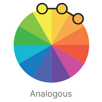
Analogous
An analogous color palette features colors (often three colors) next to each other on the color wheel. Since they’re adjacent colors on the wheel, they’re somewhat similar and work well together.
Get millions of stock images and videos at the best price
Unlimited access. No attribution required. Starts at just $9/month.
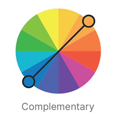
Complementary
Complementary palettes use colors that are opposite of each other on the color wheel. For example, blue and orange make a complementary color scheme because they’re opposite each other on the color wheel.
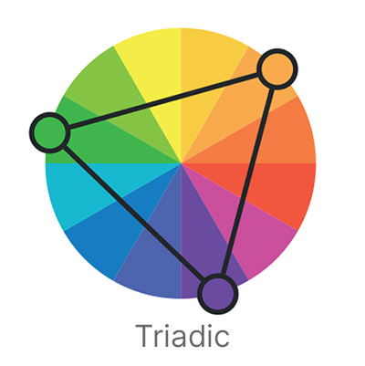
Triadic
A triadic color palette uses three equidistant colors on the color wheel, which tends to create a pleasing combination.
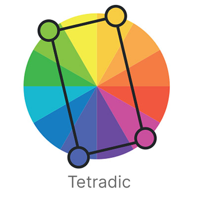
Tetradic
Also known as “double complementary,” a tetradic color scheme includes two sets of complementary combinations. With a total of four colors, there are two sets of colors that are opposite each other on the color wheel.
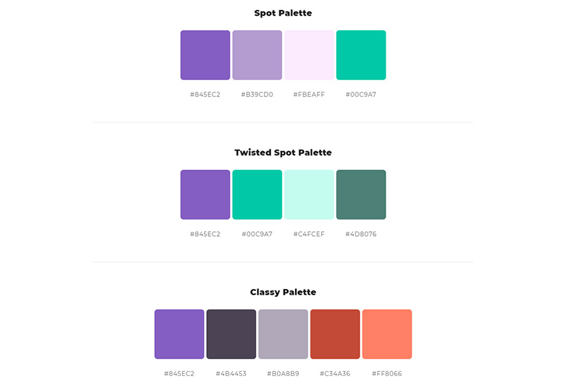
How Many Colors Should Be In Your Palette?
There’s no exact answer to how many colors you can or should use in your color scheme. However, it’s important to note that using too many colors can make the design seem unbalanced and cluttered. If you’re looking for a general guide to follow, stick to the three colors. With three colors in your palette, you can create a pleasing result without going overboard. However, if you wish to experiment with more than three colors, try using tints, shades, and tones for each of your original color choices. This way, you can incorporate more variety but still maintain a sense of order and uniformity.
The Best Free Color Palette Generators
Here are our favorite color scheme generators you can use to explore countless creative possibilities. These tools will help you create the perfect color palette for your next design project.
1. Coolors
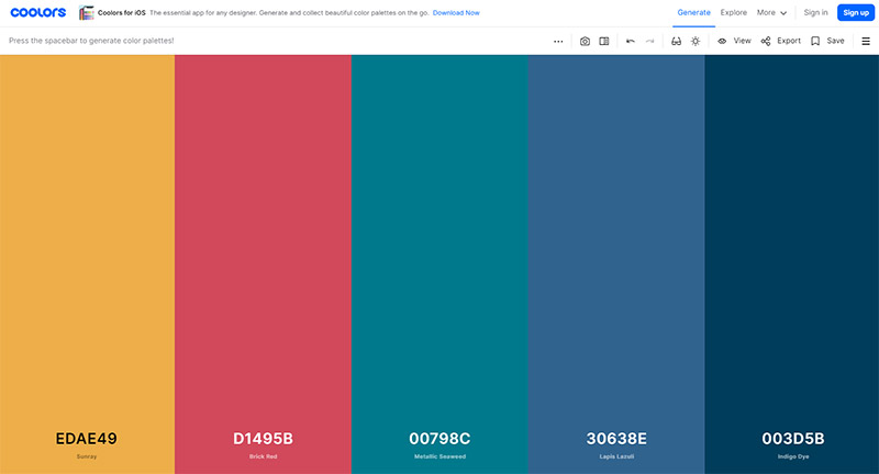
Coolors gives you lots of possibilities. You can have it generate random color palettes. Keep hitting the space bar to have a new palette generated. This is a speedy way to view lots of options, and you can save the palettes you like so you can come back to them later. You can tweak the results of any palette by adjusting hue, saturation, brightness, and temperature sliders. You can even test any color scheme for potential issues for viewers with color blindness.
You’ll also have the ability to create specific types of palettes. Using a dropdown, you can select monochromatic, analogous, complementary, split complementary, triadic, and tetradic if you have something specific in mind. If none of these options are set, Coolors will generate all different types of combinations.
Instead of using the tool to generate a new color scheme, you can browse trending palettes that other users have saved. Of course, you can save any of these palettes from the library or open them in the generator to make adjustments.
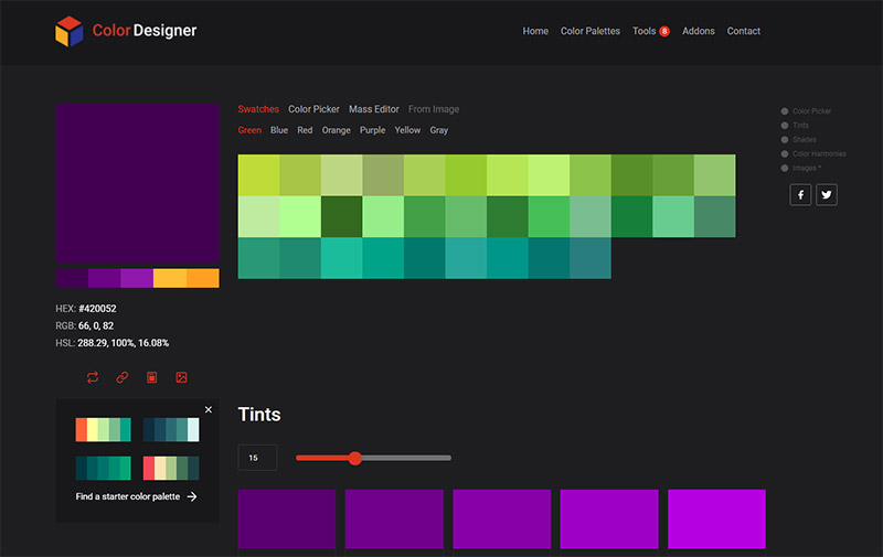
2. Colormind
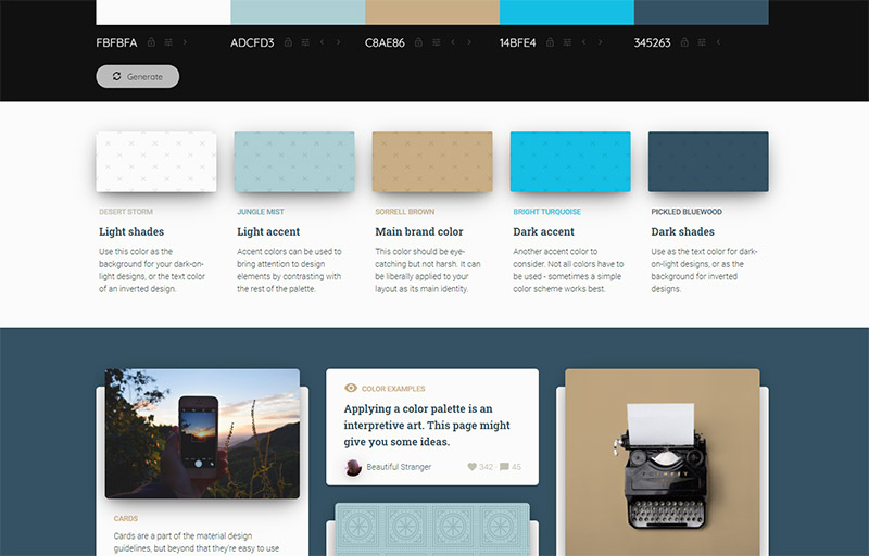
Colormind shows different color schemes on the homepage at random. Click the “generate” button to see more options. You can edit all the generated colors with a color picker to easily customize the results. If you know one of the colors you want to include in your palette, you can lock that color and have Colormind generate a palette to go with the locked color. You can also lock more than one color if you want. This approach is helpful when you’re experimenting because you may come across a few colors you like, but others included in the palette aren’t precisely what you want. Colormind allows you to lock the ones you like and keep working to refine the rest of the palette.
Web and UI designers will love Colormind. In addition to generating color palettes, you can instantly view how these combinations would look on a sample landing page template (as shown in the screenshot above).
Optionally, you can upload a photo or image to use as the basis of a color palette. Instead of simply showing you the colors included in the picture, Colormind will attempt to generate a pleasing palette that corresponds to it.
3. Paletton
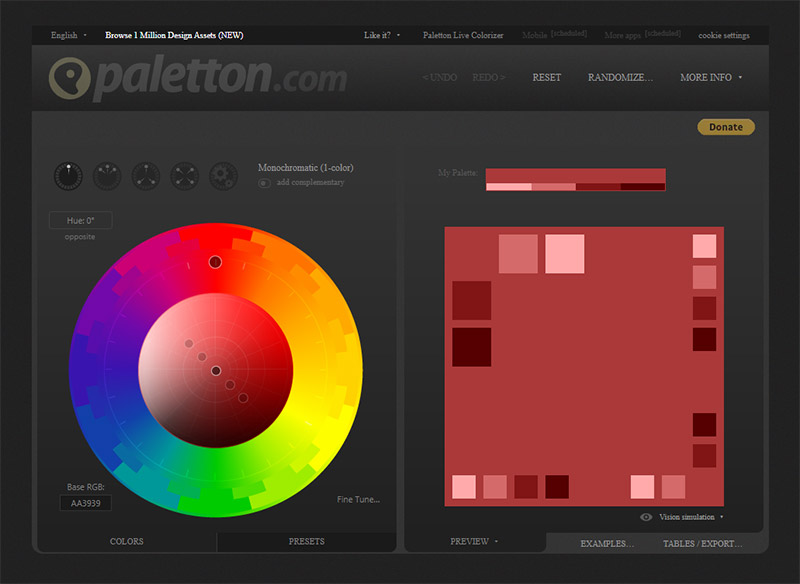
Paletton is one of the more advanced color palette generators. The interface can be a bit intimidating at first because it’s not immediately clear how Paletton works.
You can use Paletton to generate monochromatic, analogous, triadic, tetradic, and “freestyle” color schemes and palettes. Start by selecting the type of palette you want to develop using the icons above the color wheel. Next, you’ll drag one of the points on the color wheel, and the other points will adjust accordingly. Another option is to click to see presets of palettes based on the colors currently selected.
4. Mudcube
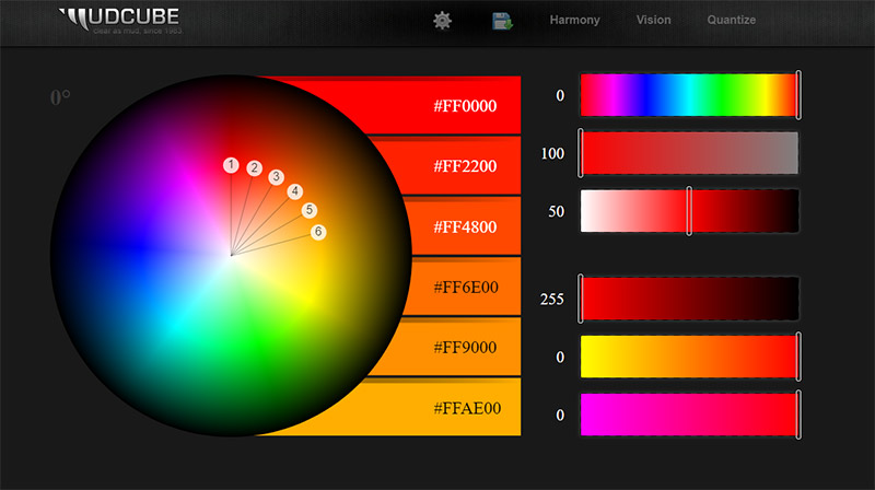
Mudcube is an interactive color-picking tool that may feel a little intimidating when you first arrive at the site, but it’s pretty easy to use once you get started. You can drag one of the points on the color sphere, and Mudcube will automatically adjust the other points to create an effective color scheme. You can see the color codes in use at any time.
There are several different options you can select. For example, you can set it to harmony, clash, analogous, complementary, split complementary, triadic, tetradic, four-tone, five-tone, or six-tone. You can also see the color palettes as a colorblind viewer would see them, and you can see the websmart and websafe colors.
5. ColorSpace
If you already know your primary color and you’re looking to build a palette around it, ColorSpace is the perfect choice. You’ll start by entering the six-digit hex code or using the color picker to select your base color. ColorSpace will then go to work and generate several different types and styles of palettes that complement your chosen primary color. The tool is very easy to use and quickly provides you with several options. It’s one of the most straightforward and user-friendly tools on this list.
ColorSpace also provides other tools that generate CSS code for two or three-color gradients.
6. Color Designer
Color Designer offers several different free online tools, including a palette generator. You can view existing palettes in various categories like the primary color or theme (warm, cold, vintage, etc.). When you view one of the palettes, you can change any of the colors included or browse different tints and shades of the color.
In addition, Color Designer also offers a handy gradient generator. Finally, you may also appreciate the Figma plugin that allows you to use Color Designer directly in Figma (see our favorite Figma plugins here) with no need to export anything.
7. Color Hunt
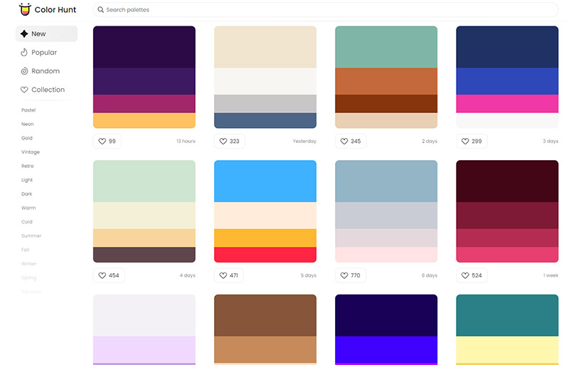
Color Hunt allows you to browse and save popular pre-made palettes or generate your own. You can browse the color palette gallery by categories, such as retro, pastel, and neon. Color Hunt also lists and displays new palettes that have been created recently or browse random palettes. When you click on any of the color palettes in this collection, you’ll see the specific colors included, as well as tags. Click on any of the tags to see additional similar color schemes.
8. Khroma
Khroma is a unique tool that generates color palettes using artificial intelligence. It starts by asking you to select 50 colors that you like. Then, it will create color combinations, palettes, and gradients for you with appropriate harmonies. You can also save the ones you might want later. Unfortunately, Khroma does not give you options to generate your own custom color palette, but it’s a fun tool to play around with and get some inspiration.
9. ColorHexa
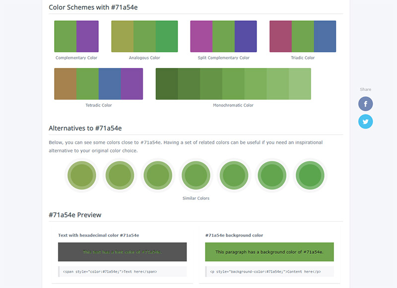
ColorHexa is a valuable tool if you already have a primary color in mind for your palette. You’ll enter the six-digit hex code for the primary color, and ColorHexa will provide suggested color palettes that are analogous, complementary, split complementary, triadic, tetradic, and monochromatic. You’ll also see some similar alternatives to your primary color, shades and tints, a color blindness simulator, and more.
10. BrandColors
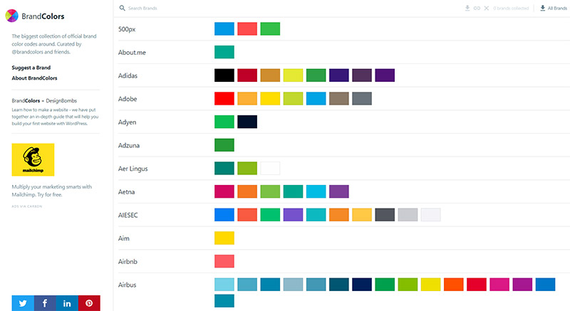
BrandColors is much different from the other tools covered here because it doesn’t help you generate your own unique color scheme. Instead, you can view the colors used by hundreds of popular and recognizable brands. The colors are presented visually, and if you hover over a color, you’ll see its six-digit hex code. If you click on the color, the code will be copied to your clipboard.
BrandColors is useful for getting ideas and seeing the exact colors popular brands use, but you’ll want to make tweaks and adjustments rather than directly copying someone else’s color scheme.
Tips for Picking a Color Scheme
When you’re ready to develop a color scheme, here are tips you can follow to make it an effective process.
Consider the Psychology of Colors
Every color creates a different psychological impact on viewers. Therefore, it’s essential to consider color psychology when choosing your palette. The psychological effect of the colors you choose should correspond to the branding or messaging of the product.
For example, blue invokes feelings of trust, dependability, and reliability. Businesses in industries like banking, finance, insurance, and law often use blue because it’s vital for customers and clients to feel safe.
Think About Your Branding
Going hand-in-hand with the psychology of color, it’s equally important to understand how you want your brand to be viewed (or how the client wants their brand to be viewed). How do you want customers to see you, and what feelings do you want to create with the color palette? What is your brand’s personality or identity?
The psychology of color plays a role here, but there’s also more to it. Do you want a traditional color scheme that can be used with your brand assets for years and decades to come? Do you want a more modern and trendy color scheme that will appeal to a younger audience? Do you want to use colors to differentiate your brand from competitors?
Start with a Primary Color
Most brands have one primary color in all of their branding. Therefore, it’s helpful to start creating a color scheme by deciding on that base color. You can then use handy color palette generators to find secondary colors that work well with the primary color and provide adequate contrast.
Optionally, you could narrow down the possibilities to a few different primary colors and see what color palettes you can come up with for each one. Then, pick the one that works the best.
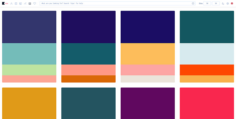
Consider Color Trends
There are always trends related to the prevalent ways we use colors. Therefore, it’s helpful to consider color trends to see if they can be implemented into your color scheme. See our Guide to Color Trends here.
Try Lots of Combinations
Developing a color palette involves a lot of trial and experimentation. That’s one of the reasons why online color palette generators are so helpful because you can see lots of different possibilities quickly.
It’s unlikely that you’ll come up with the perfect color scheme on your first attempt. You’ll need to test lots of combinations, see what works well together, and make adjustments as needed. Don’t be afraid to experiment.
Final Thoughts
Try the options covered here, and you’re sure to find a color tool that helps generate an effective palette for your project. These resources are helpful for professional designers, hobbyists, and business owners looking to create a pleasing and effective color palette.
For more design tips, please see:
Lead image by happymeluv.