6 Web Design Basics for Good Website Development
Creating an effective website requires following fundamental design principles to craft an aesthetically pleasing and highly functional result. Whether starting a site from scratch or revamping an existing one, incorporating essential web design fundamentals is vital to building an attractive, user-friendly, and professional site.
A website's design directly impacts user experience and business goals. An engaging, well-designed site draws in visitors, converts them to customers, and boosts sales. However, aesthetics should never take priority over usability and functionality. A beautiful website is useless if users find it challenging to navigate or cannot easily access critical information and features.
Vital elements of exceptional web design include:
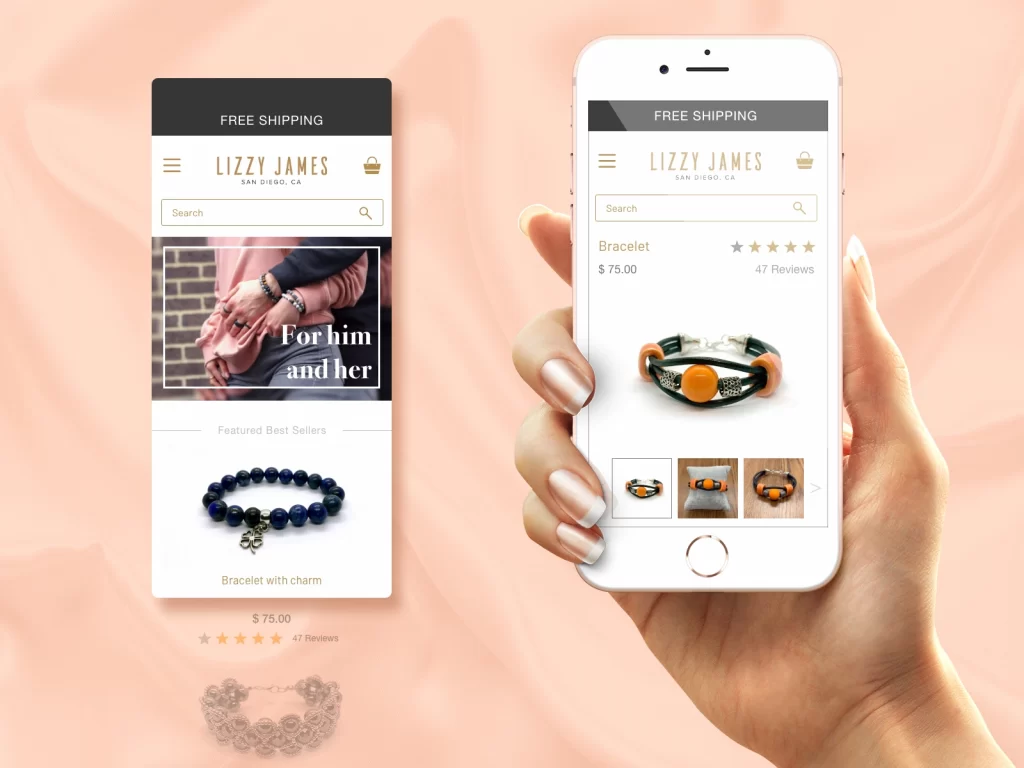
- Responsive design – The site adapts seamlessly to any screen size, providing an optimal viewing and interaction experience across desktops, tablets, and mobile devices.
- Intuitive navigation – Menus, links, and site architecture guide users logically through content in a way that matches their expectations.
- Visual hierarchy – Establish a clear focal point and rhythm by strategically using fonts, colours, spacing, and other elements that visually distinguish and organise content.
- Quality images – Photos and graphics should balance aesthetics and functionality. Images should load quickly, convey purpose, and enhance content.
- Consistent layout – Maintain alignment, proximity, and repetition in design elements across all pages for cohesion.
- Accessible features – Support disabled users through alt text, ARIA labels, colour contrast, keyboard shortcuts, and other inclusive design practices.
- Performance optimisation – Site speed and responsiveness are maximised through techniques like minification, compression, caching, and efficient code.
Mastering the fundamentals of excellent web design principles establishes a solid framework for building an engaging website that effectively serves its purpose and users.
Table of Contents
Web Design Basics to Follow

1 – Usability
Usability is a critical component of effective web design in the modern era. While usability has been studied for decades in fields like human-computer interaction and ergonomics, it has taken on even greater importance with the proliferation of websites and web applications in the 21st century.
At its core, usability refers to how easy and efficient a website or application is to use. A usable website has interfaces and interactions that are intuitive, learnable, and memorable for users. Critical aspects of usability include:
- Learnability: How fast can a new user accomplish tasks the first time they visit the site? Can they operate the interface efficiently after learning it once?
- Efficiency: How quickly can users perform tasks and find information on the site? Minimising the steps for everyday tasks improves efficiency.
- Memorability: If a user leaves and returns to the site after some time, can they remember how to use the interface? Intuitive navigation and consistency help with memorability.
- Errors: The site should have low error rates and allow easy recovery from any mistakes. Users should not make errors due to the design.
- Satisfaction: Is using the website subjectively pleasing for users? This includes having an aesthetically pleasing design.
Achieving usability requires carefully considering the target users' goals, abilities, and contexts. Extensive user testing is essential to uncovering usability issues and iteratively improving the design. Users will go elsewhere if a website is difficult and frustrating to use. On the other hand, high usability leads to increased user engagement, loyalty, and conversion rates. With the abundance of choices online, usability is no longer optional – it is essential to surviving and thriving on the modern web.
For instance, take a look at this page: https://www.cinchhomeservices.com/faq-library/-/faq/home-warranty-Maryland. You can see the usability priority in design.
2 – Interactivity
Interactivity is critical to modern digital experiences, enabling two-way communication between people and technology. On websites and apps, interactivity allows users to actively engage with content instead of passively consuming it. This creates a more dynamic, immersive experience while providing valuable insights into user behaviour and preferences.
At its core, interactivity enables meaningful dialogue and exchange between users and technology. Whenever you click a link, fill out a form, play a video game, or react to a social media post, you interact with technology in a two-way flow of information. Brands leverage interactivity in websites, apps, and social platforms to better understand and serve their audiences.
There are many ways to bake interactivity into digital experiences. On websites, features like menus, hover effects, animations, and embedded media make static pages feel dynamic and reactive to user input. Games and quizzes provide entertainment while collecting data on preferences. Chatbots simulate conversation to guide users. Social media facilitates global interactions between people mediated by technology.
Interactivity not only improves user engagement, it also enables personalisation. The data gathered from interactive elements can be used to customise and tailor experiences to specific individuals. For example, an ecommerce site can serve product recommendations based on past purchases and interactions.
When designing for interactivity, colour can be used to guide the user experience effectively. Monochromatic colour schemes utilise different shades and tints of one hue, creating visually cohesive interfaces. Complementary colours on opposite sides of the colour wheel provide high contrast for drawing attention to interactive elements like buttons and menus.
Thoughtful use of interactive features creates more rewarding, tailored user experiences while providing brands valuable insights into their audiences. With mindful colour choices, interactivity can be emphasised and harmonised in digital interfaces. By facilitating engaging two-way dialogue between people and technology, interactivity remains an essential ingredient of modern digital experiences.
3 – Visual Elements

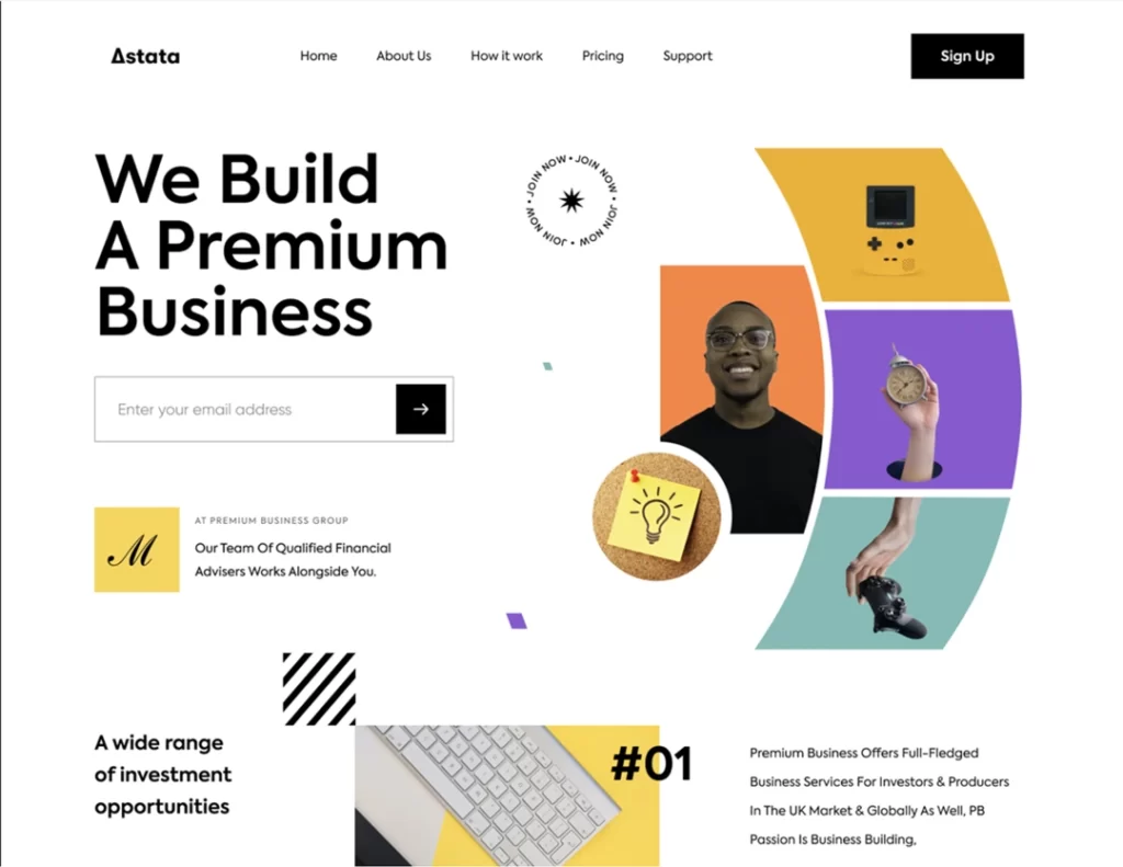
Visual elements are critical to effective web design, as they establish aesthetics, enhance usability, and communicate brand identity. Careful use of colour, whitespace, typography, and imagery creates cohesiveness across web pages while optimising the user experience.
Colour choice directly impacts site visitors emotionally and psychologically. Blues and greens elicit trust and security, while reds and oranges convey excitement and intensity. Selecting colours that align with your brand personality and resonate with your target audience is vital. Additionally, ensuring adequate contrast between text and backgrounds enhances readability.
Whitespace, or negative space, allows web content to breathe. Strategic use of padding and margins prevents dense blocks of text that are visually unappealing and difficult to digest. Whitespace also contributes to faster page loading by reducing visual clutter. Ample whitespace focuses on essential elements like headlines, call-to-action buttons, and hero images.
Typography establishes hierarchy, rhythm, and tone. Pairing complementary fonts with styles like bold and italic creates visual interest. Fonts with styles like bold and italic make visual interest: legible body text and prominent headlines aid scanning and comprehension.
Finally, compelling imagery immediately captures attention while conveying core messages. Photographs, illustrations, and icons should align with branding and subject matter while being professionally executed. Images boost engagement as visual content is processed 60,000 times faster than text.
By artfully incorporating visual elements, web designers shape experiences that inform, inspire, and connect with users. Colour, whitespace, typography, and imagery transform flat pages into aesthetically pleasing, highly functional digital environments.
4 – Grid System
Grid systems are an integral component of modern website design and development. They provide structure, alignment, and visual consistency across layouts, serving as the framework for the rest of the design. Grids help create order amid the chaos of a complex digital product by imposing columns, rows, and gutters to organise content logically.
A grid gives a website coherence and elevates the user experience. Thoughtfully composed grids make navigation intuitive by establishing clear pathways for scrolling and scanning. They also lend websites a polished, sophisticated aesthetic appreciated by users. Grids can be flexible and responsive, adapting layouts seamlessly across desktop, tablet, and mobile displays. This ensures site visitors encounter an optimal viewing experience regardless of their device.
Several typical grid types exist, each with their advantages. Column grids divide space vertically into columns of varying widths. Modular grids use columns and modules of equal size for maximum consistency. Hierarchical grids employ different column sizes to denote importance and relationships. Baseline grids align type and page elements to a typical grid for a unified look.
Designers employ time-tested techniques like the rule of thirds and the golden ratio to give grids mathematical harmony. The rule of thirds splits designs into thirds vertically and horizontally, providing aesthetic balance. The golden ratio uses proportional relationships to create organic, natural layouts. Both techniques help designers determine where to place page elements within grid structures.
As we design and develop digital products in 2023 and beyond, grid systems will continue to provide the backbone of visual design. Their flexibility and functionality allow designers to craft beautiful, usable experiences that stand the test of time.
5 – Fluid Layouts
Fluid layouts, which rely on percentages rather than fixed pixel widths, are often considered more user-friendly than set structures because they adjust to each user's screen resolution. However, fluid layouts require special skills to implement appropriately. If not designed well, fluids can create problems such as excessive white space on larger screens or distorted, illegible content on smaller screens.
A key advantage of fluid layouts is responsiveness – the ability to adapt seamlessly to various screen sizes. By using relative units like percentages or em units instead of fixed pixels, fluid layouts can shrink and expand to fill the available space. This provides a more optimised experience for users, no matter their device.
However, fluids do lack the precision and control of fixed layouts. Pixel-perfect alignment is harder to achieve when elements are sized relatively. Fluids may also be more prone to content overflow issues when font sizes or other aspects are increased. Customers resizing text could lead to pages becoming overcrowded or important content being pushed outside the visible area.
Proper use of media queries can help mitigate these risks. Setting breakpoint rules allows developers to control which CSS styles apply at which screen widths. So while a fluid approach is used overall, fixed pixel layouts can be employed at specific sizes to enforce constraints. Similarly, alternate content display and flow can be defined for different devices.
In summary, fluid layouts provide flexibility but lack accuracy. With careful design and testing across screen sizes, the advantages of a fluid approach can be retained while avoiding potential pitfalls like distortion or overflow. Implemented well, fluidity promotes a more seamless user experience across devices.
6 – Imagery

Visuals are essential for communicating a brand's identity and conveying complex ideas. Imagery that aligns with a company's mission and values can connect with users on an emotional level. When thoughtfully incorporated into websites and marketing materials, photos, illustrations, icons, and videos create engaging experiences that bring delight.
For example, an outdoor apparel company can showcase scenic landscapes that inspire adventure. A nonprofit fighting world hunger might use poignant images of needy families, highlighting their important cause. Even simple iconography can clarify complex processes, like using step-by-step illustrations to demonstrate how to assemble furniture or prepare a recipe.
Strong visuals make information more digestible. Research shows that we process images 60,000 times faster than text. When coordinated with well-written copy, imagery can tell a story and make abstract concepts tangible.
Beyond visual identity and messaging, images play a vital role in web design. Layouts, grid systems, colour schemes, fonts, and other elements shape a website's look and feel. Thoughtful design provides an accessible user experience and allows vital information to shine.
Consider how white space conveys openness versus crowded layouts that overwhelm. Simple, readable fonts improve scanability, while links coloured to contrast text are easier to spot. Visual hierarchy draws the eye to essential headings and calls to action. Responsively designed sites tailor the interface for mobile vs desktop.
Every design choice informs the user experience. Photography, graphics, and careful layouts create visually appealing sites that communicate clearly. When paired with solid branding, web design empowers businesses to connect with users and share their vision.
Wrapping Up
A well-designed website is crucial for any business to establish an online presence. Following fundamental web design basics like clear layout, easy navigation, compelling visuals, and accessible content, you can create a site that effectively engages users and supports your business goals.
While good web design requires understanding various technical elements, keeping the user experience at the forefront is vital. The six basics we've covered – clean layout, intuitive navigation, quality images, easy scannability, responsive design, and accessible content – provide a solid foundation for crafting a website that connects with visitors and encourages them to take action.
With these core elements in place, you can layer on more advanced features and functionality to take your site to the next level. But always view your website through the eyes of visitors and continually refine the design to make their experience as seamless as possible. You'll develop a site that attracts, engages, and converts your target audience by focusing on user needs.
