The Role of Heatmaps in Optimising a Website Design
In our digital age, the competition for website traffic is fierce, and standing out requires more than just a great product or service. The key? Optimising your website design to provide an unparalleled user experience.
Imagine having a ‘superpower' that lets you see exactly how your site users interact with your website. Exciting, isn't it? That's precisely what heatmaps offer. A heatmap is your behind-the-scenes detective, unearthing valuable insights about your web pages. It's like a GPS, guiding your design decisions and helping you avoid unnecessary detours or dead-ends.
With over 64.6 per cent of the global population using the internet, understanding how your audience navigates your site can give you a massive advantage. Read on, and let's uncover the fascinating role of heatmaps and how they can supercharge your website design.
Table of Contents
What are Heatmaps?

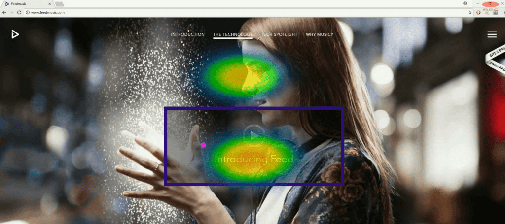
In the simplest terms, the heatmap definition is the ‘thermal images‘ of your website's user activity. Have you ever seen a thermal image with colours from blue to red representing different temperatures? That's what a heatmap does for your website, but instead of temperature, the colours represent mouse clicks, scrolls, or attention spans on various sections of your web pages.
At first glance, you'll notice a rainbow of hues splashed across your web page. Deep red zones signify areas garnering the most attention, transforming to cooler blues to indicate less engagement. These vibrant shades are not just for aesthetics; they are invaluable data visualisations.
Imagine being the Sherlock Holmes of your website, with the ability to dissect every nook and cranny of your user's journey. Website optimisation using heatmaps provides this ‘X-ray vision', revealing patterns, trends, and otherwise invisible behaviours.
So, are heatmaps some fancy, new-age tool? Not quite. They borrow their roots from statistical graphics and carry the legacy into the digital realm. Through heatmaps, data isn't just understood—it's experienced. A heatmap is your portal to visualising and understanding your users' digital footprint.
Benefits of Using Heatmaps in Web Design
Fuel your digital success story with heatmaps! They're not just pretty pictures but powerful tools to illuminate your user's path. Unearth hidden patterns, sharpen your design strategy, and boost your website's performance, all with the help of these colourful depictions of data. Here's why the importance of heatmaps in web design is paramount:
Improving user experience (UX)
Harnessing heatmaps, you can tailor a truly memorable user experience. They shed light on areas where users linger and those they bypass. With these insights, you can refine your design. Tricky navigation? Simplify it. Engaging content? Highlight it. Remember, a positive user experience can convert casual browsers into loyal customers.
Enhancing content placement
Heatmaps function as a spotlight, brilliantly illuminating the high-traffic sections on your web pages. This knowledge is crucial for strategic content positioning. Place your essential content, riveting blog posts, captivating videos, or compelling calls to action in these ‘hot' zones. This clever manoeuvre ensures your star content grabs maximum attention, captivating audiences and boosting engagement, which is why website optimisation using heatmaps is vital.
Streamlining navigation paths
Navigation paths, represented by cooler zones on heatmaps, unveil the user's journey across your website. These paths often reveal common routes or dead ends. Studying these simplifies and enhances the user's path, turning a maze into a smooth highway. This not only makes your website more accessible but also boosts user retention and engagement. Remember, a well-guided journey can lead to a satisfied customer!
Boosting conversion rates
Heatmaps are your digital crystal ball, predicting your site's conversion potential. They metaphorically highlight your website's ‘hot' and ‘cold' zones. Explore these patterns and identify the elements within the ‘hot' zones that drive user action. This could be an intriguing headline, a compelling call to action, or a captivating image.
Now, strategically replicate these elements in your ‘cold' areas. Witness your conversion rates soar, transforming your website from a digital billboard into an interactive marketplace. Heatmaps are the unsung heroes in the quest for conversion rate optimisation.
Different Types of Heatmaps
Have you ever wondered how to utilise heatmaps to get a 360-degree view of user interaction? In the dynamic world of heat mapping, various types offer a unique lens to view your data.
These various forms are like different flavours in a box of chocolates, each offering a distinct taste of user behaviour. More than just a visual spectacle, they are your detective tools—ready to reveal critical insights on optimising your website.
In the following sections, we'll explore the role of heatmaps and their different variants in detail.
Scroll maps: Uncovering user scroll behaviour

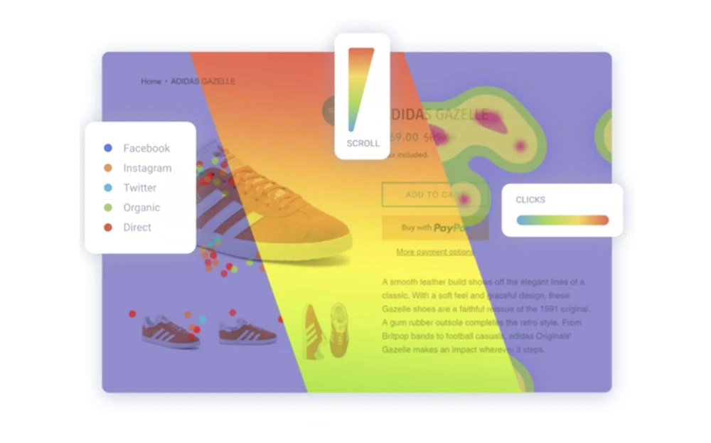
Scroll maps take you on a visual journey of your user's scroll behaviour on your site. Think of it as a thermometer measuring the scrolling temperature. In the ‘hotter' zones, users spend more time scrolling, glowing red in engagement. Conversely, cooler shades represent areas where users scroll past rapidly, indicating less interest.
With scroll maps, you can spot the precise ‘fall-off' point, where user engagement drastically drops, also known as ‘below the fold.' This insight is golden, allowing you to position your key content above the fold strategically. Scroll maps are your secret weapon in the battle for attention, empowering you to keep users hooked, scrolling, and engaged.
Click maps: Discovering what truly engages.

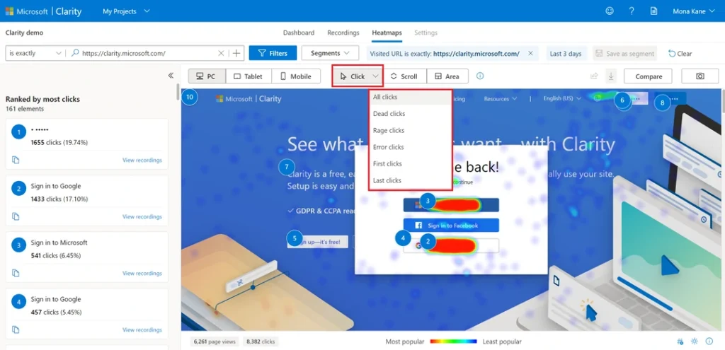
Click maps, as the name suggests, are all about visitor clicks. They're like forensic light sources, highlighting your website's areas that draw the most engagement. Each click on a button, image, or link leaves a ‘thermal trace'. More clicks translate to ‘warmer' areas on the map.
The beauty of click maps lies in their simplicity, providing a straightforward way to measure effective engagement. They help identify ‘click hotspots', the engaging elements that genuinely resonate with your users.
With this insight, you can strategically replicate these elements across your site, driving higher user engagement. Click maps are your roadmap to unravelling what truly captivates your audience.
Move and hover maps: Tracking mouse movements.

Move maps and hover maps add a whole new dimension to data interpretation. Imagine watching your users' every cursor move, tracing those unseen digital trails. That's what move maps offer—a unique bird's-eye view of mouse movements. They highlight the areas where cursors dance, skip, or dash across your website.
Hover maps, however, focus on those points where the mouse pointer pauses as if lost in thought. It unveils those captivating sections where users hover, reflecting moments of intrigue or indecision.
Together, these maps unravel a story of user curiosity and interaction, taking heat mapping to a new level.
Attention and eye-tracking maps: Identifying focus points

Attention and eye-tracking maps are like x-ray vision glasses, revealing your user's focus points. Attention maps, generated through mouse movements, clicks, and scrolls, expose areas where users are most engaged.
Meanwhile, eye-tracking heatmaps equipped with lab-grade equipment trace users' eye movements, unveiling sections that captivate their gaze. These maps provide a fascinating glimpse into the user's mind, highlighting areas that piqued their curiosity or held their interest.
Together, they offer valuable insights, guiding you in strategically placing content for maximum impact. Harness these tools to transform your site into a user engagement magnet!
How To Set Up and Read Heatmaps
Setting up and interpreting heatmaps is like conducting a digital treasure hunt, unlocking the secrets of user interactions with your website. It's a fascinating process, blending elements of psychology, design, and data analysis.
By learning how to set up and read these colourful maps, you'll gain a unique understanding of your users, empowering you to enhance engagement and optimise conversion rates. Let's embark on this exciting journey and discover how website optimisation using heatmaps can turn your site into a user engagement magnet.
Choosing the right heatmap tool
Choosing the right heatmap tool is akin to picking the perfect magnifying glass to observe your site's user behaviour. The ideal tool should be intuitive, user-friendly, and comprehensive. It should demystify complex data, transforming it into a vibrant visual spectacle that reveals user interaction patterns.
Consider the type of data you'll be analysing and your skill level in interpreting heatmaps. Some tools offer advanced features, such as eye-tracking and attention maps, while others stick to the basics, like scroll and click maps. The secret lies in matching the tool to your specific needs, ensuring a balance between functionality and usability.
Integrating with your website
Integrating a heatmap tool with your website is an invigorating process, like initiating a deep-sea dive into a world of user behaviour. In this stage, your website and the chosen tool unite, paving the way for insightful data collection.
You embed the tool into your site's backend with a simple code snippet. This seamless integration functions like an undercover agent, silently observing and recording user interactions.
Interpreting the data points
Interpreting data points is like reading a captivating novel, with each click, scroll or hover telling its unique story of user behaviour. You examine these actions as colourful dots and trails on the heatmap.
You uncover high and low engagement areas by scrutinising the ‘hot' and ‘cold' zones. This analysis lets you unearth patterns, identify user preferences and reveal hidden opportunities.
How To Use Heatmaps for Design Optimisation
Unleashing the power of heatmaps can revolutionise your website design, turning it into a user engagement powerhouse. By understanding these elements, you can fine-tune your strategy to match user preferences perfectly, transforming your site into a beacon of engagement. Here's how to tap into the potential of heatmaps for design optimisation.
Identifying high-engagement areas
High-engagement areas are akin to treasure islands on your website. Through vibrant hues on your heatmap, they shimmer with user interest. Each click, hover, and scroll represents user intrigue, painting a picture of captivating content or irresistible design elements. These zones resonate with your audience, making them worthy of further exploration and replication.
Identifying problem areas
Unearthing problem areas on your website is like playing detective in a digital world. Heatmaps illuminate these trouble spots, highlighting cold zones marked by a distinct lack of clicks, movement, or attention. These areas, less frequented by users, can be likened to abandoned territories in the vast landscape of your website.
Such spots may be home to overlooked content, excessive complexity, or unappealing design elements. They stand as quiet reminders of what failed to resonate with your audience.
By identifying these regions, you embark on a journey to discover the underlying issues. It could be a confusing navigation menu or an inconspicuous call-to-action button. Or it could be an information overload that's discouraging engagement.
Once these problem areas are pinpointed, they serve as a valuable guide, steering your design improvements and transforming these barren lands into engaging hotspots.
Navigating flow analysis
Navigating flow analysis is like guiding a ship through a vibrant, ever-changing sea of user activity. This process illuminates users' journey on your website, mapping out their paths and destinations. From the landing page to the final click, it traces every twist and turn, offering a dynamic view of user navigation.
Flow analysis is akin to a digital compass, guiding you through the user experience. It reveals the routes users favour, their detours, and the dead-ends they encounter. With every colourful line and node, it paints a fascinating picture of user exploration.
By delving into flow analysis, you unearth valuable insights. You identify the paths that lead to conversions and those that result in exits. This knowledge empowers you to optimise your website, smoothing out navigation and enhancing user engagement.
A/B testing
A/B testing is the digital equivalent of a coin flip, a randomised experiment that dives into the heart of user preferences. It's the process of simultaneously serving two versions of a webpage—version A and version B—to different segments of website visitors. The purpose? To identify which version performs better and improves user engagement.
Imagine it as an exciting race between two design strategies, each vying for the user's vote. Every click, every scroll, and every hover becomes valuable feedback, a silent vote in this digital race.
The beauty of A/B testing lies in its simplicity. It cuts through the noise of user behaviour, presenting precise, actionable results. With these insights, you can fine-tune your website design into an engaging, user-friendly hub. It's about turning a hunch into a data-backed decision, fuelling your creativity with the power of statistics.
Armed with the results from A/B testing, you can confidently implement design changes, knowing your users have validated them. These invaluable insights will help you make data-driven decisions, improving your website's design and boosting user engagement.
Content placement and format
Content placement and format serve as the blueprint of your website's visual narrative. Strategic placement guides users' eyes, directing attention toward critical elements. Concurrently, compelling formatting ensures content is digestible and engaging, enhancing user interaction and retention. Clever heatmap usage can optimise both aspects, creating an exceptional user experience.
Pitfalls To Avoid When Using Heatmaps

Embarking on a heatmap adventure can be thrilling, but don't let the vibrant colours blind you to potential pitfalls. As we traverse this digital terrain, let's uncover the traps that could derail your user engagement journey.
Misinterpreting data
Misinterpreting data is like navigating a maze with an inaccurate map. It can cause you to misjudge user behaviour, leading to ineffective design changes. Imagine planting a beautiful garden but relying on incorrect weather patterns. Misinterpreted data sends you down a similar path, causing you to make decisions based on faulty premises.
The beauty of a heatmap can be intoxicating, luring you into assuming all ‘hot' areas are universally beneficial. However, this isn't always the case. A highly-clicked place might not equate to productive interactions; it could result from user confusion or accidental clicks. Similarly, ‘cold' zones are only sometimes problematic. They could be low-priority areas to users, like your terms and conditions.
Avoid the pitfall of data misinterpretation by questioning, verifying, and cross-referencing your findings. Consider user surveys and behavioural analytics alongside your heatmap data. This multifaceted approach provides a broader, more accurate view, paving the way for successful website optimisation.
Ignoring the bigger picture
A classic blunder with heatmaps involves developing tunnel vision and overlooking the greater landscape. This pitfall occurs when you focus solely on individual data points, ignoring the overall behavioural pattern.
Imagine being absorbed by a single instrument and missing the symphony's harmony. It's crucial to step back occasionally and perceive the entire interplay of engagement across your website.
Analyse how various sections interact, influence each other, and contribute to the user's journey. This panoramic view provides valuable insights into holistic website performance, aiding in holistic design optimisation.
Remember, every tree counts, but the forest's beauty lies in its entirety. Don't let the allure of individual data points distract you from the bigger, more meaningful picture.
Combining Heatmaps with Other Analytics Tools
Heatmaps are a game-changer in optimising your website's user experience. However, it would be best if you didn't use them in isolation. Consider heatmaps as a piece of the grand analytics puzzle, offering unique insights into user behaviour. But to reveal the complete picture, you must combine them with other analytics tools.
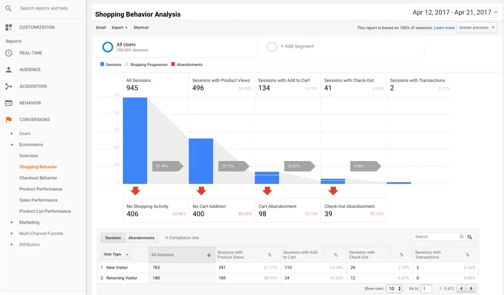
The amalgamation of heatmaps with tools such as Google Analytics, event tracking, or conversion funnels can provide a 360-degree view of user behaviour, allowing for surgical precision in website optimisation. These tools' fusion carves a path to superior user engagement and increased conversions.
Let's delve further.
The symbiosis with Google Analytics

Google Analytics, the digital data powerhouse, forms a potent partnership with Heatmaps. Heatmaps provide a vibrant visual representation of user interactions in this symbiosis. At the same time, Google Analytics dives deep into numerical data, offering granular insights into traffic sources, bounce rates, and user demographics.
Together, they form an unparalleled duo, providing a comprehensive view of user behaviour. They help locate the ‘what' and ‘why' of user interactions, creating an all-encompassing narrative of user behaviour. This symbiotic relationship allows for an enhanced understanding of user engagement, facilitating more targeted and effective website optimisation.
Survey feedback and heatmaps
Survey feedback, a treasure trove of qualitative data, couples brilliantly with heatmaps. It's akin to eavesdropping conversations among users, revealing their unspoken thoughts and actions. Together, these tools illuminate the hidden corners of user behaviour.
Heatmaps visualise user interactions, revealing your site's ‘hot' and ‘cold' areas. They beautifully capture the ‘what' of user activity. Yet, they might leave you pondering the ‘why' behind certain behaviours.
That's where survey feedback steps in. It explores the ‘why', unveiling user motivations, preferences, and pain points. It paints a comprehensive picture of user engagement when coupled with the visual data of heatmaps.
This powerful combination lets you decode the user journey more effectively, bridging the gap between user actions and intentions. Consequently, it empowers you to optimise your website design, enhancing user engagement and conversion rates.
The Indispensable Role of Heatmaps in the Future of Web Design
Heatmaps will be indispensable as we navigate the future of web design. They will continue to provide a visually compelling and informationally-rich perspective on user behaviour. Heatmaps reveal a site's ‘hot' and ‘cold' areas, highlighting areas of effusive activity and relatively unexplored ones. However, their strength shines when synced with tools like Google Analytics and user surveys, forming a formidable alliance offering holistic user behaviour insights.
Heatmaps will form an integral part of the web designer's toolbox, helping them to craft user-centric, intuitive, and engaging websites. Hence, understanding and adeptly applying heatmaps is no longer an option; it's necessary for any web designer aspiring to succeed in the digital realm.
