The Designer Guide to Web Design Colours
Did you ever think about the colours of the digital world? All those vibrant hues and shades that splash across screens all over the internet? It’s time to give them a little more credit. Colours bring this online world to life. They trigger emotions, guide our eyes, and make lasting impressions.
But finding the perfect palette for a website isn’t as simple as picking what looks pretty. There’s an art (and some science) to it all. Let’s jump into this kaleidoscope of web design colours and discuss how to create unforgettable digital experiences.
Table of Contents
The Importance of Colour
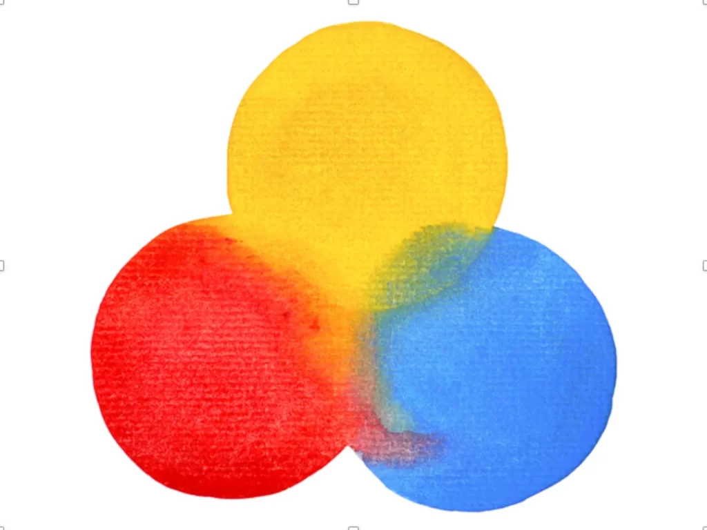
Imagine living in a colourless world where everything was grey and dull. It's not very memorable or exciting, I’d assume. Colours are like spices for designs—they add flavour and depth to every interaction users have with your site or app. They grab attention, convey meaning, and shape emotional connections with your audience.
You only need to picture some iconic brands to realise it:
- What do you see when you think of “McDonald's”? Those golden arches against that bright red background. Instantly recognisable—always associated with greasy indulgence.
- How about “Tiffany & Co.”? That Robin's egg blue they’re famous for screams elegance and luxury.
Colours matter so much because they can:
- Create brand identity: No one will forget your look if it is used correctly.
- Influence emotions: Different shades can subconsciously affect user experiences.
- Guide attention: You can direct visitors’ eyes around your site by strategically placing different colours in certain spots.
- Boost comprehension: Thoughtful choices make content more accessible to read while still maintaining its message.
So don’t take colour lightly when it comes to web design—it’s not just about looking nice—it’s also a tool for creating an exceptional experience.
The Chromatic Cast: Understanding Colour Theory
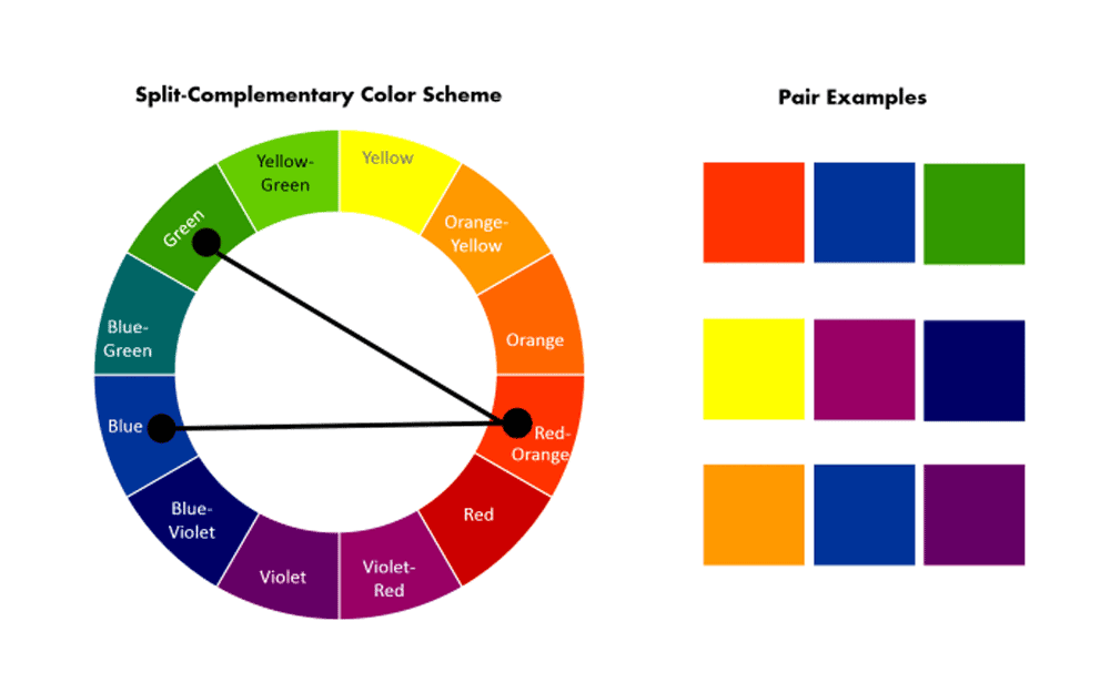
Before I start mindlessly listing off colour choices, let's get some essential facts out. It's like getting a backstage pass to the world of ripe, overripe, green bananas.
The Colour Wheel
At its very core, colours are many things. But in this case, it is a wheel of primary, secondary and tertiary colours. This tool helps us visualise a relationship between colours, ultimately making it easier for you to create an excellent-looking palette.
Primary Colours
Simply put, The primary colours cannot be made by mixing other colours. They are red, blue, and yellow. Let me know if your mind is blown yet!
Secondary Colours
Mix two primary colours, and you've got yourself the secondary family! Orange (red + yellow), green (yellow + blue), and violet (blue + red)
Tertiary Colours
Do you know when couples have kids, but they come out looking like both parents? That's what’s happening here, except with these colours. Red-orange, yellow-green, and blue-violet are just some of those examples.
Complementary Colours
These guys sit across each other on the colour wheel: red and green or blue and orange. Any contrasting hue will give you a vibrant look!
Analogous Colours
Neighbours on the colour wheel: Yellow, yellow-orange, orange. Simple!
There you go! There’s more to learn, so don’t stop now! Just remember that rules are meant to be broken… within reason, of course!
Colour and the Web: A Love Story
Now that we've discussed the theory of colours let's get down to what they do digitally. Compared to print designs, web colours are made with red, green, and blue lights (known as RGB). These three colours get mixed in different amounts to form every colour you see on your screen.
Every colour has unique values for each of these primary colours. Pure red is represented as RGB (255, 0, 0), and deep navy blue would be RGB (0, 0, 128).
Hex Codes: The Language of Web Colours
To identify web design colours, we use a system called hexadecimal (hex) codes, which are funky six-character sequences like #FF0000 (red) or #00FF00 (green). It’s an organised way to communicate precise colours across devices and platforms.
But don’t worry; you won’t need to memorise any strange code combinations. Most design tools have a handy colour picker to do all the heavy lifting by generating hex codes based on visually selected colours.
Web-Safe Colours: Playing It Safe
In the old days, when monitors could only handle a limited amount of colours at once, designers had to use one out of 216 “web-safe” colours that could display consistently across platforms and browsers.
While modern displays can show millions of different hues now, some designers still like to use web-safe palettes because they act as a safety net for rendering consistent colours, especially on older systems or in restrictive environments.
However, there's no reason to restrict yourself. You can experiment with shades with today’s vibrant screens and advanced colour practices.
Choosing the Perfect Palette

Now for the fun part – building your colour palette! But with so many options, where do you start? Fear not; we have strategies to guide you.
Begin with Your Brand
Your brand's personality and values should be at the core of your colour choices. Depending on what you want to convey, select the colours that will help bring it to life.
For example, a trendy streetwear line may gravitate towards bold colours like electric yellow or neon pink. Meanwhile, an elegant jewellery brand might choose rich hues like emerald green or royal purple.
Think About Cultural Associations
Colours can mean different things in different cultures. For example, white represents purity in the West but is a mourning colour elsewhere.
Always consider the cultural connotations of your colour choices to avoid confusion and ensure your design is universally understood.
Draw Inspiration from Nature
Mother Nature knows best. If all else fails, look outside and see how colours mix naturally to create something beautiful.
The warm tones of a desert sunset or the extraordinary hues of a tropical beach are tried-and-true combinations that are always eye-catching and harmonious.
Leverage Colour Psychology
You’d be surprised how much the surrounding colours can influence our emotions and behaviour. Knowing the basics about colour psychology is crucial when designing something that needs to impact people’s perceptions.
For example, red is often associated with passion — making it perfect for call-to-action buttons. Blue conveys trustworthiness and calmness — great if you work with finances or a corporate company.
Explore Existing Resources
There’s no need to start from scratch when plenty of tools offer pre-made palettes ready to apply to your project. You’ll find websites like Coolors, Adobe Color, and ColorHunt that offer just that and generators if none of their suggestions fit what you're after.
Design libraries like Material Design and Flat UI Colours offer comprehensive systems, too, so you can be sure every shade needed is in one place.
And lastly, don’t forget to explore what others have done. There’s plenty of inspiration on Behance and Dribbble — whether you require a whole palette or just want to add a bit of freshness to your existing ideas.
Finding the Right Balance
After you’ve gathered your first round of colours, it’s time to refine them. To create a design that looks cohesive and good, you must strike a balance between the shades. Here are 30 tips to help.
Use few colours
Using every colour in the world for your artwork is pretty tempting, but this is not advisable. Keep your palette focused on only 3-5 primary colours and several neutral accents or neutrals. If you use so many colours, you’ll confuse yourself and even the user.
Create a hierarchy of colour.
Practically all colours are created equal, but they don’t all perform equal functions in an artwork. You must strategically assign roles and positions to each hue in your artwork while designing it. Assigning different roles helps guide users’ eyes through specific elements of your design.
For example, if users want to know how clickable links are on your site, they can easily do so by determining the colour used.
Think about ratios
The proportions and relationships between each colour in your palette play as much a role as the colours themselves. A well-balanced design usually follows the 60-30-10 rule:
- Dominant Colour (60%): Sets overall tone/mood
- Secondary Colour (30%): Supports dominant colour by contrasting/complementing it
- Accent Colour (10%): Used sparingly for emphasis/visual interest
Be mindful of context.
The context in which specific colours appear can go a long way in determining their perceived tone and intensity by users. Hence, ensure its effect is suitable before using any bright, saturated hue on large background areas.
Also, note that some shades may look too vivid against darker tones compared to lighter ones. So, always think about how different combinations interact and adjust accordingly.
Accessibility: Designing for All

However, it is essential to make sure that your colour selections are accessible to different abilities of users, even though making visually alluring designs is a must. About 1 in every 12 men and 1 in every 200 women across the globe have some form of colour blindness, thus necessitating inclusive design.
Contrast is Crucial
For instance, there are specific contrast ratio recommendations under the Web Content Accessibility Guidelines (WCAG) to ensure text and interactive elements remain legible against background colours.
Many design tools will, therefore, offer accessibility checkers or colour contrast analysers, which can help you evaluate and adjust your colour combinations as needed.
Focus on Meaning
On top of this, it is vital to think about the meanings and associations our use of colours conveys. For example, when used together, red and green may imply opposite actions or states; however, this may be an ambiguous message for those who suffer from colour blindness. There's also the option of a site writing about a specific brand, like WPDean, which writes about WordPress topics and uses a shade of blue, as WordPress does.
One should consider matching hues with different colours or incorporating other visual prompts, such as icons or textual labels, to back up its intended meanings.
Best Practices for Accessible Design
Ensure that your designs are genuinely accessible by testing them. Collect responses from various groups, including individuals living with disabilities, among others, through watching videos simulating various forms of colour blindness.
Starting with accessibility first, you’ll create more inclusive experiences that resonate with a broader variety of users.
Putting It All Together
You now have expertise in colour theory, so it is time to test your skills by creating a striking and consistent colour palette for your next web design project. Below are the steps that you can follow:
- Define Your Brand: Start by articulating your brand's personality, values, and target audience. This will form a basis for choosing colours.
- Gather Inspiration: Nature, cultural references, existing brands or curated resources could be a jumping-off point for initial colour directions.
- Establish a Base: Choose one dominant colour that captures your intended message's overall mood and tone; this will serve as an anchor point for your palette.
- Add Complementary Hues: Select 1-2 supportive colours that fit well with your base using classic colour wheel rules like complementary or analogous schemes.
- Introduce Accents: Bring in 1-2 bright accent colours to add spark wherever necessary; they should occupy a small fraction of the entire palette.
- Refine and Balance: Change your colour choices until you reach a balanced and cohesive appearance that aligns with brand identity and design objectives by adjusting shades, tints, etc.
- Test for Accessibility: Use colour contrast testers and simulators while gauging whether the palette guarantees legibility among users.
- Iterate and Evolve: Color palettes are living things. Feel free to go back and update selections whenever needed due to changes in brand or design needs.
Remember that there is no one-size-fits-all formula for creating a grand colour scheme. It is an ever-changing journey into trial-and-error, originality and deep thinking. However, armed with these tools and strategies, you are well on your way to crafting captivating web designs that truly pop.
Vibrant Visuals: Putting Colour Into Practice
Having discussed colour theory and strategy, here are examples of excellent web design colour palettes that bring these principles to life in the real world.
Mailchimp: Keeping It Fun and Friendly
For example, Mailchimp is a platform for email marketers that has created a vibrant playfulness that embodies its quirky brand.
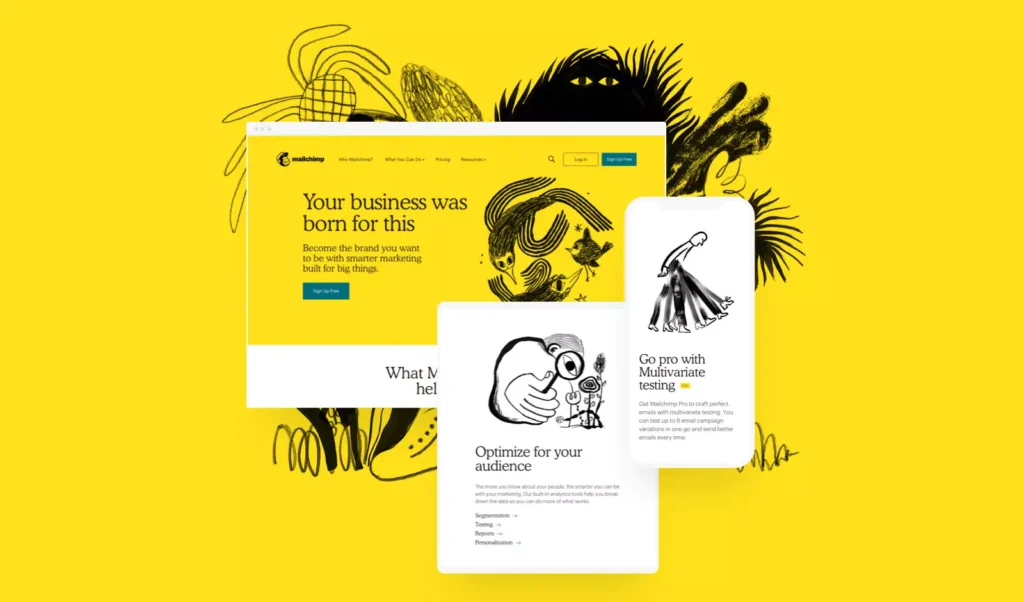
The primary palette consists of happy yellow as a dominating colour, grey shades as contrast colours and bright accents with different tints of teal and pink. The combination gives off energy and happiness without overpowering or becoming childish.
On top of this, Mailchimp’s designs have incorporated whimsical use of patterns and unexpected mixtures of colours, making it an enchanting experience when used by any individual.
Spotify: Streaming in Style
In comparison, music streaming giant Spotify favours a more subtle but inviting colour scheme.
Their primary brand colour is green, which they pair with black and white to achieve a clean, contemporary look. Sometimes, they add splashes of bright colours, such as pink, purple or turquoise, to highlight certain features or information.
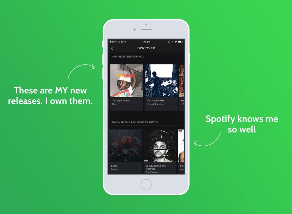
This colour may be minimalistic, but it resonates well with Spotify’s objective of presenting itself as a smooth customer interface through which people can find music easily while enjoying themselves online.
Headspace: Cultivating Calm
According to Headspace's mental health application that specialises in meditation, colour plays an essential role in emotions. Such is evoked by their subdued earthy palette, highlighting peacefulness and mindfulness intended for development.
A tranquil yet comforting appeal is created by blending warm beige tones, soft green shades, and dusty pinks. Bright orange pops break up the monotony but still keep things calm within this serene ambience that is maintained overall.

Through this intentional colour approach, Headspace reminds users about its brand promise, guiding them towards controlled self-awareness.
FAQs on Web Design Colours
Do you have more questions about creating the perfect colour palette for your web designs? Here are some often-asked questions and answers:
How many colours should my palette be?
While there isn't an exact number, most designers recommend a focused palette of 3-5 primary colours. Plus, a few accent or neutral shades. Too many colours can confuse your design and user.
Do I need to follow traditional colour theory rules?
Not really! Colour theory is an excellent place to start, but it’s not the law. Don’t be afraid to experiment with combinations that feel authentic to your brand.
How do I make sure my colours are accessible?
Ensure enough contrast, mainly when applied to texts or interactive elements. To test if you’ve created any visual impairments, use colour blindness simulators. Additionally, pairing colours with distinct hues or other visual cues.
What are some exceptional resources for finding inspiration?
You can get inspired by nature, but you can also look at curated colour palettes such as Adobe Color, Coolors and Colour Hunt. Material Design and Flat UI Colours offer comprehensive colour systems if you want something more systematic.
How often should I refresh my brand's colour palette?
While it’s crucial to maintain consistency, refreshing every few years will keep things modern and relevant.
Can I use the same colour palette on all my digital platforms?
Yes! When possible, using a cohesive colour strategy across your website, apps, and social media helps create brand recognition and creates coherent experiences.
What are some tips for using colours in data visualisation or infographics?
Choose contrasting palettes so that different data points will stand out. Also, consider using colouring to highlight critical insights or draw attention to important information. Avoid using too many competing hues because they’ll just confuse.
How can I make sure my colours work on a global scale?
Different cultures associate meaning with other colours, so constantly research before making decisions. A colour you may think is harmless can be a massive turn-off in another culture. When in doubt, opt for universal, neutral tones.
How do I make sure my colours match across large web applications or platforms?
You must establish a transparent system or design to maintain consistency as you scale. This means defining role colours (e.g., error states), usage guidelines and tint and shades. Tools like Figma and Adobe XD will help streamline this process.
What do I need to know about dark mode?
Making your colours pop is crucial when using dark mode and low-light user interfaces. You want your colours to be legible, so rely more heavily on lighter tints and shades. Use brighter accent colours sparingly for emphasis.
How can I make sure my colours look good as the world changes?
You might think that following trends will keep you looking modern, but the best thing you can do is choose a core colour and build your brand around that. Trust classic colour theory to get you there.
Web design is all about making something great out of nothing. You’re the artist in this scenario, and your colours are your paints. They can bring life to whatever digital creation you invent when used correctly.
So, let them be your friend on this journey. Use those brushes to create new hues that stretch beyond what’s been done before. Your work will shine brighter than anyone else’s if you consider these tips and bend them to fit your creative needs.
Good luck! Remember, art is subjective, so don’t be afraid to let loose with it.
