How Good Web Design Can Boost Traffic
In the digital age, a company's website is often the first interaction potential customers will have with the business. With more and more commerce moving online, having an effective web presence is crucial for reaching and converting site visitors into paying customers. Good web design plays a pivotal role in this process.
When crafted thoughtfully and strategically, a website's design can draw visitors in, encourage engagement, build trust and credibility, and ultimately drive more traffic to the site. This article will explore key web design elements and best practices that can help substantially boost your website traffic when executed properly.
Table of Contents
The Importance of Good Web Design
Before diving into specific techniques, it's helpful to step back and understand why good web design matters in the first place. At a basic level, the design of a website includes its layout, visual hierarchy, typography, colour scheme, imagery, and more. The choices in designing these elements set the tone for the site visitor's experience and impact how easily they can find information and navigate the site.
If the design is clean, intuitive, visually appealing, and aligns with the brand, visitors are more likely to explore further, interact with site content, and convert to customers. Conversely, a confusing, cluttered, or unattractive design can deter visitors and prevent them from quickly leaving the site. By influencing user experience and engagement, web design directly affects traffic metrics.
Good design indicates the business cares about the details and the customer's experience. This builds visitor confidence and trust, making them more likely to stick around and complete desired actions like signing up for a newsletter, purchasing, or contacting the company. The subsequent sections explore tactical ways even minor tweaks in web design can boost traffic for online businesses.
Optimise Page Speed

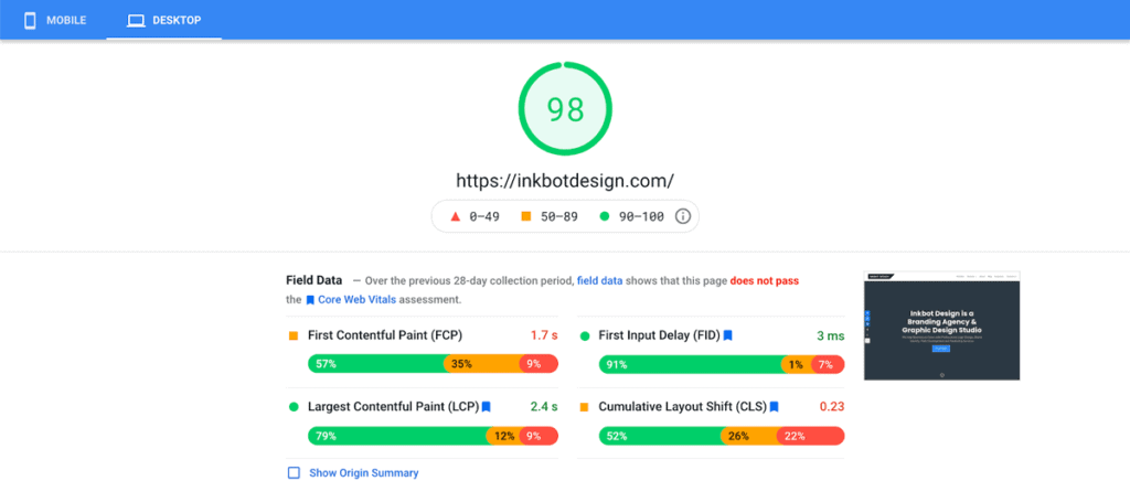
Site speed is a foundational component of the overall user experience. With more commerce happening on mobile devices, slow load times simply aren't an option if you want to keep visitors on-site. Google research shows that 53% of mobile site visitors will leave a page that takes longer than 3 seconds to load.
Optimising page speed should be a top priority. By streamlining code, compressing images, minimising HTTP requests, implementing browser caching, and upgrading to a faster web host, sites can improve load times dramatically. As pages load faster, visitors are less likely to bounce and more apt to delve deeper into site content.
Specific Tactics to Improve Page Speed:
- Enable GZIP compression
- Minify CSS, JavaScript, and HTML files
- Lazy load non-critical assets
- Optimise and compress images
- Remove unused code and plugins
- Upgrade to faster web hosting
Use an Intuitive, Responsive Layout
Along with fast load times, having an intuitive site structure and layout facilitates user engagement and boosts time on site. A clean, consistent layout allows visitors to take in information easily without distraction. Critical elements like navigation and calls-to-action should pop out visually to guide visitors seamlessly through site content.
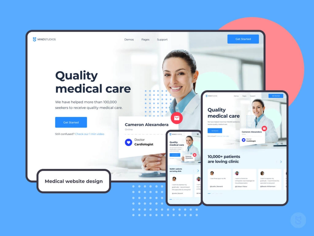
As more users access sites on mobile, having a responsive design that automatically adapts to smaller screens is also essential for keeping visitors from bouncing. A layout optimised for mobile users removes pinch/zooming and horizontal scrolling, which frustrates them. Excellent web design considers desktop and mobile use cases to make navigation effortless across devices.
Responsive Web Design Tips:
- Use flexible containers like percentages or EM units
- Design with a mobile-first approach
- Implement media queries for screen size breakpoints
- Show responsive behaviour with live previews
- Test on actual mobile devices
Use Visual Hierarchy Strategically
Beyond page structure, the strategic use of visual hierarchy guides visitors to key page elements in the intended order. Effective visual hierarchy leverages contrast, size, colour, space, and typography to indicate relative importance and establish relationships between content pieces.
For instance, essential items like headlines and calls-to-action should highlight background colours to capture attention first. Supplementary details use lower-contrast colours and fonts so they don’t distract from the primary content. Quality web design makes deliberate contrast choices so the visitor journey aligns with business goals.
Visual Hierarchy Tips:
- Establish direction with scale and colour
- Use space and dividers between elements
- Make critical items pop with contrast
- Use fonts strategically based on size and style
- Consistent styling for similar page aspects
Showcase Brand Identity Through Design

Beyond guiding visitors through site content, web design also represents a brand visually online. Elements like colour schemes, fonts, imagery, and other styles form a brand's visual identity. When aligned, these aesthetics make a brand easily recognisable to visitors by browsing different pages and sites under the brand’s umbrella.
The ability to translate brand identity consistently throughout the digital properties provides familiarity that attracts visitors and fosters brand loyalty. For example, Mailchimp's marketing assets, product packaging, and web page design all use the same playful visual style and monkey imagery. This consistency strengthens their unique branding that visitors come to expect and trust.
Tips for Showcasing Brand Identity:
- Determine primary brand colours and use them consistently
- Establish brand-specific imagery like logos and icons
- Select one or two fonts that align with the brand's personality
- Carryover identifying styles like illustration or photo filters
- Use messaging that matches brand voice across channels
Guide Visitors With Strong Calls-to-Action
Calls-to-action (CTAs) directly prompt visitors to sign up for an email list, schedule a demo, download content, or purchase. Good web design draws attention to these clickable buttons with strategic placement, sizing, colour, and labelling. Visitors should never wonder what to do next.
For instance, primary CTAs typically use high-contrast colours like vibrant buttons that jump off the page visually. Labels clearly define the action, such as “Add to Cart” or “Download Now.” Consistent CTA placement, often above the page fold, trains visitors to find them easily. Good CTAs reduce confusion and distractions to boost conversions.
Effective CTA Tips:
- Place buttons in consistent locations on each page
- Use contrasting colours that align with a brand palette
- Write clear, action-oriented button text
- Make buttons large enough to see and click easily
- Limit one primary CTA per page to avoid confusion
Use Whitespace and Contrast Strategically
Whitespace refers to the negative or empty space between content pieces on a page. Along with making a layout visually appealing, whitespace brings order, organisation, and visual rest to complex page designs. It guides the visitor’s eye through information in a logical flow while lowering the cognitive load.
Similarly, strategically contrasting colours and typography maintain a critical visual hierarchy on busy pages with lots of text and images. For example, key statistics or pull quotes can stand out sharply from body text using contrast to capture attention when skimming through content.
Visual Break Tips:
- Separate paragraphs and content sections
- Frame images with whitespace
- Alternate image sides across page sections
- Use dividers between logical content groups
- Pop key messages from body text with contrast
Show Trust Symbols and Social Proof

Web design plays a crucial role in influencing visitor trust and credibility perceptions. Design elements like security badges, trust seals, solid navigation, professional imagery, and social proof signals visually communicate site legitimacy and professionalism.
For example, ecommerce sites frequently show secure checkout badges from providers like Norton or Trust Guard during the purchasing process. Quality images showing real customers or team members make the business more personable and transparent.
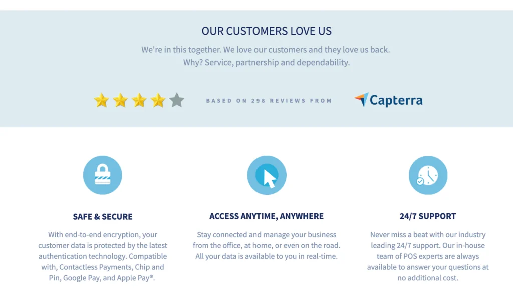
Third-party trust signals like star reviews, customer logos, and testimonials provide unbiased social proof that boosts conversion rates. Wise use of trust-building design elements helps visitors feel more comfortable engaging with site content and conversions.
Trust Element Best Practices:
- Display customer logos and testimonials prominently
- Show security seals near purchasing areas
- Introduce team members with quality headshots
- Create visible policies for shipping, returns, etc.
- Share star ratings and positive review snippets
Use Progress Indicators
A key aspect of interaction design involves using progress indicators to enhance user awareness throughout site flows. For example, checkout and survey processes leverage progress bars to indicate how many steps remain for completion. This prevents visitors from feeling surprised or overwhelmed by extra steps.
Progress indicators reassure visitors they are on the right track and increase the likelihood of completing goals by breaking processes into digestible chunks. Flow steps can also change visual states to show completed, current, and remaining stages. Well-designed and -placed progress trackers reduce friction and drop-offs for conversion funnels.
Progress Indicator Tips:
- Display checkout step numbers and flow % completion
- Use colour to distinguish completed and active steps
- Show form field completion progress
- Indicate required vs. optional form fields
- Highlight validation issues before submit
Personalise With Dynamic Content
Advances in web technology now enable incredible personalisation capabilities based on factors like visitor demographics, interests, behaviour, and intent signals. By dynamically inserting content tailored to individual site visitors, businesses can deliver more relevant messages that resonate better.
For example, sites can customise homepage banner ads based on a visitor’s browsing history across other sites using cookies and pixels. An e-commerce shopper may also see suggested products on category pages that match items recently viewed. Personalised content matches individual interests and intent better for each website visit.
Personalisation Ideas:
- Show ads for related products browsed recently
- Recommend blog articles about visited topic tags
- Insert popular searches others used for search terms
- Display recent purchases toward checkout
- Send emails for abandoned cart items
Design for Scannability
In the digital age, with endless content competing for attention, most website visitors do not read total pages word for word. Instead, visitors often skim by scanning for keywords, paragraph headings, and visual breakouts that catch their eye.
Optimising content for such “scannability” lets visitors rapidly discover essential information. Techniques like chunking text in short paragraphs, highlighting critical bits, and supplementing ideas with tables or charts facilitate the scanning behaviour common today.
Scannability Tips:
- Break content into short, focused paragraphs
- Use descriptive headings for paragraphs and sections
- Include relevant statistics and quick facts
- Embed supporting charts, graphs, or figures
- Make key sentences and terms bold or larger
Choose the Right Typography

Along with content formatting, typography choices also influence scannability and readership for large blocks of text. Hard-to-read font styles slow down readers and turn visitors away from quality content that appears intimidating to digest. Too many changes in font styles also produce unnecessary visual noise.
Finding the right balance starts by choosing easy-to-read fonts for body paragraphs—those with large x-heights, clean lines, and adequate spacing between letters. More creative stylised fonts can highlight headings and short key phrases. Consistent styling and limiting font variations strengthen site cohesion.
Web Typography Tips:
- Use simple, easy-to-read fonts for body text
- Complement with stylised fonts for headings
- Maintain sufficient font size for readability
- Use font colours with enough contrast
- Limit variations in fonts across page sections
Carefully Select Colour Palettes
Choosing colour affects web design aesthetics, usability, conversions, and site credibility. While creative uses of colour can beautifully accent design, colours can also detract or confuse visitors if not carefully considered. Principles of colour theory help inform strategic site palettes.
For example, warm and bright accent colours typically energise and engage visitors best to support calls-to-action. Dark backgrounds with colourful fonts fatigue the eyes for large body text sections. High-contrast palettes also optimise readability and scannability compared to low-contrast schemes.
The best practice encourages creating an intentional, cohesive palette upfront instead of arbitrarily picking colours. Utilising colour psychology and usage principles elevates site effectiveness.
Colour Selection Principles:
- Determine primary brand and accent colours
- Use color contrast ratios properly for readability
- Add colors sparingly to avoid overwhelming visitors
- Consider the psychological effects of color associations
- Test palettes with colour-blindness filters
Carefully Craft Page Titles and Meta Descriptions
Beyond visual design, strategic crafting of backend page elements also significantly impacts site traffic. Page titles and meta descriptions provide brief page summaries visible on search engine results pages (SERPs). Compelling title tags and descriptions can increase the number of visitors who discover your content and site listings through search.
Each page should contain a unique, keyword-rich page title concisely summarising the topic so searchers know what they will find on your page. Meta descriptions give additional context regarding page content to entice clicks while aligning closely with associated search queries. Pages can gain more impressions and clicks with strategic page titles and meta descriptions.
Title Tag and Meta Description Tips:
- Insert target keyword early in title tags
- Summarise key page aspects in the title
- Differentiate similar site page titles
- Match meta description topics to title tags
- Include popular related search queries
- Limit to 60 characters for meta description
Curate Engaging Imagery and Multimedia

When used well, imagery and multimedia elements can significantly enhance content presentation and accessibility for website visitors. Photos, illustrations, icons, data visualisations, videos, and other graphics supplement and support written content. These visual elements add variety to page design and engage different learning styles.
For example, original photos of products help online shoppers evaluate items better than stock images. Explainer videos may describe complex services more clearly than text alone. Well-placed graphics also facilitate visual skimming of long-form written content. Compelling imagery keeps all visitor types immersed in the site content.
Visual Asset Optimisation Tips:
- Use original, high-quality photos and graphics
- Show people interacting with products/services
- Caption charts/graphs so standalone, meaningful
- Keep videos short unless very high-quality content
- Ensure multimedia loads quickly without slowing the page
Promote Great Content
While design significantly enables the user experience, quality content remains the backbone for keeping visitors engaged. Functional, practical, inspiring, or entertaining content gets shared and brings repeat site traffic. After good UX and conversions, blogs, tools, research reports, and other resources should all link internally to related content on your site.
For example, each blog article links other complementary pieces for extended reading. Product pages connect to related best uses or buying guides. This link allows visitors to navigate more pages and topics of interest effortlessly. Driving visitors deeper nurtures customer relationships and page authority with search algorithms.
Internal Linking Best Practices:
- Link useful context references in the content
- Connect related content across site sections
- Use descriptive anchor text for context
- Link to category/tag/series pages from posts
- Point recent/popular content to great evergreen content
Conclusion
In conclusion, a website's design significantly impacts key traffic metrics like time on site, pages per visit, and bounce rates by shaping the user experience. While aesthetically appealing design creates initial good impressions, incorporating research-backed best practices goes much further to increase meaningful engagement and conversions actively.
Even minor tweaks to website copy, layout, visuals, and personalisation can substantially compound visitor interest and traffic. Evolving design alongside customer feedback and analytics data helps continuously enhance accessibility, value delivery, and visitor return rate. Excellent web design removes friction so visitors focus on relevant site content and desired actions in their journey.
How Good Web Design Can Boost Traffic (FAQs)
Here are some common questions about using web design to boost website traffic:
What web design skills are most important for increasing traffic?
Some of the most valuable web design skills for boosting traffic include conversion-focused design, conveying trust and social proof, optimising page speed, facilitating easy site navigation, and driving visitors to quality content.
What web design changes typically give the most significant traffic gains?
Upgrading page speed, improving calls-to-action, adding more trust signals like reviews and security badges, enhancing content promotion, fixing mobile responsiveness, increasing personalisation, and monitoring analytics data for optimisation often provide the most significant website traffic gains.
How much can a web design revamp increase traffic?
Complete website redesigns focusing specifically on boosted usability, engagement, and conversions can increase organic traffic by 50-100% in many cases. Individual page redesigns can also produce over 20% traffic lifts when well-optimised.
How long does it take to see positive impacts from web design changes?
Minor tweaks like improving page speed may impact traffic within a few weeks as search engines recrawl pages. More significant site migrations and redesigns typically take 2-3 months to demonstrate measurable changes in traffic as visitors and algorithms adjust to updated properties.
What tools help measure web design's impact on site traffic?
Web analytics platforms like Google Analytics provide data on key site performance metrics like visit duration, bounce rates, and conversion rates used to gauge design effectiveness. Tools like PageSpeed Insights, Lighthouse Scores, and Heatmaps also evaluate technical and UX metrics for optimisation.
