Top 6 Graphic Design Elements Crucial to Your Website’s SEO
The internet is overflowing with SEO tips.
If you are a business owner, you have probably scoured the web, looking for easy-to-implement strategies to increase your rankings.
However, you might not know that your website’s graphic design elements impact your search engine rankings!
If this is your first time hearing this, it is no fault of your own.
Many marketing agencies and industry experts focus on keyword density and link building as their primary search engine optimisation strategies. And let’s be clear, both of these are super important. However, this doesn’t give you an excuse to disregard the visual elements on your website.
After all, Google considers all aspects of your website when deciding how much authority to give you.
So, if your goal is to secure the top position on SERPs and actively drive the success of your business, you need to understand that web design is equally as important as the copy on your site. (We should know – there were times when we had to redesign clients’ entire sites so they could get an ROI on our SEO services!)
So, how can you boost your website’s search engine optimisation and reap the benefits of having a high ranking?
This article will share our inside web design tips and tricks to improve your search engine rankings.
Here are the top graphic design elements to consider for search engine optimisation:
Table of Contents
1 — Website Layout
One of the first things you need to consider when looking for ways to improve your website’s SEO with graphic design is your site’s layout. Why? Because a well-thought-out, user-oriented layout ensures that web visitors quickly find what they’re after, interact with your content, and stick around on your site for longer.
So how, exactly, do you organise your website’s layout for it to have a positive impact on your rankings?
Well, three main tips will help you optimise your website’s aesthetic appearance to impact your site’s SEO positively.
Keep Content on Top
If you look at the research regarding how people interact with online content, you’ll find that they spend most of their time looking at the content above the fold. That’s right. Eye tracking research from the NN Group revealed that most internet users spend 57% of their page-viewing time above the fold.
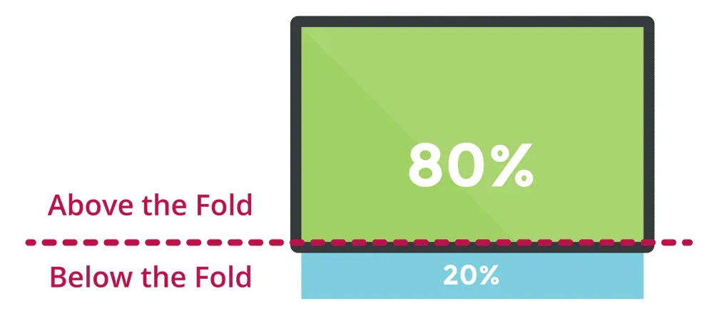
Now, 57% isn’t that huge of a number. But, if you were to compare the amount of time your visitors spend above the fold with the time they spend viewing the rest of your site’s content, you’d realise that the content above the fold of a website gets 102% more viewing time than material that is below the fold.
Suppose you look at things through the number. In that case, it quickly becomes evident that where your content is positioned significantly impacts how potential customers interact with your site, how long they stick around, and how Google will rank your pages.
Of course, knowing that people spend more time viewing the content within the first screenful of their device does not mean that you should cram in all of your content at the top of your site.
It means that, as a business owner, you have to develop your awareness regarding what information you want your audience to see.
For example, if you are a non-profit agency, one of your most crucial objectives would be receiving donations. Therefore, as part of your website optimisation, you would want to place your graphic design elements, such as the “Donate” button, in a visible location on your homepage. This would be a call to action that should never be buried beneath the fold since you do not want potential donors getting lost when looking for it.
Then again, if you’re an agency, the highest-value piece of content you can show on your homepage will be your unique value proposition. So make sure that it gets a prime position in your site’s hero section, as done on the Digitarial Agency homepage.

Or, if you’re an eCommerce business, like KENZO, you’ll want web visitors who visit your landing pages to immediately see the products they’re after, along with a few key UX elements like your navigation menu search option, product filters, and cart.

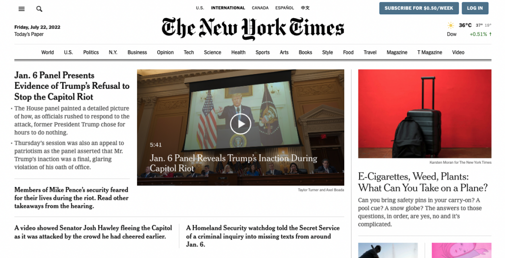
And, on content sites like the NY Times homepage, the highest value elements often include the latest piece of content published, which is why they’re often positioned above the fold, ensuring that web visitors immediately notice them.
Pro tip: Knowing that Google considers page layout when ranking your site and that the content you place above the fold directly impacts your audience’s web browsing experience, make sure you don’t overcrowd this space on your homepage.
Things like ads above the fold significantly strain and harm user experience, which is likely to make web visitors bounce. And, knowing that a high bounce rate means lower SERP rankings, you should not mistake bombarding your web visitors with irrelevant content that prevents them from finding the information they came to see on your site.
Skip the Sliders
While sliders are undoubtedly one of the most popular graphic design elements for many business owners looking to modernise their websites, they are not all that functional.
We know it is difficult to hear. However, it is true!
In fact, it has been proven that sliders have incredibly low click-through rates compared to other graphic design elements. Moreover, SEO industry leader Yoast went as far as to say that sliders should be banned from websites altogether.
It seems ridiculous that a design element that has become so mainstream would be detrimental to businesses and their ability to convert website visitors into paying customers, but the statistics do not lie.
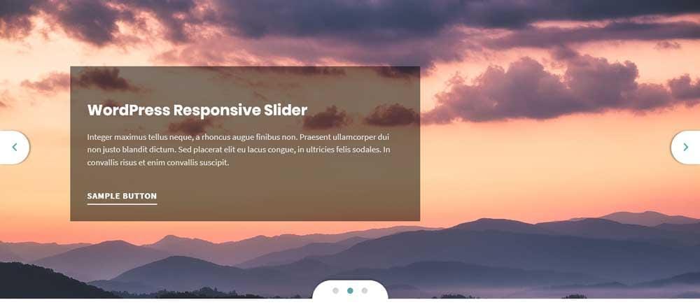
Among the top complaints that internet users have about sliders is that:
- They often switch to the next slide before the users can read the text on the first slide.
- Sliders push down the content that the user initially came to the website to find.
- They often feel like advertisements.
So, if you currently use a slider on your website, consider changing it to a static image that links to a highly-visited page. Otherwise, no matter how many other SEO tips you implement, it will hinder your site's performance.
Improve Readability
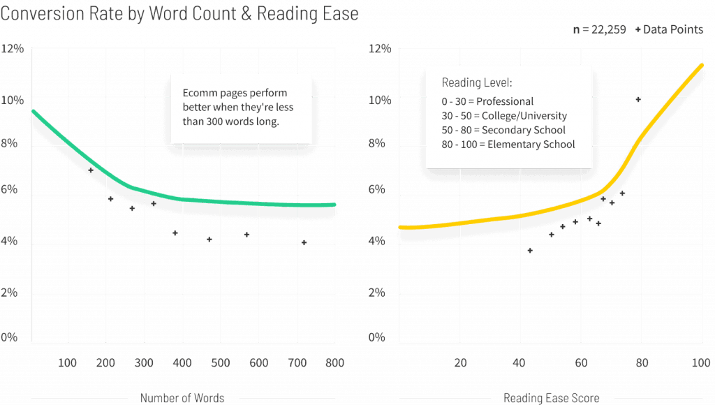
Finally, as you explore how you can use visual design to improve your site’s SEO, you must remember that how you present the content on your pages directly impacts your content’s readability score.
Now, you may ask: what does readability have to do with SEO?
Well, it turns out that readability helps you secure the top SERP positions in two main ways.
On the one hand, simple, easy-to-read, and grammatically correct content is more to land you higher Google rankings.
On the other hand, you must remember that prioritising readability directly impacts user experience, helping web visitors quickly find the information they’re after, encouraging them to convert, and allowing you to position your brand as a reputable source of information.
So, how exactly does graphic design and layout, in particular, impact readability?
Well, it’s pretty simple. Considering that there are specific reading patterns that users tend to gravitate toward when consuming content online, as well as knowing the positive impact of good formatting on readability, you can achieve a great deal by doing something as easy as ensuring your graphic elements are well-laid-out on your web pages.
Moreover, you could even take things a step further. For example, you could replace some of the text on your website with visuals. This will positively impact readability, as people process images faster than words.
Check out how effectively Brakes To You does this on its home page, which uses custom illustrations to convey the benefits its customers get access to when investing in the business’s services.

Or, if you want to elevate your site’s readability to boost SEO, don’t forget the importance of choosing the font for your website. Make sure you prioritise legibility and user-friendliness over appearance. And, whenever you’re in doubt, go with something simple. It’s bound to deliver a better user experience than a visually stunning cursive font that’s almost impossible to read.
2 — Mobile-First Design
Did you know that almost 60% of all internet traffic in 2022 happens through mobile phones? That’s right; people are browsing on their handheld devices.
So, if you want to make sure that your website has a chance of ranking high on Google, you need to make sure it’s mobile-friendly. To test if it is, you can use Google’s own free tools.
Or, if you know that your pages don’t display well on smaller screens, it’s high time that you hired a professional design service to help you bring your business website into the 21st century and maximise your chances of securing a top position on SERPs.
3 — CTA Buttons
Unless you’re an absolute novice in design, marketing, and websites, you’re likely to have heard about CTA buttons.
But, if you need a reminder, the abbreviation CTA stands for call-to-action, which is usually a short sentence on your site meant to inspire or prompt your website visitors to do something.
As they’re one of the primary conversion driving elements on any online page, CTAs are an integral graphic design element that you can use (and optimise) to turn web visitors into buyers. Unfortunately, many businesses do not think about how CTAs impact SEO.
You see, CTA buttons directly influence user behaviour. And as we’ve already mentioned, longer dwell times, lower bounce rates, and longer page sessions lead Google to assign more value to your content, which directly translates to better SERP positioning.
So, if you can play around with the placement and design of your CTA buttons and make them more visible (and more likely to lead web visitors to take action), you can directly ensure that your site ranks higher on Google.
For example, one typical mistake designers make placing just one CTA button on a page (usually at the bottom). But by positioning CTAs throughout the content and implementing design strategies to maximise their visibility, designers could effectively encourage web visitors to notice these graphic elements, consider taking action, and convert.
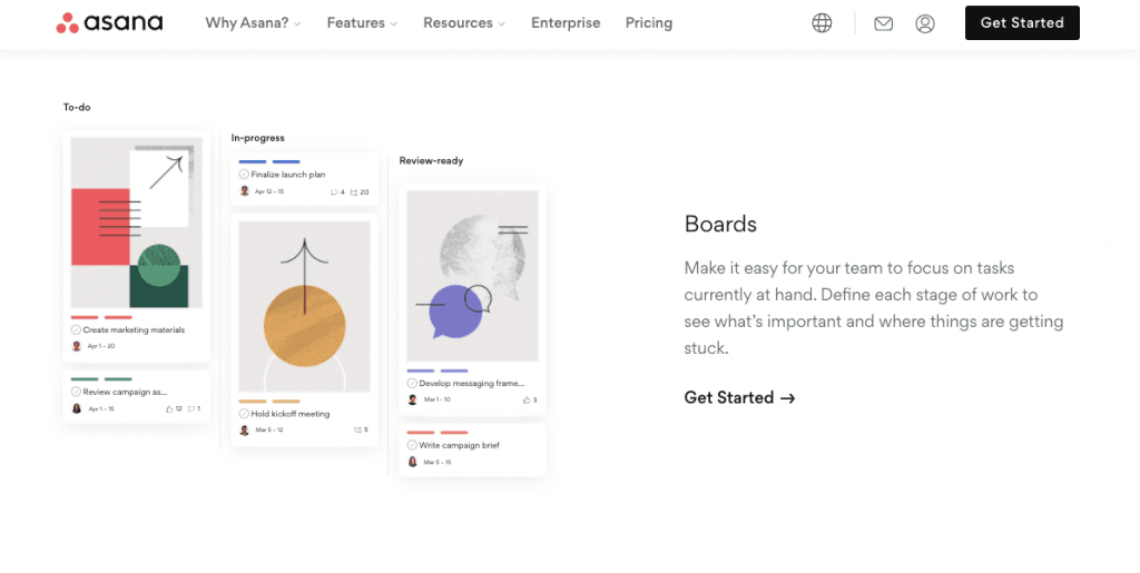
If you check out the Asana homepage, you’ll notice that it contains six CTA buttons inviting web visitors to “Get started.” And they’re organised in the best possible way too.
There’s a button in the top right corner of the page, which is always visible, no matter how far web visitors scroll. There’s a CTA in the hero section of the homepage, as well as one at the bottom. And, there are calls to action at the end of each content section, ensuring that people who want to give Asana’s SAAS product don’t have to waste time looking for the conversion element on the content-heavy page.
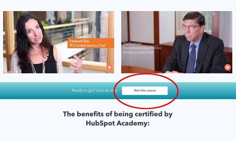
Or, if you’d like to apply an even better design trick to highlight the CTAs on your homepage, you could do something similar to Hubspot Academy. This brand chose to place a coloured bar halfway through its content. The element contains text in a contrasting tone, making the words of the CTA stand out, ensuring that the button is eye-catching, compelling, and effective at boosting click-through and conversion rates, which results in better SERP rankings.
4 — Website Colour Scheme
It is scientifically proven that specific colours influence how internet users behave online. For example, one study discovered that women have negative reactions to the colours grey, orange, and brown. Moreover, Hubspot increased landing page conversions by 21% by changing the colour of its CTA buttons.
Colour psychology is a valuable theory that allows marketers to direct the focus of internet users to the most critical content on their website. After all, isn’t that what website optimisation is all about?
So, if you’re looking to encourage web visitors to take specific actions on your site (and consequently optimise your website to rank higher on SERPs), make sure you are intentional with how you use colours.
Choose an Aesthetically Pleasing Colour Palette
One way to improve your site's appeal to your audience is to use an aesthetically pleasing colour palette.
The easiest way to do this is to pick a palette using a colour wheel tool, like the one by Adobe.
By doing this, you can ensure that the colours on your website don’t clash (even if you have multiple essential web page elements that need different hues to stand out).
Moreover, you can choose a highlight colour to tie your entire website together. For a great example, look at how the shade of blue from the MarketBeat homepage is repeated throughout the site and used to establish the brand’s visual identity.

Employ Contrast to Help High-Value Elements Stand Out
Another excellent way to use your website’s colour scheme to improve your website’s SEO is to employ contrast.
For example, knowing that your CTA’s need to be discernable, you can simply opt to select colours that emphasise contrast.
Below is a fantastic example of a contrasting button from Resume Baking.
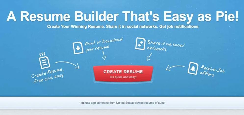
Notice how the CTA button is an opposing colour, making it the page's focal point? This is ideal for conversion optimisation through graphic design elements.
Don’t forget: Google considers how quickly visitors can navigate your website when ranking you. So, by using colour schemes and contrast, you can positively impact the UX on your site and ensure your business has the highest chance of standing out on SERPs.
5 — Visuals
The visuals you include on your website make for one of the most impactful graphic design elements crucial to its SEO and conversion potential.
Unfortunately, many businesses think that the way to go about adding visuals to web pages is to use anything. But here’s the truth: the way you choose what photos, illustrations, or videos to include on your website directly influences the first impression you leave on your visitors. (Sometimes, it’s even better not to use visuals and go with a minimalistic look, as done in the example below, than to use images not aligned with your brand identity.)
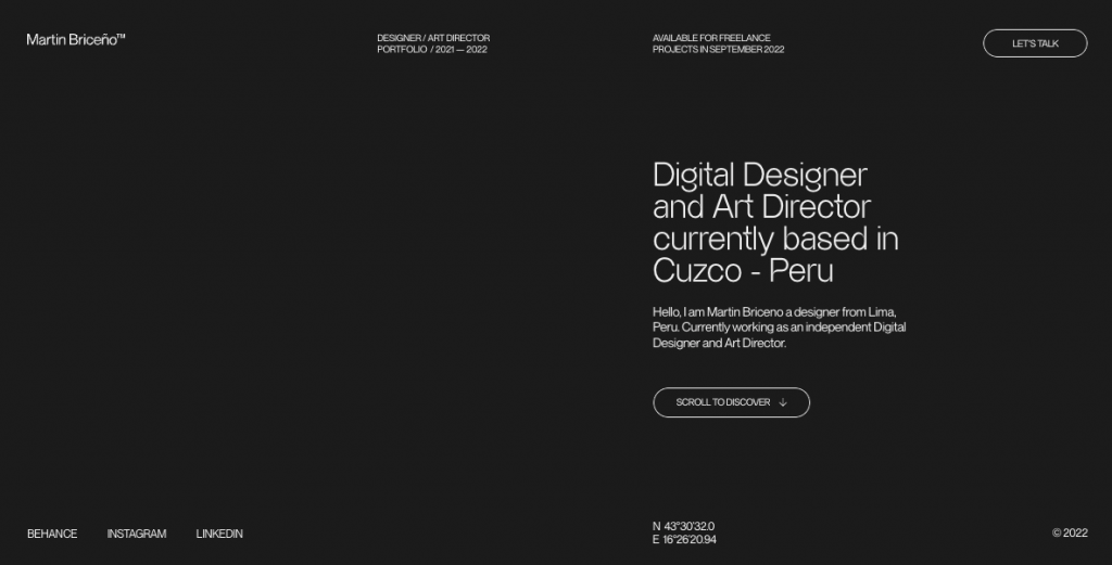
And, when people don’t like what they see, chances are they’re going to bounce, sending a signal to Google that the content on your site is not valuable.
Not convinced that your website visuals matter when it comes to SEO? Just look at the research data.
One study by Adobe discovered that 59% of internet users prefer to consume beautifully designed content. Even more importantly, 89% of internet users would stop viewing content that doesn’t display well on their devices.
With this in mind, it’s essential to optimise the visual elements on your site so that it has the highest possible chance of appealing to your audience and helping you score the top positions on SERPs.
Generally, there are three main rules you should try to stick to when attempting this:
Stay away from Stock Photography (Where Possible)
Sure, shooting your photos to use on your site isn’t always possible. The process is both time-consuming and expensive. Plus, planning photoshoots takes a good amount of experience.
However, did you know that unique and authentic pictures increase conversions by as much as 161%?
Suddenly, organising a photo shoot seems like a worthwhile investment, right?
The bottom line is that stock images found on prominent websites like Shutterstock or Bigstock are used all over the web, and Google knows that!

So, the more your site is filled with generic stock images, the less leading-edge you will appear to users, and the less willing Google will be to give your website authority. In Google’s Guide to Material Design, the search engine titan explicitly states that you should avoid stock images.
So, when choosing what graphic design elements to include on your website, consider which photos can be replaced with authentic, in-house images.
Use Video
The benefits of adding video to websites are well known. Wistia, for example, discovered that pages with video content had 46.2% more views and that people spent 2.6x more on pages with video. And Wyzowl found that:
- 73% of people prefer to learn about products by watching videos.
- 88% of consumers say they’ve been convinced to purchase a product because they watched a brand’s video.
- People are 2x as likely to share video content with their friends than any other format.
So, if you’re looking for ways to supercharge your website’s SEO, it’s not a bad idea to start producing videos you can add to your website.
The best way to do this is to use video to introduce your audience to your products naturally. If you need any inspiration, make sure you check out Dollar Shave Club. This brand managed to position itself as an authority in its niche thanks to understanding the power and benefits of investing in video content.
Don’t Forget the Alt Attributes
One additional hack that will allow you to use visuals to boost your website’s SEO is always adding alt attributes to your images and videos.
Yes, the primary function of Alt tags is to improve website accessibility. But, the truth is that Google also uses this information to understand what images are about.
So, to ensure that your original visuals show up on SERPs, don’t be lazy and forget to include a short text description of your multimedia assets. Especially if they could make the difference between your site winning position no.1 on Google vs being buried somewhere on the results' second or third page.
6 — Breadcrumbs
When search engines like Google crawl your website, breadcrumb trails help them organise your content and better understand the flow of your site. Additionally, breadcrumbs allow visitors to know exactly where they are as they navigate various pages. At any point, they can refer to the breadcrumb trail and click back to any previous page they visited.
This wonders for your bounce rate since visitors are less likely to get lost and leave your site frustrated!
Thus like graphic design elements, breadcrumbs are genuinely powerful search engine optimisation tools.
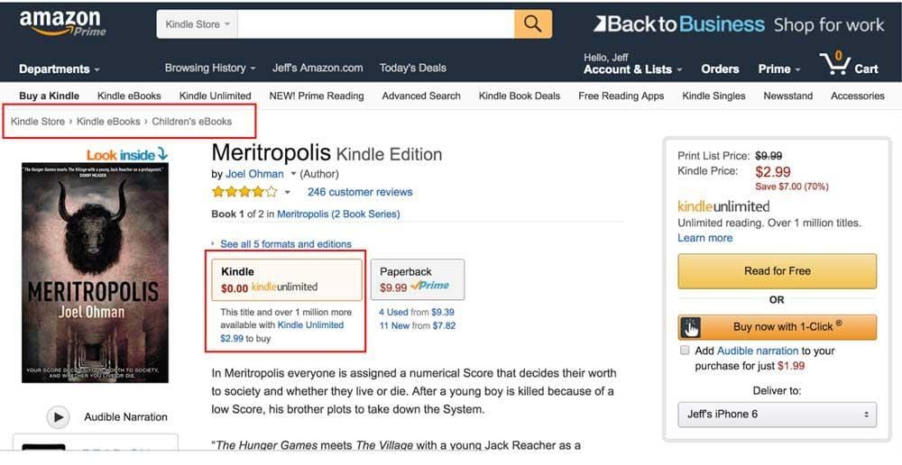
If you built your site using WordPress and have Yoast installed, Yoast will review the breadcrumb structure of your website and improve the likelihood of Google examining your site’s structure.
Check out this article for more information on how to best implement breadcrumbs to benefit your SEO rankings and web page optimisation.
Bottom Line
Remember, there are numerous on-page tweaks any business can make to improve search engine rankings. Website SEO is never complete. It is an ongoing process that every business has to dedicate time and focus to.
With Google’s algorithm continually evolving, websites have to adapt accordingly.
Since 2011, Google has released eight algorithm updates, which have impacted how websites are viewed, categorised, and ranked by the search engine. Red flags continue to arise from duplicate content to spam links and poor mobile usability.
Even the most seasoned internet marketing experts struggle to predict what algorithm changes Google will roll out next. Still, one thing is sure: working with Google is the surest way for businesses to attract customers online and increase conversion rates.
This article's six graphic design elements are an excellent start when looking for ways to improve your site’s ranking. And, remember, any improvement you make to your site’s SEO is worth the effort, especially if it has the potential to deliver better conversions and a more substantial online presence for your brand.
