The Iconic History of the FedEx Logo Design
FedEx Corporation is a multinational company that has made a name for itself in eCommerce, transportation and business services; with its FedEx Express division providing shipping services worldwide, FedEx has become a household name in the industry. A critical element that has contributed to the brand's success is its unique logo design, which contains a hidden meaning.
Over the years, the FedEx logo has undergone several changes, each reflecting the growth and development of the brand. The original logo was designed in 1971 and featured the company name in bold purple letters. But it wasn't until 1994 that the current logo was introduced, combining the company name and a bold, forward-pointing arrow.
Its clever use of negative space to create a hidden meaning sets the FedEx logo apart. Looking closely, you will notice that the negative space between the “E” and the “x” in the logo forms an arrow. This arrow stands for speed, reliability and efficiency, the core values FedEx wants to convey to its customers.
But the meaning of the logo continues beyond there. The colour palette also plays a crucial role in the design. The bold purple of the original logo was replaced by a shade of blue, which stands for trust and security. The colour orange used in the logo stands for energy, enthusiasm and creativity.
FedEx's success can be traced back to its commitment to providing reliable and efficient customer service. With the help of innovative technologies and a strong logistics network, FedEx can offer fast and affordable shipping services to businesses and individuals worldwide. The FedEx logo reflects the brand's commitment to excellence and innovation with its hidden meaning and distinctive design.
Table of Contents
Federal Express: 1973 – 1994

The FedEx logo has undergone a significant evolution since the company's founding. The first logo reflected the company's original name, Federal Express, which founder Fred Smith chose with a specific goal. He hoped the name would attract the Federal Reserve Bank as a customer. The word “Federal” would give the company a sense of patriotism and a desire to contribute to the country's economy.
The first logo was a rectangle divided into two panels by a diagonal line. The upper field was a bold purple, the lower area a vibrant orange. The brand's name was prominently displayed, with the word “Federal” in white lettering on a purple background and “Express” in orange lettering on a white background.
Over the years, the logo's colour palette has gone through a few variations. In some versions, a dark, muted purple was combined with a bright, active orange. In other arrangements, a vibrant, almost blue purple was used, with the word “Express” being almost burgundy. They made these colour changes to keep pace with the company's evolving branding strategies.
The FedEx Logo Design: 1991 – 1994

Following the acquisition of the Flying Tigers network, Federal Express became the most prominent full-service cargo airline, delivering to over twenty countries. However, this new status also highlighted the need to update the brand identity. One of the most significant changes was introducing a shorter name, “FedEx”, which would better represent the company's global reach.
The switch to the new branding took time to happen. Instead, the company used a transitional logo for three years that combined elements of the original logo and the iconic “white arrow” wordmark. The transitional logo included the shortened name but retained the orange and purple colour scheme and a round font reminiscent of the original emblem. The diagonal theme of the original logo was abandoned, leaving only the company name on a white background.
Although the transitional logo could have been more impressive, it served an essential purpose by linking the original logo and the new branding. This allowed customers to recognise the new logo and connect with the familiar brand they had come to know.
The Current FedEx Logo: 1994 – Today
Lindon Leader, the renowned Senior Design Director at Landor Associates, is the creative mind behind FedEx's iconic “white arrow” logo. Leader's penchant for minimalist design stems from his admiration for Smith & Hawken, the popular garden lifestyle brand from the 1980s. His unique style was characterised by using a lot of white space in his designs, starkly contrasting with the cluttered and hectic designs of the time.
While customers appreciated his style, they often asked if he could use the white space somehow. This prompted Leader to explore negative space, eventually creating the FedEx logo. Leader drew inspiration from the Northwest Orient Airlines logo, which combined the letters “N” and “W” into a single glyph using negative space.
However, the development of the successful FedEx logo took time to happen. According to FedEx, three design teams worked tirelessly on the new visual brand identity, and the number of logo iterations exceeded two hundred. Finally, Leader's design, which included the hidden arrow between the “E” and the “x”, was chosen as the new logo.
Since its introduction, the FedEx logo has been considered one of the world's most iconic and recognisable logos. The bold purple and orange colours, the clever use of spaces and negative space, and the hidden arrow make it a striking design. The logo has won over 40 international design awards and is considered among the eight best logo designs of the last four decades.
Design Considerations of the FedEx Logo
Landor Associates also adjusted the typography, opting for a slightly different font to make the design more modern and streamlined. In addition, the company's name was written entirely in capital letters for a bolder, more confident look.
The new logo was launched alongside various brand communication materials, including print ads, posters and digital media. The new design was well received by customers and industry experts alike. They praised the company for retaining the iconic “white arrow” essence while making it more contemporary and relevant to the modern age.
When asked about his experience in designing the great FedEx logo, Lindon stated:
“I've always said it takes a great client to do a great project. Frederick Smith, the CEO, allowed us to do our job and said to me, ‘Lindon, if you feel that our trucks need to be pink and green, just give me a good reason.' In other words, he was trusting us.”
Critical Elements of the Brand
Considering the growing progress and reach of the company, the new design was based on a few attributes, including speed, precision, service, and reliability.
As Lindon stated,
“They're the kind of attributes you just don't develop overnight – no pun intended, given their original tagline.”
The FedEx logo is a classic example of a thoughtful and strategic design that has helped the brand make significant strides. The designer, Lindon Leader, incorporated specific attributes into his plan that has contributed to the logo's continued success. Today, the FedEx logo is a benchmark for aspiring and experienced designers.
Leader reportedly spent more than nine months researching and conceptualising the logo design. He investigated customer perceptions and found that few knew about the company's capabilities and the scope of Federal Express. This realisation led to the developing of a logo that effectively communicates the company's identity.
In addition, Leader realised that the word “Federal” evokes negative associations in certain parts of the world, such as in the Federal Republic of Germany and among Federalists in Latin America. As a result, the company changed its name to FedEx, which was easier to use and more acceptable worldwide.
FedEx executives also wanted to change the way customers addressed the company. Instead of saying “FedEx a package”, they wanted the brand to be recognised as “FedEx the brand”. They positioned the brand strategy to achieve this, and the logo played a crucial role.
The Story behind “E” and “X”
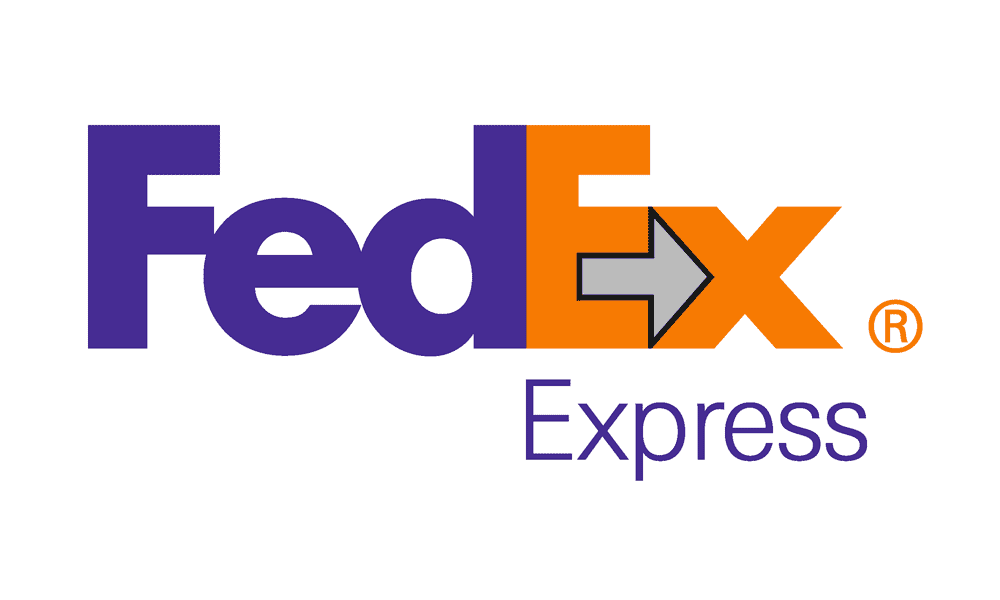
FedEx is an excellent example of using negative space to convey a strong message. Looking closely at the logo, you can see a small arrow between the letters “E” and “X” pointing to the right. Lindon Leader had a penchant for using negative space in his designs. He incorporated a hidden arrow into the second version of the official FedEx logo while leaving almost 40% of the space white.
Though he had to face much criticism for keeping such a massive percentage of space empty, which he addressed by saying,
“I cannot tell you how many times I fight with a client who says, ‘I'm paying an enormous amount of money to pay for an ad in a magazine, and you're telling me you want 60 per cent of it to be empty space?' On the one hand, I can understand where they're coming from. But basically, the average client does not have a sophisticated enough appreciation of white space to understand that it can be a strategic marketing tool.”
They formed a large team to design different versions of the logo. Over 200 logos were created, in which many designers tried to integrate the arrow but make it so that it was not visible.
Finally, they decided on the logo's colour palette and fonts and chose the best one. The most surprising thing was that none of the FedEx executives noticed the arrow, except for a few, including Fred Smith – the global brand manager.
Font Style
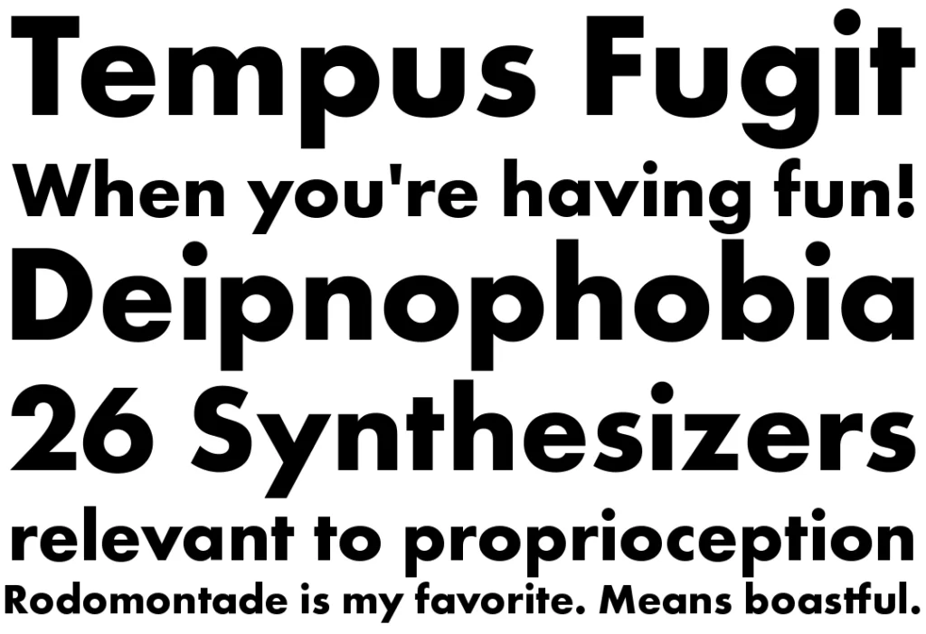
Choosing the right font can make all the difference when designing a logo. The font used for the FedEx logo combines two fonts – Futura Bold and Univers 67. Lindon Leader, the designer, preferred these fonts when they designed the logo in 1990.
Even after finalising the elements, Lindon put much effort into formatting the logo. He made several adjustments, such as changing letter spacing and balancing upper and lower case letters.
However, one of the biggest challenges Lindon encountered during the design process was the negative appearance of the arrow. Nevertheless, he managed to shape the “X” using Univers 67 and a light stroke in Futura Bold, resulting in the final shape of the logo.
The arrow, which runs from right to left between the letters “E” and “X”, indicates that the company covers all products from A to X. The arrow is a symbol of the company. In addition, the arrow's direction symbolises the company's progress, which is moving in the right direction.
Despite its small size, the arrow played an essential role in changing the viewer's perception of the logo. The subtle use of negative space to convey a hidden message is now standard in logo design and has become a hallmark of the FedEx logo.
The FedEx Colours
Designing a logo is often a complex process that involves many iterations and versions. This is certainly true for the FedEx logo, which went through many combinations and colour palettes before arriving at the final version we see today.
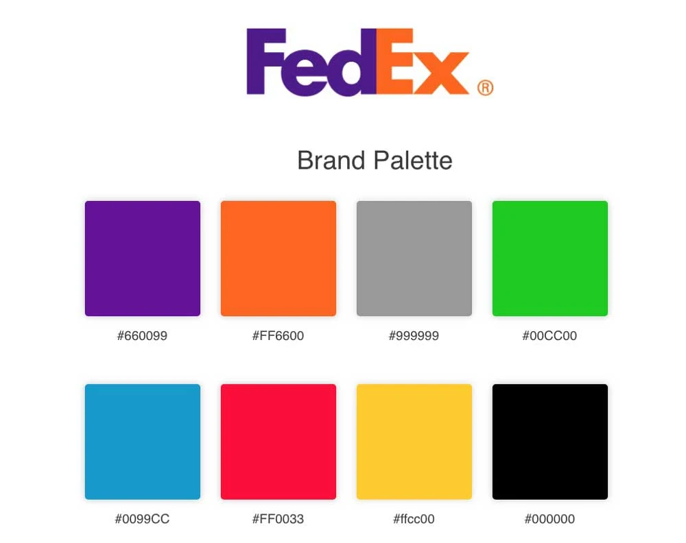
One of the most critical decisions made during the design process was the choice of the colour palette. Various combinations were tried, including black with grey and grey with orange and light purple typography. Lindon Leader, the designer of the logo, finally decided on a light shade of purple for the “Fed” part of the logo, which contrasted nicely with the bright orange for the “Ex” part.
But why did Lindon choose these colours? One reason was that the new logo should still be recognisable as part of the FedEx brand, even though it differed from the previous logo. Lindon maintained a sense of continuity and familiarity with the branding by keeping the purple colour.
Another reason for choosing the colours was to convey a sense of vibrancy and energy. Bright colours like purple and orange are often associated with excitement and enthusiasm and can help a brand stand out in a crowded market. By uniquely combining these colours, Lindon created a distinctive and memorable logo that captures the essence of the FedEx brand.
Why the FedEx Logo Works

The success of the FedEx logo can be attributed to the clever design strategies used in both versions.
The first logo, with the company's original name, “Federal Express”, was instrumental in gaining recognition from government organisations. It helped cement the brand's reputation and visibility in the industry.
However, the second version of the logo helped the FedEx brand gain global recognition. The integration of the hidden arrow in the negative space between the “E” and the “X” symbolised progress and movement, which perfectly matched the company's delivery services. The use of bold, bright colours and straightforward typography in the second version of the logo made it visually appealing and helped it stand out from the competition.
These design decisions proved successful, and FedEx quickly gained global recognition and expanded its services worldwide. The result was a substantial return on investment for the company, which tripled its profits in a relatively short time.
Today, FedEx is a shining example of how to create a successful brand campaign. Its logo is widely recognised as a classic example of creative and strategic design thinking, inspiring start-ups and professional designers alike.
Wrapping Up
The FedEx logo is a perfect example of how a well-designed logo can significantly impact a brand's success. Lindon Leader's thoughtful inclusion of negative space and colour scheme in the second version of the logo created a lasting impression that still resonates today. The logo has won over 40 awards worldwide and is recognised globally as a symbol of excellence and reliability. The evolution of the FedEx logo reflects the company's growth and expansion into new markets, making it a classic example from which both novice and professional designers can learn. As FedEx continues to thrive in the ever-evolving business world, the iconic logo design remains a testament to the power of innovative branding and design strategies.
