7 Logo Design Tips To Enhance Brand Reputation
Do you know the story behind the famous bitten Apple logo on iPhones?
This simple image has a surprisingly exciting background. Some say it depicts the apple that fell on Newton, leading him to discover gravity. Others say it represents the forbidden fruit from the Garden of Eden, pointing to the thirst for knowledge.
Another speculation calls it a tribute to Alan Turing, the father of computers. He bit into an apple poisoned by cyanide and died. Some even believe the icon goes after Steve Jobs’s favourite kind of Apple, the McIntosh.
But why the bite? Look closely, and you will see clever wordplay there.
How? The bite on the apple symbolically puns the word byte, a unit of digital data. Moreover, the bite prevents the apple from being mistaken for a cherry or other tiny fruit when viewed on a smaller scale.
The element of mystery behind this simple icon has kept people thinking about it. This is what the power of an effective logo is! Your brand is incomplete without a representative logo. But how to design a logo that receives the desired attention? Here are some logo design tips for you.
Table of Contents
What is a Logo?

A logo is the mark of identity for a business. This mark infuses the whole concept of a brand into a single picture! Consider it a reflection of a business’s story, purpose, and values.
Logos can consist of anything you want, from text, images, and symbols to a combination of everything.
Text-based logos are known as monograms, wordmarks, and letter marks.
Image-based logos include pictorial marks, abstract logos, and mascots. Plus, there are emblem logos where you put text or pictures on a geometric-shaped shield.
A well-designed logo can turn your brand into a huge success! Continue reading to learn how.
Role of a Logo in Branding
Why is the logo such a big deal?
Well, it’s not just any random image. It is the first thing people notice about your brand. Hence, you need a logo that grabs people’s attention immediately.
Potential customers judge your brand by its logo. No matter how good your products and services are, no one will bother trying them out if your logo fails to impress them.
However, a logo is not just a one-time deal. This is the image people remember you by, which makes up your brand identity!
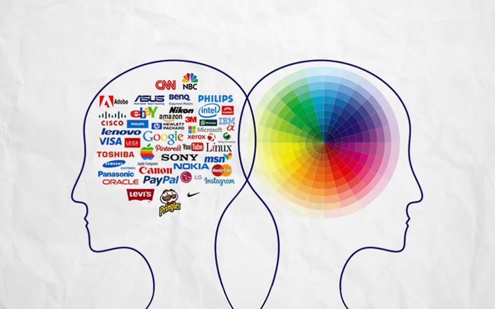
Even if potential customers forget about your brand, seeing its image will help them recall it quickly. In short, a logo sticks your brand into the minds of your target audience.
Moreover, people attach certain perceptions to a symbol. Let me explain with an example. Numerous tech companies offer electronic gadgets at a much lower price than Apple.
However, some people still pay more for Apple products happily. Why? Because they perceive Apple’s logo as a symbol of luxury and class! This is how a logo builds a strong emotional connection with your target audience.
The Process of Logo Design

To design an effective logo, you must first understand each step involved in the design process.
The first step is to build a brand profile. It would help to have a brand profile to ensure your logo represents your brand the way you want. This requires a detailed evaluation of who you are, what you do, and what audience you aim for.
The next step is to research your brand’s industry. This means you have to notice your competitors and determine what makes you different from them.
Then, you must consider all the areas where you intend to use your logo. This ensures you build a scalable design that looks effective on all mediums.
Considering all the above considerations, you will be ready to experiment with different designs!
Elements of a Logo Design

A yummy dish consists of different ingredients, right? Similarly, a logo is a thoughtful combination of different visual elements. So let’s know the ingredients you need to consider for an effective logo design.
Shapes
Yes, even shapes can evoke different emotions in humans. Circles are associated with unity, harmony, and commitment because they have no ends. Triangles represent high levels of growth, energy, and excitement. Squares and rectangles evoke feelings of stability and consistency.
Business Cues
Your logo should give people an idea about what you do at first glance. Even if you want to use an abstract icon for your brand, complement it with straightforward typography mentioning your business. Give your audience at least some kind of clue to avoid confusion.
Colours
People have attached each colour with different emotional connotations and cultural associations. For example, red indicates emergency and urgency. Yellow is more of a happy colour. Using the right colours can make your audience feel exactly what you want.
Tone
Ever seen a law firm’s logo with bright colours or cartoon images? No, because nobody would take them seriously like that! Similarly, you hardly see a simple monochrome logo on brands for kids. Your logo should set the right tone for your target audience.
Typography
The text you use in your logo also dramatically impacts your audience. How you write is as important as what you write. From the typeface and colour to the font style and size, every single detail matters!
Serifs are more suitable for professional brands, while sans-serif typeface usually works best for fancy brands. The bold and underlined techniques put extra emphasis on a word.
Sizes
There are multiple channels to advertise your products now. Your logo appears everywhere, from massive billboards to smartphones with a small screens! You can create different versions of the same logo to fit different-sized mediums. In short, your logo should be scalable.
Trends
Staying on trend is essential for every brand in this dynamic era. Your brand popularity automatically increases if you follow the latest trends in logo design. Why? Because it’s safe to experiment with something you know will impress people.
7 Logo Design Tips to Enhance Your Brand Reputation
At this point, you have already read about logos and their role in branding. You also know how logos are designed and what elements are used.
Here are some design tips for creating an effective logo that enhances your brand reputation.
1 – Know your Brand

Using a randomly-designed image as their logo is a huge mistake many brands make! Check out this logo maker app from Adobe for examples of how you can create the logo your brand deserves.
Do not jump to the designing part directly! Instead, evaluate your brand in detail.
Why go through so much hustle? Because you don’t want a meaningless logo to represent your entire business. You must understand your target audience, competitors, and industry practices to convey your brand story effectively.
Moreover, you have to determine your brand’s personality. Do you want people to perceive you as classy, economical, tough, soft, or connected? This information will help you design a logo that fits your brand perfectly.
2 – Experiment with Empty Space
Minimalism is the hot new trend in the market right now!
Designers are aiming for minimalism in their designs. Brands with overstuffed logos are redesigning simpler versions for a cleaner look. People can read and understand your logo from a distance if you keep it simple and focused.
One way to achieve a minimalistic look is to use space in your design. Space is the blank area, free from all elements. Using lots of space in your logo makes it printable at any size, effective without colour, and compatible with different media.
3 – Play with Colours

Colours are fun to experiment with!
Use colours that fit your brand personality well.
Professional firms may use black and white to avoid giving off carefree vibes. Brands with kids as their target audience should use multiple colours to attract them.
If you don’t want your logo to look like a rainbow, try using different shades of the same colour. It will give your logo a beautiful yet consistent look.
Popular colour combinations of two or three colours will make your logo catchy enough to grab attention.
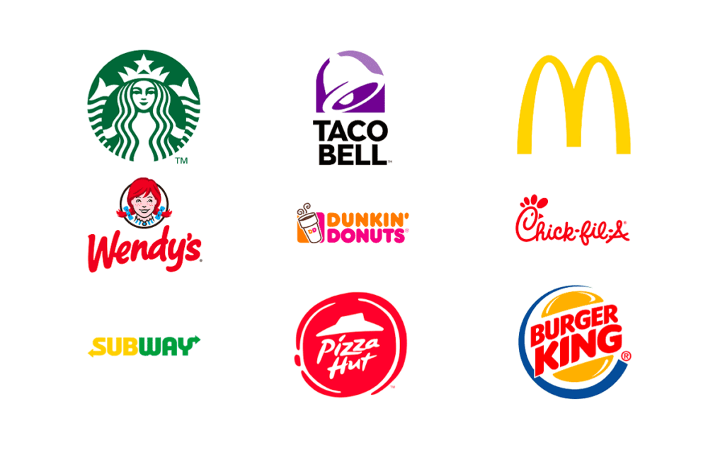
Want your brand to come across as bold? Use red, black, and orange in your colour palette. Use blue, turquoise, and orange to evoke the memories of seas and sunsets. Want to give off funky vibes? Use fun colour combos like green, pink, and yellow.
4 – Focus on the Fonts
Fonts can make or break your logo design!
The characteristics of your fonts play a vital role in how people perceive your brand.
First, choose a font style from serifs, sans-serif, script, etc. Serifs evoke a feeling of class, tradition, and professionalism. Sans serifs are more suitable for a simple and modern look. Scriptwriting gives a refined and elegant vibe.
Then, have to choose the right size and weight for your fonts. Thin fonts seem more delicate, while thick fonts are perceived to be more assertive. Too thin or thick fonts may ruin their readability and appeal on different mediums.
Ensure every font aspect suits your brand and looks good across all mediums. For example, cursive and fancy handwriting on a hospital’s logo won't look good.
5 – Make it Memorable

Add a unique twist to your logo that hooks into the minds of your target audience.
It would be best to examine the logos of similar brands in the industry. Don’t add anything similar to them in your design to avoid looking like a copy!
To make your brand stand out in the market, use an approach or a technique that hasn’t been used by anyone else in the industry.
You may add a unique image, a rare colour combination, or a different kind of typography to make your logo unique. Your logo shouldn’t look like anyone, not even by coincidence!
6 – Incorporate a Story
Who doesn’t love a good story?
Add meaning to your logo by associating it with an exciting background story. The audience will remember your logo more clearly once they know its story.
For example, the three dots on the logo of Dominos, the famous pizza chain, represent the three original outlets started by the owners.
A story will give your logo a unique touch and make you stand out. Knowing an inside story about your brand will make people feel more connected to you. Story-telling is a great technique to build curiosity about your products too.
7 – Work on Feedback

Some people will like your design, and some won’t.
However, suggestions for improvements never harmed anyone.
Once you are done, share your design with friends, family, or fellow designers to see what they think. Jot down all the suggestions together and implement those that seem valuable.
However, don’t just tweak your design on every suggestion you receive.
Why? Because not everyone knows enough about graphic design techniques and trends. Knowing which advice is worth implementing is to ask people their judgment criteria. If you think their evaluation criteria are valid, go ahead with their suggestions.
Final Words
Logos are at the heart of every brand. You will see them everywhere, from billboards and magazines to social media and business cards!
Designing an effective logo can be quite complex. It would help if you comprehensively understood your brand before starting.
You must also learn about your industry’s practices and competitors’ designs. Then comes the time to experiment with different visual elements!
To create a powerful logo:
- Decide the right kind, colour palette, shapes, and typography.
- Use negative space for a minimalistic look.
- Don’t forget to add a unique touch to your logo that makes you stand out from the competitors.
- Think of a background story to make your logo more attractive.
Come up with a few drafts and then take feedback from relevant people to improve them. These tips will help you design a logo that enhances your brand’s reputation!
Author Bio: Waleed Khan is the director of APPSTIRR (LABSTIRR Corp), a US-based company that provides software solutions, mobile application development, and digital marketing services. APPSTIRR holds an extensive portfolio of clients around the world.
