Future Factory by Dutchscot
Opinion by Sarah Malik Posted 17 November 2022
‘Lead generation for creative agencies’. It’s one of those lines that makes complete sense to some but sounds like gobbledigook to everyone else. ‘Lead generation’ is a general mystery, unless your job depends on it. And what is a creative agency after all? But of course, so far as branding is concerned, ‘everyone else’ really doesn’t matter. Hitting the spot for customers is what counts.
Enter the Future Factory. In short, they find sales leads for other companies, mainly creative. And from the looks of things, they have a lot of customers (counting M&C Saatchi, Mother, and Made By Many among them). Lead generation happens typically ‘behind the scenes’. Big and small, these companies rely on Future Factory for their commercial plumbing, transporting the life blood to their businesses. It’s not glamorous, but it’s important stuff.
This post includes Extended Insights for BP&O Plus members.
Find out more and sign-up here.

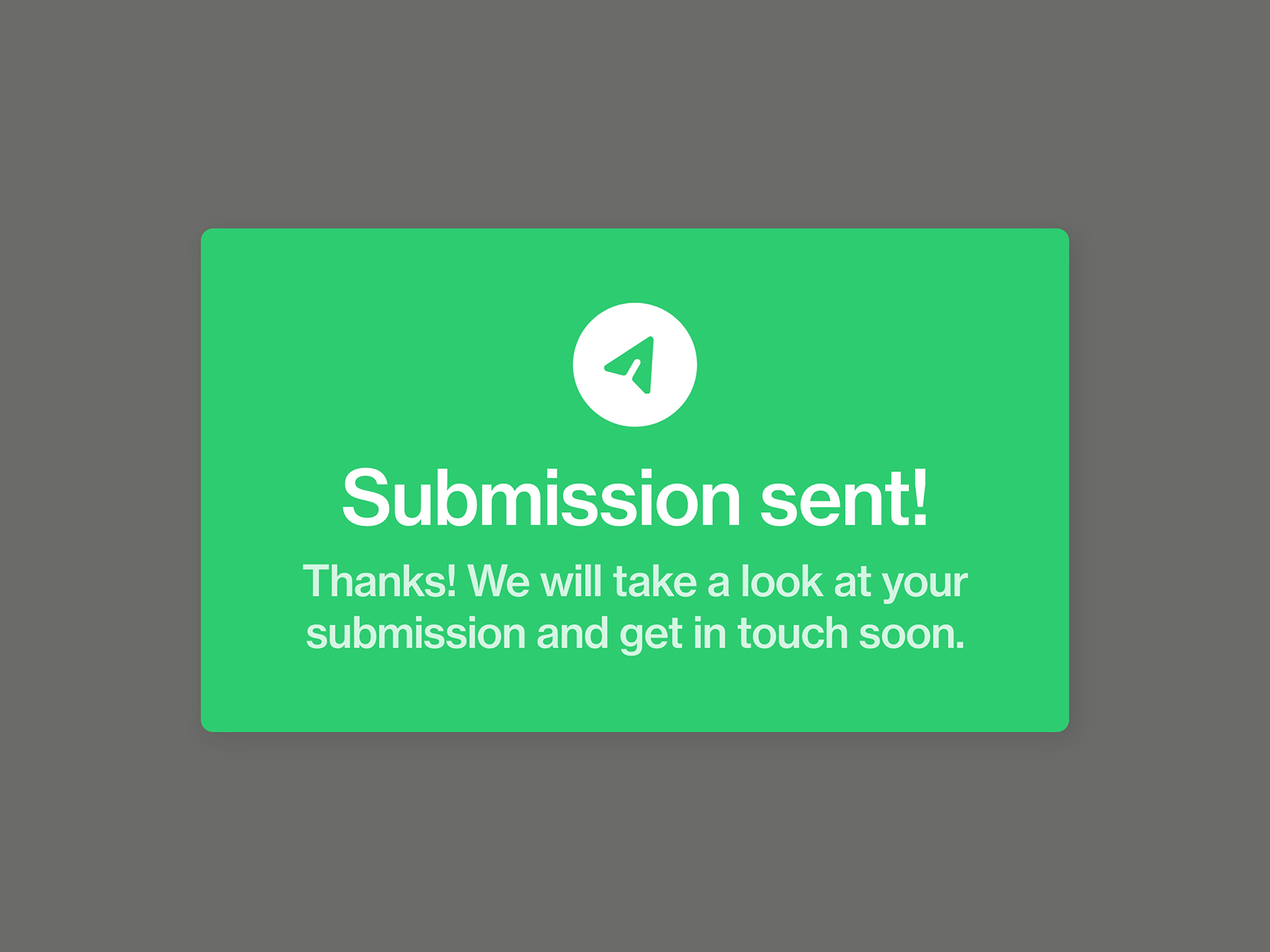
So what is the Future Factory to its customers? Well, if you take DutchScot’s rebrand at face value, the answer seems to be something of a machine. It makes sense; they make stuff (leads) and send what they have made to customers (clients). They haven’t called the company a ‘factory’ for nothing.
DutchScot’s visual communication really runs with this concept. A series of tubes – the plumbing analogy was meant quite seriously – with words moving within them, is the most striking feature of the new website; dynamic, quick. But they could scarcely be called mechanical; the zesty, energetic colour palette and elegant curves of the piping gives it a human edge. After all, this is a ‘human’ business.


Pace is everything in motion, and DutchScot evidently get this. The landing page animation – suggesting the belt and cogs of a bicycle – accelerates and decelerates like a rollercoaster reaching the apex of an ascent. At the same time, continuing the theme of adrenaline-fuelled pursuits, the letters of the words (in this case ‘Future Factory’ in uppercase Rois) bunch satisfyingly and convincingly into neatly plumbed corners and then spread out like F1 cars on the straight.

But then the backdrop to the ‘Team’ section, unusually prominent on the landing page, is entirely static and – what is more – an earthy brown monochrome. Space to pause. But also a nice emphasis: this is what you’re really paying for. Cause and effect; these people make that stuff happen.


I don’t think it would be controversial to say – and I certainly see it in my own practice – that motion is increasingly expected as part of a brand rollout. This is not to say that it need be complex, or of massive production value; indeed a lot of style is dictated by what is available at a reasonable cost. (In this respect, it’s the mass market website building platforms that set the direction.) But setting film aside, animation of letters, shapes and abstract accumulations of colour… we see this more and more.
It’s hardly surprising – after all, what is the world around us other than colours moving? The impressionists, over a hundred years ago, distilled this down to two dimensions. Designers today have more at their disposal to translate an experience or a feeling onto ‘the canvas’. But we are, after-all, working with much the same objective.
And DutchScot for Future Factory, with this in mind, has done a great job. Energy, movement, progress, but within a structure, an order. On the ‘Services’ page, the header animation shows three pipes ‘feeding’ onto a central one, which takes three words (‘Bespoke’, ‘Business’ and ‘Leads’) towards the top right of the view. In the tributaries, each word waits its turn. But then, when the path is clear, they all surge forward. The timing and pace is brilliant: reliable, polite to a fault but, when the starting gates open, they are off!