Going by Design Studio
Opinion by Emily Gosling Posted 30 May 2023
If you’ve heard of Scott’s Cheap Flights, it’s more than likely through word of mouth – it’s the sort of thing shared by a helpful colleague or cousin when you discuss trying to make holiday plans, much like the sage advice to use a private browser when looking at flight prices.
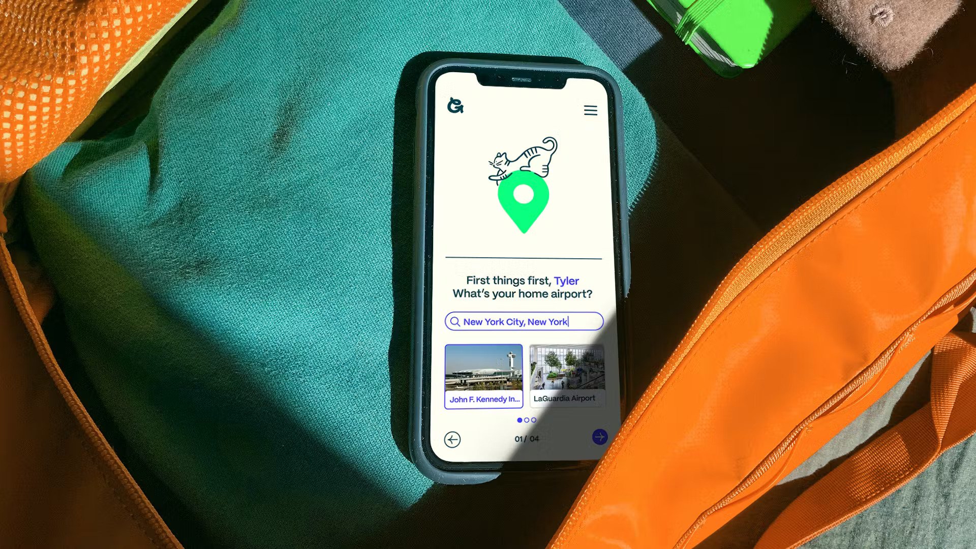
And from these fairly humble beginnings, the service – which started out in 2015 by, yes a man called Scott as a newsletter for family and friends – Scott’s Cheap Flights has grown to a membership of a whopping 2 million people. No longer just a newsletter, Scott’s Cheap Flights now encompasses a fully-fledged website, search engine and forthcoming app; all of which work to help members get better value travel by booking things a little differently.
This growth has meant that Scott’s Cheap Flights no longer does what it says on the tin: it’s about a lot more than just cheap flights; and there are a lot more people behind it than just the titular Scott. Indeed, the team is now made up of more than 60 people, and all these changes have meant that a brand overhaul was long overdue.
As such, DesignStudio – the branding agency behind rebrands for the likes of fellow holiday-related companies such as AirBnb, Center Parcs and Eurostar – was brought in to create a new brand strategy and visual identity that would take Scott’s Cheap Flights into the future, and ushered in the new name, Going.
Speaking with Going employees, key stakeholders and Scott’s members, including longtime followers of the brand led to the notion that with Going, there’s less focus on a particular destination and more a sense of users having the courage to pick a deal by ‘spinning the globe’. And it’s this that then formed the foundation of a new visual language for the company.

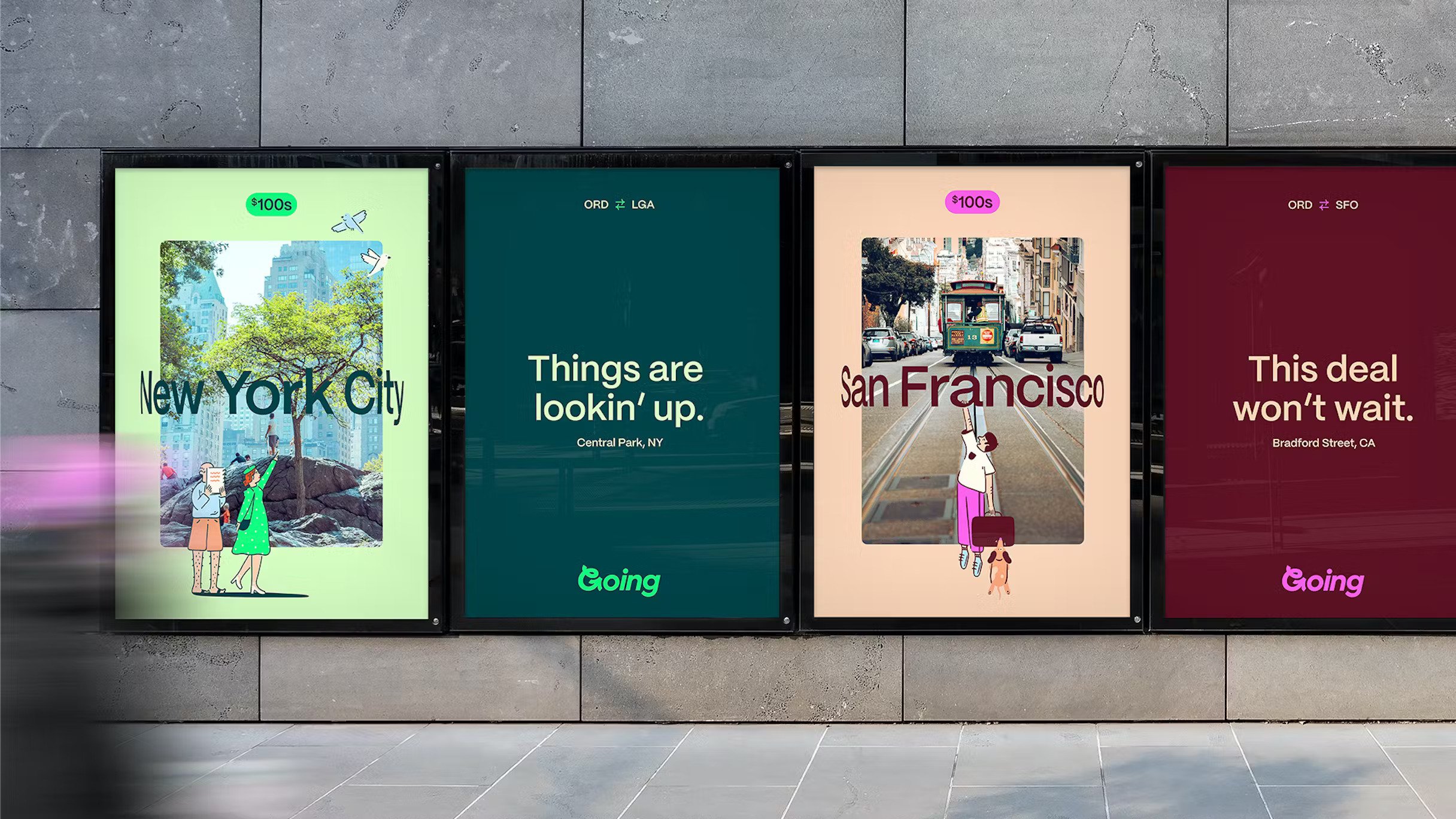
The new brand identity and website looks to set Going apart from other travel-based platforms with a more emotive feel; and it certainly achieves a more friendlier quality far removed from the familiar utilitarian vibe of travel price comparison sites. This begins with the new logomark which takes the ‘G’ of Going as its starting point, incorporating a playful reverse loop and an aeroplane-like shape as an ‘interpretation of the spontaneous twists and turns of travelling’.
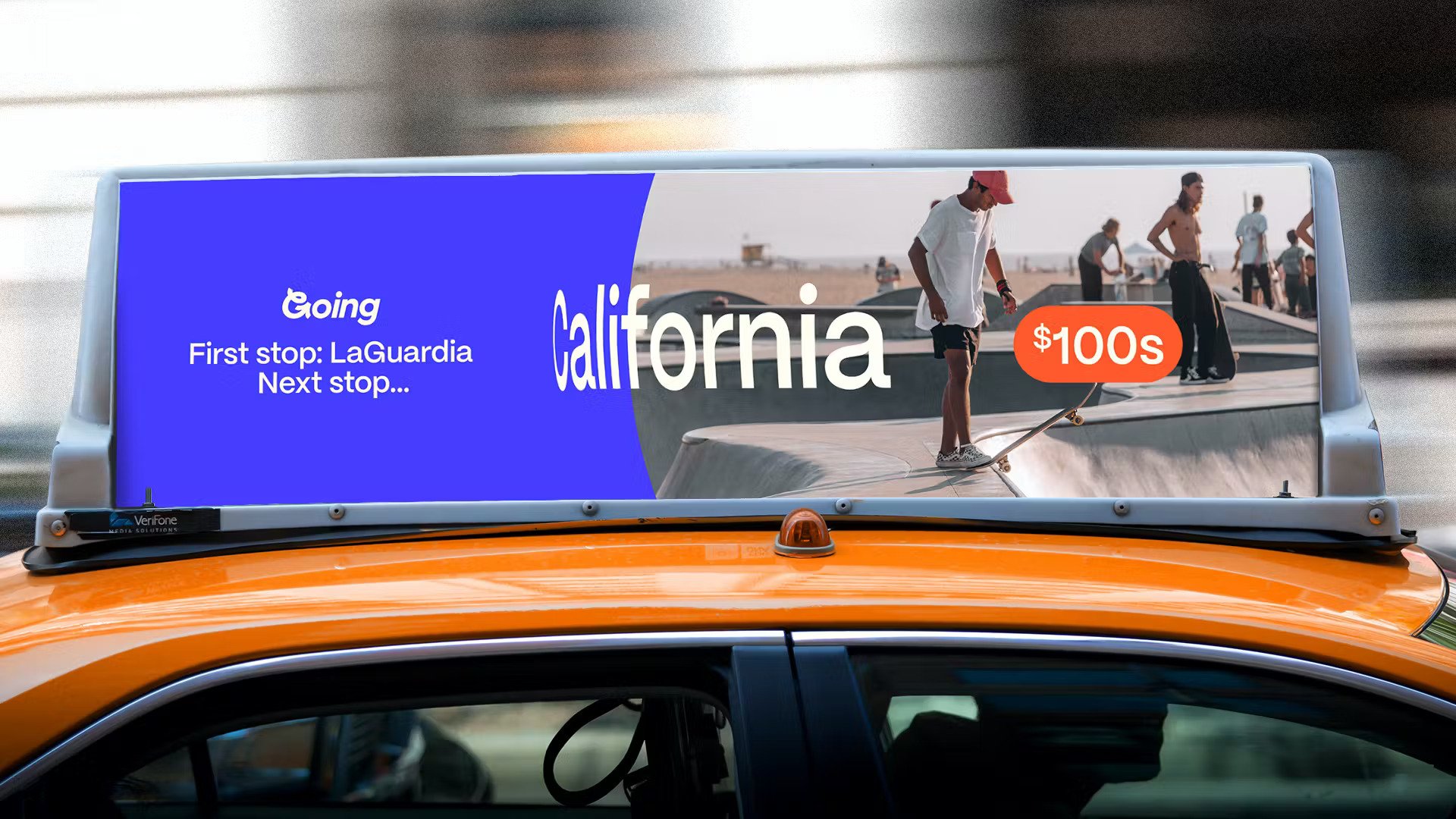
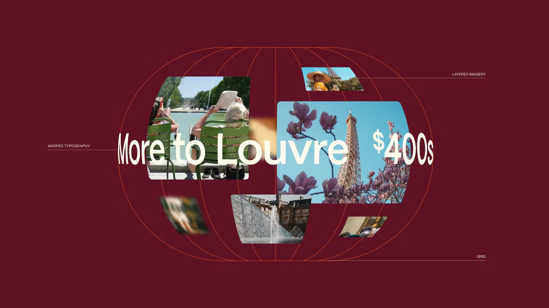
The rest of the visual identity stems from ideas of Going users being ‘intrepid’ and ‘open-minded. These are reflected in the interactive and motion principles of the brand; which encourage users to spin a globe in order to spontaneously pick a destination. This idea also impresses itself on and unites type and photography through a spherical warping. Headline font, PP Mori by foundry Pangram Pangram lends the work both character and a unifying practicality across print and digital.
The illustrations by Olivia Malone are a lovely touch, and push the brand further into the world of the personable and personalised. These are liberally used across Going’s touchpoints as depictions of its community members. The illustrations are often in motion too, interacting with the globe device at the heart of the Going website interface and with the individual destinations. While this might not seem obvious, according to DesignStudio the interaction expresses “Going’s role in bridging the gap between dreaming of where to go, and actually booking it”. They further this idea saying that, when pairing illustration with iconography, these “signify how Going is always looking for ways to make travel planning more easy and enjoyable.” Interesting.
The new palette is largely based around shades of green, with accents of orange, blue and the odd splash of purple. There’s an interesting interplay of ideas here, reflecting aspects of the biological diversity of the four hemispheres, vibrant colour conveying travel’s inherent excitement and sense of discovery, and varying warm and cool tones depicting a range of different climates. These are pleasing notions, in practical terms, it offers both consistency and flexibility depending on the use case.
The brand photography occasionally feels a bit of a letdown next to the rest of the visual identity: while the typography and illustrations feel fresh and dynamic, the stock imagery feel of certain photography on editorial content (like this) can err on the side of cheesy, or look like a bit of an afterthought. While DesignStudio claims that the destination photography avoids “bucket list landmarks,” that doesn’t currently seem to be the case, with a cursory glance of the site revealing the Eiffel Tower and Taj Mahal. Where it does succeed is in eschewing overly posed, cliched ‘people on holiday’ snaps, instead favouring user-generated content where possible. There’s certainly an Instagram-like feel to certain shots, where places are represented with closeups of unusual destination-specific dishes or patterned tiling.
Aside from this, Design Studio have developed an appealing and expansive toolkit for the Going team to use. It both reflects the personal touch of the Scott-centric beginnings and the founder’s ongoing involvement in the company, and sets the brand up for its expansion into the app arena.
