The Power of Colour in Branding and Marketing
Colour plays a vital role in branding and marketing. A company's colours communicate messages about its personality, values, and image. Colours invoke emotions, memories and associations in people and can be used deliberately to influence customer perceptions and behaviour. This article explores the psychology and impact of colour in branding and marketing.
Table of Contents
How Colour Affects Consumers Psychologically

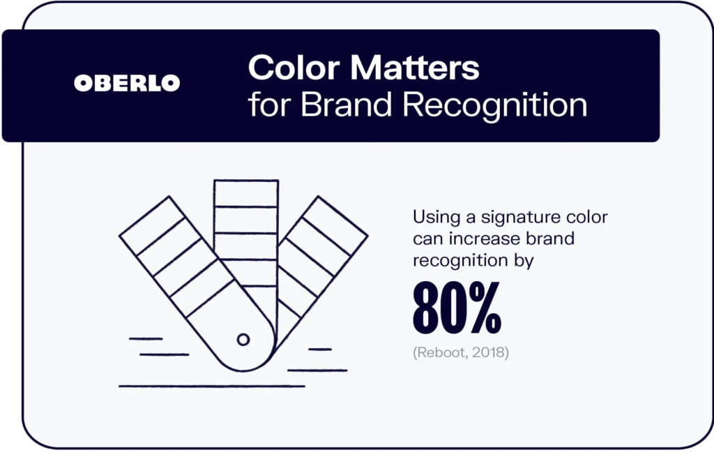
Brands think carefully about colour and colour schemes. Colours strongly influence how consumers emotionally respond to brands and products. Researchers have found colours can increase brand recognition by up to 80%. Let's explore critical findings on colour psychology:
Colour Evokes Emotion
Colours trigger emotional reactions. Red signifies excitement; blue is trusted and secure; yellow cheers people up. Brands choose colours to align with desired consumer emotions.
| Colour | Emotion |
| Red | Love, passion, excitement, energy |
| Pink | Happiness, romance, femininity |
| Orange | Enthusiasm, creativity, fun |
| Yellow | Joy, optimism, confidence |
| Green | Peace, growth, health |
| Blue | Trust, stability, intelligence |
| Purple | Royalty, luxury, spirituality |
| Black | Power, sophistication, mystery |
| White | Purity, simplicity, cleanliness |
| Grey | Neutrality, detachment, sadness |
| Brown | Stability, earthiness, rustic |
Colour Influences Perceptions
Colour alters how people perceive brands and products. Blue and green brands are seen as dependable. A red fast food logo sparks appetite. Coloured packaging shapes quality perceptions, too.
- Blue bottle = Natural spring water
- Red bottle = Sugary soda
Subtle colour tweaks can powerfully shift impressions.
Colour Impacts Behaviour
Colours can influence actual consumer behaviour. One test found red checkout buttons increased impulse buys by 24% vs grey buttons. Restaurants with blue lighting see patrons lingering longer—coloured calls-to-action boost click-through rates.
Brilliant brand colour strategies tap into the mind and emotions.
Brand Colour Foundation: Primary Palette

A brand's primary colour palette forms the foundation of its visual identity. This core set of 2-4 colours appears widely across branding touchpoints. When choosing primary colours, brands evaluate meaning, uniqueness, and aesthetic appeal.
Key Brand Colour Selection Factors
Colour Meaning
- Aligns with brand personality
- Evokes desired emotions
- Shapes helpful perceptions
Colour Differentiation
- Distinct from competitors
- Ownable colour territory
Aesthetic Appeal
- Harmonious combinations
- Visually pleasing
- Stylish, modern, or classic
By imbuing colours with strategic meaning, brands spark instant emotional connections thanks to colour psychology.
Company History and Heritage
Established brands often derive colour palettes from their heritage. Coca-Cola's famous red echoes its original serving trays. Tiffany's robin egg blue harkens to 19th-century catalogues. Colour history builds familiarity and nostalgia.
Industry Conventions
Within industries, familiar colour codes help attract the right consumers. Barbie doll pink signifies fun. John Deere's Green says agriculture. UPS brown trucks deliver trustworthiness. Conventional colours assist in recognition and positioning.
Optimising Brand Colours For Impact

Brands extensively test colours and colour combinations to maximise resonance and results. Useful techniques include:
Colour Psychology Research
Academic colour research identifies reactions to hundreds of subtle hues. Brands reference this data, choosing colours optimised for specific traits. Muted blues denote stability, and light greens speak to health. Wise brands utilise empirical colour insights.
Customer Surveys
Online surveys help brands show colour options and ask customers direct questions:
- “Which logo colour suits our brand personality?”
- “Which colour makes you feel happy and optimistic?”
Client perspectives ensure colours align with customer expectations.
Performance Testing
Brands A/B test colour schemes to see what achieves the best response rates. For example, which email CTA button colour generates more clicks – red or green? Direct result testing refines colour choices to maximise outcomes.
Careful research and testing allow brands to leverage colour psychology with brilliant precision.
Coordinating Colour in Branding
Brands manually combine colours, seeking the perfect hues. But, emerging artificial intelligence tools can smartly generate entire matched colour schemes.
Manual Colour Matching
Graphic designers traditionally put together colour palettes by hand based on aesthetics, meaning, and performance. However, even experts can work hard to blend multiple colours that work together. Exhaustive trial and error eats up resources. What's an advanced alternative?
AI-Powered ColourMatching
Innovative AI colour tools – like Colorspire – offer brands more intelligent direction. These technologies can algorithmically generate full-colour schemes scientifically customised to brand parameters. A few clicks produce rich, nuanced palettes forged for optimal resonance and results. AI assistance accelerates branding success.
The Future of AI Colour Direction
As colour psychology data grows, AI will get exponentially better at emotive colour recommendations. Brands could describe adjectives or emotions wanted, and AI will output completely matched brand colour schemes engineered to uniquely spark those consumer feelings and reactions. AIColour promises brands colour mastery beyond human limitations.
Industry examples: Signature Brand Colours

Iconic brands are easily identifiable by their signature colour palettes across logos, packaging, merchandising and marketing. These examples showcase how consistent, strategic use of colour builds familiarity and connection over time.
| Brand | Associated Colours |
| Coca-Cola | Red |
| Tiffany & Co. | Robin egg blue |
| UPS | Brown |
| Rolex | Green |
| Ferrari | Red |
| Starbucks | Green |
| YouTube | Red |
| Target | Red |
| John Deere | Green & Yellow |
| Rainbow gradient |
Coca-Cola's Spencerian red script logo and contoured bottle are globally identifiable. Coffee giant Starbucks features green prominently across storefronts, packaging, and aprons. Confection legend Cadbury developed signature purple and gold tins starting in 1908. Distinctive colours help these brands stand out.
Computing innovator IBM trademarked its authoritative blue in 1947. Fellow electronics producer HP chose contrasting cyan and green reflecting precision technology. Camera pioneer Canon utilises conservative but dependable colours across its name, cameras and print materials. Recurrent brand colours bolster memorability and trustworthiness.
Automotive Companies
Legendary Italian supercar maker Ferrari races with signature vermillion vehicles, attire, and branding. Equipment manufacturer John Deere features trusty green and yellow across two centuries of farming gear—safety-focused Volvo projects security and reliability through cool tone silver and blue tints. Vehicle colour converges with brand identity.
Optimising Colours For Digital Marketing
Brand colours critically impact digital marketing success. Onscreen presentations shape first impressions and trust. Usability relies on getting colour combinations and contrast right. Graphics catch the eye while conveying brand style. Optimised palettes perform across devices and environments. What colour practices work best digitally?
Web Design Adaptability
Fixed brand palettes can't perfectly display across varying screens, browsers and devices. Flexible digital colour systems intelligently auto-adapt imagery to maximise visibility as conditions change. Dynamic colour ensures consistency in shifting contexts.
Readability Prioritisation
Text legibility matters most. Brand colours should decorate complement – not obscure – core content. Dark, muted backgrounds prominently feature brighter, easy-reading text out front. Photography adopts colour tints harmonising with headlines.
Conversion Testing
Digital channels enable continual colour experiments. Brands A/B test button shades, layout tints, and link colours to lift response metrics. Does crimson or blue produce more newsletter clicks? Visitor data informs continual optimisation.
Ongoing experimentation paired with analytics reflection advances digital colour mastery.
Video and Motion Media Settings
Colour presentation grows complex, adapting branding to dynamic video and motion contexts across websites, ads and apps. Mobile introduces tricky new technical constraints. How can brands effectively transition colour palettes cinematically?
Style Guides Dictate Standards
Brand style manuals document colour codes, fonts, image filters and graphic rules. Designers ensure on-brand motion media treatments across projects and teams by consulting detailed style guidance. Style consistency nurtures recognition and trust.
Resolution Changes Require Adaptivity
Mobile screens utilise RGB colour, PC browsers leverage CMYK, and print uses Pantone matching systems. Brand colours shift moving between media. Adaptive colour management dynamically calibrates to Output intents, preserving logo consistency.
Colour Grading Sets Tone
Cinematic colour grading tailors the mood. Cool, muted hues suggest conservative dependability. Saturated neon palettes reflect youthful energy. Closing graphics echo the climax feelings. Graded colour guides the journey.
From static to motion, adaptive colour systems enable brands to convey identity dynamically while enticing targeted emotions.
International Brand Colour Considerations

As brands expand worldwide, global colour associations require localisation sensitivity to prevent missteps. Colours carry distinct meanings across cultures. Red signifies luck in China but danger in Nigeria. Brands attune colour choices to regional nuances.
Researched Regional Adaptations
International branding introduces fresh complexities. Blue calms those in the UK but seems corporate to Australians. Africans feel green denotes prosperity. Global brands smartly evolve colour selections based on cultural research to forge positive overseas associations.
| Country | Colour | Association |
| China | Red | Luck, happiness, prosperity |
| India | Saffron | Sacrifice, courage, renunciation |
| Ireland | Green | Luck, nationalism |
| Egypt | Blue | Protection, mysticism, femininity |
| Mexico | Green, White, Red | Independence, unity |
| Japan | White | Purity, simplicity, emptiness |
| United States | Red, White, Blue | Patriotism, independence |
| Netherlands | Orange | National pride, royalty |
| Brazil | Green, Yellow | Abundance, exuberance |
| Saudi Arabia | Green | Islam, nature |
With localisation, brands can avoid alienating audiences. Colours carry distinct cultural connotations.
Consistent Core Identity
Adapting brand colour regionally shows respect while maintaining loyalty. Packaging responds to local preferences; websites mirror favoured palette patterns. Primary brand colours and logos remain steady at the centre, building consistency. Concentric colour circles balance adaptation with coherence as brands span the globe.
Conclusion
A brand's colour palette profoundly impacts marketing success. Colours speak to emotion, convey personality and shift perceptions. Aligning branding colours with psychology and culture while uniquely differentiating from competitors helps forge positive connections with consumers, leading to real behaviour change and commercial outcomes in today's visually-driven society.
Brands invest deeply in strategic colour mastery for a good reason – colour transforms marketing resonance across media and borders when optimised. Distinct colours build familiarity across years of exposure, cementing recognition and preference with every red can, blue website footer or green tractor purchased. Conclusively, branding colour matters.
Common Colour Branding FAQs
Why is brand colour choice important?
Brand colour selection helps determine consumer emotional response, shape positive brand impressions, align with target markets, express company values, boost visual identity and guide business messaging for optimised marketing results.
How are primary brand colours used?
Primary brand colours appear widely across company logos, packaging, websites, stationery, uniforms, marketing materials, and more – frequent exposure nurtures instant recognition, which converts to preference and sales over time.
What are the primary factors deciding brand colour palettes?
Key considerations include desired brand personality expression, helpful emotional resonance, differentiated visual identity from competitors, core target market cultural associations, accessible colour harmonies, and iterative performance testing.
How can brands manage colour adaptations?
Maintaining brand guide colour specifications enables adaptations across media like print, digital, video and global regions, while core colours consistently anchor identity as variations evolve responsively.
Why will brand colour mastery grow?
Ongoing psychology research, conversion performance testing, localisation attunement and AI assistance will exponentially improve emotive branding colour selections, yielding ever-stronger consumer connections.
