
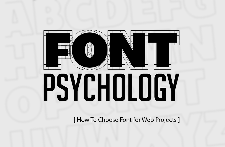
Fonts play a pivotal role in web design, and font psychology explores the impact of typefaces on human emotions and perceptions. Fonts silently conveying messages and evoking emotions. They are more than just text; they are visual elements that influence how users perceive and interact with a website. In this comprehensive guide, we will explore the fascinating realm of font psychology and learn how to choose fonts effectively for web projects.
You may be interested in the following related articles as well.
- 100 Greatest Free Fonts For 2022
- 50 Top Fonts For Graphic Designers
- 100 Best Free Fonts Of 2021
- 25 Best Logo Fonts For Logo Design
Unlimited Downloads
Over 1,500,000+ Fonts, Mockups, Freebies & Design Assets

Table Of Content
Understanding Font Psychology
Before diving into font selection, it’s essential to understand how fonts can affect human perception and emotions.
Fonts play a significant role in the world of design and communication, whether we realize it or not. They are more than just text; they are a form of visual language that conveys meaning and emotion. This concept is at the heart of font psychology, a field that explores how different fonts influence our perceptions, emotions, and attitudes. In this article, we will delve into the fascinating world of font psychology and how it impacts our daily lives.
Fonts are not created equal. Each typeface has its own unique personality, and this personality can evoke a wide range of emotions and responses. For example, consider the difference between a playful, rounded font and a bold, serif font. The former might be associated with fun and informality, while the latter conveys a sense of tradition and stability.
One of the fundamental aspects of font psychology is the association between fonts and the brands or messages they represent. Companies and organizations carefully select fonts to align with their brand identity and the message they want to convey. For instance, Coca-Cola’s iconic cursive logo is not just a random choice; it’s carefully designed to evoke feelings of nostalgia, comfort, and tradition. In contrast, a tech startup might opt for a sleek, modern font to convey innovation and forward-thinking.
Fonts can also influence how we absorb and retain information. Research has shown that the choice of font can impact reading comprehension and memory. For example, a study conducted by researchers at Princeton University found that students who received printed materials in a legible, easy-to-read font performed better on tests compared to those who received materials in a difficult-to-read font. This suggests that font choice can affect how effectively information is conveyed and retained.
- Serif vs. Sans Serif: One of the most fundamental distinctions in fonts is between serif and sans-serif fonts. Serif fonts, with their decorative tails or “serifs,” often convey tradition, elegance, and reliability. On the other hand, sans-serif fonts, characterized by clean lines without serifs, tend to feel modern, minimalistic, and straightforward.
- Font Weight: The thickness or weight of a font can influence its message. Bold fonts command attention and convey confidence, while lighter weights may appear delicate or subtle.
- Font Style: Fonts come in various styles, such as italic, oblique, or normal. Italics can add emphasis or suggest informality, while oblique fonts are slanted versions of the regular font, providing a sense of motion or distinction.
- Decorative Fonts: Decorative or display fonts are highly stylized and often used sparingly for special occasions or headlines. They can convey uniqueness or playfulness but should be used with caution to maintain readability.
- Script Fonts: Script fonts mimic handwriting and can evoke a personal, elegant, or artistic feel. They are often used for invitations or branding that seeks a more personalized touch.
- Monospaced Fonts: Monospaced fonts, where each character takes up the same horizontal space, are associated with typewriters and coding. They convey a sense of order and precision.
Choosing Fonts for Web Projects

Selecting the right fonts for web projects is a crucial aspect of web design, as it directly impacts readability, user experience, and the overall aesthetic appeal of a website. Here are some key considerations to keep in mind when choosing fonts for your web projects.
- Readability: The primary purpose of text on a website is to convey information. Therefore, prioritizing readability is essential. Choose fonts that are easy to read both on desktop and mobile devices. Sans-serif fonts like Arial, Helvetica, or Roboto are popular choices for body text due to their clarity.
- Consistency: Maintain consistency in your font choices to create a cohesive and professional look. Typically, web designers use one font for headings (e.g., a bold serif font) and another for body text (e.g., a clean sans-serif font) to establish a visual hierarchy.
- Responsiveness: Ensure that the selected fonts are responsive and look good on various screen sizes and resolutions. Some fonts may not render well on smaller screens, leading to legibility issues. Test your fonts across different devices to ensure a seamless user experience.
- Web-safe Fonts: To ensure that your chosen fonts display consistently across different browsers and platforms, consider using web-safe fonts or web font services like Google Fonts or Adobe Fonts. These services provide a wide range of fonts that are optimized for web use.
- Branding: If your web project is for a business or brand, align the font choices with the brand’s identity. The fonts should reflect the brand’s personality and values. A unique custom font can help distinguish the brand, but ensure it doesn’t compromise readability.
- Font Pairing: Selecting complementary fonts is an art. Pair fonts that create visual harmony and maintain contrast. Combining a decorative font for headlines with a simple, legible font for body text is a common practice.
- Accessibility: Accessibility is a critical consideration. Choose fonts that meet accessibility guidelines, such as having good color contrast with the background and providing options for adjustable font sizes.
- Loading Speed: Be mindful of font file sizes, as large font files can slow down page loading times. Optimize your fonts to strike a balance between aesthetics and performance.
- Testing: Before finalizing your font choices, conduct usability testing with potential users to gather feedback on readability and overall user experience. This can help identify any issues and refine your font selections.
Now that we understand font psychology, let’s delve into the steps for choosing fonts for web projects effectively.
- Define Project Goals:
- Begin by understanding the project’s objectives and target audience.
- Consider the mood and tone you want to convey. Is it a formal business website or a creative portfolio?
- Readability is Paramount:
- Above all else, your chosen fonts must be readable. Consider factors like font size, line spacing (leading), and letter spacing (kerning).
- Test fonts on different devices and screen sizes to ensure readability remains consistent.
- Font Pairing :
- Use a combination of fonts to create visual hierarchy. Typically, a pairing includes a primary font for body text and a secondary font for headings.
- Ensure that the two fonts complement each other in terms of style and readability.
- Consider Branding:
- If the web project is for a brand, the chosen fonts should align with the brand’s identity and values.
- Create a visual connection between the brand’s offline and online presence through font choices.
- Accessibility Matters:
- Ensure that your chosen fonts meet accessibility standards. Fonts should be legible, especially for users with visual impairments.
- Pay attention to contrast between text and background, as this affects readability.
- Test on Multiple Devices:
- Different devices and browsers can render fonts differently. Test your chosen fonts across various platforms to ensure consistency.
- Limit Font Styles:
- While variety can be engaging, too many font styles can lead to visual clutter. Limit your selection to a few fonts for cohesion.
Selecting fonts for web projects involves a thoughtful balance between aesthetics and functionality. Prioritize readability, consistency, and responsiveness while considering the brand identity and accessibility. By carefully choosing fonts that align with your project’s goals and target audience, you can enhance the user experience and make your web project visually appealing and effective.
Font Psychology in Action
Font psychology, the study of how fonts influence emotions and perceptions, plays a pivotal role in various aspects of our lives, from branding and marketing to education and communication. When put into action effectively, font psychology can have a profound impact on how messages are received and interpreted.
One of the most prominent examples of font psychology in action is in branding and marketing. Companies carefully select fonts to align with their brand image and the emotions they want to evoke in consumers. For instance, luxury brands often use elegant, sophisticated fonts to convey a sense of exclusivity and refinement. On the other hand, tech companies might opt for clean, modern fonts to communicate innovation and cutting-edge technology.
In advertising, font choices can make or break a campaign. Fonts can be used to create a sense of urgency, trust, or excitement. Bold, attention-grabbing fonts might be employed in a sale announcement, while a gentle, script font could be used for a heartfelt message. The success of an advertisement often hinges on the psychological impact of the chosen fonts.
Let’s explore how font psychology influences real-world web design:
Font psychology exerts a significant influence on real-world web design, shaping the way users perceive and interact with websites. Here’s a concise look at how it plays a pivotal role:
- Branding and Identity: Font choices can help establish a website’s brand identity. Serif fonts may be used for a sense of tradition and sophistication, while sans-serif fonts often convey modernity and simplicity. The font selected must align with the brand’s values and target audience.
- Readability and User Experience: Ensuring that text is easily readable is a fundamental aspect of web design. Legible fonts and appropriate font sizes enhance user experience, keeping visitors engaged and encouraging them to stay on the site longer.
- Hierarchy and Emphasis: Font weights, styles, and sizes are employed to create a visual hierarchy on a webpage. Headers and subheadings in different fonts help users quickly understand the content’s structure and importance.
- Emotional Appeal: Fonts can evoke emotions. For instance, script fonts may infuse warmth and friendliness, while bold, geometric fonts can exude confidence and strength. Choosing fonts that resonate with the website’s message or purpose can emotionally connect with users.
- Cultural and Industry Relevance: Different cultures and industries associate certain fonts with specific themes or ideas. Understanding these associations is crucial when designing websites that cater to diverse audiences or niches.
In essence, font psychology goes beyond aesthetics in web design. It’s a tool that web designers wield to create websites that not only look visually appealing but also effectively communicate messages, establish brand identities, and provide a seamless user experience.
Few examples of Fonts used by globally renowned websites:
- Apple:
- Apple’s website predominantly uses the sans-serif font San Francisco. This choice aligns with the brand’s modern and minimalist image, emphasizing clarity and simplicity.
- The New York Times:
- The New York Times opts for the classic serif font, Georgia, in its headlines and body text. This choice conveys tradition, reliability, and a sense of authority in journalism.
- Mailchimp:
- Mailchimp balances the modernity of the sans-serif font Avenir with the playful script font Fredericka the Great for its logo. This combination suggests a blend of professionalism and approachability.
Tools and Resources for Font Selection

Selecting the right font is a critical aspect of graphic design, web development, and branding. It can greatly influence the overall look and feel of a project. Fortunately, there is a wide range of tools and resources available to assist designers and developers in making informed font choices.
- Google Fonts: A vast collection of free and open-source web fonts with easy integration into web projects.
- Adobe Fonts: Adobe’s library of high-quality fonts for use in web design and other creative projects.
- Font Pairing Tools: Online tools like Font Pair and Typ.io provide font combinations for inspiration and testing.
- Font Psychology Resources: Books such as “The Psychology of Typography” by Armin Vit and “Thinking with Type” by Ellen Lupton delve into the psychology behind fonts.
- Typeface Libraries: Websites like Google Fonts, Adobe Fonts, and Font Squirrel offer extensive collections of free and paid fonts. These platforms allow users to preview and download fonts for various design projects.
- Typography Tools: Tools like Adobe Typekit and Font Book on Mac OS provide font management capabilities. They help organize and activate fonts, ensuring a streamlined workflow.
- Font Pairing Guides: Designers often need to pair fonts harmoniously. Tools like Typ.io and Fontjoy offer suggestions for font combinations, helping to create visually appealing layouts.
- Prototyping Tools: Prototyping tools such as Figma, Adobe XD, and Sketch include font libraries and text styling options, making it easy to experiment with fonts in a design mockup.
- Font Licensing Resources: For understanding font licenses and usage rights, resources like Fontspring’s Font Licensing Guide provide valuable insights to avoid legal issues.
- Font Identification: If you come across a font you like but don’t know its name, tools like WhatTheFont and Fontspring Matcherator can identify fonts from images or web links.
Conclusion
Fonts are more than just text; they are powerful tools for conveying messages and emotions in web design. By understanding font psychology, defining project goals, prioritizing readability, considering branding, and adhering to accessibility standards, designers can choose fonts that resonate with users and enhance the overall web experience.
In the digital age, where information is often conveyed through text on screens, the art of font selection is a skill that distinguishes exceptional web projects from the rest. Embrace the world of fonts, experiment, and create web designs that not only look great but also communicate effectively with your audience.


")


Font Psychology in a single sentence:
“Font psychology is the study of how different typefaces and typography choices can influence human emotions, perceptions, and behaviors.”
🙂
As per Google baba:
“Font psychology is the study of how different fonts and typographic styles impact viewers’ thoughts, feelings, and behaviors. It is based on the idea that our brains associate different fonts with certain traits or characteristics. For example, we might associate serif fonts with tradition and trustworthiness, while sans-serif fonts with modernity and innovation.”