
Every brand has a different story. Your brand has a unique style, tone of voice, and approach to its marketing strategy. One of the most important branding decisions you can make is to choose your brand colors. While it may seem like a simple choice, choosing the appropriate colors for your brand identity is an essential component in developing a strong and consistent personality for your company or business.
Choosing the right colors is no easy task. How do you decide which colors best fit your company’s personality and values?
The good news is that with some help from this guide, you’ll be well on your way to choosing the perfect colors for your brand (or for a client).
Why Your Brand Colors Matter
The colors you choose for your brand are the face of your company. They not only reflect the mood and feelings you intend to convey but also influence how your audience perceives your brand. The colors you choose can attract or repel potential customers and have a big impact on your brand’s personality.
Branding is a powerful tool that helps your business to stand out from the crowd. In fact, it’s been said that 80% of our decision-making happens within 90 seconds of receiving a stimulus—and both color and branding play an important role in this process. This means that choosing the right colors for your brand identity is key to making sure you don’t lose customers before they even learn anything else about your business.
Your brand colors send a strong message about what your company is all about. As such, it’s important that you stick with your selected color palette and that the colors remain consistent throughout any design materials you produce (e.g., logos, website, social media banners) to reinforce the continuity of your brand identity.
In short, choosing the right colors can help you reach your target audience while still staying true to who you are as a business.
Get millions of stock images and videos at the best price
Unlimited access. No attribution required. Starts at just $9/month.

Consider the Meaning or Impact of Colors
The psychology of color is a fascinating subject. Every color has a different impact on viewers, even if the impact is subconscious. When you’re choosing your brand’s colors, it’s essential to have a clear understanding of the psychology of color and how color impacts certain emotions, feelings, or moods. Take the psychology of colors into consideration when you’re picking the color scheme for your brand.
The colors you choose should work well with your brand’s personality, while also evoking the right feelings and emotions for the viewer. When used appropriately, color is an extremely powerful tool for branding and marketing. When used incorrectly, colors may confuse viewers or present the wrong message.
Here’s an overview of the common associations that are related to each color.
- Red – passion, desire, excitement, power, aggression, danger, anger
- Orange – happiness, optimism, friendliness, confidence, enthusiasm, rejuvenation, caution
- Yellow – warmth, clarity, brightness, energy, frustration, anger
- Green – nature, growth, peace, organic, health, fitness, outdoors, money, safety, security, luck, envy
- Blue – trust, security, loyalty, dependability, reliability, strength, maturity, calmness, sadness
- Purple – royalty, luxury, creativity, wisdom, imagination, power, bravery, spirituality
- Pink – love, romance, femininity, kindness, compassion, sincerity, calmness, joy, youth
- Brown – nature, ruggedness, security, strength, comfort, dependability, reliability, security, loneliness, isolation
- Black – elegance, luxury, mystery, boldness, power, unhappiness, evil, anger, death
- White – purity, innocence, cleanliness, safety, peacefulness, honesty, emptiness, coldness
For a more detailed look at the topic, you can read The Psychology of Color to learn the finer details that should influence the colors you choose.
Define Your Brand Identity or Personality

Before you decide on the color palette for your brand, it’s essential to define your brand identity or personality. You should clearly understand how you want your audience to view your brand. Here are some questions you can answer that will help to define your brand’s identity:
- What is the purpose of your brand?
- What are your brand’s values?
- How do you want customers to feel when they interact with your brand or your products?
- How do you want customers to describe your brand?
The brand’s desired identity or personality can then be used in combination with color psychology (see the common color associations listed above). When they both come together, you’ll know how you can convey or present your brand’s identity in the best way.
What Colors Are Your Competitors Using?
When you’re trying to find the perfect color scheme for your brand, it can be helpful to look at the colors other brands in your industry or niche are using. First, choose several competitors that you feel to have an identity and branding strategy that’s similar to your own.
While doing this research, pay attention to which colors seem to work best with each company’s branding and marketing efforts. Do you think the colors these other brands are using help to present the right image or identity? Take note of the ones you think are effective and the ones you think could be better.
Each company will have a different approach based on its target audience and unique personality or message, so don’t expect your competitors’ color schemes to fit with your brand’s identity.
Once you’ve discovered some common themes, you may have a better idea about the colors you should use for your own brand. Of course, you don’t want to simply copy the colors from your competitors. Use what you find as inspiration and adapt it to suit your own brand. In fact, you may also use this exercise to find colors or shades you should avoid if you want to have a look that stands out from your competitors.
Adapt a Color Scheme from Your Surroundings
Another option is to choose your color palette based on the surroundings of your business. For example, a seafood brand might use colors found in sea life. A cycling brand might use colors from urban scenery like blues and grays. This is an effective way to choose a color palette that’s appropriate and fitting for your brand.
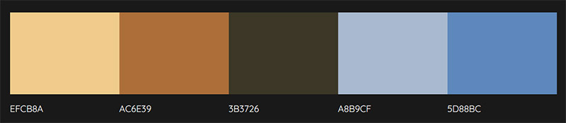
An easy way to do this is to start with a photo that portrays your environment or something very similar. An outdoor adventure company might use a photo like the one below to help with creating a color scheme.

Next, upload the photo to Colormind and it will extract the colors in the photo so you can easily use them to create a color scheme. From the image above, Colormind generated this palette:
This is a common approach and you can see examples in many different industries. For example, many landscaping or gardening companies use green as a primary color, because it’s a natural fit for this type of business.
Find Inspiration
Other brands within your industry shouldn’t be your only source of inspiration. You can also browse marketing materials from companies in other industries to get ideas related to colors and color combinations.
You might find some inspiration in fashion, food, travel, sports, music, entertainment… the possibilities are nearly endless! You can browse logo and branding galleries online, pick up a magazine and check out the ads, look at product packaging in a store, or any number of other things. Of course, you can also browse vector designs at Vecteezy as another way to find color inspiration. By creating a free account, you can save resources to collections as a way of organizing your inspiration
Once you’ve found something that inspires you, keep track of it. Take a picture, grab a screenshot, or pull out the page from a magazine. Keep track of your inspiration so you can use it when you’re choosing your own colors.
Choose Your Primary Color
Now that you’ve done your preliminary background work, it’s time to actually start choosing your colors. Most brands have a single primary color. T-Mobile has magenta, UPS has brown, Starbucks has green, etc.
The easiest and most effective way to go about creating a color scheme for your brand is to start by simply deciding on a primary color. Of course, this is where you’ll want to consider your brand’s identity and the psychology of color. Be sure you choose a primary color that fits well with your desired identity and also has the right impact on viewers.
Choose Your Secondary Colors

Next, you should choose 1-3 secondary colors to be used along with your primary color. Using many different colors can be tempting, but try to limit yourself to only 2-3 secondary colors at the most. Effective branding does not need a lot of different colors.
There are a few types of color schemes:
- Monochromatic – Variations of the same hue.
- Analogous – Colors (usually 3) next to each other on the color wheel.
- Complementary – Colors that are opposite each other on the color wheel.
- Triadic – Three colors that are equidistant on the color wheel.
- Tetradic – Two sets of complementary colors.
See our list of the best free color palette generators that can help you to create your own color scheme.
Choose a Neutral Color
Lastly, you should choose a neutral color for your brand. This color may be used as a background. Find a neutral color that goes well with the primary and secondary colors to complete your brand’s color scheme.
Final Thoughts on Choosing Brand Colors
Picking the right brand colors is important to the success of your business, so it’s not a decision that should be rushed. Think about how you want your brand to be viewed and how you can use color psychology in your favor. Start by picking a primary color that will serve as the foundation of your color scheme, and then add some secondary colors and a neutral.
Lead image by bilicube.