Daniel Jensen: Current Events by Bedow
Opinion by Richard Baird Posted 24 October 2019
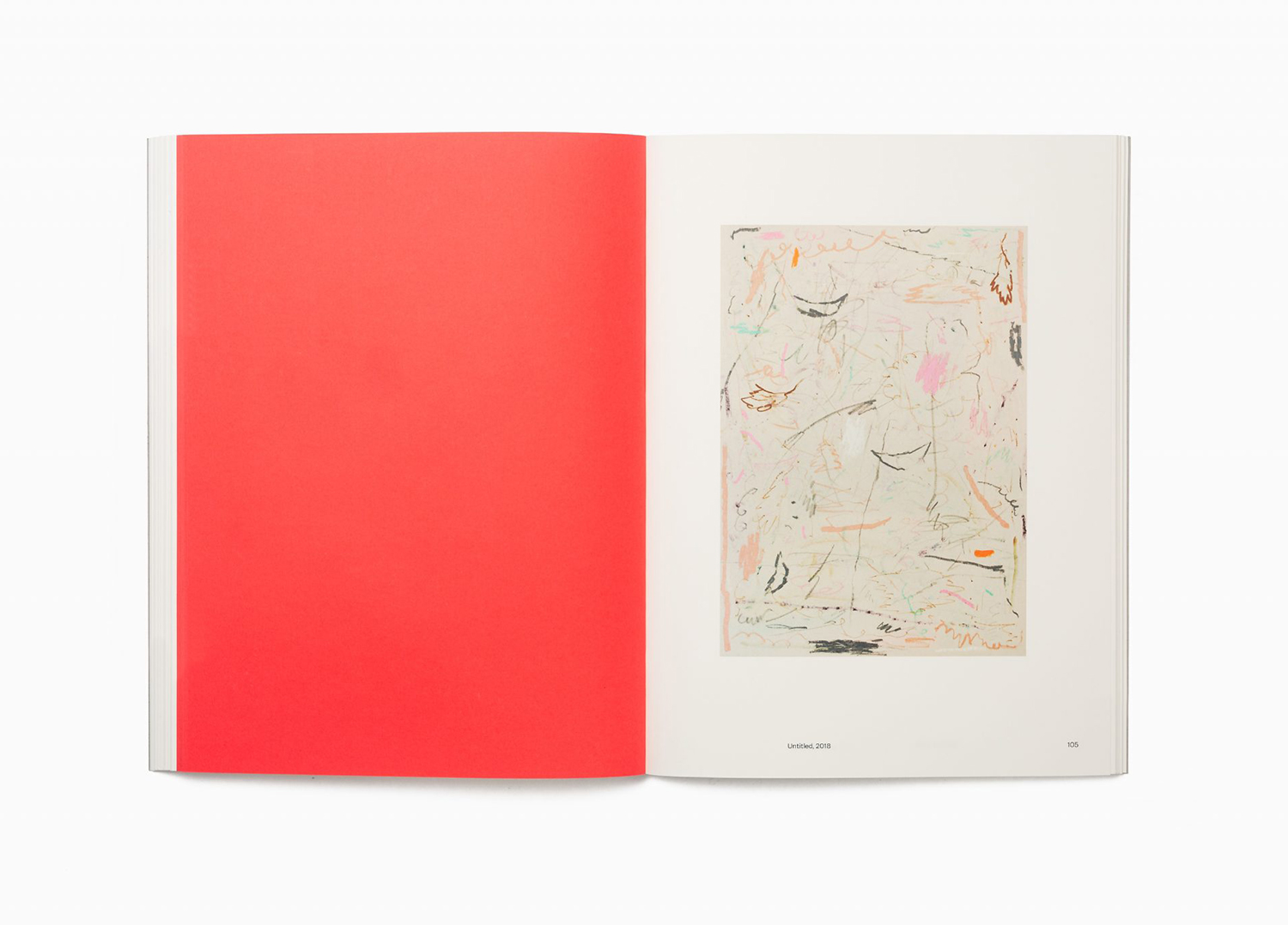
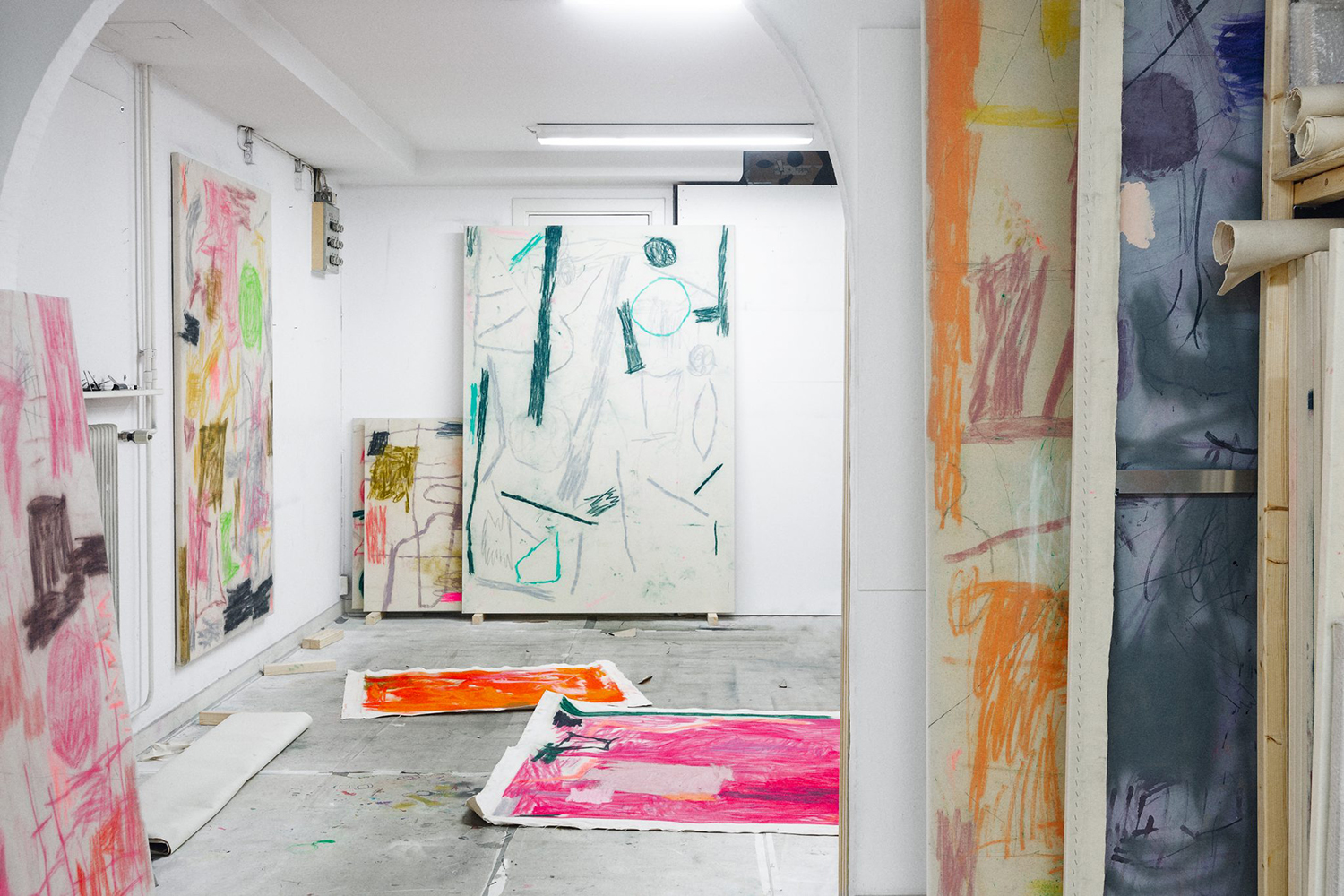
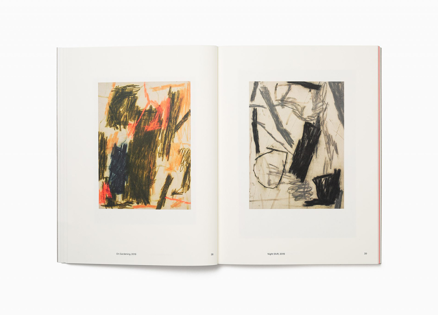
Daniel Jensen is a Swedish artist whose work moves between paintings, sculptures and drawings and explores themes such as society and pop-culture, film, literature and nature. His latest book, designed by Bedow, features artworks that are figurative and abstract, unrelated and absent a narrative. With such compelling and intense imagery of colour and dynamic shape, Bedow developed a format that would hold these works with a calm and classic sensititivity, using type and space to frame the work.
The artist book as design excercise carries with it the burden of collectivising differing works–perhaps seperated by time, style or medium–and expressing something of the subtext that links them.
These often follow a typical pattern; a striking graphic expression across the cover, capturing the spirit of the art and artist, and interior pages that evoke the vernacular of the contemporary gallery space.
What lies between is the nuance, the details that hold the book together, the material narrative of sequential pages and their texture and weight without imposing or unintentionally shaping the moods that are intended to be evoked through the artwork presented on the page.
Materiality, page furniture and the pace and transitions between different pieces of work are critical to creating an aesthetic appeal and drawing out the subtexts without being blunt. Daniel Jensen: Current Events designed Bedow is a fantastic example of this.

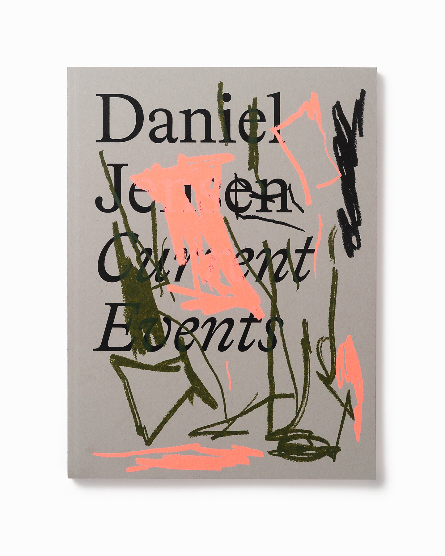
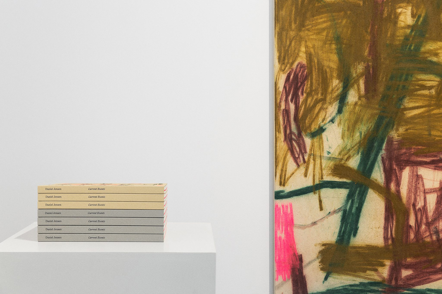
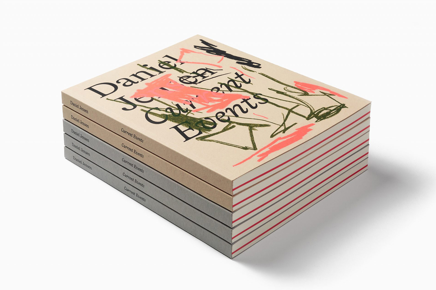
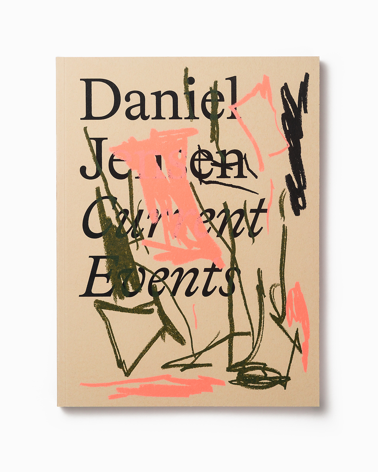
The cover, created by the artist specifically for the book, and essentially a limited edition artwork in its own right, sees a critical and essential relationship formed between the formal; the faceless and unrevealing nature of a name and its typesetting, and the expressive and illuminating idiosyncrasies of the artist’s work.
The defacement of the artist’s name by the artist, creating moments of illegiability, are eye-catching from a distance with a materiality up close in the surface texture of the book, the layering of ink and differing opacities. In this process, in the replication of paint on canvas and alongside the limited run of the book and the art created specifically for its cover, a closer relationship between reader, art and artist is formed. Also check out Fredrik Værslev As I Imagine Him by Zak Group. The result is provocative and elegant in its idea yet, with a child like joy and freedom present in form.
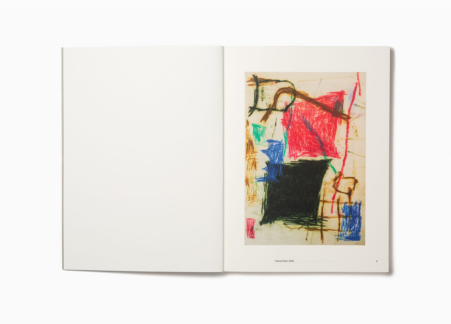
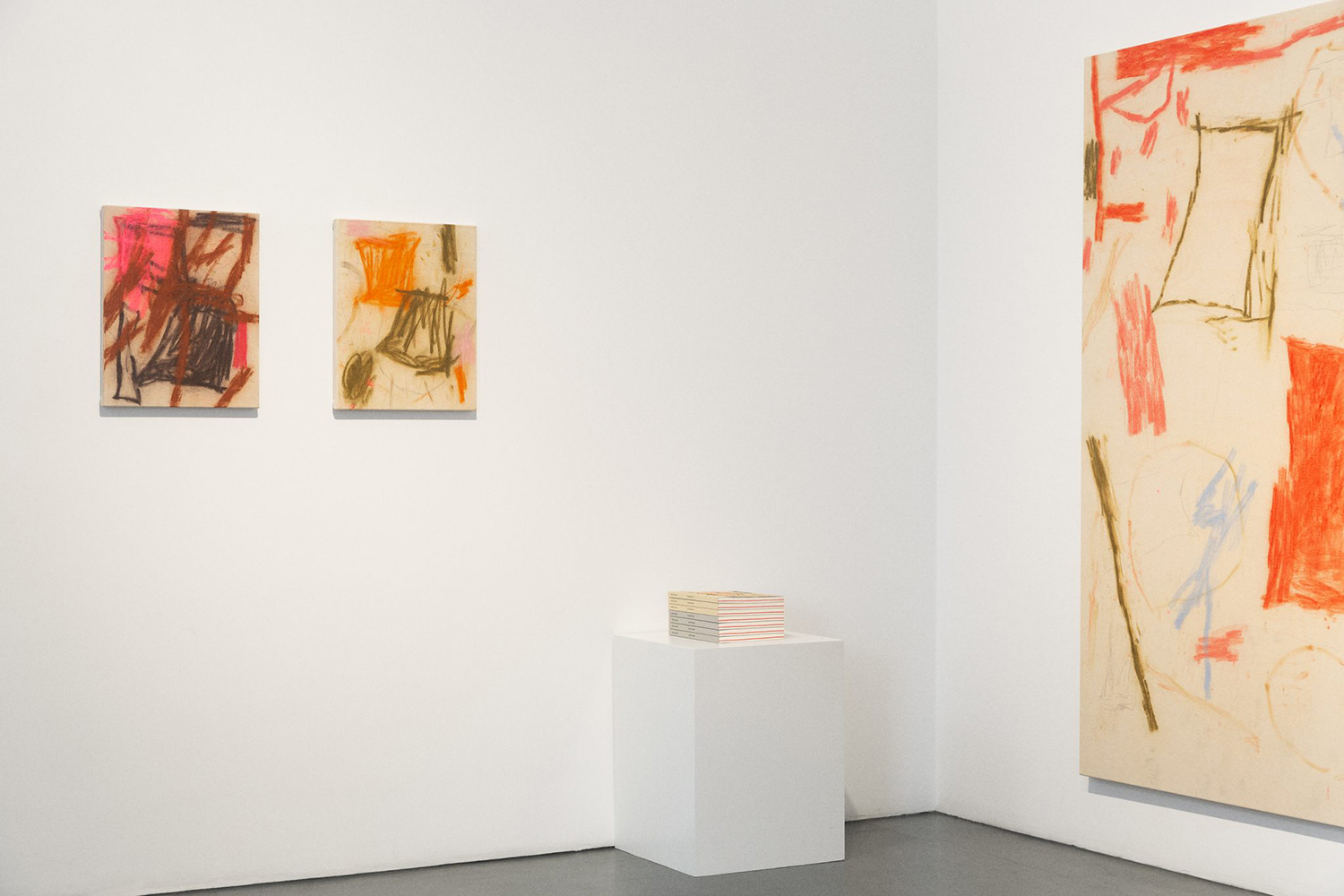
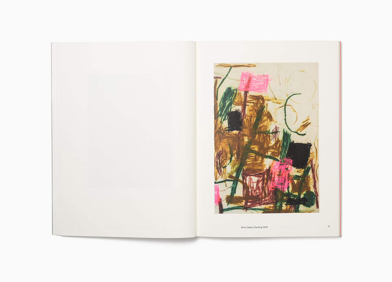
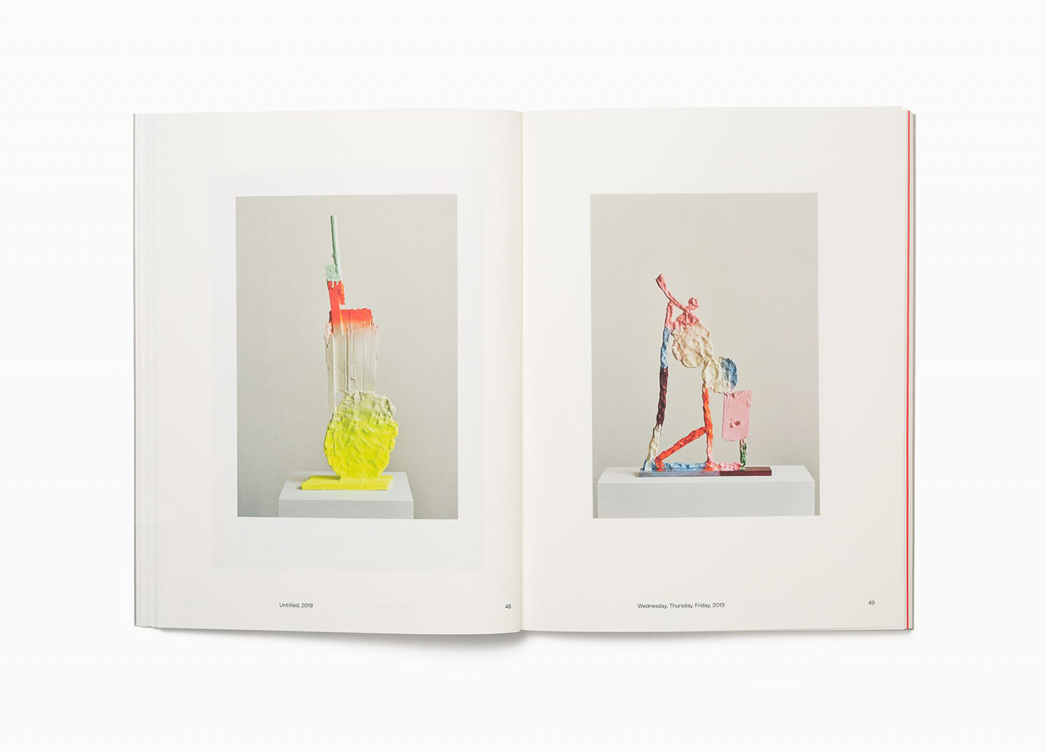
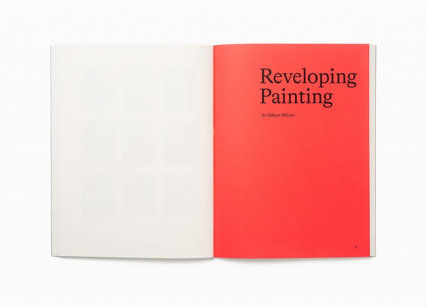
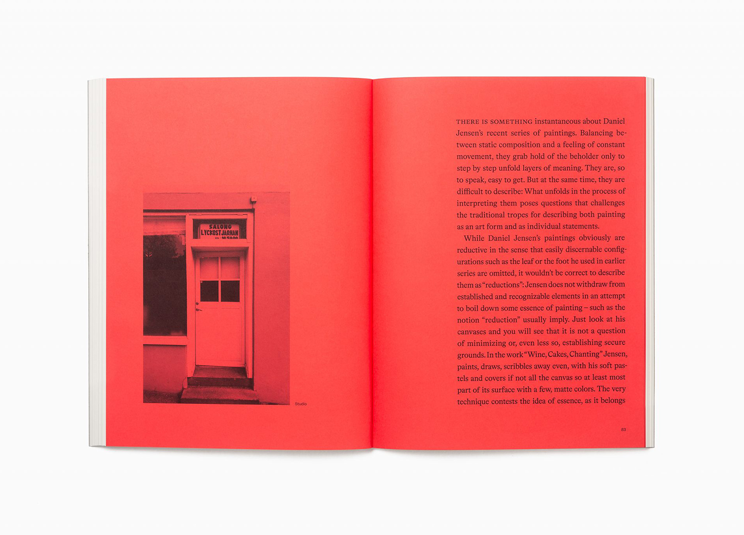
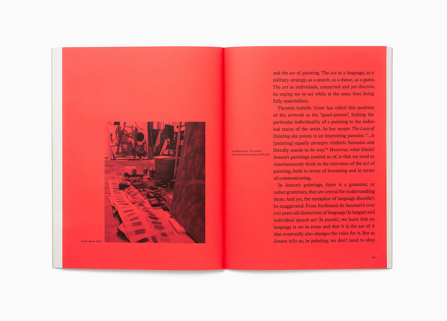
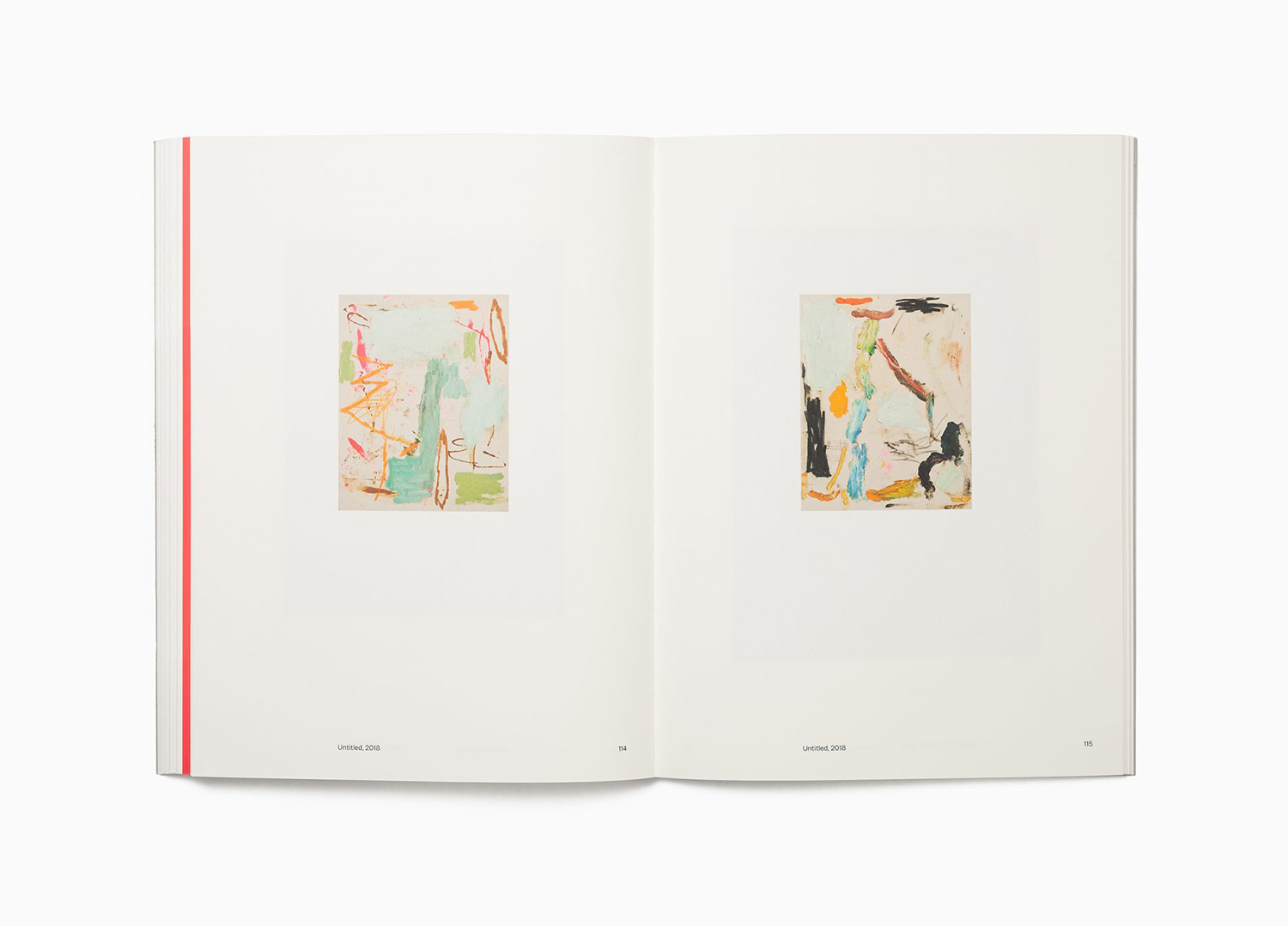
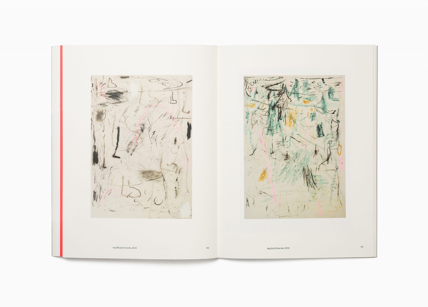
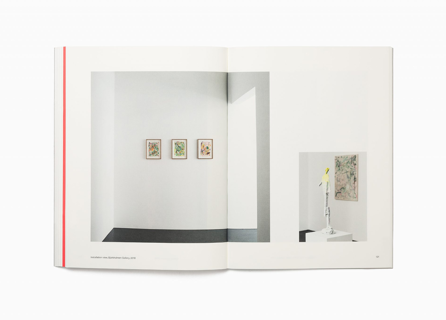
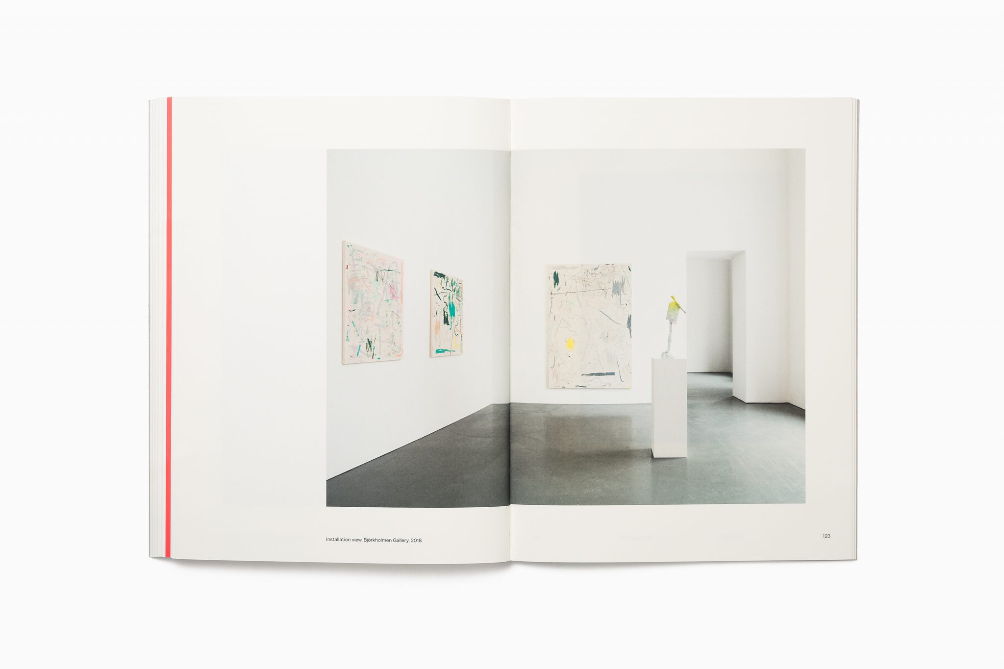
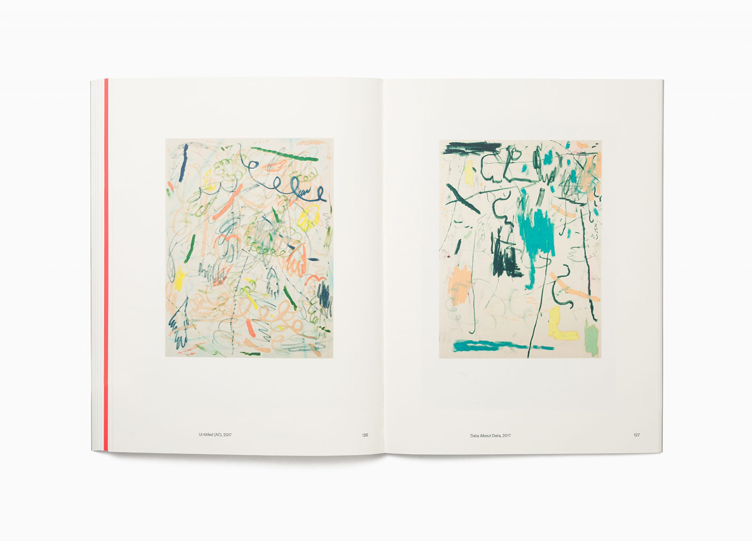
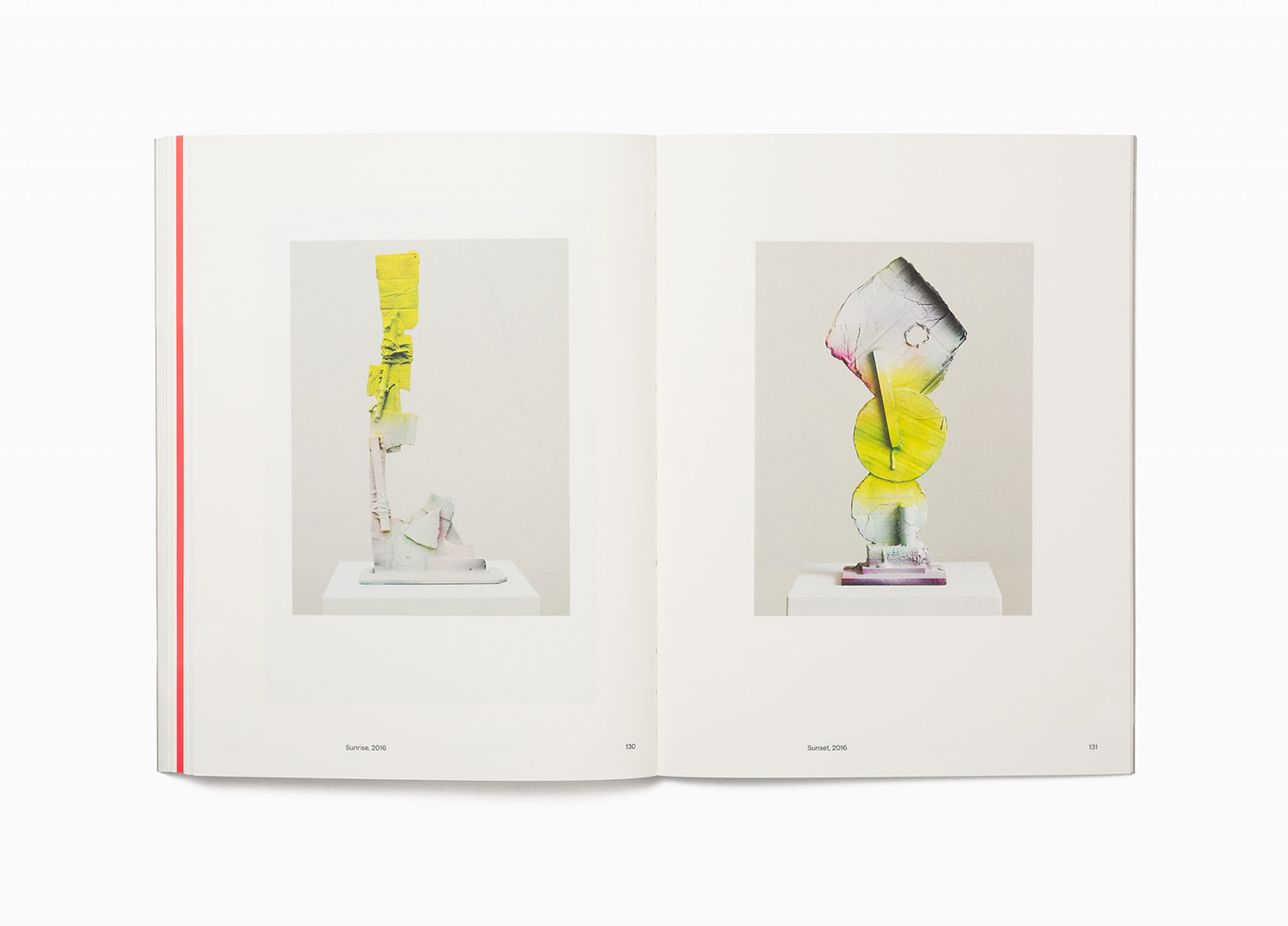
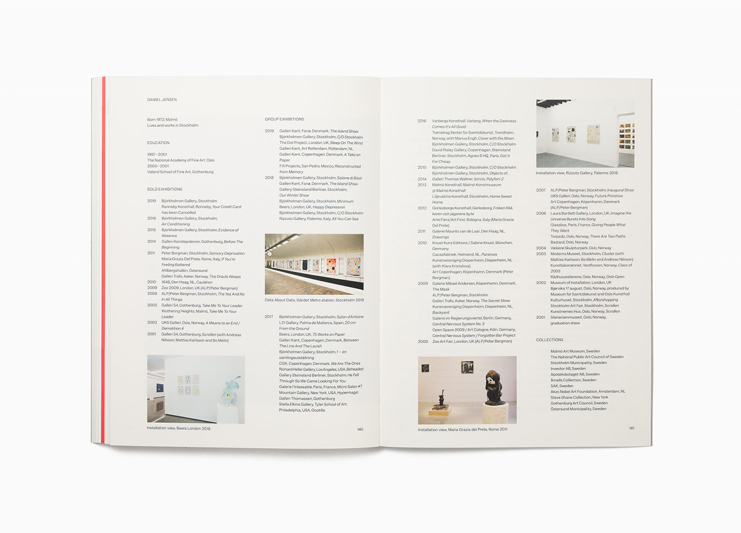
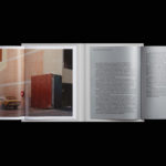
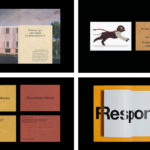
Inside the book, the borders around the image and the page furniture create a gallery-like relationship between the artwork and the surface of the page. It is not unusual, however, with the colour and forms employed by the artist, this feels thoroughly appropriate, with enough variation to break up the book. These variations includes text pages at the centre which punctuate the document with a vibrant red often seen in Daniel’s work, and a biography timeline at the back.
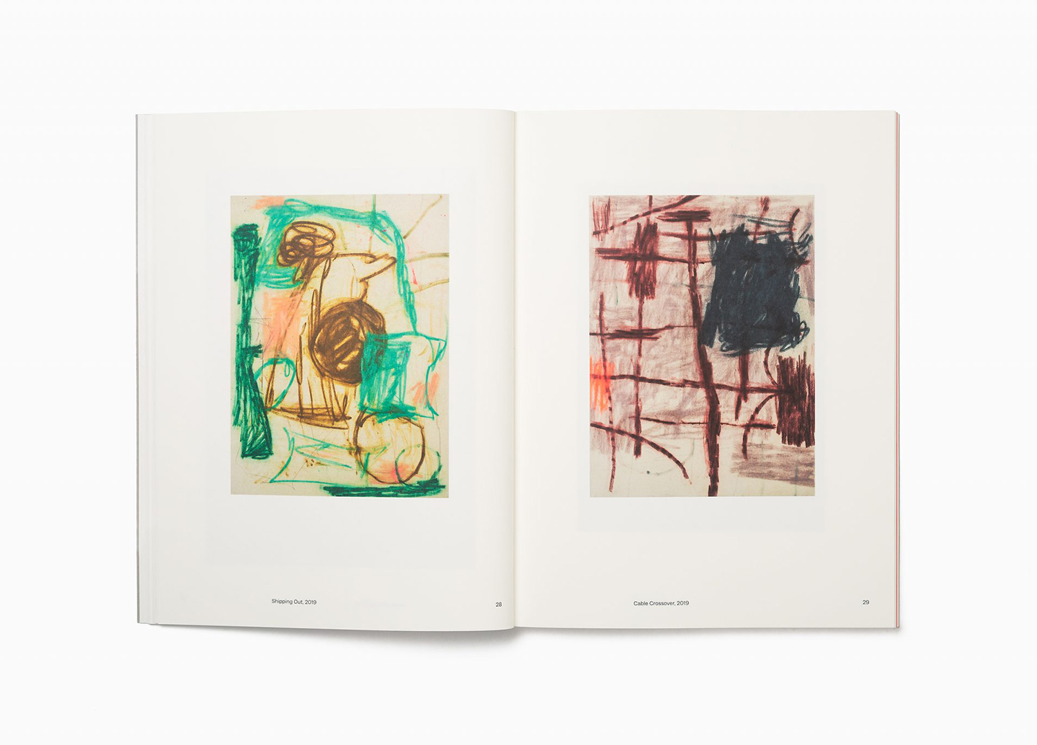

Details such as uncoated natural white paper–evoking the rough canvases of Daniel’s artwork–and contrasting text pages in a much lighter 120gsm paper use material to delineate between sections. Text also serves to divide with informative gallery-like details set in the contemporary forms of Garnett by Sharp Type and Brandford from Lineto holding longer copy with a literary and narrative sensibility. These all add a dimensionality to the document without undermining the images. More work by Bedow on BP&O.