Are you captivated by the world of graphic design or need some basic design advice for your marketing, but unsure where to start?
Do you find yourself drawn to creating logos, brand identities, social graphics, and packaging, but feel overwhelmed by the complexity of it all?

Every professional graphic designer began where you are now, learning the fundamentals of graphic design.
The Basic Principles of Graphic Design: Overview
In this comprehensive guide, I’ll take you on a journey through the bedrock of all great designs – the graphic design fundamentals.
Together, we will explore what graphic design is and the importance of graphic design, then dive into:
- The principles of composition and layout
- The key basics of typography
- The vibrant world of color theory
- The visual language of design
- The tools of the trade
I’ll also walk you through the process of taking a design project from start to finish.
By the end of this blog, you’ll have a solid foundation to start your journey in learning graphic design, and who knows, maybe even ignite a passion that could lead to a fulfilling career.
So, are you ready to embark on this exciting graphic design journey? Let’s dive in!
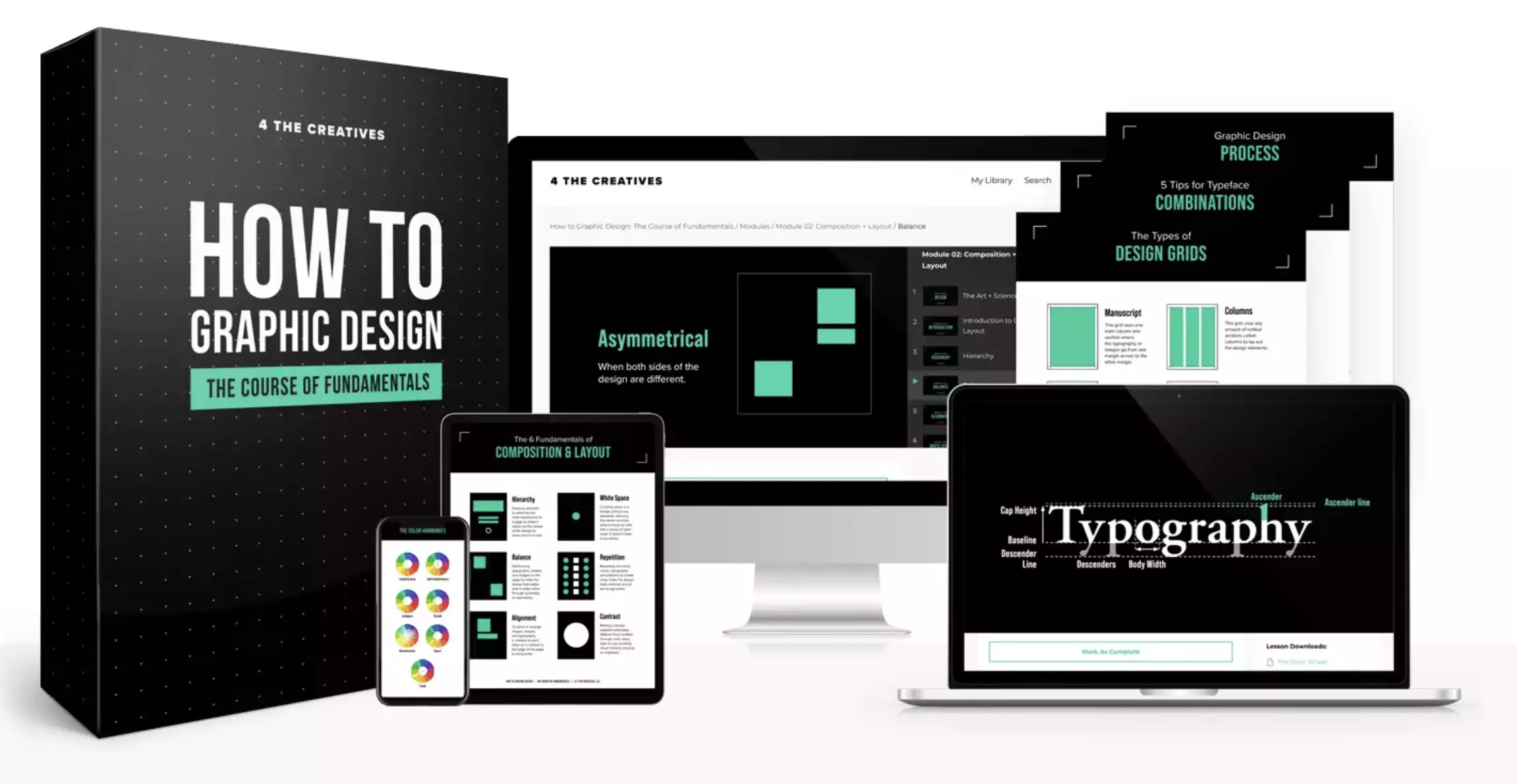
Learn the vital skills you need to be a graphic designer and create quality designs without wasting your time digging through tons of how-to videos or paying thousands of dollars in expensive programs. Check out the course: How to Graphic Design: The Course of Fundamentals.
- Perfect for aspiring graphic designers
Graphic Design Fundamentals: The Bedrock of Design
When looking into graphic design, many eager creatives want to jump straight to designing logos or brand identity design, or even packaging.
However before you can learn these more advanced skills, every designer must first learn and master the fundamentals of graphic design.
The graphic design fundamentals are the bedrock for all designs you do. If something looks off with a design, it comes back to a misapplied graphic design principle.
Just like a heart surgeon first gains a thorough understanding of how a body works before diving deep into learning about the heart, so must a logo, packaging, web, or motion graphics designer first know all the fundamentals of graphic design before diving deeper into their more advanced design specialization.
The Importance of a Graphic Designer in Today’s World
Everywhere around us, graphic design is used to attract viewers and deliver the intended message. From social media posts to ads, to store signage to catalogs and magazines.
When you learn graphic design, you have the power to convey information to the world through designing billboards, posters, flyers, and social media content.
You also wield the ability to help any business look professional, captivate their right customers’/clients’ attention, and therefore reach their business goals.
What is Graphic Design?
Graphic design is defined as the art and skill of combining elements such as text, pictures, visuals, shapes, and textures to catch the attention of the desired audience and deliver specific communication.
Without graphic design, things look dull, amateur, and boring. It is not something that any business owner that knows Photoshop can start creating. It is an acquired skill with rules that require lots of practice to master. And these skills begin with the fundamentals.
Here are each of the fundamentals of graphic design so you can become a well-rounded and professional graphic designer.
Composition & Layout
Composition is how something is put together and layout is the way that type and images are set out on a page.
You will hear these terms used together to mean how a designer has placed images, shapes, and typography to create a pleasing design that attracts the viewer and delivers the right message to that viewer.
Inside this graphic design basic are 7 vital components to make up a pleasing design layout.
1. Hierarchy:
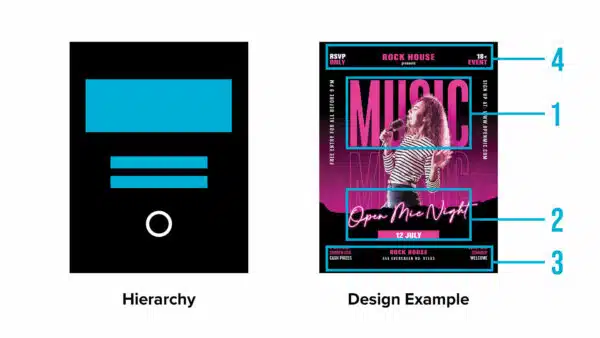
This comes from the word “hierarch” which means “a chief priest, archbishop or leader.” Hierarchy in graphic design is defined as a clear order of importance so that the viewer knows what to look at first, second, and third.
This could be accomplished through order on the page, size, or the biggest contrast. Under this principle is also proximity meaning when items are grouped together they can be seen as one section of a design instead of having everything running into each other.
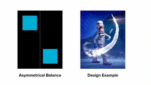
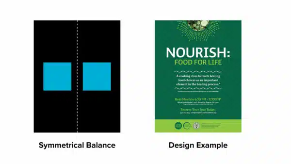
2. Balance:
This tool helps you to know when a design looks incomplete and allows an equilibrium in your designs.
There can be symmetrical balance where things are the same on both sides of the design or they can be asymmetrical where while not the same, both parts of the design still complement each other.
3. Alignment:
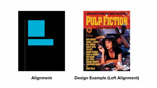
To ensure design elements are not placed randomly, but that they are aligned to one another allowing for a more unified and professional look to the design. The alternate would be to have things out of alignment which can confuse the viewer and repel them from the design.
4. White Space:
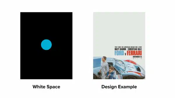
The area of the design without print or pictures. It means the lack of any elements and gives your design breathing room to focus the eye on the important elements within the design. When a layout has no white space, it makes it harder to know what to focus on and can add extra tension to a design.
5. Repetition:
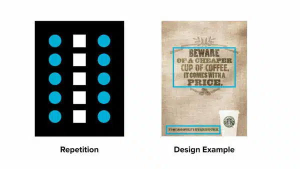
This is using something over and over for consistency and visual unity. It is about repeating shapes, typography, style, colors, and design elements to be recognizable and not confuse viewers.
6. Contrast:
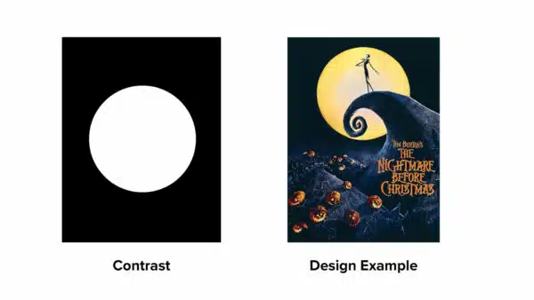
To be very different from something else. It helps to make things more interesting, adds surprise to the viewer, and allows something to stand out or be emphasized. The ultimate in contrast is black and white or big and small.
7. Grid:
An integral part of layout and composition is using a valuable tool called a grid. It is a system for organizing a design using a series of horizontal and vertical lines. It allows you to have alignment, even white space, and consistent repetition of elements. There are 6 different grid layout categories:
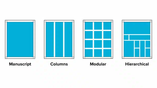
Manuscript: Is one big column that is used often in books and Word documents.
Columns: Dividing a layout into 2 or more columns to help divide type and images into pleasing and organized designs. It is often found in magazine layouts.
Modular: Smaller divisions of the design based on modules.
Hierarchical: Having the most important element at the top and the rest of the elements below.
Rule of Thirds:
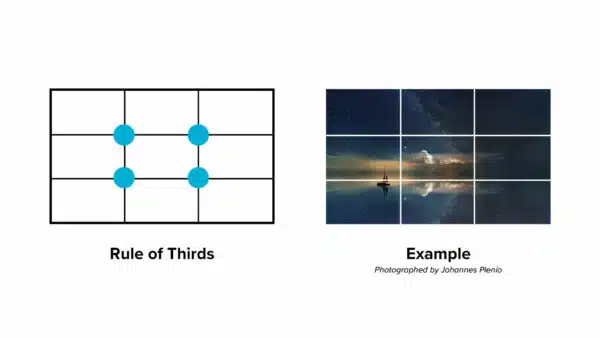
Dividing the page into 3 equal parts and positioning elements in one of the thirds (not the center).
Golden Ratio:
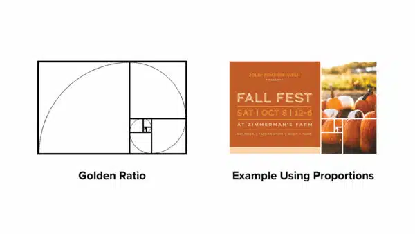
Using the ratio of 0.618 to 0.382, divide your layout in this way and use it as your guide for placing elements.
Typography
Typography is one of the core fundamentals of graphic design and is the art or way of arranging type on a page to either be printed or digitally displayed.
This graphic design basic is a vital part of any design because it helps to communicate a concept that the viewers need to read and understand. Choosing the correct typography can make the difference between conveying the right mood and not.
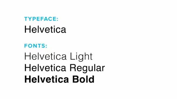
The usual word we hear for a type of typography is a font, but it is important to clarify this further. A typeface is the overall name of a family of fonts.
For example, Helvetica is a typeface and a font would be one of the styles inside of that typeface such as Helvetica Light, Helvetica Regular, and Helvetica Bold.
The 4 Categories of Typefaces
There are 4 main categories that typefaces fall into:
Serif:
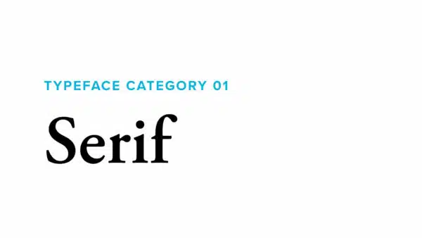
Typefaces that have little hooks on the end of each letter that help lead the eye from one letter to the next. These are used for books, magazines, and large amounts of printed words as it is easier on the eyes.
Sans Serif:
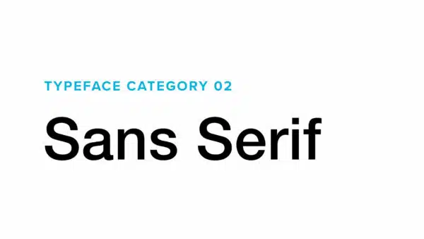
Typefaces without serifs. These are considered more modern as they originated more recently than sans serifs. You will see them used more often in digital format as they are easier to read on screens.
Script:
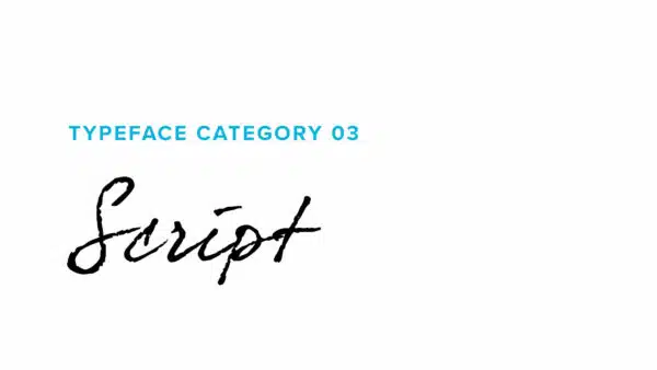
Typefaces that are similar to handwritten cursive letters, each one leading into the next. These are generally harder to read and should be used for headlines and accents. See the best script fonts here.
Display:
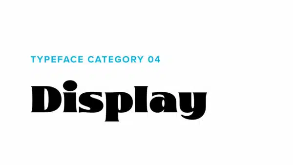
Typefaces that are more fancy and stylized with exact characters. Display fonts are great for titles and short amounts of large type but should be avoided where you will need to have a lot of words in a design. They can have a big impact on the setting of the mood of a design.
Choosing the Right Typeface
You have to ensure that you use the appropriate category for the type of design you are creating. If you are trying to convey an elegant design and you use a silly display typeface, you will throw the viewer off.
Adobe Fonts has a great selection of typefaces to choose from with different categories depending on the style you want to achieve. You should play around with this site to get familiar with what typefaces convey specific moods.
Pairing Fonts
It is important to not use more than 2 typefaces in a design. Otherwise, it can start to look too confusing and amateur. A good rule of thumb is to think with contrast. You wouldn’t want to use 2 different serif typefaces together as there would be no contrast. Instead, you want to pair typefaces from the 4 different categories.
Examples of this could be:
A serif and a sans serif.
A sans serif and a display.
A script and a serif.
- You could also pair 2 different fonts within the same typeface. For example a Bold with a Regular.
- You want to ensure that you skip over one font inside of a typeface to ensure contrast. So you would not use a Regular with a Medium font, but rather a Regular with a Bold.
- Go for the maximum contrast. Sometimes that could mean a Light with an ExtraBold.
Color Theory in Graphic Design
Just like an artist first needs to know how to draw well before approaching the subject of painting, a designer first must understand all the compositional graphic design basics and typography fundamentals before approaching the subject of color.
Color is the tool to use to enhance an already well-created design with the right emotions, set the correct tone and attract the viewer.
The Color Wheel
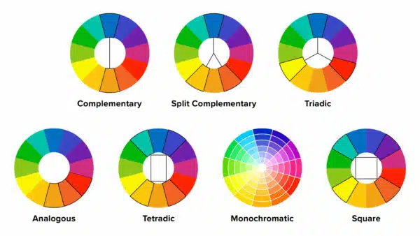
A tool that designers can use to make great color choices is the color wheel. This is a circular arrangement of colors organized by their color relationship to one another. You can create many color palettes from this color wheel if you know how to use it correctly.
A color palette is the range of colors used by a designer in their project. It is important to start with a color palette instead of randomly placing colors as you like.
There are 7 main color palettes:
Complementary:
- 2 colors opposite each other on the color wheel.
Split Complementary:
- 1 main color and then the 2 colors on either side of its complementary.
Triadic:
- 3 colors that are each 3 colors away from each other on the color wheel.
Analogous:
- 3 colors directly next to each other on the color wheel.
Tetrad:
- 2 sets of complementary colors along a rectangle.
Monochromatic:
- 1 color with different values of that color.
A value is how light or dark a color is. It gets adjusted by adding more white or more black to the color.
Square:
- 4 colors each 2 colors away from one other.
When working with these color palettes, it is important to not use all the colors in equal quantities, especially those with more than 2 colors.
The best way is to use 60% of one color, 30% of another, and then 10% of what would be the accent color. This will ensure it is tastefully done instead of too overwhelming.
Color Meaning
Every color evokes a specific emotion and meaning. It’s important to use the correct one according to the audience the design is intended for.
For example, if you are creating a package design for a children’s toy brand, you wouldn’t want to use black. Black usually evokes elegance, class, or men’s brands. Instead, you would use colors such as yellow, orange, or red.
It is also important to understand that different colors can have different levels of brightness. When you add grey to a color it automatically becomes more dull.
For children’s brands, you can notice that the color is at its full brightness, whereas for more serious designs, there is a more muted look to them. This is done intentionally to set the right mood.
Visual Language in Graphic Design
An important graphic design fundamental is using visuals. Since the saying goes “a picture is worth a thousand words” what better way to convey a concept within the constraints of a static design?
The 4 main categories of visual language are:
Photographs:

Most designers are not also photographers and luckily there are some great online resources such as stock websites that you can purchase these from to help communicate whatever the message of your design is such as Adobe Stock.
Illustrations:
Sometimes the right visual to use for the style of your design is an illustration. This works very well on packaging, posters, and even social media graphics.
Textures:
There are designs that work very well when they have certain textures added to them. Such as when you want to communicate a scary vibe in a design, adding a shattered or grungy texture can help to convey the right communication.
Shapes:

These are used to add visual interest, express different ideas, add depth to an image, emphasize an area, and symbolize a concept. These shapes can vary from wavy lines, straight lines, circles, squares, dots, rectangles, triangles, and more.
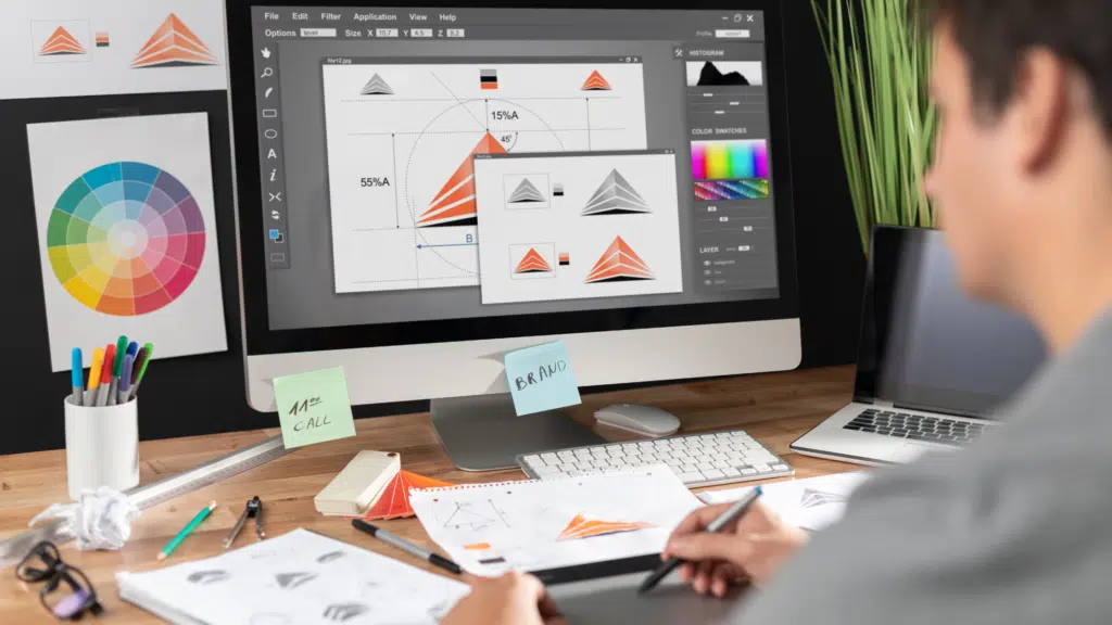
Graphic Design Tools to Use
Whereas a tool is a vital component of creating a design, too many new graphic designers jump into learning the programs before even understanding the fundamentals of graphic design.
And this is backward. It creates more stiff designers that expect the tools to do the work for them, rather than the tools helping them to create the designs.
The best programs for graphic designers and my go-to ones are:
- Adobe InDesign for flyers, social media posts, packaging, and layouts.
- Adobe Photoshop for correcting/adjusting images, color correcting, and texture application.
- Adobe Illustrator for creating illustrations, logos, and shapes.
See more of the best graphic design software here.
Taking a Design Project from Start to Finish: 4 Steps
When you get a project from a design client, you are helping that client to solve a problem for their business.
1. Designing Your Project:
If you are designing a flyer, you are solving the problem of attracting their audience to their business, if you are designing a social media post, you are solving the problem of engaging with their audience and sharing something helpful to keep their business top of mind.
2. Graphic Designing for Marketing:
Marketing of a business cannot occur well without some aspect of graphic design.
So the first step is the client comes to you with a problem to solve. And in order to design something effective, there are specific questions you need to answer each and every time. You will be submitting what is called a brief to the client for them to fill out.
The definition of a brief is a set of instructions given to a person about a job. So you want them to give the instructions to you about specific aspects of the design project before you jump in.
3. Preparing a Summary:
After deciding on the brief, you summarize all the research you have done and create a mood board for your project. This helps to give you the general look and feel as well as the color palette you will be working in.
Then you do a ton of sketches and work the problem out on paper. You will be much less attached to ideas than if you jump right into the computer. Too many creatives jump right to the computer these days and this is a big error in their process.
4. The Final Step:
After you complete the sketches you can go onto the prototyping stage, where you move to the design process in the computer where you are executing your sketches and exploring what other ways you can make your design ideas even better.
All the while referring to your mood board and putting yourself in the target audience’s shoes, NOT the client’s shoes. You are designing this to attract your client’s target audience. Never forget this point.
Then you want to present your design in a professional way with mockups and with the research information to back it up as well as help you sell the design to the client and why this is the best design for the purpose of his specific business goal.
Advanced Levels of Graphic Design
Too many creatives misunderstand that first and foremost you have to master these fundamentals of graphic design and then move on to learning logos, brand identity, motion graphics, packaging, or websites.
Just because you learn the graphic design basics does not mean you should be a perfect logo designer. It is a whole other skill and art in itself and is the topic for another blog, another course, and another time. But I put this information here so you aren’t too hard on yourself.
How to Learn Graphic Design Course
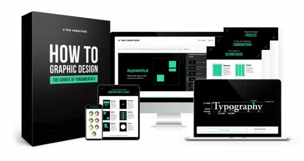
If you are looking for more in-depth direction and an instructor to critique your designs, I suggest you look at a course that hundreds of other creatives have taken to acquire the skills of graphic design to make this into a career: How to Graphic Design: The Course of Fundamentals.
Here you will learn the vital skills you need to be a graphic designer and create quality designs without wasting your time digging through tons of how-to videos.
Fundamentals of Graphic Design Summary
We must keep in mind that our goal as graphic designers is to attract and keep the viewer’s interest. That is what these graphic design fundamentals help us to accomplish. If you view yourself as a graphic designer as a design thinker rather than an order taker.
Graphic Designers play a vital role in every company and no AI program can replace the creative mind.
Explore your own creativity by taking each one of these fundamentals and mastering it before going on to the next. They will each build on each other and over time through practice you will become a professional graphic designer.


