How To Create A Visual Hierarchy In Your Design
When using design for relaying information or communication, you should strategically approach your design rather than just going with what visually looks best.
Many design concepts are forgotten in today's design landscape, especially on social media. However, these concepts still significantly influence how your design communicates its ideas.
That's where visual hierarchy comes in. How your design presents bits of information you want to convey is vital. The font size, contrasts, spacing, and other design principles are equally important in a visual hierarchy.
Before we go deeper into how to create a visual hierarchy, let's take a closer look at its basics.
Table of Contents
What Is Visual Hierarchy?

Visual hierarchy is the order of elements in your design based on how humans process them. As the name implies, the higher an element is in a visual hierarchy, the more priority it should have in your design consideration.
The simplest example is the headline or title of the information you want to convey with a design. Let's say you're designing an infographic on designing for brands. Based on the visual hierarchy concept, the title – e.g., 10 Elements for a Brand Design should have a bigger font at a prominent spot like the top of the page.
Why Is Visual Hierarchy Important?
Visual hierarchy is crucial for your design because it defines the importance of each element and the sequence in which they should appear within a composition.
It affects how your audience reads or views your content. Establishing a hierarchy also helps your audience to view your content from the most crucial element to the least important detail.
Without visual hierarchy, two potential risks might result in two of these scenarios:
- Your audience might be interested in viewing your content, but they'll bounce around from one element to another without getting the whole point.
- Your audience perceives every part of your design as equal, which could cause them to miss important parts.
That said, whether you're a student doing a part-time job as a designer or an experienced professional, having a visual hierarchy in your work will never go wrong.
9 Steps to Create a Visual Hierarchy in Your Designs
1. Design based on the viewing patterns
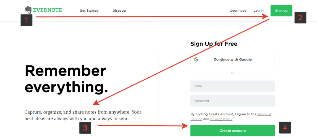
Like most cultures, read texts from top to bottom and from left to right; people will also read your design in specific patterns. Based on the eye tracking technology, there are two patterns that people use to view a design:
F pattern

Viewers start from the very top part and move their eyes to the right. Then, they'll move slightly down and do the same movement, but shorter. Finally, they'll scan the left part of the design to the bottom, making a letter F with their movement.
Z pattern

The Z pattern is the other prominent viewing pattern you can incorporate into your design. This pattern starts from the top left corner and goes straight to the right. Then, viewers will direct their eyes diagonally to the middle left side of the design and go back to the right.
2. Use a design structure
Structuring your design is also a significant part of establishing a visual hierarchy. Creating a predetermined layout to place design elements will improve its overall structure.
Artists around the world have relied on several compositional techniques that are still relevant to this day:
Rule of thirds
The rule of thirds simply divides the entire design into nine boxes using grid lines. These grid lines act as a guideline to place focal points (e.g., the main focus of the design). Ideally, the focal point should be on one of the lines or in one of the four intersection points.
The rule of odds
This composition utilises objects with an odd number to make one of them stand out while using the others as complementary elements. The idea is to use one of the objects as the ‘centre' of attention – note the quote marks since the focal point is not always in the middle of the page.
Implied movement
An implied movement is a term used to describe a design technique where you structure elements in a way that leads the viewer's eye to a focal point. The most common element used for this is the leading lines.
Leading lines also don't have to be lines – they can be repeated design elements, objects or shapes, negative spaces, or anything that creates a sense of direction.
3. Modify visibility with size
Whether a design for a gaming website, lifestyle blog, Instagram post, or infographic, you can play with two elements to create a visual hierarchy: size (the dimension) and scale (size relative to other elements).
Playing with the size is one of the easiest yet most effective ways to create a cue on how important an element is to your design.
The simplest way to establish a visual hierarchy with size is by enlarging the focal point to occupy a prominent space in your design. Doing so will put the essential element higher in the visual hierarchy and get the most attention from your audience.
For the elements that aren't as important, you can give them a smaller size and make them less visible – therefore lower in the visual hierarchy.
But as with another design concept map, you'll have to use this approach with balance and moderation. You can't make a good design with a focal point that occupies most of the page and the other elements are barely visible.
4. Drive attention with spacing

Creating white space in a design typically allows the rest of the canvas to stand out more. It's often absent in today's digital design, but white space remains one of the most critical elements of a visual hierarchy.
When you want to design an infographic or anything that conveys information, you might be inclined to put as much information as possible. However it often leads to a lack of white space, resulting in a chaotic and confusing design.
You might have seen designs jam-packed with text, images, and information in brochures or flyers. You won't even know where to start reading those things!
Unused space in your design doesn't mean wasted space, but it means you:
- Give some room for your audience's eye to rest.
- Add a ‘path' to travel through the design.
- Add a space between groups of elements to create sections.
So, always plan to leave some space empty in your design intentionally. It will make it look much better than just stuffing them with information.
5. Play with colour contrast to drive attention
Colours are natural attractions for our eyes – the more colourful something is, the more pleasing it is.
But that doesn't mean you can just spew a dozen different colours to your design. A bright flower in a colourful garden won't be noticed – but a black rose will stick out like a sore thumb. The same goes the other way.
Instead, you can play with contrasting colours to drive your audience's attention to the critical elements of your design. There are many ways to play with colour contrast to create a visual hierarchy in your design:
Temperature
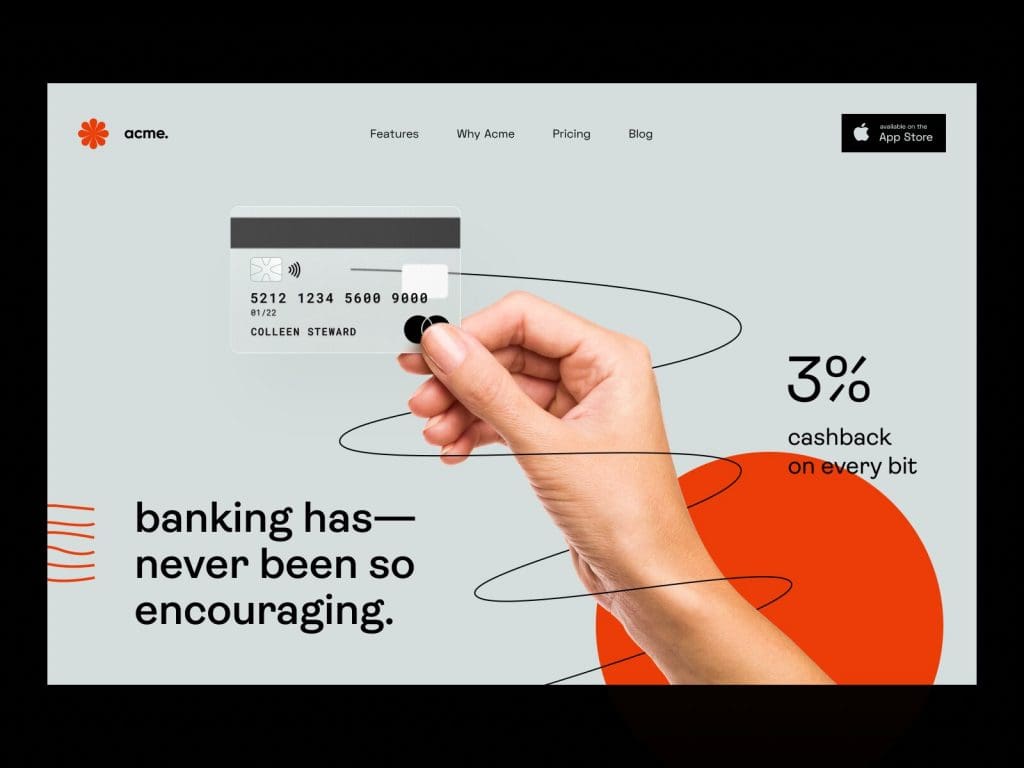
Colours are inherently divided into warm (like orange, red, and yellow), cool (like blue and green), and neutral (brown, black, white, and grey). Choosing colours with different temperatures can help direct visual attraction to the right places in your design.
Value
A colour's value is how bright or dark it is. Mixing high and low-value colours can also create a contrasting effect that directs the audience's attention to the critical parts of your design.
Saturation
When you see blood or crimson red, it's the red colour in its 100% saturation (or close to it). On the other hand, salmon pink has lower saturation despite being in the same red spectrum. Using a highly saturated colour in combination with faded hues can help you establish which one is at the top of the visual hierarchy in your design.
6. Create a typographic hierarchy
Typographic hierarchy establishes the order of importance between the text elements in your design.
Besides paintings and pure visual arts, most designs these days involve some sort of information in text. In this case, choosing different levels of typography is something you can't afford to neglect.
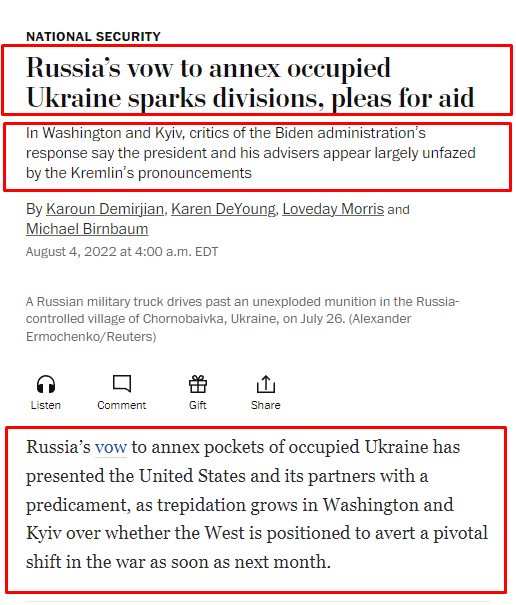
In most scenarios, you shouldn't use more than three levels of typography for your design. You can get an idea of these layers from typical newspaper design – in this example, the Washington Post:

- The heading is level one in the visual hierarchy; it usually has the most significant and boldest font.
- The subheading is level two in the visual hierarchy. It has a more extensive and bolder font than the rest of the design but is less prominent than the heading.
- The paragraph is level three in the visual hierarchy. It's smaller to accommodate the more text-heavy parts of your design to deliver the complete message that you couldn't fit in the heading or subheading.
Adding more layers is often unnecessary because it may create a sense of chaos, inconsistency, and nonuniformity in your design. It's also essential to pick out the fonts and sizes you want to use beforehand so you don't have to consider them when creating your design.
7. Choose suitable typefaces, styles and categories
The visual aspect of the fonts you use in your design also influences the overall look of it. The fonts' appearance, like category (e.g., sans-serif, serif, script, or decorative) and style (bold, italic, capitalisation, etc.), can make or break your design.
The whole appearance of text is known as typefaces – and you can think of them as the ‘personality' of your design. Some typefaces will give a design an elegant look, while others can give that flamboyant vibe to it.
Depending on the context of your design, you'll have to use different typefaces. For example, you can use script fonts like Alex Brush to create elegance when designing an invitation to a fancy dinner party.
On the other hand, if you're designing an invitation to a guys' night out, a casual font like the LoRes Bold will be a better fit.
8. Play with proximity to establish a design relationship
The closer elements of your design are to each other, the more related they are to your audience's mind. As one of the essential elements in design composition, proximity can significantly affect how your design feels.
Imagine being in a bar and seeing a group of five guys on one side and a girl on the other. Your first assumption would be that those five guys are friends. But if the girl moves close to them, you'll assume she's part of the group, too.
Placing elements close to each other can give an added layer or message to your design. Check out this FedEx poster, for example:

The two characters on a map of Australia and (what seems to be) Vietnam visualise the distance that FedEx can deliver your packages. If the wall didn't have the map drawing, it wouldn't have as much emphasis on the distance – just a person handing out delivery to someone else.
9. Use repetition to create uniformity
Like how colour contrast can direct the audience's attention to an element, repeating a pattern of images, font, or colour selection can create a sense of uniformity throughout the design.
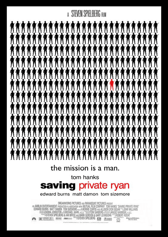
Take, for example, this fan-made poster of Saving Private Ryan:

Repeating soldier drawings that occupy most of the design creates a sense of uniformity. On top of that, the reappearing black and white colour glues everything together perfectly.
On the other hand, the red font highlights the name of the movie's protagonist – which is also reflected in the soldiers' lines.
Conclusion
Visual hierarchy is an essential concept that establishes the degree of importance for each element in your design. Without a clear visual hierarchy, your audience will have difficulty directing their attention – especially in information-packed visuals like infographics or posters.
Since art is always unique, you'll face nuances while creating your design's visual hierarchy. Hopefully, the guide we've put together above can help you create a design that can relay information.
