13 Essential Elements of Art that Bring Design to Life
Design surrounds us. It's in the clothes we wear, the phones we use, the packaging of our food, and the websites we visit. But what makes design compelling? Underneath the layers of colour, shape, and texture lie the essential elements of art that give design its power. Master these building blocks; you can craft designs that captivate audiences and bring ideas to life.
Table of Contents
Line

Lines are the foundation of design. They direct the eye, divide space, and create shapes and forms. Lines come in all weights and lengths. Thick, thin, short, long – each creates a different feel.
- Thick lines are bold and attention-grabbing. They convey strength and confidence.
- Thin lines are subtle and elegant. They suggest delicacy and precision.
- Short lines feel stable and grounded. They imply directness and clarity.
- Long lines are dynamic and energetic. They give a sense of movement and progression.
Skilful use of lines gives the design a visual impact. Lines lead the eye through a composition. They draw attention to critical elements. Changing line quality keeps the viewer engaged.
In logo design, lines form symbolic shapes that represent brands. Product packaging uses lines to highlight information hierarchy—website lines direct users through navigation and layout. Mastering the nuances of the line creates designs that feel right.
Shape
Shapes are created when lines connect to enclose space. Like lines, shapes have associative meanings and characteristics. Circles feel inclusive and community-oriented. Squares connote stability and balance. Triangles imply dynamic energy and action.
Shapes give designers building blocks to construct engaging compositions. Overlapping shapes create depth and layers. Transparent shapes suggest openness and accessibility. Clustering shapes together can build visual momentum.
Different shapes evoke certain emotions and reactions. Angular shapes feel masculine, technical, and urban. Rounded shapes feel approachable, friendly, and organic. Skillfully combining shapes creates visually captivating designs with depth and personality.
Shapes help establish brand identities. For example, Facebook's simple, rounded square represents its friendly, community-driven platform. UPS's shield emblem conveys strength and stability. Shapes give designs symbolic meaning that resonates with audiences.
Colour

Colour brings designs to life. Different colours have associative meanings that evoke reactions and emotions in viewers. Warm colours like red, orange, and yellow feel energetic, passionate, and upbeat. Cool colours like blue, green, and purple feel serene, soothing, and professional.
Colour establishes brand identity and recognition. Ferrari red conveys speed, luxury, and passion. Tiffany's robin egg blue evokes elegance and exclusivity. Heineken green represents natural refreshment. Leveraging colour associations helps designs connect with audiences.
Colour combinations also set moods. Complementary colours like blue and orange feel vibrant and dynamic. Analogous colours, like shades of blue, create comfortable, harmonious compositions. Monochromatic colour schemes using tints and shades of one colour feel refined and focused.
Colour is powerful but must be wielded thoughtfully. Too many colours feel overwhelming and amateurish. Sophistic colour balances grab attention while conveying professionalism and purpose: master colour associations and combinations to craft designs that impress and inspire.
Texture
Texture adds depth and dimension to designs. It gives surfaces and materials visual and tactile properties. Smooth, glossy textures feel sleek and polished. Matte, rough textures feel earthy and rugged.
Texture establishes physicality and personality. For example, Apple's rounded rectangular shapes feel clean and futuristic paired with glossy glass and aluminium textures. Slab serif fonts with rough edges echo vintage letterpress printing.
Background textures also set overall tones. Concrete and wood textures feel grounded and natural. Fabric and paper textures provide warmth. Marble and granite textures convey exclusivity and luxury. Used thoughtfully, texture creates designs that audiences can visualise and connect with.
Textures naturally guide attention, too. Smooth, sharp areas stand out against rough backgrounds. Subtle paper textures recede compared to bold front-and-center photographic subjects. Leveraging textures creates contrast and visual interest in designs.
Space

Negative space gives designs room to breathe. Also called white space, negative space is the area between design elements like shapes, lines, and text.
Negative space prevents compositions from feeling cluttered. It provides resting places for the viewer's eye to stop and reset as it travels across the design. Negative space brings order and clarity.
Negative space also sets up relationships between design elements. It helps group elements, distinguishing main subjects from secondary supporting forms and details. Negative space provides hierarchies for the eye to follow through the composition.
Master designers leverage negative space to draw attention where they intend and guide the viewer's gaze. They balance positive elements with carefully considered negative space. This interplay creates engaging designs that feel intentionally composed.
Value
Value refers to the lightness or darkness of shapes, colours, and textures. It creates contrast and visual interest. Dark values stand out against light ones, attracting viewer attention. Light values recede against dark backgrounds.
Dramatic value contrast grabs the eyes with its visual energy. Low-value contrast has a calming effect with its more subtle gradations. High-value contrast pops central subjects from backgrounds. Low contrast provides unity and cohesion.
Value establishes design hierarchies. Headers in a bold, dark colour attract attention. Paragraph text in a medium, muted tone is easy to scan but doesn't overpower. Footers in a light, clean shade stay visible but visually recede.
Like a volume knob, values naturally tune the viewer's eyes and direct focus. Adjusting value contrast in compositions controls emphasis and creates balance based on importance and meaning.
Scale & Proportion

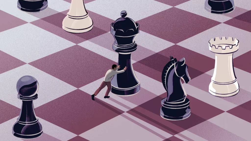
Scale refers to the relative size of design elements. Proportion is the relationship between element sizes. Different scales and proportions contribute to the composition's look, feel, and visual hierarchy.
- Large-scale elements feel dominant and vital. Small-scale components are secondary supporting.
- Big shapes expand; small shapes contract visual space.
- Exaggerated proportions feel dramatic. Harmonious proportions provide balance.
Scale and proportion work together to direct viewer attention. Larger headline text paired with smaller body text creates clear information hierarchies. Icons and logos enlarged compared to real-world objects seem symbolic conceptual.
Scale and proportion also affect tone. Friendly designs use approachable scales and proportions. Serious institutions use formal scales and proportions to convey gravitas. Dramatic scales and proportions feel playful and quirky.
Thoughtful use of scale and proportion creates visual interest and establishes meaning. It cues viewers to know where to look and how to feel as they experience designs.
Movement
Movement leads the viewer's eye through designs in deliberate visual paths. It engages the viewer and elicits responses. Different types of movement provide different experiences.
- Diagonal lines swooping curves – create dynamic, fluid movement
- Zigzags, spirals, pinwheels – suggest lively, energetic movement
- Radial lines – make a central focal point from which the eye moves outward
- Horizontal lines – calm, restful movement
- Vertical lines – structural, upright movement
Movement connects design elements into cohesive compositions. It provides flow between otherwise disconnected shapes and forms. Movement weaves together individual touches into holistic designs.
The movement also creates interest and vitality. It brings excitement to otherwise static pages and screens. Movement keeps the eye travelling through designs instead of losing focus. Kinetic methods engage viewers and encourage interaction.
Emphasis & Dominance

Emphasis directs the viewer's attention to essential parts of a composition. Dominance establishes a hierarchy among elements. Together, they focus the eye and tune the viewer's experience.
- Colour – bright colours attract the most attention
- Scale – significant elements draw the eye before small ones
- Contrast – substantial value contrasts grab focus
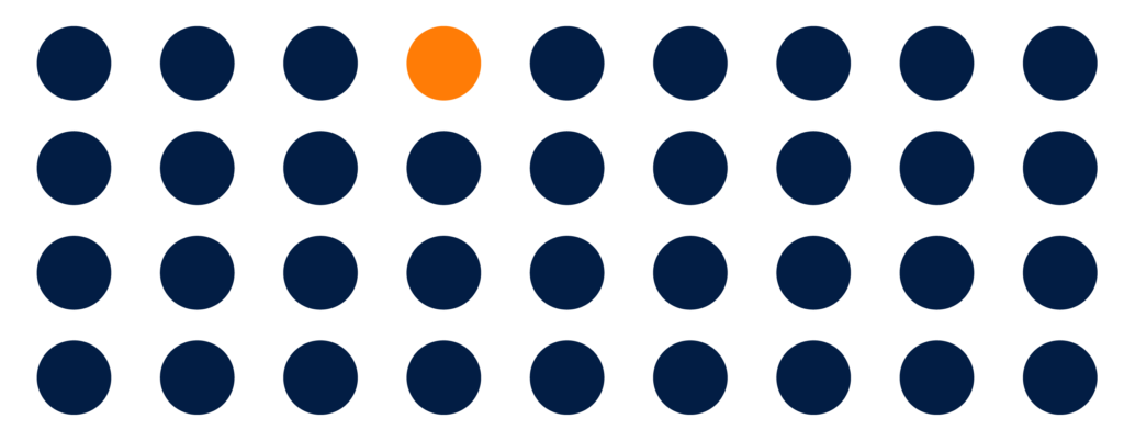
- Isolation – visual separation amplifies emphasis
- Placement – centrally placed aspects are emphasised
Emphasis and dominance prevent chaotic, overwhelming designs. They create clarity and visual cohesion. When everything competes for attention, nothing wins. Selectively applying emphasis and dominance tunes compositions and connects with audiences.
Unity & Variety
Unity ties together otherwise separate design elements into wholesome compositions. Repetition of colour, shape, and texture provides consistency. Grid systems and page templates foster cohesion.
Counterbalancing unity variety adds visual interest. Too much repetition feels monotonous. Variety gives viewers new elements to explore. Alone, the variety seems disjointed. Combined with unity, variety provides engaging designs.
Unity without variety lacks inspiration. Variety without unity lacks cohesion. Great designs incorporate both. They adhere to consistent structural frameworks while including fresh details and flourishes. Unity and variety work in harmony to create compelling compositions.
Balance

Balance provides equilibrium and stability in compositions. It comes from distributing visual weight across a design. Visual importance stems from element size, colour, contrast, and position.
- Symmetrical balance – mirrored halves split down the middle
- Asymmetrical balance – uneven but still balanced
- Radial symmetry – weight emanates from a centre point
Symmetrical designs feel formal and secure. Asymmetrical balance feels more casual and playful. Radial balance leads eyes inward toward a focal area. Different types of balance set the mood.
Balance aligns with meaning. Serious institutional websites warrant symmetrical stability. Quirky personal blogs work well asymmetrically. Brand hero graphics reflect radial emphasis. Choose balance types suited to the message.
Without balance, designs feel uneven and uncomfortable. With balance, designs feel right. Layouts have purpose and intent. Content and function align. Balance binds excellent design together.
Rhythm
Rhythm adds predictable structure. It creates a sense of continuity through repeating visual elements. Rhythmic compositions feel orderly, intentional, and flowing.
Repetition of lines, shapes, colours, and textures creates visual rhythm. Rhythms appear in sequential and alternating patterns, grid systems, and modular components.
Subtle rhythms guide eyes through designs in predictable ways. Overt rhythms can feel visually overwhelming. Consistent rhythms work well for informational content. More complex rhythms engage viewers around compelling imagery.
Rhythm creates familiarity and relationships between design elements. Like meter and tempo in music, visual rhythm brings cohesion and movement to otherwise disconnected parts. Design rhythm turns disjointed assets into synergistic compositions.
Harmony

Harmony results from the thoughtful combination of design principles like scale, colour, shape, and rhythm. Harmonious compositions just feel right. Elements seem to belong together naturally.
With harmony, no one part overpowers others. All pieces work together to support one another. There is visual coherence and purposeful relationships between parts and whole. The composition comes together perfectly.
Harmony requires balance. Tension from contrast keeps designs interesting, but imbalance diminishes harmony. With competing elements fighting for attention, compositions fracture and lack cohesion.
Skillful designers blend elements harmoniously. They control contrast and accent judiciously. Harmony elevates successful designs, intuitively conveying meaning and emotion through synergistic compositions.
Gestalt Principles of Perception
While elements of art build design components, Gestalt principles instruct how viewers perceive and interpret compositions. Harnessing Gestalt principles helps designs communicate clearly and engage audiences intuitively.
Similarity – Viewers group similar elements, distinguishing them from contrasts
Continuation – The eye follows a path through aligned components
Closure – Visual gaps are perceptually filled to complete shapes and ideas
Proximity – Spatial relationships reveal connections between elements.
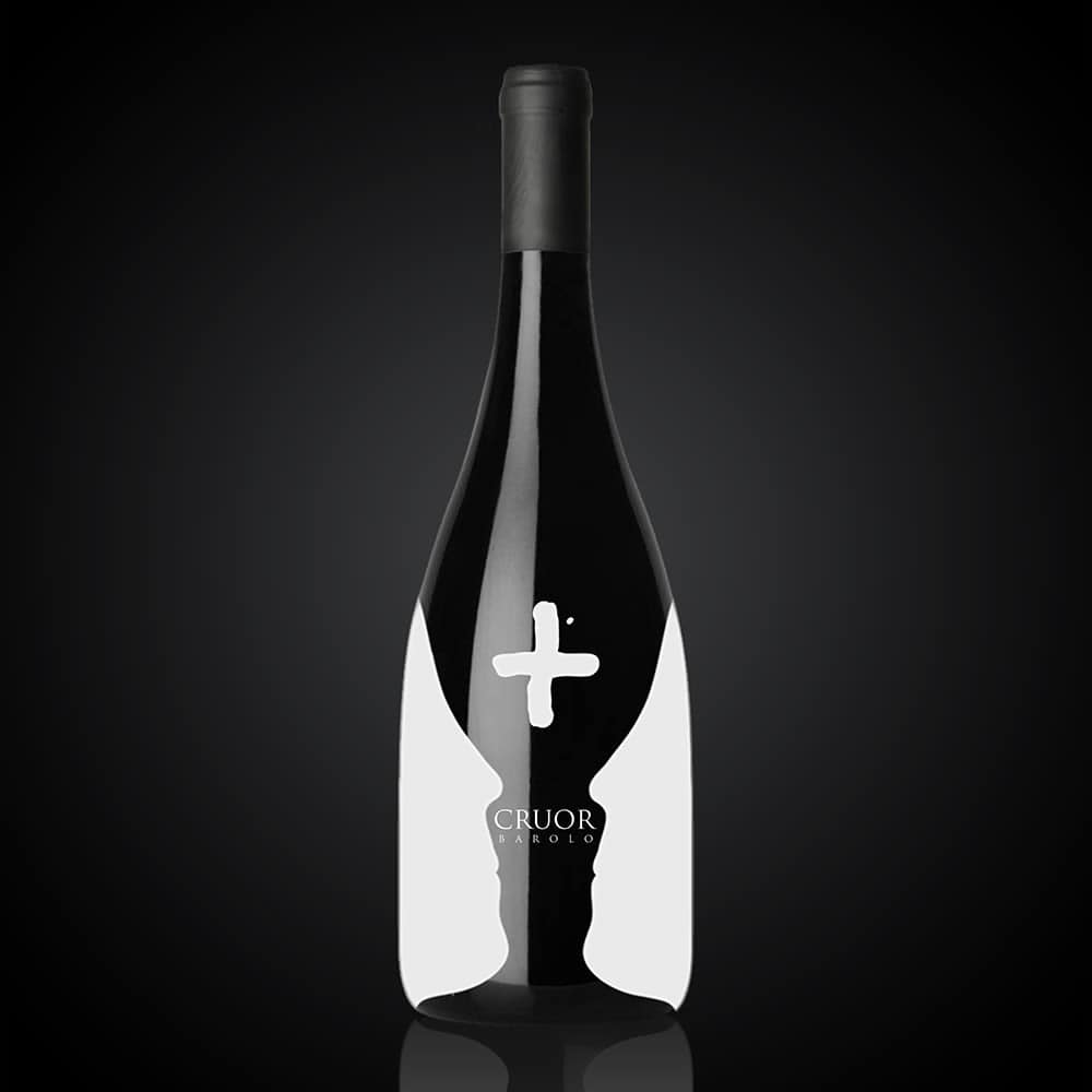
Figure/Ground – Prominent subjects pop out from backgrounds
Scale – Dominant sizes establish hierarchical importance
Skilful designers compose using Gestalt theory, guiding viewer perception down intended paths. These innate visual heuristics help designs communicate quickly and intuitively. Master both art elements and Gestalt principles to create genuinely compelling compositions.
Conclusion: Master the Elements, Design with Purpose
Art works and design elements may seem esoteric and academic, but they form the core building blocks of visual communication. Lines, shapes, colour, texture, space, contrast, composition – these fundamentals make design engaging and meaningful.
Internalise the expressive powers behind each visual element. Combine them with purpose and thoughtfulness. Let form, function, and meaning shape compositions. Outstanding design balances feeling with rationale, intuition, and intent.
Make these essential elements your allies. Let them energise your designs and connect with audiences. Let them help build compelling brands, engaging experiences, and inspired works that make a difference in the world.
Design is everywhere, affecting everyone daily. Skillfully wielding the elements gives designers the power to positively impact attitudes and emotions and enact real change through their work.
Master the elements, then design boldly with vision and care. Create designs that don't just look good but also make good – make people think, make people feel, make people's lives better.
Great designers know it's about more than just shapes and colours. It's about connections, emotion, and humanity. Lead people through the pixelated paths we weave. Build bridges, tell stories. Create designs that matter.
Frequently Asked Questions About Elements of Art in Design
What are the essential elements of art and design?
The most common elements of art and design include line, shape, colour, texture, space, form, value, emphasis, movement, balance, rhythm, unity, variety, and harmony. Mastering these core elements allows designers to create polished, professional visual compositions.
How do you use the elements of art in a design?
Thoughtfully combine elements of art to lead the viewer's eye, establish hierarchy, convey ideas, and set the right mood. For example, use bold lines to delineate sections, varied colour temperatures to create contrast, and balanced negative space for visual resting places.
What are the three most essential elements of design?
The three most essential elements are space, line, and colour. Space creates relationships, the line provides structure, and colour brings vibrancy. However, all elements work together synergistically in successful designs.
How do the principles of design work with the elements of art?
Whereas elements of art are the ingredients, principles of design instruct how to combine them effectively. Principles like scale and proportion, balance, and emphasis guide using lines, shapes, colours, etc., to create cohesive and engaging compositions.
How can you make the elements of art and design principles work together?
Use design principles like rhythm and variety to provide overall coherence while judiciously applying contrasting elements of art like colours and shapes to add needed visual interest. Ensure emphasis and dominance direct focus without causing distraction.
