The Science of Colour Psychology: How It Impacts Brand Perception
Hey there, fellow brand enthusiasts! Have you ever wondered why some brands captivate us effortlessly while others fail to make a lasting impression? Well, my friends, it's time to unravel the secret behind this captivating phenomenon: the science of colour psychology.
In the fascinating world of branding, colours hold immense power. They can evoke emotions, shape perceptions, and influence our decision-making process on a subconscious level. Don't believe me? Let's dive into the colourful realm of research and statistics to see how crucial colour is in shaping brand perception.
According to a study by the Institute for Color Research, people subconsciously judge a person, environment, or product within 90 seconds of initial interaction. And guess what? Up to 90% of this assessment is based on colour alone. Yes, you read that right—colour plays a significant role in forming those all-important first impressions.
But wait, it gets even more intriguing! A study by the University of Winnipeg found that different colours have unique psychological effects on our brains. For instance, warm colours like red and orange stimulate excitement and passion, while cooler tones like blue and green evoke a sense of calm and trust.
Now, let's talk about the impact of colours on branding. 85% of consumers claim that colour is the primary reason they buy a particular product. That's right—colour can make or break the success of a brand. Think about it—how often have you been drawn to a product on the shelf simply because of its vibrant packaging?
Not only can colours attract customers, but they can also reinforce brand recognition and loyalty. A study by the University of Loyola, Maryland, revealed that consistent branding colours can increase brand recognition by up to 80%. By using colours strategically, companies can etch their brand identity into the minds of consumers, creating a lasting impression that keeps them coming back for more.
So, whether you're a seasoned marketer, a budding entrepreneur, or simply someone curious about the enchanting world of branding, understanding the science of colour psychology is essential. By harnessing the power of colour, you can create a strong brand identity that resonates with your target audience and leaves an indelible mark on their minds.
In the upcoming blog post, we'll explore the fascinating realm of colour psychology even further. We'll uncover the meaning behind different colours, how to choose the right colour palette for your brand, and the impact of colours in various industries. Prepare for a colourful journey to revolutionise your perception and employ branding strategies.
Remember, colours are not just pretty decorations—they hold immense power to influence our emotions, shape our perceptions, and leave a lasting impact. So, let's dive into colour psychology together and discover the art of captivating brand perception.
Stay tuned for our next blog post, where we'll delve deeper into the meanings behind different colours and how they can be used to evoke specific emotions. Get ready to see the world of branding in a whole new light!
Let the colourful adventure begin!
Table of Contents
The Basics of Colour Psychology
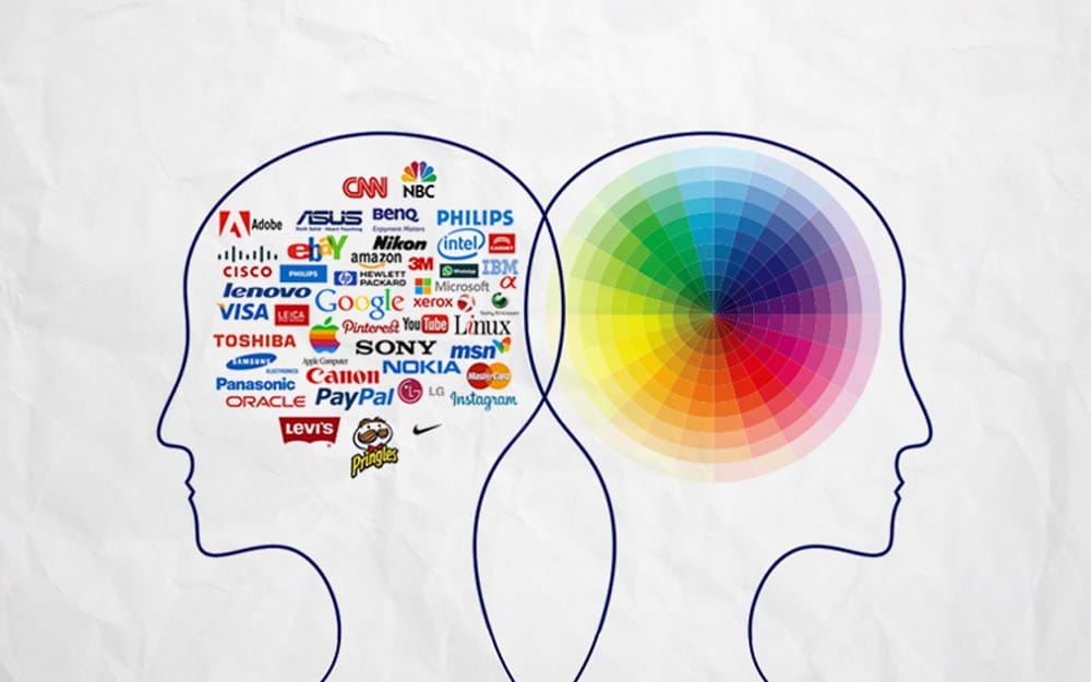
To understand colour psychology, we must first recognise that colours are not merely visual sensations but carry more profound meanings and evoke emotional responses. The psychological impact of colours can be attributed to various factors, such as cultural associations, personal experiences, and even evolutionary instincts. Here are some fundamental principles that underpin colour psychology:
Colour Associations and Symbolism
Colours hold significant symbolic meanings deeply rooted in our culture and society. Throughout history, shades have been attributed to specific emotions and concepts, allowing them to convey messages beyond their visual appearance. A prime example is red, universally associated with passion, energy, and urgency. Its vibrant hue stirs intense emotions and is a powerful symbol of love, desire, and determination.
On the other hand, the colour blue evokes a sense of trust, calmness, and reliability. Blue carries a tranquil essence, often associated with the sky's vastness and the ocean's serenity. It conveys a feeling of stability, loyalty, and peace, making it a popular choice in branding, especially for companies aiming to instil trust and dependability.
However, it's crucial to recognise that the symbolic associations of colours can vary across different cultures and contexts. While red may universally represent passion and energy, its interpretation can differ from one culture to another. In some Eastern cultures, red symbolises good fortune, luck, and celebration, whereas, in Western cultures, it can also denote danger or warning. This variation highlights the importance of considering cultural context when deciphering colour symbolism.
Furthermore, cultural and personal experiences can influence how individuals perceive and interpret colours. For instance, a colour that evokes joy and happiness in one culture might be associated with mourning or sadness in another. Additionally, the symbolism of colours can evolve as societal values and norms change. This dynamic nature demonstrates the significance of staying attuned to cultural shifts and historical context when analysing the meaning of colours.
In contemporary society, understanding colour symbolism extends beyond art and design. It is crucial in various domains, such as marketing, branding, and communication. Businesses strategically employ colours in their logos, advertisements, and product packaging to evoke specific emotions and create a desired perception among consumers. By utilising the right colours, companies can influence consumers' purchasing decisions, establish brand identity, and convey their values effectively.
Emotional Responses to Colours
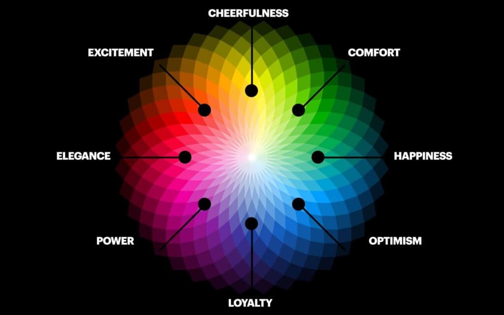
Colours possess the remarkable ability to evoke profound emotional responses within us. By harnessing the psychological power of colours, businesses can skillfully shape the atmosphere and mood of their spaces. Warm hues like red, orange, and yellow are known to ignite feelings of excitement, enthusiasm, and unbridled happiness. They have an innate ability to grab attention and create a sense of urgency, making them ideal choices for businesses aiming to instil energy and enthusiasm in their customers.
Red, the colour of passion and intensity, can evoke a sense of urgency, increasing heart rate and stimulating the appetite. It is often employed in restaurants and food establishments to enhance desire and encourage customers to indulge in their offerings. Red can also symbolise power, love, and courage, making it an excellent choice for businesses aiming to convey a solid and passionate message.
With its vibrant and energetic nature, Orange exudes a sense of enthusiasm, excitement, and warmth. It stimulates social interaction and evokes feelings of friendliness and approachability. Businesses seeking to create a welcoming and cheerful environment, such as cafes or social gatherings, often incorporate orange to foster a lively and convivial atmosphere.
Yellow, the colour of sunshine and happiness, is associated with optimism, creativity, and intellectual stimulation. It can help businesses in industries such as art, education, or design to foster an environment that encourages innovation, curiosity, and learning. Yellow can also grab attention, making it a practical choice for storefronts or advertisements, as it draws people in with its radiance.
In contrast, cool colours like blue, green, and purple offer a sense of tranquillity, calmness, and serenity. Blue, often associated with the sky and water, conveys a feeling of peace, trust, and reliability. It has a calming effect on the mind and body, making it an excellent choice for businesses that want to promote relaxation and reduce stress. Spa centres, wellness retreats, and healthcare facilities often utilise blue tones to create an environment of serenity and healing.
Green, representing nature and growth, instils harmony, balance, and rejuvenation. It is commonly used in health, sustainability, and environmental consciousness businesses. Green can also promote a sense of reassurance, making it a suitable choice for financial institutions or companies that aim to establish trust and stability.
Purple, a blend of calm blue and passionate red, conveys a sense of luxury, creativity, and spirituality. It is often associated with imagination, wisdom, and extravagance. Businesses seeking to evoke a sense of opulence and elegance, such as high-end fashion or beauty brands, can utilise purple to create a sophisticated and alluring atmosphere.
By comprehending the emotional impact of various colours, businesses can strategically utilise them to create specific environments and elicit desired emotional responses from their customers. The skilful selection and implementation of colours can significantly enhance brand perception, customer engagement, and overall ambience, ultimately contributing to the success and effectiveness of a business.
Personal and Cultural Influences
Colours can remarkably stir emotions that resonate with people on a universal level. However, it is crucial to recognise that personal and cultural experiences influence individual colour preferences and responses. While some emotional reactions to colours may be shared across cultures, the meanings and associations of specific colours can vary widely.
Cultural diversity plays a pivotal role in shaping colour preferences. Different societies have distinct interpretations and symbolic representations of colours, leading to contrasting emotional responses. For example, in many Western cultures, red is often associated with passion, love, and good fortune, while in some Eastern cultures, it can symbolise luck, celebration, or even warning signs. Similarly, white may signify purity and innocence in Western societies, but in certain Eastern cultures, it is associated with mourning and funerals.
Beyond cultural influences, personal experiences and memories also contribute to an individual's perception and reaction to colours. Each person carries unique memories and associations tied to different hues. For instance, someone with a joyful childhood experience associated with the colour blue might perceive it as comforting and soothing. On the other hand, an individual who experienced a traumatic event in the presence of the same colour may find it unsettling or distressing. These personal connections between colours and memories shape an individual's emotional response to them.
Psychological factors such as personality traits and personal preferences also influence colour perception. People with extroverted personalities may be drawn to vibrant, energetic colours like yellow or red. At the same time, introverted individuals might find solace in softer and more muted tones like pastels or earthy hues. Personal preferences and lifestyle choices can influence how someone responds to colours in their immediate environment, whether it's the colour scheme of their home, workplace, or even their selection of clothing.
Understanding the complexity of individual colour preferences and responses is essential in various fields, such as marketing, design, and psychology. It highlights the need for sensitivity and cultural awareness when using colours to communicate messages or evoke certain emotions. By acknowledging the impact of personal and cultural experiences on colour perception, we can foster a greater understanding and appreciation for how colours shape our lives.
The Role of Colour in Branding and Marketing
In the competitive world of branding and marketing, colour plays a crucial role in shaping consumer perceptions and influencing purchase decisions. Businesses strategically use colours to convey their brand identity, evoke specific emotions, and differentiate themselves from competitors. Here are some key ways in which colour impacts branding and marketing:
Brand Identity and Personality
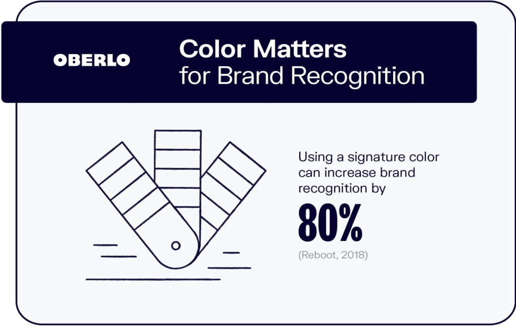
The strategic use of colours holds immense potential in effectively conveying brand values and personality traits. Brands can establish a unique and resonating identity by selecting specific colours that align with their target audience. This deliberate choice of colours empowers brands to communicate messages and evoke emotions subtly yet impactfully.
One notable example is using vibrant and energetic colours such as red and yellow by fast-food chains. These dynamic hues are purposefully chosen to evoke a sense of speed, excitement, and urgency. Red stimulates appetite and creates a sense of urgency with its bold and attention-grabbing nature. It is an ideal colour choice for restaurants looking to convey a quick and convenient dining experience. Conversely, yellow is associated with energy, happiness, and optimism, further enhancing the overall atmosphere and instilling a positive perception of the brand.
In contrast, luxury brands often opt for a more subdued and elegant colour palette to convey sophistication and exclusivity. Muted colours, such as soft neutrals, pastels, and earthy tones, create an aura of refinement, refinement, and understated luxury. These subtle hues allow luxury brands to establish an image of exclusivity and timeless elegance, appealing to discerning customers seeking products and experiences that exude sophistication. Luxury brands can communicate their commitment to quality, craftsmanship, and meticulous attention to detail by utilising a restrained and refined colour scheme.
Brands must understand that colour psychology shapes consumers' perceptions and emotional responses. Different colours evoke distinct emotions and associations, tapping into the subconscious mind and influencing purchasing decisions. Brands that invest in comprehensive research and analysis of their target audience can harness the power of colours to create a harmonious and persuasive visual identity that resonates with their customers deeply.
Beyond the initial selection of colours, consistency in colour usage is critical to establishing a solid and recognisable brand identity. By consistently employing a specific colour palette across various touchpoints, including logos, packaging, websites, and advertisements, brands can reinforce their personality traits and values, building trust and loyalty among their customer base.
Creating Brand Associations
Maintaining consistent and distinctive colour schemes throughout various branding materials is a powerful strategy that fosters robust associations between the chosen colours and a brand. This intentional repetition over time allows these hues to become deeply embedded in the consciousness of consumers, resulting in immediate recognition and a solid connection to the brand itself. Notable examples include the iconic blue of Facebook and the vibrant red associated with Coca-Cola. These colours have seamlessly intertwined with their brands to the point where they have become virtually inseparable.
The significance of consistent branding colours lies in their psychological impact on consumers. Colours can evoke emotions, trigger memories, and elicit subconscious responses. By meticulously selecting and implementing specific shades, a brand can effectively communicate its personality, values, and message to the target audience. This harmonious fusion of colour and branding allows consumers to form a mental shorthand, associating a particular hue with a specific brand without additional cues.
Take Facebook, for instance. The social media giant has cultivated an indelible connection between its brand and the colour blue. Through a well-executed and unwavering use of this hue across its various platforms and marketing collateral, Facebook has ingrained the association of blue with its brand identity. Consequently, when users see that distinct shade of blue, it instantly triggers an immediate connection to Facebook, invoking a sense of familiarity, trust, and global reach.
Similarly, Coca-Cola's utilisation of red has become synonymous with its brand identity. For decades, the vibrant red hue has adorned Coca-Cola's packaging, advertising campaigns, and logo. This consistent and unwavering use of red has established an enduring link between the colour and the brand. As a result, when individuals encounter the colour red, whether on a billboard, in a store, or even during the holiday season, they automatically associate it with the refreshing taste, happiness, and timeless appeal of Coca-Cola.
Consistency in colour branding is not only limited to these iconic examples but also extends to numerous successful businesses across various industries. Brands like Apple, with its sleek silver and black colour scheme, or Starbucks, with its rich green hues, have effectively harnessed the power of colour associations to establish strong connections with their target markets.
Influence on Consumer Behaviour
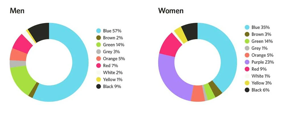
The influence of colours on consumer behaviour cannot be underestimated, as they can subtly but significantly impact our perceptions and decisions. Extensive research has demonstrated that various colours have the potential to influence how consumers perceive products, their inclination to make purchases, and even their long-term recollection of a brand. By understanding the psychology of colours, businesses can strategically leverage this knowledge to create compelling marketing strategies.
One compelling example is red, which has been found to stimulate appetite. Several studies have unveiled that when red is incorporated into the branding and décor of restaurants, it can increase food sales. This effect is rooted in the innate response that red evokes within us—a feeling of heightened energy, passion, and urgency. When individuals encounter red in a dining setting, their appetites tend to be stimulated, making them more likely to order food and potentially spend more. Fast food chains, for instance, have effectively harnessed the power of red in their logos, packaging, and interior designs, capitalising on its ability to create a sense of urgency and enhance the overall dining experience.
In addition to red, other colours can also profoundly impact consumer behaviour. For example, green is often associated with nature, tranquillity, and sustainability. Brands that utilise green marketing strategies can tap into these associations, appealing to environmentally conscious consumers and conveying a sense of harmony and eco-friendliness. This colour choice can be particularly effective for businesses in industries such as organic food, natural skincare, or sustainable fashion.
Moreover, blue is frequently associated with trust, reliability, and professionalism. Financial institutions, insurance companies, and technology brands often incorporate blue into their logos and branding to instil consumer confidence and dependability. By utilising blue strategically, these companies aim to establish a positive emotional connection and foster long-term loyalty with their target audience.
It is important to note that the impact of colours can vary across cultures and personal preferences. While red may stimulate appetite in one culture, it might hold different connotations or meanings in another. Therefore, businesses must consider their target audience's cultural backgrounds and individual preferences when implementing colour strategies.
Cultural Considerations in Branding
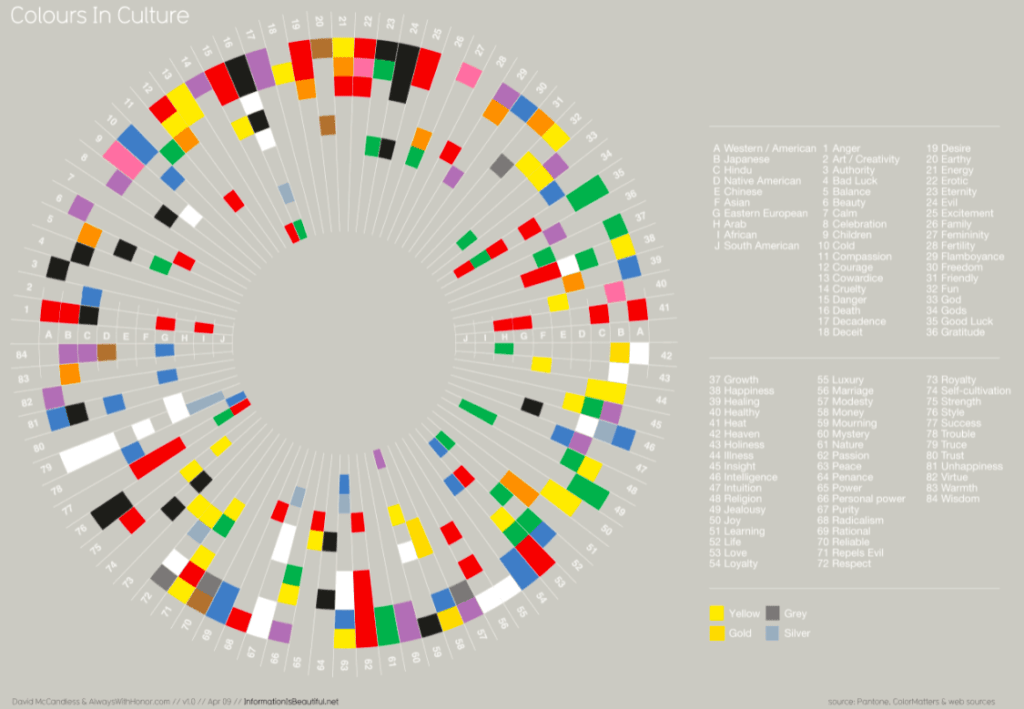
When businesses venture into new markets, it becomes imperative for them to examine and navigate the cultural nuances associated with colour carefully. Colours possess diverse meanings and associations across various cultures, and disregarding these distinctions can result in misinterpretations or offend potential customers. By adapting branding strategies to harmonise with cultural preferences, businesses can guarantee effective communication of their intended message while establishing a solid connection with their target audience.
Cultural sensitivity regarding colours plays a significant role in international marketing efforts. The interpretation of colours can vary significantly between different societies, and what may evoke positive emotions in one culture might elicit contrasting reactions in another. For instance, while red symbolises luck and prosperity in Chinese culture, it may represent danger or warning in Western cultures. Such disparities underline the importance of understanding cultural contexts to tailor branding elements accordingly.
Incorporating cultural considerations into branding strategies requires thoroughly understanding the target market's preferences, beliefs, and historical associations with colour. This involves conducting in-depth research, consulting with local experts, or partnering with native professionals with deep market knowledge. By investing time and resources into this process, businesses can avoid unintended consequences and ensure that their brand messaging aligns with the cultural values of the target audience.
Understanding Colour Associations
While general emotional responses are associated with colours, the specific associations can vary based on cultural context, personal experiences, and individual preferences. It is essential to recognise these nuances to leverage colour psychology in branding and design effectively. Here are some key colours and their typical associations:
Red

Red, a captivating and vibrant hue, possesses an inherent ability to seize attention and leave a lasting impression. It is a colour that symbolises intense emotions, such as passion, energy, and urgency. The sight of red ignites a spark, evoking a sense of fervour and vitality. It represents power, love, and excitement, making it a potent force in personal and professional realms.
Red holds a special place in branding and marketing, as it can stimulate appetite and desire. This characteristic has made red a popular choice in the food and beverage industry, where it is utilised to entice customers and create a sense of craving for products. From tantalising restaurant signs to alluring packaging, red has awakened the taste buds and enthralled consumers.
However, it is essential to exercise caution and tact when incorporating red into design or branding strategies. As much as red can evoke positive emotions, it also has the potential to elicit feelings of aggression or danger. Its intensity can be overwhelming if not used judiciously. The key lies in striking a delicate balance between its powerful impact and the desired emotional response.
In personal expression, red has long been associated with love, romance, and passion. It symbolises the fire that burns within us, igniting our deepest desires and kindling a fervent flame of affection. Red roses, for instance, have become a timeless symbol of love and devotion, capturing the essence of deep respect and ardour.
Moreover, red transcends mere symbolism and enters the realm of cultural significance. It plays a vital role in various traditions and celebrations around the world. From the vibrant red lanterns adorning Chinese New Year festivities to the crimson garments worn during joyous Indian weddings, red embodies happiness, good fortune, and auspicious beginnings.
In sports, red is often associated with dynamism and competitiveness. It symbolises the relentless pursuit of victory, instilling a sense of urgency and determination in athletes. Teams in red uniforms project a powerful presence, exuding confidence and a strong will to succeed.
Blue

Blue, often intertwined with trust, calmness, and reliability, can create an atmosphere of reassurance and steadfastness. Its tranquil nature is a beacon of security and professionalism, making it a favoured choice among banks, tech companies, and healthcare providers. The versatile shades of blue offer a spectrum of emotions and connotations, each contributing to the desired message.
Lighter hues of blue gently embrace the senses, evoking a serene and peaceful ambience. These soft tones carry a profound sense of tranquillity, instilling a feeling of ease and harmony in those who encounter them. The ethereal pastels of baby blue and powder blue, reminiscent of a clear summer sky or the gentle lapping of ocean waves, transport individuals to calmness and contentment. Their delicate touch provides a peaceful respite from the hectic pace of everyday life, encouraging relaxation and reflection.
Conversely, darker shades of blue emanate authority and stability, commanding respect and confidence. With their commanding presence, deep blues project a sense of reliability and unwavering dependability. The rich navy blue or midnight blue hues, reminiscent of the vast expanse of a starlit night sky or the depths of a tranquil ocean, exude a sense of control and steadfastness. They invoke feelings of trust, establishing an aura of reliability and expertise. Such tones are often employed to convey a sense of professionalism and competence, captivating the attention of clients and customers alike.
The harmonious combination of light and dark blues creates a comprehensive palette that allows businesses and organisations to convey various emotions and qualities. The tranquil allure of light blues can be used to soothe and comfort, while the commanding presence of darker blues can instil a sense of confidence and dependability. By strategically incorporating these shades into their branding and design, companies and institutions communicate a message of trustworthiness, calmness, and stability to their target audience.
It is no wonder that blue is a favoured choice in various industries. Banks utilise their associations with trust and reliability to instil a sense of security in their customers, assuring them that their financial well-being is in capable hands. Tech companies employ blue to convey professionalism and competence, reassuring users that their innovative solutions are dependable and of the highest quality. Healthcare providers, too, utilise blue to create a sense of calmness and comfort in a potentially stressful environment, fostering trust and instilling confidence in their patients.
Yellow
Yellow is an exuberant and dynamic colour that embodies a spectrum of emotions ranging from joy and optimism to creativity and happiness. Its vibrant nature commands attention and is a powerful tool to stimulate positivity and invigorate the senses. This effervescent hue uniquely uplifts moods, infuses spaces with energy, and evokes a sense of delight in those who encounter it.
The colour yellow has long been associated with feelings of cheerfulness and optimism. Its warm and radiant presence can effortlessly brighten any room or design, making it an excellent choice for spaces that inspire positivity and a zest for life. Whether used as an accent or the dominant shade, yellow can invigorate the atmosphere and encourage a lighthearted outlook.
Furthermore, yellow holds a close relationship with creativity. Artists, designers, and creators often embrace it because it can spark innovation and imaginative thinking. The colour's vibrancy and intensity stimulate the mind and encourage unique perspectives and unconventional ideas. Incorporating yellow into creative environments, such as studios or workspaces, can foster an atmosphere of inspiration, pushing boundaries, and exploring new possibilities.
Despite its numerous positive attributes, exercising moderation when using yellow is crucial. Too much of this intense hue can lead to feelings of restlessness, anxiety, or even irritation. As with any colour, balance is critical. Combining yellow with complementary or contrasting colours can help temper its potency while still harnessing its energetic qualities. Pairing yellow with calming blues or grounding neutrals can create a harmonious equilibrium that allows the colour to shine without overwhelming the senses.
Green

Green is a hue that resonates deeply with the natural world, embodying the essence of nature, growth, and harmony. Its lush tones evoke a sense of tranquillity and balance, bringing to mind the vibrant foliage of flourishing forests and the soothing serenity of open meadows. As a colour that symbolises life and renewal, green is often embraced as a representation of freshness, vitality, and environmental consciousness.
With its inherent connection to the environment, green intertwines with health, wellness, and sustainability. The colour is frequently employed by businesses and organisations operating in these industries to convey a message of well-being, vitality, and a commitment to eco-friendly practices. Whether it is a natural skincare brand emphasising organic ingredients or a sustainable fashion label advocating for ethical production processes, green acts as a visual cue, signalling their dedication to preserving the planet and promoting a healthier lifestyle.
Beyond its affiliation with the natural world, green also holds connotations of prosperity and abundance. It is often associated with wealth and financial success, making it an apt choice for institutions operating in finance and investment. Banks, insurance companies, and investment firms often incorporate shades of green into their branding to evoke feelings of stability, growth, and financial security. By aligning themselves with this colour, these organisations seek to instil trust and confidence in their clients, assuring them of their ability to manage and grow their resources effectively.
Moreover, green is versatile, allowing it to adapt and cater to diverse industries and contexts. Its multifaceted symbolism can evoke a wide range of emotions and associations. From the tranquillity of a spa offering rejuvenating treatments to the invigorating energy of a fitness brand inspiring active lifestyles, green can be harnessed to communicate various brand values and aspirations.
Purple
Purple, a captivating hue that exudes a sense of opulence, creativity, and spiritual depth, has long been intertwined with a touch of mystique and elegance. Its rich and regal nature draws forth an air of luxury, making it an alluring choice in various contexts. Notably, purple is a favoured colour in beauty and cosmetics to evoke a profound sense of sophistication and allure.
Symbolically, purple holds a unique place in our collective consciousness. It has historically been associated with royalty and nobility, denoting power, wealth, and extravagance. This association stems from ancient times when obtaining purple dye was laborious and costly, making it exclusive to the elite. Thus, purple came to embody a sense of grandeur and privilege that resonates today.
Beyond its connections to the elite, purple also holds significance in creativity. This vibrant hue is enchanting and stimulates the imagination, making it a preferred choice among artists, designers, and innovators. Its ability to inspire and encourage unconventional thinking has solidified its position as a colour representing the boundless possibilities of imagination and artistic expression.
Furthermore, purple has deep-rooted spiritual connotations. Across different cultures and belief systems, purple is associated with introspection, intuition, and enlightenment. It is often considered a colour that facilitates deep contemplation, meditation, and connection with the higher realms of consciousness. This spiritual essence adds a layer of depth to the allure of purple, making it a colour that transcends the material world and delves into the profound aspects of human existence.
However, it is essential to acknowledge that purple can elicit varying individual responses. While many are drawn to its luxurious and enchanting qualities, some may perceive it as artificial or unappealing. The boldness and intensity of purple may only resonate with some people's aesthetic preferences. Additionally, people's cultural and personal associations with colour can significantly influence their perception of it. As with any colour, individual interpretations and biases play a significant role in how purple is perceived and received.
Orange
Orange is a vibrant colour that seamlessly blends the dynamic energy of red with the comforting warmth of yellow. It embodies a remarkable combination of emotions, symbolising enthusiasm, creativity, and a thirst for adventure. The invigorating qualities of orange make it a compelling choice for brands looking to evoke a sense of excitement and liveliness in their messaging.
With its ability to ignite passion and stimulate the imagination, orange has become a popular colour in marketing and design. It exudes a sense of optimism, encouraging individuals to embrace their creativity and approach life adventurously. Whether it's a call to action or an invitation to explore new horizons, orange captures attention and motivates individuals to take action.
However, like any powerful tool, orange must be used judiciously. Its energetic nature can be overwhelming if overused. When employing orange, it is crucial to strike a delicate balance and apply it selectively to achieve the desired effect. By incorporating orange strategically, brands can create a sense of urgency, drawing attention to critical elements or messages. It can highlight special promotions, limited-time offers, or convey dynamism.
Furthermore, the playful and energetic personality associated with orange can be an effective tool for brands targeting youthful or adventurous audiences. It evokes a sense of spontaneity, joy, and approachability, helping to create a lasting impression on consumers. Whether it's in a logo, website design, or advertising materials, the strategic use of orange can infuse a brand with a sense of liveliness and capture the attention of potential customers.
Pink
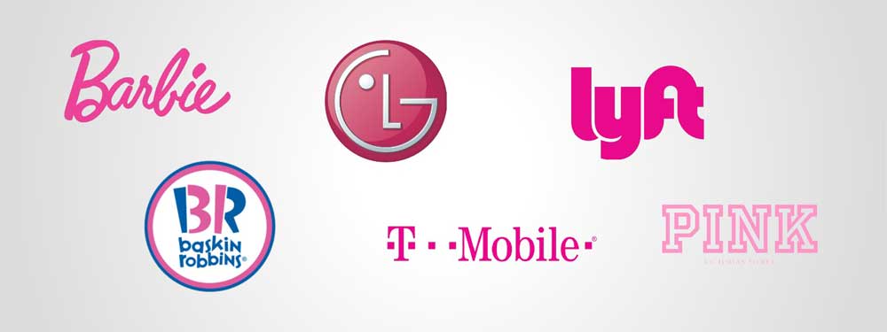
Pink is widely recognised as a symbol of femininity, evoking sentiments of tenderness and nurturing. This delicate hue is significant in our cultural associations, representing compassion, love, and youthfulness. Its soft and gentle nature makes it a popular choice in various industries that cater to female consumers, including fashion, beauty, and healthcare.
Pink has a profound emotional impact, eliciting feelings of warmth, empathy, and care. Its association with femininity is deeply ingrained in our societal norms and has been reinforced over time. This connection is often celebrated, as it aligns with the traditional attributes attributed to women.
However, it is crucial to approach pink with sensitivity and mindfulness. While it is a powerful tool for capturing the attention of female consumers, care should be taken not to perpetuate gender stereotypes. Limiting pink exclusively to products or services targeted at women can reinforce the notion that femininity is defined as a particular colour or that specific industries are solely for women. This narrow perspective disregards individuals' diverse interests, preferences, and identities.
Instead, it is vital to embrace inclusivity and recognise that colour associations do not solely define gender. By diversifying colour choices and design elements, industries can appeal to a broader audience and foster a more inclusive environment. Taking a balanced approach that acknowledges the multifaceted nature of femininity and avoids rigid stereotypes allows for greater freedom of self-expression and acceptance.
Black and White

Black is a colour that embodies a sense of power, elegance, and sophistication. With its timeless allure, black has long been associated with luxury brands and is frequently chosen to represent formal and high-end products. Its depth and intensity exude a sense of authority and exclusivity, making it a preferred choice in fashion, accessories, and high-value items.
In the realm of design and aesthetics, black holds a captivating allure. It can effortlessly elevate any object or space, imparting a touch of sophistication and refinement. From sleek black automobiles to stylish black-tie attire, this colour has an innate ability to command attention and leave a lasting impression.
Conversely, white represents purity, simplicity, and cleanliness. It evokes a sense of pristine beauty and conveys innocence and flawlessness. Often associated with new beginnings, white symbolises purity and offers a blank canvas on which possibilities can flourish.
White is ideal for conveying trust and hygiene in the healthcare, beauty, and technology industries. Its crisp and unblemished appearance instils confidence in consumers, assuring them of cleanliness and a commitment to quality. White is frequently employed in medical settings, where its association with sterility and cleanliness is essential. In the beauty industry, white packaging and interiors create a sense of purity and elegance, reflecting the desire for unadulterated beauty products. Furthermore, white design elements in technology often evoke a modern and minimalist aesthetic, symbolising simplicity and innovation.
Both black and white, though seemingly opposites hold their unique powers of communication and captivation. They can enhance brand identity, create emotional connections with consumers, and convey luxury, trust, and sophistication messages effectively. Whether individually or in combination, these colours continue to be embraced across various industries for their timeless appeal and visual impact.
Applying Colour Psychology in Design and Branding
Understanding colour psychology is only the first step; applying this knowledge effectively is the key to creating impactful designs and memorable brands. Here are some practical tips for using colour psychology in design and branding:
Consistency is Key
Consistency in colour usage across branding materials is essential for building strong associations between the colour and the brand. This includes using consistent colour palettes in logos, websites, packaging, and advertising. A consistent colour scheme helps establish brand recognition and reinforces the desired emotional response in consumers.
Consider Target Audience
When selecting colours for branding, it is crucial to consider the preferences and expectations of the target audience. Research your target demographic and understand the cultural, gender, and age-related associations with colours to ensure your brand resonates with the intended audience. For example, bright and bold colours may appeal to younger audiences, while muted and sophisticated colours may be more suitable for older demographics.
Balance and Contrast
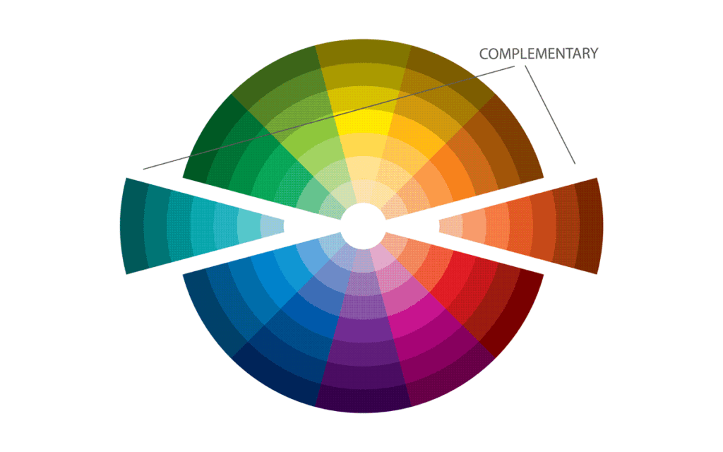
Using colours in combination with others can create powerful effects. Consider the balance and contrast between colours to ensure visual harmony. Complementary colours (those opposite each other on the colour wheel) can make a visually striking impact. In contrast, analogous colours (adjacent to each other) can create a sense of harmony and cohesion.
Test and Iterate
Design and branding are iterative processes, and colour choices should be tested and refined based on user feedback and data. Conduct A/B testing to evaluate the impact of different colour variations on consumer behaviour and brand perception. Analyse click-through rates, conversion rates, and brand recognition to make data-driven decisions.
Conclusion
Colour psychology is a powerful tool businesses can leverage to create memorable branding experiences and influence consumer behaviour. By understanding the psychological impact of colours and carefully selecting hues that align with their brand identity and target audience, businesses can evoke the desired emotions and build strong associations with their brand. Whether it's a fast-food chain's vibrant red or a technology company's calming blue, the strategic use of colour can captivate consumers and leave a lasting impression. So, next time you encounter a brand, pay attention to the colours it employs, and you may discover the fascinating world of colour psychology at work.
