Top 10 Website Design Tips to Boost your Traffic
When it comes to web design, a little goes a long way. The design of your website has a profound impact on your ability to generate traffic to your site and convert that traffic into sales. In this article, we'll share some simple website design tips you can implement to improve your traffic and sales. These ten tips will significantly impact your website's conversion rate and boost your search engine rankings.
To get more visitors, you need to think about your website differently. A website is like a business card that will get you noticed. You need to be creative and innovative; if you want to stand out, you must take web design courses.
It would be best if you thought about what people need and what they want. Your website needs to be user-friendly and attractive. But the most important thing is for it to be functional.
This article will teach you how to get the most out of your website. I've been in the web design industry for over ten years. During that time, I learned a lot. I've seen good sites and bad sites.
I've seen sites that have great functionality but have no design. I've also seen beautiful sites, but they are not functional.
There is a vast difference between the two.
Keep reading to learn how to get the most out of your website.
Table of Contents
Top 10 Website Design Tips
Keep your design simple. Avoid complex designs that require too many fonts, images or colours. The best websites are often the simplest and easiest to navigate.
1 – Make site speed a priority
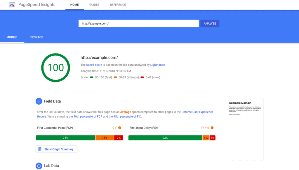
Users who experience slow pages are less likely to return to your website.
Speed affects your website's performance in many ways. It affects how quickly a browser downloads a page's content and renders graphics. It affects how quickly users navigate a site. It also affects how quickly a search engine indexes and returns search results.
According to Google, the average webpage is loaded in three seconds or less. However, on some websites, this time may be much longer. Page speed is critical because fast sites are visited more often and generate more revenue than slow sites.
How Does Page Speed Affect Your Site?
Page speed depends on the technology used to deliver content to the user. There are two main categories of page speed:
Content delivery network (CDN)
A CDN is a collection of servers that store and serve websites and applications across the internet. A CDN distributes a load of data across many servers to make it faster for users.
In this sense, a CDN is similar to a web host. However, a CDN differs from a web host because it is a collection of servers rather than a single server. It also differs from a web host because it is not a business relationship but a technical solution.
CDNs cache websites and deliver their content to end users through the internet. Because it is a distributed system, CDNs can offer users a wide geographic area of content and speed. In addition, because the content is stored and cached across many servers, CDNs can also offer a high level of redundancy in case one server fails.
The benefits of a CDN include the following:
- Reduced site latency
- Increased traffic and revenue
- Better security
- Reduced server costs
- Improved user experience
Optimised web pages
In terms of website design, a CDN is a must-have tool for every website. Web pages load slowly without a CDN, and visitors are less likely to return.
CDNs can be integrated into your website design and added to your current web hosting plan. However, it is often more cost-effective to buy a separate CDN package.
A CDN works by caching a website's HTML, images, JavaScript, and CSS. The CDN stores the content on its servers and delivers it to users when requested. In this way, a CDN saves bandwidth and reduces the amount of data sent over the internet.
For example, if a user requests a page on your site, the CDN can access the page's content, download it, and cache it on its servers. Then, if that same page is requested again, the CDN will access the cached copy rather than send a request to your server. This means that the first user's request goes faster, and the second user receives a faster response.
The CDN will also cache the files from your server, reducing the bandwidth required to send data across the internet. This means that the CDN's servers handle the request and pass the data on to your site's servers.
The CDN will also optimise your site's images, CSS, and JavaScript files, improving the loading speed and user experience.
Another advantage of CDN is that it protects against malware, which can infect your website and steal valuable information such as credit card numbers and passwords.
Although a CDN is essential for a fast website, it comes with some drawbacks, including:
Costs
You must pay a monthly or annual subscription fee to use a CDN. In addition, your CDN will have additional fees for specific services.
Security
A CDN provides a single point of failure that hackers could attack. For this reason, it is recommended that you use a separate web hosting account and purchase an SSL certificate to secure your website's connection.
Bandwidth
A CDN will increase the amount of data transferred to your site, which can lead to higher bandwidth costs.
What Should I Look For in a CDN?
Your first step is to choose a CDN that meets your needs. When choosing a CDN provider, you will want to consider the following:
The size of the network
A CDN can offer a wide geographic area for content distribution and speed. You may want a CDN that offers content to users in all of Europe, for example. In contrast, a CDN with a smaller network can provide faster response times in a local area, such as within your city.
The CDN's pricing structure
A CDN may offer a free trial period. Before committing to a contract, you should know the cost of using a CDN.
The speed of the CDN
The speed of the CDN is a factor in determining which CDN is best for you. If your site needs high-speed content delivery, choose a CDN with an extensive network and low prices. If your site only needs slower content delivery, you may want to choose a CDN with a smaller network and higher costs.
2 – Identify the best web hosting and CMS
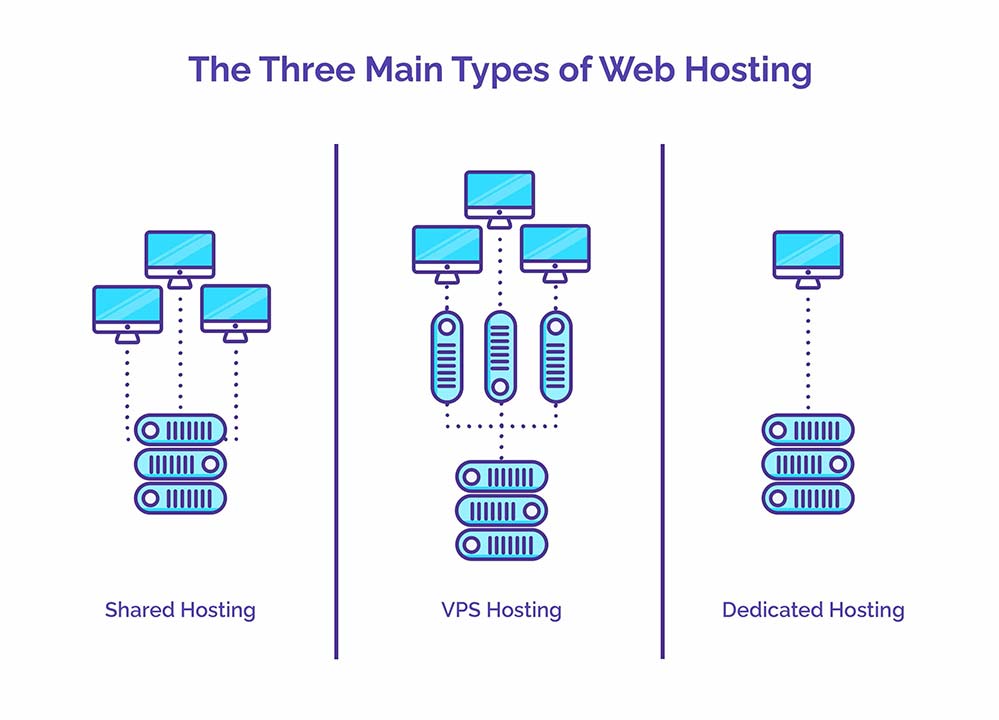
It's easy to get carried away when choosing a CMS and web host. When considering your options, keep the following things in mind:
Choose a provider that offers 24/7 support.
It's essential to reach a live human at any time of day or night. Some web hosts offer 24/7 customer support, but that's no guarantee.
Look for a provider that's been around for years.
A company with a long history is likelier to have a stable platform than a newcomer that may disappear overnight.
Find a provider that has a track record of reliability
Many prominent providers have an excellent reputation and a track record for zero downtime (at least 99.5%) and malware issues. Look for a provider that offers security patches and backups.
Find a provider that has a robust feature set.
If your website needs many features, look for a provider that offers both robust features and plenty of them. The number of features you need will depend on the type of website you're building, so it's always a good idea to research each option before settling on a provider.
Don't worry about the price.
You don't need to pay top dollar to get the right hosting solution. Our selected providers are all affordable yet offer top-notch features and performance.
3 – Prioritise the user experience

When building a site, focusing on the user experience is essential. This includes the type of device a user uses, how easy it is to navigate and browse your website, and how convenient your content is to access. If a website's interface is unintuitive, users won't stick around to learn about your business, which means they won't be as interested in hearing about your product or service.
This is why a clean, minimalist design with an easy navigation bar is essential. A clean, minimal design is also easier to navigate and allows users to find what they're looking for faster, so they'll be more satisfied with the experience and will return to your site.
How do you prioritise UX?
UX is the science of what makes a website or app intuitive and usable. UX experts evaluate a website's layout, navigation system, and overall design to determine how well it meets its users' needs. In this case, it's vital to ensure that the interface is straightforward, so users save time and effort figuring out how to use it.
What are some of the elements that contribute to a great user experience?
Here are a few things to consider:
- Clean, minimal design
- Clear and intuitive navigation
- Easy-to-find information
- Usability tests
- User Feedback
- User testing
In usability testing, you get to know your users and determine their needs. Sometimes you may notice that the navigation could be clearer to understand or match the content. In this case, adjust the navigation or layout accordingly to help improve the user experience.
If you need help deciding what to include or remove from your site, use usability testing software, such as Usabilla. The tool lets you test and optimises your website's look, feel, and navigation. It can also analyse your users' behaviour and see where they go wrong, giving you valuable information on improving your site.
4 – Keep your site pages consistent
The easiest way to improve your website's conversion rate is by providing a consistent and reliable user experience across all pages and content.
Maintaining a consistent theme and looking across all pages and content is recommended to keep your website consistent. For example, if you have a blog, it's a good idea to design it with a consistent theme and font across all pages and posts. This helps visitors identify the type of content they're receiving and provides a positive experience.
With your website, consistency means ensuring that users know where to go, what to expect, and how to navigate your website. Users should feel at home when browsing through your website.
In contrast, users will become confused and frustrated if your website is inconsistent. It's a good idea to test different designs to determine what works best for your users. Once you've identified what you think is the best layout, it's time to implement it.
You may have noticed that many websites use the same colour palette and typography across all pages and content. This consistency adds a sense of cohesiveness and continuity to your website when done correctly.
Consistent Design
Consistent design is also crucial in content, including text, images, and videos. The consistent design ensures that content appears similar across all pages and doesn't confuse or mislead users.
For example, let's say you have a website with a blog that includes multiple pages and content. You want to ensure that all the blog posts appear in the same fonts, colours, and layouts. The same goes for other types of content, such as articles, links, product descriptions, etc.
To achieve a consistent theme and look across all pages and content, it's a good idea to use a shared design library, such as CSS or a CMS, that allows you to customise your design in a modular fashion.
Another benefit of using a design library is that it lets you preview your design before finalising it. With a consistent design, you'll find it easier to create content for your website and keep track of what's already been created.
5 – Use a responsive design
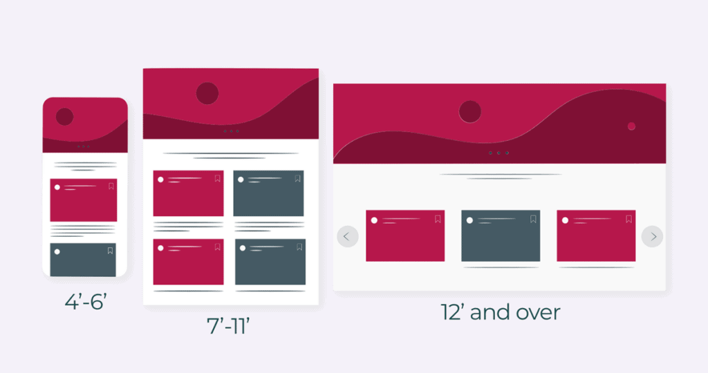
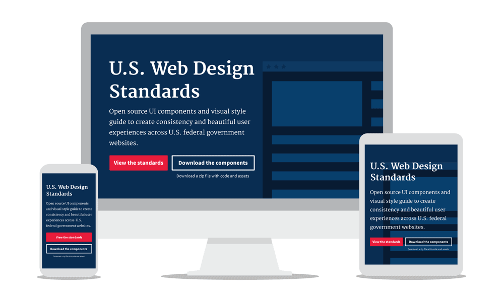
When building a website, we often make decisions about the look and feel of a page without thinking about why it's the way it is. This is how websites work in the traditional world — they don't need to be responsive because they're built around the desktop viewport. However, the world of smartphones and tablets is different — mobile devices are smaller, and the screen sizes vary widely.
A responsive website is designed to adapt to the display of any device on which it is viewed. Responsive sites automatically adjust to the screen size and resolution, using flexible layouts and smart media queries to ensure the content is presented as well as possible.
With a responsive website, your text and images can adjust to the screen size, and the page layout will automatically adapt to fit the device. The result is a better user experience.
What Is Responsive Web Design?
Responsive web design (RWD) is a type of website design that adapts to the screen size and resolution of the device on which it is viewed. The term “responsive” refers to making the site look good on all screens, from desktops and laptops to tablets and smartphones.
A responsive website is typically implemented using CSS3 media queries, HTML5, and JavaScript. A website built in this manner is known as a “mobile first” design. This means the site has its basic structure before scaling to smaller devices.
Why Is Responsive Web Design Important?
With the rise of mobile devices, many websites have begun adopting responsive design, which is critical in today's digital world. By creating a responsive website, you can optimise your content and offer a consistent experience across multiple devices, whether connected to the internet via a smartphone or a computer.
Responsive websites also are more accessible to users. With a responsive website, any disability doesn't stop users from accessing your content.
Responsive design has become increasingly important as users rely on mobile devices to access the internet. In the past, Developers built most websites for the desktop — and, in turn, the browser window — to maximise the visibility of a particular page. But as more people view websites on mobile devices, a responsive design allows a website to adjust to various screen sizes and resolutions.
How Can You Implement Responsive Web Design?
When you build a website, you have two options for the initial view of the site:
You can choose to set up the site in the traditional manner. The site looks the same regardless of the device on which it is accessed. In this case, you'll want to keep your navigation on the left side and your primary content on the right.
Or, you can opt for a responsive website. In this case, you'll want to set up the site in a way that considers the device being used to view the site. The page will adjust so the text and images appear correctly on all devices.
You'll need to do a few things to set up a responsive website.
First, you'll want to consider the primary screen size of the device on which your site is being accessed.
For example, if you're planning on designing a mobile-friendly website, you'll want to choose a device screen size of roughly 912 pixels wide. For tablets, it's 768 pixels, and for laptops, 1024 pixels.
Next, you'll need to identify the size of the viewport. The viewport is the area in which the website is displayed. For example, if your phone is about 7 inches tall, the viewport will be the portion of the site visible to you when you view it on your phone.
In this case, the viewport's width would be the width of your phone screen, plus a little extra room on both sides. So, if you add up the width of the phone screen, plus 8 inches, you'll get the total width of the viewport.
The next step is determining what kind of media query you want to use to define the viewport.
Media queries are the building blocks of a responsive website. When a user views your site on a specific device, you can use media queries to adjust the size and appearance of your website.
The media query will identify the screen size of the device being used, and the media query will adjust the website's style accordingly.
6 – Keep it simple
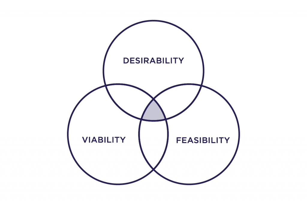
When designing a website, it's tempting to go all out with complicated design elements. Keeping things simple can improve user experience and increase conversion rates.
For example, when people see a website full of different font styles, navigation buttons, images, and other clutter, they often need more interest in clicking on the site.
When designing a website, simplicity is the way to go.
Why Make It Simple?
Simple websites are faster to load, easy to read, and more easily customisable. People prefer to avoid being overwhelmed with choices when browsing a website, and when a website uses many design elements, they may assume it's hard to navigate.
To make it easy, you can put navigation at the top of the page rather than buried within a dropdown menu.
It also makes sense to simplify the design by reducing the number of colours and using fewer fonts. People are less interested in reading cluttered pages and are more likely to click on links if the page is easy to scan.
Simplicity is also key to a great user experience. Visitors can navigate the site quickly if they have only one or two pages on a website.
7 – Remember Hick's Law
When designing your website, you must remember that your visitors see it differently from the way you do. For example, when they're looking at your website on a desktop monitor, they typically look at it at a diagonal, whereas when they're viewing it on a mobile phone, they typically look at it straight on.
Hick's Law states that the most effective way to communicate information is by presenting it in a manner that is easiest for the viewer to understand rather than forcing them to scroll through too much information.
A good rule of thumb is to ensure that your website content is presented at an aspect ratio of 1.5:1 or 2.4:1. If the page is too wide, it can cause headaches or eyestrain for your viewer. If it's too tall, it's harder to read.
For example, let's say your website contains an article about how to make your coffee taste better. Instead of creating a 2.4:1 image that shows the entire article, create an image that's 1.7:1 or 1.3:1. Your reader doesn't have to scroll down a very long page to read the article.
When designing your website, consider how your viewers access the page, whether they use a mobile phone, tablet, or computer. Think about how they'll interact with the information and how you can best present it to them.
Best Practices
In addition to ensuring that your site is set up for optimum viewing, it's essential to keep in mind that there are other considerations when it comes to web design. Here are some of the most important factors to remember while developing your website.
Avoid Using Flash
Flash is notorious for being a slow-loading file, so it's not a good choice for your website. The same goes for videos, slideshows, or other media that require Adobe Flash Player.
While your site may load quickly in the short term, the browser will eventually slow down while waiting for the Flash files to download. This could result in your site taking longer to load and fewer people visiting your site.
Ensure that you use HTML and CSS for your website
While the HTML5 standard was introduced to the public in 2014, many websites today are still designed with the old HTML 4 standard. HTML is the language that defines the appearance of your website, while CSS controls the style and layout of your website.
Use CSS to change your site's text size, colours, backgrounds, and spacing. While you can use CSS to change the size of images, it isn't a good idea to use it to increase the size of your website. It can lead to slow page loads and increased bandwidth usage.
Consider the Way Your Site Will Function
As you're designing your website, think about how the visitors will view it, whether on a mobile phone or desktop computer. Remember that you may have multiple devices, such as a mobile phone, laptop, and tablet, and you need to consider how each one will work together.
For example, if your website displays a list of products on the homepage and you plan to sell them on your site, you need to ensure that they are displayed on the smartphone screen correctly.
Consider how visitors will navigate the website. Do you want your visitors to click through each page individually, or can they select their desired page with just one click?
In addition to ensuring that your site is designed well, it's also essential to have a content management system (CMS). A CMS allows you to control the look of your site, add new content, and manage your site content without having to build it from scratch.
8 – Comply with privacy laws
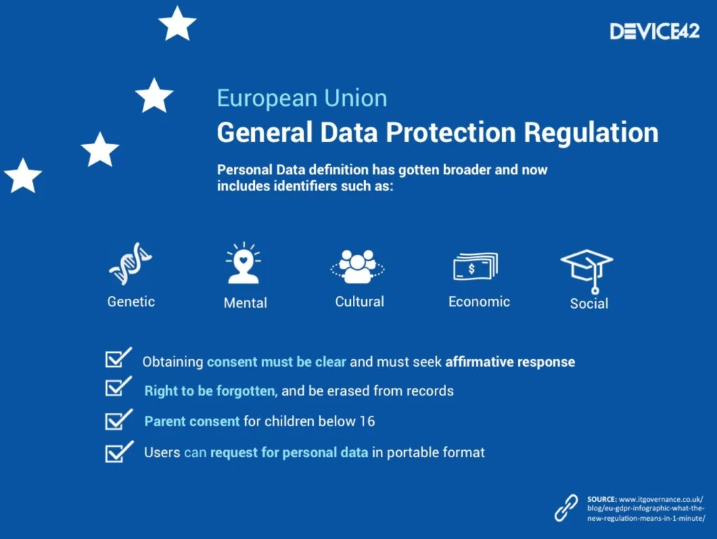
Privacy laws protect users from having their personal information collected without consent or notice. When building your website, it's critical to ensure that you comply with the privacy policies of the country and state where you reside.
Here are some of the top privacy concerns for websites:
- Location tracking – Your web browser will tell you where you are when you visit a website. While it's a valuable feature for business purposes, it can reveal sensitive information if misused.
- Email collection – If you've bought something online, you know you're being asked to provide your email address. While this is the most common way to communicate with someone, it can create a privacy concern if the website isn't using an SSL certificate to encrypt your communication. An SSL certificate is a standard security measure that protects all of your communications over the internet.
- Cookies – Cookies are bits of text stored on your computer. Some websites use cookies to identify your computer to direct you to the right content. Cookies are helpful but can be used for nefarious reasons too.
- Collection of Information – Websites must give people a clear idea of what information they collect, how it's collected, and how the data will be used. This transparency allows people to make an informed decision regarding whether to share information with a company.
In addition to privacy laws, specific privacy laws apply to each state, including California, Texas, and New York. All states have specific rules regarding the collection of consumer credit reports, as well as the sale of personal information.
California and Texas require that consumers be notified before collecting certain personal information. These laws also specify what a company must do in the event of a data breach. New York has specific guidelines for companies that sell products or services to consumers.
These laws protect the privacy of your personal information and help maintain trust in the online environment. By choosing a reputable website development company, you can rest assured that your privacy is protected and move forward with confidence, knowing that your site is secure.
9 – Remember the “F” pattern

The F pattern is based on the Golden Ratio. This mathematical ratio is a formula used to create beautiful architecture, art, and nature for thousands of years. In the early 1900s, mathematician and physicist Norman Foster developed the formula to describe the perfect proportion of any shape or design.
Today, the golden ratio aligns various elements on a website.
How Does the F Pattern Help Websites?
By dividing elements into the same proportions on both the left and right sides, the page elements can be presented in a balanced and symmetrical manner. In this way, visitors can focus on the content rather than be distracted by unbalanced elements on the page.
While some designers prefer to leave the majority of their designs unbalanced, the F Pattern provides an opportunity to use symmetry. In addition to helping the visitor focus on the content, it also helps to create a sense of balance, order, and harmony on the page.
Why Use the F Pattern?
The F pattern balances the elements of your page and helps to increase the likelihood of a positive user experience. When elements are arranged in an F pattern, they appear more symmetrical, which makes the page more appealing. It also allows the viewer's eye to move from one area of the page to another without distraction.
A balanced page is easier to read and increases your chances of achieving higher search engine rankings.
In addition to using the F pattern, it's crucial to balance the amount of text on the left and right sides.
You can apply the F pattern to the entire page or specific areas, such as the title, subheadline, featured image, and body copy.
How Do I Apply the F Pattern?
To begin the process, identify the three main headings on the page. Each of these headings should be given a different font weight and size.
Next, divide each heading into two sections. The first section contains the left half of the text, and the second contains the right half.
When creating the sections, remember that the left and right columns should be the same width. Divide each section into four parts. The first part should contain the page's title, followed by the left column.
The following section should include the subheadline, and the third and fourth sections should contain the body copy.
In each section, give the text the same amount of space on both sides of the screen.
The process is nearly identical if you need to add additional headings or change the page's layout.
10 – Use social proof

Social proof is a proven method to help visitors trust your website, especially when purchasing online. When visitors see products they like, trust in your brand increases. And when they feel safe and secure, they're less likely to feel like they have to ask lots of questions or question your expertise and are more likely to make a purchase.
Another reason social proof is valuable is that it builds trust in your brand. When people see other customers buying a product or using your service, they're more likely to trust that you can help them too. This trust in your brand increases the likelihood that they'll buy from you.
And lastly, social proof helps you build credibility in your industry. When customers see you're liked and trusted, it's easier for them to see you as an expert in your field. That means they're more likely to trust you and feel confident that your business can solve their problem.
Concluding our website design tips
Website design is a critical aspect of any business's success. It's the face of your company, but it's also the foundation upon which everything else will be built.
It's the first impression your customers get and, therefore, the first step in establishing a trusting relationship with them.
Your website has to work for the people who visit it and eventually become customers. That means clearly understanding your audience, designing for them, and promoting your site accordingly.
You've got a great opportunity here. If you take advantage of it, you'll be able to create a professional-looking, easy-to-navigate site that sells itself.
Want to know more website design tips? Subscribe to the newsletter below for free content!
