History of the NASA Logo Design: From Meatball to Worm
If you're a fan of NASA, you're probably familiar with the agency's iconic logos. There's the classic Meatball, the ever-popular Seal, and the futuristic Worm – which sounds like a sci-fi creature straight out of Star Trek. But did you know that NASA doesn't just stick to these three designs? That's right, folks – sometimes, the space agency likes to mix things up with new emblems for special projects.
Take the Artemis program, for example. NASA's ambitious mission to send humans back to the Moon by 2024 has its unique logo, featuring a bold “A” and an arrow pointing towards the Moon. It's like the Bat-Signal, but for space exploration. Or how about the Perseverance rover, which landed on Mars in February 2021? Its mission patch features a stylised rover with the word “Perseverance” written in Morse code. It's like a secret message to the universe – we come in peace but are also really smart.

But let's remember the classics. The Meatball, with its red, white, and blue colours and starry design, has been a symbol of NASA since its inception in 1958. It's like a patriotic fireworks show but on a logo. The Seal, which features an eagle carrying a banner with the agency's name, has been around since the early days of the Apollo program. It's like a superhero emblem but for rocket scientists.
And then there's the Worm. This logo, which features a sleek, stylised wordmark, was used by NASA from 1975 to 1992. It's like a font that only exists in the future. Some people loved and hated it, but one thing's for sure – it looks fantastic on a t-shirt.
Table of Contents
The illustrated NASA logo

Once upon a time, before NASA was NASA, it was known as NACA, an acronym for The National Advisory Committee on Aeronautics. It was so long ago; some of us weren't even born yet!
However, as the agency started to dive into spaceflight and develop newfangled space shuttle capabilities, they needed a new name to reflect their interstellar ambitions. And thus, NASA was born.
Nowadays, NASA has some fierce competition in the space race, with Elon Musk and other private companies trying to one-up each other with rockets and space exploration. At least NASA has a cool name, right?
Let's travel back to the 1950s when NASA was still in its infancy, and its logo was just a twinkle in the eye of James Modarelli, the agency's in-house illustrator. Modarelli was an artist ahead of his time, reflected in the round shape of the NASA logo and the colour scheme that screams “modern America.”
Unfortunately, as with all fashion trends, the logo's design has aged worse than milk left in the sun. But let's cut James some slack – he didn't have the benefit of hindsight like we do today.
One sure thing is that placing the title behind “NASA” in a spherical shape was no coincidence. With NASA receiving massive funding from the US government, it's no wonder the logo unintentionally resembles the Oval Office.
NASA's colour choice for their logo may have been a nod to the American flag, but it also served as a reminder that they weren't secretly working for some intergalactic overlord (as far as we know).
The Apollo missions were a testament to NASA's close relationship with the US government, but as time passed, people started questioning the logo's relevance.
After all, should the logo reflect its time or aim for something more timeless and iconic?
Modarelli listened to the criticism and got to work on a new, futuristic take on the logo. Who knows, maybe he was inspired by a sci-fi movie or two. After all, NASA is no stranger to Hollywood.
The NASA Meatball

Regarding logos, the NASA team indeed runs smoothly. They underwent a makeover phase in the 1960s when James Modarelli, the in-house illustrator, decided to take the reins and create a more modern and recognisable visual identity.
His first attempt may have fallen short of expectations, but Modarelli wasn't one to give up easily. He went back to the drawing board, quite literally, and crafted a new logo that would become a classic – or as we like to call it, the “meatball.”
This new and improved logo was a hit with the public and even had its fun nickname. Modarelli had taken a page from the fast food industry and created a delicious logo.
From that day forward, Meatball has been synonymous with NASA and its outstanding achievements. So, the next time you look up at the stars and marvel at the wonder of the universe, remember that it all started with a simple meatball logo.
This new NASA logo is about reaching for the stars and exploring the unknown, so it features a red stripe representing the agency's mission and vision. And with stars and a shooting star in the centre, it's clear that NASA is always moving forward and embracing the unknown.
The blue background rounds out the logo in a controlled spherical shape, giving it a stable stance. It's like NASA is saying, “We got this. We're not just exploring space; we control it.”
Modarelli was given carte blanche to create the new logo, and boy, did he deliver. It symbolises a possible future where we're the masters of space and our fate. But as with any good logo, it needed a catchy nickname, and that's where the comically titled “meatball” came in.
The NASA logotype

The 80s were a tumultuous time for fashion and design, with bold colours, funky patterns, and more hairspray than anyone knew what to do with. So naturally, NASA wanted in on the action and decided to revamp its logo again.
This time, they brought in the dynamic duo of Richard Danne and Bruce Blackburn, who were like the Batman and Robin of graphic design (minus the capes, sadly). These guys had a vision for the future of this world, and NASA was all about it.
Their new logo was a departure from the previous spherical design and instead went for a more geometric and modern look. The red chevron shape was meant to represent a wing and embody the agency's mission of pushing the boundaries of flight and exploration.
Some people were sceptical of the new design, saying it looked more like a corporate logo than something representing space exploration. But NASA was all like, “Hey, we can be corporate AND cool simultaneously!”
Ultimately, the logo became known as the “worm” because of its sleek, slim design. And let's be honest; it's much more fun to say you work for NASA's Worm Program than its Meatball Program.
The NASA redesign of the 1980s was as surprising as a UFO sighting in Times Square. Danne and Blackburn, the creative duo behind the new logo, presented a bold vision of the future that left the board reeling. They were hesitant about how the agency's employees would react to the new design that lacked any flashy shapes or illustrations to cling onto. So, they kept it hush-hush from everyone in lower management until it was too late. The redesign was a covert operation that left NASA staff seeing stars.
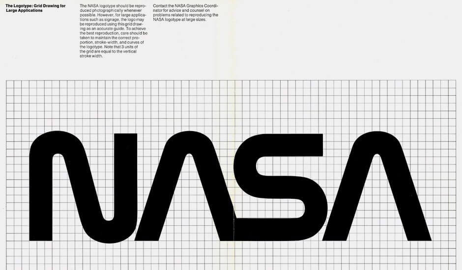
The logotype, or as some critics referred to it, a “logon't,” was nothing more than a stylised “NASA.” Sure, it represented the agency's adventurous spirit, but it lacked the pizzazz of its predecessor. It won the Award of Design Excellence, but that was like getting a participation trophy at a school science fair. After 17 years of use, the logotype was tossed aside like yesterday's space debris.
What followed was a sight for sore eyes and a welcome change for those who missed the “meatball.”

The Time of Nostalgia
NASA was back to its old tricks when it decided to bring back the “meatball” logo in 1992, and boy did it feel like a reunion. The agency had finally come to its senses and realised that its old logo was the cat's pyjamas.
After 17 long years of wandering in the wilderness, the agency returned to its roots and brought back the magic of exploration. It's like they could finally take off their restrictive space suits and breathe in the fresh air of the past.
The reason for the change was clear as day – the “meatball” was way ahead of its time in design, aesthetics, and groundbreaking ideas. It was the Michael Jordan of logos if you will.
Even though the agency tried to move on with the “worm” design, the public still couldn't get enough of the “meatball”. People still imagine it when they think of NASA, even though the “worm” design is more recent.
And don't even get us started on the miniature printed items that still use the “meatball” logo. It's just too good to give up, even if it's too detailed for those tiny elements that need to be printed.
NASA continues experimenting with new designs on their space shuttles, aircraft, departments, and teams. But really, nothing relatively measures up to the “meatball”. It's like trying to replace Michael Jordan with a rookie – good luck with that.
NASA takes its team branding seriously, like a sports team or the army. After all, it's essential for rocket scientists and astronauts to feel like they're part of a fantastic club. And what's cooler than exploring the unknown depths of space, am I right?
The Columbia space shuttle proudly displayed its team patch, featuring a spherical shape representing the agency's never-ending quest to reach for the stars. It was a fitting symbol for a craft that circles the earth and then shoots into space, like an expensive frisbee.
The team patch is just one example of how NASA incorporates its logo into various operations. And if you look closely, you can see how the agency's visual identity has evolved, with each iteration reflecting the era's zeitgeist.
Designing for the Future
Designing for the future is always challenging, especially regarding NASA's visual identity. The “meatball” versus “worm” debate rages on, with supporters of each side bickering like cats and dogs. Some believe returning to the old design is like reheating your leftovers in the microwave, while others think the current logo is too plain and boring.
Let's face it; it's only possible to please some people regarding design. We'll never see a world where everyone agrees on the perfect logo. However, NASA can constantly update its logo and surprise us with a new design we never thought possible.
Until then, we should focus on the present and do our part to educate ourselves on the history and evolution of design. Who knows? Maybe we'll be the ones to come up with the next big thing in visual identity.
