Giving Household Brands the Apple Treatment — How to Upgrade a Brand
What would household brands look like if you gave them an “Apple make-over”?
There are so-called household brands that we’ve grown so used to we’ve stopped questioning them.
We all remember that one brand that hit the market and caused a stir — the “new kid on the block.”
When it happened, we stopped and stared. We oohed and aahed.
Household brands, on the other hand, we often grew up with, so we are so used to their look and feel that we don’t even question them.
Table of Contents
Why Virgin Is an Incredible Household Brand

Then there are brands, while household names, such as Virgin, keep surprising us.
Virgin is synonymous with customer care and fun. You rarely meet a Virgin employee who doesn’t go out of their way to help you.
At least in the UK. And that, in and of itself, is sometimes enough to surprise you.
Yes, you expect excellent customer care, but after being on a call with HSBC and then calling Virgin Money, you are still surprised at how different Virgin Money is from any other bank.
Over the years, Branson and co. have pulled so many marketing stunts you barely raise your eyebrows when another one comes along… that’s to say, once you’ve gotten over the initial surprise of whatever just happened.
Remember that one time back in 1999, when Branson decided to fly around the London Eye with a banner that read: “BA can’t get it up!” It was true. British Airways were having problems erecting the London Eye.
What Branson does next may be surprising, but the fact that he comes up with something to do next isn’t.
It would be more surprising if he suddenly stopped pulling PR stunts.
About as surprising as if anyone on Virgin Atlantic treated you the way the hostesses do when you fly American Airways (we all have to have one company we love to hate and after a few uncomfortable encounters with their staff, let’s just say we’ve chosen American Airways).
Virgin is different from other household names because it’s an iconic brand.
It’s not just a brand we’re all used to; it’s a brand that has made a name for itself worldwide thanks to its sass.
The Design That Makes a Brand Iconic

When Virgin presents a cell phone contract, it comes across differently than when Vodacom does so, yet the service itself can be identical.
Branding is about perception — how a brand is perceived depends on how it’s presented.
To become an iconic brand, you need to present your products and Virgin and other brands that have turned into icons.
While there’s more to a brand than the design of its products and packaging, the design significantly impacts how you view the brand.
Virgin, for example, is known for being a burst of colour. It’s impossible to miss Virgin’s air hostesses' bright red at any airport worldwide.
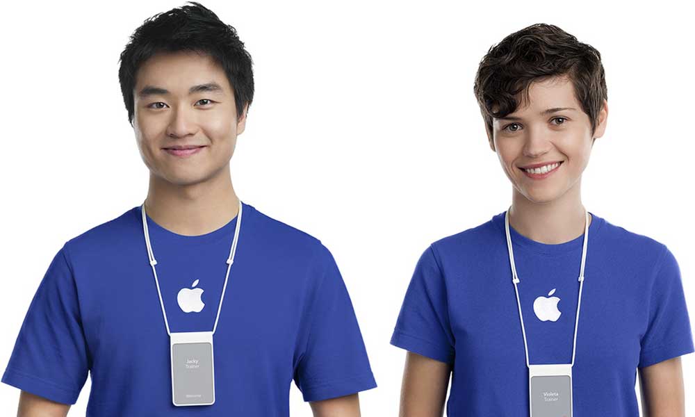
Another brand that has become well-known for its design is Apple.

If Virgin have been praised for their happy and helpful staff, their catchy colours and their ability to come up with PR stunts, Apple have been praised for their incredible minimalist design, their products’ user-friendliness and their customer service team.
People associate Apple with innovation, customer service and design.
It’s no secret that Steve Jobs was obsessed with design.
He was convinced that even the parts of a laptop/computer that couldn’t be seen should be well designed.
Apple’s ability to revolutionise minimalist design has often been praised — not least in the Apple stores.
It was one of the first stores not to be littered with products.
Here, you walked in and found what you were looking for in a heartbeat.
There is, of course, also the Genius Bar — where you receive customer service in Apple Stores. The idea of a Genius Bar in and of itself is genius.
Minimalist design, in short, usually helps bring out functionality and style while minimising clutter and confusion.
Luxurious brands worldwide often apply the Apple touch when designing their brands — they focus on minimalist design and optimal functionality.
To see how design can change how you perceive a brand, we decided to redesign several household brands — give them the Apple treatment. Suddenly, even takeaway fried chicken started looking luxurious…
Tetley

If you grew up in the UK, you grew up with Tetley.
They’re the largest tea provider (by volume) in the UK and Canada and the second largest in the United States.
Tetley offers various teas, probably the most famous for good old black tea.
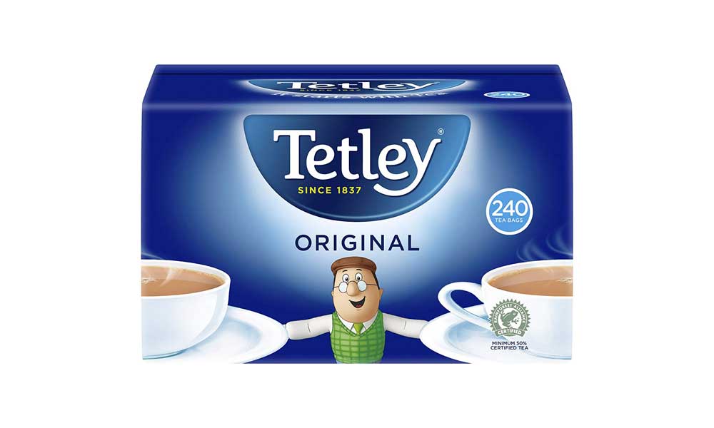
Having been launched in 1837, Tetley is a brand like Fortnum and Mason that looks posh and regal, but on the contrary, Tetley has an almost cartoon-like logo and cheap-looking packaging.
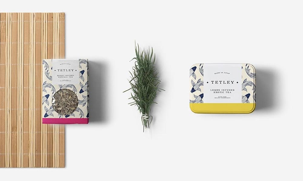
Rebranding Tetley, we kept the bright colours but gave the logo design and packaging a complete overhaul.

This made them look like a tea merchant, not a cheap brand owned by a global corporation.
In turn, it makes them one of the household brands that appeal to a more sophisticated market.
To start, we chose a serif font to bring out the “heritage” feeling, i.e. that they were once an upstanding tea merchant.
We then used a Japanese print to tie into the origins of the tea itself and earthy tones to relate to the natural element of the product.
We also added a coloured strip to give the products an easily recognisable touch and allow customers to visualise the flavour of the tea.
McDonald's

Pretty much anywhere you go in the world, there’s McDonald's.
It’s hard to find a person that doesn’t know what McDonald’s logo and colours look like. Frankly, their logo is legendary.
However, we wanted to find out what McDonald's would look like if it became a sophisticated brand, selling high-end burgers and coffee instead of fast food filled with additives.
We thought of the brand as one of the high-end coffee shops in London.

We kept McDonald’s classic look and slogan (including a modern and minimalist sans-serif font) but changed the colours to add a more mature look.
The bags also give them a signature look — it would be easy to spot anyone getting a coffee and cake from McDonald’s!
We also added a wooden peg to give them a more sophisticated look.
The pegs also come in handy for keeping the bags properly sealed Both the paper bags and the wooden pegs also add an eco-friendly touch.
The result? A brand that could very well be that of an independent coffee shop in a trendy part of London.
LYNX

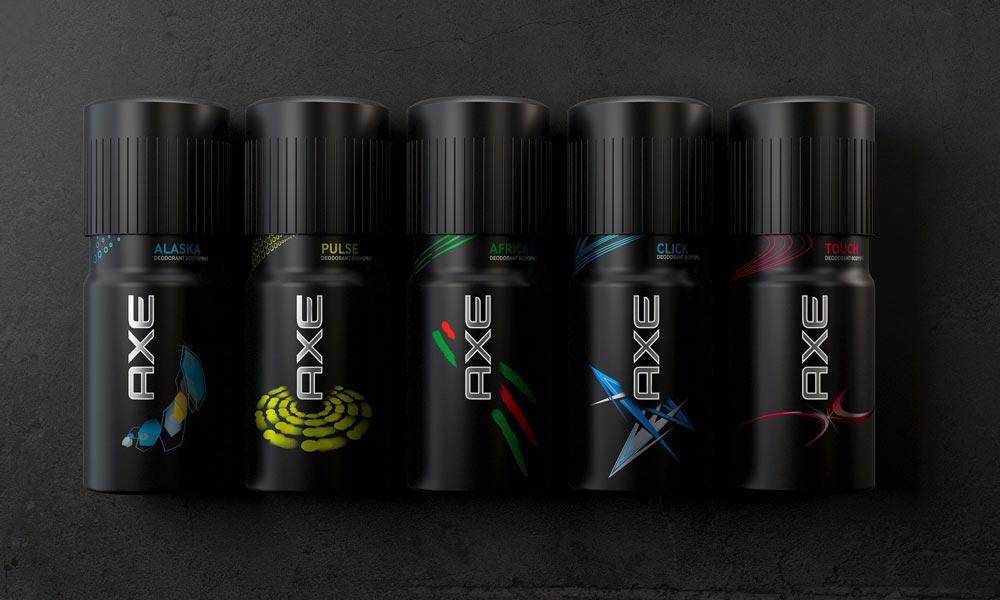
Lynx is one of those household brands that look like something out of a 90s commercial.
They are the epitome of a cheap body product brand and have done incredibly well for themselves.
However, what would they look like if they went with current trends that praise natural ingredients and simplicity instead of the over-the-top manufactured scents and products of the 90s?

We re-worked their logo utilising a clean sans-serif font to make it more masculine and appeal to their demographic.
Adding spacing also makes the logo look more high-end.
We also upgraded the colour combinations for a more mature look.
Ryan Air

Ryan Air has encountered turbulence more than once (not least for wanting to charge passengers for using the bathroom).
Still, everyone flies Ryan Air. Why? Because it was cheap.
Being household brands offering affordable products doesn’t mean you have to be cheap.
Your staff can offer excellent customer service, and your brand can look amazing.
With this make-over, we wanted to remove the negative connotations of flying with a low-budget airline.
We started by making the brand colours more vibrant to attract a younger and more style-conscious audience.

Aeroplane tickets can be crowded with information and difficult to read.
We wanted to change that and give them a more sophisticated look.
We implemented a hierarchy in terms of the different typefaces (bold and light) to allow the passenger to find the critical bits of information quickly.
Moreover, we included the return ticket on the same boarding pass to avoid printing another ticket.
The only problem is that you must check in before receiving your boarding pass…
KFC

We redesigned McDonald’s, so why not KFC?
KFC’s chicken may be legendarily low on chicken. Still, if they ever decided to serve gourmet chicken from a high-end butcher to a discerning clientele, they should consider this kind of packaging — minimalist and classy.
First of all, we removed the, in this case, garish red and went for subtle blue tones to give the brand an inviting feel.
Blue is a calm colour, while red stands for urgency and speed, which isn’t always a great combo where food is concerned (it depends on the execution — red-checkered tablecloths in Italian restaurants are, after all, legendary).

Wanting to make the brand more modern and sophisticated, we chose a sans-serif typeface to go with the packaging overhaul.
It gives a clean and minimalist feel, emphasising the overall packaging and not just the writing.
Heinz

Heinz, like Tetley, has been around for a while.
In fact, for most of us, ketchup = Heinz.
They’re the original and — dare we say — best?
Their iconic glass bottles have led to us ending up with ketchup all over our clothes (and none on our food).
Like Coca-Cola’s original glass bottles, they have an emotional appeal.
However, their more modern plastic bottles are not precisely iconic in their design.
What would Heinz look like if they upscaled their brand and upgraded their packaging?
We had fun experimenting with alternative packaging solutions as iconic as the original glass bottle.
First, we got rid of plastic as it’s associated with cheaper products.
Instead, we chose metallic chrome to add originality and sophistication.

While you can no longer see the ketchup inside the tin, we added a splash of red under the logo to provide visual stimuli that engage other senses, such as taste.
By sticking with a simple sans-serif for the typeface, we helped ensure people’s eyes were drawn to the splash of ketchup instead of the text.
It also helps to make it easy to read when people skim the shelves of stores to find what they’re looking for.
Heineken

Heineken is another of the household brands that it’s hard NOT having heard of.
Anyone who’s walked into a bar or a store to buy beer has seen a Heineken.
While it’s a brand that’s been praised for some of its branding and marketing initiatives, we had fun looking at what Heineken could do with a premium beer option.
Of course, we couldn’t resist going with Apple’s signature white.
Heineken already uses green and white in their branding, so we didn’t change the brand colours; we just wholly decluttered their packaging, Apple style.

This is maybe one of the best examples of showing how simplicity and minimalism can completely transform the look and feel of a brand.
The logo and the colours are the same, yet the product looks completely different.
Our choice of using mainly white brings out the green that much more. And green is associated with being a “stamp of approval.”
As mentioned, we kept the serif typeface for the logo, which gives a sense of maturity and heritage, but for the rest of the text, we kept to sans-serif to provide a clear hierarchy.
The sans-serif font will also appeal to a younger generation and help declutter the label.
Moreover, beer (and alcoholic beverages in general) often have a similar design.
Distinguishing one from another on the shelves isn’t always easy. With this design, Heineken would stand out.
In Closing
Our experiment was a lot of fun (for us) and hopefully helped you see how design can completely alter the look and feel of household brands.
If you want to charge customers a high price, having a sophisticated design is incredibly helpful as it will appeal to high-end and discerning customers.
Minimalist design can help achieve that, and at Inkbot Design, we tend to favour minimalist simplicity as it helps add brand value in most instances.
Remember that not every brand is Apple — you must find your brand identity.
Some brands have (and rightly so) a much more old-fashioned design.
However, you can still upgrade a brand while keeping a sense of heritage, as we did with Tetley.
Some brands appeal to those who want to buy a cheap product, so making it look overly sophisticated isn’t necessarily a good idea.
Still, you can make simple tweaks to improve household brands using the lessons from Apple, such as decluttering the label to make it easier for customers to understand what they’re buying.
