Vintage Logo Design: Inspiration & Examples
Vintage. The term brings to mind sepia-toned photographs, steamer trunks full of old treasures, and flickering black-and-white films. It evokes simplicity, nostalgia, and something authentic from decades past.
In the world of design, “vintage” has undeniable allure. Modern designers frequently draw creative inspiration from retro advertisements, typography, colour palettes, and graphic styles. Some of the most iconic images were crafted 50 or more years ago by masterful designers who understood visual communication at its most basic, recognisable level.
While computer technology has enabled some incredible graphic feats today, many contemporary logo designs still owe an artistic debt to the vintage logos that came before them. These vintage logos display masterful use of negative space, symbolic association, custom typography, and visual identity at its most primal and recognisable level.
In this guide, we'll admire some examples of vintage logo design and examine what makes them so artistically inspiring, even today.
Table of Contents
The Marks of Masterful Vintage Design
Before we celebrate specific vintage logo design marvels, let's define what constitutes this category of graphic artwork and identity creation:
- Vintage logos date from the 1930s to the 1980s. While “vintage” has a floating definition, logos from this design era display a cohesive mid-century aesthetic. This spans Art Deco influence in the 1930s, Swiss minimalism in the 1950s and 60s, psychedelia in the late 1960s, earth tones in the 1970s, and digital emergence in the 1980s. This article will focus on vintage logo designs from this visually unified 50-year period.
- They utilise basic shapes and symbols. Many vintage logo designs employ simple geometric shapes (circles, squares, triangles) and incorporate symbolic images. Some reference the business or product, while others suggest universal concepts like global navigation, speed, or strength.
- They display masterful use of negative space. The savvy incorporation of negative space allows the most iconic vintage logo designs to imply missing shapes and letters while relying on the viewer's brain to fill them in. This allows simple forms to convey layered visual meaning.
- They embrace bold custom typography. From slender serif fonts to chunky sans serifs, vintage logo designs highlight figurative word forms and hand-drawn letter shapes to communicate brands and business names artistically.
- They understand simplicity and memorability. Vintage logo marks stand out for their sparse lines, limited colour palettes, and grasp of iconography at its most primal. Removing extraneous visuals allows these logos to achieve instantly familiar symbolism.
What unifies these principles across the decades of vintage design? Stripping visual brands to their symbolic essence in shapes and figures that viewers can imprint indelibly upon their collective memory.
1930s: The Birth of Vintage Branding
As a brand identity builds familiarity over years or decades, its logo design achieves “vintage” status. While many vintage logos hail from the 1950s forward, a few originated in the previous decades and became graphic icons throughout the 20th century.
The 1930s saw increased industrialisation, cargo transport, infrastructure projects, and a boom in consumer goods spawned by the machine age. As significant corporations vied for customer dollars, they increasingly branded their products and retail spaces with graphic logos to symbolise quality, strength, speed, and modernity.
Art Deco's influence provided a unifying aesthetic, with its sharp lines, symmetry, stylisation, and visual cues lifted from machinery, navigation tools, and the built urban landscape.
While championed by significant corporations, the celebrity-level branding phenomenon also took root in this era, with two bubbly soda pop beverages still dominating today.
Coca-Cola
The calligraphy cola branding of Coca-Cola originated with patent medicine peddler John Pemberton in 1886. He likely lifted motifs from another era to render the words with elaborate curlicues in an advertising poster around 1895.
In the 1930s, the Coca-Cola logo displayed on delivery trucks, serving trays, advertising signs, and print materials helped cement this ornate cursive logo in public memory. The logo remains unchanged nearly 140 years later, proving that vintage designs endure via timeless familiarity.
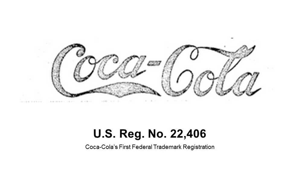
Vintage Coca-Cola logo featuring ornate calligraphy
Pepsi
The Pepsi globe is nearly as iconic as Coca-Cola's script logo and almost as vintage. It originated in the 1940s design as World War II drew to a close and American corporations expanded internationally.
The globe visual celebrated Pepsi's distribution across all continents (save Antarctica) while implying themes of world peace through shared commerce in the post-war years. The red-white-and-blue colour scheme drew obvious visual parallels with the American flag, appealing to patriotic emotions.

Pepsi's vintage logo with a symbolic globe from the 1940s
Over many decades, the globe shape morphed in design—enlarged, flattened, rendered more realistic—but remains identifiable as the vintage icon signalling Pepsi's global availability…plus refreshment crossing all borders and boundaries.
Shell
The Shell branding also proves extremely vintage, with origins dating back to 1900. The logo began as a realistic seashell drawing but gradually evolved into a bold red-and-yellow scallop shape.
The visual identity references the company's early history of delivering sea shells (later moving into fuel oil transport and petrol services). But the pared-down geometric logo also suggests concepts like:
- Energy
- Vibrancy
- Movement
By mid-century, the bold yellow Shell mark achieved instant recognition, even silhouette-style, devoid of its defining red outline and lettering.

Early 1960s Shell logo with the bold yellow and red colourway
Like all stellar vintage logo designs, the pared-down Shell visual identity implies layered meaning via imaginative use of colour, shape, line, and negative space.
1950s Minimalism Forges Vintage Vogue
The 1950s bore witness to post-war prosperity with soaring living standards, increased leisure time, and more disposable income flooding consumers' coffers. Television collided with radio as the prime broadcast medium, exponentially growing advertising budgets in all sectors.
Swiss design aesthetics dominated marketing and branding across North America during this commercialisation surge. Swiss influence established principles of design unity, clean lines, orderly layouts, and simplified visual communication. Typography moved toward sans serif typefaces like Helvetica and Univers, portending sleek machine-age modernity.
These Swiss design principles spawned vintage minimalist logo marks across transportation, tourism, finance, insurance, and beyond. While lacking the stylistic flourishes of 1930s Art Deco, the sparse lines and stripped-down shapes often outlasted more flamboyant graphics in memory-stickiness and timeless appeal.
American Airlines
The American Airlines branding falls firmly in the vintage logo family, having continually morphed throughout eight decades while retaining its original double-A eagle icon as the visual lynchpin.
Updated numerous times since debuting in 1937, the logo maintained core design motifs that made this mark so distinctive…

Vintage Elements Retained Throughout AA Logo Evolution
- Stylised eagle shapes connoting flight and patriotic symbolism.
- The overlapping letter “A” integrated into the eagle's body
- Bold red-white-and-blue colour scheme
- Diagonal solid lines imply speed and motion
The streamlined eagle icon projects a sleek modernist look with minimal detail. Yet it succeeds brilliantly as a vintage logo, fusing business name, national identity, emotional appeal and industry evocation in an admirably concise graphic mark.
Chase Bank
Similarly vintage, the Chase Bank logo design spans six decades with only minor stylistic shifts. What began as the Chase National Bank in 1960 adopted a linear graphic motif integrating the bold capital “C” with overlapping shapes connoting security, strength and interconnected finance.

Minimalist lines and shapes fuse the initial “C” with symbols of protection in the vintage Chase logo, ca. mid-1960s
Like other Swiss modern designs, the Chase visual identity stands out for:
- Sparse linear aesthetic
- Restrained colour scheme
- Symbolic shapes
- Typographic focus on the initial letter
This vintage mark succeeds by leaving ample negative space around its central motifs. The eye can easily discern the letter and graphic symbols while readily retaining the logo's overall shape and colour impression after brief exposure—the hallmarks of vintage memorability.
Psychedelic Graphics Infuse Vintage Visual Identities of the Late 1960s
The late 1960s witnessed explosive social transformation with civil rights struggles, anti-war protests, new waves of feminism…and the mind-bending advent of psychedelic drugs.
As music and fashion adopted far-out styles, corporate graphic design mirrored the visual swirling textures, optical illusions, and trippy colour juxtapositions overtaking youth culture. The resulting logos telegraph kaleidoscopic energy, irreverent humour and vibrant colour.
Yet even as visual complexity increased, simplicity and memorability remained hallmarks of the most compelling vintage late-1960s logo designs.
Milton Glaser's Columbia Records

Graphic icon Milton Glaser merged musical and visual arts when tasked with reimagining Columbia Records' identity. While paying homage to the company's earliest Victorian-era branding, Glaser certainly inflected the vintage design sensibilities of 1968.
Departing from the stodgy, stately motifs of the past, he rendered the torch-bearing goddess icon as a loose graphic outline practically pulsing with movement. He inserted a kinetic multicoloured soundtrack into her dynamic form, revealing an irreverent, star-bursting psychedelic style.
Yet, for all its psychedelic peculiarity, the vintage logo design succeeds by retaining simple universal symbolism. The central torch radiates themes of artistry, light, knowledge, enlightenment and inspiration…all fused into a vibrant graphic suitable for anchoring Columbia Records' vast musical legacy.
Milton Glaser's I Love NY
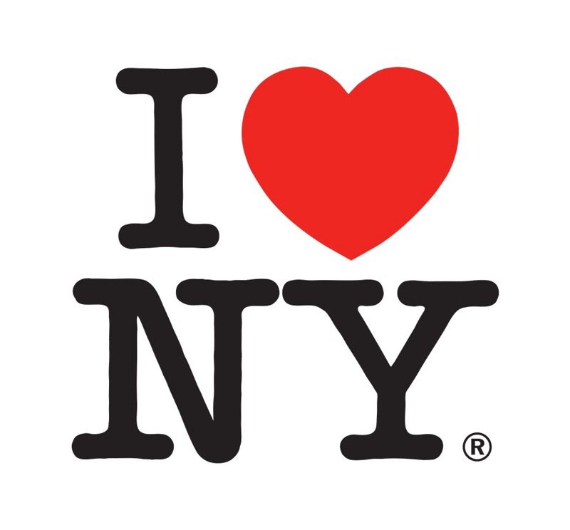
Beyond record labels, even state tourism agencies jumped aboard the visual revolution of the late 1960s era. Seeking an identity campaign to revive interest in destination travel to New York, the state tourism office tapped graphic genius Milton Glaser.
The resulting “I Love New York” mini-poster logo bursts with Pop Art exuberance. The simplified I (heart) NY lettering block typography resembles a road sign, suggesting a rebus-style graphic pun. The off-kilter, hand-drawn red heart conveys irrepressible passion and kinetic energy, contrasted only by the sturdy rendering of NY in stacked city initials.
While employing the Day-Glo colour palette and bubbly letter forms of 1960s style, the genial message and charming graphic synthesis proved vintage-worthy. The iconic logo still graces millions of souvenir t-shirts and travel posters over 50 years later.
Vintage Vector Graphics Reflect the Digital Disco Style of the Late 1970s and Early 80s
By the late 1970s, iconic logos increasingly relied upon computer drawing programs allowing colorised vector graphic renderings. The resulting visual identities often adopted the sleek futurism, vibrant colours, and visual angularity of the era, sometimes dubbed “Digital Disco.”
Pop culture sensation Star Wars spawned an obsession with all things intergalactic. This new visual fixation infused branding across industries seeking to telegraph speed, technology and forward momentum into the space age.
While dimensional lettering and visual depth increased, logo simplicity and symbolic resonance remained hallmarks of this timeframe's most compelling vintage brand identity designs.
NASA
As national euphoria swelled over new frontiers in space exploration, NASA underwent an exhaustive 1979 rebranding endeavour to ready its image for the approaching millennium.
Seeking to update its vintage 1950s meatball logo, NASA tapped legendary New York designer Danne & Blackburn. Their visionary concept adapted the orbital iconography and sleek vector aesthetic advanced by space-age computer graphics.
The resulting NASA insignia or “worm” logo epitomises the forward-focused, galactically inspired vintage logo style of the early digital era:
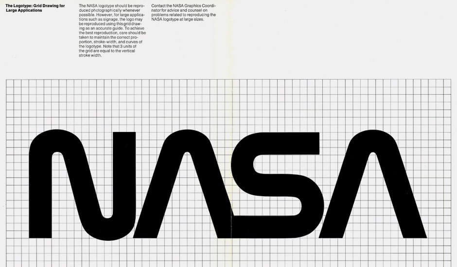
Futuristic vector graphics amplify spatial energy in NASA's vintage 1980s insignia
- Kinetic angled letterforms
- The suggestion of orbital pathways
- Visual tapering adds depth, dimension
- Block minimalism reflects digital/computationalist aesthetic
While replaced in the 1990s backlash against all things dated 1980s, the so-called NASA worm logo enjoys renewed appreciation in 2024 as a stellar example of vintage vector logo art.
Nickelodeon
While interstellar travel dominated future visions of the 1970s-80s cusp era, down at the kid level, the Nickelodeon TV network fixated juvenile viewers with its comic slime-fest programming.
When rebranded from a pinwheel logo to vivid orange 3D lettering, Nickelodeon also debuted its trademark glowing green slime—the messy hallmark of its zany game shows.

The visual identity marries digital-age dimensional typography with visual cues of messy kid play. For children of the 1970s, few media logos prove more vintage than Nickelodeon's surreal 1980s graphic indulgence in playful surrealism.
Principles of Great Vintage Logo Design
The most compelling vintage logo designs stand out while retaining incredible memorability and resonance decades after inception. What branding strategies unite the top vintage visual identities across eras of minimalism, psychedelia, disco modernism and beyond?
Vintage Logo Best Practices
- Harness universal symbolism
- Balance simplicity with depth
- Use negative space strategically
- Customise typography
- Limit colors
- Consider dimensionality
These principles characterise vintage logo design across the decades. Vintage logos fuse business names with visual recognition and layered meaning by embracing symbolic colour and shape, clever negative space, and strategically odd or dimensional lettering. They condense multifaceted stories into sparse graphic marks, achieving instant familiarity.
Great vintage logo designs understand this less-is-more aesthetic and the eidetic power of clean lines and bold forms.
Lasting Lessons from Vintage Visual Identities

Modern designers continually find inspiration from the vintage logos anchoring beloved brands across decades. What lessons emerge today from these mid-century masterworks?
Vintage Logo Takeaways
- Symbols matter – Core symbolic shapes inspire recognition and loyalty
- Typography talks – Stylised letterforms fuse word and image
- Colour binds memory – Strategic palettes make an instant imprint
- Negative space adds depth – Visual contrast makes logos iconic
- Dimensionality amplifies – Kinetic shapes grab the viewer's attention
Vintage logo designs display mastery by embracing these fundamentals of a solid visual identity. They pinpoint the graphic essence of a brand, then render its name and motifs in symbolic colours and shapes that lodge permanently in cultural memory.
While trends shift over time, these principles maintain relevance. Contemporary logo designers can anchor innovative marks to these vintage strategies, ensuring longstanding viewer connection and magnetic brand familiarity.
Conclusion: Vintage Inspirations Frame Future Visuals
In chronicling vintage logo design from the ornate 1930s through the digital 1980s, we see how masterful marks encapsulate eras while transcending them. Great logos express the aesthetic zeitgeist of their inception years while retaining memorability across generations.
Through stylised, symbolic graphics and strategic use of colour, line, shape, text, motion and depth…vintage visual identities compress layered meaning into concise graphic signs. These logos fuse business origins and mid-century modern aesthetics into marks, achieving instant familiarity.
However, trends shift in the arts, entertainment, fashion, technology and culture at large…vintage logo designs display enduring power. Their bold shapes lodge indelibly into public memory, reinforced by repetitive exposure across decades.
Like the swooping AA eagle, Columbia torch, I Love NY, NASA worm, Chase “C” security emblem and original Nickelodeon slime…vintage logos imprint their graphic essence on the collective cultural imagination. Their sparse lines and simplified contours reflect new styling innovations through the decades.
Vintage logo designs cast long shadows into the future for each new class of image-makers seeking to capture viewer attention while securing audience connection over the long term. Their stunning shapes not only inscribe history but inform visions yet to come.
FAQs: Pondering Vintage Logo Design
Here are answers to frequent questions about the history, relevance, and artistic lessons emerging from vintage logo designs across the years:
What period defines vintage logo designs?
While subjective, “vintage logo” typically indicates marks originating from 1930 until computer graphic styles took hold in the 1980s. This 50-year period displays cohesive design aesthetics around symbolic association, dimensional typography, and universal archetypes that still influence modern branding techniques.
Do vintage logos remain relevant in the age of digital design?
Absolutely. While production methods keep changing, vintage logo designs remain the gold standard for branding goals like instant familiarity, visual imprinting, and long-term recognition. Digital designers still employ themes of simplicity, colour strategy, symbolic association, and stylised typography that historically made vintage marks so iconic.
Should modern companies ever revert to classic vintage logo designs?
Some do revert to earlier-era logos after unsuccessful contemporary redesigns. Coca-Cola, Shell, Starbucks, and other brands rediscovered classic logos that are still imprinted on consumer memory. However, updating vintage designs can demonstrate changing values around diversity and inclusion. Most brands opt to balance visual heritage and updated messaging.
