Logo Design Rules: 10 Golden Rules for Crafting Logos
Logos are one of the most vital elements of any brand's visual identity. As a graphic design beginner, learning logo design rules and principles can help you create iconic and memorable logo marks. This comprehensive guide covers all the essential logo design rules, best practices, tips, examples, and more to equip you with the knowledge for crafting brilliant logos. So, let's dive in!
Table of Contents
Choosing the Right Logo Type
Wordmarks
A wordmark (or logotype) logo consists solely of a business's name rendered in a unique typographic style. For example, Google, Disney, Microsoft, and Coca-Cola are classic and globally recognised wordmark logos.
Wordmarks work best for companies with short or familiar names. They allow versatility in stylisation while retaining brand recognition. Consider a wordmark logo if your business name is:
- Straightforward, simple, and easy to spell/pronounce
- Already widely known
- Evocative on its own
However, avoid cryptic or overly long names that are hard to decipher or remember.
Lettermarks
Lettermark logos feature a business's initials rather than its full name—for example, BMW, UPS, H&M, CNN, and IBM.

Letter marks are ideal when your company name is difficult to interpret or pronounce. They also convey heritage and authority thanks to their resemblance to monogram crests.
Consider a lettermark if your business name is:
- Hard to understand at a glance
- Laden with extra prefixes or suffixes
- An initialism
But avoid letter marks if your name initials could invite ridicule or unintended meanings. Research them thoroughly!
Pictorial Marks
Pictorial mark logos symbolically represent a business through an illustrative icon without using any words or letters. Some examples are the Apple, Shell, Lacoste crocodile, Twitter bird, and Tour de France's bicyclist logo.

Pictorial marks allow greater visual expression and flexibility across colours, sizes, and mediums. However, their most significant assets—instant recognition and memorability—can be challenging to achieve for unknown brands.
Consider an icon logo if your business deals in:
- Very distinctive products/services
- Illustration-friendly concepts
- Target demographics open to new brands
However, avoid conceptually ambiguous objects or generic symbols that could signify anything. Strive for originality.
Combination Marks
As the name suggests, a combination of mark logos fuse pictorial and wordmark elements. Some well-known examples are Burger King, Doritos, Domino’s Pizza, Starbucks Coffee, and Beats by Dre.

Combination logos deliver the best of both worlds—symbolic graphics and name recognition. Consider using one if your business:
- Would benefit from an illustrative motif
- Has an average length or familiar name
But be wary of overcomplicating with too many disparate elements competing for attention. Simplicity goes a long way.
Abstract Logos
Have you ever seen the Pepsi globe, Adidas trefoil leaves, Target bullseye, Nike swoosh or the Amazon smile? These are all examples of iconic abstract logo marks conveying brand essence through colour, shape, symmetry, or stylistic nuance rather than concrete objects.

Abstract logos work brilliantly if you want room for:
- Visual experimentation
- Cryptic messaging
- Remakes/iterations
However, achieving high recall with arbitrary shapes or patterns requires virtuoso design skills. Test them thoroughly before adoption.
When to Use Which Logo Type?
- Wordmarks — Suitable for well-known, easy-to-say brand names
- Lettermarks — Useful for difficult names or initialisms
- Pictorial logos — Capitalize on visual flexibility for distinctive products/services
- Combination marks — Balance graphics and text for added context
- Abstract logos — Explore shapes and styling for deeper meaning
Analyse your brand identity thoroughly before deciding on logotypes. Their assets and limitations vary.
10 Fundamental Logo Design Rules
Before crafting your logo, acquaint yourself with these ten golden rules shared by iconic marks across industries:
Simplicity is Key for Logo Memorability
“Simplicity is the ultimate sophistication.” – Leonardo da Vinci’s wisdom applies perfectly to crafting an iconic logo design. When it comes to logos, essential is better in regards to driving memorability.
Some key reasons simplicity stands out include:
- Less complex shapes – Clean, basic shapes like circles, squares and triangles are more straightforward for our brains to process and recall quickly.
- Limited detailing – When a logo lacks intricate details, the key elements have room to shine.
- Bold colours – Using just one or two bold colours instead of a complex palette focuses attention.
- Distinctive iconography – An uncomplicated, meaningful symbol is more memorable. Examples include Apple’s apple, Twitter’s bird and McDonald’s golden arches.
While simplicity enhances memorability, that doesn’t mean it is boring. Creative, clever touches can still packaged into a clean, simple logo for added distinctiveness.
As seen above, some top brands boast simple yet iconic logo designs.
Balance easy recognition with original touches for a logo that quickly resonates with audiences.
Scale your Logos for Digital Media
Today’s media landscape provides many touchpoints between brands and consumers. And often, initial interactions occur on digital channels versus traditional media.
- According to Sprout Social, over 64% of Americans engage with brands on social media.
- Statista said there were 5.3 billion active internet users as of January 2024.
With digital media dominating, you must design your logo for retina and smaller screens.
Critical Tips for Digital Logo Design
- Lead with boldness – Strong colours and clean lines enable logos to stand out among small screens and cluttered environments.
- Simplify detailing – Intricate details will get lost, so focus on iconic, defined shapes.
- Evaluate on black backgrounds – With unpredictable digital contexts, assess if your logo pops when placed on black.
- Animate a favicon – Create a simplified animated logo for branding browser tabs.
Follow digital-first logo guidelines, and your logo will shine across websites, apps, banners, profiles, browsers and other properties.
Use Colour Psychology to Reinforce Messaging
Colours evoke innate reactions, associations and impressions. Brilliant designers tap into colour psychology when composing logos. Match hues with descriptive brand attributes or desired responses from audiences.
For example, shades of blue cue feelings of trust, security and dependability. Financial brands like American Express and PayPal leverage blues in their logo designs. When consumers connect blue with credibility and faith, it strengthens their positioning around handling finances.
Common colour associations include:
- Black – power, sophistication, exclusivity
- White – purity, perfection, simplicity
- Red – urgency, intensity, aggression
- Green – health, tranquillity, renewal
- Yellow – happiness, warmth, optimism
Attaching meanings through the calculated use of colour helps logos connect with consumers. But stay aware of negative connotations, too.
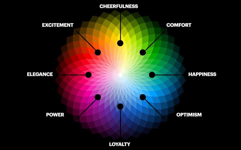
Such as red sparking hunger for fast food brands but signalling errors for a bank.
Build a strategic colour scheme, bringing together relevant associations that faithfully communicate your brand story.
Embrace Negative Space in Logo Designs
Negative space refers to the background, unused area surrounding the key images and elements in a logo. It’s often overlooked, but leveraging negative space creatively enhances logo designs.
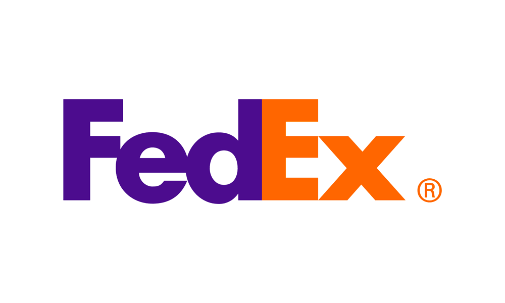
When used intentionally, negative space imparts simplicity and breathing room for increased engagement. For example, the arrow in the FedEx logo only emerges through the mindful use of negative space between letters.
This clever touch instantly sparks curiosity and memorability.
Other strategic applications of negative space include:
- Lead the eye towards focal points
- Suggest additional meaning through invisible shapes
- Maintain cleanliness and organisation
- Enable flexibility for size scaling
Getting creative with negative space enables logos to feel both intricate and uncomplicated. The key is striking the right balance between occupied and empty areas. Use generosity with spacing to elevate engagement.
Illustrate Brand Values Through Custom Fonts
Typography pulls significant weight when making first impressions. McDonald’s former VP of Design notes, “Fonts have emotive qualities that allow them to reinforce or establish a brand's personality.”
That’s why custom fonts reign supreme for delivering differentiation. Consider global brands like Coca-Cola, Disney, Netflix and Visa. Their one-of-a-kind fonts transformed straightforward names into visual monuments.
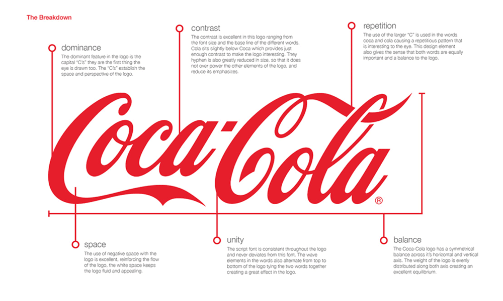
But commissioning proprietary fonts presents challenges, especially for small businesses, including:
- Design costs
- Licensing restrictions
- Learning curves
Thankfully, typography technology advancements now enable easier creation and implementation of custom fonts. With DIY and affordable font generation tools like Logaster, Hoefler, and Typography.com, custom fonts are within reach for businesses of all sizes.
When used thoughtfully, uniquely owned fonts promote instant familiarity and reinforce core identity.
They also increase protection from competitors mimicking your critical logotype assets.
Maintain Adaptability Across Touchpoints
Beyond digital screens, logos like building signage, product packaging, uniforms, swag, and more appear on brand touchpoints.
Ideally, your logo remains recognisable when flexing across contexts. However, application environments introduce constraints demanding adaptability.
Consider a few examples:
- Print materials limit colour options.
- Merchandise creates size restrictions.
- Outdoor signage requires visibility from a distance.
The ability to elegantly adapt to mediums preserves brand integrity. McDonald’s again offers an admired example, adjusting their iconic Golden Arches for slogans, restaurants, ads and products.
Build adaptability directly into your logo design through the following:
- Simplified versions – Like a favicon or emblem
- One colour option – For cost-effective production
- Outline/line versions – Maintaining recognition without colour fill
- Stacked/horizontal orientation – Alternate layouts suit different dimensions
- Size-agnostic vector files – Scales up or down without losing quality
Plan for adaptation during the design process. Then, provide logo variants reliably carrying your brand across the customer journey.
Seek Feedback from a Diverse Audience
You may have absolute clarity around your brand identity and target demographic. But remember, the customer determines what ultimately resonates, not internal teams.
Thus, soliciting feedback from a diverse external audience is wise when validating logo designs. Comments from impartial perspectives outside your bubble can prove invaluable.
Use online surveys and social listening tools to garner large-scale reactions swiftly. Consider gathering feedback on elements like:
- Meaningful symbolism
- Colour scheme emotions
- Personality descriptors
- Visual preference
- Comparisons to competitors
Listen, iterate and test further until consensus support emerges. Diverse outside perspectives reduce insular blindspots. They illuminate gaps separating intent from interpretation. Mind this disconnect when pleasing tuning logo presentation and performance.
Design Interesting Logos Without Complexity
Conveying uniqueness is essential, but take care when pursuing visual novelty.
Pushing too far risks muddying meaningful symbolism and hampering practicality. For example, graffiti-style logos prove distracting across formal business contexts.
Instead, infuse novelty through restraint. Think clever over complex. Some tactics include:
- Hidden shapes – See FedEx’s arrow in negative space
- Dual images – The Yin Yang symbol embeds two contrary images
- Rotational symmetry – Mercedes-Benz’s 3-point star looks the same at multiple angles
- Optical illusions – Cannot unsee the two profiles in Joust’s logo
- Imaginative minimalism – Removal of all superfluous elements
These subtle surprises spark added intrigue, inviting audiences to engage more deeply with decoding brand stories.
Use a Simple Logo With and Without Taglines
Taglines provide another vehicle for affixing brand attributes to your visual identity. They are typically shown alongside logos; these short phrases spotlight values, personality or positioning.
For example, Apple’s “Think Different” arrested attention by challenging status quo compliance in tech. The NHS tugs heartstrings with “Here for you”, showing unwavering human support.

However, taglines also introduce potential clutter and confinement. Therefore, transparently assess if one makes strategic sense for long-run goals.
If adopting a tagline, ensure the logo withstands standalone use without appearing incomplete. Design flexible logo and tagline lockup, signature and overlay arrangements that maintain integrity, whether combined or separate.
This preserves clarity while taglines rotate across campaigns and initiatives. Logos outlive fleeting mantras. Build standalone power flexing beyond current initiatives.
Steer Clear of Overt Brand References
Resist overtly spelling out your brand name or business type through visuals or descriptive font choices. For example, an overly literal fast food logo would simply show eating utensils and meals.
Doing so rarely sparks lasting memorability and risks dating poorly. Instead, symbolism should aim to suggest broader meanings through artful metaphors.
Ambiguity invites curiosity, consideration and interpretation – ultimately forging more profound connections. McDonald’s leadership again proved masterful, selecting the universal theme of a welcoming place under the golden arches.
This warm, comforting concept transcended fast food, becoming linked to positive American culture. According to brand valuation firm Interbrand, the logo now enjoys 99% global familiarity.
So pursue abstracted, figurative logos even if your company name remains unclear at first glimpse. Mystery gives way to awareness upon repeated exposure in patronage-building touchpoints.
What to Avoid in Logo Design
While there are few fixed rules in logo design today, some pitfalls threaten brand credibility:
Clichés to steer clear of
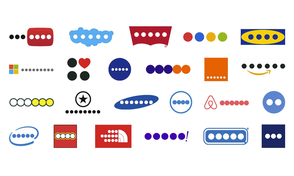
Generic elements like globes, hands, suns, light bulbs or stereotypical symbols of common industries often creep into amateur logos. But remember—overused motifs get drowned in visual noise. Seek unusual alternatives that uniquely reflect your brand.
Current design trends
Logos are built to outlast temporary fads. So resist tropes are likely to appear dated soon, like excessive gradients, drop shadows, bevel effects, or decorative serifs. Opt for versatile, classic styling instead.
Intricate details
Logos primarily exist as small icons or avatars accompanying branded content. So, reject needlessly overcomplicated graphics in favour of precise, reconcilable shapes optimised for scalability.
Excessive effects
Fancy decorations like blurs, lens flares, overlapping transparencies or superfluous textures rarely translate well into icons. Icons prioritise clarity. So, adopt aesthetic minimalism over expressive maximalism in logos.
Generic fonts
Steer clear of default system fonts like Arial, Times New Roman or generic Comic Sans warnings. Craft logos require tailor-made typography—either newly designed or significantly modified from existing fonts.
Difficult names/initials
Cryptic names clutter logos instead of communicating brands. Reconsider unrealistic contortions required to force-fit convoluted names into icons unfit for precise rendering across contexts and mediums.
Photos/gradient effects
Logos built around photographic elements rarely scale down gracefully into icons. Similarly, complex colour gradients get muddled in print reproduction. Rethink overly intricate graphics in terms of versatility.
Best Practices for Crafting Logos
Follow these strategic steps for ensuring logo designs check not only aesthetic boxes but also strategic ones:
Kickstart with competitive research
- Study competing brand logos intensively before conceptualising your own. Analyse strengths to emulate and weaknesses to avoid.
Align with brand strategy.
- Treat logo design not as an isolated visual exercise but as an extension of branding strategy. Reflect company values, personality and positioning visually.
Conceptualise strategically
- Brainstorm purposefully instead of unquestioningly sketching shapes. Focus on embedding symbolic meaning and versatility into graphics from the start.
Define design guardrails
- Outline non-negotiable boundaries for universal usage—size limits, colour standards, and placement guidelines. This preserves integrity across contexts.
Construct scalable vector files.
- Craft logos as mathematically scalable SVGs, allowing flawless expansion or reduction to any dimensions without quality loss.
Include high-res guidelines
- Share explanatory style guide documents with logo vector files specifying corporate colour codes, typographic details, clear space rules and incorrect usage warnings.
Register trademarks proactively
- Seek intellectual property registration for your logo design to preempt unauthorised exploitation from third parties. This prevents brand erosion via passing off.
Test iteratively before finalising.
- Scrutinise logo effectiveness across contexts—digital vs print, full-colour vs black and white, mockups on stationery vs billboards—seeking areas for optimisation.
Secure stakeholder signoffs
- Garner multi-level consensus from key decision-makers before adopting logo redesigns. Sudden unilateral changes risk disenfranchising employees or customers wedded to legacy marks. Manage perceptions deftly.
Common Logo Design Mistakes
As a final cautionary note, beware of these frequent stumbling blocks:
- Clutter – Logos sink under the weight of excessive textual or graphic elements competing for attention in limited spaces. Streamline mercilessly!
- Trend alignment – Faddish contemporary styles rarely withstand shifting aesthetics over long durations—Anchor logo design in versatile classics instead.
- Ambiguity — Cryptic shapes or fragmented typography that are tough to decipher from small sizes defeat quick brand association purposes.
- Derivative designs — Lifting amateurishly from existing brand marks attracts legal headaches or ridicule. Seek breakthrough originality instead!
- Print consideration — Neglecting tangible media limitations during digital design risks unpleasant surprises in physical reproduction. Iterate across formats.
- Scalability ignorance – Testing adaptability for enlargement and reduction scenarios can expose unintended design weaknesses or omissions. Get logo resizing right!
- Contextual blindness – Preview placements across probable settings—stationery, billboards, icon avatars—to assess situational effectiveness. One size can’t fit all!
- Rushed execution – Brainstorm extensively, iterating endlessly before finalising logos. Great concepts take time to crystallise. Resist rushing!
Carefully avoid these hazards to create globally admired and beloved logo marks carrying your brand forward!
Conclusion
Logos make or break brands by fusing strategy into design. Master universally shared best practices and emerging trends to craft visually captivating, functionally versatile marks. Balance brand heritage and continuity with creative leaps reflecting changing expectations. But above all—keep observing, analysing and iterating! Logo design mastery demands lifelong learning.
FAQs
Here are answers to common questions on logo design rules:
What makes iconic logos so memorable and impactful?
Brilliant logos derive effectiveness from simplicity, originality, relevance to brand identity, versatility across contexts, and just enough subtly encoded meaning to spark lasting intrigue or recognition.
What are some recent logo design innovations and trends?
Rising trends include kinetic logos adapting motion graphics for digital media, responsive logos iteratively changing via code, and generative design via AI empowering endless personalised variations. Sustainability messaging and muted colour palettes focusing on accessibility have also grown popular.
How much should one budget for getting a quality logo designed?
Professional logo design processes can cost between 0 to ,000+ depending on project complexity, design firm/freelancer portfolio standards and geographic locations determining pricing. Quality never comes cheap.
Should my logo shape depend on visual links to my product or service?
Sometimes. Clever allusions add relevance, like Toblerone’s triangular chocolate visual metaphor. But avoid forced gimmicks without symbolic meaning or versatility linking branding to offerings. Relevance shouldn’t override functionality.
How often should one update or redesign existing brand logos?
Logo redesign cycles vary widely by company age, growth stage, and pace of industry evolution. Young startups may refresh logos in under five years, seeking to convey shifting ambitions. But legacy brands often retain core marks for decades, only polishing styles periodically. Tread carefully with equity established in existing marks—strategic gradualism over radical makeovers is advisable for avoiding customer alienation risks.
