The Vibrant World of Japanese Graphic Design
Graphic design in Japan has a rich history and culture that has influenced design worldwide. From ukiyo-e woodblock prints to manga comics, Japanese graphic artists are known for their creative visual expression. As Japan rapidly modernised during the 20th century, graphic design evolved into a vibrant industry that blended traditional artistic values with innovative techniques.
Table of Contents
Ukiyo-e: The Origins of Creative Printing
Ukiyo-e, or “pictures of the floating world,” were popular Edo-period woodblock prints and paintings depicting entertainment districts and daily life scenes. These mass-produced prints from the 1600s to 1900s marked the beginning of commercial graphic design in Japan.
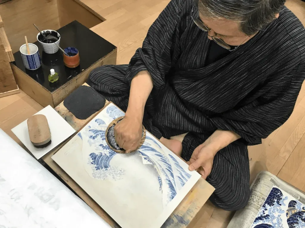
Some key features of ukiyo-e included:
- Bold, eye-catching colours with limited shading
- Flattened perspective rather than Western realism
- Creative cropping of images
- Inexpensive prints for mass consumption
In the mid-19th century, ukiyo-e saw increased perspective techniques and a shift towards landscapes over figures. The ukiyo-e aesthetic inspired European modern artists like Van Gogh and Monet, introducing creative Japanese visuals to the West.
The Manga Revolution
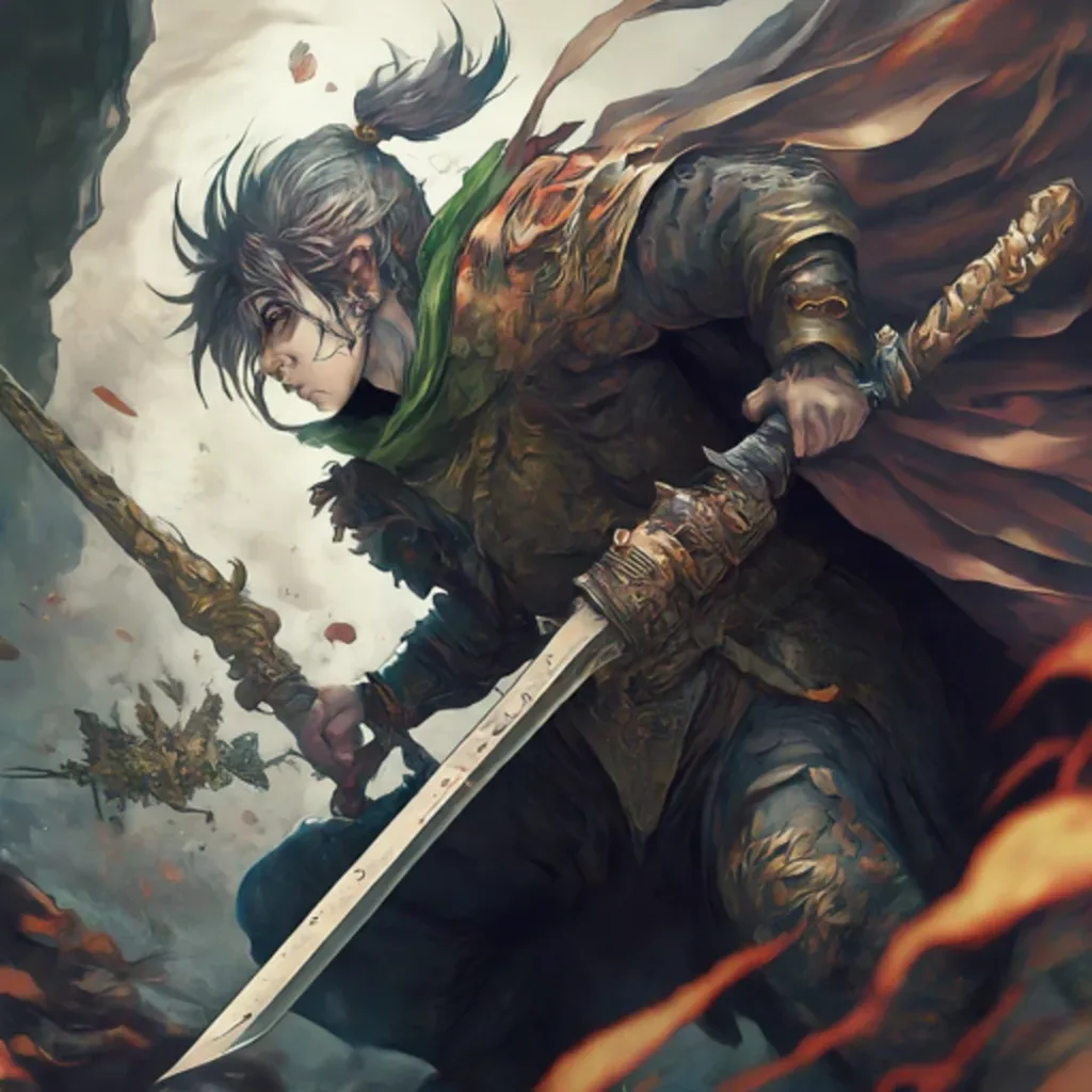
Manga, or Japanese comics and graphic novels, revolutionised visual storytelling after World War II.
Origins of Modern Manga
Influenced by American comics and cinema, Osamu Tezuka pioneered story manga in the 1940s-50s by cinematising techniques:
- Panels to indicate shots and angles
- Fast-paced, concise narrative
- Expressive characters
Astro Boy and Kimba, the White Lion, brought sci-fi manga aimed at youth to popularity, opening the door for future manga diversity.
Manga Demographics
Modern manga appeals to all demographics in Japan with distinct genres and styles:
- Shōnen – Targeted towards men, with action, robots, sports
- Shōjo – Targeted towards women, with romance, drama
- Seinen – Aimed at older young men, with deeper themes
- Josei – Focused on adult women, covering social issues
- Kodomo – For children, with educational topics
Within these demographics exist a wide range of subgenres. This segmentation allows a vast manga industry to cater to all interests.
Iconic Visual Style
While manga art varies drastically between works, some common stylistic markers include:
- Exaggerated facial features
- Dramatic angles and foreshortening
- Segmented panels and word balloons
- Speed lines, sweat drops, and visual icons
- Characters with large eyes, colourful hair
- Text overlaid with sound effects (onomatopoeia)
This developed visual language transports readers into emotive worlds while advancing the story.
Post-War Graphic Design
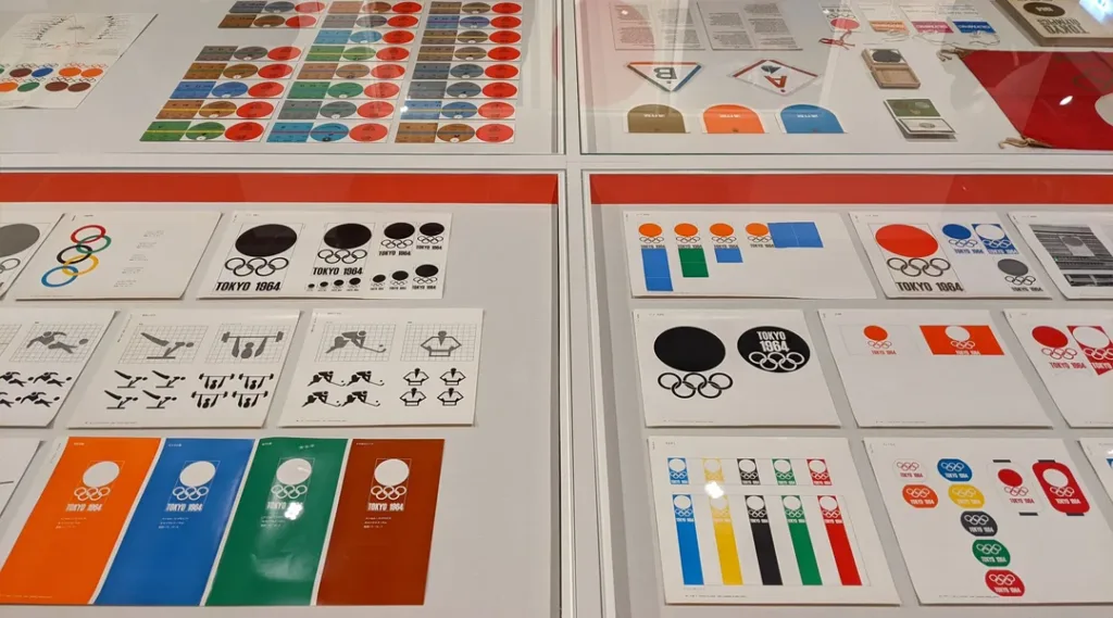
After WWII, Japan rebuilt while embracing traditional art and international modernism in graphic design. By the 1964 Tokyo Olympics, Japan had shown itself to be a design leader on the global stage.
Blending Old and New
Post-war designers in Japan fused traditional aesthetics with modern, Swiss-inspired international styles. They balanced clean, grid-based layouts from the International Typographic Style with handmade brush strokes, fabrics, origami textures, and calligraphy.
This East-West, historical-contemporary fusion created an innovative national aesthetic. It sparked the rise of iconically Japanese designs, like the Shinkansen bullet train and the Kikkoman soy sauce logo.
Pioneers of Post-War Design
Influential post-war designers in Japan included Ikko Tanaka, Yusaku Kamekura, and Tadanori Yokoo.
Ikko Tanaka (1930-2002)
- Combined Swiss Modernism with ukiyo-e and zen painting
- Designed logos for Mitsubishi, Suntory, NEC, and more
- Postage stamp and museum poster designs
Yusaku Kamekura (1915-1997)
- Dynamic use of photography in advertisements
- Logos for the Tokyo Olympics, Mazda, and Hitachi
- Integrated traditional calligraphy into modern graphic design
Tadanori Yokoo (1936-2022)
- Graphic prints with pop art influence
- Psychedelic palette with optical illusions
- Designed posters, advertisements, and book covers
These three designers contributed significantly to corporate branding, advertising, poster art, and more. Their innovations blended past and present to define the postwar Japanese style.
Character Business in Japan
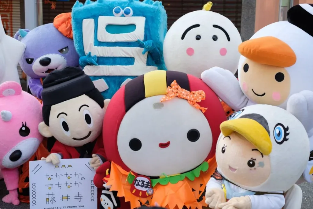
Japanese characters, or “yuru kyara”, depict everything from towns to companies. These mascots appear across branding, merchandising, and promotions.
Local Mascot Characters
There are over 1,400 “gotōchi kyara” mascots for geographic places across Japan. Prefectures, cities, towns, and train stations adopt cute mascot characters or “yuru kyara” to promote tourism and local goods.
For example:
- Kumamon from Kumamoto Prefecture
- Funassyi representing Funabashi City
- Hikonyan promoting Hikone City
Popular place-based characters appear on local souvenirs and at community events. They economically revitalise smaller regions through place branding and merchandising.
Corporate & Brand Mascots
Companies also utilise character mascots or “yuru kyara” for promotions and advertising.
Well-known examples include:
- Peko-chan for Fujiya sweets
- Colonel Sanders for KFC
- Hello Kitty by Sanrio
In 2020, the market size for character merchandising in Japan was approximately 1.7 trillion yen. From soft toys to collectables, Japanese characters drive profits.
Letterpress Printing Revival
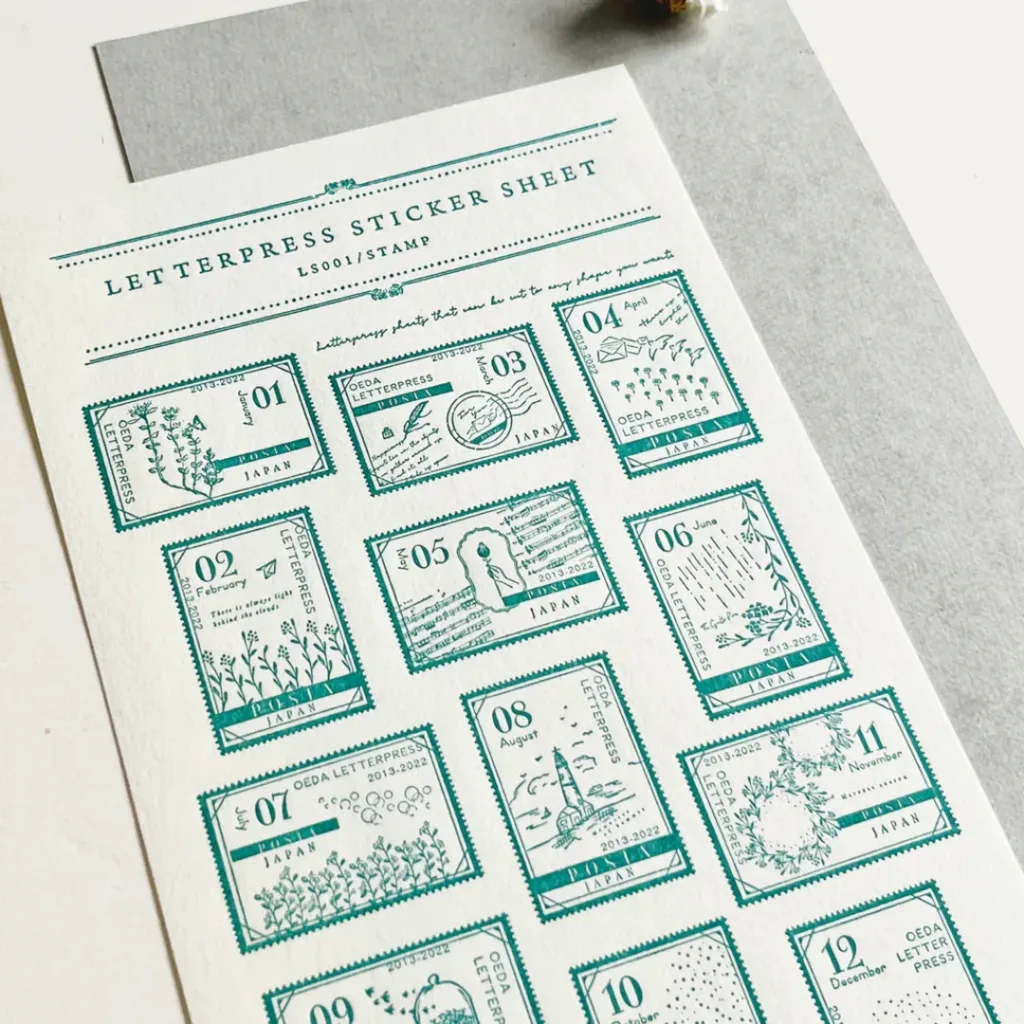
Despite digital design dominance, letterpress printing is witnessing a revival in Japan. This traditional technique uses a physically movable type pressed into paper. It emerged in Japan in the 1600s but dwindled with offset lithographic printing in the 1900s.
Traditions Adapted Anew
Today, more Japanese graphic designers are returning to old-fashioned letterpress:
- Blending modern graphic design with traditional printing
- Experimenting by printing on materials like wood or fabric
- Crafting branding elements, business cards, invitations
- Holding letterpress workshops and maker spaces
This retro technique adds handmade, tactile warmth to modern digital designs. Letterpress connects generations through knowledge transfer workshops while revitalising an old craft.
Packaging Design Innovation
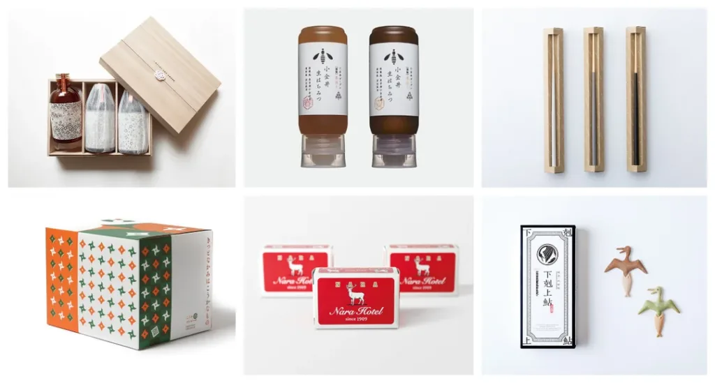
Graphics on product packaging captivate consumers across store shelves. This critical branding area has seen ongoing Japanese innovation.
Local vs Global Approaches
Japan boasts two major competing orientations in package design:
- Localisation – Packaging adjusted to suit Japanese cultural tastes or values
- Globalisation – Internationalized designs prioritising global marketability
For example, Kikkoman soy sauce uses calligraphy brush strokes on their international products. However, local products feature a traditional ukiyo e-e aesthetic.
This strategic balance between specialised local and mass global designs characterises much of Japanese packaging today.
Sustainable Packaging
Sustainability is an increasing priority across Japanese package design. Initiatives include:
- Reducing material waste and plastic usage
- Using plant-based or recycled materials
- Crafting reusable, refillable containers
- Shifting towards minimal, eco-conscious branding
Typography Evolution
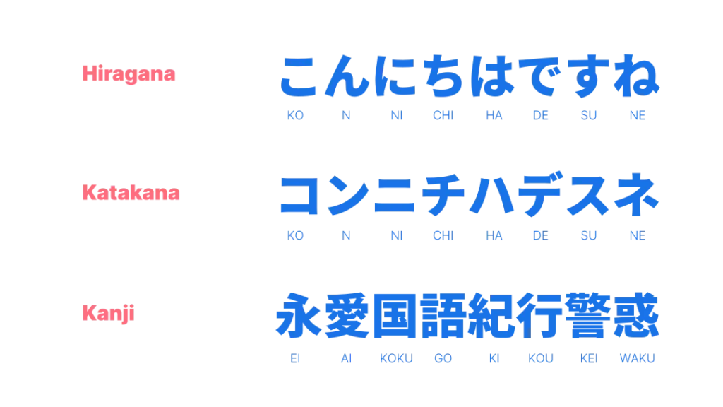
The typographic landscape in Japan has shifted in sync with technological and design innovations. This evolutionary journey reflects changing artistic styles.
Early Letterpress Printing
Japan first imported movable type letterpress technology from Europe in the 1500s-1600s. Early Japanese letterpress faced challenges in printing their complex writing system, including:
- Thousands of Kanji characters
- Calligraphic main text with phonetic Furigana readings
- Vertical and right-to-left formatting
- Mixing Japanese with Classical Chinese
Printers developed clever solutions, like using woodblocks with movable type or reducing duplication of Kanji glyphs. By the late 1700s, publication printing was established.
Modern Digital Fonts
In desktop publishing's digital age, Japanese fonts evolved new diversity:
- Mincho – Serif font inspired by brush calligraphy
- Gothic – Sans-serif with precision strokes
- Maru – Rounded, comic-inspired
- Gyosho – Flowing cursive style
The digital type also enabled better Kanji support. For example, Adobe’s “Ryumin” contains over 70,000 characters. These modern innovations expanded typographic possibilities.
Printing Technology Advances
Print production technologies, enabling graphic design and art innovations, transformed Japan's history.
Woodblocks to Digital Print
Critical milestones in Japan's print technologies:
- Woodblock – Edo era ukiyo-e mass production
- Lithography – Meiji period books and art reproductions
- Offset printing – Postwar efficiency and quality
- Digital – 1980s accessible printing revolution
Designers readily adopted new production modes like Edo ukiyo-e woodblock art. Similarly, today’s innovations in digital printing drive creativity.
On-Demand Printing explosion
Recent on-demand printing progress empowers small designers:
- Accessible digital machines and software
- Agile production of custom orders
- Expanded printing capabilities with special inks, cuts, prototypes
Through these emerging technologies, independent artists and entrepreneurs customise designs affordably.
Contemporary Trends
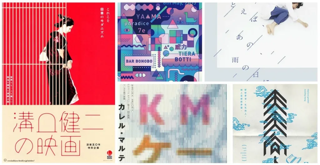
Creative Japanese graphic arts stay culturally vibrant today through modern mediums, techniques, and global inspiration.
Dynamic Mediums
Designers utilise varied mediums for dynamic expressions:
- Print – Books, editorial, packaging, paper crafts
- Screen – Animation, mobile apps, video games, web
- Environment – Signage, architecture, exhibitions
- Fashion and Textiles – Clothing, accessories, fabrics
- 3D Objects – Character goods, furniture, sculpture
These physical and digital canvases enable boundless innovation.
Celebrity Collaborations
Top brands increasingly collaborate with celebrities for buzzworthy graphic collections. These headline-grabbing artist pairings include:
- Takashi Murakami with Louis Vuitton bags
- Yayoi Kusama polka dots on Lancôme cosmetics
- Fanxyred Group and Casetify tech accessories
These partnerships amplify artistic exposure by merging pop culture icons with top designers.
Guiding Creative Values
Core concepts rooted in tradition continue steering Japanese graphic arts through ever-evolving modern trends.
Harmonious Minimalism
Clean, sparse aesthetic approaches trace back to Zen art influences. This appreciation of negative space, asymmetry, and simplicity imbues visual harmony. We see this in branding elements like Muji’s logo or Issey Miyake’s fashion silhouette.
Handmade Quality
While Japan thrives technologically, handmade craftsmanship retains its cultural cachet. Tactile irregularities in printing, textures, or brush strokes add individuality. Many designers prioritise these touches over mass mechanical precision, like Ingfonica Studio’s posters.
Artistic Collectivism
Collaborative group initiatives are expected compared to lone geniuses in the West. Design units like Nendo Studio or music collectives like Yoningumi exemplify this teamwork approach. Working communally often sparks new creativity.
Japanese graphic arts retain cultural essence by sustaining aspects of traditional perspectives amidst fast-paced change.
Conclusion
We’ve explored wide-ranging eras and forms of Japanese graphic design – from ukiyo-e woodblock prints starting in the 17th century to today’s dynamic mediums like mobile apps, architecture, and fashion.
Despite massive technological shifts, certain handmade qualities and design values persist. These traditional traces, whether visible brushstrokes or invisible zen-inspired minimalism, infuse contemporary works with cultural richness. They blend harmoniously with modern, globalised aesthetics, as seen in the convergence between precision Swiss grids and irregular Japanese fabrics.
As designers continue reinterpreting customs, past innovations fuel new visual worldbuilding. The cycle of honouring history while pioneering the future sustains Japan’s ever-evolving, vibrant graphic arts.
FAQs on Japanese Graphic Design
What are some traditional features of Japanese graphic design?
Some core traditional elements include calligraphy and brush strokes, handcrafted imperfections prioritised over precision, textures like origami paper or fabrics, and asymmetrical, negative space approaches influenced by zen arts.
How has Japanese typography changed over time?
Letterpress printing first brought movable type to Japan in the 1500s-1600s, posing challenges for printing complex Japanese writing vertically. Modern digital fonts enabled advances like more extensive Kanji character libraries and new styles like Maru (comic), Gyosho (cursive) or Gothic (sans-serif).
What is the difference between manga and anime?
Manga refers to Japanese comics or graphic novels with a unique stylistic visual language, like exaggerated facial features and onomatopoeia. Anime refers to Japanese animation adapted from manga or created independently for media like television and film.
How are corporate brand mascots used in Japanese graphic design?
Japanese companies utilise cute, personified mascot characters called “yuru kyara” across their branding, merchandising and promotions. These mascots drive profits on character goods while raising brand awareness. For instance, Peko-chan represents Fujiya sweets.
What is driving sustainability in Japanese package design?
Many Japanese companies now prioritise eco-conscious packaging using recyclable, renewable, and plastic-free materials. They also design reusable containers and refillable packs as part of zero-waste initiatives in response to growing sustainability concerns.
