
This post contains affiliate links. We may earn a commission if you click on them and make a purchase. It’s at no extra cost to you and helps us run this site. Thanks for your support!
Check out the Interlaken typeface, where modernity meets typography.
When it comes to graphic design fonts are the brushstrokes that paint the canvas of creativity. They hold the power to evoke emotions, define brands, and convey messages. Among the vast array of typefaces, one stands tall, crafted meticulously to revolutionize the art of branding and display—Interlaken.
Designed by the visionary Roch Modrzejewski of the renowned ROHH foundry, Interlaken isn’t just a typeface; it’s a doorway to a realm where innovation meets elegance. This modern display and branding font family isn’t merely a set of characters; it’s a muse for crafting captivating logotypes, eye-catching posters, and commanding headlines effortlessly.
Embracing Uniqueness
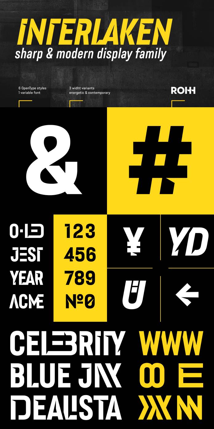
At first glance, Interlaken captivates with its powerful, modern character. Its uppercase family comprises six OpenType fonts and a 2-axis variable font—each a testament to precision and versatility. But it’s not just about the numbers; it’s about the intricacies packed within.
Delve deeper, and you’ll discover a treasure trove of features—stunning stylistic alternates and an abundance of original ligatures. These elements aren’t just adornments; they’re tools engineered to simplify the creative process. Crafting projects with Interlaken isn’t work; it’s an adventure, a journey through seamless design.
A Symphony of Functionality
Interlaken isn’t just about aesthetics; it’s a typographic Swiss army knife, tailored to streamline your workflow. Its wide array of OpenType features isn’t a luxury; it’s a necessity, crafted explicitly to elevate your projects while minimizing time and effort.
The font family’s three-width variants open doors to diverse design scenarios. Its cutout details aren’t just aesthetic flair; they create an illusion of inner shadows, casting a mesmerizing spell, especially against darker backgrounds. It’s not just a font; it’s an experience—where form meets function in perfect harmony.
The Perfect Fit
Interlaken isn’t confined to a singular industry or purpose; it’s a chameleon, seamlessly adapting to various sectors. From the dynamic realms of sports and fitness to the cutting-edge domains of modern technology and fashion, Interlaken thrives. Its presence in the gaming world is no surprise; its boldness and versatility align effortlessly with the industry’s dynamic visuals.
But Interlaken’s brilliance doesn’t shine in isolation. It’s a team player, complementing and enhancing other typefaces like Rothorn, Conthey, Conthey Inline, and Axalp Grotesk. Together, they form a symphony of typography, each contributing its unique note to create harmony in design.
Conclusion
Interlaken isn’t just a font; it’s a game-changer, a catalyst for boundless creativity. It doesn’t confine itself to pixels or paper; it transcends, becoming an extension of the designer’s imagination. In a world where every curve, every line tells a story, Interlaken isn’t just a tale—it’s a saga, waiting to be penned by the visionary minds of designers worldwide.
So, pick up the brush, wield the pen, and let Interlaken be your guiding light in the symphony of design. Embrace its power, unlock its potential, and witness your visions transform into masterpieces—one stroke at a time.
Feel free to find more trending typefaces on WE AND THE COLOR.
Subscribe to our newsletter!


