20 Football Team Logos That Capture the Spirit of the Beautiful Game
Welcome, sports fans, graphic designers, and anyone in between! Are you ready to journey through the powerful, creative, and dynamic world of football team logos? Our beautiful game is not just about the thrill of goals scored or the camaraderie shared by millions around the globe—it's also about how teams are visually represented and the spirit they embody through their logos.
Football's influence is undeniable, with over 3.5 billion passionate football followers globally and hundreds of thousands of teams from the grassroots to the elite level. It's a sport that captivates our hearts and minds, and it's no surprise that the icons associated with it are imbued with such powerful symbolism and distinctiveness.
The world of football team logos is as diverse as the sport itself, blending history, culture, and design uniquely and compellingly. A team's logo is more than just a mere identifier—it tells a story, represents a community, and symbolises pride, loyalty, and undying support for fans.
In this riveting article, we'll showcase 20 football team logos that have captured the beautiful game's spirit in all its glory. These logos are not only aesthetically pleasing, but they also embody the essence of their respective teams and the sport overall. So, whether you're a diehard football fan looking to appreciate the creative artistry behind your favourite teams or a design enthusiast seeking inspiration, this article has something for everyone.
Grab your shirt, and let's kick off this journey together—into the colourful, vibrant world of football team logos!
Table of Contents
1 – FC Barcelona
The one we see today was introduced back in 2002, and boy, did it bring a modern touch to the club's identity. It's like a fresh interpretation of all the previous versions that came before it, breathing new life into the emblem.
One of the most significant changes that took place in the 2000s was the removal of the dots from the wordmark. They decided to streamline the design and give it a cleaner look. So now, instead of those dots, we have the letters “FCB” standing tall and proud in a popular sans-serif typeface. It's a choice that exudes elegance and professionalism, reflecting the club's fundamental approach to the game.
But that's not all! The iconic football, always present in the Barcelona badge, made a comeback in gold and black. It perfectly matches the golden frame surrounding the crest and the banner with the wordmark. Picture it in your mind, a harmonious combination that ties everything together, creating a visual feast for the eyes.
With this modern interpretation, Barcelona's badge embodies the club's rich history while embracing the present. It captures the essence of their relentless pursuit of excellence on and off the field. It's a symbol that represents their dedication, skill, and unwavering commitment to the beautiful game.
So, the Barcelona badge we see today is a true testament to the club's evolution and desire to push boundaries continuously. It's a visual representation of their enduring legacy and a reminder of the values they hold dear.
2 – Real Madrid

It's like a fashion-forward time machine that returns to the club's glorious beginnings. Their emblem is the epitome of minimalistic and stylish design, capturing the essence of the club's rich history.
But it's not just about looking good; the emblem also exudes a regal aura, symbolising Real Madrid's prestigious “Royal” status in football. It proudly showcases the club's strong connection with its roots and traditions, staying relevant and fashionable even in the modern era.
Imagine it's a perfectly tailored suit that never goes out of style, always making a statement wherever it goes. Real Madrid's visual identity is a testament to its unwavering commitment to excellence and dedication to upholding its esteemed heritage.
When you look at that emblem, you can't help but feel the weight of history and the passion of the millions of fans who have supported the club over the years. It's a symbol that unites generations of Madridistas, past, present, and future, under one stylish and timeless banner.
So, whether you're a diehard fan or a casual observer, the visual identity of Real Madrid tells a captivating story. It's a story of triumph, elegance, and a reliable connection to the club's noble past. And as the world changes and evolves, Real Madrid's visual identity stands tall, a beacon of tradition and style that will continue to inspire and captivate generations.
3 – Bayern Munich
So, in 2017, Bayern Munchen unveiled its latest visual identity, which builds upon its previous version while incorporating some noteworthy changes. While the overall design retains a sense of familiarity, one can't help but notice the profound transformation in its colour palette.
The new iteration of Bayern Munchen's visual identity breathed new life into their brand. By brightening and making the colours more distinct, they've infused the logo, jerseys, and overall branding with a renewed energy and contemporary appeal. Imagine a captivating blend of red, blue, and white coming together to form a powerful and visually striking representation of this iconic football club.
The choice of these colours serves a purpose beyond mere aesthetics. It's a deliberate statement of Bayern Munchen's status as a dominant force in the footballing world. The red, a bold and fiery hue, signifies their fierce passion and unwavering determination on the field. It symbolises the club's history, rich with success and triumph, and is a testament to its enduring legacy.
Meanwhile, the blue and white elements exude a sense of professionalism and authority. They embody the club's unwavering commitment to excellence, emphasising their status as a top-tier institution within the footballing realm. This colour combination represents the astute decision-making and strategic prowess Bayern Munchen exhibits both on and off the pitch.
When you witness the Bayern Munchen visual identity in action, whether it's their players charging across the pitch or their iconic crest emblazoned on a jersey, you can't help but feel the weight of their storied past and their unyielding ambition for the future. It's a visual representation that encapsulates the club's journey and achievements while projecting an image of power and professionalism.
4 – Manchester United
This bright and intense emblem captures the club's spirit and history. Picture a dark red and gold colour palette, meticulously crafted to stand out on the vibrant red jerseys worn by the players.
The shades of red on the badge and the uniform may vary slightly. Still, the emblem is a richer and darker red, ensuring it catches everyone's attention when proudly displayed on the players' chests. It's a sight to behold!
The Man UTD badge is a thing of beauty. Its design features a sharp and distinctive geometric crest with clean lines. If you take a closer look, you'll notice a straight top line and a triangular bottom, adding a touch of elegance to the overall shape. The crest is predominantly yellow, exuding a sense of brightness and optimism.
Now, pay attention to the details. Below the crest, you'll spot a little red banner proudly displaying “Manchester United.” This banner perfectly complements the vibrant red hue of the jerseys. But there's more to discover! Above the red banner, you'll find a symbol that adds a dash of history and tradition—a yellow ship. This ship symbolises Manchester's maritime heritage, representing the city's proud roots.
And that's not all! Nestled within the geometric heraldic image is a powerful symbol—the trident. This symbol, also in vivid red, adds strength and authority to the badge. It visually represents Manchester United's dominance and success on the football field.
5 – Juventus
Change can be unsettling, especially regarding something as iconic as a sports team's logo. But sometimes, stepping outside the box can lead to excellent results. In the case of Juventus, they've hit the bullseye with their new design.
When it comes to logos, you want something instantly recognisable and easily remembered. And that's precisely what the new Juventus logo brings to the table. It's clean, sleek, and modern, with sharp lines and a bold black-and-white colour scheme. It's a departure from the old oval shape but a change for the better.
You see, a logo is more than just a symbol. It represents the identity and values of a team. And the new Juventus logo does just that. It embodies a sense of strength, determination, and a forward-thinking approach. The logo exudes confidence and tells the world that Juventus is ready to conquer new frontiers.
Some might argue that the old logo had its charm and nostalgia, and that's true. But in today's fast-paced world, a logo needs to stand out and make an impact. The new Juventus logo does precisely that. It captures attention, sparks conversations, and leaves a lasting impression.
6 – Paris Saint-Germain
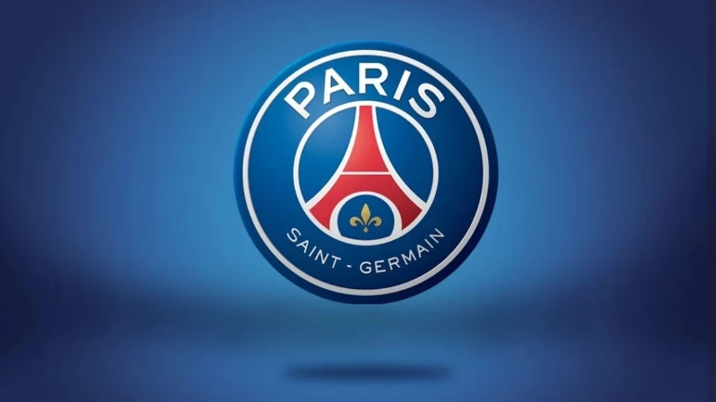
Let me tell you about the fascinating 2013 redesign for the PSG visual identity. It was a transformation that brought some notable changes to their iconic logo.
Firstly, they removed the cradle element from their previous design, giving the logo a fresh and modern look. The logo's frame was widened, providing a more open and inviting feel.
The colour palette underwent a significant upgrade as well. They opted for a calmer and lighter combination of blue, white, and red, which brought a sense of elegance and sophistication to the overall design. These refined colours perfectly complemented the brand's image.
The wordmark received a significant alteration too. Instead of being presented as a single entity, it was now split into two distinct parts. The enlarged word “Paris” gracefully arched along the upper part of the badge, emphasising the team's connection to the vibrant French capital. A smaller “Saint-Germain” was on the bottom, symbolising the team's roots and heritage.
The elegant gold fleur-de-lys, a symbol associated with French royalty, became the central element of the logo. It was elegantly placed within a smaller blue circle, creating a visually pleasing contrast. Positioned beneath the iconic Eiffel Tower, this emblematic symbol showcased the team's pride and connection to their home city.
In addition to the primary version of the logo, a secondary version was created. This alternate version featured gradient shades, adding a sleek and voluminous effect to the design. It further enhanced the logo's versatility and adaptability across various platforms.
Overall, the redesign of 2013 brought a sense of refinement and modernisation to the PSG visual identity. It captured the team's heritage's essence while embracing a contemporary aesthetic. The new logo symbolised PSG's commitment to tradition and progress with its widened frame, elegant colour palette, split wordmark, and iconic gold fleur-de-lys.
7 – AC Milan

The initial version was crafted in 1998, and although there have been a few minor tweaks over the years, the essence remains intact. Picture this: a sleek oval shape, now encased in a vibrant red shade, delicately outlined in black. It's a simple yet impactful framing choice that exudes elegance.
Now, let's talk about the inscription. The letters “ACM 1899” are boldly displayed in black, using a solid sans-serif typeface. It's a no-nonsense choice that exudes confidence and influence. The simplicity of the font adds to the overall power of the design, making a statement that can't be ignored.
You'll notice that all the lines are impeccably clean and precise when you look closer. These small details contribute to the iconic nature of A.C. Milan's visual identity. The sheer tidiness of the design is a testament to the club's commitment to excellence, both on and off the football field.
What's truly remarkable about A.C. Milan's visual identity is its global recognition. Fans and even non-football enthusiasts can immediately identify the club with just a glimpse. It's a symbol that transcends borders and language barriers. Such is the power of a truly iconic design.
8 – Arsenal FC
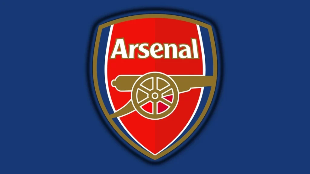
While the new design still pays homage to the club's heritage and history, it does so in a modern and powerful way. Picture this: a bold gold cannon, facing right, proudly taking centre stage in the badge. It's the most prominent element, elegantly outlined in delicate white, and emerges triumphantly from a striking blue and white shield.
But that's not all! The word “Arsenal” is written in white with a sleek gold outline, adding a touch of sophistication and elegance to the overall design. The choice of font is critical here. They opted for a bold and elegant sans-serif typeface that closely resembles the Clear Gothic TS DemiBold and Monotype Clearface Gothic fonts. However, they didn't stop there. They modified the lines, giving it a distinctive and unforgettable flair.
The result? A visual identity that captures the essence of the club's history while embracing the modern era. It's a fusion of tradition and contemporary aesthetics, creating a style that is both timeless and memorable. The logo proudly represents the strength and spirit of the club, and the carefully crafted typography adds a touch of refinement. It's a design that fans and enthusiasts can instantly connect with and proudly display as a symbol of their allegiance.
9 – Borussia Dortmund

Since 1993, their logo has undergone some subtle yet impactful changes. If we compare it to the previous version, you'll notice a striking resemblance, but a keen eye will spot a couple of minor adjustments that add a touch of modernity to the design.
One of the noticeable modifications is the reduction of black rings from the logo. Previously, two black rings encircled the emblem, but now, only one remains, creating a cleaner and more streamlined appearance. The decision to remove a ring demonstrates the club's inclination towards simplicity and a more contemporary aesthetic.
Moreover, the solitary black ring that remains has been made bolder, commanding attention and emphasising its significance. This alteration adds strength and solidity to the logo, symbolising the club's unwavering determination and resilience.
Another change worth mentioning is the boldening of the font itself. The typography used in the logo now appears thicker and more pronounced, amplifying the visual impact of the team's name. This enhancement brings a sense of dynamism and energy, reflecting the passion and intensity associated with Borussia Dortmund.
10 – Inter Milan
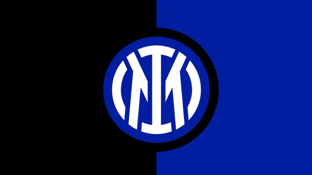
Let me tell you about the Inter Milan logo's remarkable transformation in 2021. They decided to give it a fresh look that caught everyone's attention. The first thing they did was switch up the colour palette, opting for a vibrant combination of bright blue, white, and black. This change alone breathed new life into the logo, making it more eye-catching and modern.
But that's not all! The contours of all the elements in the logo were also refined and given a bolder appearance. It was like they put the logo through a makeover, giving it a sleek and polished look. The attention to detail was remarkable, as they ensured every line and curve was clean and sharp. The overall effect was stunning, making the logo even more visually appealing.
Now, let's talk about the “FCIM” monogram. In previous versions, it was a bit complex and intricate. However, the designers decided to simplify things while maintaining the essence of the insignia. They replaced the “FCIM” with two overlapping letters “, IM,” which represent Inter Milan. These letters were enclosed within a white circular frame, giving it a sense of unity and balance.
Interestingly, the circular frame's thickness matches the characters' bars, creating a harmonious and consistent design. It's a subtle yet impactful detail showing the thoughtfulness of the logo's creation.
11 – Ajax Amsterdam

Do you know what's fascinating? This logo manages to strike a delicate balance between modernity and tradition. It's like a visual reminder of Ajax's deep-rooted connection with its history and heritage. The club holds its past close to its heart, and this emblem is a testament to that.
When you look at the contemporary design, it's hard not to be captivated. The logo exudes a sense of freshness and elegance, as if telling you that this club stays relevant and ahead of the game. It's a true work of art, a graphical representation that perfectly embodies the reputation and prestige of the Ajax football club.
This logo is a reflection of the team's playing style as well. Like the logo, Ajax is known for its fluid and dynamic approach to the game. They embrace innovation and always strive to push boundaries, just as their emblem breaks away from conventional designs.
12 – Tottenham Hotspur

An incredible transformation occurred in 2013 when Tottenham Hotspur gave their badge a new look. The redesign breathed new life into their emblem, leaving fans and football enthusiasts in awe.
In this remarkable overhaul, they boldly removed all those extra outlines cluttering the old badge. This move instantly gave the logo a sleek and modern feel, allowing the true essence of the Tottenham Hotspur bird to take centre stage. The bird's silhouette was elongated, giving it a more elegant and majestic appearance, capturing the club's spirit.
But it didn't stop there. The contours of the emblem were meticulously cleaned up, resulting in a refined and polished design. Every detail was carefully considered, ensuring the badge was visually appealing and professionally executed to the highest standards.
The outcome? An emblem that can only be described as breathtakingly beautiful. Its simplicity and sophistication make it stand out in football logos. And the best part is that this magnificent emblem continues to be proudly used by the club even today, symbolising the rich history and unwavering passion of Tottenham Hotspur.
13 – Olympique Lyon

It was crafted in 2006 and is a true sight to behold. Picture this: a striking combination of dark blue and red forming a regal crest, elegantly outlined in shimmering gold. It's an absolute stunner!
Looking closer at the logo, you'll notice two bold and solid letters, “OL” proudly standing in white at the forefront. They symbolise the club's name, Olympique Lyonnais, and exude strength and determination. But that's not all! Nestled right in the middle of the letter “O,” you'll find a majestic lion rampant, its glorious presence making it clear that this team is a force to be reckoned with.
A clean and crisp white wordmark is placed on a vibrant red background to add charm to this masterpiece. It creates a beautiful contrast, capturing attention and giving the logo a touch of modernity.
Now, what makes this logo truly special is how it incorporates the French flag's colours. The dark blue, red, and white hues proudly pay homage to the nation, igniting a sense of patriotism. And let's remember that touch of gold outlining the crest, symbolising victory and triumph. It's like a shining testament to the winning spirit that flows through the players' veins and their unwavering professionalism.
Overall, the Olympique Lyonnais logo is a true work of art. It combines power, elegance, and national pride, encapsulating the club's and its players' essence. It's no wonder that whenever fans catch a glimpse of this emblem, their hearts swell with admiration, and their excitement for the game reaches new heights.
14 – Valencia CF
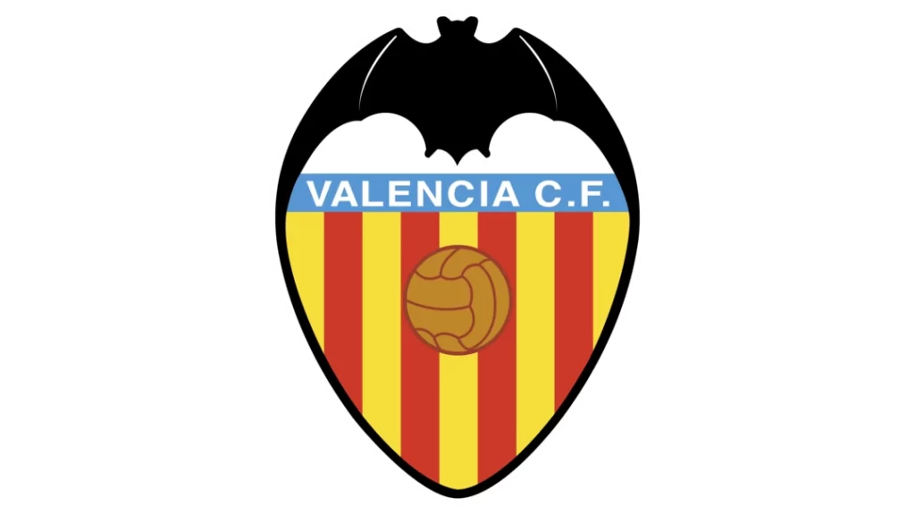
It was back in 1992 when they decided to give their logo a little makeover. They wanted to keep the essence of the design the same, so they kept the composition and colour palette intact. However, they focused on enhancing the details by cleaning and strengthening the lines and contours.
One noticeable change they made was to mute the shades of the logo. This subtle adjustment had a significant impact, making the entire emblem appear more professional and robust. You know, sometimes the small things make a big difference!
Now, let's talk about the typeface. Believe it or not, they decided to leave it untouched. They must have thought, “If it ain't broke, don't fix it!” And you know what? They were right! The typeface perfectly complements the overall design, so they saw no reason to change it.
Oh, and how could I forget about the bat? That iconic symbol remained untouched as well. It's a unique and recognisable element of the Valencia crest, so they knew better than to mess with it. After all, the bat has a rich history and is deeply intertwined with the club's identity.
15 – Fiorentina

ACF Fiorentina holds a strong bond with the city it represents—Florence. Since its establishment in 1926, the team has proudly called Florence home. It's no wonder they chose the fleur-de-lis as a central element of their logo. This elegant and timeless symbol has deep historical roots within the city itself.
If you stroll through Florence, you'll notice that the flag and the city's coat of arms feature a striking red fleur-de-lis against a backdrop of pure white. It's a symbol that Florentines have embraced for centuries, representing their rich heritage and cultural significance.
By incorporating the fleur-de-lis into its logo, ACF Fiorentina pays homage to Florence's vibrant history and traditions. It is a constant reminder of the club's strong connection to the city and its people.
Over the years, as the club evolved and grew, its logo may have evolved too, but the essence of the red fleur-de-lis remained steadfast. It is a powerful symbol of unity, pride, and unwavering loyalty, not just for the club's players and fans but also for the people of Florence.
16 – Celtic FC
It's got a definite Scottish vibe going on. When you look at their logo and branding, you can't help but feel that Celtic spirit. They've nailed it with their colours: green and white. Those two colours are closely associated with Scotland, so it's a perfect match.
Now, the logo itself is iconic. At the centre, you'll find a four-leaf clover, the main element of their visual identity. It's a symbol of good luck, and it beautifully represents the Celtic heritage. When you see that clover, you instantly know you're looking at the emblem of the Celtic club.
Interestingly, the current logo version was designed back in 1995. It has stood the test of time and has become deeply ingrained in the hearts of Celtic fans worldwide. However, there was a special occasion in 2012 when they introduced a temporary logo to commemorate their 125th anniversary. It was a unique badge that replaced the regular logo for a year, giving fans something special to celebrate.
17 – RB Leipzig

You won't believe the transformation that took place with the redesign of RasenBallsport Leipzig's visual identity back in 2014! A significant overhaul brought about the most minimalistic version of their branding. Picture this: the iconic large yellow Sun that used to dominate the centre of their badge was wholly removed. Instead, they decided to go big with their black and white Football emblem, enlarging it to take the Sun's place as the centrepiece of the composition.
But that's not all! The changes didn't stop there. Along with removing the yellow element, they also bid farewell to the red lettering that used to sit at the top of the crest. Now, the crest boasts a sleek and dark stylised “RB Leipzig” inscription, arched along the bottom border of the logo. It's a refined touch that adds a touch of elegance and modernity to their visual identity.
By embracing this new design, RB Leipzig boldly stated their commitment to simplicity and sophistication. Removing the Sun and the streamlined lettering showcased their desire to create a clean and striking visual representation of their club.
18 – Shakhtar Donetsk

It all started back in 2007 when the club underwent a significant transformation. “Shakhtar” was chosen to represent the team, marking a new chapter in its history. Since then, it has become integral to the club's identity.
Now, let's delve into the details of the current emblem, which underwent renewal simultaneously. The symbol is a striking composition that beautifully captures the club's spirit. Picture an oval shape elegantly outlined in contrasting white and black colours. It immediately catches your attention, making a bold statement.
The emblem is horizontally divided by a white banner proudly displaying the prominent “Shakhtar” lettering in bold black font. It's a simple yet powerful design choice, ensuring the club's name takes centre stage. After all, the term carries the weight of the club's legacy and success.
As we move our gaze upward, we encounter the upper part of the emblem adorned in vibrant orange. Within this captivating orange backdrop, there lies a stylised flame, symbolising the passion and intensity that the team brings to the game. It's a visual representation of the burning desire to achieve greatness and leave a lasting impact.
Now, shifting our attention to the lower part of the emblem, we discover a solid black background. A small yet significant symbol—a white axe and hammer catches our eye. This subtle yet meaningful addition pays homage to the club's founding year, 1936, a nod to its rich history and enduring roots.
As a whole, the Shakhtar emblem embodies a perfect blend of aesthetics, symbolism, and history. It's a testament to the club's evolution and growth, constantly adapting to the changing times while remaining rooted in its foundation.
19 – West Ham United
It's modern and sleek, sporting a burgundy crest and snazzy blue outline. At the heart of the logo, you'll find two yellowhammers nestled snugly in the centre. Two distinct parts of the inscription surround them: “West Ham United” and “London” on the bottom.
Now, let's talk about the typography used in this logo. The lettering is all in captivating capital letters, giving it a bold and powerful presence. The choice of a simple yet stylish sans-serif typeface adds a touch of sophistication to the overall design. And what's more, the lettering is in crisp white, standing out brilliantly against the burgundy background.
It's incredible how a logo can capture the essence of a club, and West Ham United's logo does just that. Its modern aesthetics, sleek lines, and attention to detail represent the club's pride, heritage, and connection to the vibrant city of London.
20 – FC Dallas
Let me tell you an exciting story about the transformation of a club in 2005. So, picture this: the club made some bold changes, starting with its name. They waved goodbye to the old and embraced a new identity as FC Dallas. But that's not all that changed that year. They also went ahead and gave their logo a complete makeover.
Imagine a majestic black horse, which had been the face of the club, stepping aside to make room for an even more powerful and masculine creature. Enter the bull. This new symbol exuded strength and resilience. Executed in a sleek combination of white and blue, the bull found its place within a modern shield adorned in shades of blue and red.
To pay homage to its roots and celebrate the club's connection to Texas, the state fondly known as the Lone Star State, the bull sported a special touch. A vibrant red flame symbol graced its forehead, representing the fiery spirit of the team. And right on its chest, a proud white five-pointed star shone brightly, symbolising the club's deep love for Texas, their cherished homeland.
Now, if you shift your gaze above the mighty bull, you'll notice a captivating inscription in all capitals: “FC Dallas.” This inscription was meticulously crafted in a sleek and robust sans-serif typeface, emanating a sense of modernity and power. It gracefully arched along the shield frame, adding a touch of dynamism to the logo's overall composition.
In summary, 2005 was a transformative year for the club. With a new name, a redesigned logo, and a captivating symbol, FC Dallas emerged as a force to be reckoned with. The bold bull, the vibrant colours, and the sleek typography perfectly captured the essence of the team, all while paying tribute to the rich heritage of Texas.
Wrapping Up the Football Team Logos
In conclusion, the 20 football team logos explored in this article are potent symbols that transcend mere graphics. These emblems imbue a shared identity, merging individual passion into a collective sense of belonging. They are not unique visual identifiers but also encapsulate the heart and soul of each club, representing history, tradition, culture, community, and the raw emotions associated with the beautiful game of football.
They combine aesthetics, simplicity, and rich symbolism to evoke strong emotional responses from fans around the globe. Every colour, line, and detail contributes to a visual narrative, a chronicle of triumph, perseverance, and sometimes, even transformation. These logos are both the touchstone of team spirit and a beacon that guides the thrill and passion of the world's most popular sport.
The power of a team logo in football should always be considered. Its impact is not confined to the football pitch but extends to every merchandise, banner, poster, and heart that carries it. It is a universal language uniting fans from diverse backgrounds under a shared crest of loyalty and camaraderie.
The unique ability of these logos to encapsulate and convey the spirit of football is a testament to the strength and significance of effective design. They remind us that design can be more than just an aesthetic endeavour—a powerful storytelling tool that captures the essence of entities, breathing life into them and making them enduring symbols of human aspiration and emotion.
Therefore, the next time you look at a football team logo, pause and ponder on the rich tapestry it weaves, the narratives it holds, and the collective spirit it encapsulates. For within those colours, shapes, and symbols lie the heart of the club, the passion of its players, the dreams of its fans, and the very soul of the beautiful game.
