Top 10 Punk Logos That Defined a Movement
Punk rock exploded onto the music scene in the mid-1970s, bringing with it a reckless, defiant energy and a bold do-it-yourself (DIY) ethic that rejected the polished perfection of mainstream rock. Central to this rebellious movement were the iconic logos and graphics that came to represent the various punk bands and their anti-establishment ideologies. More than just visual identifiers, these logos embodied the raw, aggressive spirit of the music itself.
This in-depth exploration will delve into the top 10 most impactful and recognisable punk logos that emerged during the genre's heyday. From the cut-and-paste ransom letter aesthetic of the Sex Pistols to the iconic crimson cross of the Dead Kennedys, these visual symbols have not only adorned album covers and t-shirts but have also become enduring emblems of punk subculture. We'll examine the DIY artistic processes used to create them and the provocative messages they conveyed.
These seminal logos continue to inspire new generations of disaffected youth looking to channel punk's rebellious energy. More than just striking graphic designs, they provide a window into the electrifying early years of punk and how visual art was used to shake up the establishment. So please put on your leather jacket, grab your safety pins, and join us as we dive into the visual language of punk rock.
Table of Contents
Visualising the Essence of The Top 10 Punk Logos
1 – The Ramones: Hey Ho, Let's Go!

The Ramones, often hailed as the pioneers of punk rock, boast one of the most recognisable logos in music history. Designed by Arturo Vega, the logo features the band's name in bold block letters, with the namesake “Ramones” rendered in a clean, formal style. This logo embodies the simplicity and no-frills approach that punk music champions. It's a testament to how a minimalist design can carry immense impact, becoming an emblem for an entire movement.
2 – Sex Pistols: The Anarchy Aesthetic
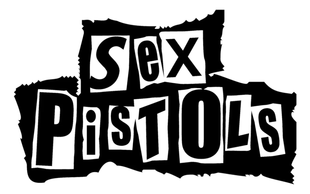
No exploration of punk logos would be complete without the infamous Sex Pistols logo. Created by Jamie Reid, this logo oozes anarchy and rebellion. The ransom-note-style lettering, combined with the disruptive colour palette and provocative imagery, perfectly mirrors the band's aggressive attitude and societal critique. The Sex Pistols logo is a prime example of how a logo can shock and provoke, making a lasting imprint on pop culture.
3 – The Misfits: Fiendish Charm
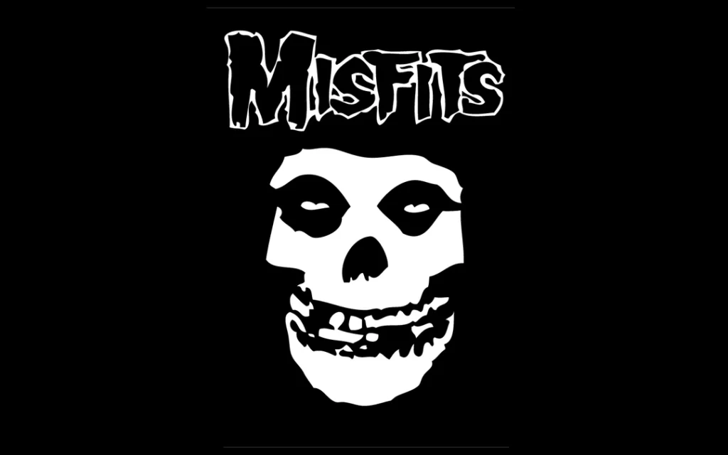
The Misfits' logo is a striking fusion of horror and punk aesthetics. Designed by Glenn Danzig, the logo features a skull with a slightly arched brow and elongated fangs, giving it a distinctive sinister charm. The bold use of black and white adds to its visual impact. This logo has become synonymous with The Misfits and a staple in punk fashion and subculture, showcasing the enduring power of a well-crafted emblem.
4 – Dead Kennedys: Satirical Subversion

The Dead Kennedy's logo is a satirical masterpiece that challenges societal norms and political issues. Designed by Winston Smith, the logo fuses the iconic Presidential seal with symbols of death and decay. This juxtaposition embodies the band's scathing critique of authority and consumer culture. The logo's intricate details and thought-provoking symbolism make it a prime example of how it can convey a band's message with artistic finesse.
5 – Black Flag: Bars of Rebellion
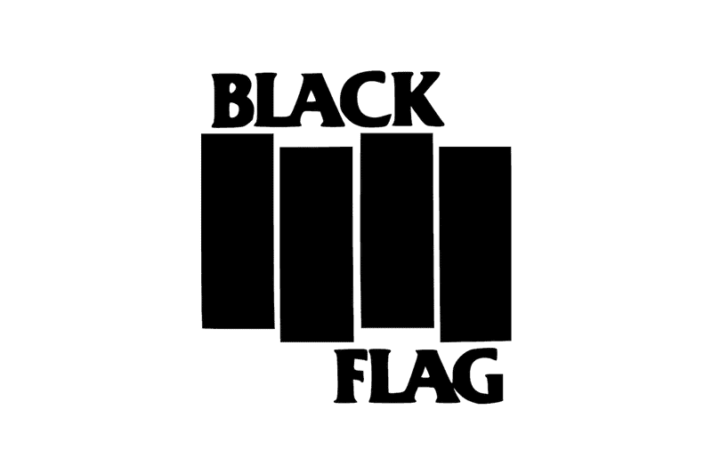
Black Flag's logo, designed by Raymond Pettibon, is a prime example of punk's DIY ethos. The logo exudes a sense of defiance and minimalism, featuring four black bars and the band's name. This design's beauty lies in its adaptability—fans often create variations, adding a personal touch to the emblem. The Black Flag logo is a reminder that sometimes, the most straightforward designs leave the strongest impressions.
6 – The Clash: A Visual Riff

The Clash's logo, designed by Ray Lowry, captures the band's fusion of punk and reggae influences. The iconic lettering, reminiscent of graffiti, gives the logo a streetwise authenticity. The British flag and the rebellious red star evoke the band's political and social commentary. This logo showcases the power of a well-thought-out design in encapsulating a band's diverse musical palette and ethos.
7 – Bad Brains: The Positive Force
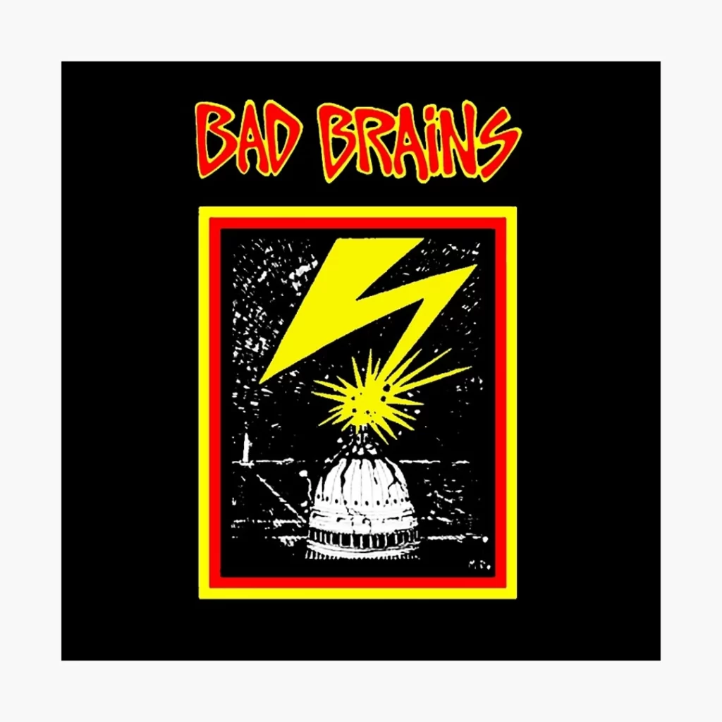
Bad Brains' logo, often called the “lightning bolt,” symbolises the band's electrifying energy. Designed by the band's guitarist, Dr. Know, the logo's dynamic lines and bold colours mirror the intensity of their music. What sets this logo apart is its inherent positivity—while punk can be associated with anger, Bad Brains' logo radiates a sense of empowerment and unity.
8 – Rancid: From Skater Culture to Punk Rock
Rancid is an American punk rock band formed in 1991 in Berkeley, California. Their logo features the band name in a stylised font with sharp, angular letters coloured in red and black. The font has a hand-drawn, do-it-yourself aesthetic reminiscent of punk/hardcore band logos from the 1970s-1980s. The letters appear dripping or melting, evoking a gritty, urban vibe. The logo often features an ominous-looking skull behind the band name, also in red and black. This ties into the band's punk rock attitude and aggressive musical style.
9 – NOFX: Humour and Irreverence
NOFX is a punk rock band formed in 1983 in Los Angeles, California. Their logo often features the letters “NOFX” in a bold, ransom-note style font, with the “O” letter styled as a circle or rounded shape. The letters are usually overlapping or interconnected in some way. Early logo versions had a more hand-drawn, scribbled look with drips or messy edges. Recent versions look refined and polished but maintain a rough, graffiti-inspired aesthetic.
10 – Buzzcocks: Pop Art Punk
The iconic logo of the pioneering punk rock band The Buzzcocks epitomises the fusion of pop art and punk aesthetic. Designed by the talented Malcolm Garrett, the band's logo features vibrant, almost neon lettering spelling out the band's name in alternating red and yellow. The bold colours and hand-drawn, uneven look exude the raw energy and irreverent spirit synonymous with punk rock.
Yet the playful, bubbly font gives the logo a pop art flair, reflecting the band's catchy melodies and accessibility. While punk was often intentionally rough around the edges, the Buzzcocks logo added a touch of upbeat pop. This visual marriage of punk attitude and pop sensibility made the logo perfectly capture the band's musical identity.
Conclusion: The Enduring Legacy of Punk Logos
Punk rock exploded onto the music scene in the 1970s with a bold, rebellious sound that matched its aggressive attitude. More than just a musical genre, punk represented a philosophy of non-conformity and resistance through its fashion, lyrics, and overall aesthetic. Crucial to this visual landscape were the logos of pioneering punk bands. These emblems were far more than just decorative images – they encapsulated the essence and ethos of the punk movement.
From the iconic ransom note typography of the Sex Pistols to the iconic red target of the Dead Kennedys, punk logos broke free of music industry norms with their DIY simplicity and tongue-in-cheek humour. Their bold designs and raw artistic quality reflected core punk ideals: a disdain for commercialism, a celebration of individuality, and the democratisation of art. For alienated youth longing to break free from societal constraints, these logos became symbols of punk identity, belonging, and shared rebellion.
Over time, punk aesthetics infiltrated the mainstream through fashion and graphic design. Yet decades later, classic punk logo designs continue to represent a pivotal counterculture movement. They remind us that powerful graphic symbols can transcend their original purpose to become visual shorthand for an entire cultural phenomenon. Whether scrawled on jackets or posters, punk logos give visual form to the anarchist spirit, anti-establishment politics, and raw creative energy that defined this revolutionary genre. Their enduring appeal is a testament to the dynamic relationship between music, visual communication, and generational attitudes.
