This site uses cookies to improve your experience. To help us insure we adhere to various privacy regulations, please select your country/region of residence. If you do not select a country, we will assume you are from the United States. Select your Cookie Settings or view our Privacy Policy and Terms of Use.
Cookie Settings
Cookies and similar technologies are used on this website for proper function of the website, for tracking performance analytics and for marketing purposes. We and some of our third-party providers may use cookie data for various purposes. Please review the cookie settings below and choose your preference.
Used for the proper function of the website
Used for monitoring website traffic and interactions
Cookie Settings
Cookies and similar technologies are used on this website for proper function of the website, for tracking performance analytics and for marketing purposes. We and some of our third-party providers may use cookie data for various purposes. Please review the cookie settings below and choose your preference.
Strictly Necessary: Used for the proper function of the website
Performance/Analytics: Used for monitoring website traffic and interactions
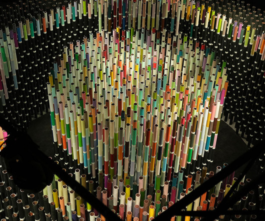
Renowned architect and artist Suchi Reddy and historic Indian brand Asian Paints recently presented Chromacosm , the largest and most comprehensive architectural color system with over 5,300 unique shades. Like a creature among grass, the viewer walks among tall stalks of colored cylinders, all adorned with a myriad of color.
The WE AND THE COLOR subreddit, r/Design_WATC , was created to fill that void for designers, artists, and creative thinkers. Engage with Like-Minded Design Enthusiasts Subscribing to r/Design_WATC means stepping into a community of passionate designers, artists, and critics. Header image by Visual Generation (via Adobe Stock).
Every designer, artist, and creative professional faces this challenge from time to time. Think about saving hours searching for the perfect image or color palette. More specifically, this is where following WE AND THE COLOR’s Pinterest account can transform your creative process. And let’s not forget the quality!
A Closer Look: Geometry, Color, and Space Beyond the striking typography, the design’s genius lies in its use of simple geometric shapes. The template also includes two distinct color palettes, each creating a profoundly different atmosphere. Red on Off-White: This version is energetic, vibrant, and urgent.
Take this Online Course by Pietari Posti of Studio Posti and Discover the Secrets to Colorful Vector Illustrations in Adobe Illustrator. With their bold colors and flawlessly clean lines, dont you think vector illustrations are fascinating, too? Do you find yourself wondering how artists achieve such vibrant, scalable graphics?
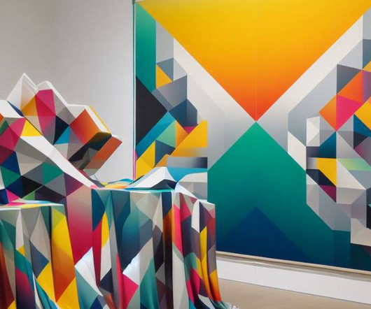
Spanning nearly the entire floor of the main space of Mercer Art Gallery in Harrogate, Liz West s expansive new installation invites viewers to revel in color and brightness. The artist has reimagined the historic early-19th-century spa promenade room as a vibrant, sensory immersion. Do stories and artists like this matter to you?
Its matte, “biscuit” finish came in a variety of colors, but most popular was a strikingly pale blueknown as Wedgwood bluedecorated with white, cameo-like reliefs. Early examples fetch thousands of dollars today. Jasperware is considered one of the designer’s most notable contributions to ceramics.
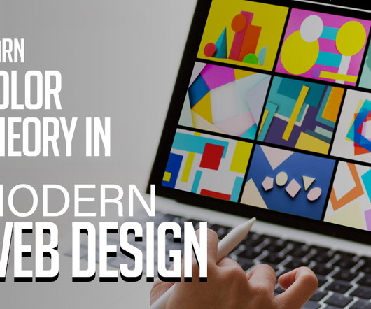
In the ever-evolving landscape of web design, colortheory remains a fundamental pillar. The judicious use of colors can significantly impact the aesthetics, usability, and overall user experience of a website. Colortheory is the foundation upon which all aspects of visual design rest. red or blue).
Collaborate with other designers and artists. Learn the basics: Start with the fundamentals of design theory, colortheory, typography , and composition. Collaborate: Collaborate with other designers and artists to expand your skills and learn from others. You may be interested in the following articles as well.
Unleash the Power of Color: Dive into Richard Mehl’s Graphic Design Course Have you ever wondered why certain color combinations evoke specific emotions? The secrets lie in the captivating world of colortheory, a fundamental skill for any graphic designer. But the creative journey doesn’t end there!
Grid Systems in Graphic Design book is the foundational text for graphic artists. This book serves as a manual for typographers and graphic artists. More than that, we discovered some wonderful wisdom and humor suitable for any graphic artist. It offers new artists a variety of tried-and-true artistic techniques.
The magic behind that impact often lies in the strategic use of color. Colortheory is the science and art of using colors effectively to communicate ideas, evoke emotions, and create harmony in visual compositions. Learn about primary, secondary, and tertiary colors, and how they interact with each other.
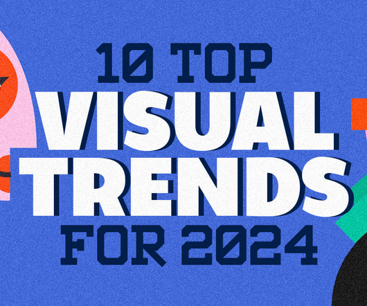
Anticipate a convergence of cutting-edge technologies, societal shifts, and artistic expressions that will define the visual trends of the year. Neural Aesthetics explores the collaborative synergy between human creativity and artificial intelligence, while the Quantum Color Palette takes us beyond the conventional spectrum.
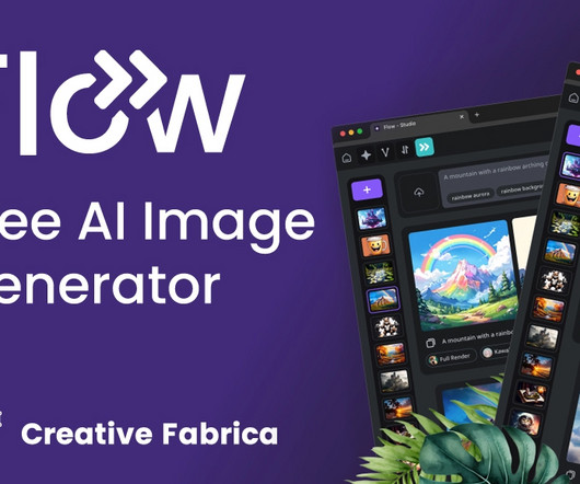
One such groundbreaking innovation is Flow , a cutting-edge Free AI Generator that has captured the attention of designers, artists, and creators worldwide. Whether you are a professional designer or an aspiring artist, Flow provides a user-friendly platform that caters to all skill levels, making advanced design accessible to everyone.
Procreate Tattoo Style Roses is loaded with 15 outline templates and brushes, making this set a breeze to optimize when you’re practicing your color and shading techniques on the raster graphics editor app. Procreate Eternal Tattoo Color Chart. 40 Tattoo Flash (Full Colors). Download Now. Mystic Illustrations Design Bundle.
Whether you’re a photographer, designer, artist, or part of a creative agency, these themes offer the flexibility and features needed to stand out in the digital landscape. With these hand-picked best WordPress themes, you have a variety of options to choose from to create a website that truly represents your creative vision.
By turning the iPad into a drawing table, it opens up the possibilities for any artists who might not consider the iPad a viable design option. That can open up many different avenues for artists. This kit has the tools to be a great choice of both lettering and illustration work which can make it a great choice for every artist.
To pursue a career as a Web Designer , you need to possess not just the technical expertise required to develop functional websites but also the artistic talent and design sensibility necessary to create an experience that consumers will adore. A wide variety of educational opportunities are available to study web design theory.
Visit Website ArtDunk Website Design Artdunk is a ecommerce where you can buy artist made basketballs. Visit Website Scheele’s Green Website Design A project about the dangerous love of the color green in the Victorian era. You may be interested in tinhe following articles as well. I’m a UX/UI Designer & Mentor.
Throw hue and tone into the mix, too, and you’re left with four, distinct color terms that everyone uses, yet not everyone understands. The mix-up among tint, shade, hue, and tone is understandable since they’re all related to colortheory and refer to similar concepts within design. Defining Tint vs. Shade, Hue, and Tone.
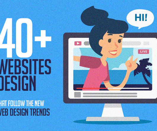
Visual Design Theory – Understanding colortheory, the basics of composition, and how to use typography among other things are all necessary for designing visually appealing websites. Though web design is a technical field, it still requires you to be an artist in a way.
Josef Albers’ seminal geometric abstract works, Homage to the Square – a series of paintings composed of four superimposed squares of oil color based upon Albers’ systematic application of colors – remain one of the art world’s most recognizable series of paintings.
In 1928, The Saturday Evening Post , then the US’s most popular illustrated weekly, heralded “The New Age of Color.” Richly-tinted branding became all the rage as forecasters realized color spelled cash. . But the idea that color exerted influence was not “new,” although we could say there is something New Age about it.
Nappy Nappy provides free stock images that showcase diversity and representation, with a focus on people of color. Free Color Tools: 24. Coolors Coolors is a color scheme generator that allows users to create and customize color palettes for various design projects. Free Mockup Tools: 30. Free Graphic Design Courses: 35.
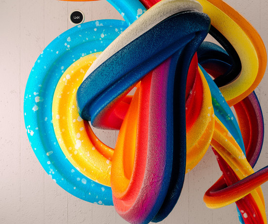
Exploring Bauhaus Influence in 3D Illustration abduzeedo 1108—23 Discover how Leonardoworx LWX merges Bauhaus principles with modern 3D illustration, crafting artworks that celebrate simplicity and color. The "ColorTheory" section is a vibrant journey through abstract swirls that interlace with a rhythmic flow.
It is about repeating shapes, typography, style, colors, and design elements to be recognizable and not confuse viewers. Color is the tool to use to enhance an already well-created design with the right emotions , set the correct tone and attract the viewer. A color palette is the range of colors used by a designer in their project.
To know how to accurately combine colors is a critical skill that artists, designers, marketers, and brand owners spend years learning and mastering. The perfect examples that just click with you, vibe on the same frequency with you and you know this is the right combination of colors just by seeing it. Article overview: 1.
The book is not particularly focused on the technical or artistic aspect of graphic design, it’s more about the business side of it. Interaction of Color by Josef Albers. Josef Albert’s Interaction of Color is thoroughly used in art education. Image Source. Grid Systems in Graphic Design by Josef Müller-Brockmann. Image Source.
Pantone Color Institute and Valentino: Pink PP My earliest discernible memory of color – and graphic design – dates back to childhood when I watched my mother change the commercial printer inks on equipment for her graphic design business. The LOVE GOOD COLOR® Toolkit 3.
At its core, design is the conscious arrangement of elements, be it colors, shapes, or materials, to create a functional and aesthetically pleasing composition. The use of design principles in art is evident in the careful selection of colors, composition, and perspective.
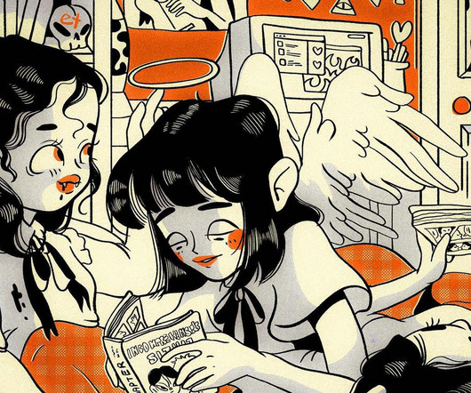
In the heart of Saint Petersburg, Russia, a dynamic artist named Polina Alexeenko is crafting a vibrant world that pulses with life and color. Polina’s artistic talent is undeniably exceptional, as seen in her playful and expressive illustrations that appear to leap off the canvas and into the imagination of the viewer.
In graphic design, mastering color harmony is an essential skill that can make or break your visual creations. Whether you’re a seasoned designer or just starting out, understanding the principles of colortheory and applying them effectively can greatly enhance the impact of your work.
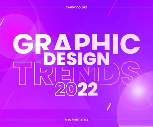
Candy colors. CANDY COLORS. Vibrant eye-candy color schemes. Skillful designers and digital artists who know their colortheory already roll their sleeves to create bold and striking graphic design creations with beautiful candy colors. Top Graphic Design Trends 2022 Overview: 1. 2D/3D Mashup.
Nick Pedersen is an award-winning photographer and digital artist based in Salt Lake City, Utah, who uses his art to explore themes related to nature and environmental issues. Pedersen’s work is a testament to the power of art to explore important issues related to our world and to inspire change.
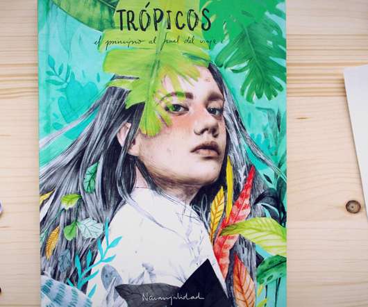
With this online course by Beatriz Ramo, aka Naranjalidad, you will learn to create stunning portraits with pencil, different color techniques, and Adobe Photoshop. Beatriz Ramo (Naranjalidad) is a freelance illustrator and artist based in Madrid, Spain. Do not hesitate to find more online courses on WE AND THE COLOR.
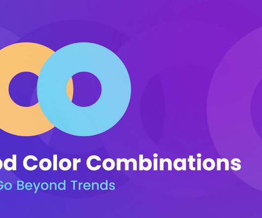
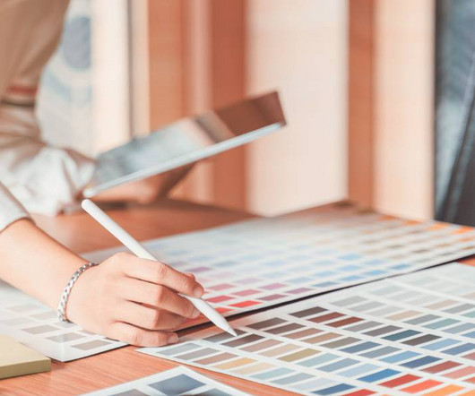
Color selection is a stage in a design process that requires both smart thinking and gut feeling. In today’s digital era, you can have as many colors and color combinations as you like. The human eye can see millions of…
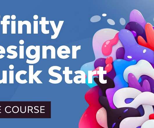
How to Use Color, Fill, and Stroke in Affinity Designer. Layers are an essential part of many designers' and artists' workflow. How to Use Color, Fill, and Stroke in Affinity Designer. The process here is rather similar: we have similar access to the Stroke color in the sub-context menu. Jump to content in this section.
Picking a nice color combination can be a challenge for any kind of artist. If you are a fashion designer, finding the best color combos is crucial. Not long ago, you had to sharpen your eyes with years of practice to build nice color schemes. You can endlessly generate random color schemes. It is Pictaculous!
If you want to improve your digital drawing skills, I’m sure you won’t want to miss out on the chance to learn from Jess Hannigan, a super-talented artist. You’ll learn how to manipulate visual elements in a digital collage, experimenting with colors, shapes, and textures to produce dynamic and engaging artwork.
As I work for an IT company, it’s quite understandable that most of my friends and acquaintances are designers, artists, and simply creative people. The list can also be considered a collection of ideas for gifts for fashion designers, cool gifts for artists, gifts for painters, gifts for graphic designers , etc. There are 28 of them.
For example, minimalism can communicate simple sophistication and class, vivid colors communicate fun, geometric shapes can be taken as vintage and neutral colors communicate professionalism. Notice that most fast food chains use a combination of the bright colors yellow, red and orange. Creative Interior Design Logo Examples.
50 Totally Free Lessons in Graphic Design Theory. Color, Texture, and Imagery. It's important to understand the basics of colortheory and get a feel for how to work with colors. Color can make areas of a design pop off the page or recede into the background. Advanced ColorTheory: What Is Color Management?
Hit ‘d’ on the keyboard to reset your colors to the default black and white. First, click Filter->Artistic->Cutout. Click Filter->Artistic->Watercolor. It was because of that inspiration that I decided to keep my colors for this poster simple. I used the snowboarder below.
It’s a dance of color, functionality, and user psychology. Material Design , Skeuomorphic , Single-Page , Parallax Scrolling , Grid Layout , Full-Screen , Illustrative , Minimalist , Dark Mode , Retro and Vintage , Artistic Show more Show less 2. Get color schemes for an appealing website. Get tips to improve your website.
We organize all of the trending information in your field so you don't have to. Join 66,000+ users and stay up to date on the latest articles your peers are reading.
You know about us, now we want to get to know you!
Let's personalize your content
Let's get even more personalized
We recognize your account from another site in our network, please click 'Send Email' below to continue with verifying your account and setting a password.


Let's personalize your content