Mastering the Art of Colour Schemes in Design
Were you aware that colour can summon strong feelings and change our moods, choices and actions? This is why choosing a suitable colour scheme for any design, be it a website, logo, product package, or interior space, is necessary.
Have you ever walked into a bright room full of life and then walked into another dull, boring room? How about the difference in energy levels between a fiery red sports car and a soothing baby blue vehicle? It’s true; colour communicates with us at subconscious levels, thus forming our views about things.
To create stunning visual designs, one must understand colour theory well enough to blend different shades effectively. At the same time, mastering colour schemes is not only scientific but also artistic. So, let’s jump right into this exciting subject together!
Table of Contents
Understanding the Basics of Colour Theory

You can only get into specific colours by knowing the basic principles of colour theory. Here they are:
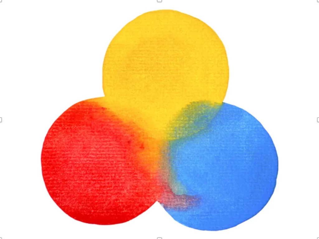
The Colour Wheel: Think of a classic colour wheel with red, yellow, and blue as the primary colours. Next comes orange, green, and purple, which are secondary because each is made by mixing two primaries. Six tertiary shades that complete this model lie between them, showing relationships between different hues.
Hue, Saturation and Value: Discussing hue saturation and value (HSV) helps us understand what colour looks like. For example, if you say something is red, that's its HUE. How bright or dull is it from pure white to black? That’s SATURATION. Lastly, V denotes lightness/darkness within any given shade.
Warm vs Cool Colours: Reds, oranges, and yellows are warm colours that create energetic feelings or vibrant impressions when combined. Blues, greens, and purples are fantastic because they usually evoke calming emotions, such as relaxation.
Now that you know some fundamental aspects of this subject matter, let us look at particular schemes and their recommended applications.
7 Classic Colour Scheme Patterns to Consider
When arranging colours, some combinations work well together and can help you achieve certain moods or visual effects. Here are seven traditional schemes:
Monochromatic
This type of scheme uses a range of tints, shades and tones of a single colour. Think sky blue to navy.

Monochromatic palettes make for sleek designs that are easy on the eyes. However, they can need more contrast and appear dull or one-dimensional.
Complementary
Complementary colours, such as red and green, sit opposite each other on the colour wheel. These high-contrast hues create a vibrant, energetic effect when placed next to each other in a design.

Complementary colour schemes are eye-catching and bold – great for accents. But if used too much or incorrectly, they can appear garish or clashy.
Analogous
With an analogous scheme, you choose three adjacent colours on the wheel: yellow-green, yellow, and yellow-orange.

Analogous palettes look harmonious because the colours share undertones. They tend to be calming without being monotonous or dull.
Triadic
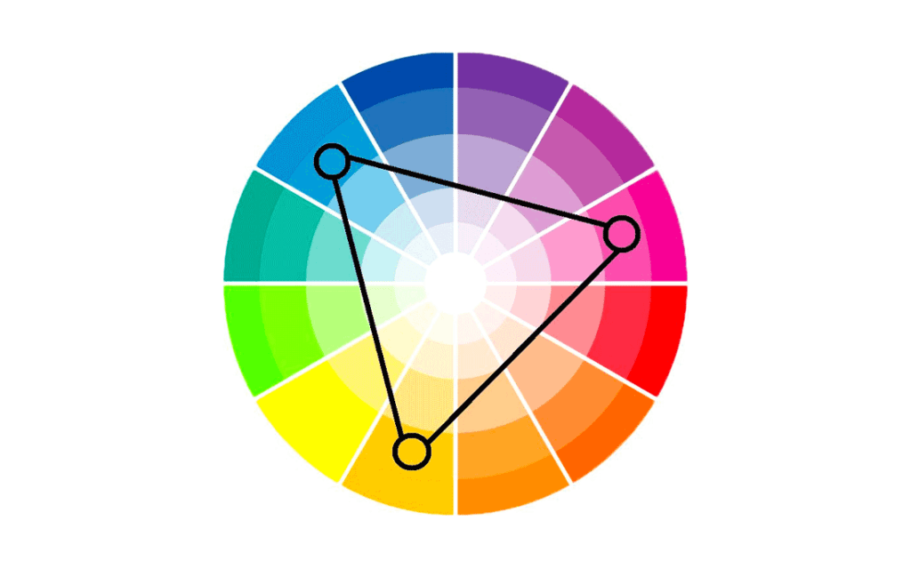
To create this scheme, use three evenly spaced colours around the wheel for a vibrant but balanced triangle shape.Red, blue and yellow (the primary colours) or orange, green and purple (the secondary) are classic examples.

Triadic combos have more energy than analogous but still offer some of the same visual harmony. Be careful not to overdo it to avoid confusing viewers' eyesight.
Split-Complementary
Pick one base colour, then combine it with two shades next to its complement on the wheel. Blindness is one example.

Split-complementary schemes have similar vibrancy levels as complementary pairs but are less intense. Colours work together here without being overwhelming.
Tetradic
Using four colours arranged in a rectangle shape on the colour wheel is called a tetradic scheme. Some examples include red, yellow, blue and green or yellow-orange, red-orange, blue-violet and yellow-green.

Tetradic combinations allow for more variety than triadic ones while still being vibrant. They create strong visual interest and energy.
Square
As the name implies, this scheme consists of four colours that sit at equal distances around the colour wheel to form a square or rectangle shape. Red, yellow, blue and green are examples.

The square is similar to tetradic but with higher contrast and tension between different hues. Such schemes can add fun or dynamic touches when used selectively.
How to Select the Right Colour Scheme
How do you decide which works best with all these colour combination options? Here are some key factors to consider:
Think About the Mood and Message
What feeling or emotion do you want to evoke with your design? Is the goal to create an energetic, bold look or a more calming, sophisticated vibe? Colour schemes like triadic or complementary will add vibrant punch, while monochromatic or analogous palettes feel more subdued.
The colours you choose also convey symbolic meanings, so think about the message you want to communicate. For example, green often symbolises nature, growth and health; blue represents trustworthiness and serenity; red signifies passion and excitement.
Consider Your Industry and Audience
Different colour schemes work better for different contexts and audiences. For example, bright, playful hues are perfect for designs aimed at kids or relating to toys or sweets. But you'd want to go with more professional, understated tones for a corporate setting, legal firm or high-end product.
Ensure your palette fits your brand's overall personality and aligns with your target customer's values and expectations: research colour trends and preferences in your particular industry.
Examine the Use Case
Where and how will this colour scheme primarily be used? Colour needs vary depending on branding a company, designing a web page, creating packaging, or laying out an interior space.
For digital designs like websites, you must account for screen displays and ensure enough contrast between colours for legibility. With print materials or physical products/spaces, different factors like paper quality or lighting environments come into play.
Quick Tip: Start With Just One or Two Colours First. When first exploring colour combinations, begin with just your primary colour or two base hues you want to use. Then, build out a full palette from there using colour scheme “recipes” and complementary accent tones.
Design Applications and Examples of Colour Schemes

Now that you understand the critical colour scheme formulas, let's look at how they come to life across different mediums:
Brand Identity and Logo Design
Few elements are more critical for a brand's visual identity than colour. The shades you choose set the entire look and tone.
Many central brands leverage colour theory to their advantage with strategic colour selections. Think of McDonald's bright red and yellow combo evoking energy and appetite appeal. Or how Starbucks' green circle suggests a natural, earthy feel.
Here are some example brand logo colour schemes:
- Nike: Simple black and the signature orange/red “Swoosh” accents for an active, bold look (analogous/complementary)
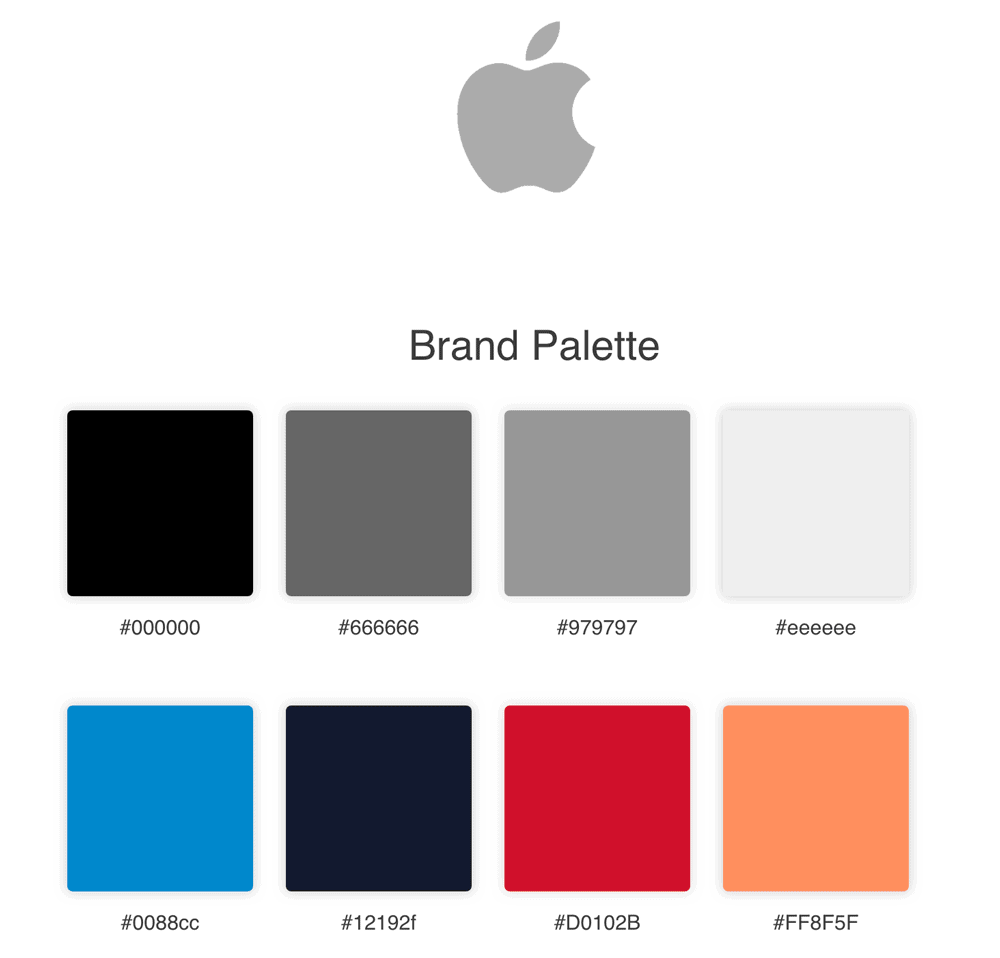
- Apple: Clean white and greyed slate with pops of colour for a modern, premium vibe (neutral background with tetradic accents)
- Instagram: A vivid gradient of warm sunset tones creates an appealing, colourful impression (analogous)
- Lego: The primary red, blue, green, and yellow palette is playful and fun for the iconic toy brand (tetradic)
- Tiffany & Co.: Timeless robin's egg blue with black and white type for sophisticated elegance (monochromatic accent with neutrals)
Website and App Design
Colour plays a massive role in creating intuitive, aesthetically pleasing websites and apps that are usable and enjoyable to navigate. Here are some prime examples:
- Mailchimp: Cheerful yellow, off-white, and charcoal make for an approachable, friendly feel that matches the brand's personality (complementary accents)
- Spotify: A minimal black and green colour scheme is both modern and relates to the brand's audio roots (monochromatic with accent)
- Trello: Bold, saturated blue complements the white interface for a clean yet fun colourway aligning with this productivity tool (complimentary)
- Airbnb: Bright coral shades and muted tones create a warm, welcoming vibe fitting for a hospitality brand (analogous)
- Asana: A vibrant pinkish-red provides energy while teal accents add balance to this app's clean interface (split-complementary)
As you can see, top websites and apps often use colour schemes like complementary, split-complementary, and accent hues to highlight critical elements while maintaining clean, high-contrast backdrops for readability.
Product Packaging
When products sit on shelves, their packaging needs to pop and grab people's attention amidst a sea of other options. Colour plays a pivotal role here.
- Vitamin Water: Each flavour variety uses a dramatically different bright colour like orange, green or purple (monochromatic)
- Coca-Cola: The iconic red immediately catches the eye and communicates excitement and energy (monochromatic accent)
- Nivea: A simple blue and white palette feels clean, trustworthy and refreshing for this skincare line (complimentary)
- Godiva: Deep brown packaging with gold accents creates a tone of decadent indulgence (analogous)
- Pepsi: Layering bright blue, red and white makes this design bold and dynamic (triadic)

Notice how each brand uses colour deliberately to reinforce the desired impression, be it refreshing, luxurious, energetic or other adjectives.
Interior Design and Environmental Branding
Designers' colours for interior spaces, stores, restaurants, and other environments profoundly impact the overall experience.
- Apple Stores: Minimalist grey neutral palette highlighting the products with pops of colour (monochromatic with accents)
- Starbucks: Green brand accents mixed with woodgrain finishes and warm lighting create an inviting, comfortable third space (analogous)
- Target: Their iconic red combines with grey and splashes of other primaries across departments and wayfinding (triadic)
- Anthropologie: An eclectic bohemian mix of furniture and decor featuring patterned analogous colour combinations (analogous)
- Restaurants & Hotels: Often leverage warm neutrals, woods and pops of colour that create specific moods (analogous or complementary accents)
The psychology of colour is so powerful in shaping physical spaces and experiences. Designers make calculated choices to inspire desired feelings and behaviours.
Tips for Using Colour Schemes Effectively

Creating harmonious, impactful colour schemes doesn't just happen by accident. Here are some tips from the pros:
- Start by defining a base hue that aligns with your brand personality and design goals.
- Build out the scheme from there using colour formulas as guidelines, but don't feel too confined. Feel free to experiment.
- Use online colour scheme tools or apps to explore combinations and preview how colours work together.
- Create a cohesive feel by carrying your colour scheme across all brand/design elements (logo, website, packaging, interior branding, etc).
- Consider how colours will render or appear in different contexts and mediums. What looks good on screen may not translate to print.
- Pay attention to accessibility and choose colours with enough contrast, especially for text and important information.
- Balance is vital – don't just default to equal parts of each colour. Define a clear hierarchy and leave breathing room with neutral accents.
- Add subtle details like gradients, textures or patterns to add visual interest to monochromatic schemes.
- Use colour sparingly and strategically to highlight the most important aspects you want to stand out.
The Never-Ending Palette: Embracing Colour Trends
While fundamental colour theory principles are at play, design is an ever-evolving art form influenced by cultural trends, seasons, new technologies and fresh takes by creatives pushing boundaries.
For example, social media significantly influences viral colour trends that take the world by storm. Remember the “millennial pink” rose-tinted craze a few years back? Or, more recently, the boldUN blue and orange-red “lava lamp” aesthetic that seemed to be everywhere?
Colour authorities like Pantone release their “Colour of the Year” predictions that have a trickle-down effect across industries from fashion and decor to product design and branding. Their 2024 colour was “Peach Fuzz,” a cosy colour of “compassion and empathy”.
Even classic colour scheme patterns get reimagined and updated continuously. We've seen modern spins like neon-soaked takes on complementary palettes, muted triadic or tetradic combos, and fresh new perspectives meshing old and new.
As a designer, it's wise to stay on top of emerging colour trends through resources and blogs and even just notice what's bubbling up organically in popular culture. But trends alone shouldn't dictate your choices. Thoughtfully combine what's current with classic colour theory for contemporary and timeless schemes.
Diving Deeper Into the Colourful World of Design
Crafting effective colour schemes is both a science and an art. At the same time, formulas and theory lay the groundwork; the most masterful designs harness colour creatively and emotively.
If this deep dive has you wanting to become a bonafide colour master, don't stop here! Many fantastic books, online courses and other resources explore colour psychology, trends, digital vs print colour spaces, and more.
Now, get out there and create something colourful!
FAQs on Colour Schemes in Design
How many colours should be in a colour scheme?
While there's no magic number, most designers recommend using no more than 5-6 colours in a palette, max. Any more than that, things can start to look disjointed or overwhelming. Of course, you can continually expand with different tints, shades and accents if needed.
What makes a good colour scheme?
An effective colour scheme feels harmonious and conveys the right mood/message for its intended purpose. It uses colour strategically to highlight critical elements, guide the eye, and create an enjoyable aesthetic experience.
How do I make colours go together nicely?
Use classic colour scheme formulas like analogous, complementary, triadic or tetradic colour combinations as a starting point. These theory-backed palettes have an intrinsic harmony. Then, tweak shades and proportions to fit your specific design.
What are some tips for selecting accent colours?
Accent hues should complement your primary colour scheme. Neutral colours like black, white, grey, or beige often work well. Or use tints/shades of your primary palette colours as accents. Accent colours should support the overall design, not compete with it.
How do I pick a colour scheme for my brand?
Research your industry's colour trends and think about what personality/mood you want to convey. Making colours feel on-brand is critical. Craft your palette thoughtfully using colour theory best practices.
Which colour combinations are most attention-grabbing?
High-contrast complementary pairs like red/green or orange/blue are among the most vibrant, eye-catching schemes. But be careful not to overuse extremely bright, saturated combinations that can be grating.
What colour schemes work best for websites?
You want ample contrast between text/CTAs and backgrounds for optimal screen legibility. Start with neutral backdrops like black/charcoal, white or soft tints/tones. Then, the colours of complementary or analogous accents are layered to highlight critical elements and convey brand personality.
Are there colours I should avoid using together?
While just about any colour can work together with the proper execution, some combinations can be particularly harsh if not used carefully:
Opposites like red/green or blue/orange side-by-side with no blending
Highly saturated primaries/secondaries with no tempering
Pure bright hues mixed with muddy, desaturated tones
Muted and softened versions of colour pairs like these are more accessible to the eyes.
How do I incorporate texture into a colour scheme?
Varying surface textures, finishes and materials (matte, gloss, metallic, etc.) allow you to add depth to flat colour schemes. In coordinating palettes, you can layer patterns like stripes, polka dots or geometrics.
Do different colours work better for print vs digital?
Colours can be rendered differently across mediums, such as computer screens vs. print materials, depending on factors like calibration and paper stock. Pay attention to these nuances and adjust your palette for the best translation.
How can I future-proof my brand's colour scheme?
Trends come and go, but you want a brand colour palette that stands the test of time. Stick to classic colour theory guidelines and ensure your core palette feels flexible enough to work with accent colours/patterns that can evolve.
Final Thoughts
The world of colour schemes is rich, nuanced and constantly evolving alongside design. While formulas and theory create a solid foundation, true colour mastery involves an artful eye for crafting harmonious yet impactful combinations.
Pay attention to hues and how colours interact regarding value, saturation, proportions, and context. Constantly exercise your colour muscles through experimentation and stay curious about fresh perspectives in this ever-changing space.
Most importantly, have fun playing with colour! After all, introducing splashes of energetic or serene hues into any design is an opportunity to spark joy and delight in your audience. Celebrate the power of colour and use it masterfully.
