
In the ever-evolving landscape of web design, color theory remains a fundamental pillar. The judicious use of colors can significantly impact the aesthetics, usability, and overall user experience of a website. In this comprehensive guide, we will explore the intricacies of color theory in modern web design, diving into the science, psychology, and practical application of color.
You may be interested in the following articles as well.
- 15+ Best Minimal Resume Templates
- 23 Fresh Free Fonts for Graphic Designers That You Won’t Want to Miss
- 36 Creative Logo Design – Inspiration #117
- Best Responsive WordPress Themes – 20 Themes
Unlimited Downloads
Over 1,500,000+ Fonts, Mockups, Freebies & Design Assets

Table Of Content
The Basics of Color Theory
Before delving into the depths of color theory, it’s essential to understand its basic building blocks. Color theory is the foundation upon which all aspects of visual design rest. It’s the science and art of how colors interact, combine, and influence human perception. Understanding the basics of color theory is essential for artists, designers, and anyone interested in creating visually compelling and harmonious compositions.
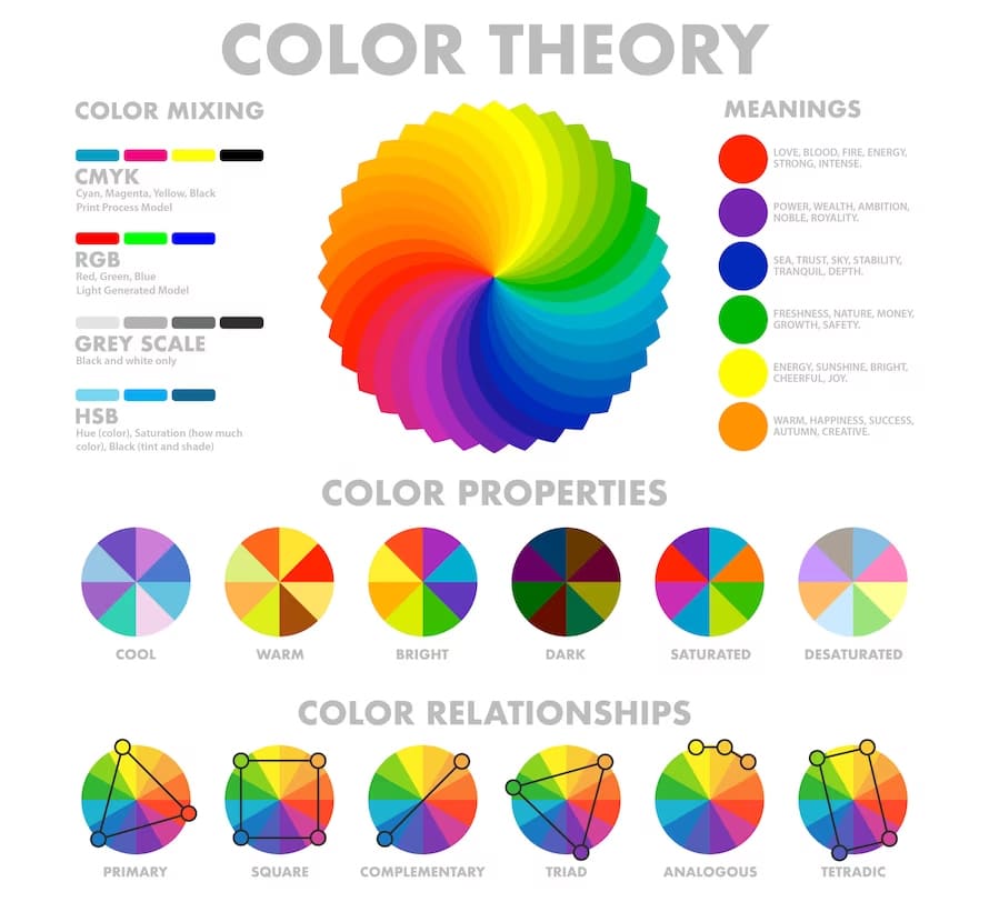
- The Color Wheel: At the core of color theory lies the color wheel, a circular representation of colors that helps us grasp their relationships. Primary colors (red, blue, and yellow) cannot be created by mixing other colors. Secondary colors (green, orange, and purple) result from mixing two primary colors. Tertiary colors emerge from combining a primary and a neighboring secondary color.
- Color Properties: Color has three primary properties: hue, saturation, and brightness. Hue refers to the actual color itself (e.g., red or blue). Saturation measures the intensity or vividness of a color, with fully saturated colors being the most vibrant. Brightness, also known as value, pertains to a color’s lightness or darkness.
- Color Harmony: Achieving color harmony is a central goal in design. Various color harmonies, such as complementary (opposite colors on the wheel), analogous (neighboring colors), and triadic (equally spaced colors), guide designers in creating visually pleasing compositions.
- Psychological Impact: Colors evoke emotional responses and influence perception. For instance, warm colors like red and orange tend to create excitement and energy, while cool colors like blue and green convey calmness and serenity. Cultural and personal associations also play a significant role in color psychology.
- Application: Color theory is employed in a wide range of design disciplines, including graphic design, interior design, fashion, and web design. By understanding color theory, designers can make informed choices that resonate with their audience, convey the desired message, and create visually stunning compositions.
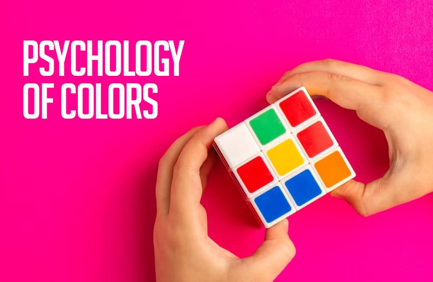
The Psychology of Colors
Understanding the psychological impact of colors is crucial in web design. Colors have the power to evoke emotions, influence decisions, and convey brand messages. In web design, the psychology of colors is a critical consideration that can significantly impact user experience, engagement, and conversion rates. Every color used on a website can convey specific emotions and messages, and understanding this can help designers make informed choices.
Firstly, the color scheme of a website sets the overall tone. For instance, a website with a predominantly blue color scheme can create a sense of trust and reliability, making it suitable for financial institutions or corporate websites. On the other hand, a vibrant and colorful palette might be more fitting for a creative or entertainment-focused site.
Call-to-action buttons often use bold and contrasting colors to draw attention and prompt users to take specific actions. Red or orange buttons, for example, can convey urgency and encourage immediate action, while green or blue buttons might suggest a more calming and reassuring approach.
- Emotional Associations: Different colors evoke various emotions. For example, blue is often associated with trust and calmness, while red can signify excitement or urgency. By choosing the right colors, designers can tap into these emotional triggers.
- Brand Identity: Colors play a pivotal role in defining a brand’s identity. Consider the bold red of Coca-Cola or the calming green of Starbucks. Consistent use of colors helps reinforce brand recognition and values.
- Cultural Significance: Colors can carry cultural significance. White, for instance, symbolizes purity in Western cultures but is associated with mourning in some Asian cultures. It’s essential to consider cultural contexts when selecting colors for a global audience.

Colors are more than just pretty decorations; they can affect how we feel and what we think. This is called the psychology of colors.
- Red is like a firetruck; it can make us feel excited or even a bit anxious. It’s often used to catch our attention.
- Blue is like the sky or the ocean; it makes us feel calm and relaxed. Many companies use blue in their logos to seem trustworthy.
- Yellow is like the sun; it makes us feel happy and energetic. That’s why it’s used for things like smiley faces.
- Green is like nature; it makes us feel refreshed and peaceful. It’s often used for things related to health or the environment.
- Purple is like royalty; it can make us feel fancy or luxurious. You might see it in high-end brands.
- Orange is like a sunset; it’s warm and fun. It can make us feel cheerful and excited.
- Black is like the night; it can be mysterious or elegant. That’s why it’s often used in fancy fashion.
- White is like a blank canvas; it can feel clean and pure. It’s used in hospitals and weddings to show cleanliness and simplicity.
- Brown is like the earth; it can make us feel warm and grounded. It’s often used in natural and rustic designs.
Remember, how colors make us feel can vary from person to person because we all have different experiences and feelings attached to them. But in general, colors can speak to our emotions and thoughts, making them a powerful tool in design and branding.
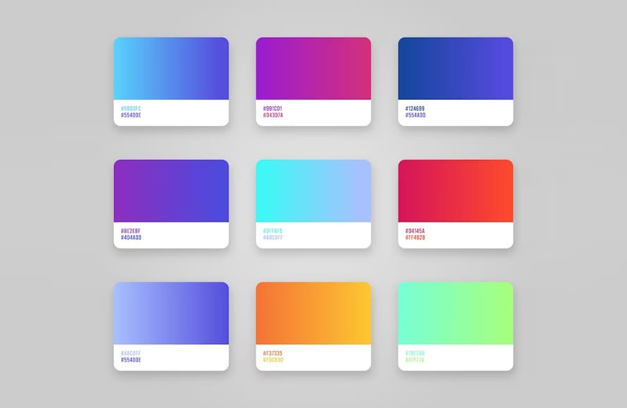
Choosing the Perfect Color Palette
Selecting the perfect color palette for web design is a critical aspect of creating a visually appealing and effective website. The choice of colors can significantly impact user experience, branding, and the overall message conveyed by the site.
- Project Goals: Start by understanding the project’s objectives and target audience. Is it a corporate website aiming for professionalism or an e-commerce site targeting a youthful audience? The answers will guide your color choices.
- Color Psychology: Refer back to the psychological impact of colors. If your goal is to create a sense of trust, blues and greens might be suitable. For excitement, consider warmer tones like reds and yellows.
- Accessibility: Accessibility is paramount in web design. Ensure that your chosen color palette complies with accessibility standards, providing adequate contrast for users with visual impairments.
- Testing: Test your color palette on different screens and devices to ensure consistency and readability. What looks vibrant on one screen might appear washed out on another.
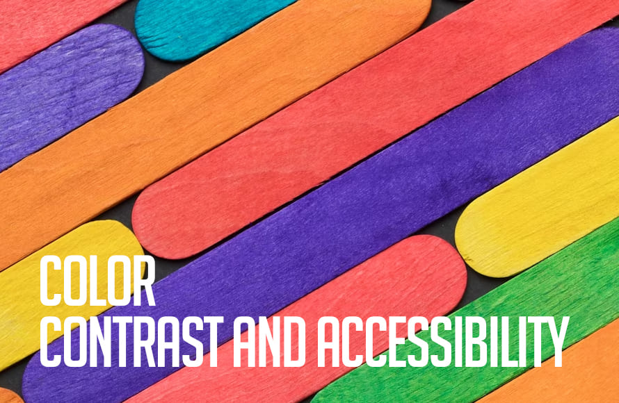
Color Contrast and Accessibility
Color contrast is an essential consideration in web design, not only for aesthetics but also for accessibility.
Harmony and contrast are essential principles in color palette selection. A well-balanced combination of colors creates a harmonious and visually pleasing design, while contrasting colors can be used to draw attention to specific elements such as call-to-action buttons or headlines.
Accessibility is another critical factor. Ensuring that the chosen colors meet accessibility standards is essential for making the website usable for all users, including those with visual impairments. Using tools like color contrast checkers can help maintain accessibility.
- Readability: High contrast between text and background colors improves readability. Dark text on a light background or vice versa is a common choice for content.
- Accessibility Standards: Adhering to accessibility standards, such as WCAG (Web Content Accessibility Guidelines), ensures that your website is usable by individuals with disabilities. These guidelines provide specific recommendations for color contrast.
- Testing Tools: Numerous online tools are available to evaluate color contrast. These tools can help you identify any issues and make necessary adjustments.
Typography and Color
Typography and color go hand in hand in web design. The choice of font and its color can significantly impact the readability and overall design of a website.
Typography refers to the choice of fonts, styles, sizes, and spacing of text on a website. It plays a crucial role in conveying the website’s tone and message. Fonts can evoke different emotions and associations; for instance, serif fonts are often associated with tradition and formality, while sans-serif fonts are seen as modern and clean. The right typography enhances readability and can guide users’ attention to important content.
Color, on the other hand, has a powerful impact on user perception and mood. It sets the overall tone of the website and helps establish brand identity. The combination of typography and color can reinforce the message and identity of a website. For example, a website for a children’s toy company may use playful, colorful fonts to match its vibrant color palette, while a law firm’s website may opt for a more conservative font and color scheme to convey professionalism and trustworthiness.
- Font Selection: The font you choose should align with your brand and project goals. For example, a playful, handwritten font may not be suitable for a corporate website.
- Font Color: Consider the contrast between text and background. Black text on a white background is a classic choice for readability, but you can experiment with other combinations as long as they meet accessibility standards.
- Hierarchy: Use color to establish hierarchy in your content. Headings and important elements can be highlighted with distinct colors to guide the user’s attention.
Color Trends in Modern Web Design
Web design trends are constantly evolving, including color trends. Staying up to date with these trends can keep your designs fresh and appealing. Here are some color trends that were prevalent in web design:

- Minimalistic Neutrals: Minimalism was on the rise, with websites often favoring neutral color palettes like whites, grays, and muted pastels. This created clean, elegant, and user-friendly interfaces.
- Dark Mode: Many websites introduced dark mode options to reduce eye strain and improve readability in low-light conditions. Dark backgrounds with contrasting text and vibrant accent colors became popular.
- Bold and Vibrant Colors: Vibrant, attention-grabbing color choices were used to make key elements like call-to-action buttons or headings stand out. These bold colors added energy and excitement to web designs.
- Gradients and Duotones: Gradients and duotones were used to add depth and visual interest to websites. They created dynamic backgrounds and drew attention to specific content.
- Sustainability-Inspired Colors: As sustainability became a prominent concern, websites started using eco-friendly color palettes, often featuring earthy tones and shades of green to convey environmental consciousness.
- High Contrast and Accessibility: Accessibility considerations led to an emphasis on high-contrast color schemes to ensure that websites were usable by all, including those with visual impairments.
- Custom Color Schemes: Brands increasingly adopted unique and custom color schemes to stand out in a crowded digital landscape and establish a strong brand identity.
Web designers often blend these trends to create unique and user-centric color palettes. However, it’s important to note that color trends continue to evolve, so staying updated with the latest design trends is crucial for creating visually appealing and relevant web experiences.
Case Studies
Let’s examine a few case studies to illustrate the practical application of color theory in web design:
- Apple: Apple’s website predominantly features a minimalist design with a clean white background. The use of white and grayscale colors aligns with their brand’s sleek and modern image.
- Spotify: Spotify’s green color scheme exudes energy and youthfulness, resonating with its predominantly young user base. The contrast between green and black enhances readability and usability.
- Airbnb: Airbnb employs a warm and inviting color palette, combining deep reds with soft blues and greens. This harmonious blend creates a sense of trust and comfort, essential for a platform that involves booking accommodations.
Tools and Resources
To master color theory in web design, you can leverage various tools and resources:
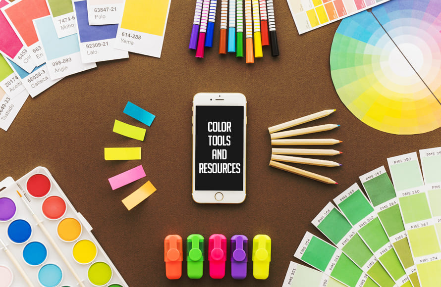
- Adobe Color Wheel: A user-friendly tool for creating color schemes based on color theory principles.
- Coolors: A color scheme generator that provides endless possibilities for color combinations.
- Color Hunt: A curated collection of beautiful color schemes for inspiration.
- Color Theory Books: Consider reading books like “Interaction of Color” by Josef Albers or “The Elements of Color” by Johannes Itten for in-depth knowledge.
Conclusion
In modern web design, color theory is not merely about aesthetics but also about creating meaningful user experiences. By understanding the basics of color theory, appreciating the psychology behind colors, and making informed choices in color palettes, contrast, and typography, designers can craft visually stunning and highly effective websites. As design trends continue to evolve, staying attuned to color preferences and accessibility standards is key to creating websites that stand out in today’s digital landscape.


")


