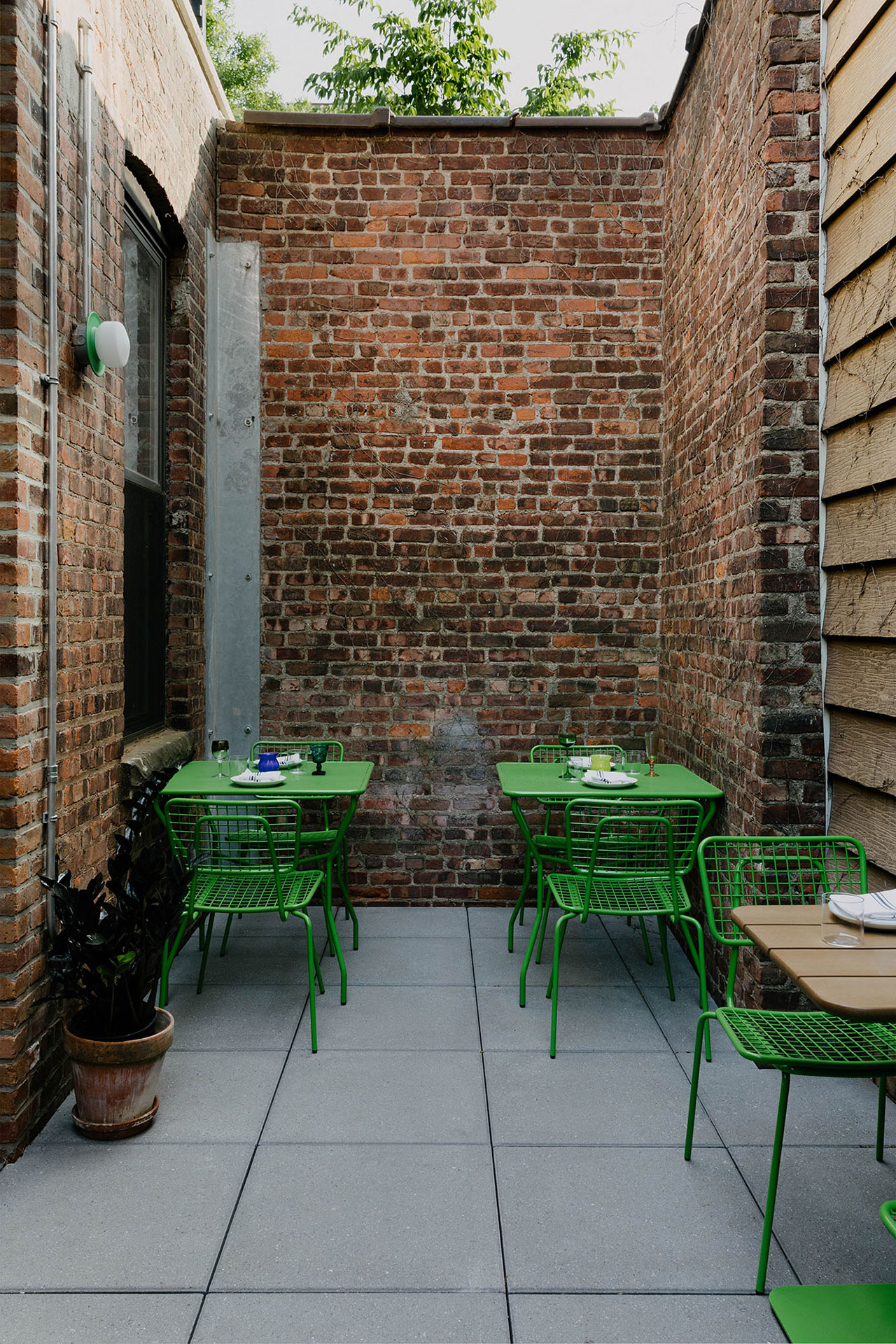


Bucking the idiom “too many cooks in the kitchen,” Café Mars represents the richness achieved when architecture marinates in collaborative effort across distinct disciplines. The founders and co-chefs, Jorge Olarte and Paul D’Avino, enlisted New York-based Format Architecture to help them deliver an experience in service to their culinary narrative, Italian-American heritage, and the Gowanus neighborhood – with a dash of Format’s signature geometry. Working closely together, the eatery’s design is made as bright as its featured flavors.

“We had many conversations with the chefs in the early stages of the project about food and memory, and the multi-sensory experience that is integral to a great meal,” the firm explains. “Through these conversations, inspiration pulled from food was less direct, but mindfulness to how a visitor would smell, touch, taste, and hear in the space, let alone what they see, was very important to materiality and adjacencies throughout the project.”
A memorable experience begins with the pasta die door handle sourced from D. Malardi & Sons, a local, third-generation and family-run macaroni die manufacturer. The detail serves to add charm to the new space while paying homage to the building’s history as a pasta factory and Italian grocery. The restaurant’s significance is also tied to the neighborhood by its location across from the first residence of D’Avino’s great-grandfather – an emigrant from Campania, Italy in 1901.
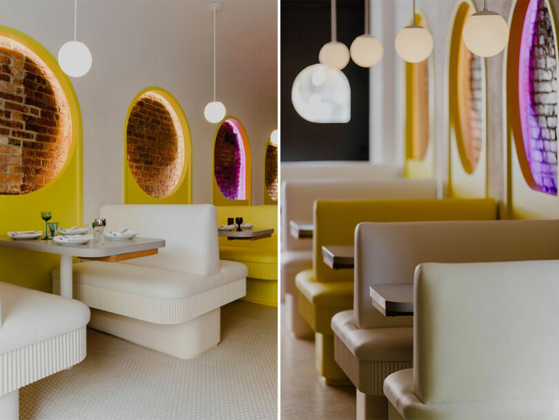
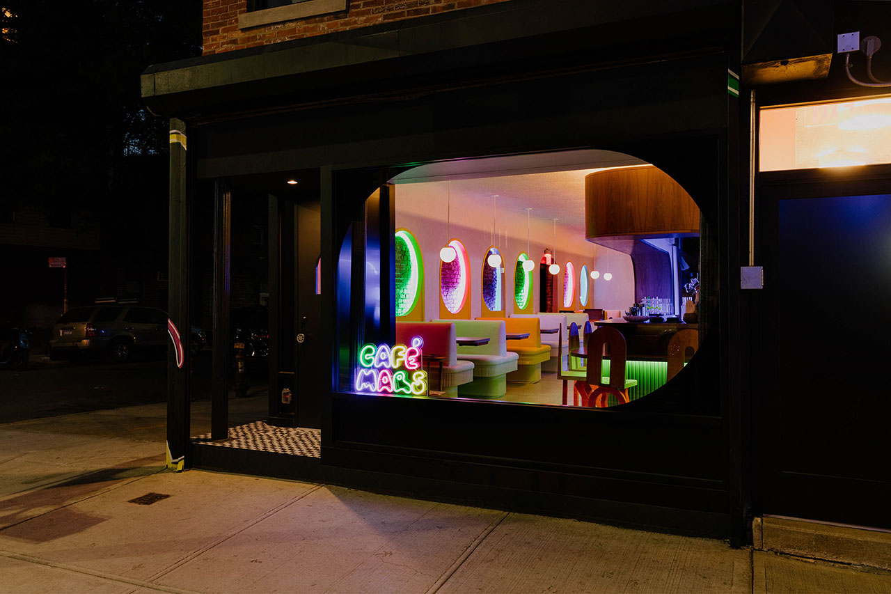
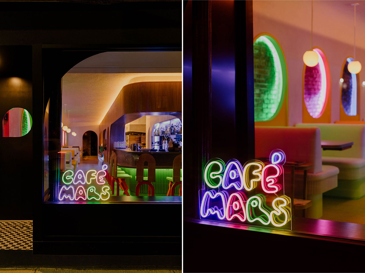
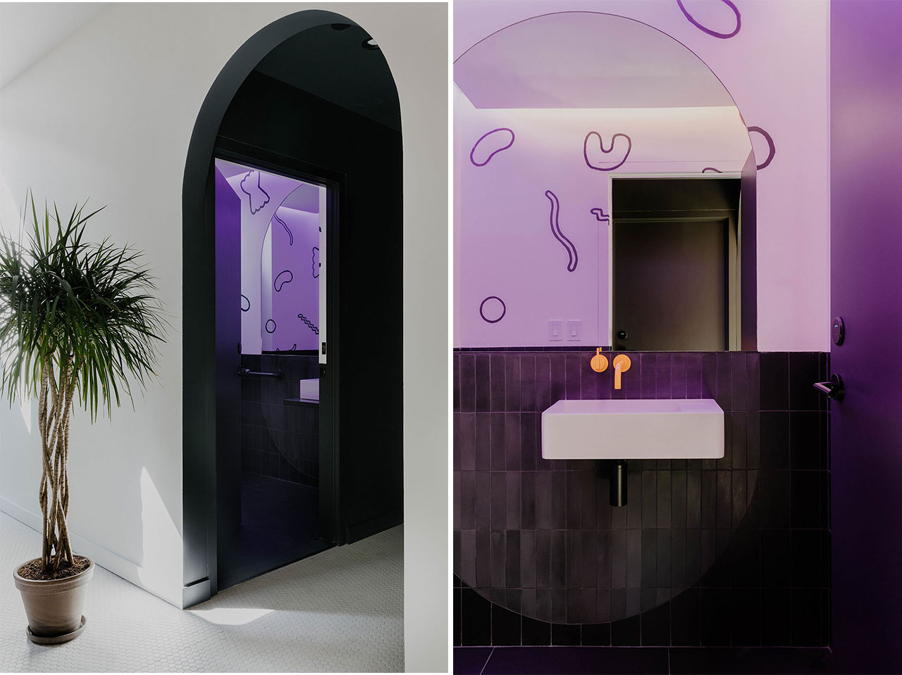
“At the beginning of the project, the chefs came to us with a large scrapbook of inspiration imagery from a broad array of disparate sources: Amalfi Coast umbrellas, neon signage from old Italian restaurants, film stills from Pee Wee’s Playhouse and Beetlejuice, Hobbit-holes, stained glass booth dividers in Chicago and New York dive bars,” the firm adds. “As we were finalizing the color palette for elements in the space, and researching fabrics and upholstery that would be appropriate for the seating and booths, the chefs came to us and said, ‘think Sesame Street,’ and very specifically referred to each hue derived from the main characters.”

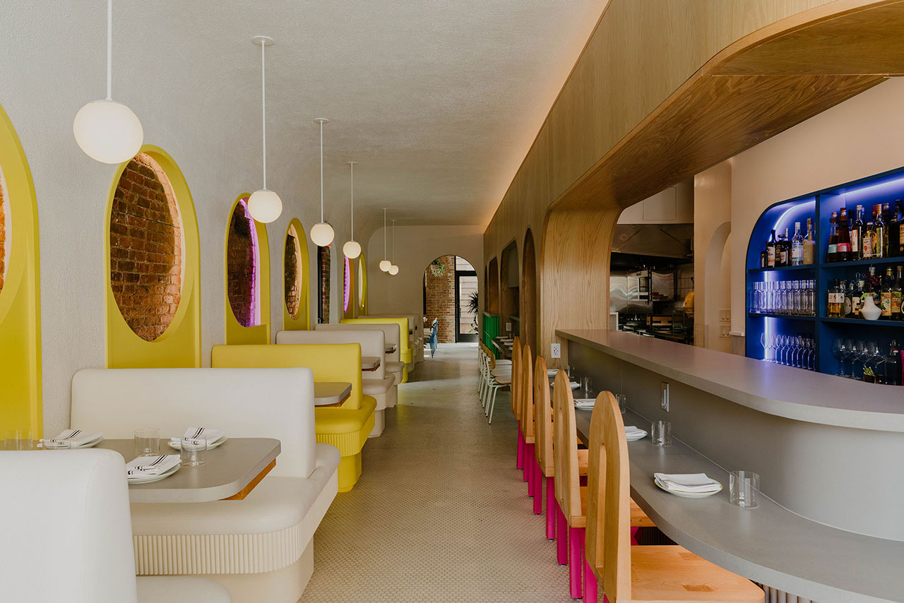
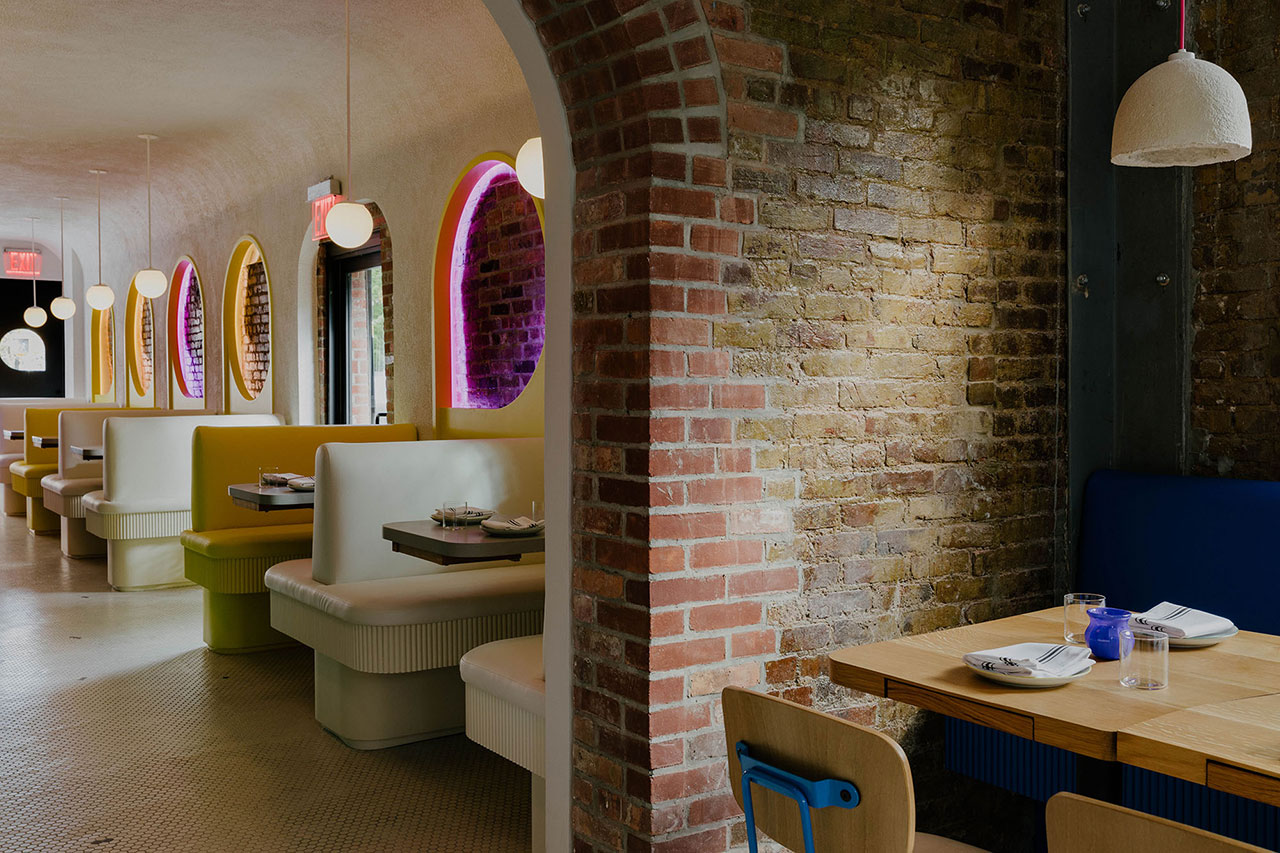
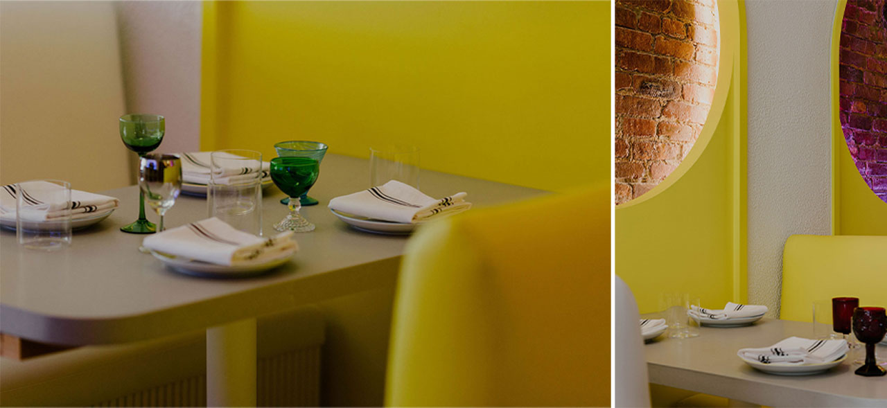
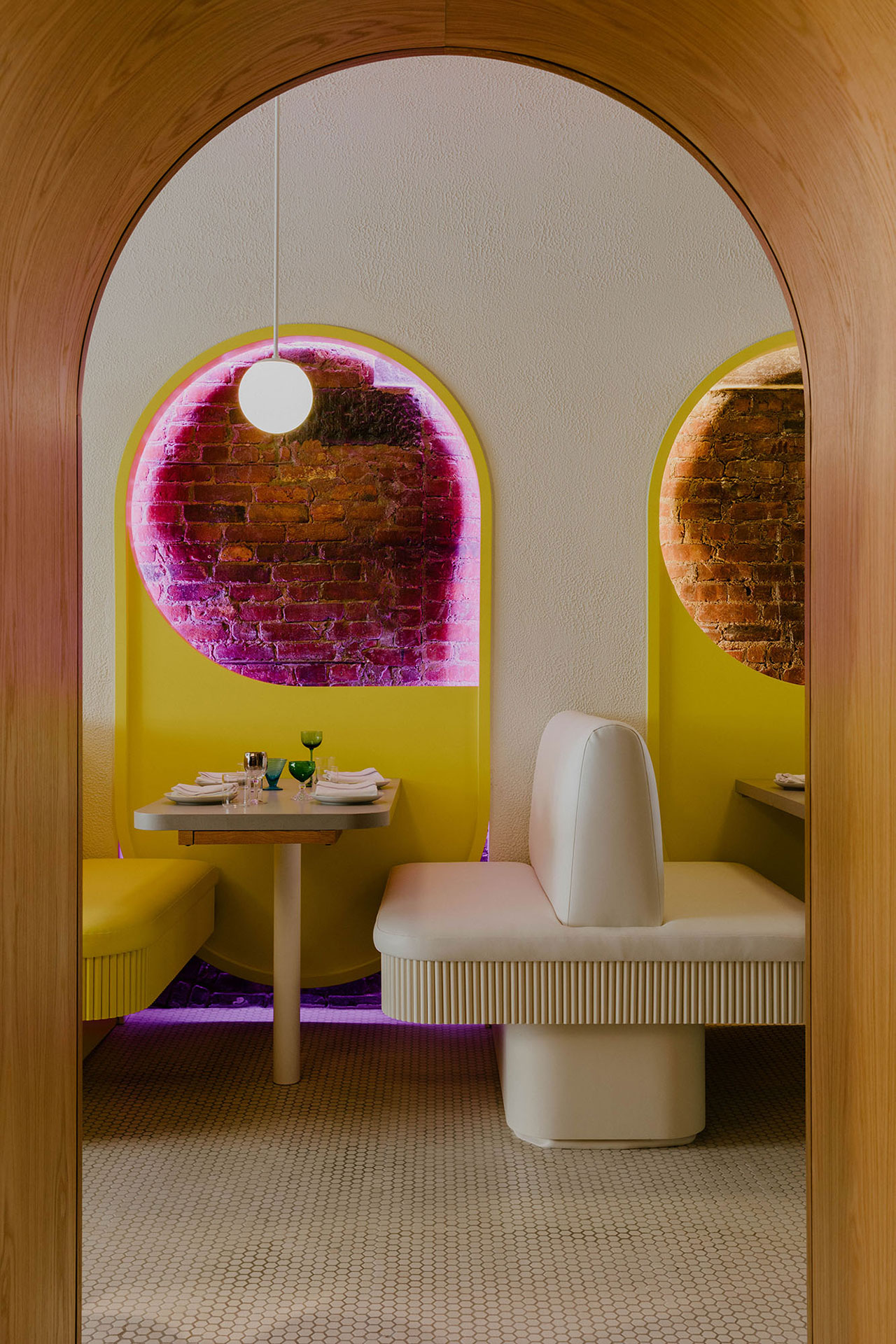
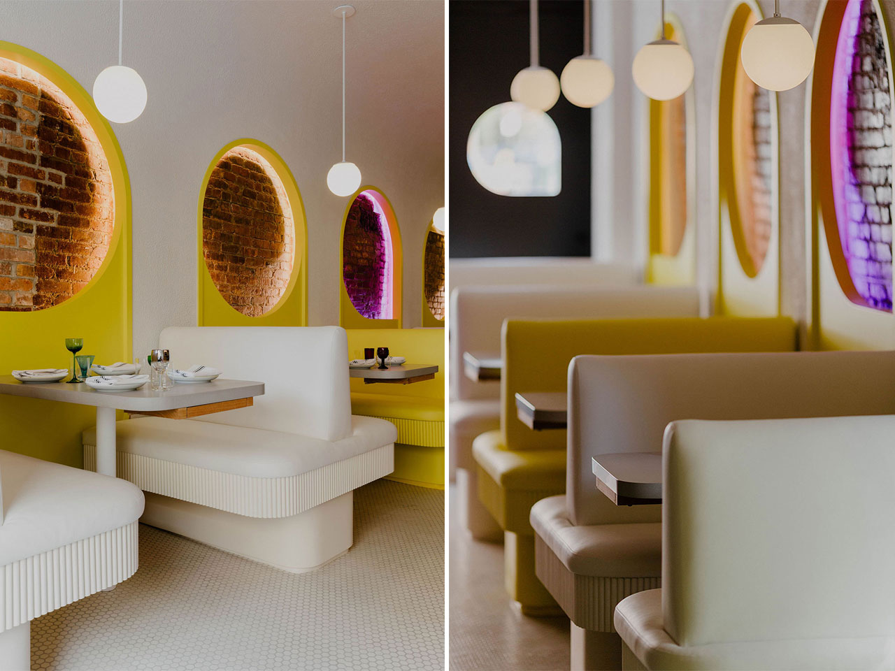
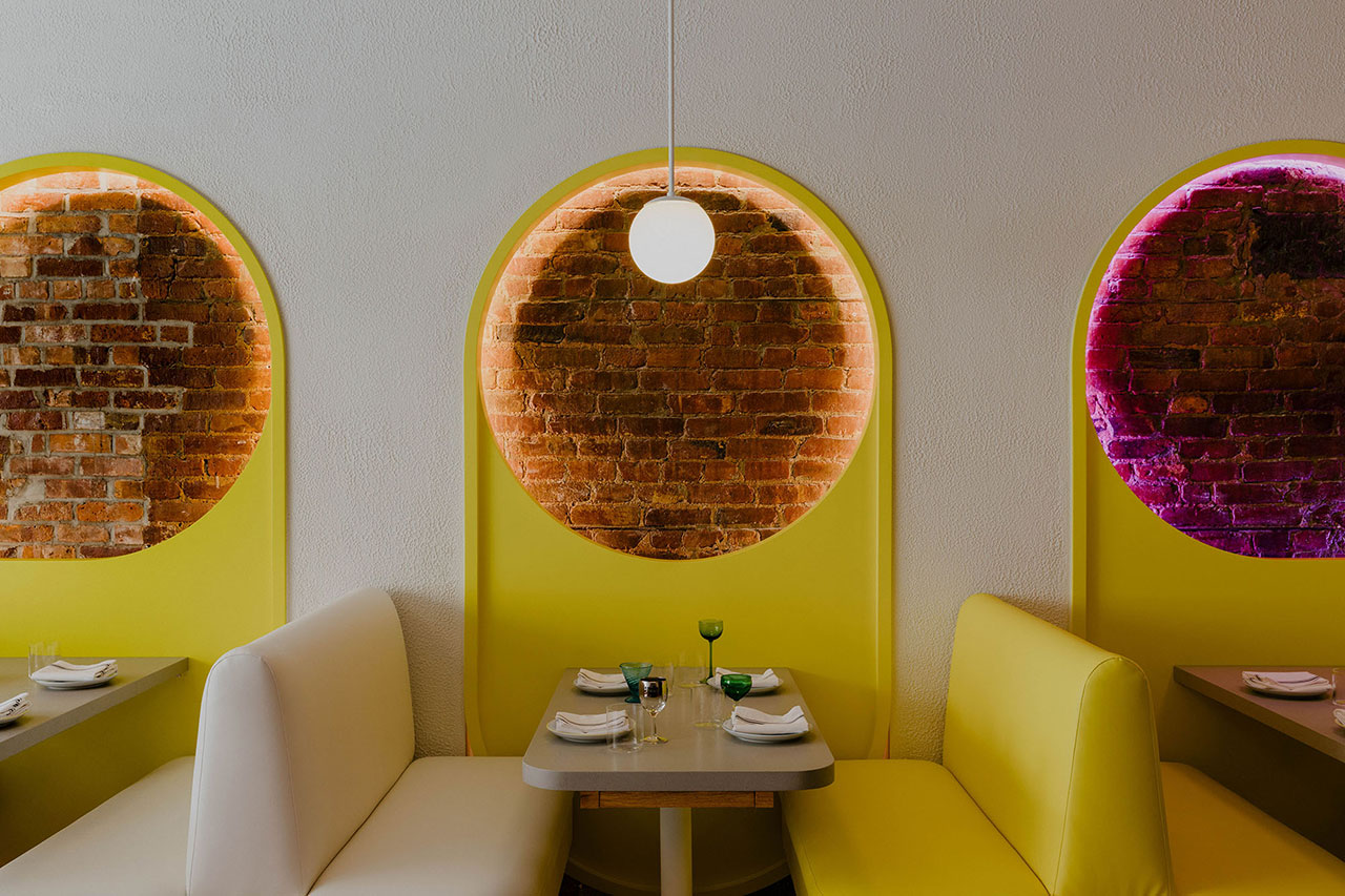
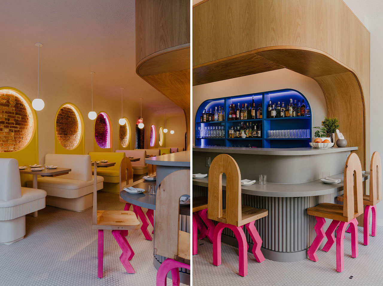
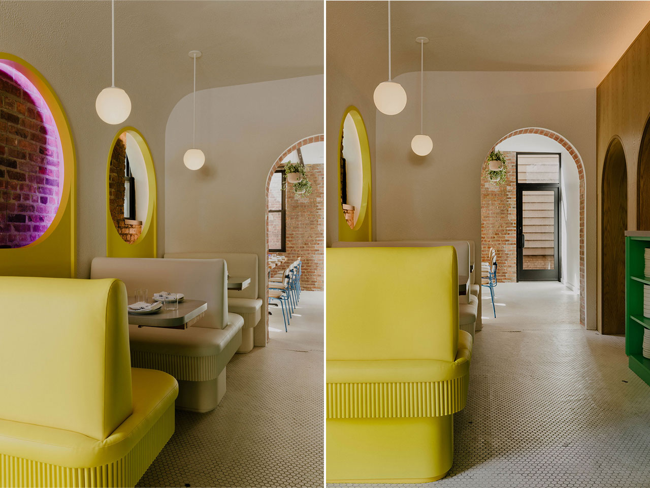
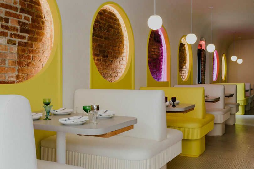
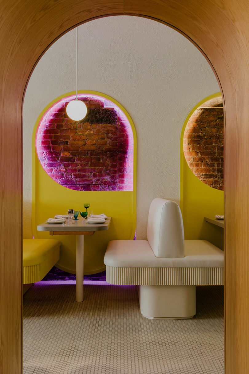
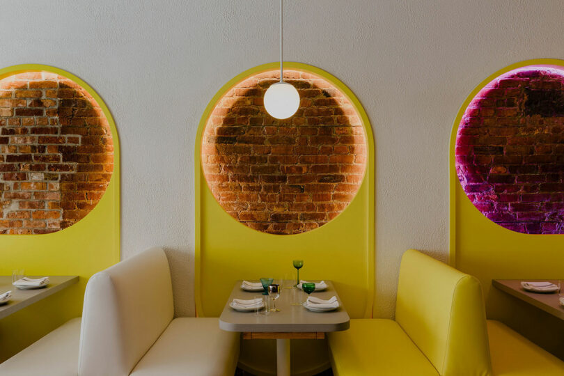
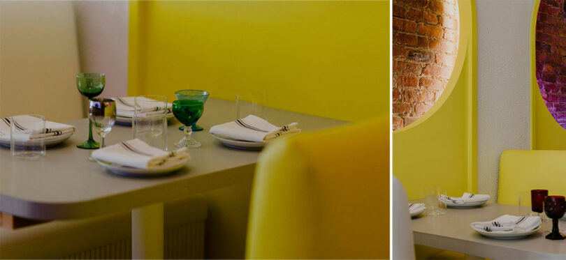
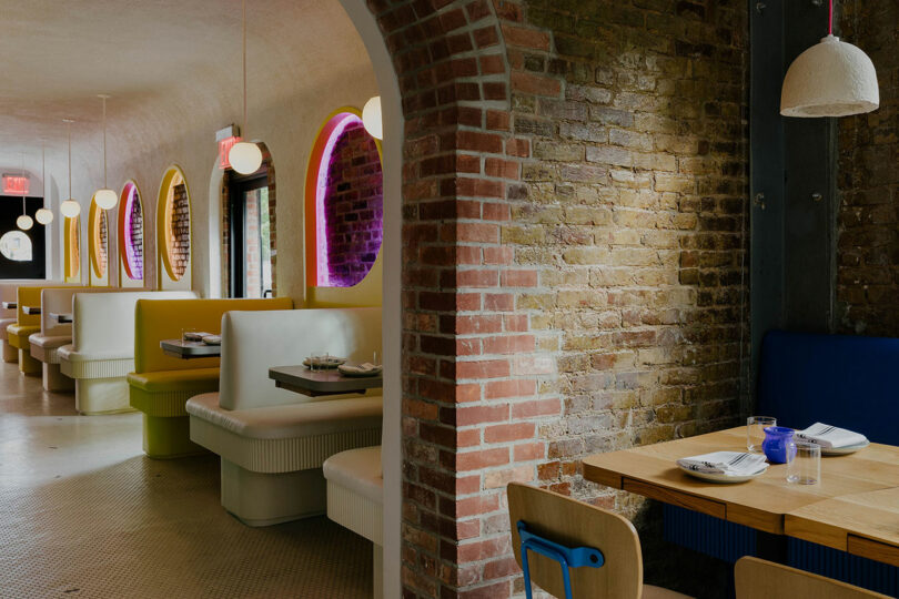
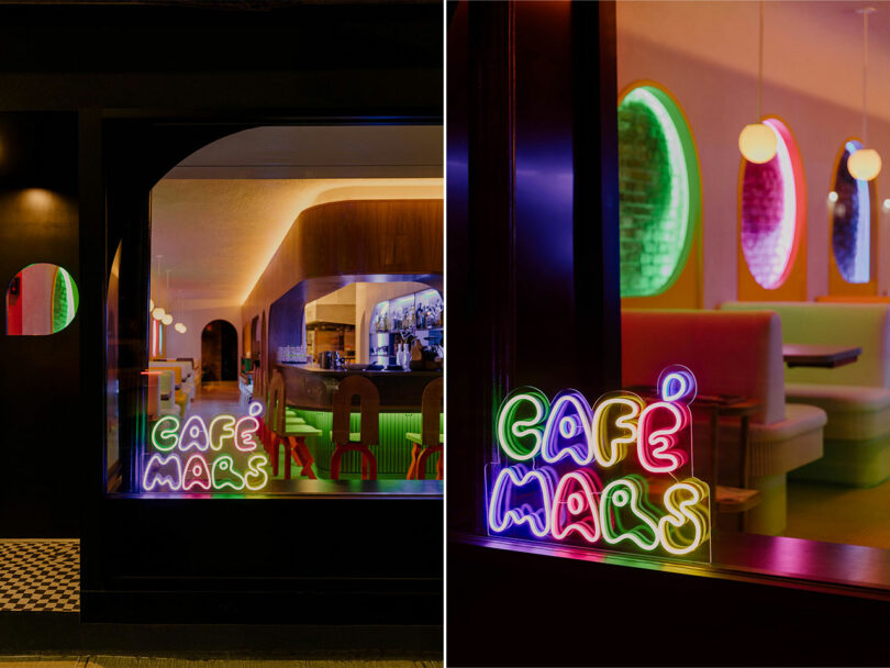
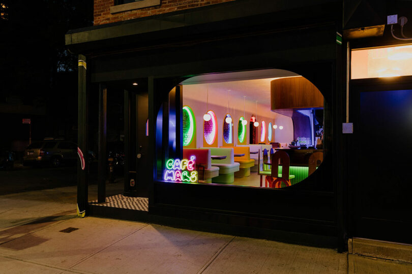
Asymmetrical yet balanced – and punchy – guests are pulled into a bright white front dining room that creates a long line of continuation through the length of the corner space. Flanking the left are six booths with custom Format yellow and white bench seatings illuminated by Andrew Neyer’s globe pendants. The original brick wall is made a backdrop at every table through colorfully backlit viewing portals punched out from an oblong yellow panel.
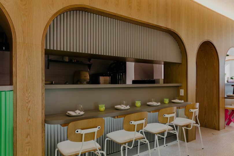

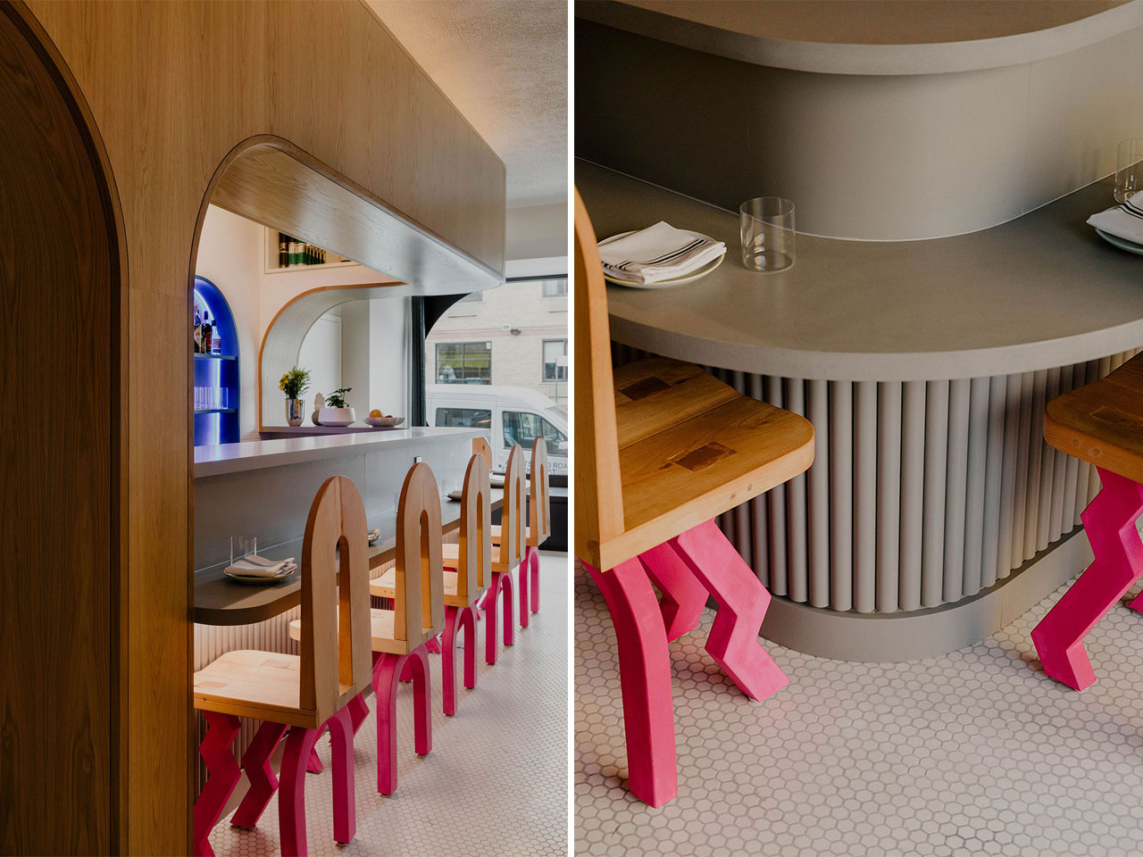
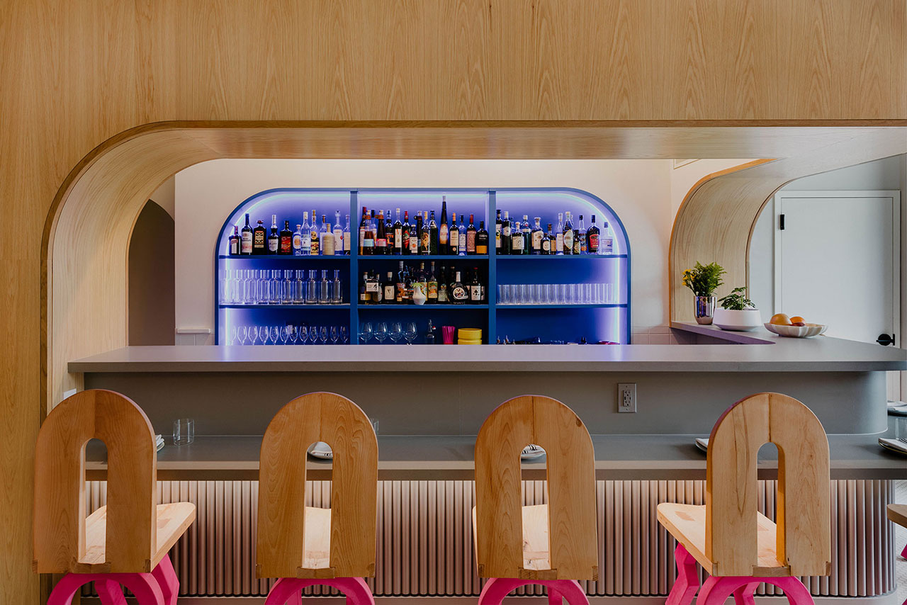
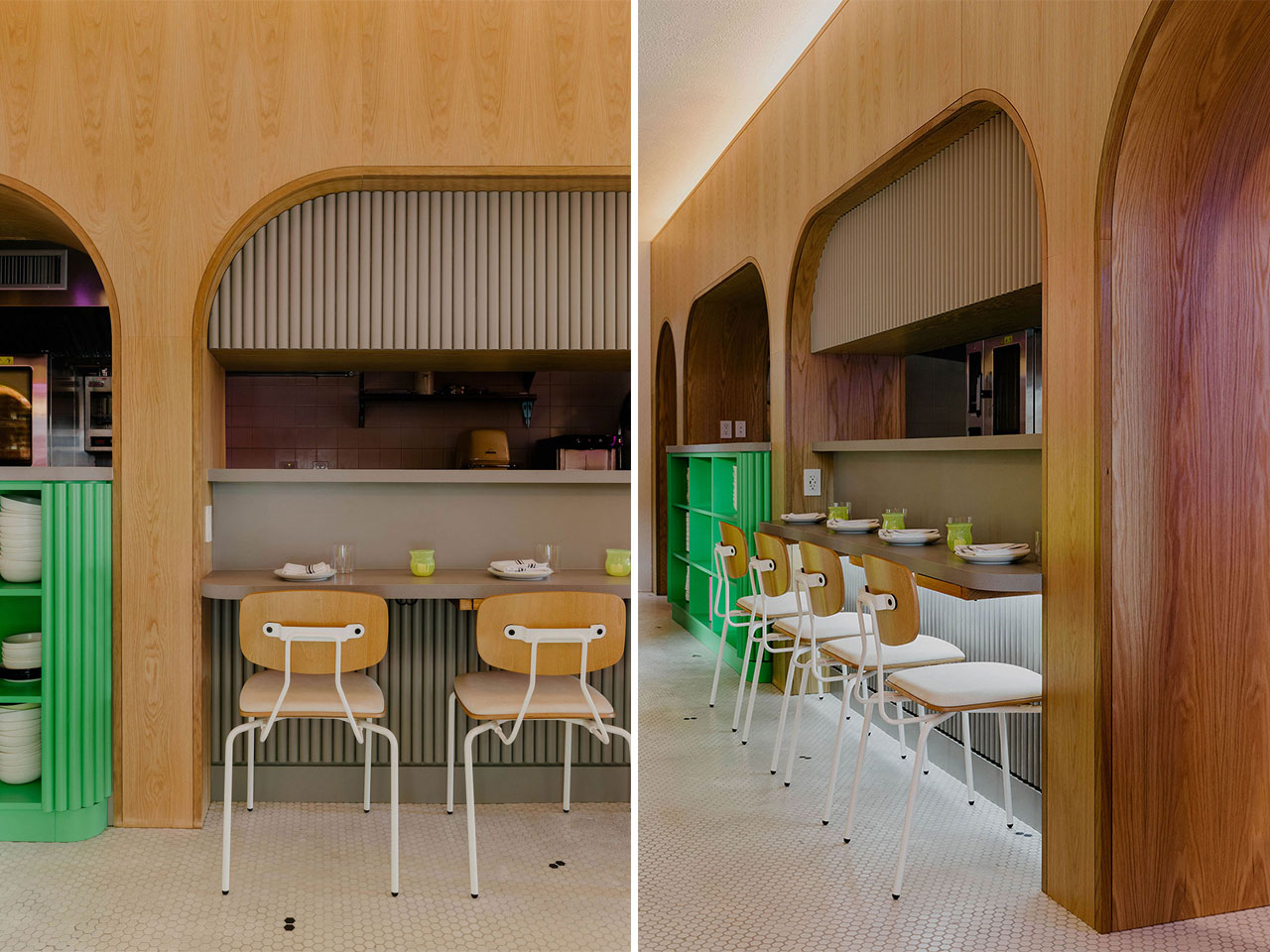
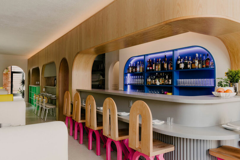
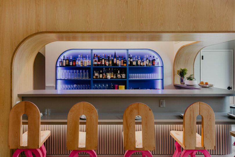
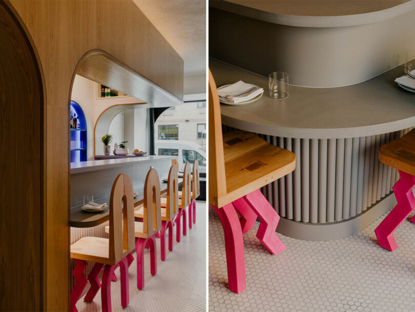
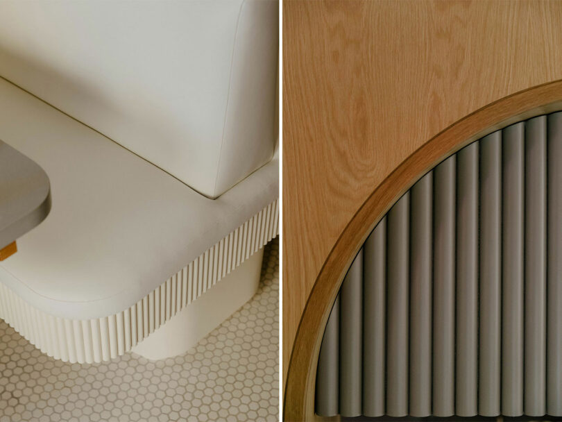
Opposite is the central bar followed by the adjacent open kitchen space, both separated by white oak paneled archways. The L-shaped, light gray counter area corresponds to a variety of curves and ribbed details from across the room while the dual tiered dining surface ensures a sense of privacy and comfort. Beyond is the cobalt blue bar outlined by LED lights. Studio Apotroes’ custom Phobos Dining Chairs, with hot pink zig-zag legs, and Grand Rapids Reece Chairs with white detailing are placed around the bar with a staccato rhythm.
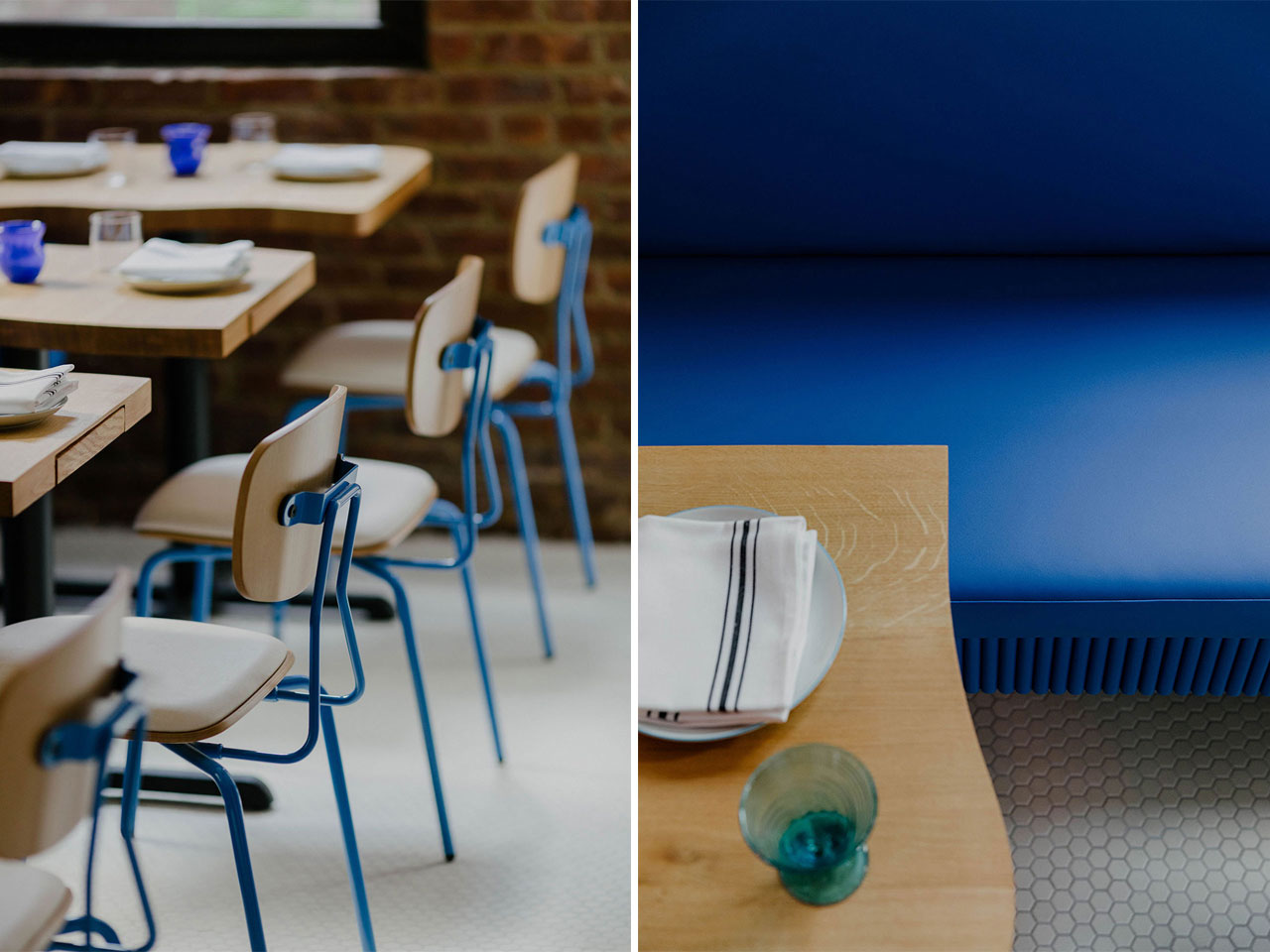
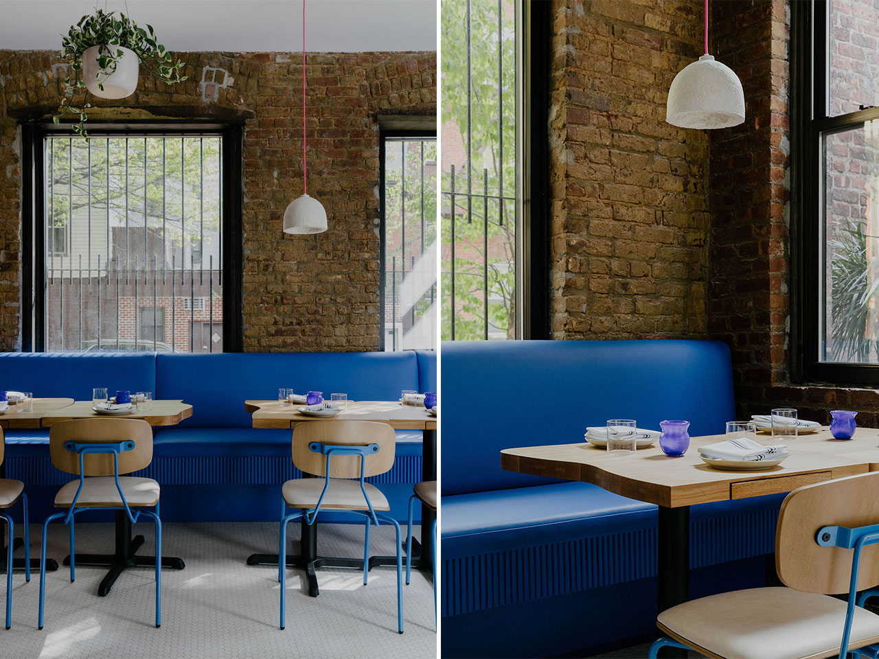
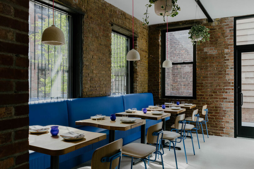
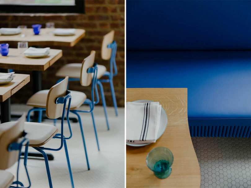
A visual rollercoaster continues as patrons venture to the Blue Dining Room at the restaurant’s rear and are greeted with a shift in materiality – generous fenestration, exposed brick, and white hexagon floor tiles. The upholstered cobalt blue banquette seating to the left is another Format-designed original and balanced by more Grand Rapids chairs, this time detailed in blue. MushLume pendants made of mycelium with hot pink wire accents hang above bespoke Todd Higuchi tables with curvy edges adding to unrelenting cheerfulness.

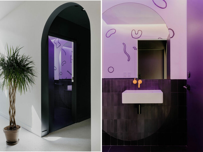

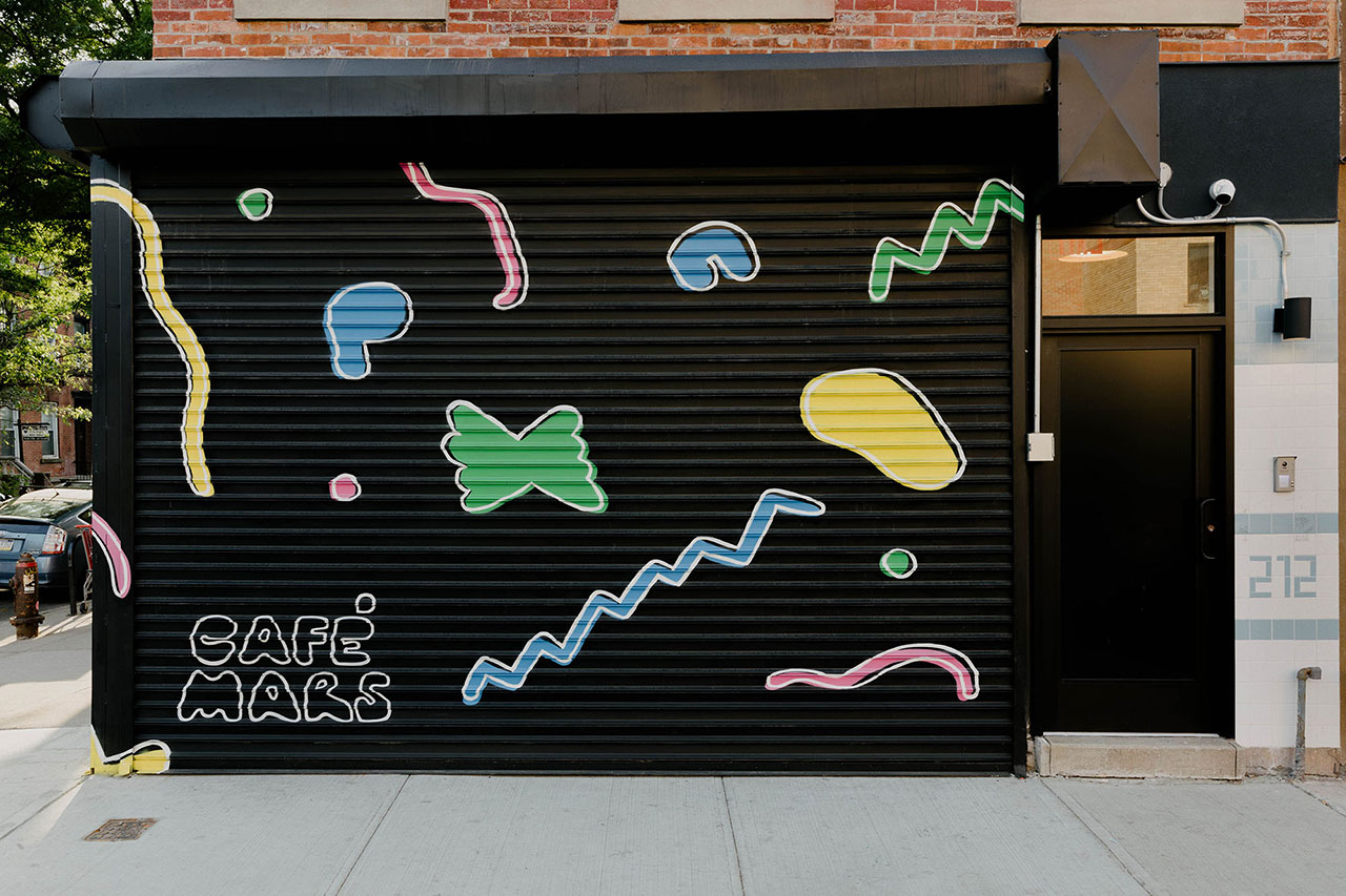
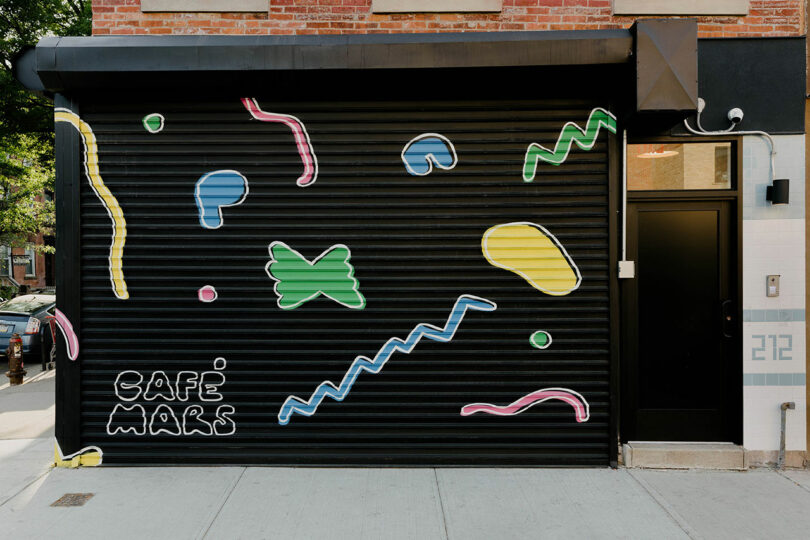
But architects weren’t the only creative forces brought in to realize this project. Artist Massimo Mongiardo was tasked to create a fresh visual identity, which included an original typeface, hand-painted pasta illustrations to adorn the entire restaurant, and neon signage. “Ultimately, the chefs had close ties with many local artisans and friends that they wanted to bring into the project directly, so this framework was really helpful for them to make sure everything felt cohesive and complementary,” the firm continues. “The earnest playfulness of this is indicative of the whimsy and joy that underscored the entire design collaboration with the chefs, and ultimately is embedded in the character of the space throughout.”
Photography by Nick Glimenakis.
This post contains affiliate links, so if you make a purchase from an affiliate link, we earn a commission. Thanks for supporting Design Milk!