The Element of Surprise in Website Design
You know that feeling when you visit a website, and it just sucks you right in? Almost like it reached out from the screen, grabbed you by the lapels, and said: “Listen up, you're in for something fresh.”
That unmistakable zing of the unexpected. That little jolt that sparks curiosity and keeps you glued to the page.
Surprise is a hugely powerful weapon in the crowded world of the web. It helps your site stand out from the dense thicket of boring business babble and uninspired design. It shakes people out of their content coma.
A little unpredictability goes a long, long way online.
Table of Contents
Building Anticipation and Pay-Off
The best kind of surprise isn't just a cheap gimmick or random shocker, in any case. It has weight and meaning. A good surprise tunes you in, making you lean forward in your chair.
Think about how movie trailers operate. They don't give away the whole bloody plot. No, they dangle just enough tantalising hints to spark your interest and anticipation. You get glimpses of the twist or climax without the complete payoff.
That's what an artful, well-designed surprise does on a website. It sets up anticipation and then pays it off gratifyingly, which delights you.
It's like hiding an unexpected animated flourish in the corner after someone hovers over an image for a few seconds. Fun little discoveries can brighten someone's day and stick in their memory.
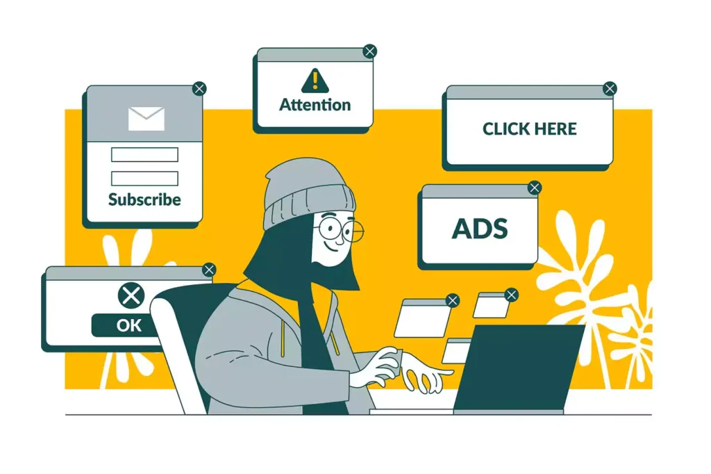
Counteracting “Banner Blindness”

Ah, but you might be thinking: “Don't we just zone out and ignore anything too gimmicky on websites nowadays?” Fair point, my friend. There is such a thing as “banner blindness” from seeing too many distracting ads and promos.
That's precisely why surprise must be judiciously applied with skill and restraint. Cheap parlor tricks won't cut it. You must lure people's focus in clever, understated ways they're not expecting.
For instance, you could design a striking visual anchor on a page that initially looks simple and understated. Then, after someone spends a few moments taking it in, you could trigger a subtle transformation or animation that highlights a key message or call to action.
The magic words here are “clever” and “understated.” Don't beat people over the head with in-your-face flash gimmickry. That's just cringe and ugly. Subtlety and wit will get you much further.
Adding Both Delight and Function
The thing is, an excellent website surprise can't just be empty frosting. You've got to balance the moment of delightful unexpectedness with straightforward functionality and substance. Otherwise, it'll feel like a goofy but pointless stunt.
Do you know those little micro-interaction animations that play when you successfully add an item to your online cart? That's a perfect example of surprise in service of both joy and utility.
First, there is a small burst of satisfaction from the slick movement and animation flair. But that little visual reward directly reinforces the critical interaction of adding something to your cart – the core function of any e-commerce site.
That harmonious blending of visual pizzaz and clear purpose? Chef's kiss. That's the sweet spot for nailing a well-designed website surprise.
Personality Shining Through

At the deepest level, a well-executed surprise showcases the designer and the brand's personality. Because surprise has a revelatory power, it peels away the formal, polished surface and lets an authentic voice shine through.
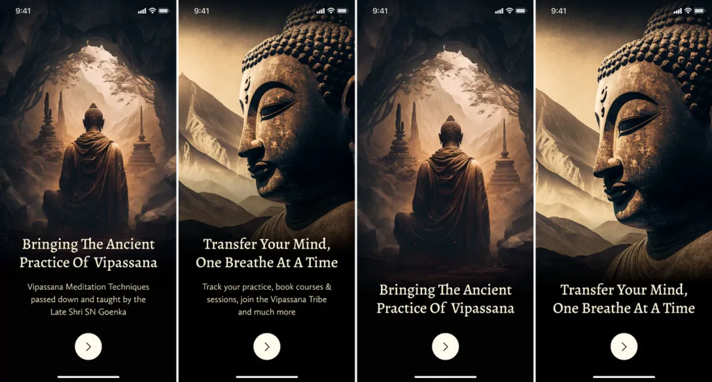
Take a look at Dhamma, a UK meditation app. Their website epitomises zen minimalism: soft nature imagery, lots of breathing room and whitespace.
But then bam! Their mascot pops up in random places – a cute, characterful moustachioed monster who makes surprised facial expressions when you hover over him. It's a delightful touch of quirky personality that contrasts with the otherwise calm, meditative aesthetic.
By letting that playful monster loose on their site, Dhamma humanised their brand and let their unique mascot character shine through in a memorable, engaging way.
Adding Texture and Dynamism
Another powerful effect of sprinkling in some judicious surprise? It can make a website's overall experience feel richer, more textured, and more dynamic – like you've escaped the flat, two-dimensional bounds of a typical web canvas.
Rather than endlessly scrolling through flat grids of content modules, you unlock an added dimension of interaction, movement, and a dash of whimsy.
This is where that surprise animator on Dribbble, Pablo Stanley, is an absolute master. His shots create these delightful little responsive vignettes, full of charming character animations that spring to life as you scroll and click around.
Surprise brings a sense of vibrancy and depth into what could've just been static illustrations or interfaces. His delightful signatures, like squash-and-stretch animations and snappy transitions, elevate his work from merely “digital” into feeling genuinely alive and tangible.
The Power of Mystery and Revelation
Speaking of flat boredom versus textured intrigue, guess which one sparks and holds people's attention better? If you answered “intrigue,” you get a gold star.
Adding in a hint of mystery and something to be revealed is the recipe for an irresistible surprise. Case in point? In my opinion, the god-tier example of website surprise mastery is Craig Mod's outstanding portfolio site.
From the moment it loads, you're greeted with a surreal scene that seems ordinary enough initially: a rotating view of a contemporary apartment interior. But very quickly, things get intriguingly… off.
Why are all the chairs floating mid-air? And what's up with those minimalist human figures? Things grow increasingly otherworldly, mysterious, and fascinating as you cycle through different perspectives on the scene.
Your curiosity is piqued. You're drawn into exploring further until Craig's signature work and “about” section is gradually revealed. It's enthralling and beautifully executed – not to mention a bold, memorable way to make a first impression as a designer.
Giving Personas & User Journeys Texture

What if you want the element of surprise to shine through the entire structure of your website's essential user journeys? Being more purposeful and strategic about inserting “wow moments” throughout someone's path can elevate their experience tremendously.
For instance, say you're an architect trying to showcase your firm's design chops. You could map out your site to guide visitors through a structured journey punctuated by sudden full-screen transitions unveiling dramatic renderings or virtual facility tours synced to revelatory moments in your storytelling.
Or you're a travel agency selling custom adventure packages. You could tempt people down an immersive path peppered with sights, sounds, and even localised language snippets from their dream destinations – while deftly weaving in relevant product info.
The basic idea? Rotate through short bursts of focused attention, then trigger more significant, jaw-dropping revelations as people progress deeper into your funnel. It adds an exhilarating sense of momentum and a rich, multi-sensory dimension.
Ideas for Striking Surprise Elements
Hopefully, by now, you'll feel inspired to integrate surprise creatively! To spark your imagination, here are some distinctive surprise elements top sites deploy:
Motion & Animation
- Unexpected hover animations on graphics/images
- Subtle kinetic effects: particles and textures that liven up backgrounds
- Triggered animated sequences that accompany key interactions
Layout & Navigation
- Distinctive animated transition effects between page loads
- Surprising navigation patterns: horizontal sliders, randomised layouts
- Sections that dynamically rearrange elements or unfold additional content
Storytelling with Reveals
- Dramatic scroll jacking for setting scenes and narrative “beats.”
- Visual reveals and layers that strip away as someone progresses
- Multimedia elements like audio, video, and voice-over emerging at critical moments
Audio & Haptic Expression
- Immersive positional 3D audio environments
- Tasteful use of sound effects adding satisfying accentuation
- Creative haptic feedback brought to life through vibrations
Novel Interactions & Navigation
- Distinctive scrolling behaviours: inertial physics, parallax, anchoring
- Personification & character guides leading users through journeys
- Conversational user interfaces and surprising chatbot interactions
Extreme Niche Aesthetics or Treatments
- Taking a no-holds-barred creative direction with visuals & branding
- Pushing the limits with daring layouts & asymmetric grid treatments
- Heavily stylised vector art, illustration, and animation treatments
The Risks: Avoiding Gimmicks & Annoyance
As we've covered, injecting calculated surprise into your site can enliven the user experience and set your brand apart with a distinctive, memorable point of view.
But you've got to strike the right balance. There's always a risk of going too far into showy, gimmickry or downright disruptive territory.
When Surprise Crosses the Line
Some red flags that your surprises might be overwhelming rather than welcome:
- Excessive Animation: Long-playing looping sequences bombard people with frenetic movement and chaos.
- Aggressive Audio: Loud noises and music blaring unexpectedly. Music autoplay is one of the most reviled web crimes.
- Seizure-Inducing Effects: Rapid strobing visuals that could legitimately trigger seizures or vertigo. Make sure to avoid these at all costs.
- Utterly Random Shock Moments: Bizarre jump scares or non-sensical visuals that feel gratuitous rather than thoughtful.
- Friction-Filled Interactions: When interactions that should be simple are made convoluted and aggravating by ill-considered surprise executions.
The golden rule? Surprise should add joy and delight – not frustrate or assault the senses. If you wouldn't enjoy it as a user, it's likely too heavy-handed.
Finding the Right Balance
To walk that tightrope of surprise done right, you need to:
1) Have purposeful restraint – Be selective with how many surprise moments you include, and space them out judiciously. Too much, and it cheapens the effect.
2) Prioritize usability over flash – Don't sacrifice core usability or clarity for unnecessary surprises.
3) Make it meaningful & contextual – Surprises succeed when they enrich and harmonise with your brand story and messaging. Random whiz-bangery falls flat.
4) Know your audience – Certain audiences may appreciate edgier, more avant-garde surprise stylings. Others seek reassuring familiarity. Design appropriately.
5) Obsess over polish & craft – Amateur execution kills the magic fast. To truly dazzle, sweat the details and strive for effortless refinement.
Ultimately, strive for that coveted “Ooh, cool!” reaction from people – that bursting of momentary wonder at an experience crafted with aplomb. That's the potent sweet spot.
A Little Surprise Goes a Long Way

In this age of infinite web scrolling and social Over-Stimulation, it's understandable why some folks might bristle at too many online stunts vying for their ever-dwindling attention.
That's precisely why subtlety, tastefulness, and artful timing are vital when designing delightful surprises. Because done with finesse and purpose? A few sparingly-used, well-executed surprise moments can refresh a digital experience.
Just ask any skilled filmmaker, choreographer, magician or novelist – this element of surprise transcends any one medium or discipline. When wielded by a master, it's the key to artfully capturing and elevating the human experience.
So embrace the power of the unexpected, my friends—craft with empathy, wit, and a mischievous twinkle in your eye. Elevate your digital canvases with moments of striking surprise that leave people grinning, inspired, and just a tad more awake to the wonder around them.
FAQs on the Element of Surprise
How do I prevent surprise elements from slowing down website performance?
The key is deploying surprises judiciously and optimising any demanding media assets like animations, videos, and sounds. Techniques like lazy-loading, compression, and efficient caching can mitigate excessive page bloat. Testing iteratively is crucial.
Are there accessibility concerns with surprise moments?
Autoplay video/audio, flashing visuals, scale/orientation shifts, and aggressive motion can impact accessibility negatively. Always follow WCAG guidelines. Consider toggle/preference options, allowing users to turn off surprising experiences if needed.
How can I gather user feedback on surprise experiences?
A/B testing will illuminate whether surprise moments resonate as intended. You can also solicit direct user feedback via surveys, heatmaps tracking engagement, and session recordings revealing when/how people encounter the surprises naturally.
Won't surprise moments just become cliché over time?
Like any creative technique, the element of surprise requires constant rejuvenation and evolution to remain impactful. But its fundamental psychological potency is durable. By keeping surprises fresh, unique, and purposeful – they retain power.
Where can I find inspiration for excellent surprise design in action?
Explore awwwards.com, which curates cutting-edge websites, deploying surprises brilliantly. Also, check out the motion design work on Dribbble, CodePen & other communities. Finally, Apple has interwoven seamless, delightful surprises into many of their hardware/software experiences over the decades – a masterclass.
