An In-Depth Look at Material Design
Material Design is a visual language and design system created by Google to guide the design aesthetics and user interface interactions across its products and services. First unveiled in 2014, Material Design aims to incorporate the classic principles of good design with innovation and technology to develop a visual language that is:
Responsive Across Different Devices and Screen Sizes
With responsive standards and flexible layouts, Material Design interfaces can reformat and rearrange seamlessly across smartphones, tablets, and desktops – regardless of the screen size. The design language was developed with a “mobile-first” ideology to optimise the user experience.
Intuitive Interactions and Animations
Intuitive, meaningful animations and transitions guide users through the product and inform them of results. The animations are crisp and responsive to every interaction.
Bold, Graphic, Imaginative Visual Style
Vibrant colours, dramatic imagery, and large graphic shapes characterise the visual style. Typography is straightforward, bold and easy to read. There is an emphasis on large images to create visual impact.
By applying these core principles in thoughtful, innovative ways – Google developed a design system that made its products more usable, beautiful and consistent across platforms. Material Design is an industry-standard, inspiring UI designers globally across software and technological services.
Table of Contents
History Behind Material Design

Google had acquired and developed a vast empire of products and services by 2014 – but the design language and user experience across their offerings lacked cohesion. As Google expanded into new frontiers like wearable technology (Google Glass) and intelligent home products (Nest), they recognised the need for a new universal design language flexible enough for any platform.
Moving Towards “Unified Cross-Platform Experience”
The executive chairman of Google, Eric Schmidt, spearheaded the need for consistent design across Google's interfaces during a strategy meeting in 2013. Schmidt envisioned that users could have fluid, intuitive interactions across smartphones, smart cars, and intelligent watches – moving users seamlessly to whatever interface they needed.
This unified UX strategy required an adaptable yet opinionated visual style to tie Google's diverse products together. Material Design was the design system solution.
Matías Duarte, Vice President of Design
Google found their design leader in Matías Duarte, vice president of design at Google. Duarte had a strong background in designing unified user interfaces, having previously led the user experience design for Palm and Android.
The “Quantum Paper” Metaphor
Duarte and his team developed “Quantum Paper” as a conceptual metaphor to guide Material Design principles. Imagine if all digital interfaces lived on a malleable, intelligent “paper” that could reshape itself to whatever users needed at the moment.
This metaphor helped the design team incorporate contemporary principles of tech capabilities with classic, identifiable materials like paper.
Fundamental Principles Behind Material Design

With aspirations of developing an adaptable yet consistent UI language – Duarte outlined three foundational principles to anchor Material Design:
1. Tactile and Tangible Surfaces
Material Design draws inspiration from the physical world – ink and paper textures, shadows, edges and shapes. A sense of tactility establishes familiarity with otherwise digital interfaces.
For example, buttons and clickable elements lift or move to mimic physical buttons being pressed. Surfaces recreate textures like paper. Light and shadow establish spatial relationships.
This tangible sensibility helps users interact with interfaces more intuitively. Actions have appropriate, familiar reactions. Digital interactions start to act more lifelike.
2. Bold, Graphic, Intentional Design
Vibrant colors, dramatic photography and curated iconography, infuse the interfaces with energy and personality. Typography is straightforward, bold, and accentuated.
Shapes tend to skew wider, cards stand out prominently, and image assets are encouraged to fill space. This amplifies the scanability, clarity and recognizability of UI elements. Streamlined menus prevent choice overload.
Overall – the visual style aims to be bold and opinionated – improving usability with decisive, graphic interfaces.
3. Seamless Motion Provides Continuity
Every action causes an appropriate, corresponding reaction in the UI. Animations and transitions provide continuity between interfaces to prevent abrupt, disconnected changes across products. The motion guides users fluidly across experiences – maintaining context and relationships.
For example, when an Android user clicks the app icon to open an app, the icon seamlessly transforms into the expanded app window itself. This smooth motion demonstrates continuity from icon to app, clarifying the relationship.
This emphasis on animated motion builds intuitive causality across interfaces. Users develop mental models that transition between actions and will have logical continuity.
Implementing Material Design: Surfaces, Space and Movement

With those core principles established as the philosophical pillars – Duarte and his design team began implementing Material Design across Google's existing apps and services.
They identified three critical elements of interface layouts that could incorporate the foundational principles: surfaces, space and movement.
Surfaces – The canvas where icons, buttons, menus and information reside. Surfaces include cards, sheets, and tabs.
Space – Defines spatial relationships and hierarchy across surfaces using principles like depth, shadows and elevation.
Movement – How users navigate surfaces using taps, swipes and transitions.
Let's explore how Material Design philosophies manifest across these three critical elements of digital interfaces:
Material Design Surfaces
Surfaces in Material Design refer to the canvas and components where content and actions live.
Some critical surfaces include:
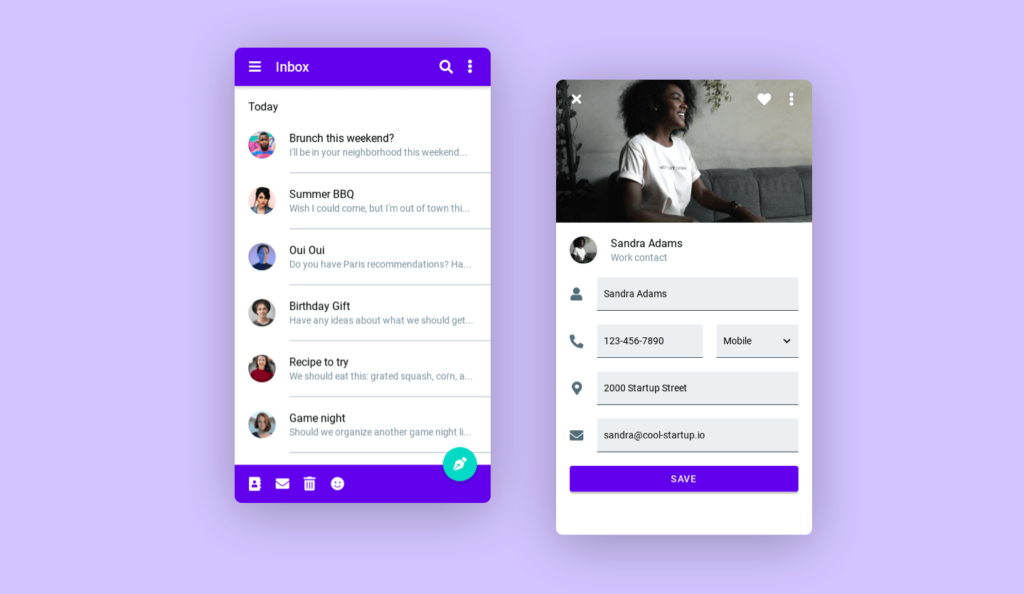
- Cards – Contained units of information and actions, usually with rounded corners
- Sheets – Surfaces containing supplementary details that expand from the bottom of the screen
- Tabs – Horizontal segments organising content into categories
- Buttons – Circular or rectangular surfaces that initiate actions
These surfaces provide flexibility to contain anything from text, inputs, imagery or icons. By framing content on intentional surfaces like cards and sheets with rounded corners – the information feels tangible, contained and scannable.
Spatial Relationships Establish Hierarchy
Space refers to the spatial relationships across surfaces on interface layouts. Elements higher on the spatial plane feel closer to users; items lower feel further away. For example, raised buttons and cards appear controlled by the user; surfaces embedded at the bottom appear supplementary.
Spatial hierarchies clarify relationships and guide visual importance across interfaces. Fundamental spatial relationships in Material Design include:
Elevation – Height of surfaces of the layout plane
Light and Shadow – Light sources interacting with surfaces indicate space
Z-Axis Depth – Overlapping elements show depth
Lift, depth and overlap make digital interfaces feel multi-dimensional. Users can accurately perceive functional groups and hierarchies across even cluttered layouts.
Motion Guides User Actions
Movement dictates how users can interact with surfaces, navigating the interface through taps, swipes and clicks. Motion guides continuity from action initiation to system feedback.
For example, clicking a button sinks before lifting off the layout plane to indicate a “button press”. Swiping left triggers a smooth animation, sliding the surface left off-screen.
Typical motions in Material Design include:
Taps/Clicks – Buttons sink to mimic “pressing”
Swipes – Fluid responsive movement across the screen
Transitions – Animated changes from one interface state to the next
Consistent interface behaviours allow users to interact intuitively with unfamiliar interfaces and elements. Users form precise mental models mapping intent to action. Motion provides visual continuity, reinforcing those mental maps.
By unifying Google products under shared standards for surfaces, space and motion – Material Design facilitates intuitive, continuous interactions grounded in physical analogies and visual hierarchy. This cohesive design language clarifies relationships across products and synthesises meaning from interactions.
Users benefit from comprehensible, even delightful interfaces following Material behaviours and layouts. As users care more about interfaces working reliably than looking cutting-edge – Material Design's basis in timeless principles establishes trust and longevity amidst Google's perpetual transformation.
Material Design Across Google Products

Let's explore how Material Design philosophies and components manifest practically across Google's products:
Android 12
The mobile operating system released in 2021 features Fluid, Bold interfaces rezoning layout space and amplifying motion behaviours.
Fluid Layouts
Components dynamically resize across screen sizes, rearranging seamlessly to optimise phones vs tablets. Top menus condense elegantly across interfaces, while bottom action menus and keyboards compress or stretch appropriately.
Bold Themes and Style
Vibrant wallpapers under enhanced iconography and typography boost aesthetics. Themes let users customise accent colours. Bubbly, organic shapes in menus, search bars and widgets improve personality.
Android 12 adapts Material principles like seamless responsiveness and graphic design for scalable, personalised mobile experiences.
Google Maps
The geospatial navigation mobile app layers colourful icons and clustering onto reactive maps, using motion and bold graphics to clarify spatial relationships.
Dynamic Map Layers
As users zoom and pan, clustered icons fan out into granular pins. Street and neighbourhood layers fade in and out appropriately. The reactive interface reveals helpful details at precisely the users’ focus.
Vibrant Pin Icons
Pins utilise bold colours like bright red, orange and green, making categories highly scannable against the muted maps. Icons are legible at a glance.
Motion Establishes Connections
Context bubbles connect new suggestions to original searches using expanding lines. Search results seamlessly flow across the screen, guided by animated paths. Motion maintains logical visual continuity.
Altogether, Google Maps demonstrates Material Design space, hierarchy and responsiveness – helping users explore fluidly.
YouTube Redesign
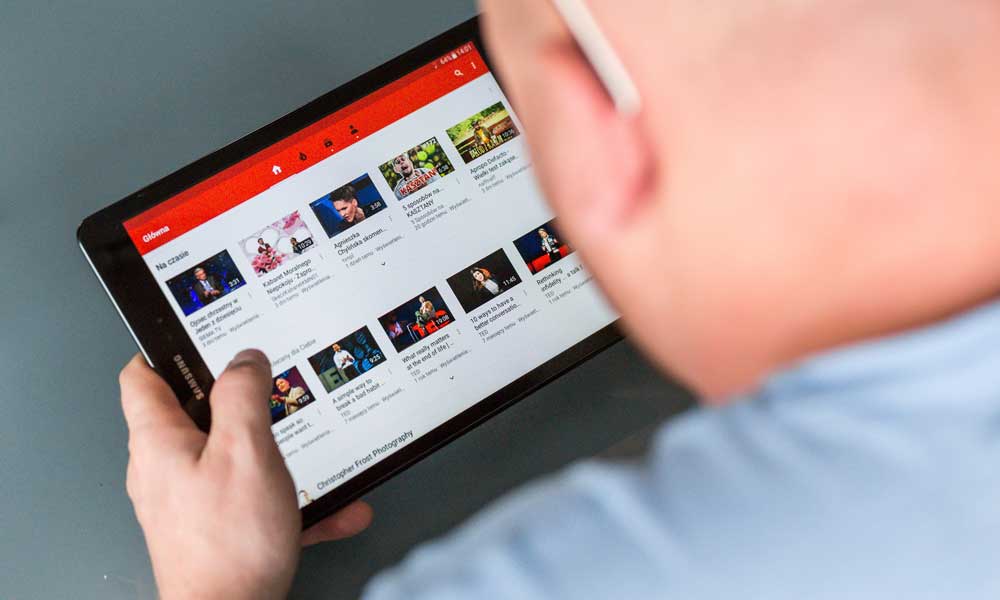
YouTube unveiled a dramatic redesign in 2017, emphasising five core modules across the platform:
Navigation Menu
It was condensed into a clean sidebar rather than a crowded top banner, allowing maximal content space. Familiar Material surfaces like cards sort topics.
Masthead Slider
Cinematic images and bold graphics carousel across the top ‘Masthead’ spotlighting trending videos. Premium aesthetics preview content.
Shelves
Displayed as responsive horizontal segments, Shelves filter and present videos in tidy graphic cards using vibrant colours for enhanced visual organisation.
Description
Primary metadata and statistics for each video or channel shift left into a clean sidebar rather than cavort below. Crisp headers declutter.
Up Next
Recommended videos populate an elegant right sidebar that users can minimise or maximise to continue suggested viewing without leaving their video.
This modular design clarifies YouTube's layout into distinct yet interconnected surfaces. Clean organisation and bold shortcuts enhance usability. Dynamic widths keep surfaces adaptable across devices. Overall, it is a distinctly ‘Material’ interface.
Benefits of Adopting Material Design

Let's analyse the unique advantages Material Design confers across user and business objectives:
Enhances User Experience
Material Design interfaces optimise for:
Responsive Display
- Content auto-reflows responsively for mobile vs desktop
- Menus and surfaces intelligently rearrange
- Flexible containers like cards and tabs rescale
Recognisability
- Tactile, lifelike digital materials (paper, ink, light)
- Intuitive gestures and interactions
- Vibrant colours and legible graphics
Continuity
- Motion guides logical transitions
- Hierarchy & relationships clarified
- Clear causality from input to response
Memorability
- Bold and dramatic visual impression
- Novel yet familiar ‘quantum paper’ metaphor
- Visceral look & feel stick mentally
Ultimately, applying Material Design makes products more usable, relatable and memorable for consumers. User confidence and delight strengthen in apps implementing Material Behaviors consistently.
Drives Business Results
Material design also uniquely aligns design principles with measurable business results:
Conversion Rates
- Clear hierarchy draws eyes to calls to action
- Clean layouts prevent choice overload
- Vivid aesthetics signal quality
Learnability
- Intuitive gestures from tactic metaphors
- Logical continuity between transitions
- Affordances suggest interactivity
Visibility
- Bold colours and graphics captivate visually
- Novel interactions spark organic virality
- differentiated ‘material-esque’ aesthetic
Overall, Material Design's standards for user experience generate tangible improvements in the critical conversion funnel and growth metrics.
Fosters Design Consistency
For Google – Material Design finally unified its disparate product domains under one consistent design language. This provides multiple benefits:
- Cross-channel experience – Consistent UX from mobile to desktop to tablets to emerging surfaces
- Recognisable identity – Unique and differentiated design style
- Developer efficiency – Components and libraries standardise design
- Iteration velocity – Shared standards and modular architecture
- Elevating prototyping – Quicker concept visualisation
The flexibility for products to manifest Material principles uniquely while obeying the broader system rules prevents fragmentation while encouraging innovation.
Overall – enforcing consistency, customizability, and responsiveness through Material Design helps technology organisations scale design.
Criticisms and Evolution of Material Design
While lauded as a breakthrough design system – Material Design also attracted fair criticism regarding its limitations. Duarte has responded by iterating Material to address feedback and technological shifts.
Early critics of Material Design argued the visual language:
- Overused unnecessary animation and motion
- Maximised flashy aesthetics over usability
- Lacked personality
- Not serious enough for enterprise contexts
- Lean visuals lacked density on the desktop
- Failed to differentiate platforms enough
Excessive Motion: While delightful at first – decorative animations degraded to needless distraction over time without improving core usability. The motion should indicate relationships.
Style Over Substance: Critics argued that bold graphics and space prioritised aesthetics rather than superficial beauty without boosting functionality. Vibrance can't compensate for weak content.
One-size-fits-none: Skeptical enterprise users felt Material tailored towards consumer apps lacked the customizability required for specialised B2B tools. Material needed modularity.
Visually exhausting: While masterfully responsive, some felt Material interfaces stretched overly airy and distracting on more comprehensive desktop layouts. Motion and rapid shifts grew tiresome over prolonged usage for creators. Panel density maximised scannability but wasn't rich enough for concentration.
Homogenisation: Concerns emerged that enforcing Material Design too vigorously across Google ecosystems overly homogenised distinct product domains like Maps, Docs, and Nest – flattening unique functionality into a sea of sameness.
In response – Duarte iterated Material to address legitimate critiques.
Material Design 2018+: Flatter, Flexible Evolution

In 2018, Google unveiled substantial Material updates for enterprise flexibility, visual calmness, and enhanced personality:
Tailored Enterprise Material
Workplace-optimised themes, denser desktop interfaces, versatile components and templating tools empowered enterprise customisation. Google developed industry and task-specific interface guidelines and layouts while easing third-party integrations. Material Theming APIs helped clients tweak styling. Admin consoles got severe facelifts.
More restrained aesthetics
Reduced vibrant colours, shadows, gradients and animations prevented visual noise, eye fatigue and needless distraction – optimising for content immersion. More conservative interfaces clarified workflows.
Unique Product Personalities
Google intentionally deviated components across product lines based on persona and functionality rather than mandating homogeneity. For example – Play Media apps infer casual entertainment to maintain vibrant glyphs – while Drive emphasises minimal productivity. Teams messaging features a bubbly design, while Meet adopts simplicity. Material morphs appropriately across domains.
Flatter yet Tactile Interfaces
Surfaces flattened, relying primarily on iconography, whitespace and round corners rather than layers of cards or overlapping sheets for a tangible feel. Reduced shadows and dimensions simplify page segmentation.
Overall – Material Design continues to adapt, addressing ethical feedback by responsively calibrating expressiveness across contexts. The underlying principles – surfaces, space, motion – hold consistently, but manifestations evolve appropriately.
Implementing Material Design In Your Products

Through thoughtful iteration, Material Design now provides customisable design standards any product development team can adopt for enhanced UX. Here's how to implement Material successfully:
Conduct Competitor Audit
Research where competitors follow or diverge from Material behaviours regarding visuals, interactions and information hierarchy. Identify gaps.
Analyse Your Product Identity
Clarify the distinct personality your product should convey – aligned or contrasted with Material – regarding aesthetics, functionality, and platforms.
Inventory Product Screens
Catalogue key workflows and interface state users move across. Note surfaces, actions and transitions.
Identify Improvement Opportunities
Decide which updates – whether tailoring components, adding motion, or tweaking layouts – will optimise screens for usability. Create hypotheses.
Implement Selectively
Apply Material Design systematically yet judiciously – limiting animated flourishes, preserving utility, and respecting workflows. Let core principles guide innovation.
Connect Motion Purposefully
Craft motion mindfully, using subtle yet responsive transitions only to demonstrate causality and continuity across interactions. Treat animation ornamentally.
Continuously Iterate
Keep tweaking implementations based on user testing and qualitative feedback—Manifest Material Design ideals uniquely for your audience and product ethos.
Key Takeaways and Future of Material Design
Let's recap the critical themes behind Material Design that still innovate interfaces today:
- Unified Design Systems – Material Design provides customisation flexibility required for ecosystem coherence
- Focus on Utility – Above stylish aesthetics, UX fundamentals maximise usability
- Nature-Inspired Metaphors – Relatable, organic physicality builds intuitive navigation
- Motion Guides Understanding – Transitions indicate causality and connections between interactions to shape mental models
- Iterate Responsively – Material Design principles manifest uniquely across products while upholding standards
- Prioritise Clarity – Clean layouts, scannable grids, and bold graphics amplify comprehension.
- Conserve Attention – Restrained aesthetics prevent distraction from focusing on goals and tasks.
- Simplify Complexity – Surfaces, space and motion frameworks simplify dense digital capabilities into relatable building blocks.
Ultimately, material design will evolve as technology shifts, yet it will retain foundational principles. Emerging frontiers like voice UX, augmented reality, and ambient computing require rethinking digital interfaces beyond screens – but tangible surfaces, comprehensible spatial relationships and continuity through logical motion transitions will anchor users in new modalities.
Material has revolutionised design standards across software, apps and experiences – establishing new best practices for beautiful, functional interfaces that respect users. While maturing past early critiques – the underlying principles Duarte based for responsive, animated interfaces enriching usability remain visionary guides for product designers across any future technology.
Conclusion
In closing, the material design was developed as a cohesive yet flexible design system enabling intuitive, continuous user experiences across Google's vast product ecosystem in the mid-2010s.
Establishing standards around tangible surfaces, bold aesthetics and meaningful motion – Material Design facilitated usability and consistency across Android, Maps, YouTube and Google's various services. Dynamic interfaces could reshape across devices and contexts – guided by universal principles rather than finite specifications.
While critiques warranted simplifying excessive dimensionality and needless animation – Google smartly iterated Material to scale elegantly. Principles manifest diversely across product lines based on utility and persona rather than mandating homogeneity. Customisation tools empower enterprise implementation integrity.
Ultimately – Material Design elevated interaction design, semantics, layout principles and cross-platform responsiveness. Duarte pioneered adaptable interface components that resonated uniquely yet cohesively across products. Material Design principles will continue guiding user experiences across technologies, establishing trust through their basis in physical intuitions and perceptual consistency.
Any organisation can benefit from implementing Material Design tailored appropriately – enhancing aesthetics, conversions and comprehension through purposeful motion, hierarchy and intuitive interactions.
Frequently Asked Questions (FAQs)
Here are some common questions about Material Design and its implementations:
How can I customise Material for my company's brand?
Use the theming APIs and component libraries to tweak stylistic variables like colour, typography, iconography, shape, and imagery to align with branding. Maintain UX principles.
Is Material Design mandatory for Android apps?
No, but following Material behaviours helps Android users interact intuitively. Apps diverging may confuse. Much code packages Material capabilities directly.
What are the best practices for motion?
Use subtle, brief animated transitions only to demonstrate logical continuity between states. Avoid decorative animation that distracts without instruction.
How might Material Design adapt to voice interfaces?
Principles like clarity, personality and seamless transitions can be retained – using sound, conversational syntax and orthogonal commands to heighten comprehensibility.
What industries most need better design systems?
Enterprise software, financial services and healthcare lag in user-centric design and can modernise rigid interfaces around Material principles by unifying workflows.
