Discover what it takes to brand a city as diverse as San Francisco. Plus learn how to land such clients and the extensive process that goes on behind the scenes.
- Read the interview below, originally published on Logo Inspirations.
- View the full Case Study
- Watch Video of the Design Process (1hr)
Overview
JUST Creative was tasked with designing the official logo design and branding for San Francisco, USA in collaboration with Miles Partnership, marketing destination specialists. After an extensive 9 month R&D project that guided the brand’s direction, the result is a new and refreshed brand for San Francisco, a brand that’s bold, welcoming, and optimistic, showcasing its scenic beauty and inner beauty.

How did the client find you?
I was subcontracted out by the agency, MILES Partnership, to develop the logo and branding for San Francisco. I had previously worked with this agency developing brands for other tourism destinations such as Puerto Rico. The agency originally found me through my website.
What was the client looking for?
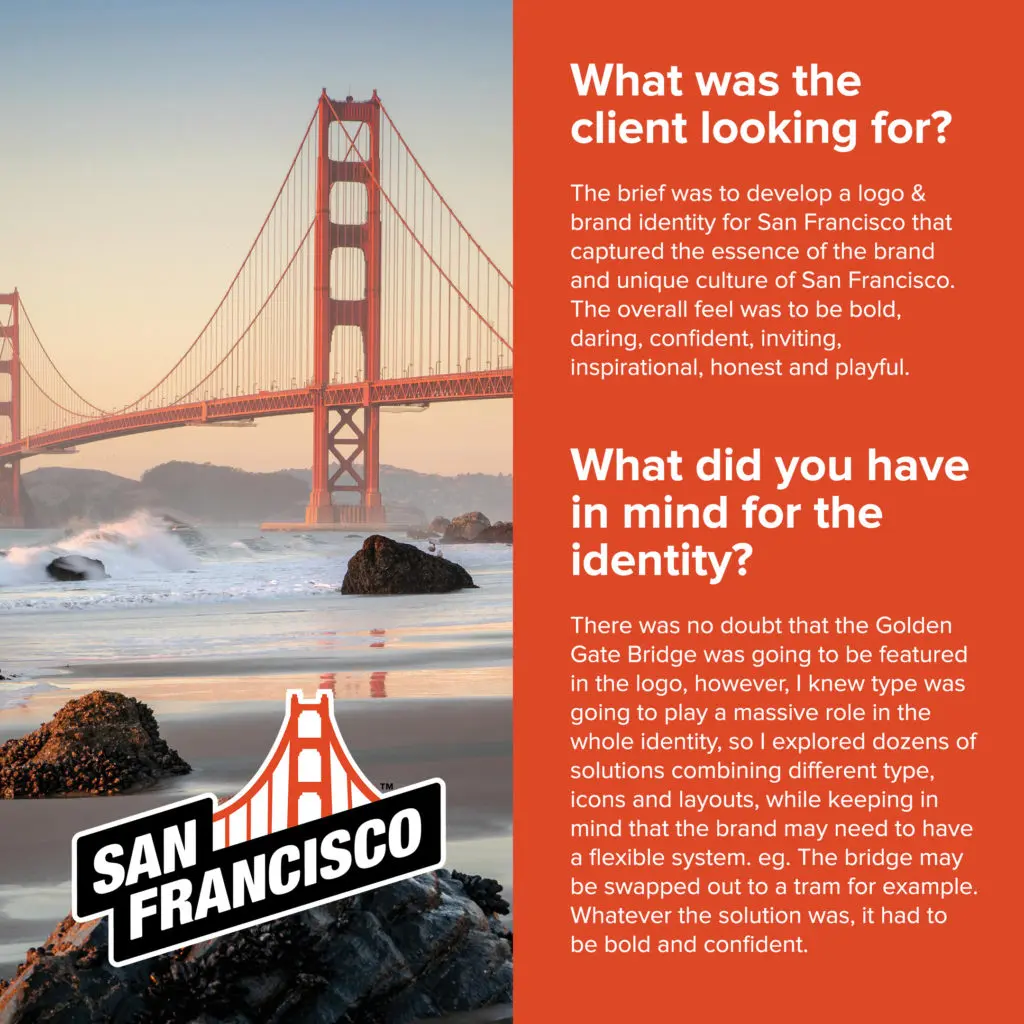
The brief was to develop a logo & brand identity for San Francisco that captured the essence of the brand and unique culture of San Francisco. The overall feel was to be bold, daring, confident, inviting, inspirational, honest and playful.
What did you have in mind for the identity?
There was no doubt that the Golden Gate Bridge was going to be featured in the logo, however, I knew type was going to play a massive role in the whole identity, so I explored dozens of solutions combining different type, icons and layouts, while keeping in mind that the brand may need to have a flexible system. eg. The bridge may be swapped out to a tram for example. Whatever the solution was, it had to be bold and confident.
What was the process when creating the logo & identity?
There was a 9 month R&D project completed by MILES, that guided the brand’s direction. This research informed the overall positioning, voice and visuals for the brand. After extensive research of my own, I sketched ideas and then moved on to the computer. After about 8 or so rounds back and forth with the agency, we got to a shortlist of a few logos that were to be presented.
How many concepts did you explore?
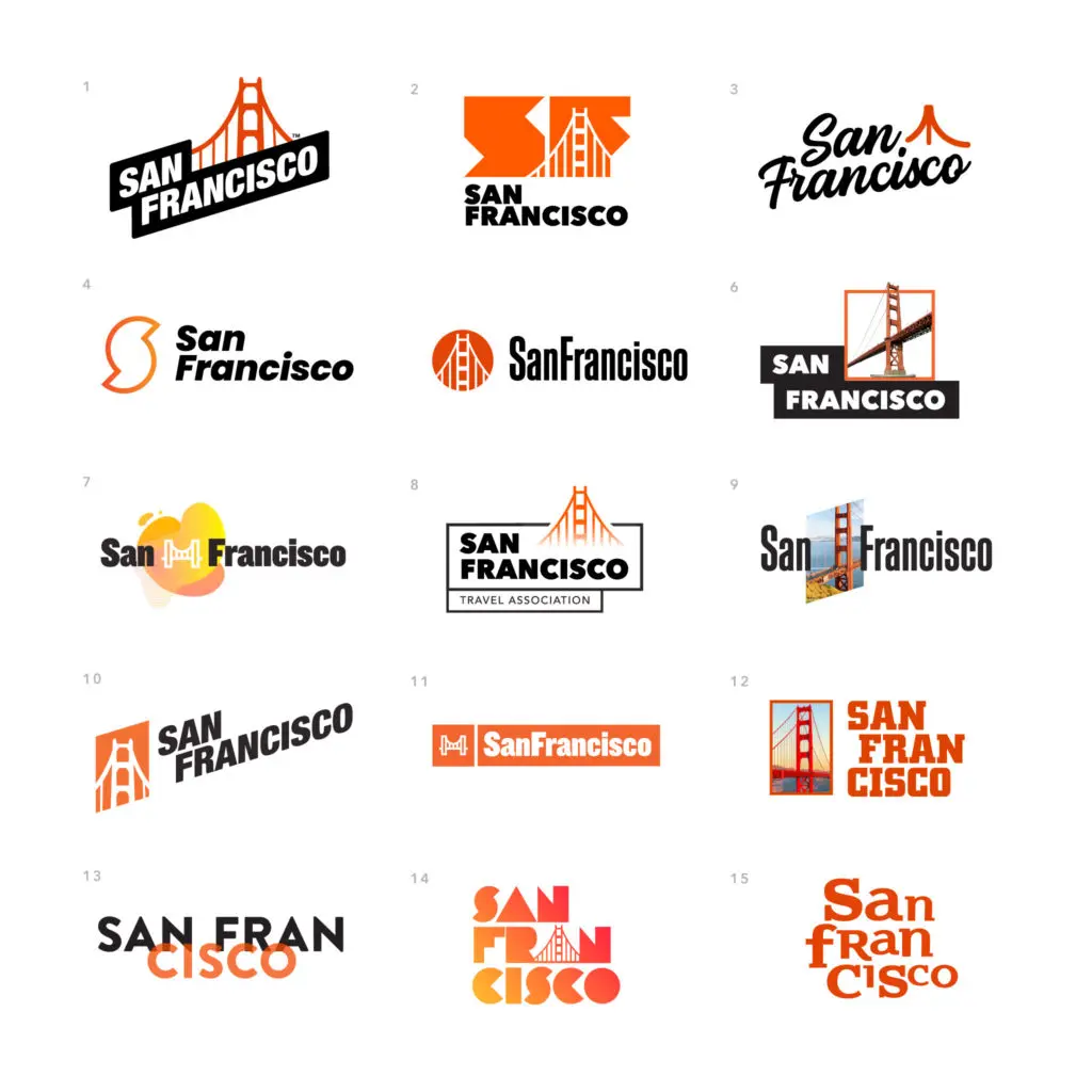
Over 50 concepts were explored on my own with about 16 presented internally to the agency and 5 to the client.
How was the winning concept chosen?
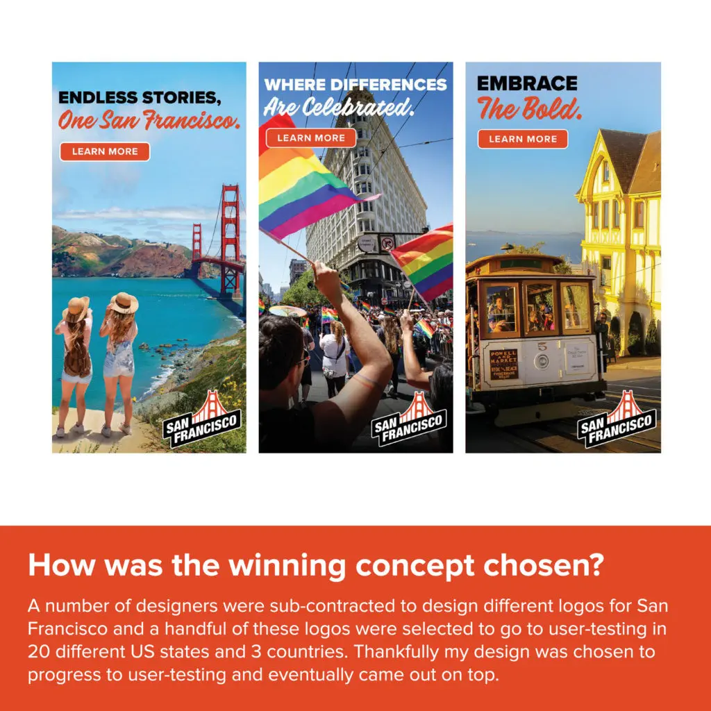
A number of designers were sub-contracted and a handful of these logos were selected to go to user-testing in 20 different US states and 3 countries. Thankfully my design was chosen to progress to user-testing and eventually came out on top.
What does the logo represent?
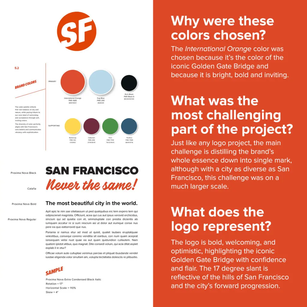
The logo is bold, welcoming, and optimistic, highlighting the iconic Golden Gate Bridge with confidence and flair. The 17 degree slant is reflective of the hills of San Francisco and the city’s forward progression.
San Francisco Logo & Identity Design Process
Images from the Interview

