How to Choose the Correct Logo Placement
A company's logo is one of its most valuable brand assets. Proper logo placement reinforces brand recognition and maintains a consistent brand image across all consumer touchpoints. However, choosing the ideal logo placement can be challenging, with countless options across mediums ranging from business cards to billboards. This comprehensive guide will walk you through the critical considerations for optimising logo placement regardless of format or size restrictions.
Table of Contents
What Logo Placement Communicates

Before determining logo position, it helps to understand the impression different placements give consumers.
Authority and Heritage
A centred logo at the top of a layout conveys heritage, prestige, and authority. This traditional positioning works for well-established companies that want to emphasise their history and trustworthiness.
Innovation and Approachability
Left-aligned or off-centre logos feel more friendly and innovative. Startups often align logos to appear fresh, energetic, and approachable.
Clarity and Directness
A logo in the top-left corner clarifies the content’s source and improves scalability. Readers can immediately identify who created the piece.
So, logo placement sends a message about your brand. But how do you select the best option for your goals and audience? Follow these steps.
Balance Prominence with Subtlety
A logo should be prominently visible without overpowering the overall design. Follow these basic guidelines:
- Avoid placing logos where they will compete with other page elements
- Scale logo size appropriately – not too big or small
- Use space to frame the logo without crowding other items
Getting the balance right may require some experimentation, but the payoff of enhanced memorability is worth the effort.
Mind the Clear Space
Defining adequate clear space around the logo prevents visual clutter. General clear space rules include:
- Top/Bottom Margins – Clear space above and below should equal 1/2 the logo height
- Side Margins – Clear space on sides should equal 1/2 the logo width
- Between Text/Images – Add margins equal to logo height between logo and page elements
Of course, specific cases may call for adjustments, but maintaining sufficient breathing room is vital.
Place Logos Strategically

“Where should I put my logo?” is one of the most common design questions. The optimum logo placement depends on the medium.
Print Materials
Place the logo at the top centred or top left for business cards.
Letterhead logos traditionally occupy the top left corner with ample margins.
With brochures/flyers, the logo typically resides at the very top centred or top right.
Digital Assets
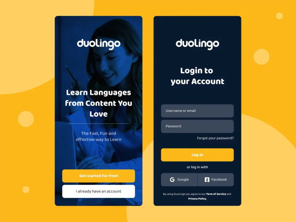
Website logos invariably sit pinned to the upper left or centred atop the header.
In mobile navigation, logos generally anchor the page left, linking to the homepage.
Email signatures should display logos at the very top, aligned left with the sender details.
Signage
Building signage logos tend to occupy the top-centered position.
For in-store displays/banners, logos often reside centred at the top or bottom edge.
Carefully weigh the context and goals when finalising outdoor signage logo placement.
On a website homepage, the top-left corner ensures high visibility and scalability. But on printed materials like stationery, centred placements are more expected.
| Medium | Most Common Positions |
| Website Homepage | Top-left corner |
| Print Newsletter | Top-center, Bottom-center |
| Packaging | Multiple prominent placements |
| Email Signature | Bottom-left, Under signoff text |
Scale Logos Appropriately
Logo scale contributes significantly to overall visibility and brand impression. Follow these standards:
Minimum Size
To retain legibility, logos should not scale below:
| Use Case | Minimum Size | Reasoning |
| Print (Letterhead, Business Cards, Brochures, etc.) | 1 inch | Logos need to remain visible and legible when printed. At smaller sizes, intricate details get lost. |
| Website | 100 x 100 px | On websites and apps, legibility depends largely on screen resolution. 100 x 100 pixels ensures visibility across devices. |
| Social Media Profile Picture | 400 x 400 px | Profile images tend to be minor, so they need a high enough resolution not to appear pixelated or blurry. |
| Outdoor Signage | 6 inches | The viewing distance for outdoor signs can be several feet. Under 6 inches makes logos hard to discern. |
| Promotional Items (Pens, Cups, etc.) | 0.5 inch | Space is limited on promotional items. A 0.5-inch logo maintains essential legibility. |
Aspect Ratio
Maintaining consistent proportions prevents distortion. Do not arbitrarily resize logo dimensions.
Relative Size
Ensure adequate logo prominence relative to other on-page elements by avoiding extremes. See the example comparisons below illustrating overly dominant and diminutive logos:
Use the surrounding content as a guideline for ideal relative logo sizing.
Choose Logo Versions Wisely

Most brands have multiple approved logo versions and colour treatments to accommodate different media. Select options appropriately:
Colour
Full-colour logos maximise visibility, but single-colour and grayscale variants expand application flexibility. Always use sufficiently contrasting colours.
Detail
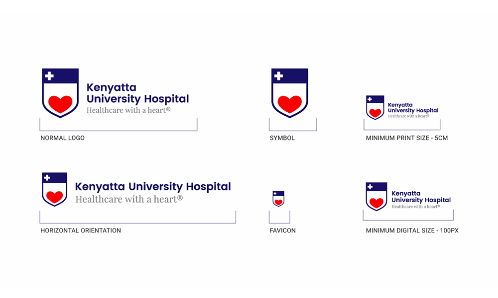
Simplified logos suit tiny spaces like favicons or icons—more detailed logo versions, better-fit brochure covers, or posters.
Aspect Ratio
Wide logos work for headers. Taller versions allow better signage visibility. Pick the best shape for each use case.
File Format
Vector files (EPS, AI) enable scaling without quality loss for print. Raster files like JPGs and PNGs are optimised for digital. Know when to use each.
Carefully vet logo versions against medium, scale, and visibility requirements before inserting to prevent issues.
Align Logos Thoughtfully
Purposeful logo alignment projects professionalism and enhances scalability:
Web Banners
Centre logos to draw immediate focus.
Print Ads
Right, justify logos to leverage directional eyeflow tendencies.
Packaging
Aligning logos left on packaging creates better product photo visibility:
Deliberate alignment choices like these optimise engagement and brand impressions.
Seek Second Opinions
Despite best efforts, logo placements sometimes miss the mark for reasons not immediately apparent. Leverage external feedback to reveal blindspots:
- Preview on different devices and print formats
- Peer review with unbiased colleagues
- User test with target demographics
- Expert audit via consultant or agency
Taking advantage of outside perspectives identifies refinements to maximise logo placement effectiveness across the board.
If you are struggling to determine the ideal placement in-house, don’t hesitate to consult professional graphic designers. Explain your branding objectives, typical use cases, target demographics, etc. Experienced designers likely have clever placement solutions you may never have considered.
Questions to Ask Design Consultants
- Where would you position our logo on our website, business cards, etc., to align with our brand personality?
- What placements would you avoid for our brand and why?
- Please provide 3-5 examples of appropriate logo placements for our company.
- How can placement signal our brand is innovative yet trustworthy?
Take their advice thoughtfully to guide your final decision.
Troubleshoot Common Logo Placement Pitfalls
Carefully avoid these ubiquitous logo layout issues:
| Pitfall | Solution |
| Too small | Increase logo size |
| Cropped or cut off | Reduce expanded margins, cutting off logo |
| Competing visually | Simplify and reduce visual clutter around the logo |
| Distorted proportions | Maintain aspect ratio when scaling |
| Insufficient contrast | Overlay logos on strongly contrasting backgrounds |
| Inconsistent styling | Standardise logo versions across media |
Addressing these familiar logo layout issues through careful quality checking optimises brand recognition and professionalism.
Optimise Logo Locations Digitally

Digital interfaces introduce expanded logo placement considerations with shifting visibility—Optimise logo findability in critical locations.
Website Header
Stick the primary logo in the upper left or centred fixed header, appearing identically across all pages.
Footer
Mirror the header logo in the website or email footer alongside the bottom navigation links.
Intro Overlays
Display logos prominently on homepage intro overlays to capture immediate attention.
Inner Pages
Repeat header logos on interior pages to maintain consistent UX, linking to the homepage.
Optimised placement across digital touchpoints strengthens branding cohesion and recognition while enhancing navigation.
Carefully Evaluate Unconventional Placements
While traditional, time-tested logo locations work perfectly for most, feel free to break conventions when beneficial.
Surprising Angles
Shift expected sightlines with unconventional logo angles on signage or packaging.
Functional Integration
Integrate logos into physical products, incorporating brand visibility into functional components.
Hidden Reveals
Prompt engagement with partially obscured logos completed when opening packages or doors for an intriguing reveal.
Assess the merits of unexpected logo treatments carefully. Imaginative placements can uniquely bolster brand experiences, while conventional options sufficiently meet everyday needs.
Adapt and Test Logos Iteratively
Logo design rarely stops at the initial concept. Brands grow and evolve across campaigns and mediums. Continually refine logo placements via honest user feedback:
- Identify new use cases – Evaluate which emerging channels and formats need logo guidance.
- Design initial layouts – Mockup logo placement options and document guidelines for these new contexts based on established best practices.
- Test iteratively – Expose logo integration examples to representative users, soliciting actionable feedback on what works or fails.
- Formalise guidelines – Compile lessons learned into expansions or refinements of formal standards for these additional applications moving forward.
- Retest periodically – Logo perceptions shift over time. Revalidate placements with fresh eyes sometimes to prevent outdated assumptions.
Careful iteration and testing uncover the best possible logo treatments across every touchpoint while keeping standards aligned with recent learnings.
Conclusion
Optimising logo placement is crucial for reinforcing consistent, recognisable branding and cutting through the visual noise vying for consumer attention across channels. While perfect placements depend significantly on context, following fundamental principles for balance, spacing, minimum size, alignment alternatives and troubleshooting common issues sets a strong foundation for most situations.
Unlocking hidden opportunities with unconventional placements and continually testing with real users fuels evolution towards more meaningful and memorable integrations that uniquely serve evolving brand needs over time. With sound foundational knowledge and iterative refinement methodology, brands can confidently tackle logo layout decisions, large and small.
Frequently Asked Questions
Where is the best place to put a logo on a website?
The header in either the top left corner or centre is standard website logo placement to enable consistent identification across all pages while anchoring navigation.
How big should my logo be on a poster?
Logos should scale to approximately 5-15% of the overall area on posters and signage to ensure adequate dominance for immediate noticeability and readability up close.
Can logo placement affect perception?
Yes. Well-placed logos attract intuitively without distracting to link favourable brand impressions, while problematic placements degrade trust or professionalism.
What is the first thing people see on a website?
Eye-tracking studies reveal web visitors' first glance at page centres and active elements. Ensure logos anchor page tops to enter central fields of vision immediately.
Where should I put my logo on a letter template?
Logo best practices for letter templates position brand logos on the top left with ample margins to avoid interfering with the date/address header, also occupying the letter’s top area.
