Good Logo Design: What It Is and How to Achieve It
In today's world, where attention spans are rapidly shrinking, a logo is often the first and sometimes the only thing people notice about a brand. According to a study, the average human attention span has fallen from 12 seconds in 2000 to just 8.25 seconds today – for context; this is worse than a goldfish (9 seconds). This makes a well-designed logo more crucial than ever for businesses and organisations that want to stand out and make a lasting impression. This article will explore the essence of good logo design and provide actionable tips on achieving it.
A logo is an artistic arrangement of colours, shapes, and typography and a visual representation of a brand's personality, values, and message. When done right, a logo can be a powerful tool that evokes emotions and helps create a strong connection between a brand and its target audience. Research has shown that it takes only 10 seconds for a person to form a first impression of a logo, further underlining the need for a well-thought-out and executed design.
But what exactly makes a good logo, and how can you create one that effectively communicates your brand's identity? Throughout this essay, we will delve into the critical elements of successful logo design, such as simplicity, versatility, memorability, and relevance. We will also discuss the importance of understanding your target audience and how a comprehensive design brief can pave the way for a winning logo.
So, whether you are a designer looking to refine your skills or a business owner seeking to create a powerful visual identity, this will guide you on your journey towards crafting a logo that truly stands out and resonates with your audience. Let's dive in and unravel the secrets behind good logo design!
Table of Contents
Understanding the Fundamentals of Logo Design

Before we dive into the characteristics of a good logo design, let's define what logo design is and its purpose. A logo is a visual symbol that represents a brand or a company. Its primary function is to identify and differentiate the business from its competitors. A logo can be a wordmark, a symbol, or a combination of both, and it can be used across various media, including websites, social media, business cards, and billboards.
The critical elements of a logo are typography, colour, and shape. Typography refers to the choice of font or lettering used in the logo. Colour can evoke emotions and associations and should be consistent with the brand's personality and values. The shape can be used to create a distinctive visual identity and to communicate the brand's essence.
Characteristics of a Good Logo Design
Now that we know the basics let's explore the characteristics of a good logo design. A good logo should be:
Simple
When it comes to logo design, a saying goes, “less is more” – and that's true! Keeping your logo simple is crucial to ensure it's easily recognisable and memorable.
One of the great things about a simple logo is that it can be reproduced in various sizes and contexts without losing its impact or legibility. Whether on a business card, a website, or a billboard, your logo should be easily identifiable and instantly recognisable.
Now, let's discuss some specific things to avoid when designing your logo. Firstly, try to limit the number of colours you use. Too many colours can make the design confusing and overwhelming. Sticking to two or three colours at most is a good rule of thumb.
Similarly, avoiding using too many elements or details in your logo is essential. The more complex the design, the harder it is for people to read and understand. Remember that your logo will be viewed in various sizes and formats, so it must be straightforward to read, even when small.
Overall, simplicity is essential when it comes to logo design. By keeping your plan simple, you'll create a logo that's memorable, versatile, and easy to recognise – and that's precisely what you want!
Memorable
A great logo sticks in people's minds long after seeing it. It's the visual representation of your brand, and it should be distinctive, unique, and original.
Your logo should clearly and concisely convey the essence of your brand. Think about iconic symbols, like Nike's Swoosh, Apple's bitten apple, or McDonald's golden arches. What makes them so memorable? They're all simple yet powerful and instantly recognisable.
The Nike Swoosh is an excellent example of a memorable logo. It's a simple, elegant design that conveys movement and energy, perfectly capturing the brand's spirit. Apple's logo is similarly iconic – the bitten apple symbolises innovation and creativity, instantly recognisable to people worldwide.
And then there's McDonald's golden arches, a classic example of effective branding. The arches are simple yet instantly recognisable, conveying the warmth and friendliness the fast-food chain is known for.
In short, a memorable logo is essential for any brand that wants to stand out in a crowded marketplace. It's the visual representation of your brand, and it should be unique, original, and instantly recognisable. By creating a logo that truly captures the essence of your brand, you'll be well on your way to building a solid and memorable brand identity.
Versatile
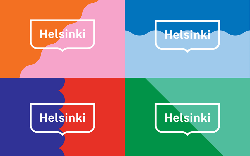
A versatile logo is a logo that can be used in a variety of situations without losing its impact or effectiveness. A logo must be adaptable because you need to find out where it might end up being used.
A great logo should look amazing in different sizes, colours, and other backgrounds. You want it to be legible and visually appealing, whether on a business card, billboard, or social media avatar. A versatile logo can also be adapted to various applications, such as signage, product packaging, vehicle wraps, etc.
Think about it: Your logo might need to be printed on a small business card or a giant billboard, and you want it to look great in both instances. Plus, you might need to use your logo on different backgrounds, like a white or darker background, so it must be flexible enough to work in various situations.
Having a versatile logo is also crucial for branding consistency. You want your logo to be instantly recognisable no matter where it's used, so it is essential to have a logo that can be adapted to different contexts.
Timeless
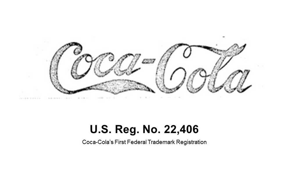
Well, let me tell you, a timeless logo is a logo that can stand the test of time. It's a logo designed with longevity in mind, so it doesn't get outdated quickly.
You see, many logos come and go with trends and fads. These logos may look great and popular initially, but they lose their appeal when the trend fades away. On the other hand, a timeless logo is designed to be adaptable, so it can evolve and adjust to changing circumstances without losing its core identity.
Think of some of the most iconic logos in the world, like Coca-Cola, Nike, or Apple. These logos have been around for decades but still look fresh and modern. They've been able to adapt to changes in their industries and the world, but they've always maintained their core identity and brand message.
So, if you're designing a logo for your business or brand, it's essential to keep this in mind. You want to create a logo that will stand the test of time and represent your brand for years. Avoid trendy design elements and focus on creating a clean, simple, and memorable logo that will resonate with your target audience.
Remember, a timeless logo is not just about creating something that looks good today; it's about creating something that will continue to look good and represent your brand for years.
Relevant to the Brand
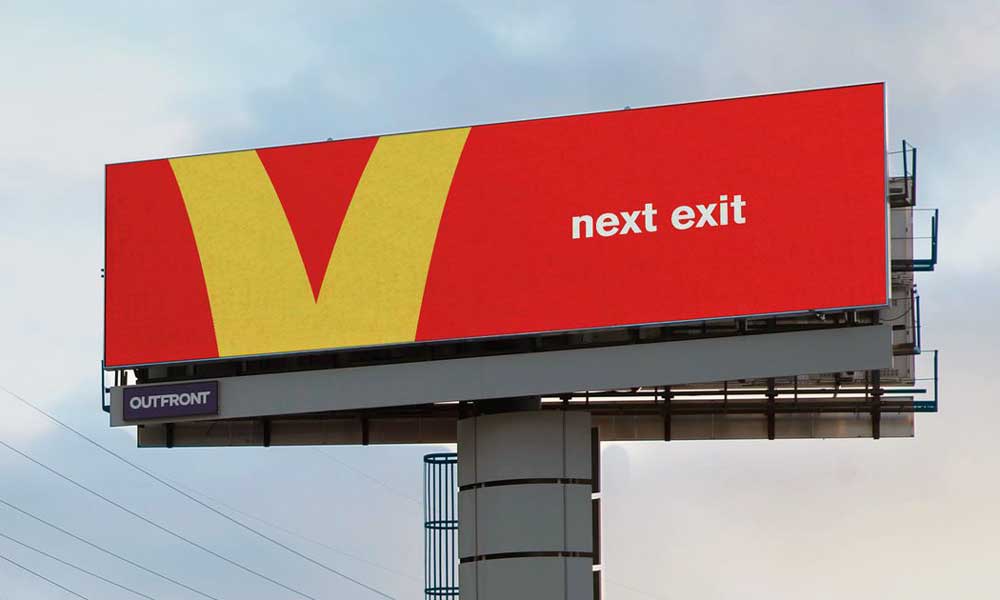
A logo is often people's first impression of a brand. It's like a visual shorthand that communicates the essence of the brand. So, the logo must reflect the brand's values, personality, and target audience.
For example, consider some of the most recognisable logos, like McDonald's or Coca-Cola. These logos not only look good, but they also communicate something about the brand. The golden arches of McDonald's are instantly recognisable, and they convey a sense of fun and playfulness that is synonymous with the brand. Meanwhile, the Coca-Cola logo is classic and timeless, reflecting the brand's long history and tradition.
On the other hand, a logo that is mismatched or inconsistent with a brand's identity can create confusion or mistrust among consumers. If a brand has a serious, professional image, but its logo is playful and whimsical, it can send mixed messages to consumers. They might wonder if the brand is as serious and professional as it claims to be.
So, if you're designing a logo for your brand, it's essential to take the time to understand your brand's values, personality, and target audience. This will help you create a logo that looks good and communicates the essence of your brand. And when your logo is consistent with your brand's identity, it will help build trust and recognition among your target audience.
Steps to Create a Good Logo Design
Now that we know what makes a logo design “good,” let's explore the steps to create one. These steps are not necessarily linear, and you may need to iterate and refine the design multiple times before reaching the final product.
Conducting Research and Gathering Inspiration
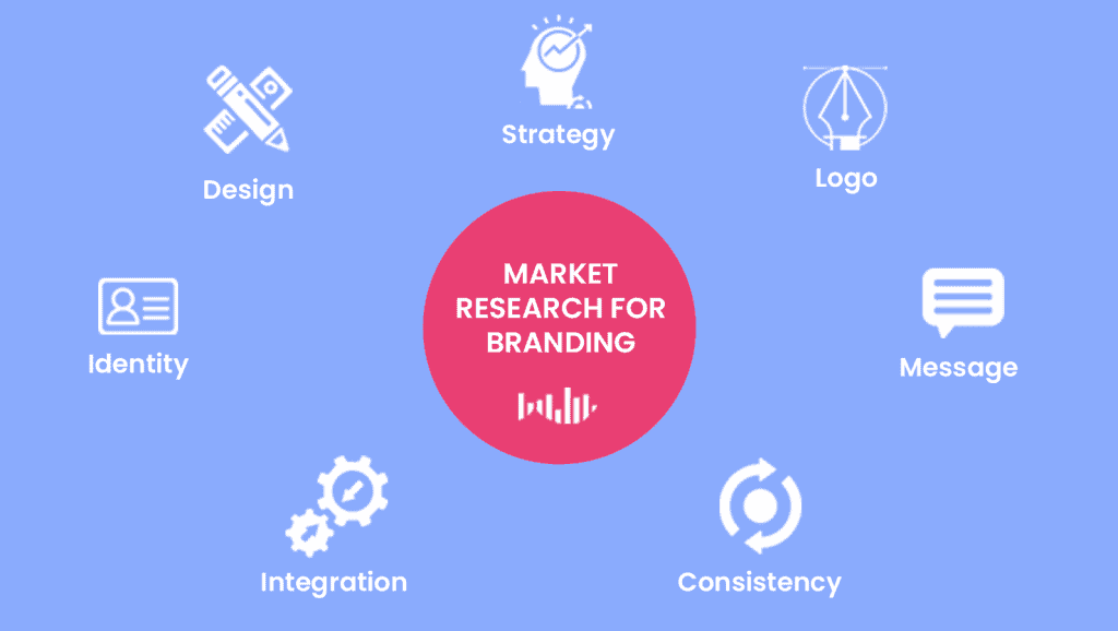
When creating a logo, research and inspiration are the key ingredients that can help make your design stand out. Before you even put pen to paper (or finger to keyboard), gathering as much information as possible about the brand you're designing for is essential. This means understanding their values, mission, and unique selling points, as well as their target audience and industry trends.
When you have a solid understanding of the brand, it's time to start seeking inspiration. Inspiration can come from many different sources; casting a wide net is always a good idea. One of the best ways to start is by looking at the competition to see what they're doing well (and what they're not doing). This can help you identify gaps in the market and find unique ways to differentiate your design.
You can also seek inspiration from logos outside the brand's industry. Design blogs and online galleries are great resources for finding fresh ideas and unique design elements to incorporate into your work. It's important to note that while it's okay to take inspiration from other designs, you should never copy them outright.
Ultimately, the research and inspiration stage aims to create a strong foundation for your design. By gathering information and seeking inspiration, you'll be better equipped to create a logo that represents the brand and resonates with its target audience.
Sketching and Brainstorming Ideas
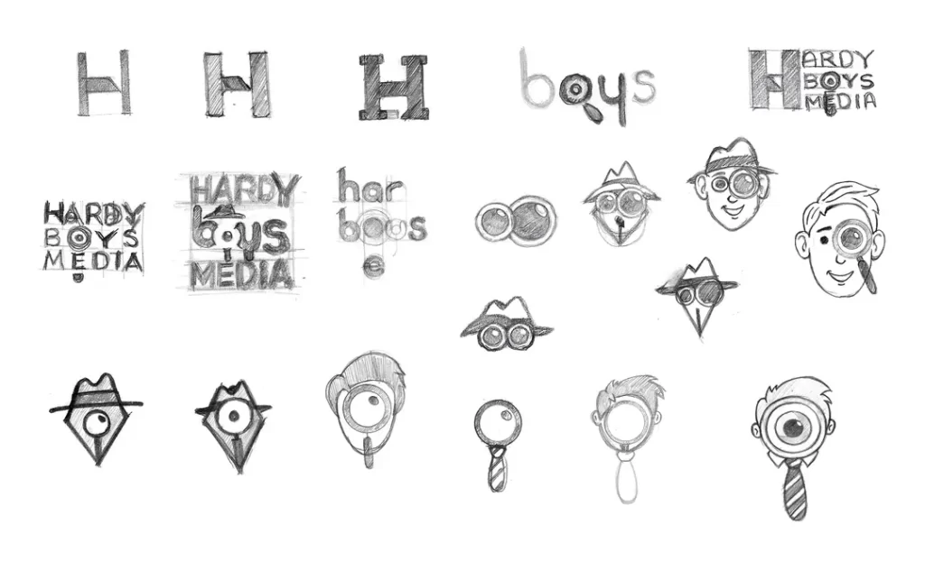
After gathering inspiration and conducting research, it's time to let your creativity take the wheel and start sketching and brainstorming ideas for your logo. This is where you get to put all that knowledge and inspiration into action!
It's important to remember that this is a brainstorming stage, so you should be okay with creating polished designs now. Instead, focus on creating rough sketches that explore different concepts and variations. Feel free to experiment with different shapes, colours, and typography options. You never know what unique ideas might emerge during this process.
It's also important to take breaks and step away from your work occasionally. Sometimes a fresh perspective can be just what you need to develop new ideas. Plus, taking a break can help prevent burnout and keep you motivated and energised throughout the design process.
One helpful tip during this stage is to create a mood board or collection of design elements that inspire you. This can be a physical or digital collage of images, colours, and typography that captures the vibe you want your logo to convey. A mood board can keep your ideas organised and focused and give you a jumping-off point when you're stuck.
Remember, the goal of this stage is to explore as many ideas as possible and narrow them down to a few decent concepts. Don't be too critical of your work at this stage. You'll have plenty of time to refine your designs later on.
Refining the Concept

Once you have a handful of design concepts, it's time to refine and narrow down your options. This is where you'll transform your rough sketches into more polished designs.
One key aspect of refining your designs is to select the most promising concepts and focus on those. It's natural to want to include every idea you came up with during the brainstorming stage, but it's essential to be selective to ensure you're putting your best foot forward. Choose the designs that align best with the brand's values and identity and have the most potential to stand out in the market.
When you've selected your top designs, it's time to start refining the details and composition. This can involve adjusting the typography, colour palette, and layout to ensure the logo is visually balanced and effective. This stage requires a keen eye for detail, as even small changes can significantly impact the final design.
Getting feedback from others is also a good idea to ensure your designs are on the right track. This could be from colleagues, clients, or other design professionals. Feedback can provide valuable insights and outside perspectives to help you improve your designs and ensure they align with the brand's values and identity.
Ultimately, this stage aims to refine your designs to a few robust options that accurately represent the brand and resonate with its target audience. This will set the stage for the final step in the logo design process: delivering the finished product.
Choosing the Appropriate Colours and Typography
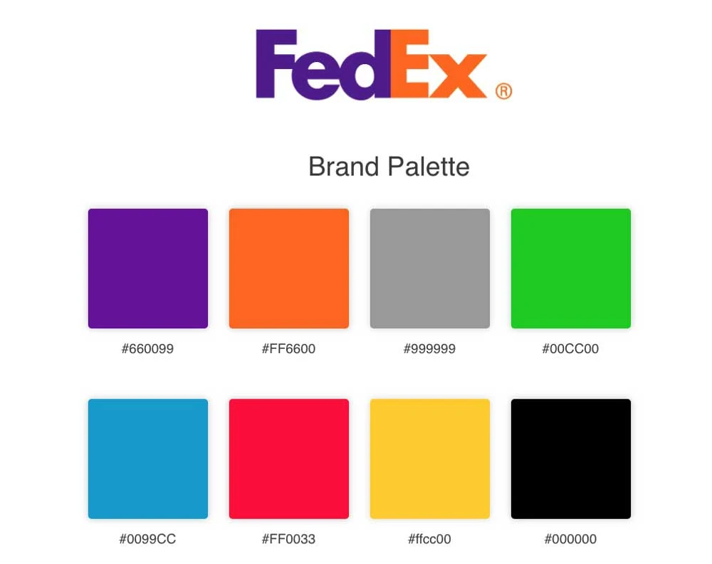
When designing a logo, choosing the right colours and typography is essential. These elements can significantly impact the logo's effectiveness in communicating the brand's identity and personality.
First, let's talk about colour. Colour is powerful and can affect people's emotions and associations with a brand. When choosing colours for a logo, it's essential to consider the psychology of colour and what each colour represents. For example, blue can convey trust and professionalism, while yellow can describe energy and optimism. Choosing the right colours can help create a solid emotional connection between the brand and its audience.
In addition to colour, typography is also critical in logo design. Your typography should be legible, distinctive, and appropriate for the brand's style. You want to choose a font that complements the overall design and reinforces the brand's identity. For example, a sleek sans-serif font may be more appropriate for a tech startup, while a classic serif font may work better for a luxury brand.
When selecting typography, it's also essential to consider the logo's scalability. The typography should be legible and clear, even when the symbol is displayed at a small size, such as on a business card or social media profile.
Choosing the right colours and typography can make or break a logo design. By considering the psychology of colour and selecting legible, distinctive typography that complements the brand's identity, you can create a logo that effectively communicates the brand's personality and resonates with its audience.
Testing the Design in Different Contexts

Once you've arrived at a final logo design, testing it in various contexts and applications is crucial to ensure it looks great and is easily recognisable. This means trying the logo on different backgrounds, sizes, and mediums to ensure it works well in various scenarios.
For example, test your logo on a light and dark background to see how it looks in both scenarios. Try the logo at different sizes to ensure it's legible and clear, even when it's small, such as on a social media profile picture or business card.
Testing the logo on different mediums, such as digital and print, is also vital to ensure it looks great in various formats. For example, a symbol that looks great on a website may translate poorly to print materials like business cards or brochures.
It's also a good idea to get feedback from others at this stage to ensure your logo is practical and memorable. You could ask colleagues, friends, or focus groups for their opinions on the design. This feedback can provide valuable insights and help you identify any potential issues with the design that you may need to look into.
Testing and feedback are crucial steps in the logo design process that can help you ensure your logo is practical, memorable, and effective in representing the brand. By testing and gathering feedback, you can ensure your final design is top-notch and ready to be used in all the ways the brand needs.
Mistakes to Avoid in Logo Design
In addition to the characteristics and steps to create a good logo design, it's also essential to avoid common mistakes that can undermine the logo's effectiveness. These mistakes include:
Overcomplicating the Design
As mentioned earlier, simplicity is key in logo design. Avoid overcomplicating the design with too many elements, colours, or details, making the logo difficult to read and remember.
Copying Other Logos
Copying other logos is unethical and ineffective in creating a memorable and effective logo. Instead, create a unique, original design that accurately represents the brand's identity.
Using Generic Symbols or Fonts
Using generic symbols or fonts can make the logo appear generic and uninspired. Instead, create a distinctive, original design that reflects the brand's values and personality.
Neglecting Scalability and Versatility
A logo that looks great on a business card may look terrible on a billboard or social media avatar. Designing a scalable and versatile logo is crucial, meaning it looks great in different sizes, contexts, and applications.
Examples of Good Logo Designs
To help you understand what makes a good logo design, look at examples of successful logos and analyse why they work.
Nike Swoosh
The Nike Swoosh logo is one of the most recognisable and iconic symbols in the world of branding. With a simple yet powerful design, it has captured the essence of the Nike brand and its athletic roots.
History and Creation
The Nike Swoosh was created in 1971 by graphic design student Carolyn Davidson. At the time, Nike was a relatively new company looking for a fresh logo to define its brand identity. Phil Knight, the co-founder of Nike, commissioned Davidson to design a logo that could convey motion, energy, and speed. The resulting Swoosh was inspired by the shape of a wing, paying homage to the Greek goddess of victory, Nike. This historical reference and the logo's dynamic design encapsulated the spirit of athletic triumph defining the brand.
Design Elements
- Simplicity: The Nike Swoosh features a minimalist design comprised of a single, fluid line that creates the recognisable swoosh shape. This simplicity allows the logo to be easily reproduced in various sizes and mediums, ensuring its legibility and recognizability.
- Versatility: The Swoosh logo's simple design allows it to be applied seamlessly to various products, from footwear to apparel and equipment. This versatility has helped establish a solid and consistent brand identity for Nike, making it easy for consumers to associate the logo with the company and its products.
- Timelessness: The Nike Swoosh has remained relatively unchanged since its inception, with only minor refinements made to its shape over the years. Its timeless design has made it relevant and recognisable even as trends and styles have evolved.
- Emotional Connection: The swoosh's design evokes feelings of movement, energy, and determination, which resonate with athletes and consumers alike. By tapping into these emotions, the logo has created a strong emotional connection with its target audience, further solidifying its place as a symbol of athletic excellence.
Impact and Recognition
Over the past five decades, the Nike Swoosh has become synonymous with athletic achievement, innovation, and success. It has been featured prominently in numerous high-profile sports events and endorsed by some of the world's most famous athletes, such as Michael Jordan, Serena Williams, and LeBron James. This widespread exposure and association with elite performance have helped to elevate the Nike brand to its current status as a global leader in the sports industry.
Moreover, the Nike Swoosh has transcended its original purpose as a simple logo and evolved into a cultural icon. It has been embraced by various subcultures and movements, from streetwear to hip-hop, and has even appeared in art and design exhibitions. This broad cultural impact has further solidified the Swoosh's status as a symbol of athletic prowess and fashion.
Apple Bitten Apple
The Apple logo, a simple bitten apple silhouette, has become a global icon representing the tech giant and its innovative products. As an emblem of technological prowess and creativity, the Apple logo has stood the test of time, maintaining its relevance in the ever-evolving digital landscape.
1 – Simplicity
One of the main reasons the Apple logo is an excellent example of good logo design is its simplicity. The iconic bitten apple shape is immediately recognisable and easily understood by people from diverse backgrounds and cultures. The minimalist approach to the design allows the logo to be reproduced at any size without losing clarity, making it versatile for various applications, from product packaging to large billboards.
2 – Uniqueness
The Apple logo stands out through its unique and creative design. When it was first introduced in 1977, the emblem starkly contrasted the prevalent text-based logos of technology companies. The bitten apple shape offered a fresh perspective and a visually appealing symbol that distinguished the brand from its competitors. This uniqueness sets Apple apart from other tech companies, even as the industry has evolved.
3 – Adaptability
A good logo should be adaptable to different contexts and media, and the Apple logo excels. The monochromatic design allows for seamless adaptation to other colour schemes and backgrounds, while the simple shape is easily reproduced in various materials, from metal to glass. This adaptability has enabled the logo to remain consistent across Apple's diverse product range and maintain a cohesive brand identity.
4 – Memorability
The Apple logo is highly memorable due to its simplicity and distinctiveness. People can instantly associate the bitten apple symbol with the company and its innovative products with a glance. The strong visual impact of the logo is vital to building brand recognition and customer loyalty. As a result, the Apple logo has become synonymous with quality, innovation, and user-friendly design.
5 – Symbolism
The Apple logo's symbolism has contributed to its effectiveness as a good logo design. The bitten apple is often associated with knowledge and discovery, referencing the biblical story of Adam and Eve. This association reinforces the company's commitment to innovation and intellectual curiosity. Furthermore, the apple is a universal symbol of education and learning, which aligns well with the company's mission to create accessible and intuitive products for users of all ages and backgrounds.
McDonald's Golden Arches

The McDonald's logo, widely recognised and cherished by millions worldwide, is an excellent example of good logo design.
Simplicity: Less is More
An essential quality of a successful logo is its simplicity, which allows for easy recognition and swift comprehension. The McDonald's logo comprises two golden arches forming the letter ‘M.' This minimalist design is clear and visually appealing, allowing it to be immediately associated with the brand. The logo's simplicity has remained consistent throughout the company's history, as it evolved from a single arch representing the architecture of the original restaurant to the iconic double arches we see today. The McDonald's logo proves that sometimes, less is more.
Memorability: Creating a Lasting Impression
A great logo should create a lasting impression in the minds of its audience. The McDonald's logo achieves this through its distinctiveness and memorability. The golden arches are a unique and recognisable shape, making it easy for customers to associate the logo with the brand. Furthermore, the bright and contrasting colours of the golden arches against the red background create a memorable visual. The McDonald's logo has become synonymous with fast food, proving its effectiveness in creating a lasting impression.
Versatility: Adaptable Across Platforms and Mediums
A versatile logo is crucial for success in today's rapidly evolving digital landscape. The McDonald's logo excels in this regard, as its simple design allows it to be easily adapted across various platforms and mediums without losing its identity. The logo can be displayed in different sizes, from a little mobile app icon to the largest billboard, while remaining recognisable and visually appealing. Furthermore, the McDonald's logo can be used effectively in monochrome, ensuring it retains its impact even when colour is not an option.
Emotional Resonance: Connecting with Customers
A successful logo should evoke emotions and resonate with its target audience. The McDonald's logo achieves this by connecting with customers emotionally. The golden arches have come to symbolise a sense of warmth, comfort, and familiarity for many people. The consistent logo use in advertising campaigns, restaurant designs, and packaging further reinforces these emotions. As a result, the McDonald's logo has become a symbol of nostalgia and childhood memories for many, fostering a solid emotional connection with the brand.
The Role of a Designer in Creating a Good Logo Design
While some business owners may be tempted to create their logo, it's essential to recognise the value of hiring a professional designer. A designer can help you create a logo that accurately represents your brand identity and values while ensuring it's compelling and memorable. A designer can also provide guidance and rationale behind design choices and communicate effectively with clients to meet their needs.
Conclusion
In conclusion, a good logo design is crucial in building a solid brand identity and communicating your values to your target audience. A good logo should be simple, memorable, versatile, timeless, and relevant to the brand. The process of creating a logo involves the following:
- Conducting research.
- Brainstorming ideas.
- Refining the concept.
- Choosing appropriate colours and typography.
- Testing the design in different contexts.
By avoiding common mistakes and following these steps, you can create a logo that accurately represents your brand and resonates with your target audience.
FAQs
What makes a logo memorable?
A memorable logo is distinct, simple, and easily recognisable. The logo should be unique, use distinctive colours, and be easily associated with the brand. The logo should also be versatile and adaptable to different sizes and platforms while remaining consistent. Additionally, a symbol that creates an emotional connection with the audience is more likely to be remembered. By combining these factors, a logo can make a lasting impression and help to establish a strong brand identity.
What are the best colours to use in a logo?
The best colours to use in a logo depend on the brand and target audience. However, some colours tend to be more effective than others. Blue is often associated with trust, professionalism, and calmness, making it a popular choice for corporate logos. Green is often associated with growth, nature, and health, making it a good choice for environmentally friendly and health-related brands. Red is associated with excitement, energy, and passion, making it a good choice for brands targeting a youthful audience. Yellow is associated with optimism and creativity, making it a good choice for playful and creative brands. Ultimately, the colours used in a logo should reflect the brand's personality and values while also appealing to its target audience.
How much does it cost to create a logo?
The cost of creating a logo can vary widely depending on various factors, such as the designer's experience, the complexity of the design, the number of revisions, and the intended use of the logo. A simple logo design can cost anywhere from £100 to £500, while a more complex logo with multiple iterations and revisions can cost anywhere from £1,000 to £10,000 or more. Additionally, larger agencies and well-known designers can charge even higher fees for their services. Ultimately, the cost of creating a logo is an investment in the brand's identity and should be balanced with the desired level of quality and expertise.
Can I design my own logo?
While it's possible to design your logo, it's essential to recognise the value of hiring a professional designer. A designer can provide guidance, expertise, and creativity to help you create a logo that accurately represents your brand identity and values.
