GOOD agency goes deep for its rebrand of the National Oceanography Centre
Inspired by the beauty of the underwater world, GOOD's new identity for the National Oceanography Centre is helping it spread its message to a wider audience.
Thanks to the efforts of David Attenborough and others, we're all worried about the state of our oceans as they struggle under the onslaught of plastic pollution. Sea covers 70% of our planet, and our collective survival depends on it. So monitoring what's going on in the depths below is crucial.
That's where the National Oceanography Centre (NOC) comes in. As one of the world's leading ocean science research institutions, they're driven by a passion for the ocean and coastlines and a desire to help them thrive. They inform, educate and lead to inspiring others to do the same.
To help them on their mission, strategic and creative agency GOOD recently worked with the organisation to develop a new brand and purpose.
Brand purpose
NOC wanted to ensure its brand's distinctiveness and clarity of communication to help it become known as the world's most innovative oceanographic institution.
To achieve this, GOOD worked with NOC to develop its purpose – defining its vision as follows: "We aim to build a world where everyone feels empowered and inspired to help our oceans thrive." And this purpose has been brought to life through a new brand idea: 'Go Deeper'.
"The ocean is the lifeblood of our world, regulating the environment even more than the Amazon rainforest," explains Peter Ryde, head of marketing at NOC. "Yet so much of our ocean is yet to be discovered, and its value is often overlooked. That's why NOC goes further to better understand our ocean and coastlines.
"Through groundbreaking research and game-changing innovation, we will empower everyone to help them thrive. Our fate on this planet is bound up in our ocean, and there is so much exciting power to harness in its depths. So here at NOC, we go deeper."
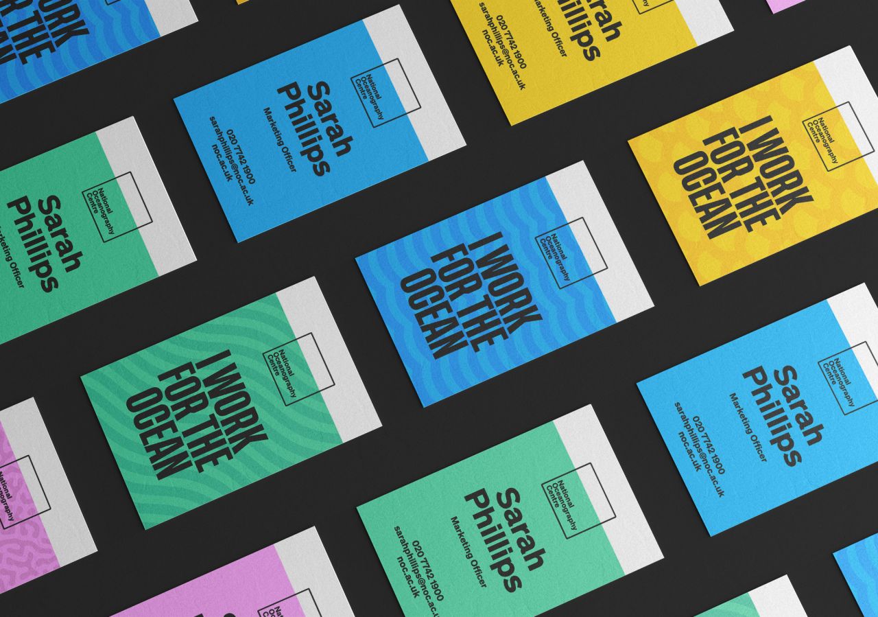
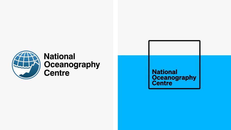
Logo and colour palette
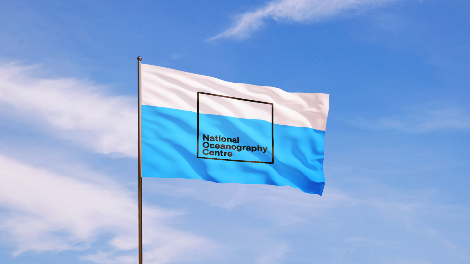
The logo has a 70/30 split to represent the 70% ratio of our ocean-covered planet. It means the logo always sits deep under the horizon line as if submerged.
"This placement allows us to carve out a space that can be filled with all of the beautiful imagery, patterns and illustrations we have created, which represent the rich visual language of the ocean," says Pete Snell, associate creative director at GOOD.
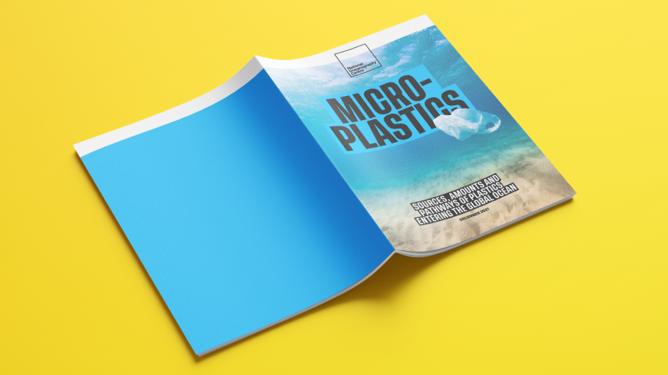
The colour palette and patterns, meanwhile, are inspired by the ocean. "Blue is our primary colour," says Pete. "But, when you look deeper, you can find a myriad of colours in the sea, from the vibrant pink of an octopus to the calming teal of a lagoon, to the vivid yellow scales of a tropical fish."
Illustrations, meanwhile, were inspired by historical, scientific illustrations, which brought the ocean to life in the early days of people's exploration of it. "We reinvigorated them with bold use of contrasting colours to ensure great visual impact," says Pete.
Overall, he says, "This is a really exciting opportunity to bring the world's leading ocean research institute to a wider audience. The ocean is a subject we all can and should care about. The new brand will transform NOC from a corporate, plain brand that only spoke to academics to one able to achieve cut-through and that can flex to reach a much wider audience. We hope that our work with NOC will inspire people and encourage them to care about the ocean – an expanse crucial to our planet's future."
Peter Ryde adds: "The rebrand is an important strategic step for NOC's independence and is an opportunity to evolve our brand to tell a more compelling, differentiating story with clarity of purpose and a distinctive look and feel that we hope enthuses, engages and enrols our audiences."
Editor's Picks


Trending


](https://www.creativeboom.com/upload/articles/86/862919952c0ad18439004228895a431dc6e45ffc_732.jpg)
Podcasts


Editor's Picks
Further Reading