The Importance of Typography in Advertising
Typography is far more than just a pretty typeface; it’s a powerful tool in advertising. It can communicate messages, establish brand identity, captivate audiences, and enhance user experience. That’s not bad for some letters on a page.
How letters appear – their shape, the space around them and how they’re arranged – can make or break an ad. Get typography right, and it can help deliver your message more effectively; get it wrong, and you could alienate potential customers.
In this article, we'll look at why typography is essential in advertising, its role in establishing brand identity, the different types of typography used, and examples of successful advertising campaigns where clever use of typography has paid off for brands (and agencies).
There are also tips for using typography effectively in ads (plus common mistakes to avoid), how advertisers are using creative typography to enhance user experience (UX), trends in creative typography across all media channels and platforms, the effect that different kinds of fonts have on our perception of a brand's personality as well as cultural associations with particular typefaces/styles/characteristics — but let's start by looking at just how vital type can be when trying to get your message across.
Table of Contents
Importance of Typography in Advertising
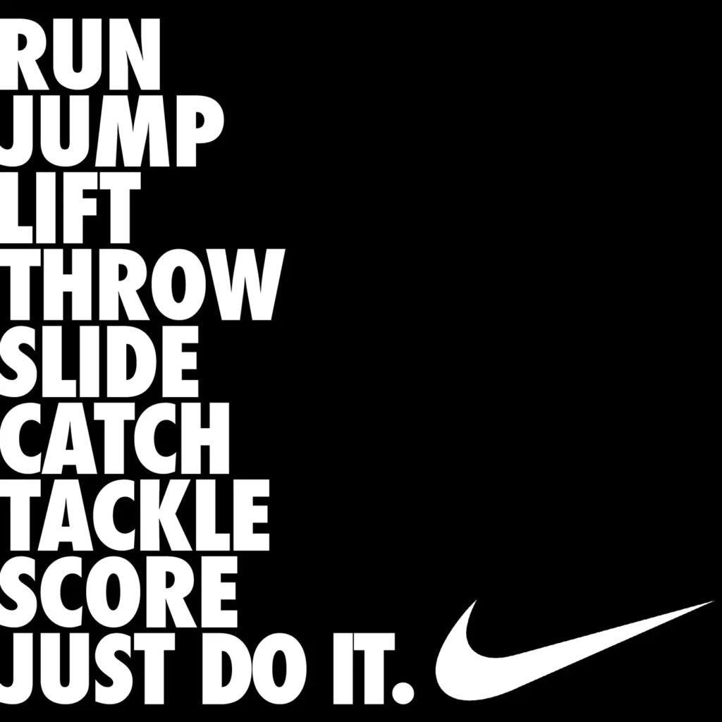
An advertisement's visual impact is about much more than simply which font you choose. It’s about creating a visual language using fonts that communicate what your brand stands for, its values and personality.
The choice of font styles/families/shapes/sizes/thicknesses/weights, colours, hierarchy/ranking/importance/order/status/relevance/priority/division/etc..(e.g., heading/subheading/body copy/etc.) consistency/co-ordination/continuity/sameness through everything from headlines through body copy etc., formatting/layout/design, white space ratios/balance/margins/guttering/padding etc. have a significant impact on how visually engaging an ad is: that’s before we even get to the words themselves.
Using typography can help turn plain text into something rich and engaging, grabbing your attention and setting the tone for a brand.
And then there’s recognition/differentiation, too. Typography is crucial in creating brand recognition (i.e., making it easier for people to identify your brand) and differentiation (making it stand out from competitors).
Choose your typography carefully so it aligns with what you want to say/value/stand for, and you’ll be better placed to evoke emotive reactions by tapping into people’s subconscious associations/beliefs about different typefaces/styles/characteristics – thus encouraging them to engage more fully/check out your ad or whatever.
Using consistent fonts across all marketing materials also helps reinforce this recognition – think Coca-Cola/Cadbury/BBC et al. – while strengthening trust in your message via familiarity/habit will help build loyalty over time.
Let's take luxury brands as an example. They tend to use elegant/script typefaces; doing so conveys sophistication/exclusivity – enhancing visual appeal/giving signals about their values. It might not be obvious why at first glance. Still, when we see images/logos connected to those names repeatedly/iconography/slogans/clarity around their ‘manifesto’ etc., our brains start putting two and two together… And if advertisers can leave viewers with certain preconceptions/reinforce who they are(our perception)/what they
Impact of Typography on Brand Identity in Advertising
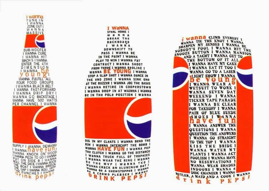
Typography plays a significant role in shaping a brand's identity in advertising. It goes beyond visual aesthetics; it is a strategic choice that helps establish a brand's identity and differentiate it from competitors. How letters are shaped and arranged can communicate attitude, emotion, and meaning beyond words. Brands invest time establishing typography rules and guidance to ensure consistency and convey the right message to their target audience.
For example, the Fisher-Price brand uses a custom typeface that creates a playful and credible image, aligning with its brand values. This choice of typography helps establish a strong brand identity that resonates with their target audience. Advertisers can substantially impact consumers by utilising typography as a visual and verbal communication tool, creating a lasting impression and fostering a sense of connection and loyalty.
To illustrate the impact of typography on brand identity, let's look at Coca-Cola. The brand's iconic cursive typography has become synonymous with its identity. The distinctive script font is instantly recognisable and evokes a sense of nostalgia and tradition. Coca-Cola's typography has played a significant role in establishing and maintaining its brand identity. It showcases how typography can become integral to a brand's identity and contribute to its success.
- Used Book in Good Condition
- Craig, James (Author)
- English (Publication Language)
- 176 Pages – 05/01/2006 (Publication Date) – Watson-Guptill (Publisher)
Different Types of Typography Used in Advertising
In advertising, different types of typography are used for various reasons. The choice depends on the brand's message and who they want to communicate with. For instance, some fonts look traditional and trustworthy (for example, Times New Roman), while others look modern and clean (like Arial). Some are meant to draw attention – display fonts that might be suitable for headlines or logos, while others convey elegance and creativity (script fonts). Then there are decorative fonts that could make your ad seem fun or even handwritten ones that can give it personality.
Here’s an example of how much difference typography can make: Let’s imagine you’re trying to get young people interested in your brand. You might go for bold, playful-looking typefaces with lots of character. This would fit well with their sense of adventure, fun, and company values – meaning they’d be more likely to relate to your words. The opposite would apply if you wanted to target an older demographic: classic, elegant letters would give a feel of sophistication and dependability instead.
Paying close attention to your typographic choices is therefore really important – because choosing carefully will help you connect with potential customers in a way they’ll relate to.
Examples of Successful Advertising Campaigns

Numerous advertising campaigns have effectively utilised typography to create impactful and memorable customer experiences. These campaigns inspire examples of how typography can strategically communicate a brand's values, capture attention, and establish a solid emotional connection with viewers.
One such successful campaign is the collaboration between ASOS and Nike. Both brands employ creative typography to convey their brand's energy and style. The typography used in their advertisements grabs attention, communicates the brands' personalities, and establishes a strong emotional connection with consumers. Starbucks is another notable example. The brand has established its identity through distinctive typography that reflects its warm and inviting atmosphere. The typography used by Starbucks enhances brand recognition and creates a sense of familiarity among consumers.
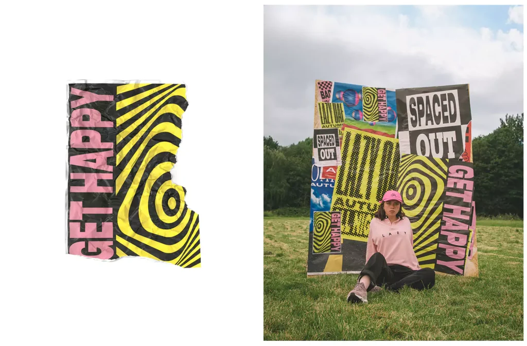
Lazy Oaf, a clothing brand, utilises playful and unconventional typography to connect with its target audience. By opting for unique typography that aligns with their brand values, Lazy Oaf effectively communicates their creative and eccentric personality, resonating with their audience. Billie, a women's razor brand, employs bold and empowering typography to challenge traditional beauty standards. This choice of typography helps create a strong emotional response and establishes a connection with their target audience, leading to increased engagement.

These examples highlight the power of typography in advertising. When used effectively, typography becomes a powerful tool that enhances an advertising campaign's overall impact and success.
Tips for Effective Typography in Advertising
To ensure that typography in advertising is effective, it is crucial to consider both the platform and target audience. Design should match the overall aesthetic of the platform – be it a social media ad or a website banner – while being legible and easy to read.
Consistency across different advertisements will help reinforce brand identity, with experimentation on current trends in creative typography, like heavily weighted fonts or platform-styled text, helping an ad stand out.
For example, when designing typography for a social media ad, advertisers need to think about the design guidelines of that specific platform and what its users want from an ad. By doing so, they can create ads that engage viewers by effectively communicating their message.
By staying current with design trends, advertisers can use innovative typography styles to introduce fresh ideas into their ads. This approach will ensure an advert catches its intended audience's attention in today’s crowded advertising landscape.
The hierarchy of typography is another crucial consideration. Headlines should be bold and eye-catching; body text should be legible and easily read. White space use can improve visual impact – allowing text room to breathe and stand out – and paying attention to details such as these when adapting your typographic style for each channel used, ensuring ads capture attention while providing a positive experience for viewers, are essential aspects not to ignore.
- advertising
- Ogilvy, David (Author)
- English (Publication Language)
- 224 Pages – 03/12/1985 (Publication Date) – Vintage (Publisher)
Typography's Impact on User Experience in Advertising
Beyond simple aesthetics, good typography is vital to offering a solid user experience in advertising. Clear and well-structured typography helps users quickly understand an ad's message. It also contributes to a website or app's overall design and navigation, making it easier for users to find what they want. And it helps ensure users have a seamless and enjoyable experience, which could boost their engagement with an ad.
Thoughtfully designed and implemented typography can improve the usability and accessibility of an ad more generally, too. For example, using appropriate font sizes and line spacing ensures text can be scanned – even on smaller screens. Consistency in typography across different sections of an ad helps users navigate it more effectively. By putting user experience at the heart of type design, advertisers can create ads that command attention while providing audiences with a positive, engaging experience.
Think about a mobile app ad that makes perfect use of typographic choices specifically made for legibility on small screens: by deploying clear fonts plus appropriate sizing and spacing throughout – all backed up by solid brand consistency – it’s easy for people viewing this advertisement to grasp its message quickly; plus such thoughtful type design would help foster positive user experiences elsewhere too.
Trends in Creative Typography for Advertising
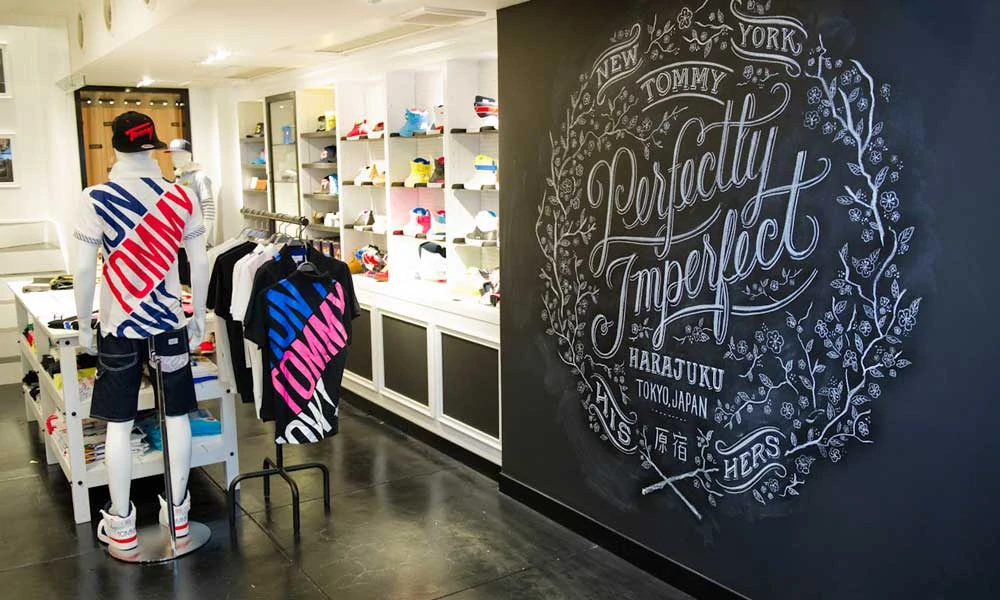
Creative typography in advertising is constantly evolving, reflecting current design trends and consumer preferences. Staying current with these trends can help advertisers create fresh and relevant advertisements for their target audience. However, it is essential to balance following directions and maintaining a consistent brand identity.
Some popular trends in creative typography include heavily weighted fonts, which add impact and visual weight to the text. This trend can be seen in advertisements where bold typography grabs attention and conveys a strong message. Platform-styled text is another trend that has gained popularity. This involves using typography that emulates the design of social media platforms, creating a sense of familiarity and resonating with the target audience. Handwriting fonts are also rising, adding a personal and authentic touch to advertisements.
While incorporating trends can help advertisements stand out, it is essential to consider whether a trend aligns with the brand's values and message before integrating it into typography design. By combining creativity with understanding audience preferences, advertisers can create typography that effectively captures attention and resonates with viewers.
Influence of Typography on Consumer Sentiment in Advertising
Typography possesses a psychology of its own, one that can affect how consumers experience advertising. The shapes and arrangements of letters can suggest particular emotions or ideas. For instance, bold, uppercase lettering may imply power and confidence; cursive, delicate lettering might offer elegance or sophistication.
Choosing typography that appeals to the target audience and aligns with an intended brand image can generate a positive emotional response and boost consumer sentiment around products or services.
Typography may help establish an emotional link with customers and influence how they perceive a brand. When typography chimes with a company's values and resonates with target audience members, it suggests certain things that generate positive feelings – known as association – boosting consumer sentiment.
Advertisers who understand these principles can harness the psychological impact of typography to create ads that catch attention more effectively and make a strong impression on viewers, grabbing their attention long enough for them to take note of what is being advertised.
Take an ad for a high-end perfume brand; if it has been put together using elegant or sophisticated typography, this will enhance the sense of exclusivity around its products in consumers’ minds – reinforcing positive consumer sentiment towards the brand. Thus, Typography becomes another tool advertisers use to evoke specific emotions or associations to build desirable customer sentiments.
Cultural Associations and the Impact of Typography on Advertising

Cultural associations also influence typography in advertising. Different cultures may have unique interpretations of letterforms and typography styles. Advertisers must consider these cultural nuances to ensure that typography appropriately resonates with their target audience. Typography can create texture, function as an illustration, or enhance visual branding while considering cultural sensitivities and associations.
Cultural associations play a significant role in typography design, as specific fonts or styles may carry different meanings in different cultures. For example, a typeface considered elegant and sophisticated in one culture may be perceived as outdated or unappealing in another. Advertisers must conduct thorough research and work with designers who understand the cultural context to ensure that typography is culturally appropriate and resonates with the target audience. By considering cultural associations, advertisers can create typography that effectively communicates their message and avoids unintended negative connotations.
For instance, a global advertising campaign must consider the cultural associations of typography across different regions. By adapting the typography to align with local cultural preferences, advertisers can ensure that the advertisement resonates with the target audience and avoids cultural misinterpretations. This attention to cultural associations in typography design helps create an inclusive and impactful advertising campaign.
Typography as a Visual and Verbal Communication Tool in Advertising

Advertising relies heavily on typography as both a visual and verbal communication tool. Typography is the design and arrangement of letters to communicate literal messages, brand personality, values, and tone. The right combination of fonts, colours, and layout can create a strong visual identity that is easily recognisable and memorable, an essential aim in advertising which benefits from frequent exposure.
Typography’s primary role is to convey information visually, but it also communicates via aesthetics by suggesting whether a message should be taken seriously or not. It provides clues about what type of product or service is being advertised (a luxury car versus an eco-friendly cleaning fluid), its target audience (nursery school children versus millennials) or even simply how to pronounce unfamiliar words.
The typography used in Apple’s advertising campaigns is clean, minimalistic and aligned with its overall aesthetic: consistency, which helps create a robust visual identity instantly recognisable as Apple.
Finally, there’s one more aspect to consider: cultural associations. Choosing the wrong font could lead consumers to mistakenly believe your product has different characteristics from those you want them to associate with your brand – something Unilever discovered when it changed the typography of some of its packaging.
In conclusion, typography isn’t just about making words look nice; it plays a vital role in helping brands create their identities, shaping users’ experiences – influencing how they feel about a company – and enabling advertisers to communicate effectively with their customers.
Last update on 2024-05-04 / Affiliate links / Images from Amazon Product Advertising API


